Popcorn Perfection: A 1920s Revival for Gourmet Delights
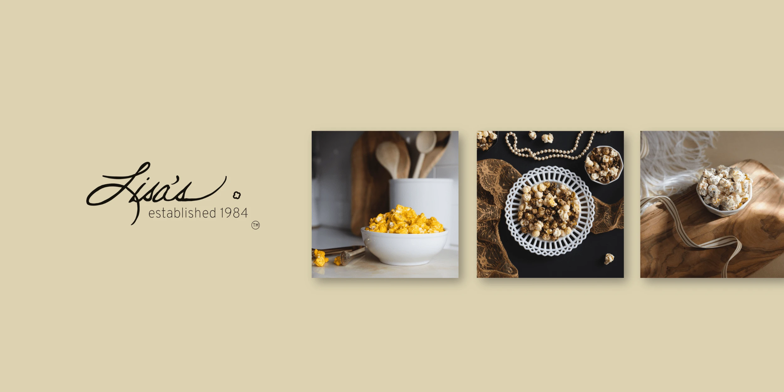
Get ready to take a delicious trip back in time! My rebranding journey for Lisa's gourmet popcorn company is like stepping into the 1920s—a dash of vintage charm mixed with modern vibes. I spiced up the logo, added a burst of colors, and infused that 'Roaring Twenties' spirit into every bit of the design. It's all about turning your favorite snack into an unforgettable experience. Come along, and let's savor the flavor of this popcorn makeover!

Lisa’s Popcorn is gourmet popcorn company that started in a kitchen as a small gesture of love to family and friends almost 40 years ago. The company had expanded within the last 10 years or so to serving not only their local Kaysville community but all across the state of Utah.
Soon after they’d make the move to e-commerce where they could reach people across the world. Lisa’s Popcorn strives to be the go to treat for all of life’s moments, big and small. Something that brings people together, and a tradition that lasts many lifetimes.
Things were going great, until they realized they weren’t sure of who they were. Lisa’s felt lost in the noise of the crowd. Although well established as a small local business, they were acquiring bigger clients. Corporate gifting and Wholesale began to ramp up. Seemingly little things like a few bags here and there breaking open in shipment, or a lack of organization materials started creeping up. They had great things going, and wanted to be more recognizable as they grew. Lisa’s wanted to keep that same love and attention they had, while growing and gathering more and more people into their popcorn family.
It was time to show the world who Lisa’s Popcorn grew up to be. With that, I was selected to conduct a rebrand. Over the last year, I have worked with the CEO on this project as well as a newly acquired business partner which you’ll see… taught me a lot more and challenged my ideas in a scary and great way.
This was the first time I ever had done something like this. I was nervous and wasn’t sure I’d be able to do everything.
I knew how important this project would be, Lisa’s Popcorn is a staple in their community. The retail store and factory are located right on Main Street next to the movie theater!
First, I conducted a brand audit and had a few interviews with the owner to see where he envisioned the company going within the next few years. He laughed and replied, “I hardly know where it’s going when I wake up in the morning!” - After working with the brand for over a year I can confidently say the long term vision is in fact strong and well thought out. Execution of this vision for the brand was on me.
Small company, small budget, narrow timeline and just me.
Remember I said I wasn’t sure I’d be able to do everything? Well that was very real, and so was my excitement. They gave me the reigns and said LET’S GO.
I tried many things, and failed a bunch.
I learned how important it is to continually iterate, test and get stakeholder feedback early in the process.
Off I went. I started doing all the things I was taught to do. The usual; surveys, analysis after analysis including their target audience. More interviews with the CEO and people involved in the day to day popcorn production to get a sense of the brand values. Being an established company, I had access to their extensive email list as well. This gave me great insight to WHO the customer is, and what they expected when it came to their gourmet popcorn go-to. I knew after the basics of this rebrand I would redesign the website as well but here we will focus on the core elements. Every bit of information and feedback I could get was important.
Through the initial phase of discovering and defining what Lisa’s has been so far, I had more confidence that I could move forward in a meaningful way.
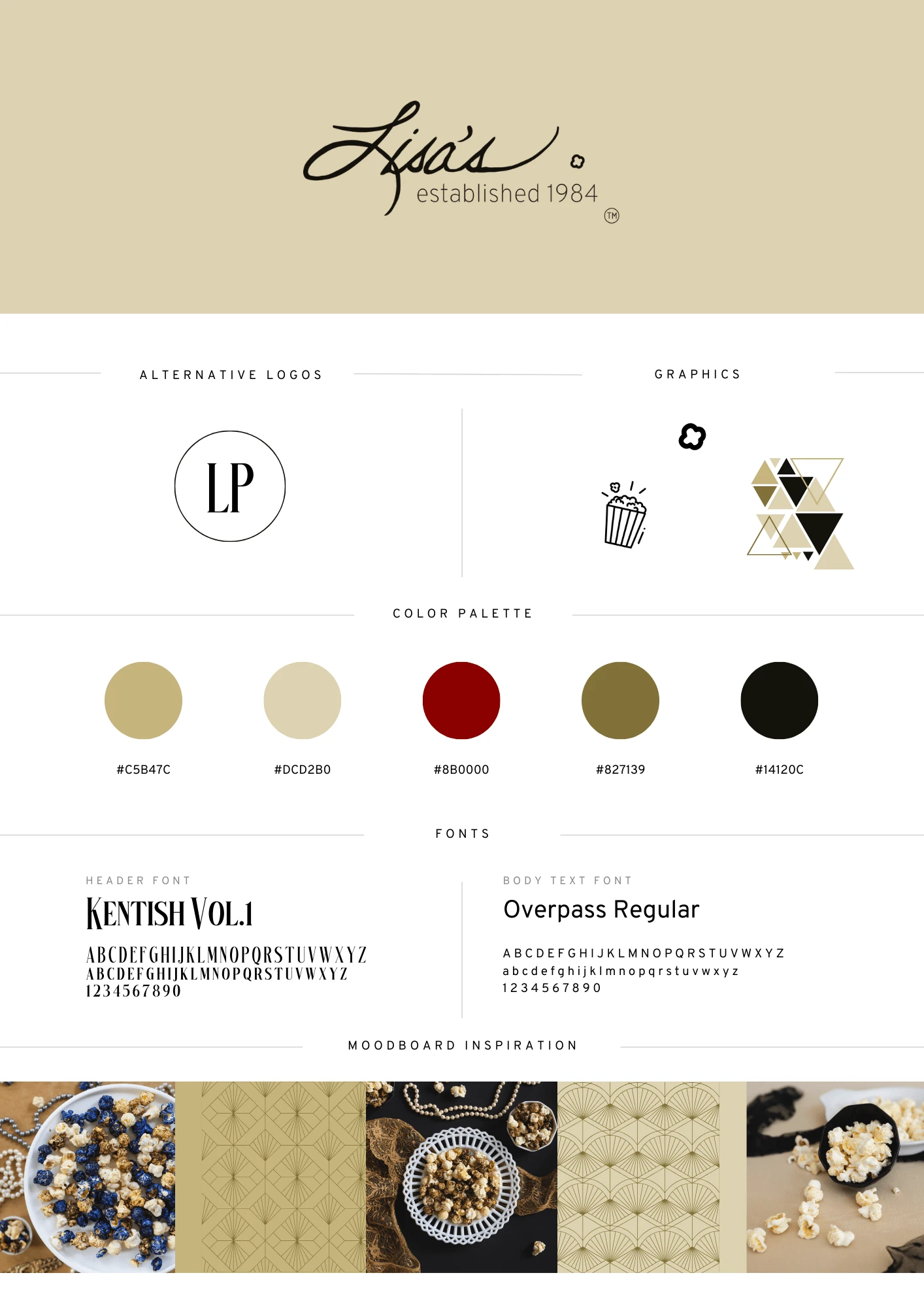
Starting with the basic visual elements: Logo, Typography, Color Palette and Imagery.
The logo included THE Lisa’s signature. That was a non negotiable detail.
So, here comes my first lesson, name and organize my designs effectively.
Why? Because I can’t recall how many iterations of the logo I did. Three? I think.

So, after all of that was approved, I moved to making a label for the packaging.
During this time, I was handling customer service. The previous year Lisa’s had switched to printed bags, they were way out of budget so they went returned to the old clear bags they had used for a long period of time prior. We got so many complaints about the bags bursting open in shipment. A lot of refunds were issued. People missed the ability to seal up the bags because they wanted to save some for later.
I took the responsibility of researching new bags and getting the sizing down. We went with a clear, re-sealable bag that of course was food safe and made with the proper materials.
I created a label for the new bags. Very very simple. Logo and popcorn type. (candied or gourmet) People were loving the new bags. No more emails for broken popcorn bags. That was a win!
Enter new business partner.
Lisa’s had a growing wholesale community as well. The new business partner helped that grow even more. We began to get feedback from our wholesale clients, they missed having the popcorn flavor on the label so they were more easily identifiable. This is a great case of having two different customer personas - D2C didn’t mind because they knew what they were buying based on the website. B2B sold the popcorn in stores and it wasn’t clear right away to the customer what the flavor was.
I designed a new label, with a few other additions per the business partner’s suggestions.
It turned out so pretty!

Then we printed it and realized the font I used for the flavors was really hard to read. So.. iterated again! So many edits and so worth it.
I think what people maybe don’t tell you is during the iteration process, not only does the design get better but HOW you design gets better. Using the tools, working in new ways, finding a flow that is better for you. And what’s great is it just keeps getting better.
I wasn’t sure we’d make it, but we did and it’s been so great!
We finalized the brand redesign! Next steps were almost in motion!
I love this company because I was able to be so cross-functional. Once I had the elements down, I moved to email design and putting all of those to use. I created templates and tweaked them until they felt great and on brand. The click rate went up, along with the attributed revenue. I nailed down the voice and tone, customers were raving about how fantastic customer service had become. The emails exchanged were amazing too, people LOVE talking to other people as long as they feel heard. That’s what I created at Lisa’s. A place that popcorn lovers know that we are understanding. We are a safe space for them to voice their concerns and give feedback!
By involving the broad customer base with B2B and D2C early on, we will be able to get to our desired outcome a lot quicker. I learned about having multiple personas and finding a way to meet their needs in a unique and equal way. Learning this will not only save the company time and money, but I am armed with the skill of looking at the problem from all angles.
The rebrand was so much fun, and has been receiving positive feedback, but this was just the beginning! We will be continually iterating and adding more to this feature to make it excellent.Stick around and I’ll take you through the website redesign next.
Like this project
Posted Oct 22, 2023
My rebranding journey for Lisa's gourmet popcorn company is like stepping into the 1920s—a dash of vintage charm mixed with modern vibes.
Likes
0
Views
9


