Surf School UX/UI Redesign resulted in +727% mobile engagement
Sofia Mateo Ortega
Surf School UX/UI Redesign resulted in +727% mobile engagement
I redesigned the site to reduce cognitive overload, simplify booking paths, and make it mobile-friendly — resulting in +727% mobile engagement and +361% desktop interaction. Start scrolling for the story.
OVERVIEW
Lanzarote Surf, one of the most recognized surf schools in the Canary Islands, struggled with a cluttered, overwhelming website.
Users faced difficulties regarding:
– navigating the site,
– understanding available courses,
– and completing bookings.
The website contained excessive text, inconsistent branding, and lacked a streamlined user flow.
GOAL
Simplify content structure to make course options clearer and easier to navigate.
Enhance branding consistency to improve credibility and user trust.
Optimize for conversions by making CTAs more prominent and reducing friction.
Improve mobile experience, given that most visitors accessed via mobile.
Maintain SEO rankings by keeping original URLs intact.
RESEARCH
Understanding the Problem
Despite the amount of information available on the original website, users were still struggling to find clarity. I conducted user interviews to uncover behavioral patterns, decision blockers, and unmet informational needs.
During interviews, we found that users still had very basic questions not addressed on the site — like how to identify their surf level in order to choose the right course. This lack of clarity often led to frustration or hesitation, causing potential customers to drop off before reaching the booking step.
FINDINGS
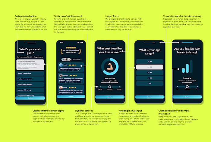
1.Users struggled with too many options, so...
Simplified offerings to highlight the most popular plans.
2.Worthless information repeated as a strategy to boost SEO but interrupted a smooth user experience, thus...
I moved that information to the footer via FAQs and optimised it for SEO.
3.There was so much text that it prevented the user from finding the information they were looking for, then...
I used dropdowns, carousels and iconography to facilitate reading.
4.Users didn’t know their surf level, until we...
Added a comparison table to help them self-assess before booking.
5.CTAs were not visible enough, but then...
Decided to made them bold, consistent, and action-driven.
6.Solo travelers hesitated to book, so I...
Adjusted messaging to encourage individual sign-ups.
Quantitative Research
To understand how the original website was performing and where users were engaging (or dropping off), I conducted a multi-source research process combining:
Google Analytics (GA4): to track traffic sources, device behavior, top-performing pages, and funnel drop-offs.
Hotjar: to analyze heatmaps and scroll depth, identifying where users lost interest or missed key actions.
Semrush: to audit search visibility, keyword positioning, and competitor presence across surf-related queries.
THE PROCESS
Designing to reduce cognitive load & promote conversions
To understand how users interacted with the website, I created a customer journey map that revealed key pain points:
Consideration Stage Issues: Users had trouble finding relevant information due to cluttered pages.
Decision Stage Friction: The lack of clear CTAs made it difficult for users to take the next step.
Mobile Experience Challenges: Despite most traffic being mobile, the desktop experience was prioritized.
Key solutions implemented:
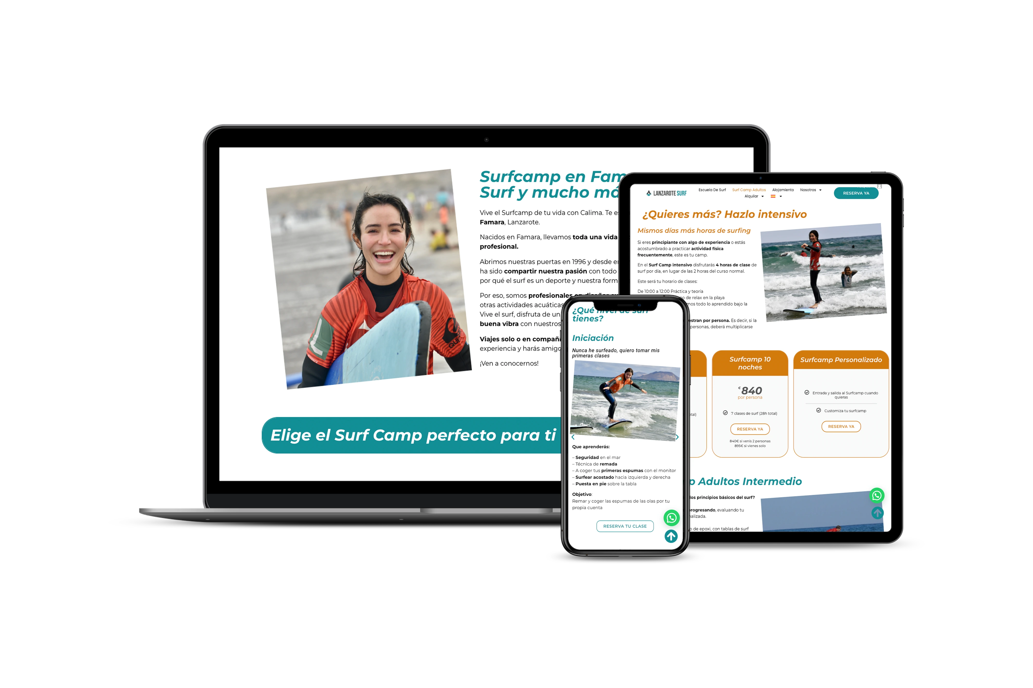
Reorganized the website’s structure to focus on high-interest content.
Consolidated pages and removed unnecessary distractions.
Simplified booking flows to guide users directly to reservations.
Optimized for mobile-first navigation.
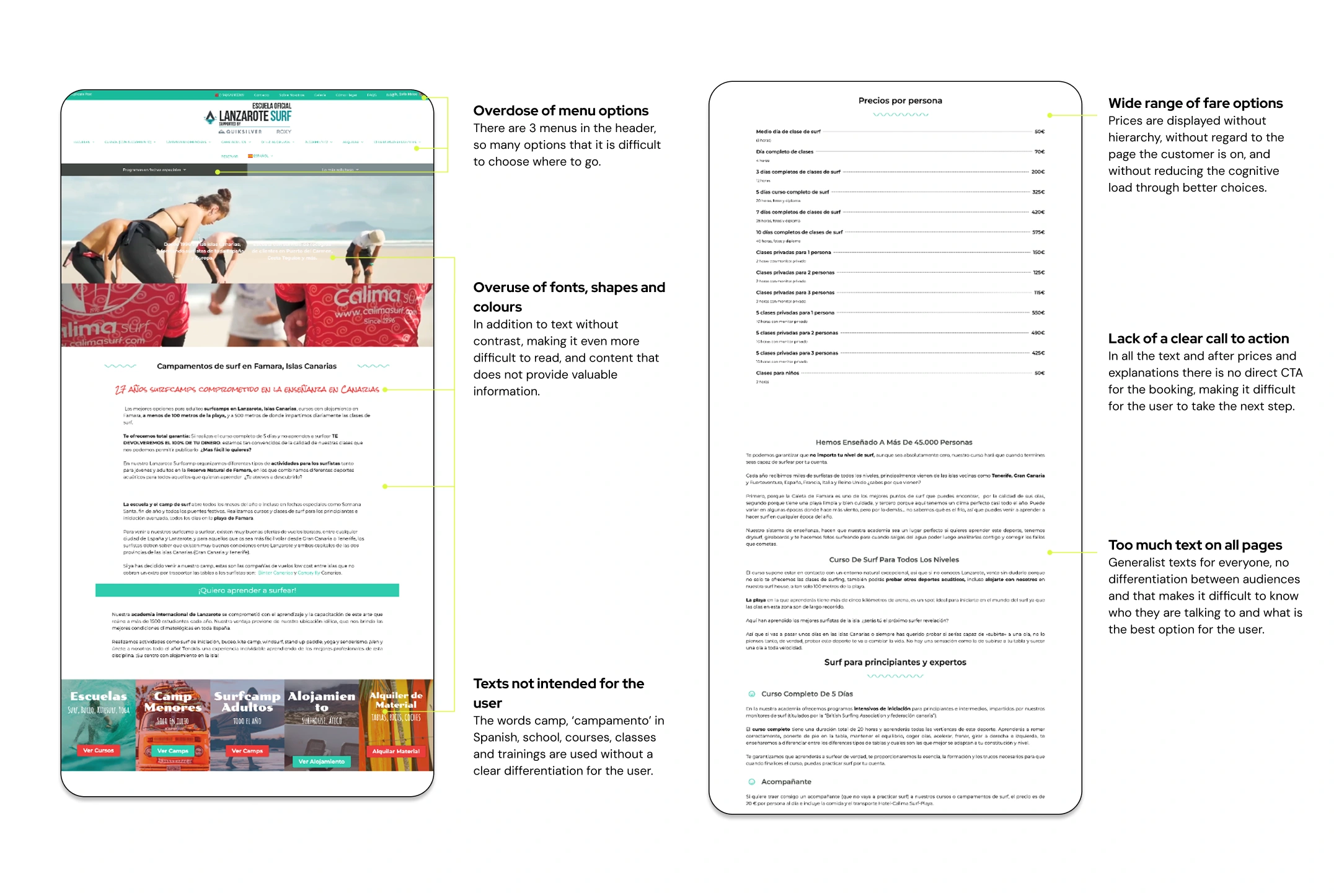
Before redesign
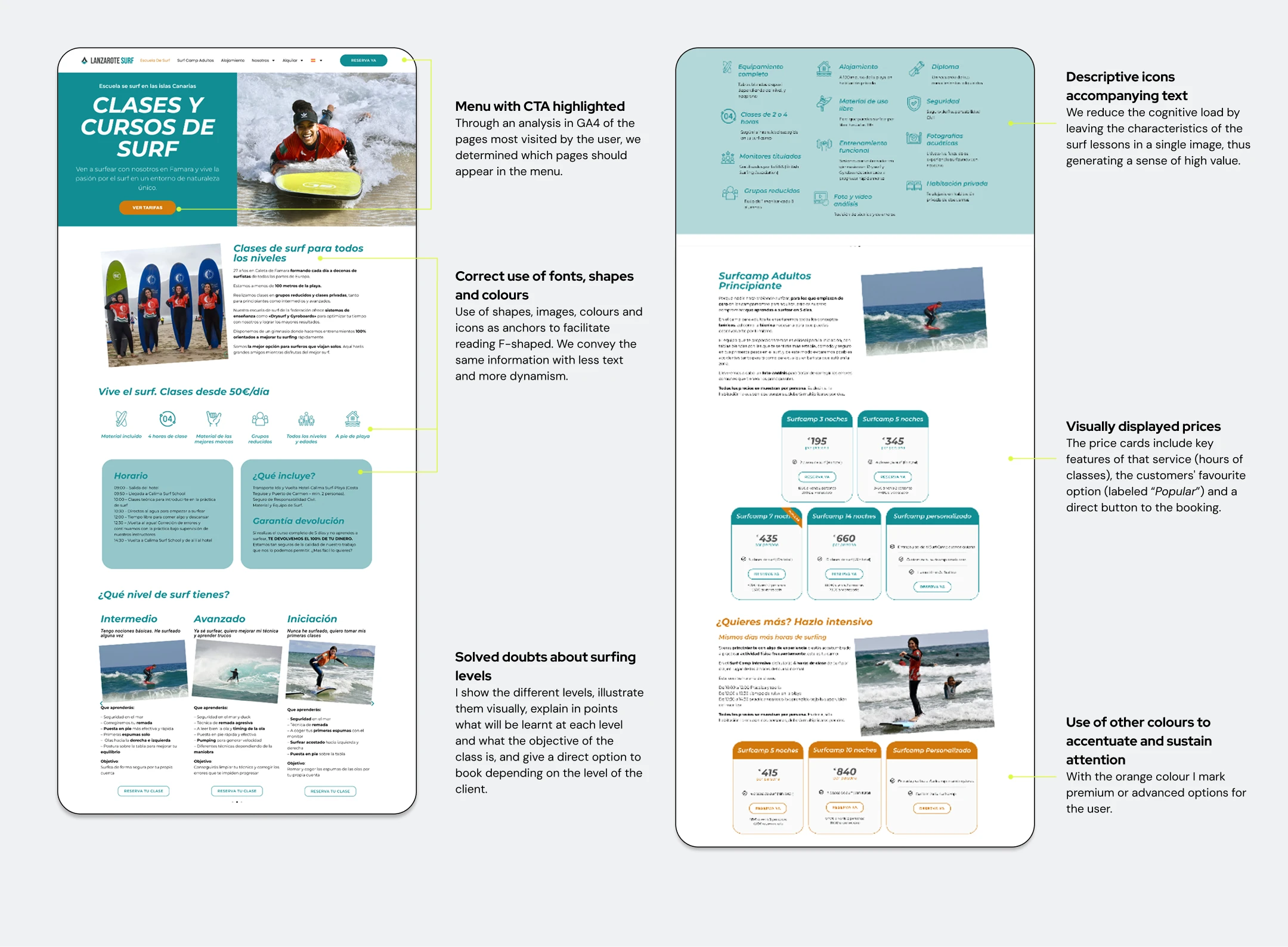
After redesign
RESULTS
Post-launch impact: Optimized for mobile-first growth.
€19K in revenue in the first 8 weeks — setting a solid foundation for 2025 growth
Mobile sessions and engagement time skyrocketed, showing improved UX.
Avg. interaction time: +727% (from 6s → 55s)
% of sessions with interaction: +95% (from 24% → 47%)
Bounce rate dropped by 35%, thanks to improved navigation
Customer support inquiries reduced, as FAQs covered common concerns
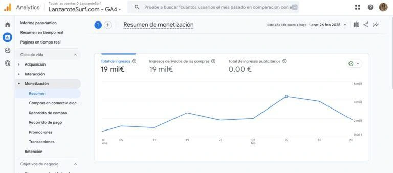
€19K in revenue in the first 8 weeks — setting a solid foundation for 2025 growth
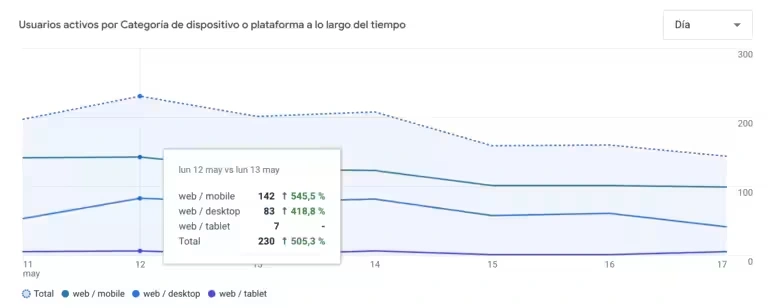
Active users per device or platform
Like this project
Posted Jun 8, 2025
Redesigned Surf's website, boosting mobile engagement by 727% and improving user experience.
Likes
0
Views
9
Timeline
Oct 1, 2024 - Feb 2, 2025