Clarifying the Message: UX Redesign for a Nonprofit Website
Sofia Mateo Ortega
Clarifying the Message: UX Redesign for a Nonprofit Website
Foundation's website was drowning in messages and missing the point. I led a UX redesign to bring focus, structure, and clarity.
The biggest challenge wasn’t visual—it was clarity. FIHF needed to show why their work matters to funders, scientists, and everyday people alike. I led a research-first process to refocus messaging, segment navigation, and turn vague CTAs into real pathways for action.
OVERVIEW
FIHF (Foundation for Innovation in Healthy Food) is a non-profit aiming to improve the nutritional value of food without requiring changes in consumer habits. The foundation collaborates with scientists, farmers, and food industry leaders.
Despite its innovative mission, its website wasn’t effectively communicating the value of the foundation to its highly diverse audience:
Unclear mission & vision: Users couldn’t understand what FIHF was or why it mattered.
Lack of stakeholder-specific messaging: Scientists, funders, and farmers had no tailored entry points.
No data tracking prior to my involvement (GA4 setup started March 9th).
Low credibility perception due to poor hierarchy, vague CTAs, and lack of partner visibility.
Overemphasis on a single initiative (Coalition for Grain Fiber), limiting perceived scope.
THE PROCESS
What Do You Actually Do? — The UX Research That Rewrote a Mission
RESEARCH
Discovery Phase
To go beyond assumptions and uncover real user needs, I combined:
User Interviews: Qualitative sessions with farmers, scientists, nutritionists, board members, and external UX advisors. Insights were mapped and synthesized (see below).
Heuristic Evaluation: Full UX audit based on usability, consistency, and conversion cues.
Quantitative Analysis:
GA4 (implemented from scratch): Acquisition, session flow, bounce rate, key events.
Hotjar: Scroll & click maps revealed weak engagement and confusion in nav flows.
Semrush: Poor keyword targeting. The only searches performed are direct searches for the name of the organization, so there is no discovery using general interest terms.
HEURISTICS
Visibility of System Status. The website lacks clear indicators of where users are or how far along they are in a process.
Match Between System and the Real World. The language used is overly technical and not easily understood by all target audiences (e.g., farmers, general public).
Flexibility and Efficiency of Use. There are no shortcuts or personalized routes for different users (e.g., scientists, farmers, donors).
User Control and Freedom. Navigation lacks clear ways to go back or undo actions.
Consistency and Standards. Some links and CTAs appear in inconsistent formats, leading to confusion.
Error Prevention. Forms do not provide real-time feedback or mark required fields clearly.
Recognition Over Recall. Main sections of the website aren’t visually highlighted, requiring users to remember where to find info.
Aesthetic Design. The site looks clean, but feels cold and impersonal due to overuse of stock imagery.
Help and Documentation. There is no Help or FAQ section to guide new users.
Research-Backed Patterns
From the interviews, I extracted the main needs across audiences:
You need to show where this is going—not just what exists now. – Stephen (Chairman)
The structure should guide me depending on who I am.” – Steve (UX Expert)
You should make it easier for [...] to see how they benefit.” – Nathan (Farmer)
BENCHMARK
Compared FIHF to FAO, WFP, Feeding America, Better Food Foundation, etc., uncovering gaps in storytelling, navigation structure, and donation flow.
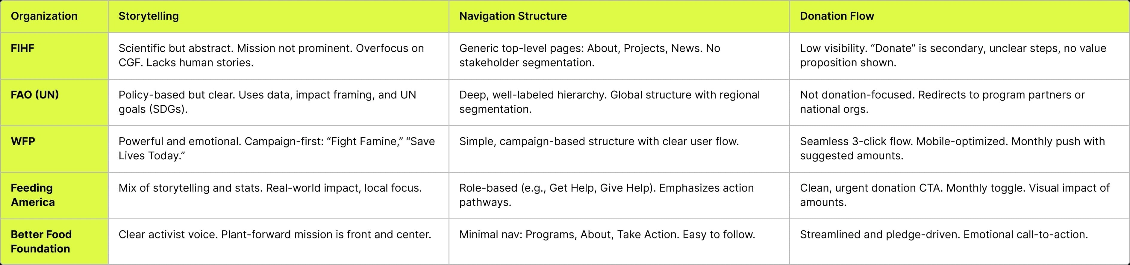
Comparison table
THE OUTCOME
Before shows mission was unclear, didn’t guide by audience, pages lacked credibility and trust, content felt cold, users missed key CTAs, no data or impact metrics were visible, users had nowhere to land based on who they are and the design felt elegant but distant.
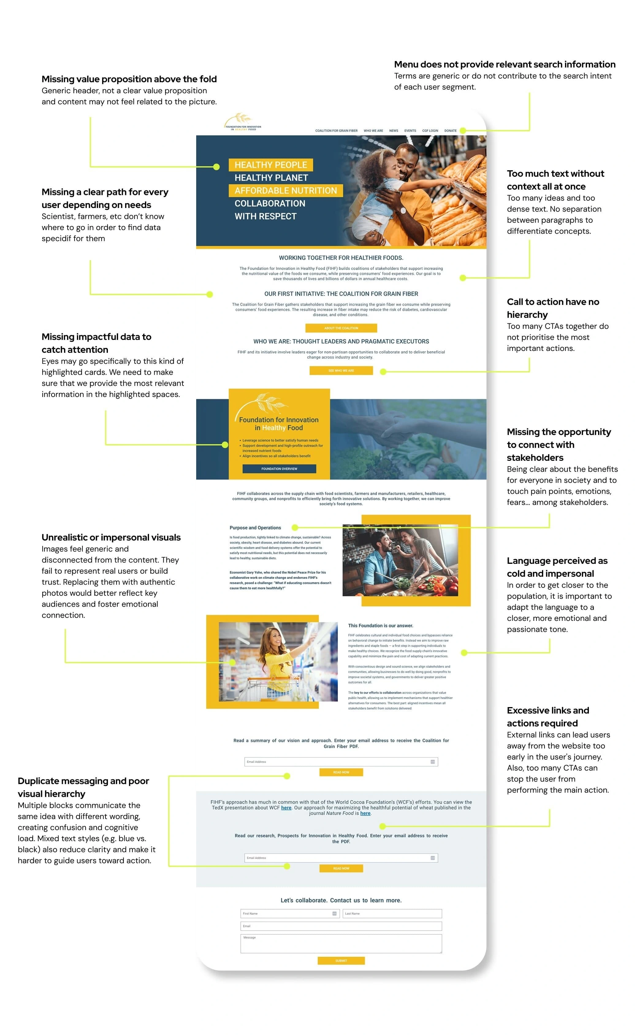
Before redesign
After the redesign, we were able to:
Explain what FIHF does, who it serves, and why it matters — all above the fold.
Segment navigation by role (e.g., Researchers, Farmers, Donors) to help users self-identify and find relevant content faster.
Elevate scientific partners, real results, and visual credibility markers to boost user confidence.
Swapp stock visuals for real people, real quotes, and real stories — making the foundation feel human and relatable.
Redesign calls to action with specific outcomes and made them visible in menu, body and footer.
Balance visual clarity with emotional storytelling and made information scannable.
And more...
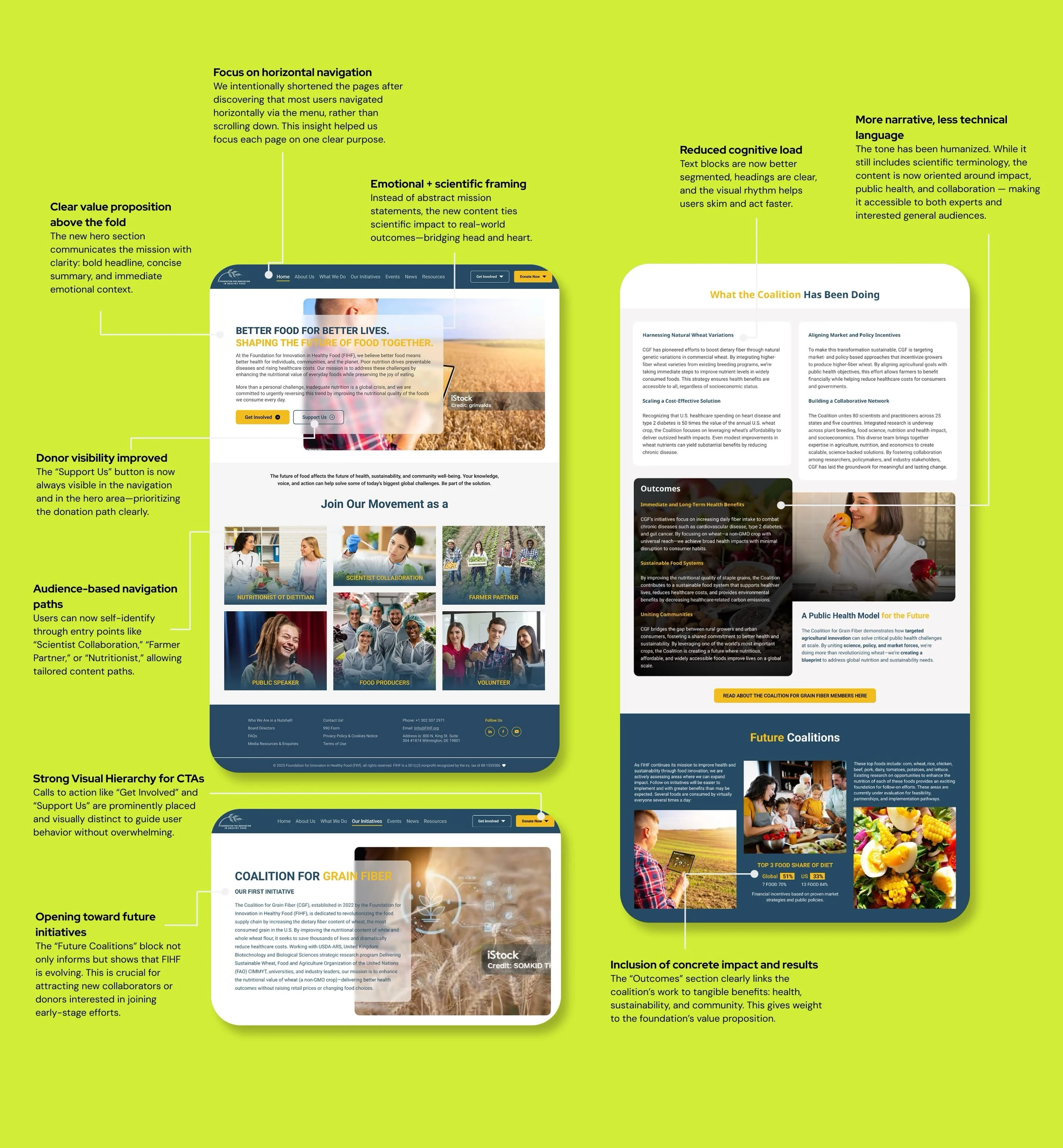
After redesign
Like this project
Posted Jun 8, 2025
Foundation's website was drowning in messages and missing the point. I led a UX redesign to bring focus, structure, and clarity.
Likes
0
Views
2
Timeline
Mar 1, 2023 - May 2, 2025