JKN Mobile, UI/UX case Study Revamp
redesign the UI jkn mobile apps to look modern and easy to use on user
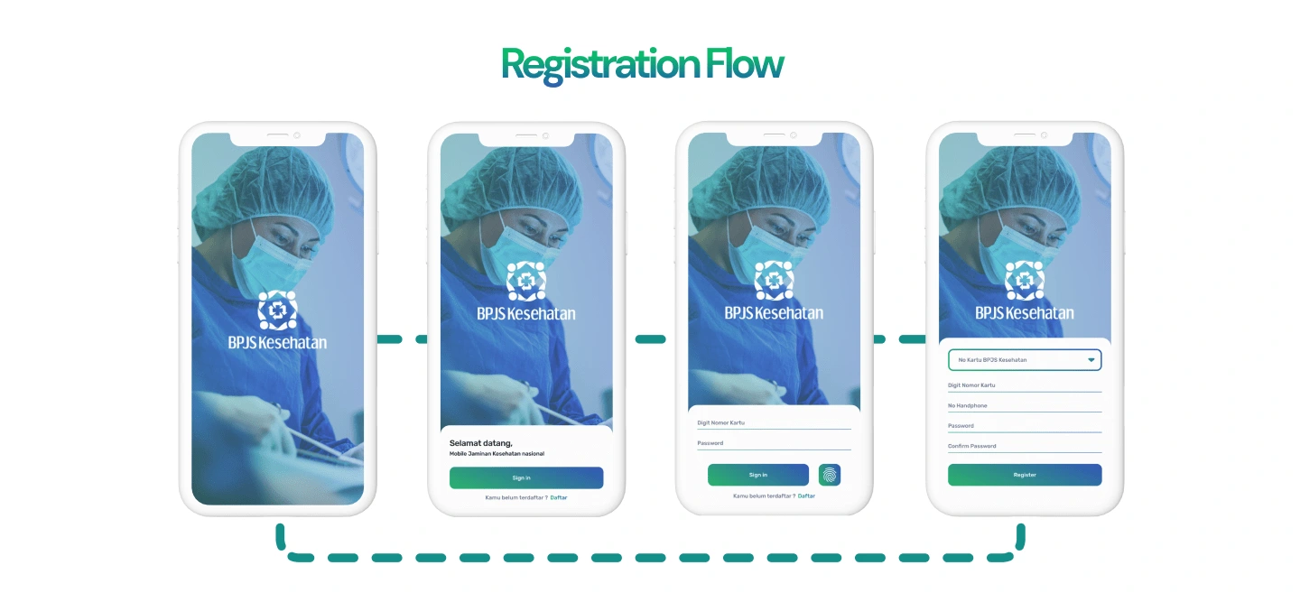
registration flow
Background
The creation of the Mobile JKN application is a tangible manifestation of BPJS Health's commitment to providing participants with easy access and optimal services. Participants can use this application to quickly and easily access various information related to the National Health Insurance program organized by BPJS Health, wherever and whenever they want.
UI Before Revamp
Before the redesign, the UI appeared old and out of date, many colors were inconsistent and did not convey a sense of identity if viewed on a mobile device.
Goals
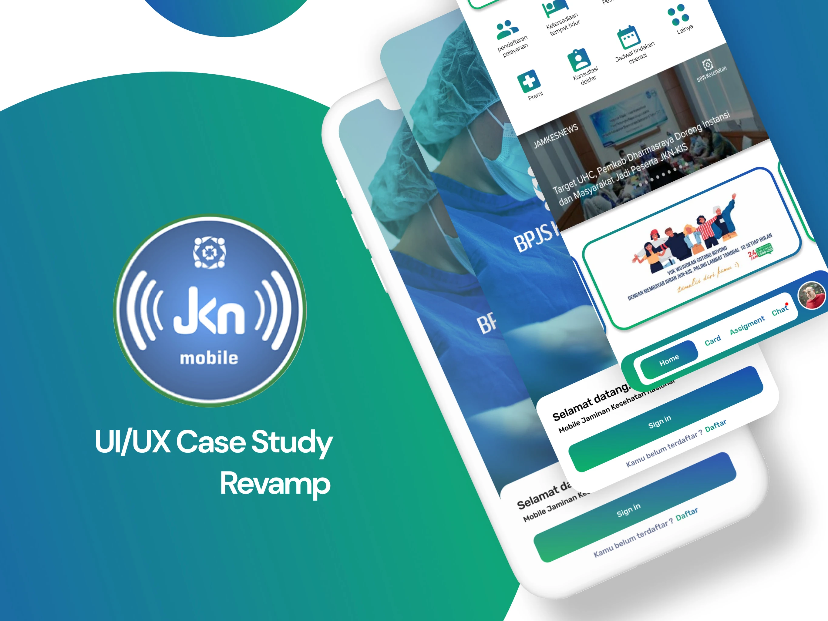
This redesign creates a UI from jkn to highlight the product itself, while also making the UI design modern and trendy.
UI After Revamp
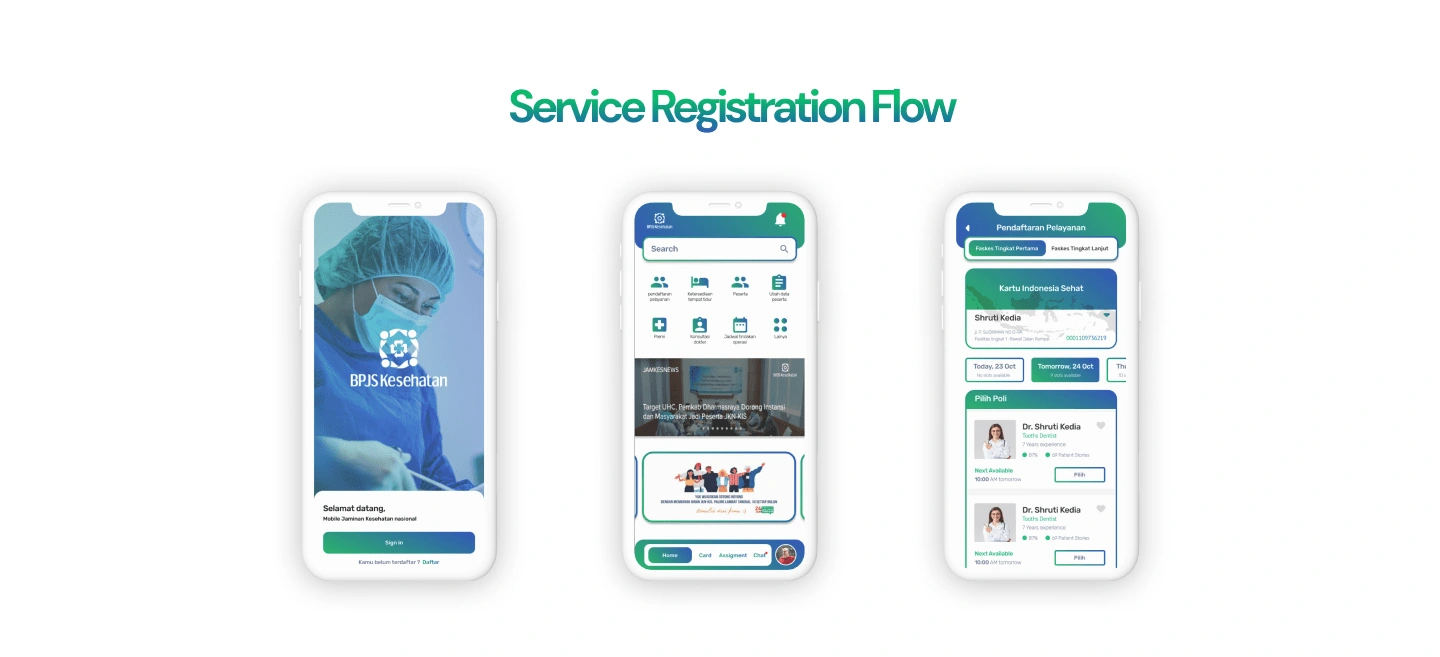
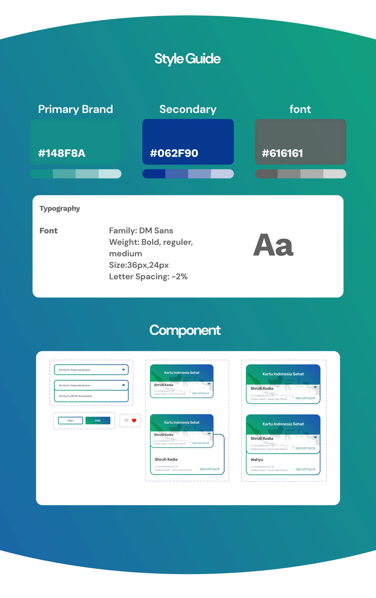
After redesigning this product, the color of the product, if not the mobile itself, will be highlighted. introducing blue and green gradations to make UI designs more modern and trendy Furthermore, the design allows this product to be enjoyed by people of all ages.
Wireframe
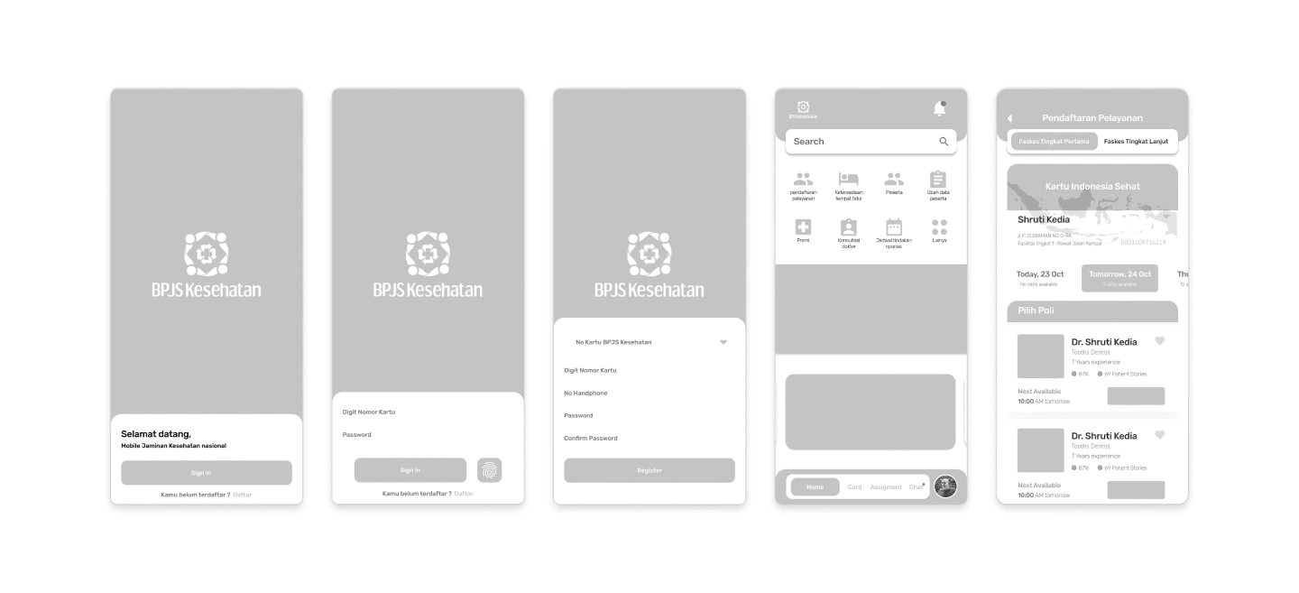
HIgh Fidelity
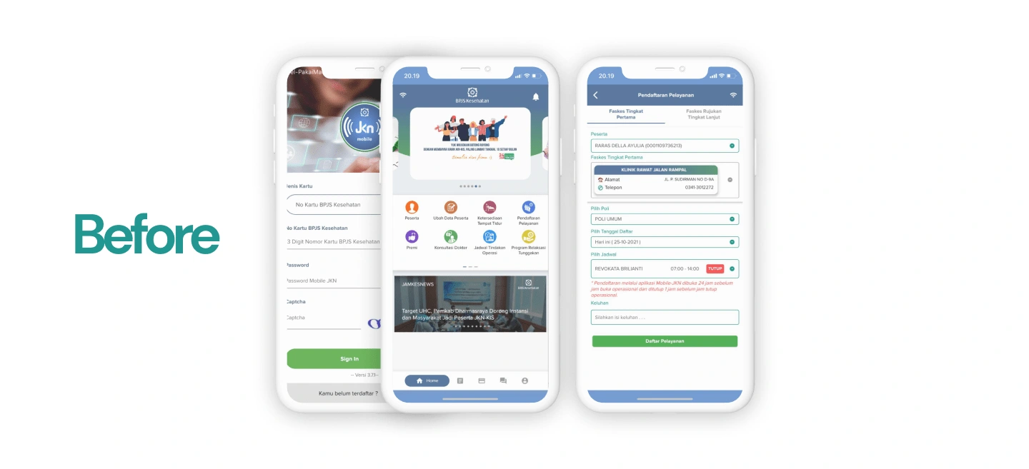
Before the redesign, the UI appeared old and out of date, many colors were inconsistent and did not convey a sense of identity if viewed on a mobile device.
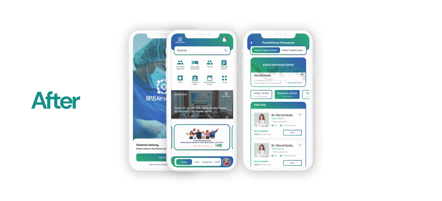
After redesigning this product, the color of the product, if not the mobile itself, will be highlighted. introducing blue and green gradations to make UI designs more modern and trendy Furthermore, the design allows this product to be enjoyed by people of all ages.
Like this project
Posted May 5, 2022
redesign the UI jkn mobile apps to look modern and easy to use

