Livis Brand Identity Development

Dominik Mészáros








Livis - Brand Identity
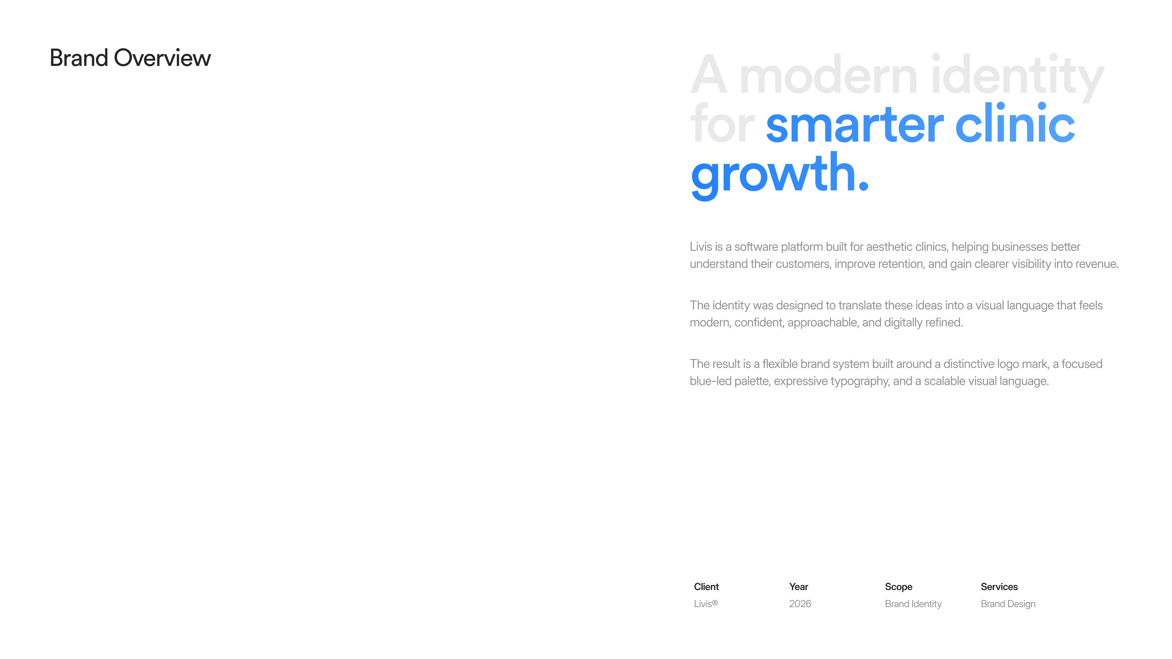
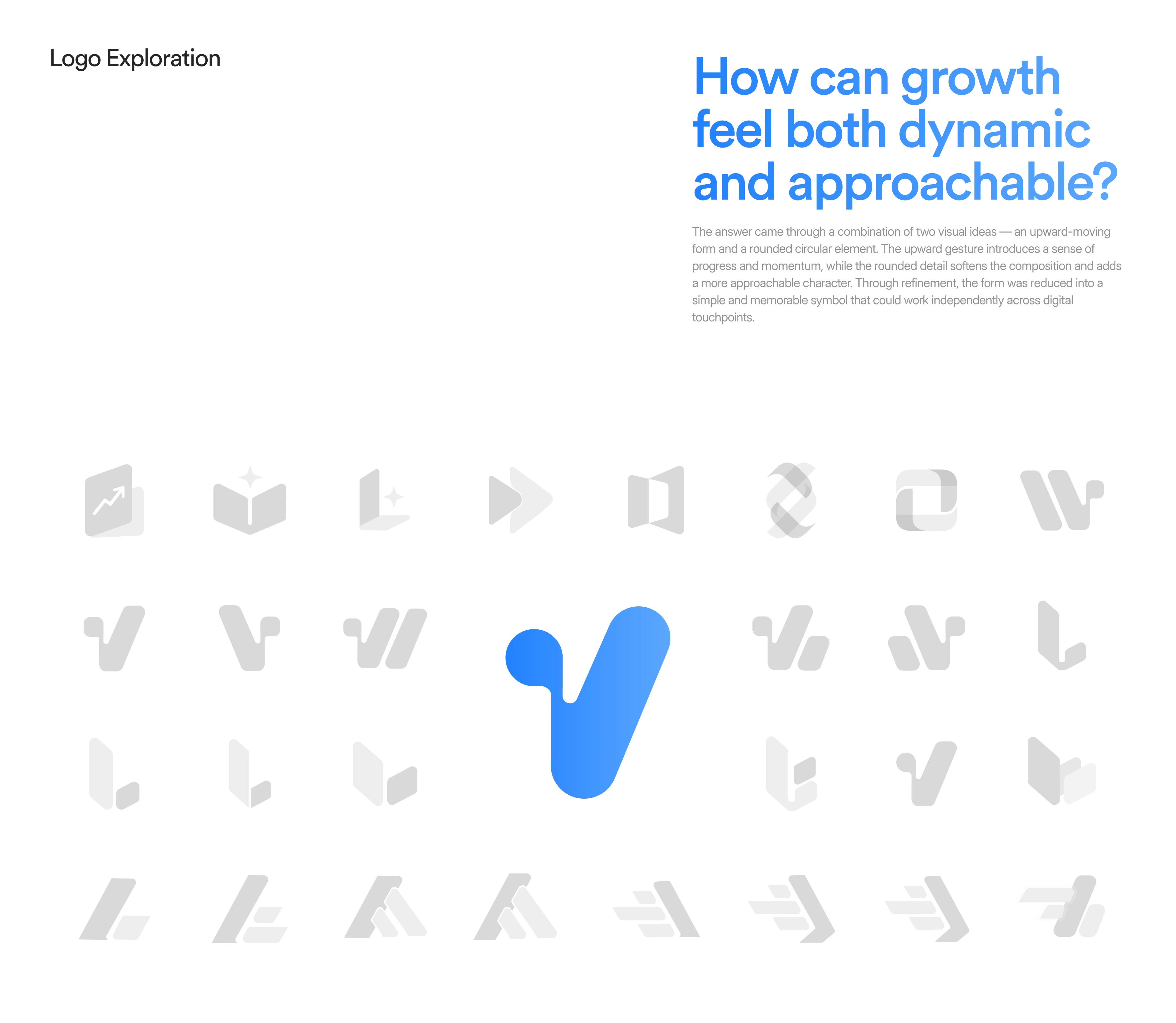
Brand identity for a software platform that helps aesthetic clinics understand their customers, improve retention, and see their revenue clearly. The challenge: make growth feel both dynamic and approachable, so the brand reads as confident and data-driven without losing the warmth of a clinic.
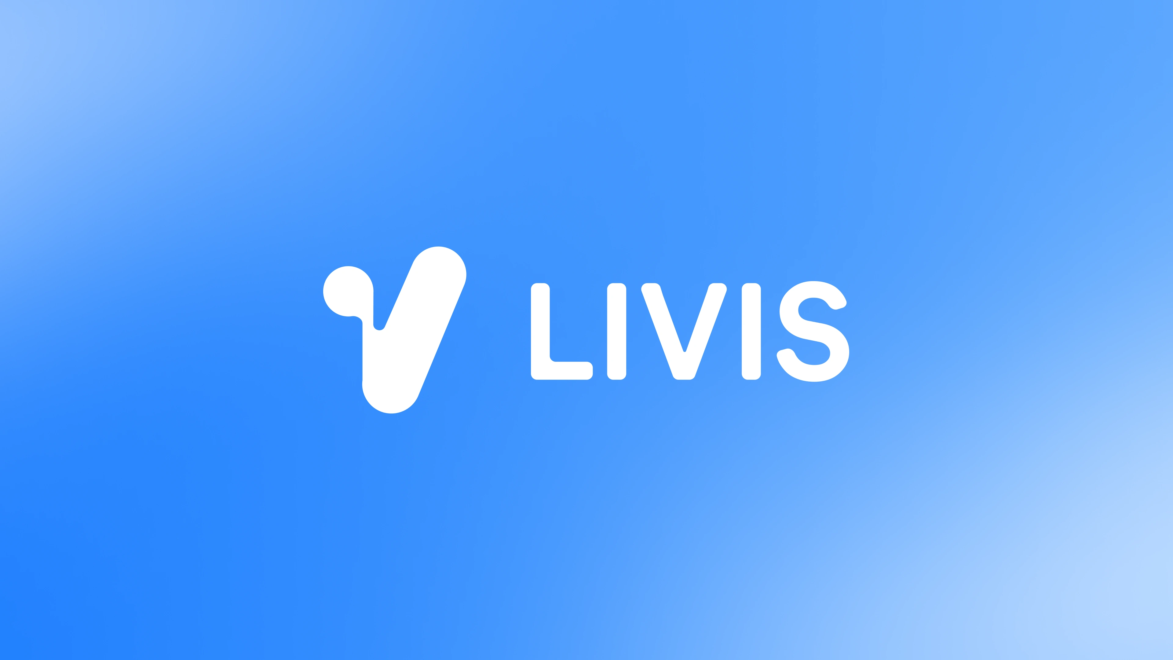
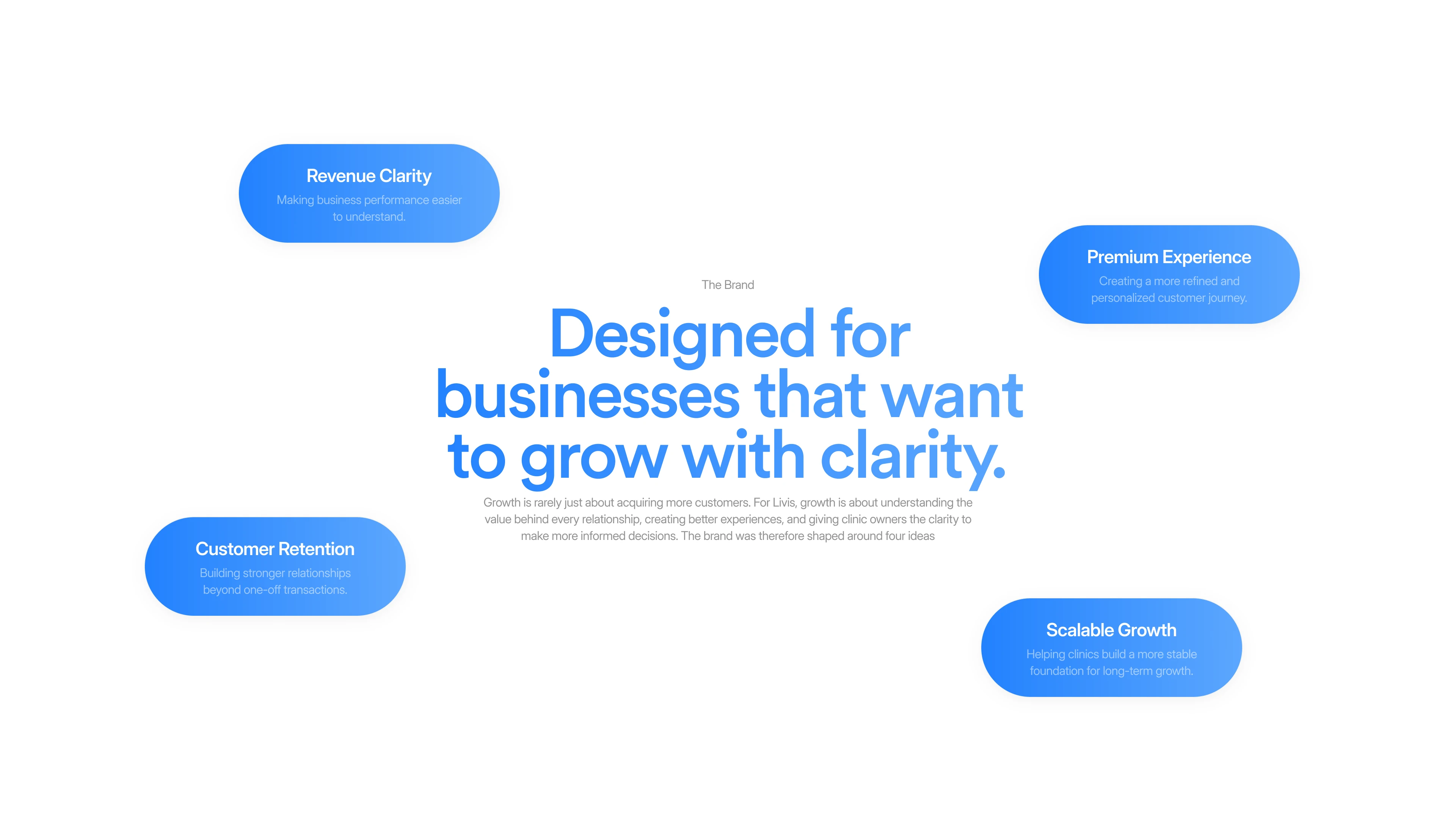
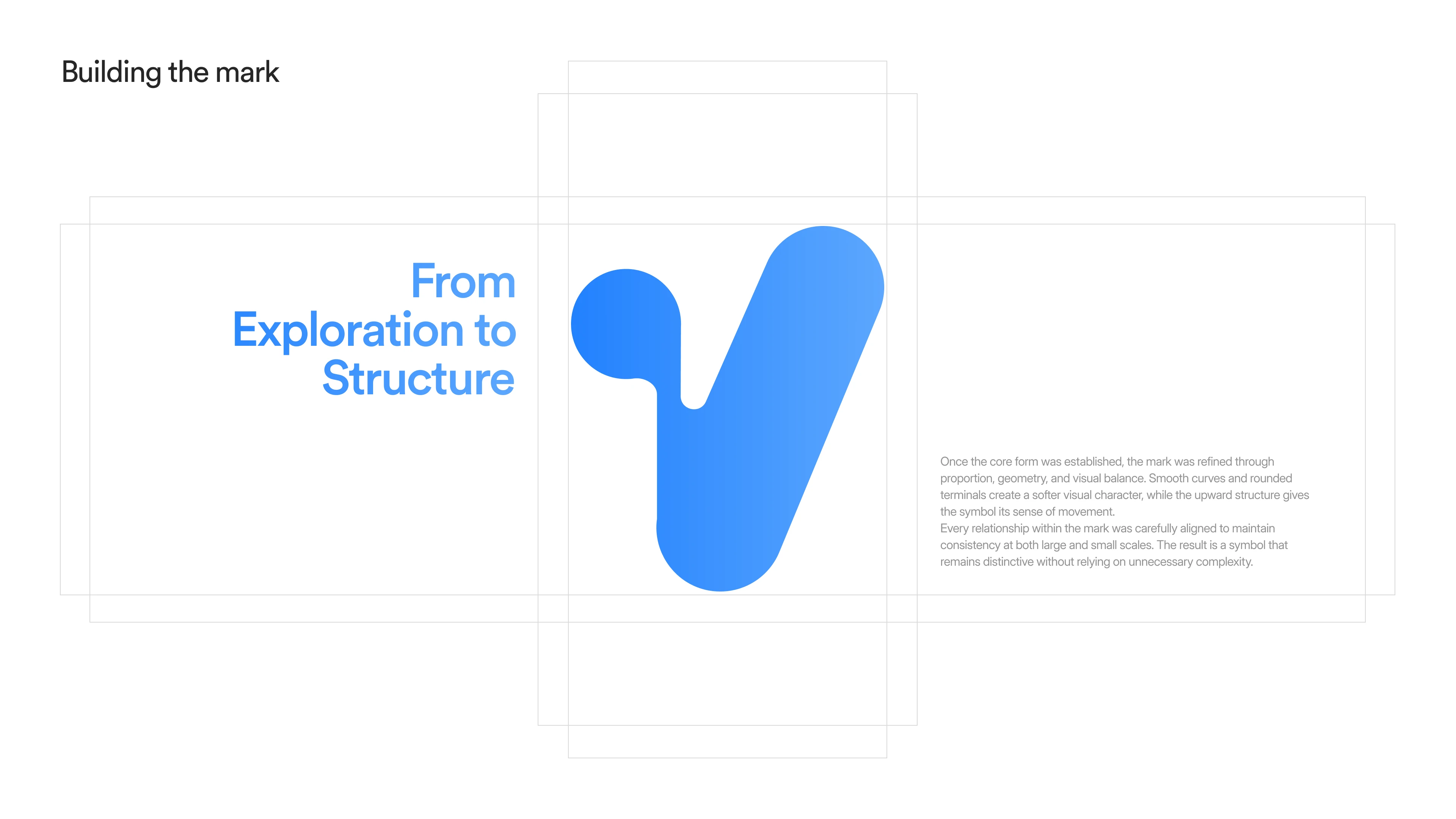
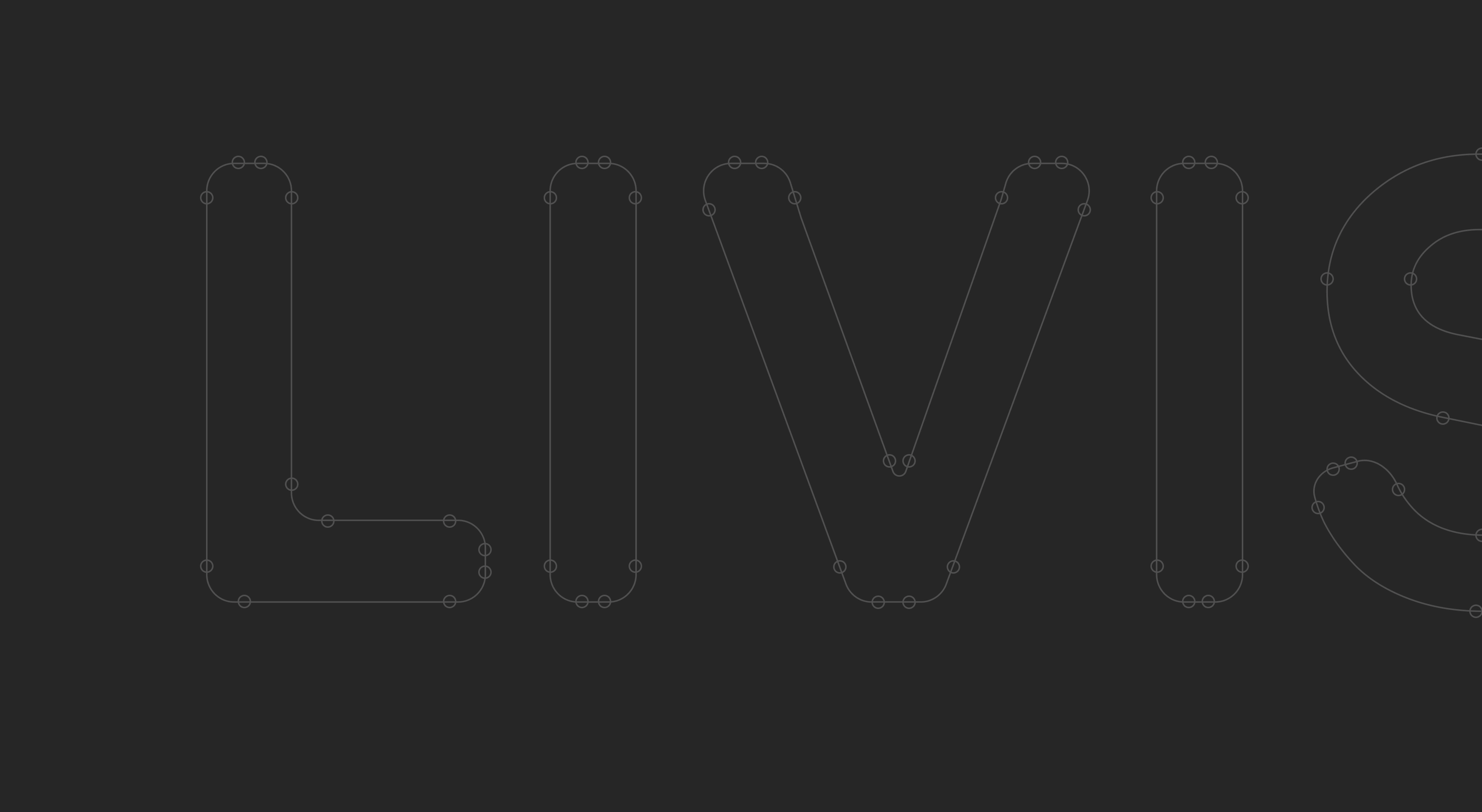
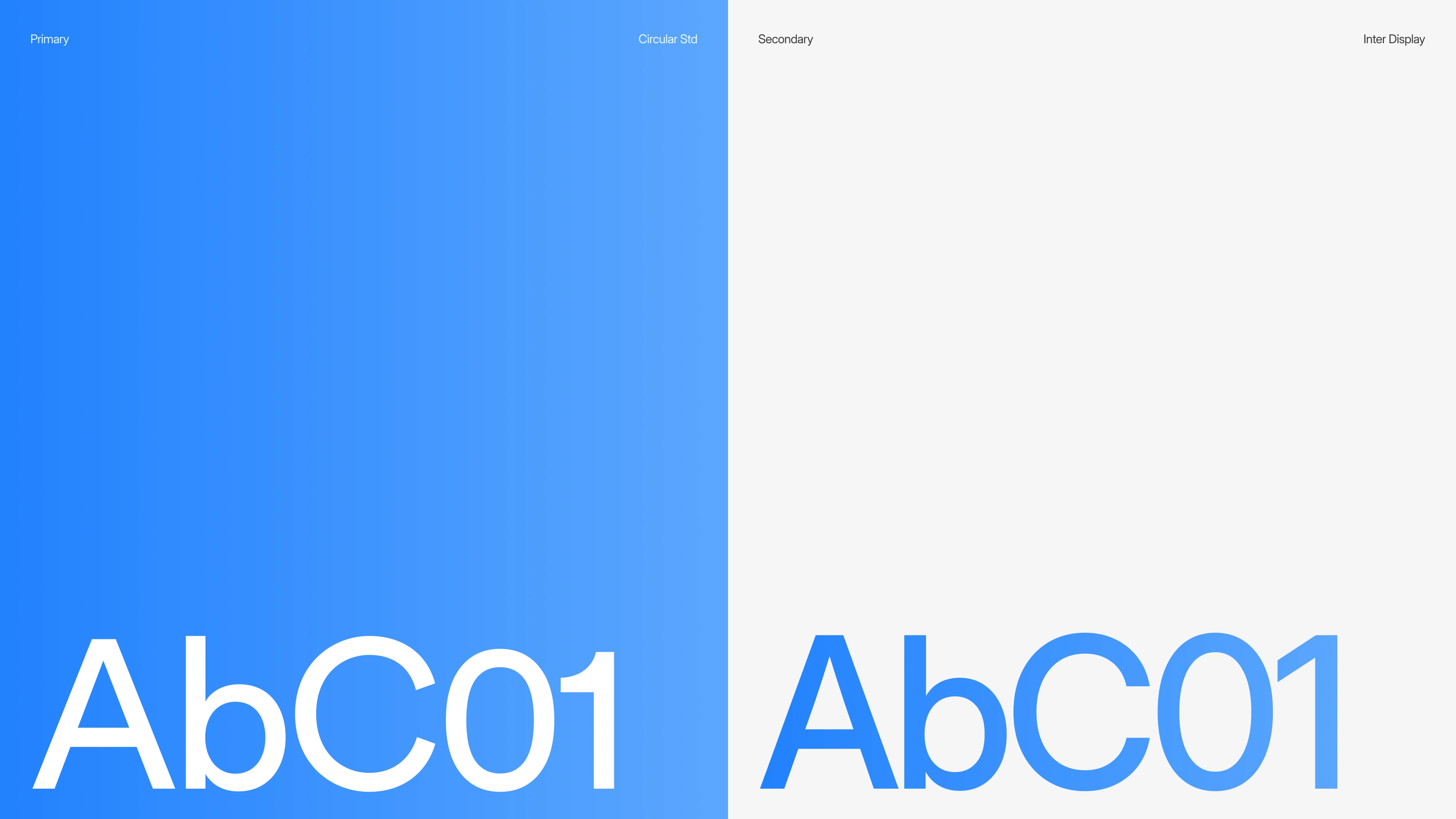
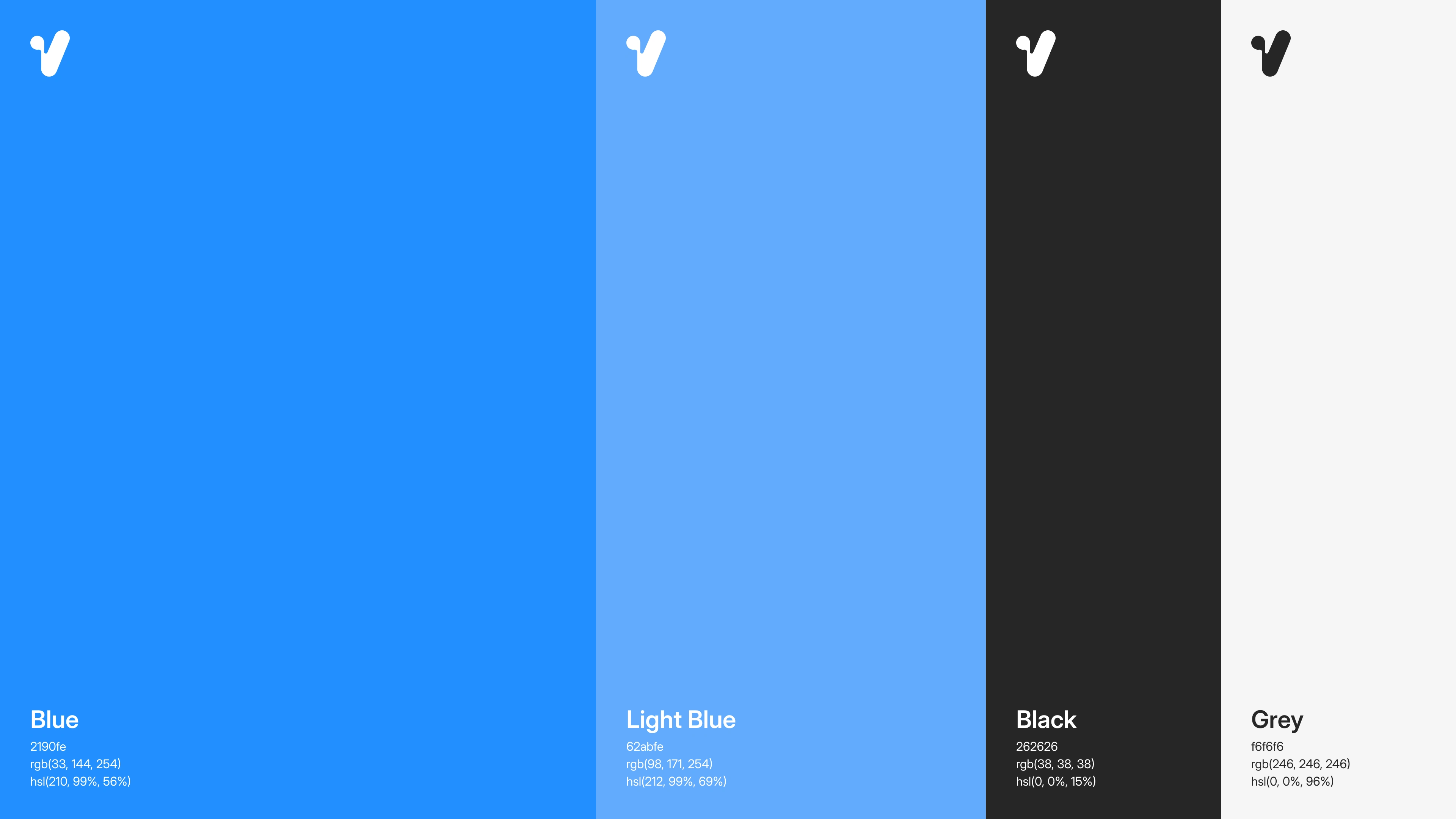
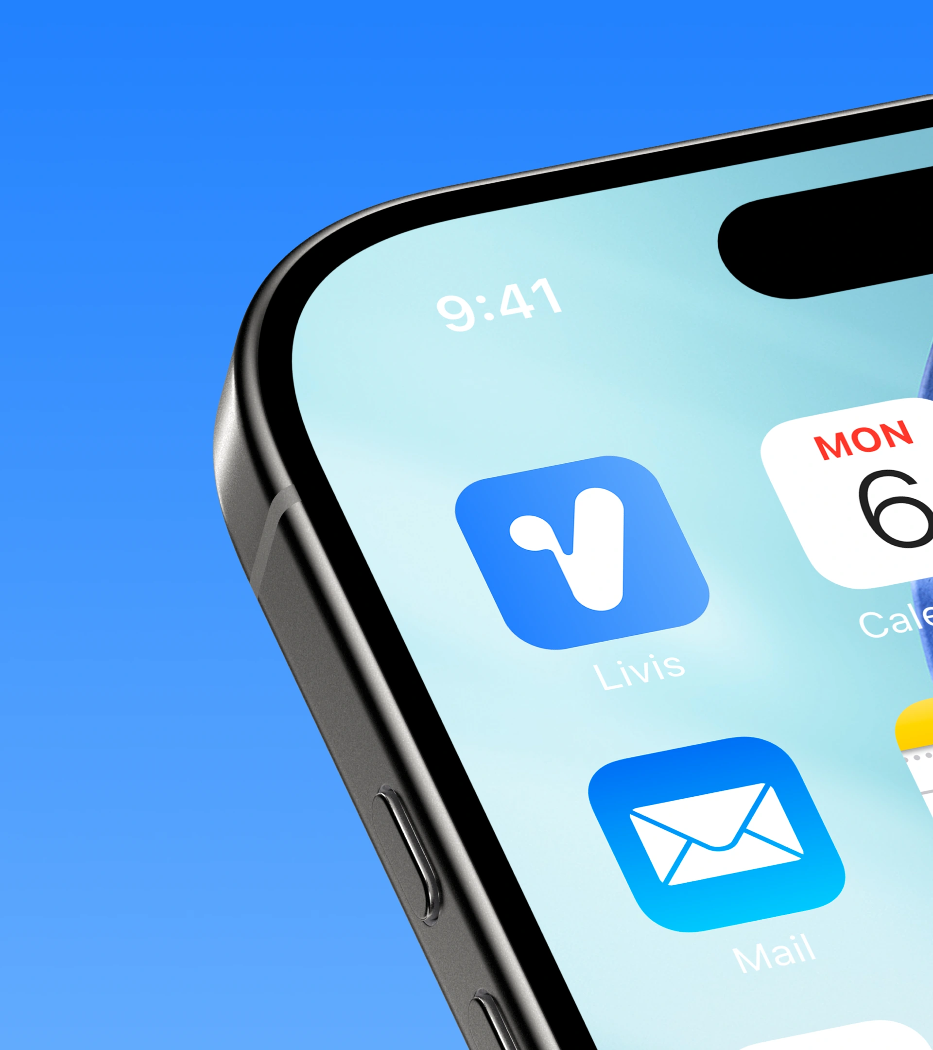
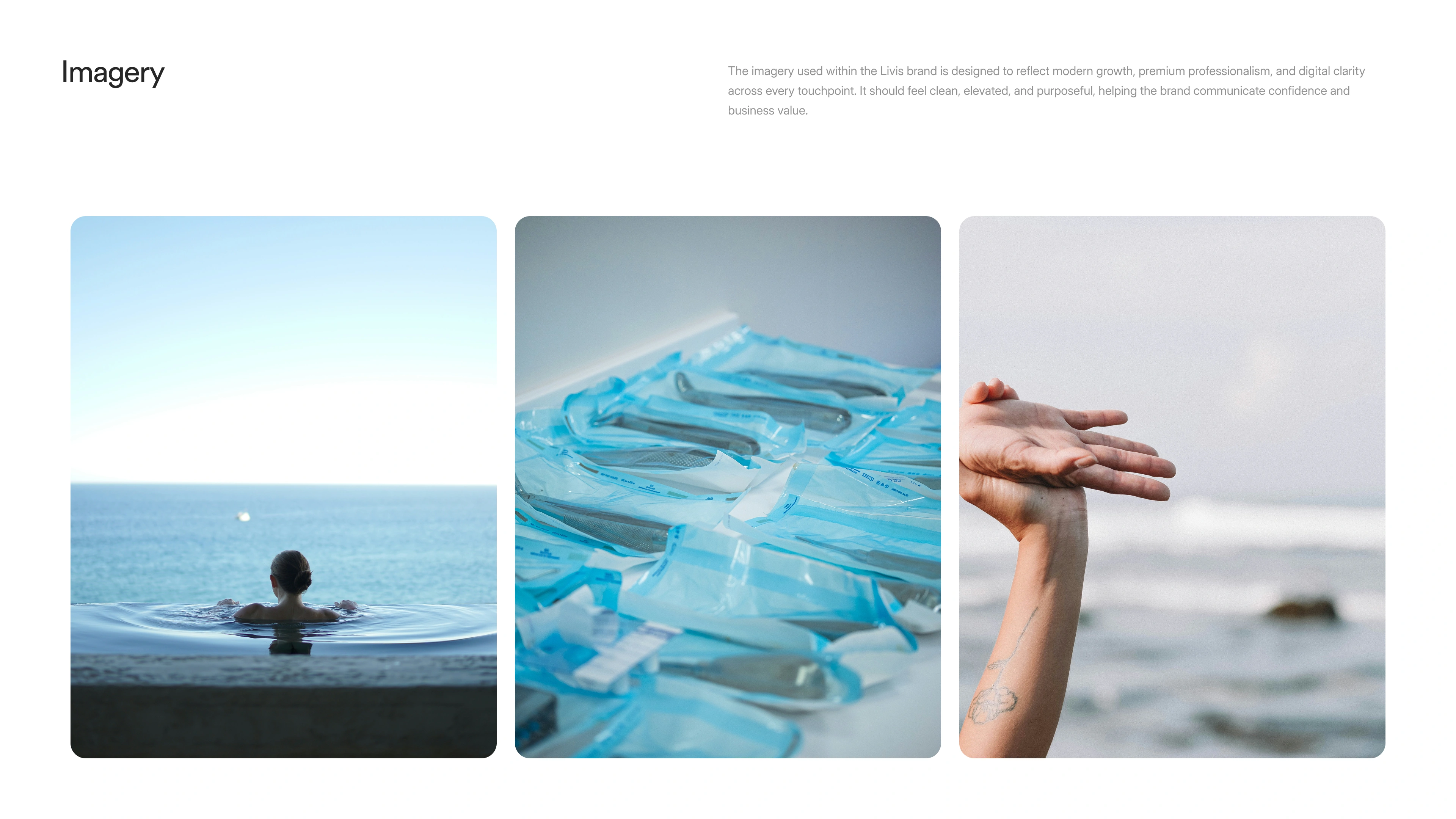
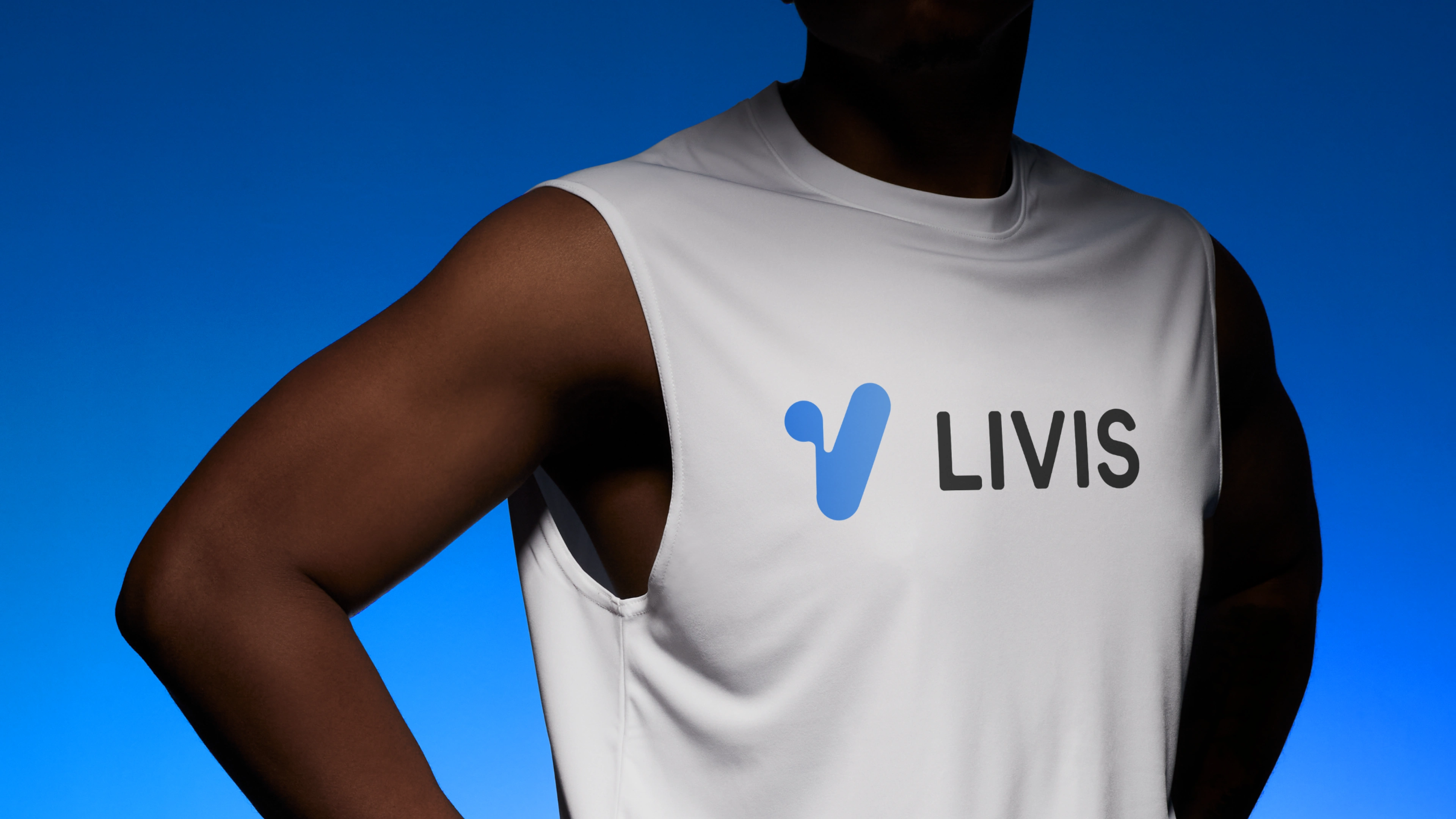
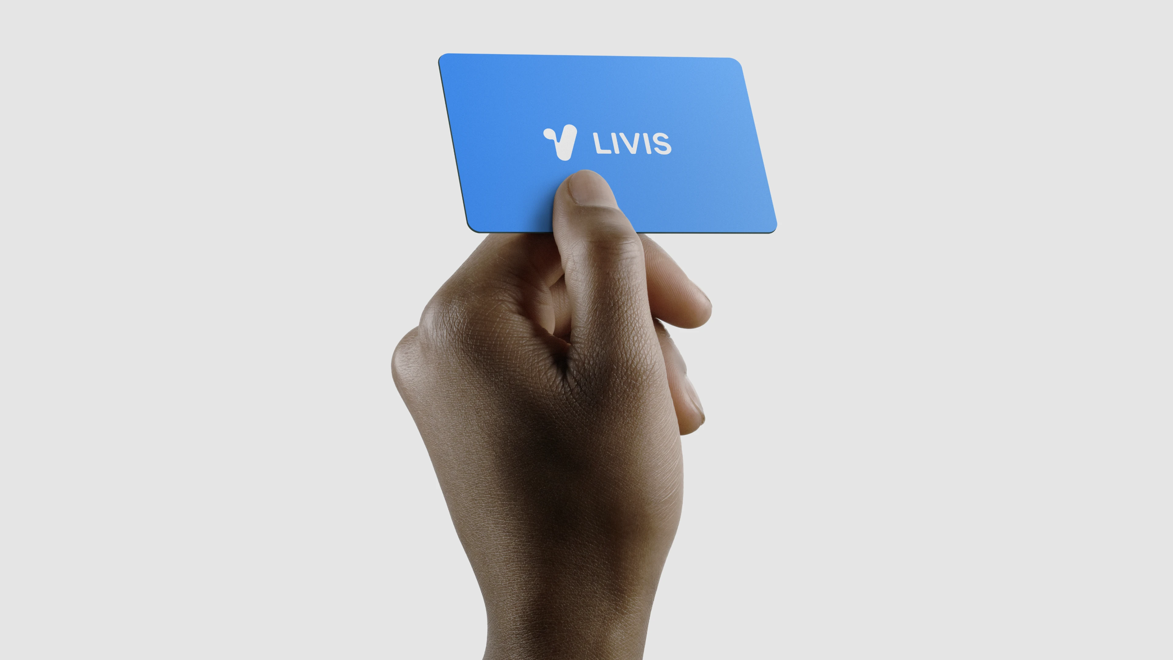
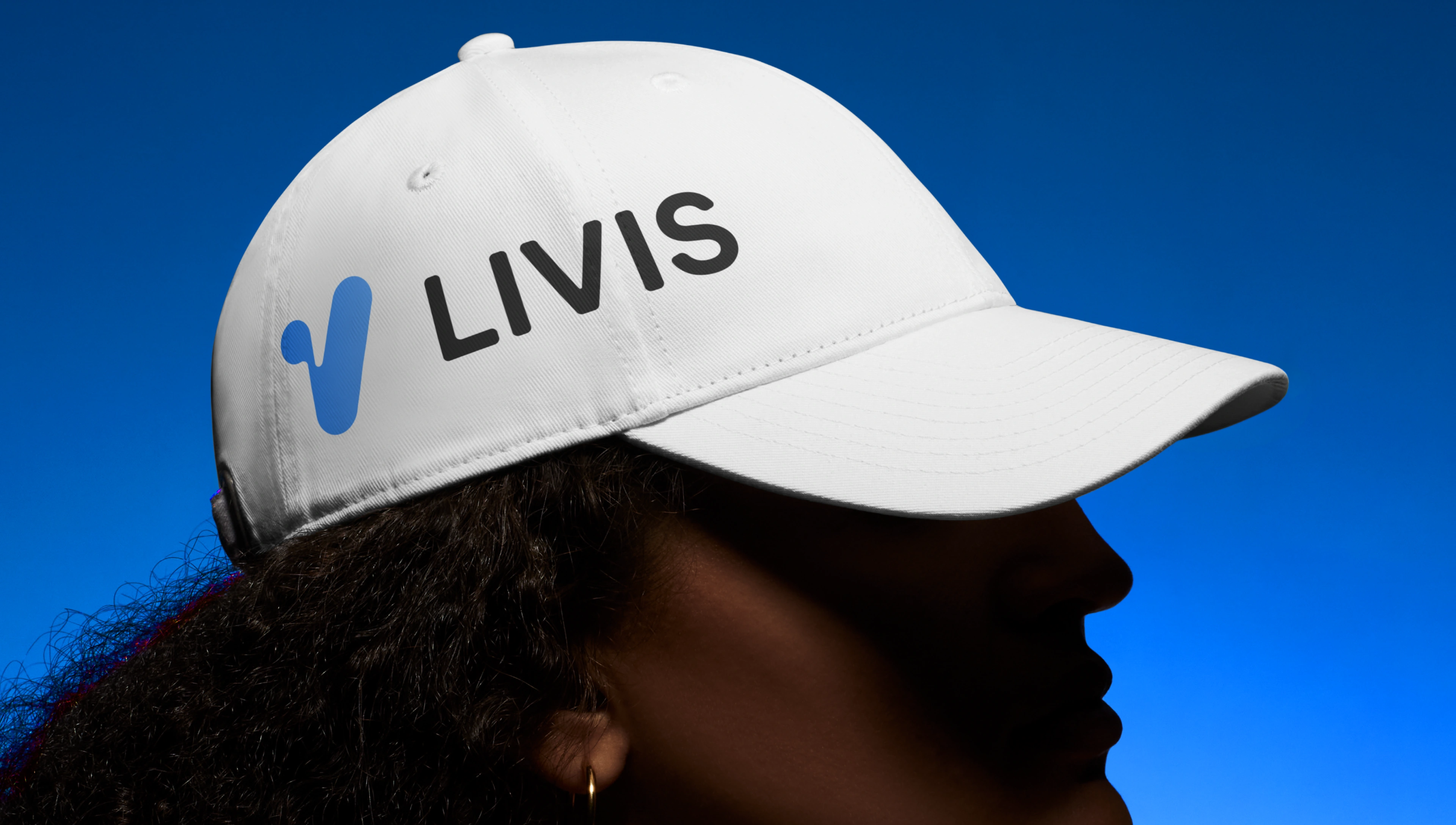
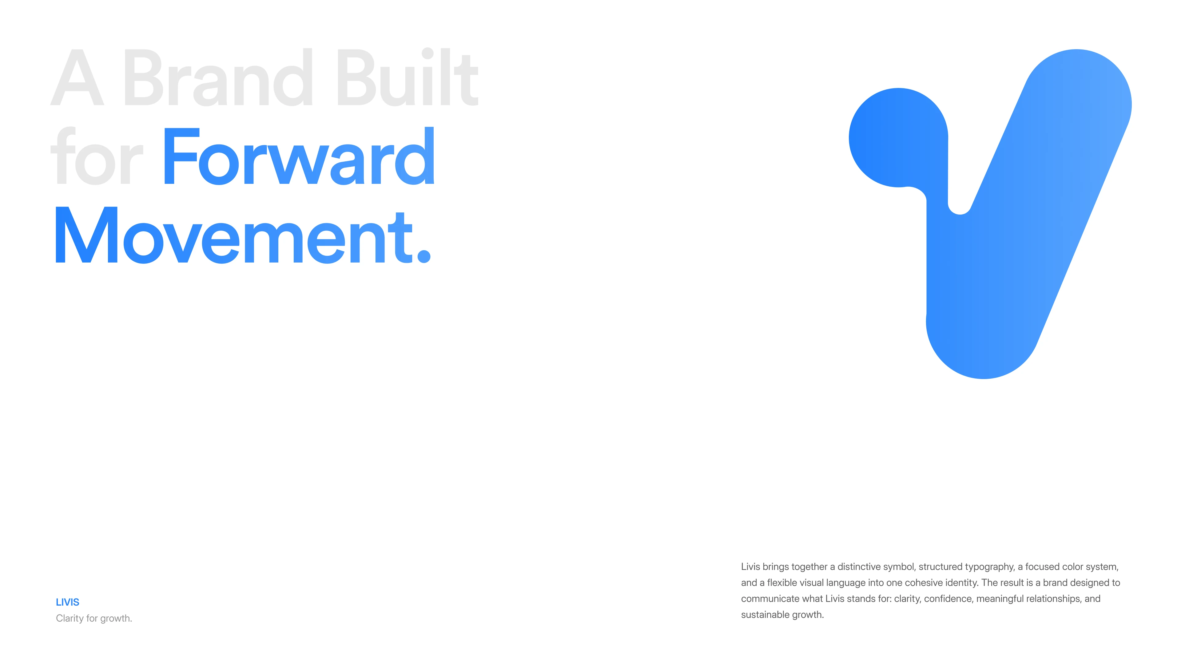
We explored more than 30 mark directions before landing on a symbol that pairs an upward stroke for momentum with a rounded circular element that softens it. The result is a simple, memorable mark that works on its own across digital touchpoints, paired with a rounded wordmark. Around it we built a flexible system with a blue-led palette, expressive typography, and four brand ideas: Revenue Clarity, Customer Retention, Premium Experience, and Scalable Growth.
Scope: Brand identity, logo design, visual system, typography, color palette
Platform: Brand Design
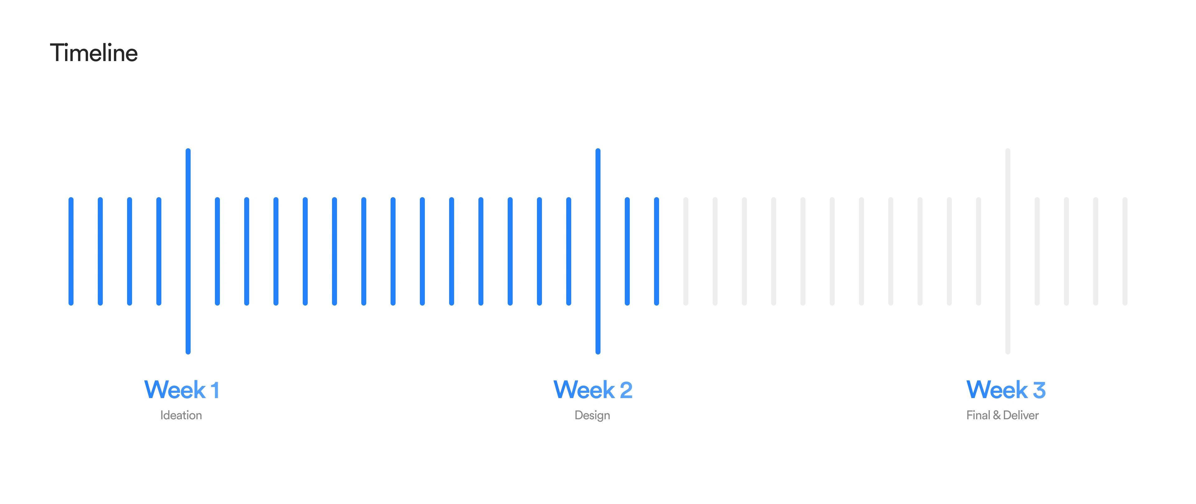
Timeline: 3 weeks
Team: Fackt (Brand Designer, Visual Designer)
Tools: Figma
Like this project
Posted Sep 20, 2026
Created a dynamic brand identity for a software platform aiding aesthetic clinics.