Oremix - Logo | Identity

Nil Brands



Posted Sep 23, 2026
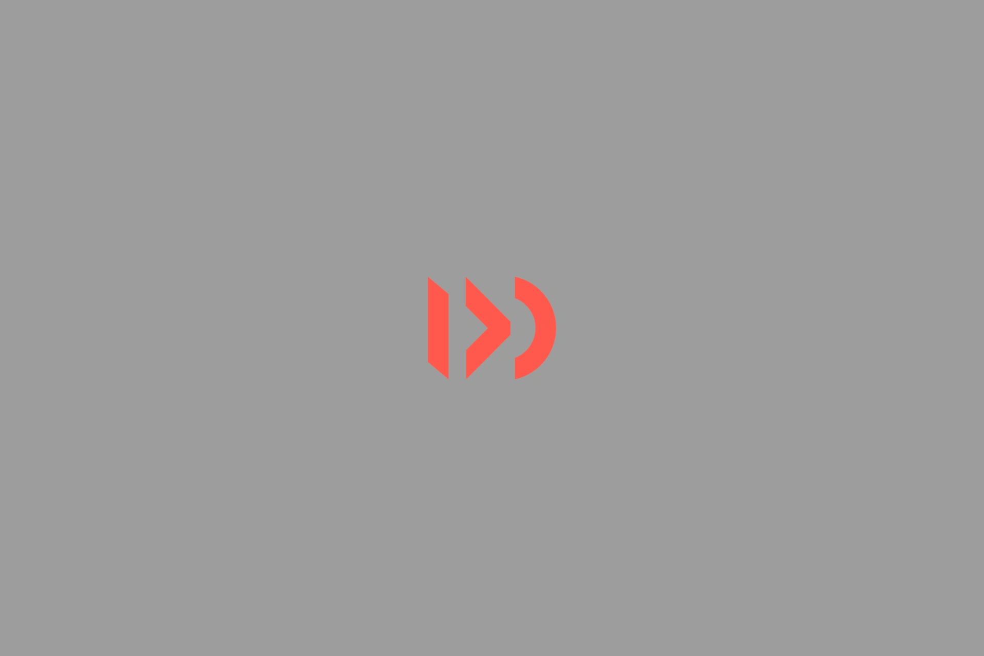
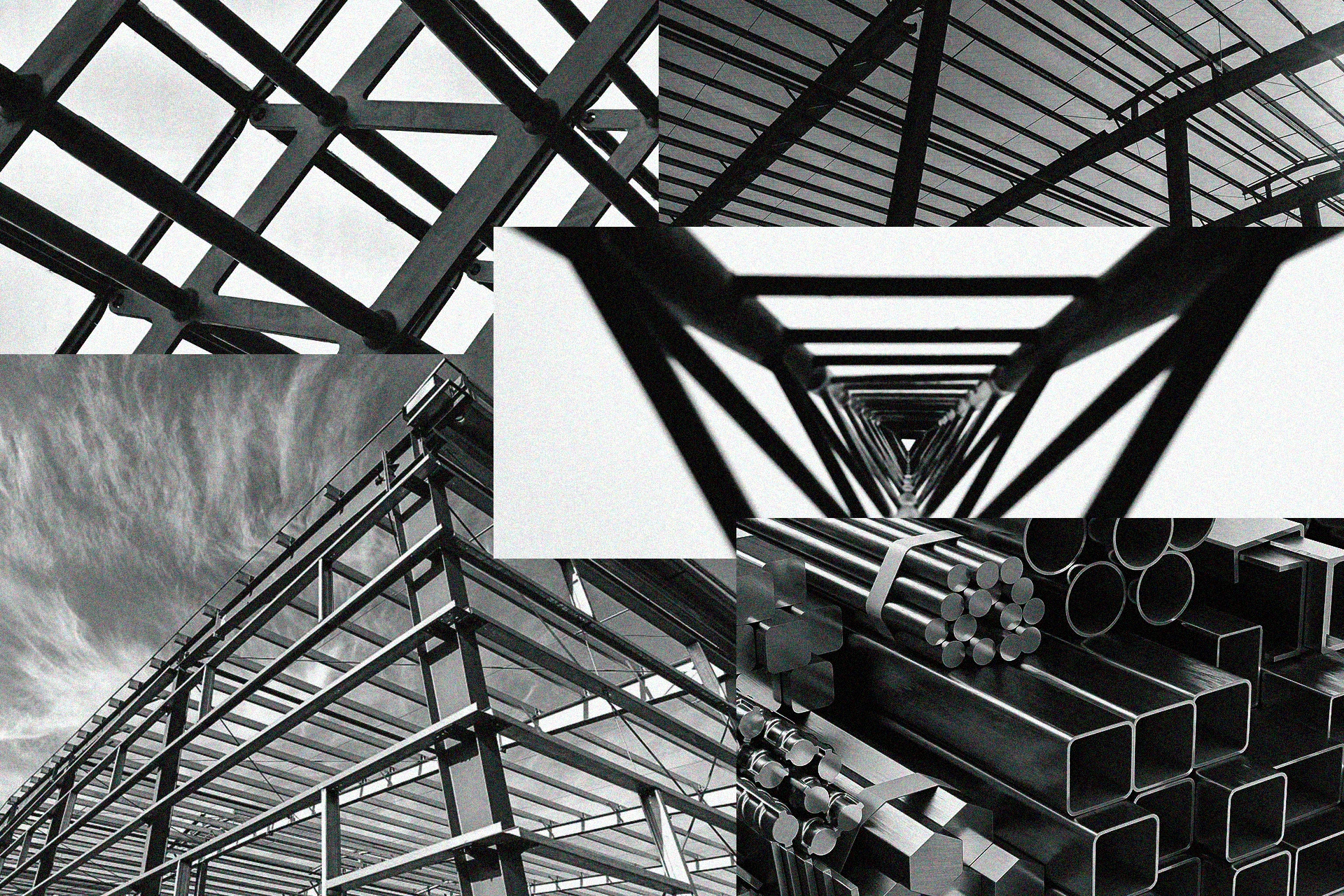
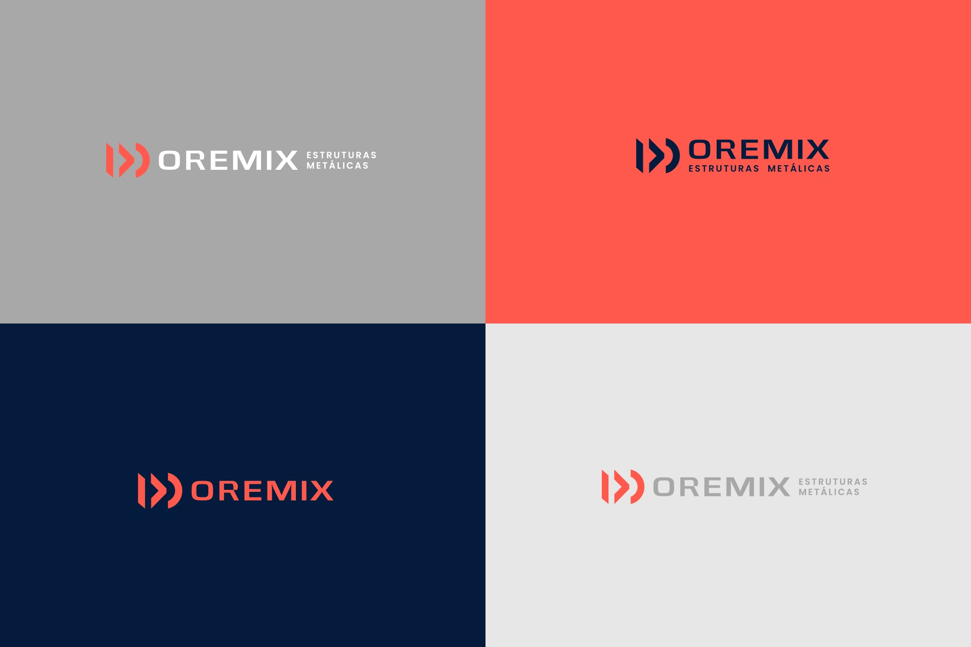
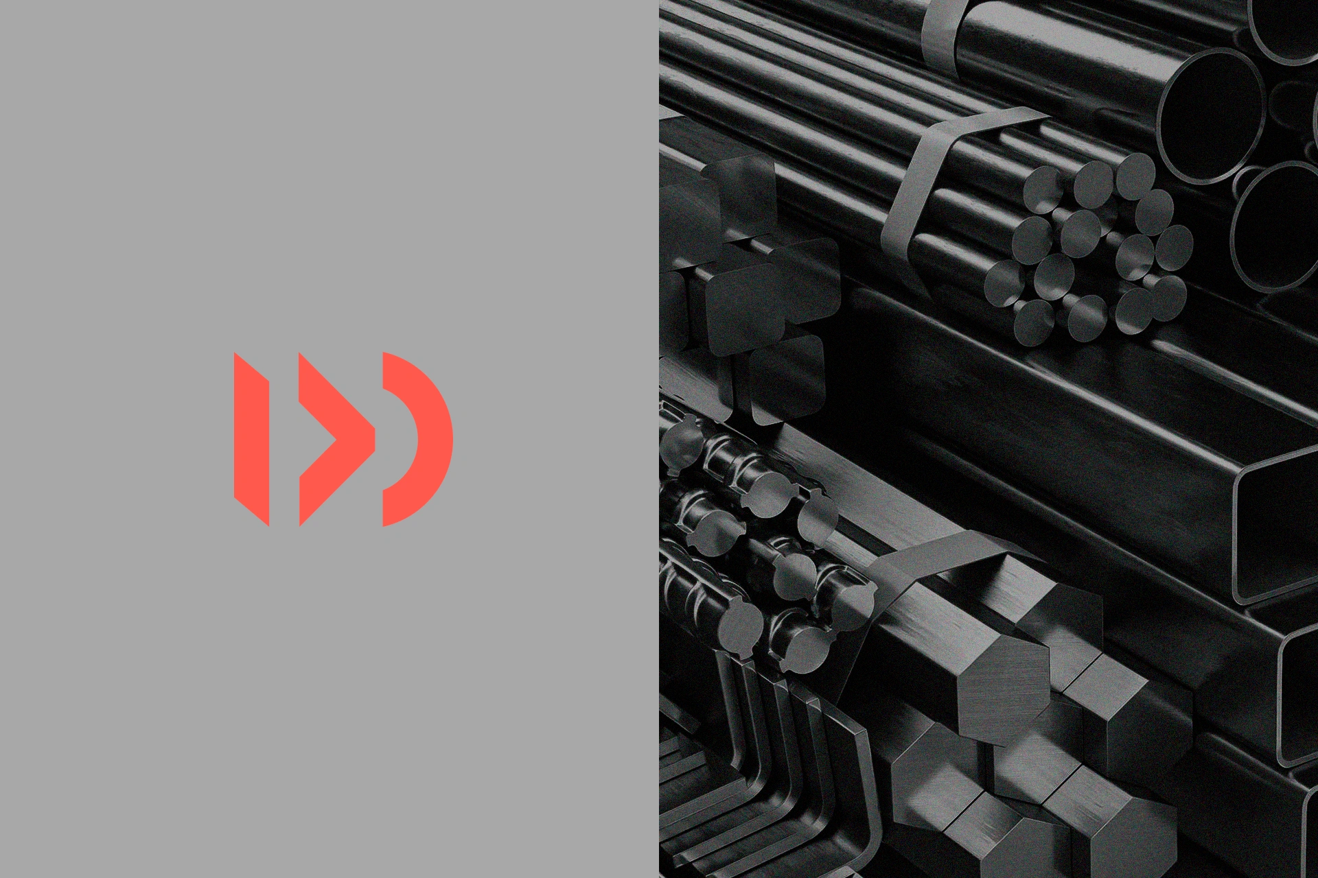
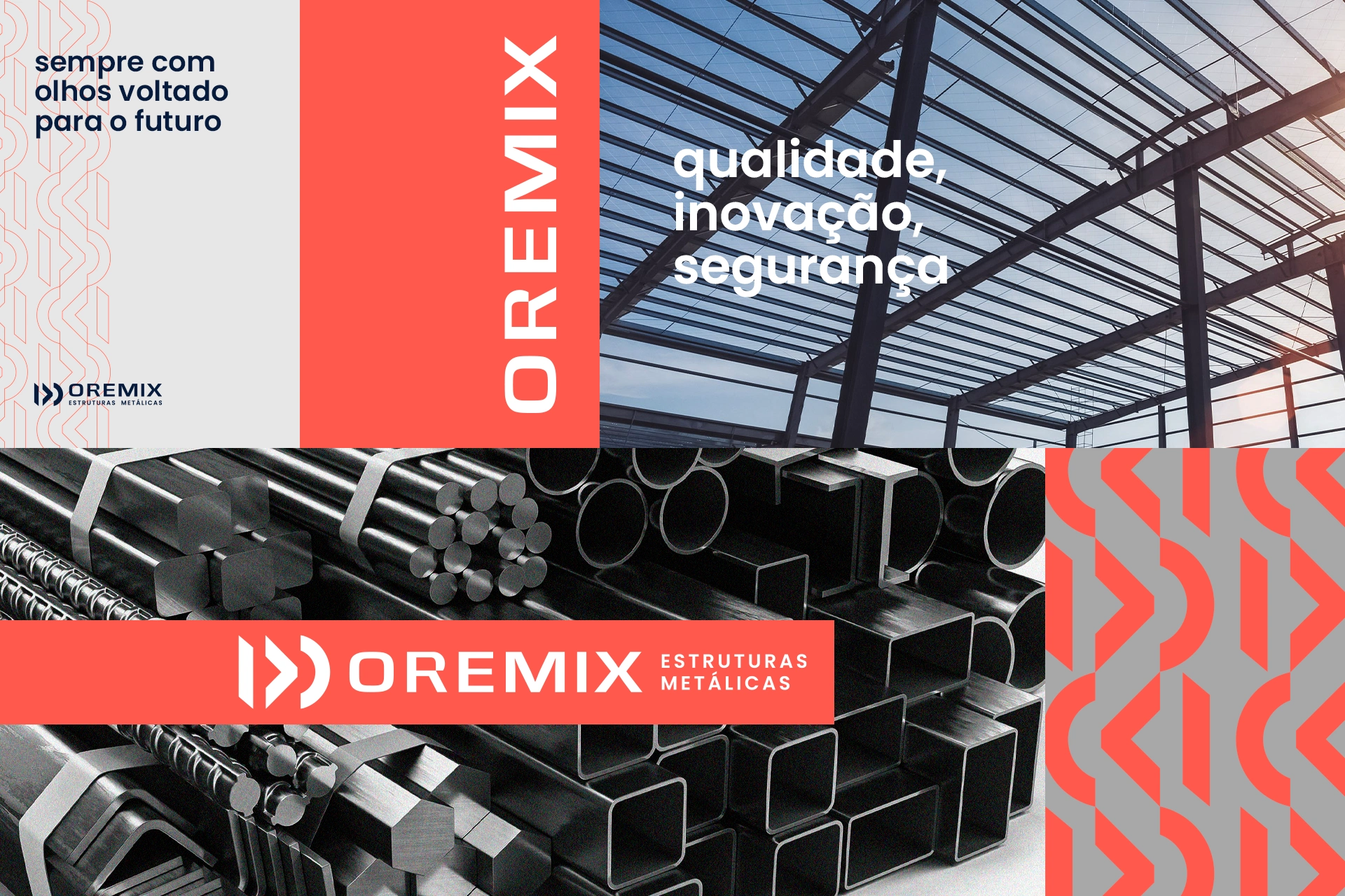
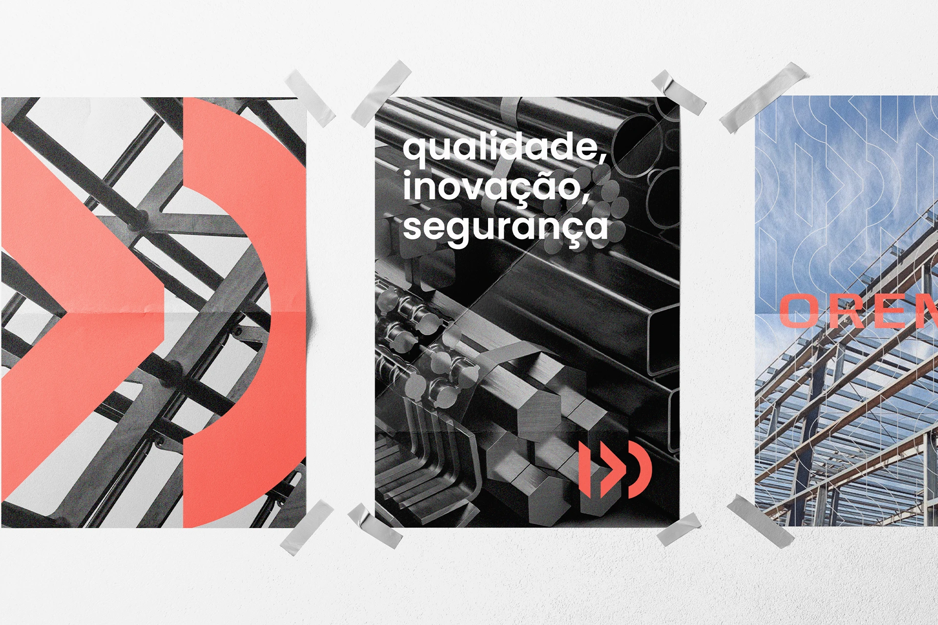
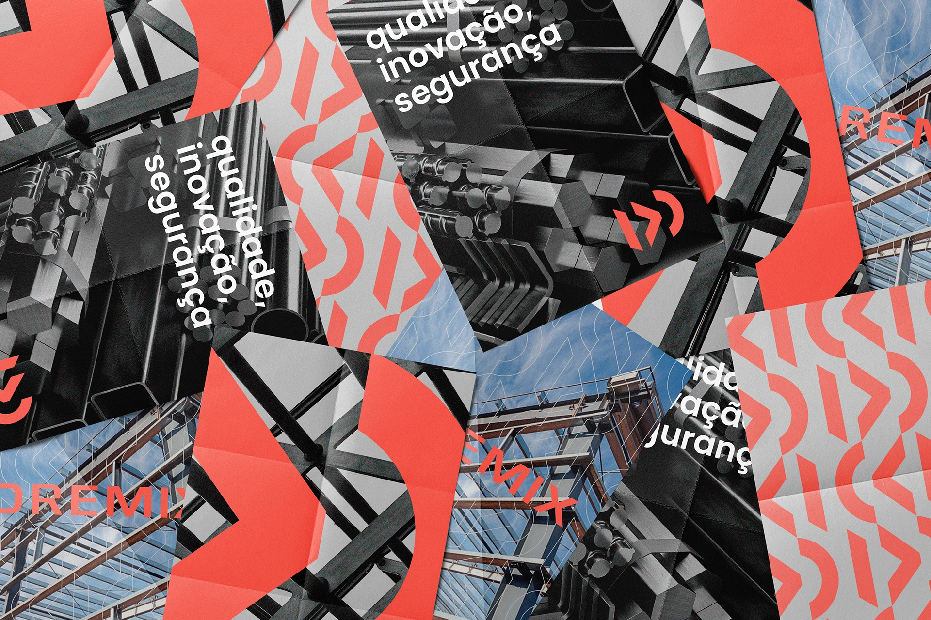
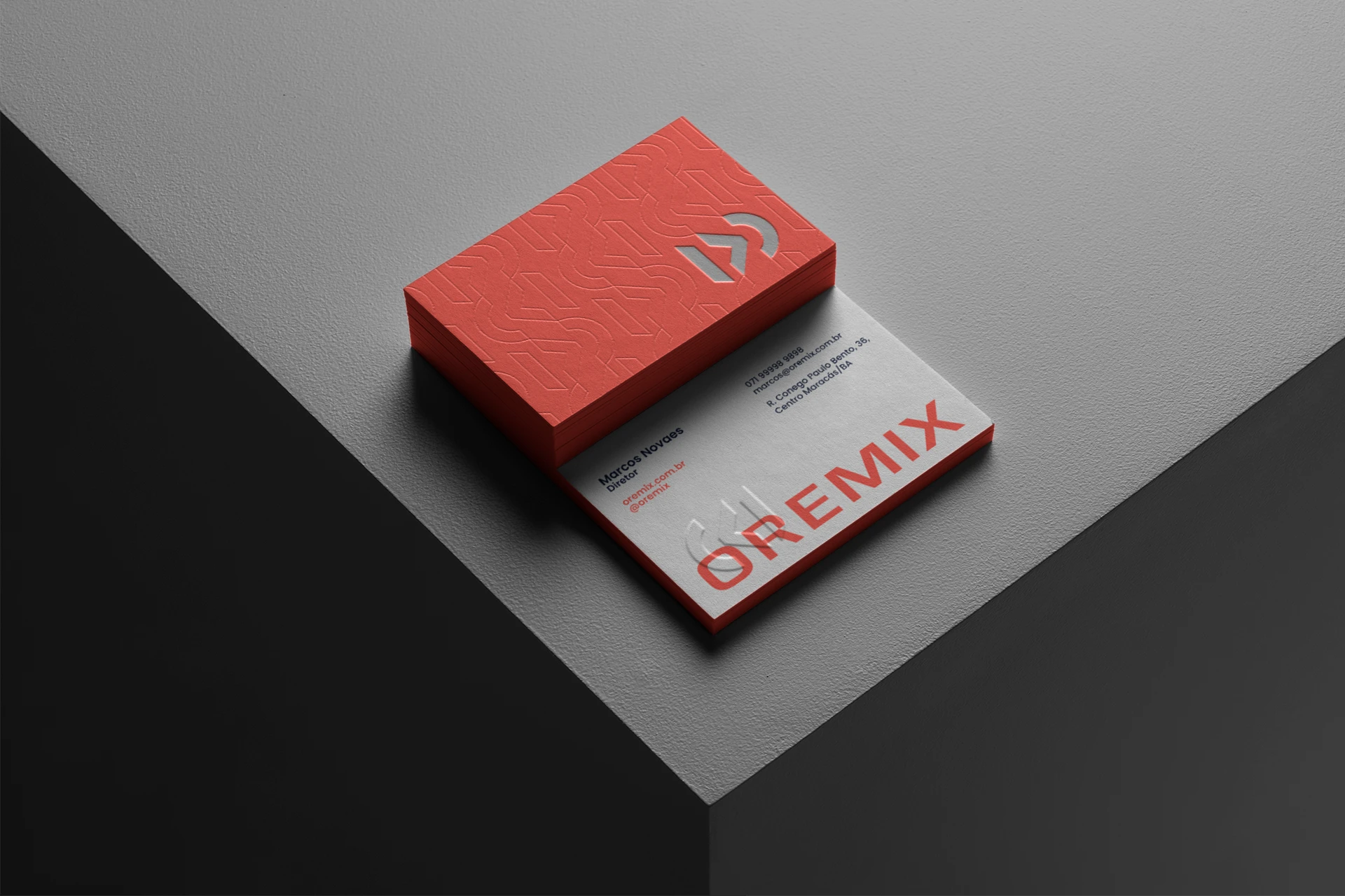
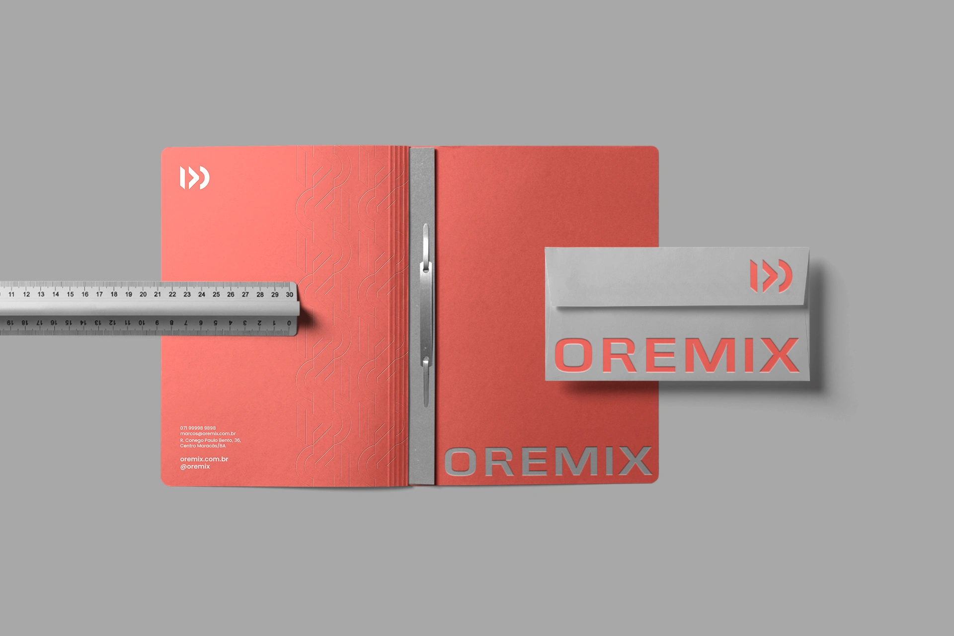
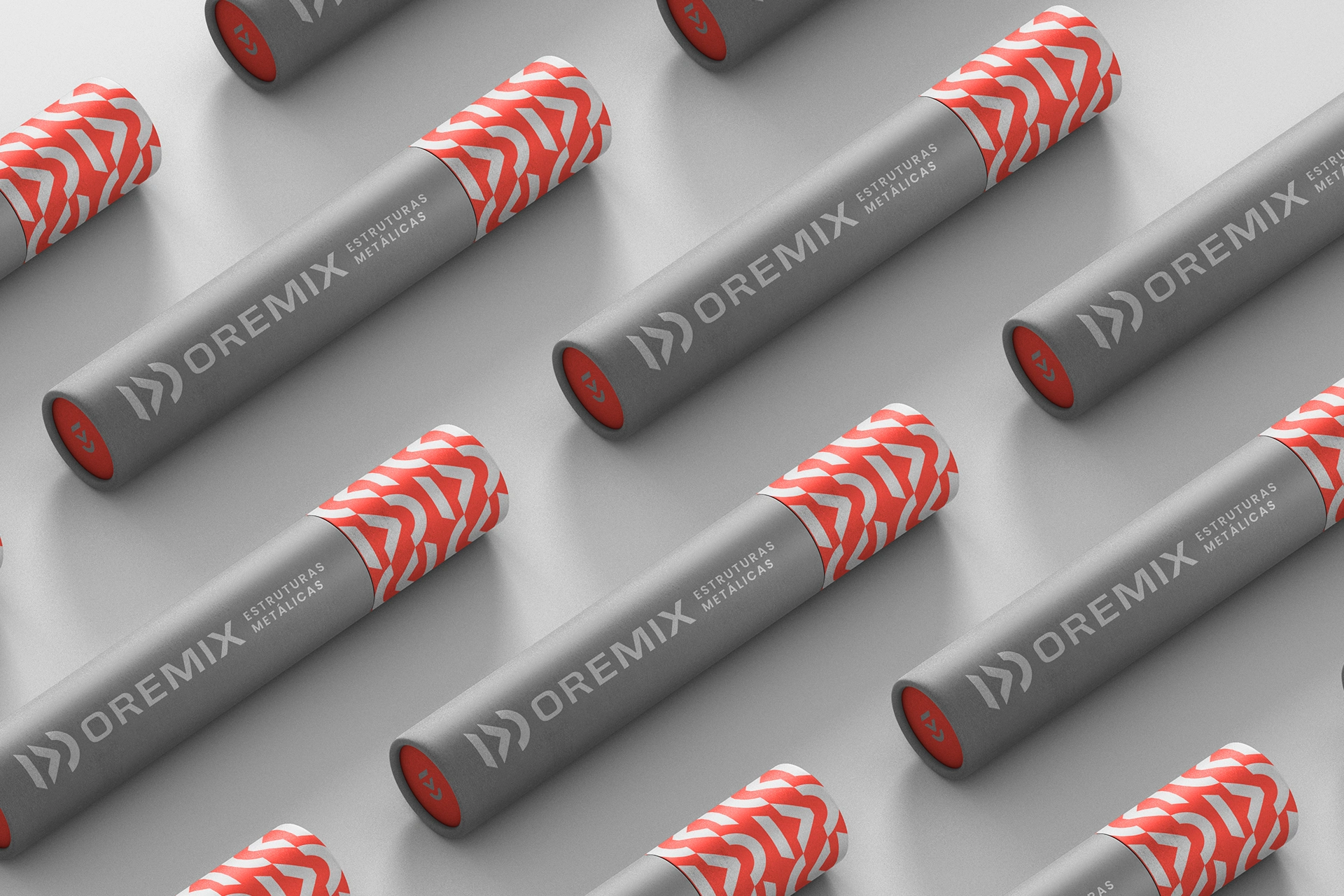
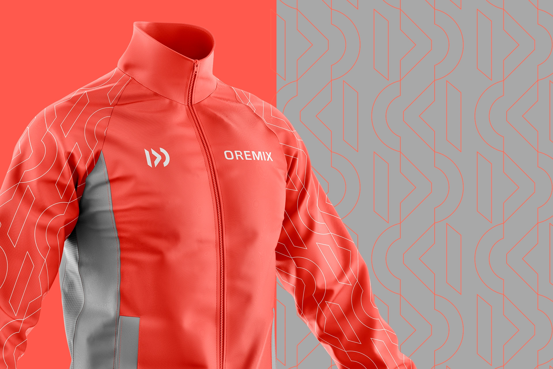
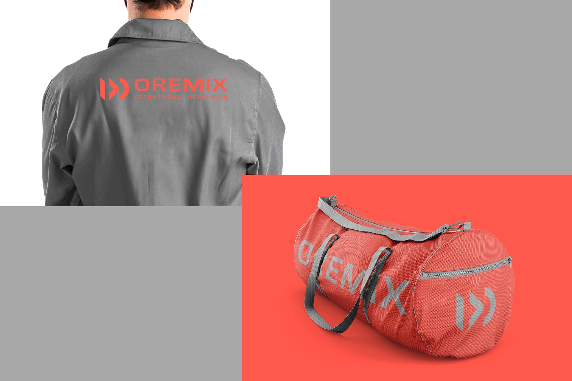
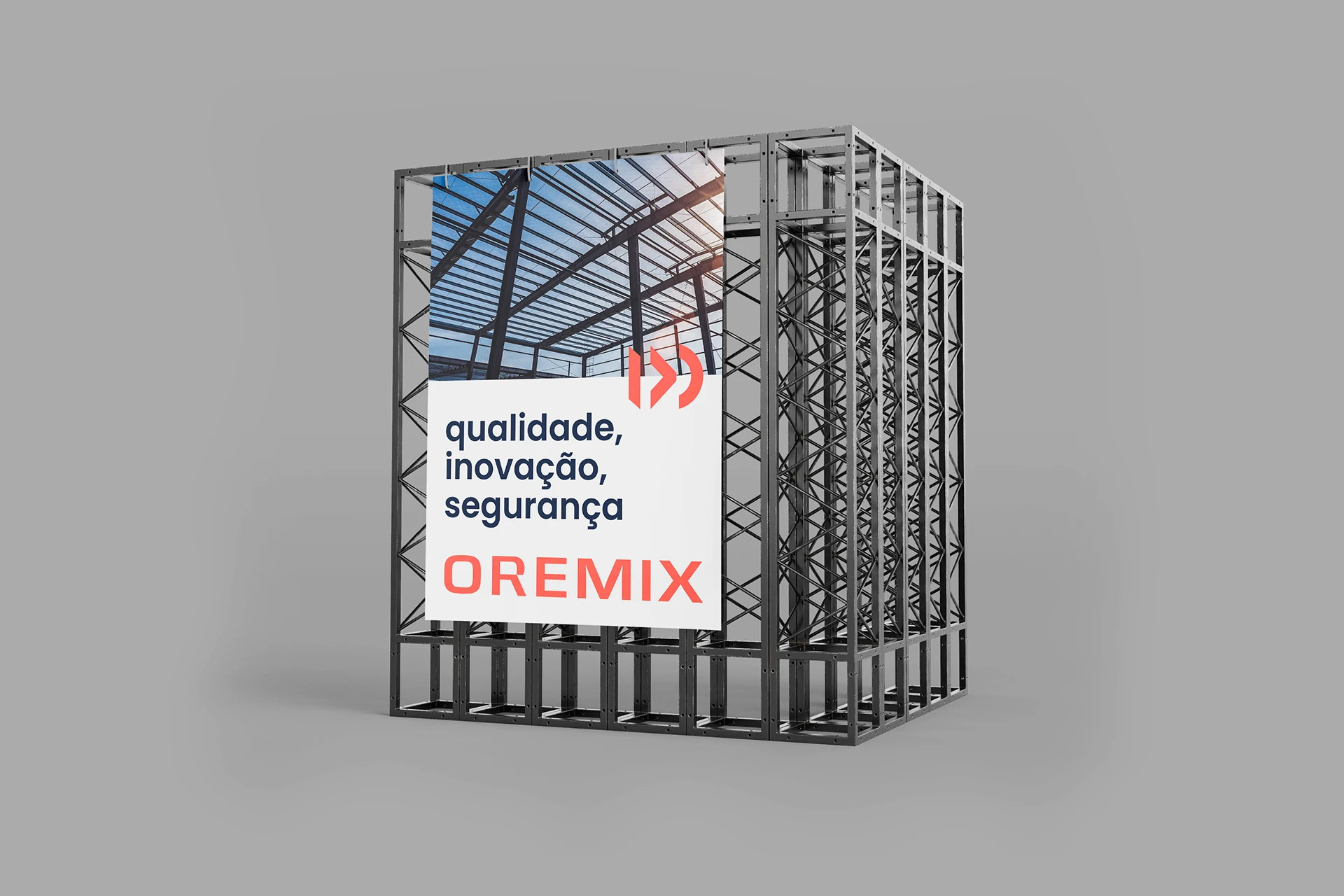
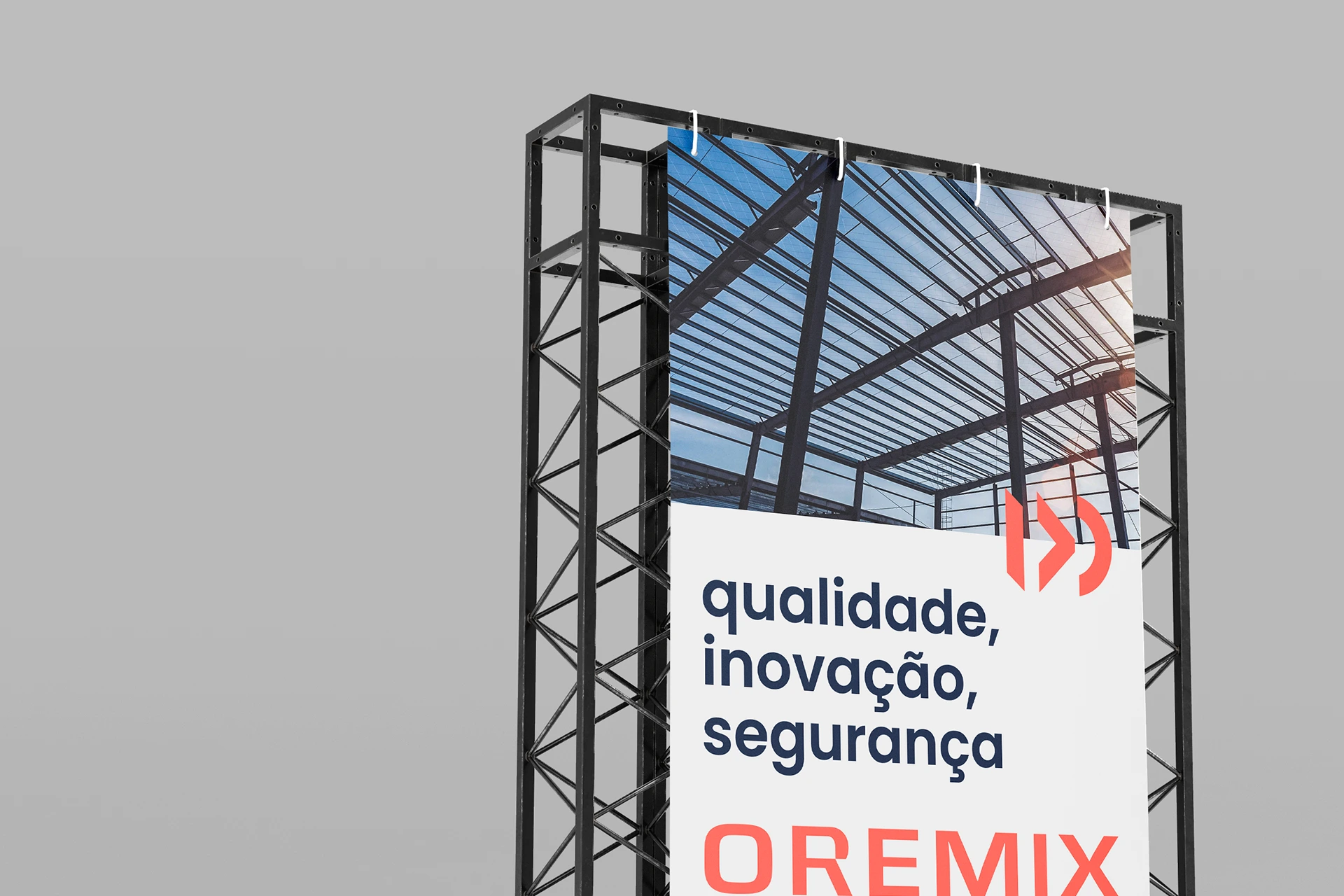
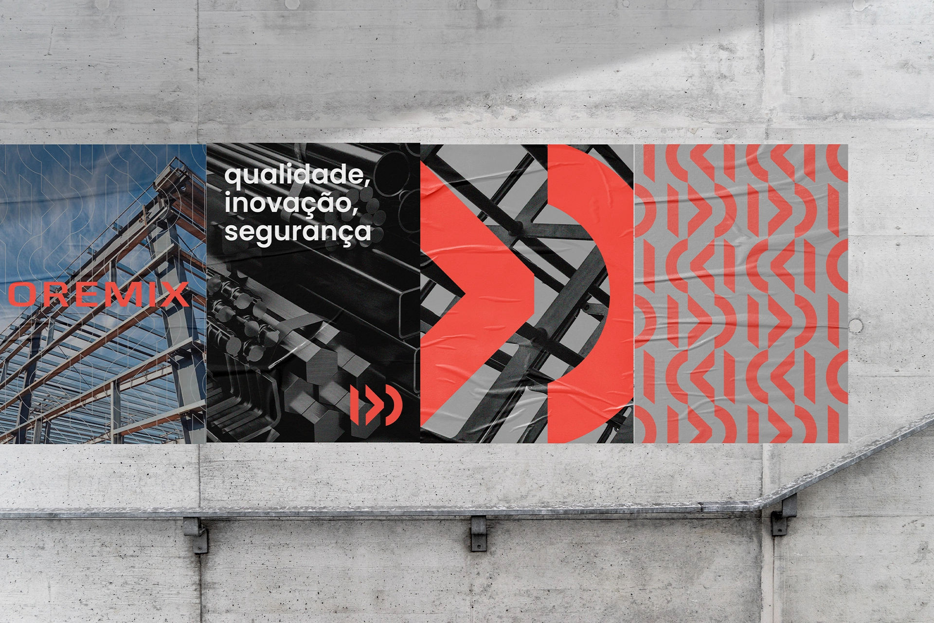
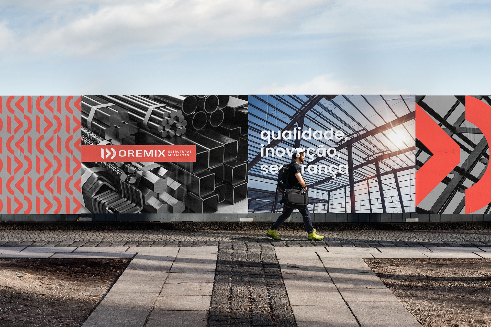
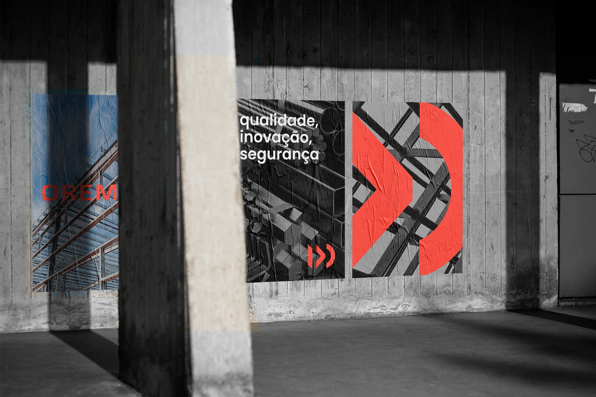
Visual identity developed for Oremix, a company that operates in the area of metal structures, providing a range of solutions to its customers and to several different sectors. For the conceptualization of the brand, it was thinking about the materials used by the company and their formats, iron bars, angles, plates, tubes ... and so on, these different formats are represented by the shapes of the brand. In addition, the company's strengths are metal roofs, and these also have different shapes, round, triagular and straight, again, represented by the shapes of the brand. Oremix is a company that thinks ahead, is always looking for new solutions and better results for its customers, and the brand conveys this idea, something that is in motion, growing, advancing.