PocketWise: Redesigning Family Finance Management
Onanefe Ede-Usoh
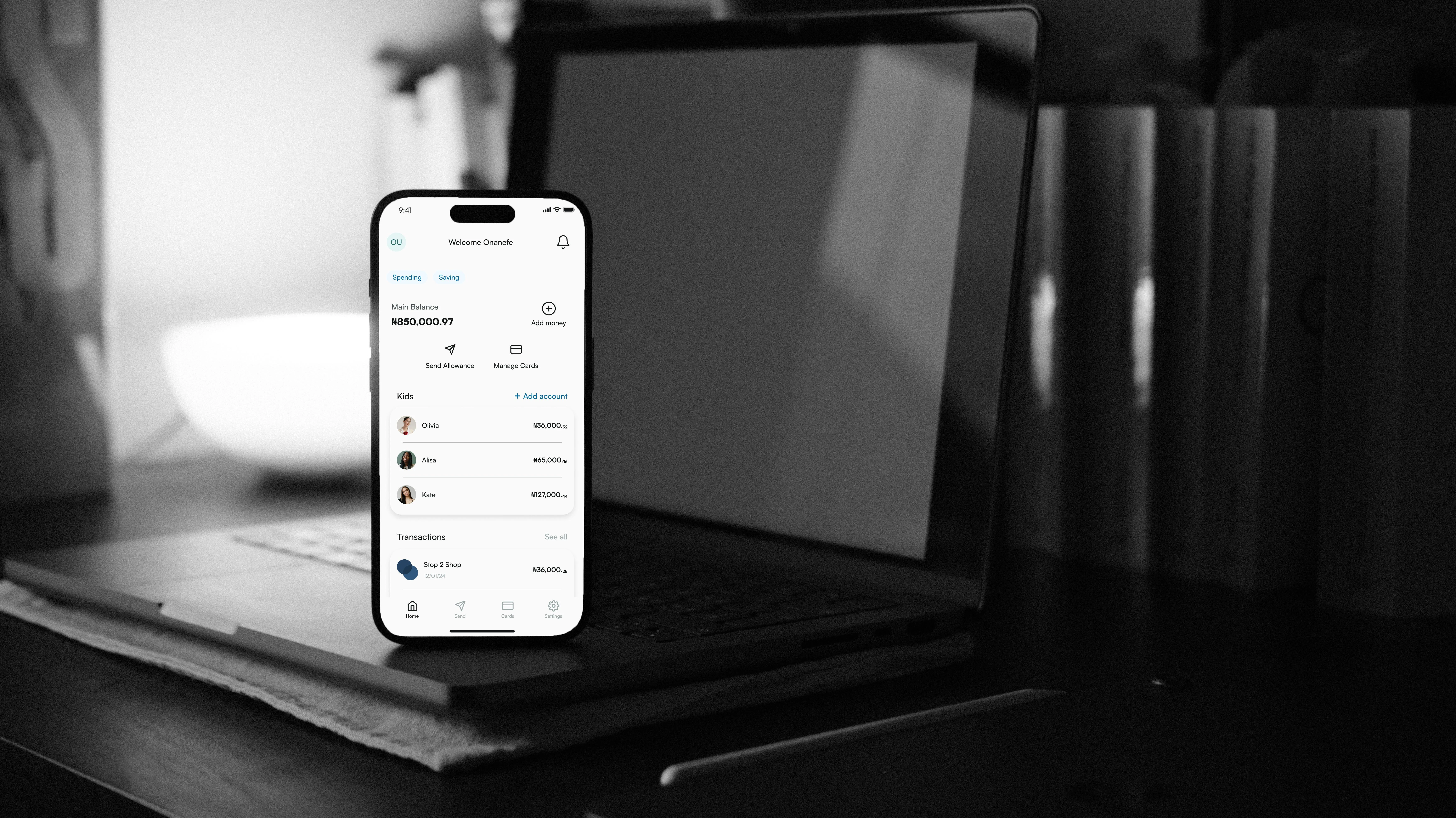
mockup of home screen design
The idea for this app came from a light-hearted conversation with my mom. She asked, "Efe, why not create an app that easily lets us send money to you and track all your biscuit eating in school?" That sparked the challenge to build a solution that simplified how parents manage pocket money for their children, while also promoting financial literacy.
Problem statement
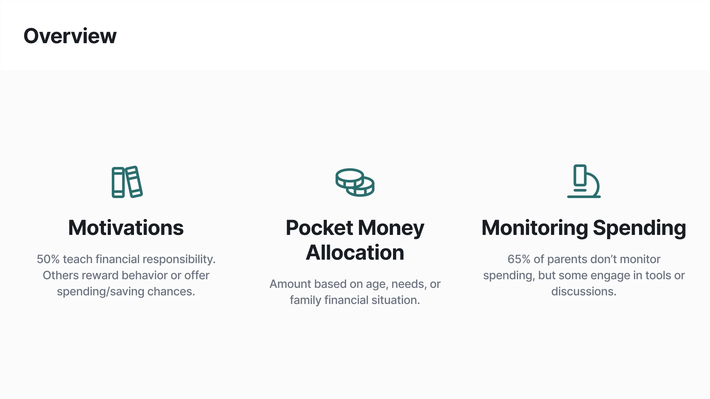
Parents often need help to balance giving their children financial independence and ensuring responsible spending. After surveying a group of parents, I identified key patterns:
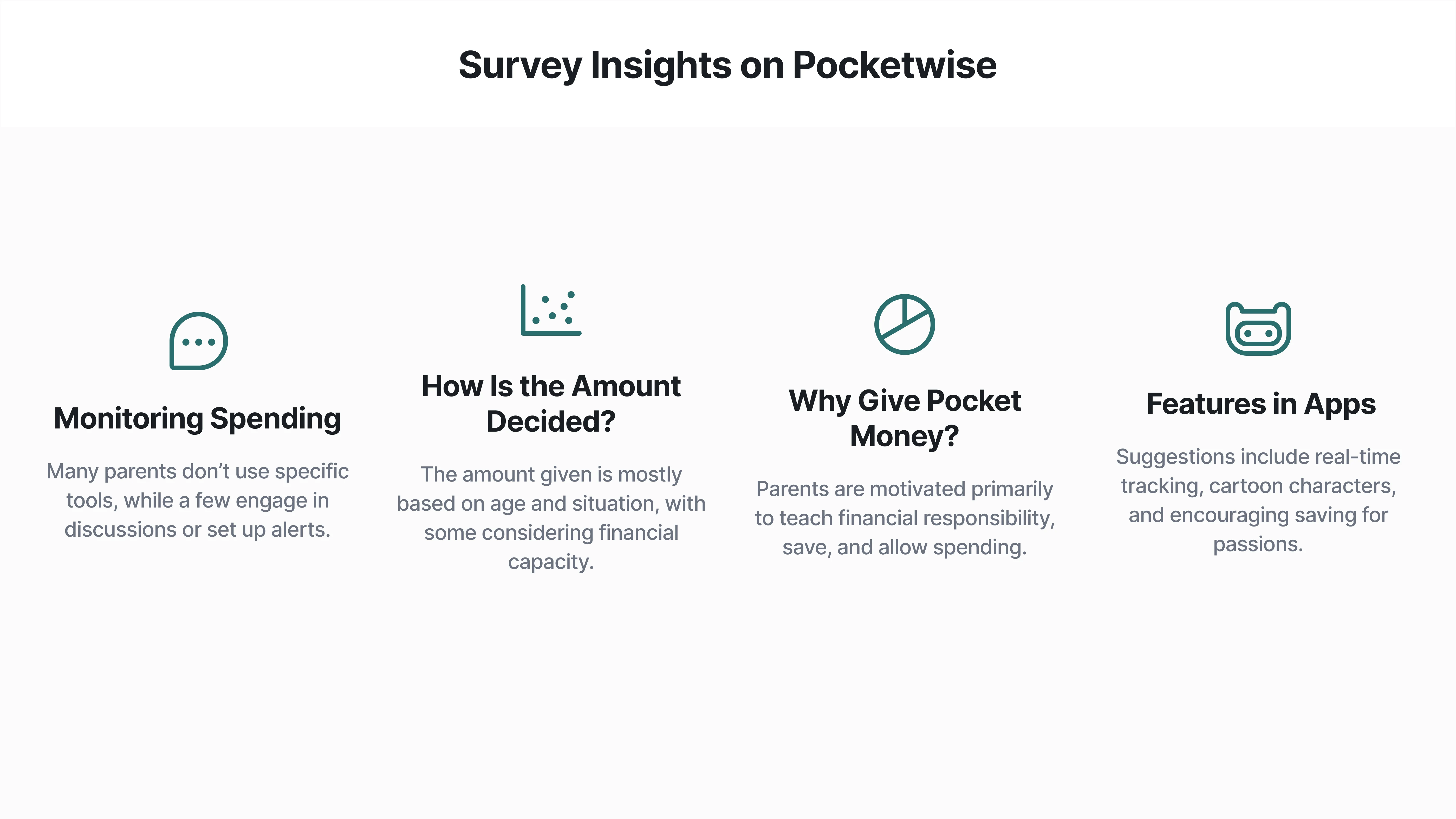
Motivation: Half of the parents surveyed give pocket money to teach financial responsibility, while others see it as a way to reward good behavior or provide spending and saving opportunities.
Pocket money allocation: Most parents base the amount they give on their child's age, needs, or current financial situation.
Spending Monitoring: While 65% of parents had not given much thought to monitoring their children’s spending, a small number actively engaged in tools or discussions to track where the money was going.
img description of problem statement
Survey insights
img description of survey insights
onboarding flow
Competitor research
I explored existing solutions such as Step (a direct competitor) and Duolingo (an indirect inspiration due to its successful gamification). Both influenced the app's design, particularly in its user engagement and clear financial tracking tools.
Design process
Branding and Visual Identity: To appeal to both parents and children, I chose Celadon Green (#307E7E) for the color palette, conveying calmness and trust. The Satoshi font was selected for its clarity, ensuring legibility for older users. The clear distinction between "0" and "O" was an important detail for this demographic.
sending allowance
Challenges and Solutions: The biggest hurdle came when designing the card section in the parent interface. The initial buttons lacked clarity. Drawing inspiration from Practical UI and advice from designer Tim, I refined the design by using multiple visual indicators to signal interactivity, improving user understanding.
card scenario
Lesson Learned
This project emphasized the importance of a user-first approach. By reducing the workload required for parents to manage tasks and keeping the business goals intact, the design allows users and stakeholders to win. I also learned that accessibility—such as high-contrast text and clear, readable fonts—is critical, especially when designing for a broader age range.
Next Steps: The children's section and additional features are in development. These updates will complete the app’s mission to help families manage finances together while teaching children about money in a fun and engaging way.
Like this project
Posted Jan 10, 2025
Pocketwise is an app that helps parents send allowance and easily track their children spending in real-time.
Likes
0
Views
3