FiatRouter Mobile-First UX Redesign
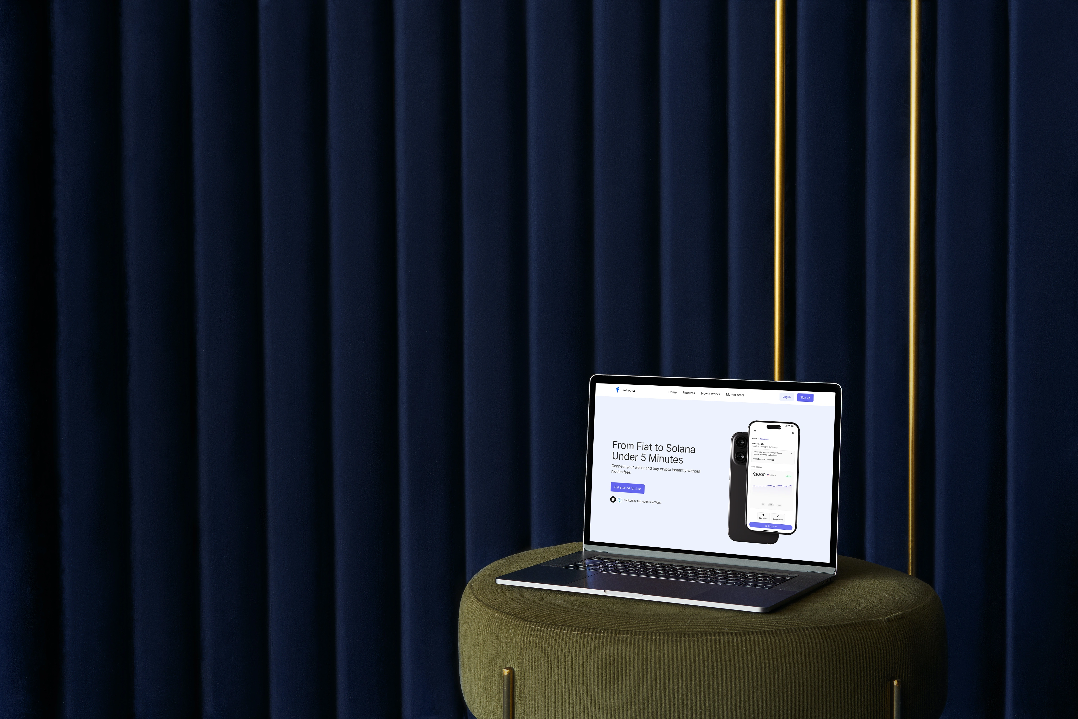
FiatRouter Mobile-First UX Redesign Process
How It Started
I discovered the @superteamearn space through a post by Sameul Xeus made on his telegram channel for those aspiring to join the web3 space. As a designer eager to dive deeper into Web3, the @fiatrouter redesign contest felt like the perfect opportunity.
Given the short timeline, I made a key decision early on: focus on the mobile experience. Why? Because in most Web3 products, the majority of users interact through their phones, and I wanted to optimize where it matters most with little time.
Step 1: Understanding the Product
I started by reviewing FiatRouter’s current website and the product document they provided. My goals were to:
Understand the core offering.
Identify UX gaps, especially on mobile.
Clarify the user flows that matter most for a first-time user.
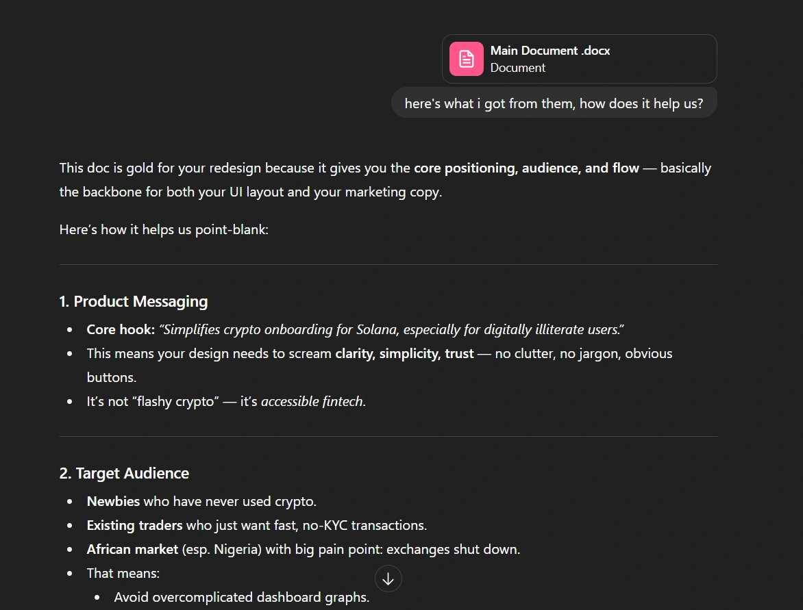
Screenshot of document uploaded to AI for company overview
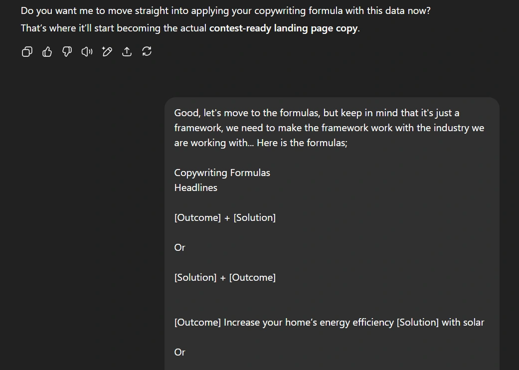
Step 2: AI-Assisted Planning (Effective Use of AI)
I collaborated with AI to speed up:
Content review & extraction from the main doc.
UX flow mapping for mobile onboarding, wallet connection, KYC, and transactions.
Copywriting for headers, CTAs, and empty states. Quick design feedback on color contrast, shadow use, and layout spacing.
The AI helped me turn a messy brainstorm into a clear plan within hours instead of days that I did not have. So, hat’s off to AI for that.
Step 3: Main UX Issues & Quick Fixes (User Experience)
1. KYC Process
Issue: KYC alert on the homepage was too subtle and easy to ignore.
icon styles were different, too much boxes which added redundancy, too many colours for the action buttons, and in light mode a prompt saying “I am here” shows up, which in my opinion doesn’t contribute anything
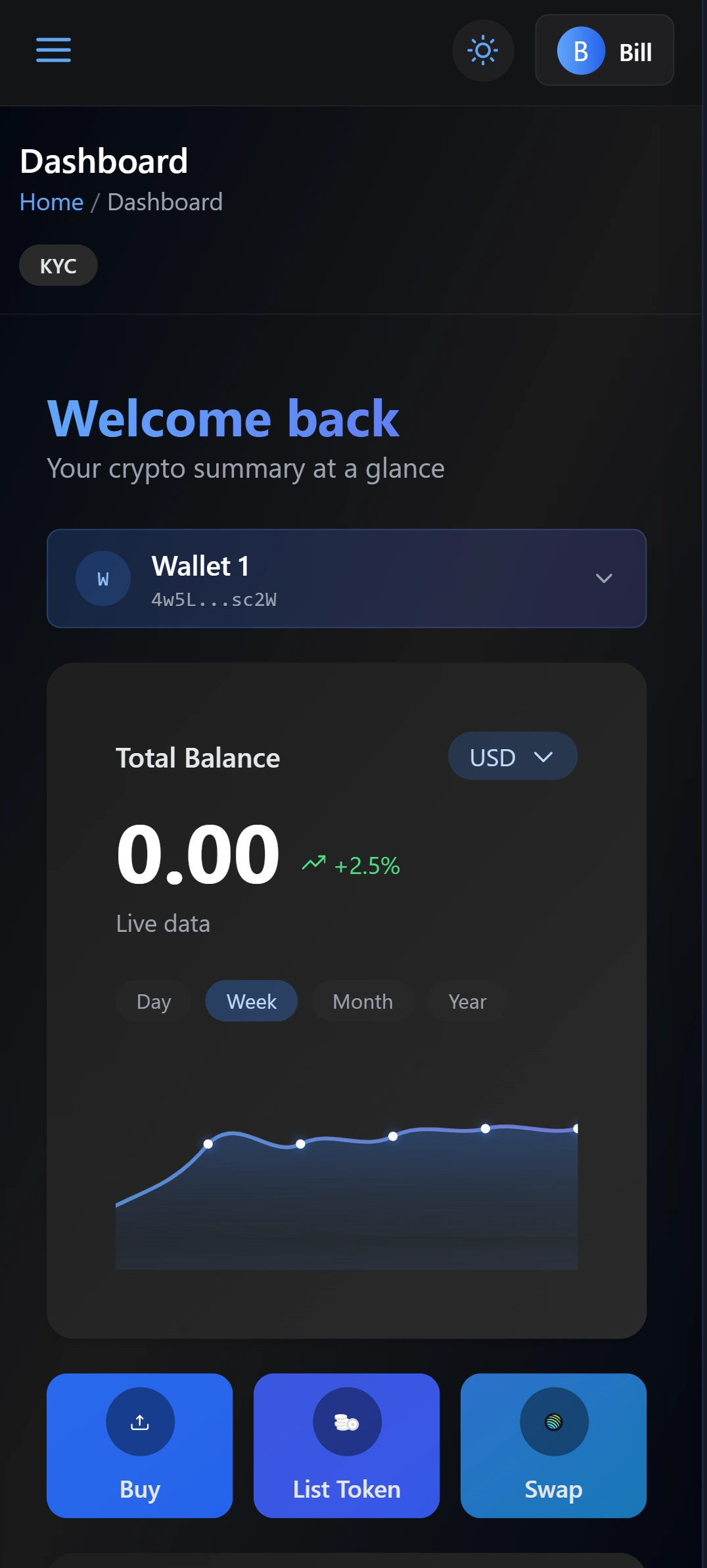
dark mode
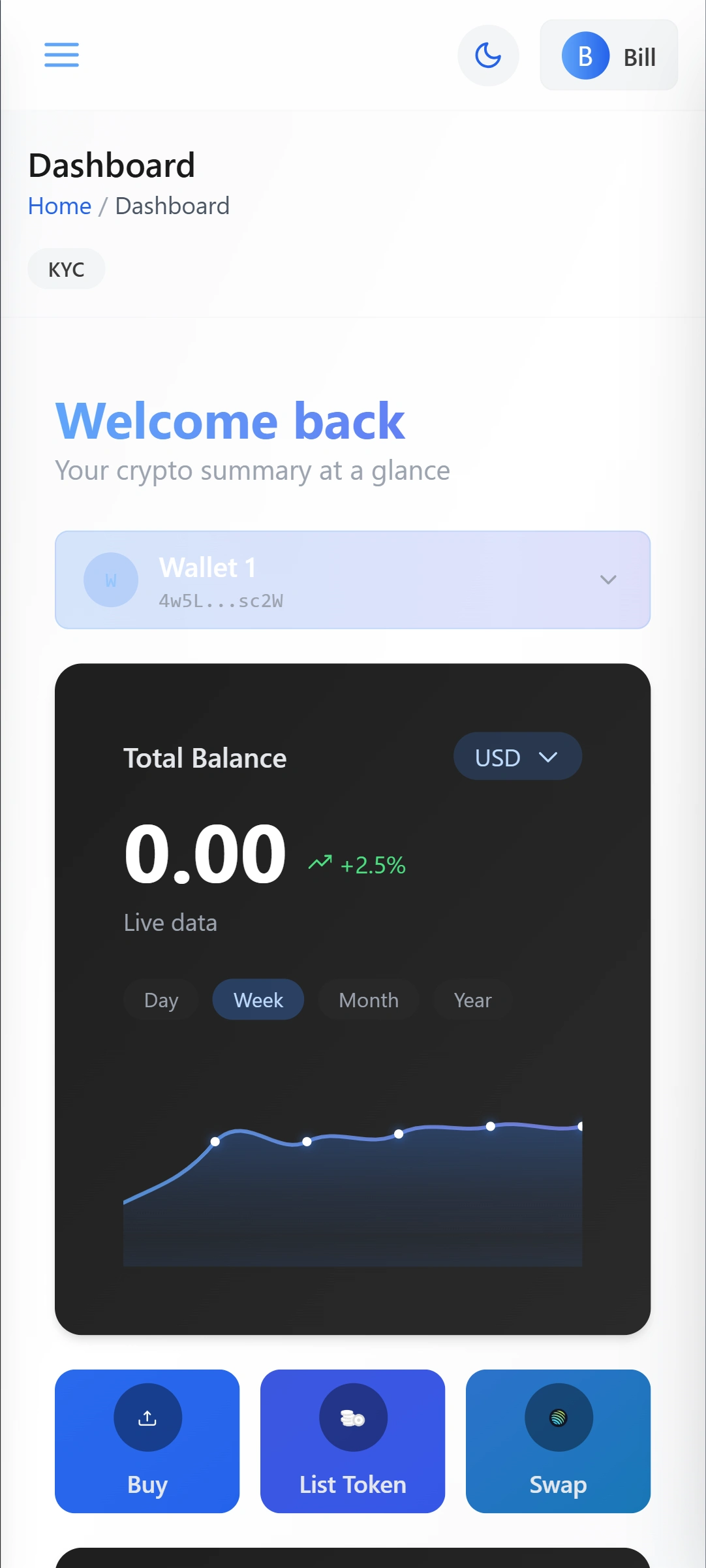
light mode
👆🏽current design of the web app on mobile (on dark & light mode)
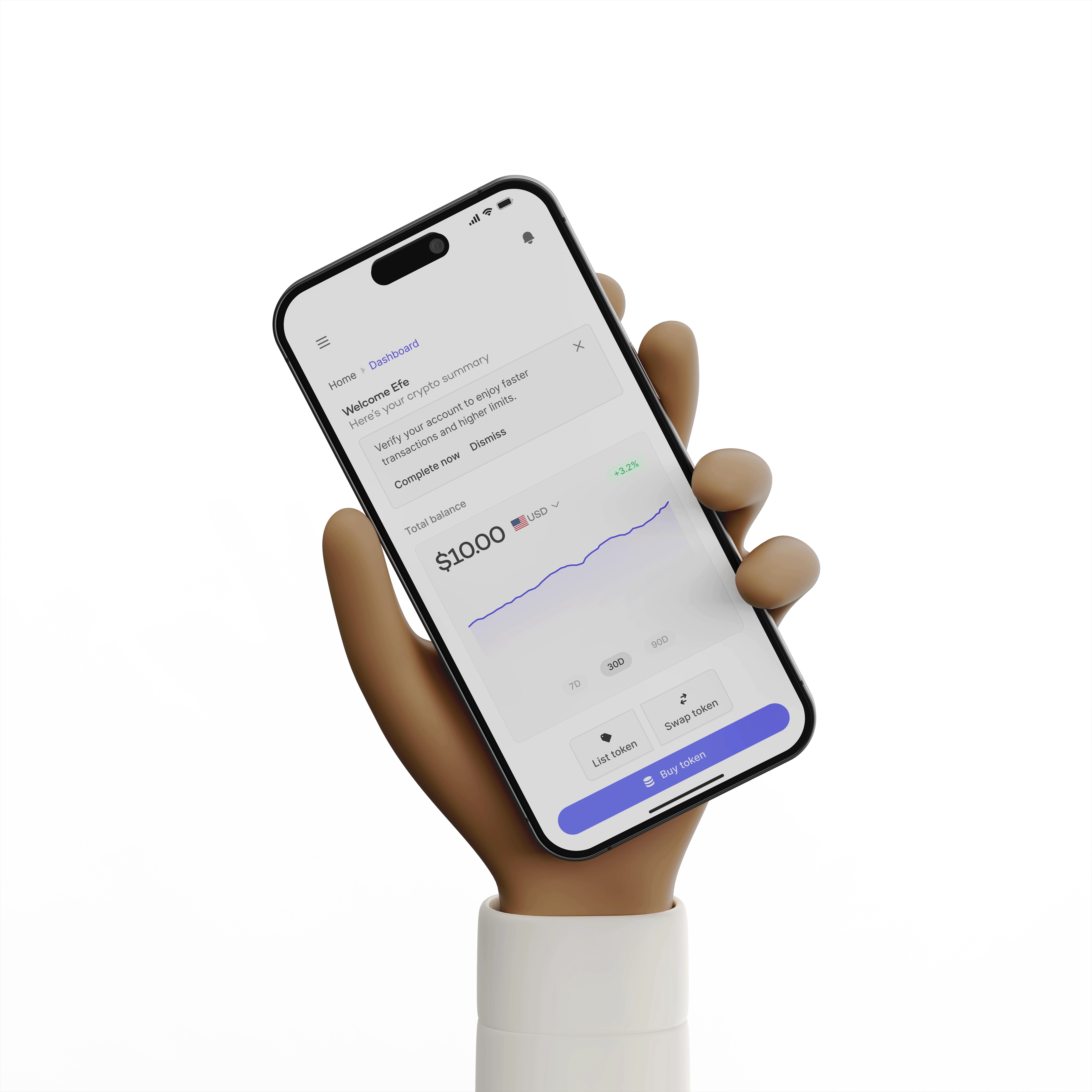
Fix: Inline alert with friendly copy, clear CTA, and a dedicated KYC screen with progress states (Pending, Success, Rejected).
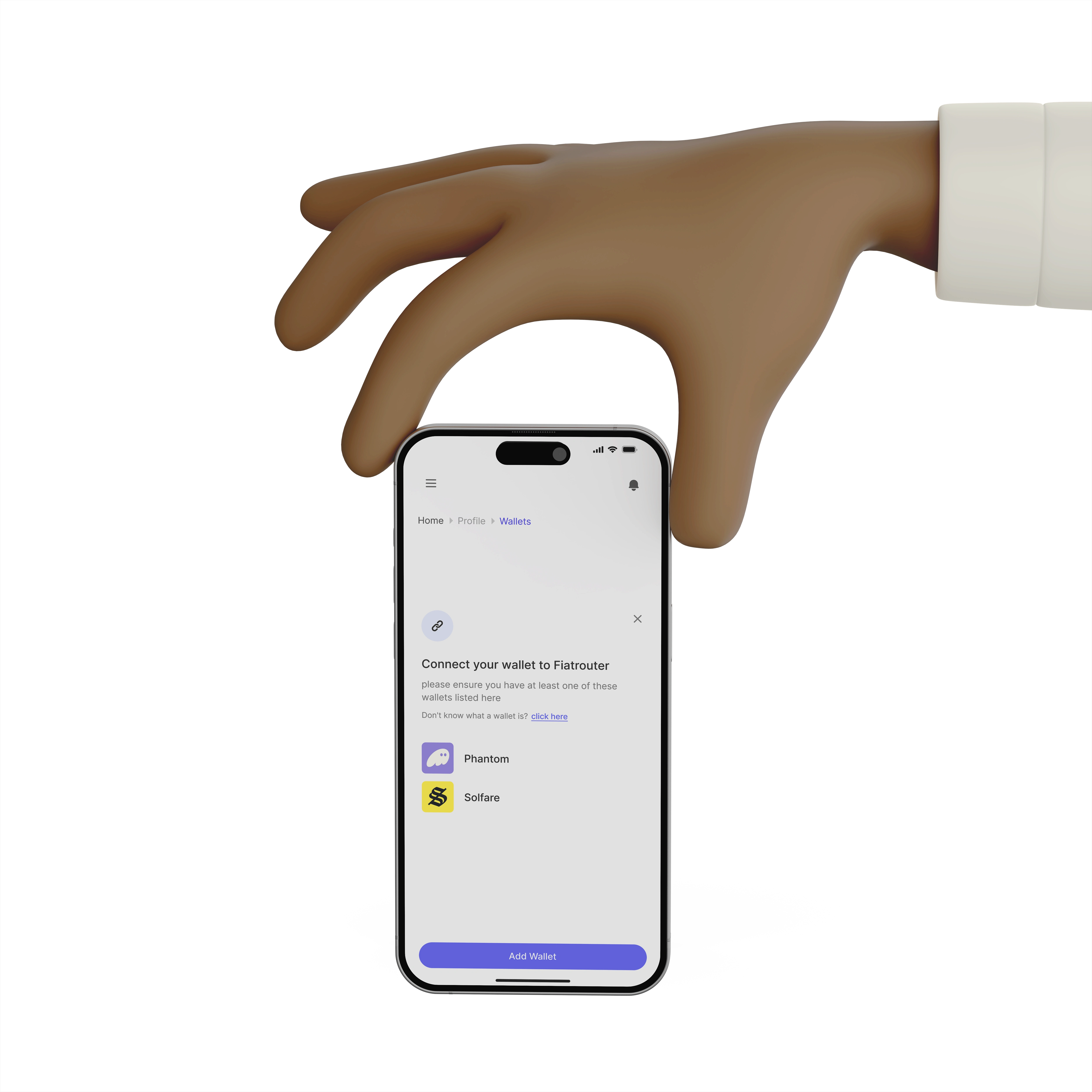
2. Wallet Connection Flow
Issue: Unclear how to add a wallet, no guidance for new users.
Fix: "Add Wallet" button → modal with wallet options (Phantom, Solflare) → guidance for beginners (“Don’t know what a wallet is? Click here”)

3. Transaction History
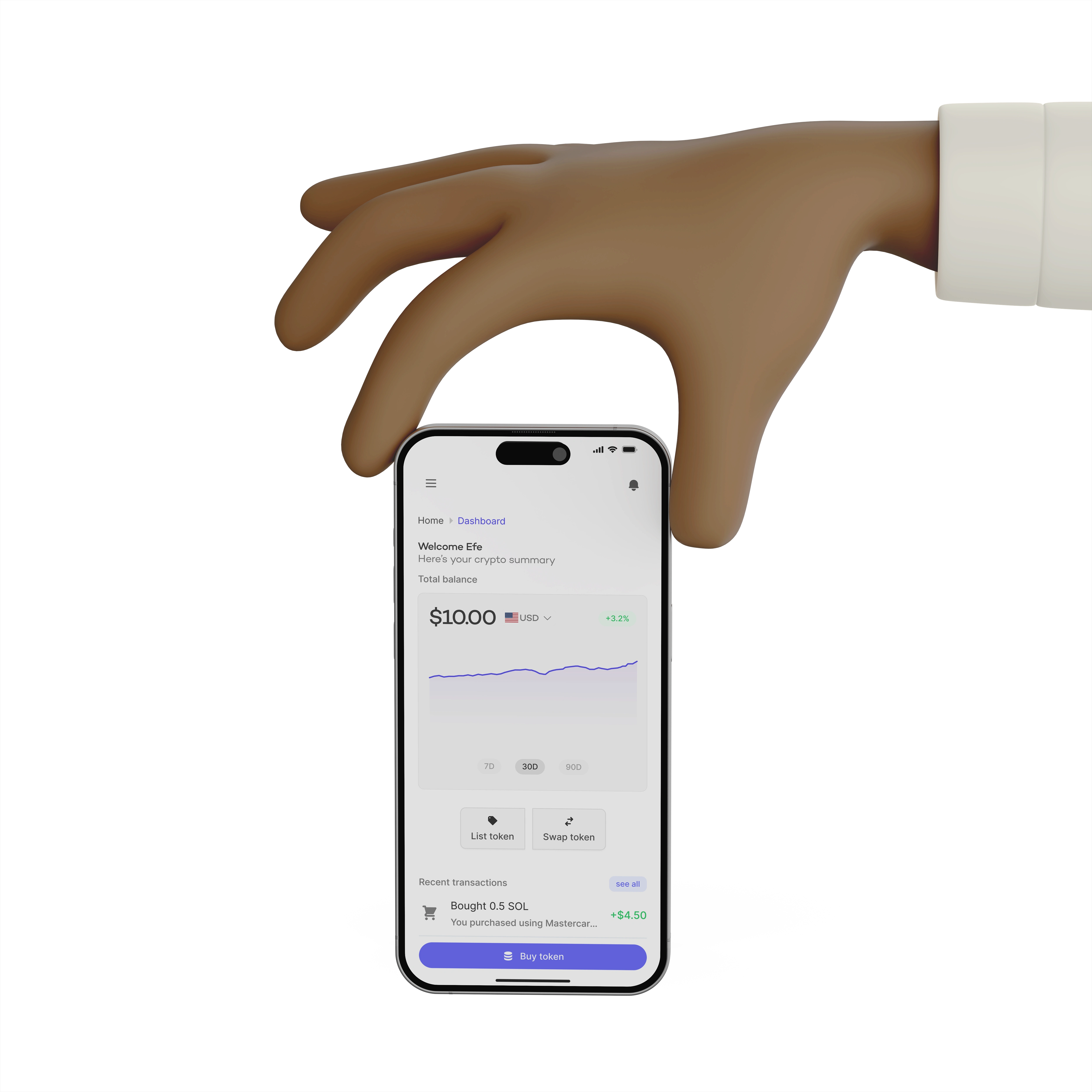
Issue: Hard to understand actions and outcomes.
Fix: Personalized headers (“You swapped 0.5 SOL”), clear amounts (+/-), color coding for gains/losses, and tags for Success, Pending, Failed. You can see an example in the dashboard
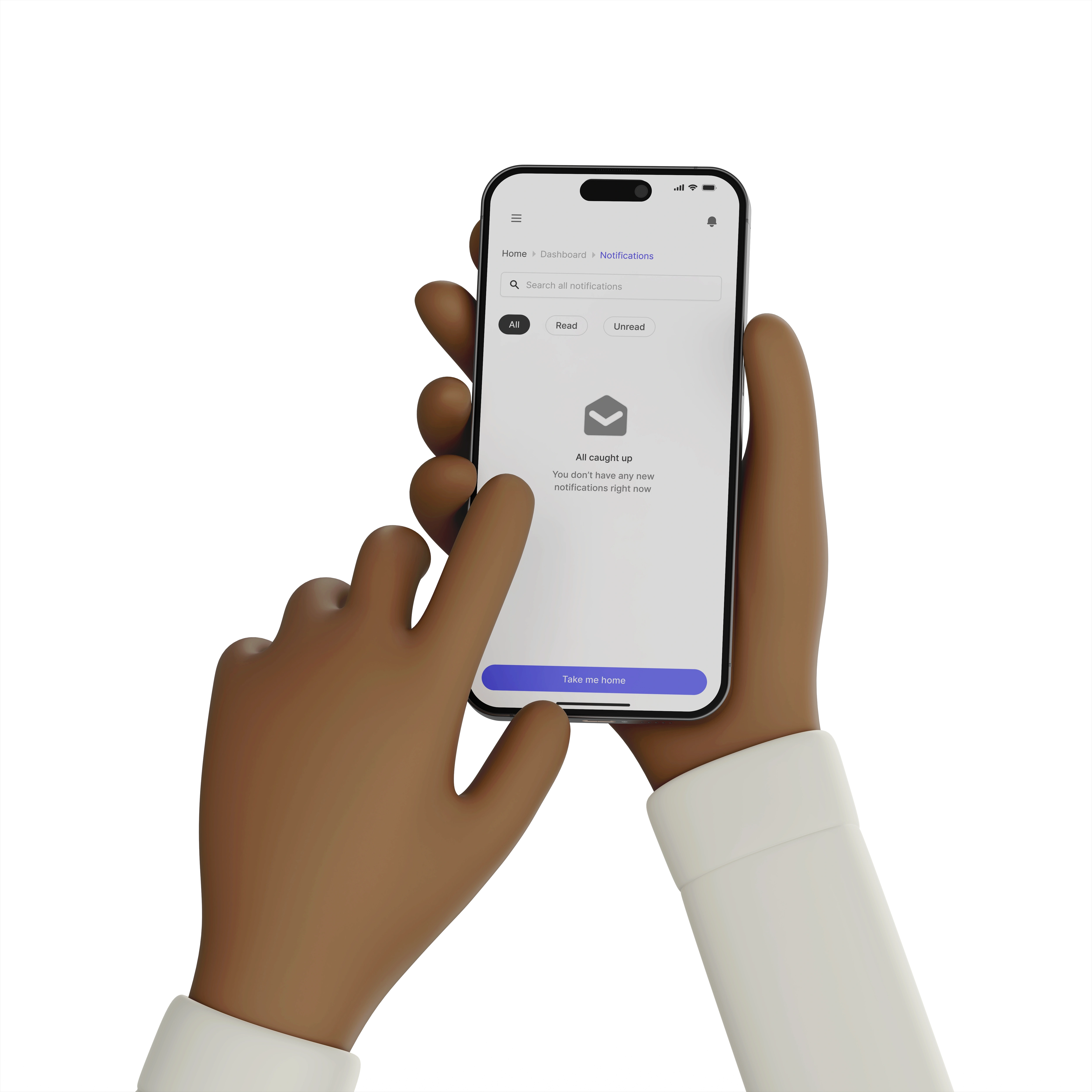
4. Empty States
Issue: No helpful feedback when lists were empty.
Fix: Added icons + friendly copy to keep the UI from feeling “broken".

Step 4: UI Refinements (Creativity)
Soft neutral grays for cards to make white backgrounds feel less flat.
Shadows for card separation instead of heavy strokes.
Balanced text contrast — dark enough for readability, light enough for visual comfort.
Gradient touches for key screens like Sign-Up to make them feel inviting.
Step 5: Why Mobile-First?
With the tight deadline, focusing on mobile meant I could:
Deliver an end-to-end experience for the majority of users.
Ensure essential flows (onboarding, KYC, wallet, transactions) were usable without desktop.
Show my ability to prioritize under constraints.
Step 6: Outcome
In under two days, I delivered:
Mobile-first redesign covering onboarding, wallet connection, KYC, transactions, notifications, and profile.
Updated copy, empty states, and flows optimized for clarity.
A design that I vofeels familiar yet fresh for both new and experienced crypto users.
Full Figma link: Figma Link Here
Like this project
Posted Aug 17, 2025
Mobile-first UX redesign for FiatRouter focusing on key user flows and mobile optimization.
Likes
0
Views
2
Timeline
Aug 13, 2025 - Aug 15, 2025

