Cable TV guide
SKY is AT&T's cable TV arm in Brazil, it is a company that has a very wide and diverse audience, mostly among the portion with less financial resources of the population.
Challenge
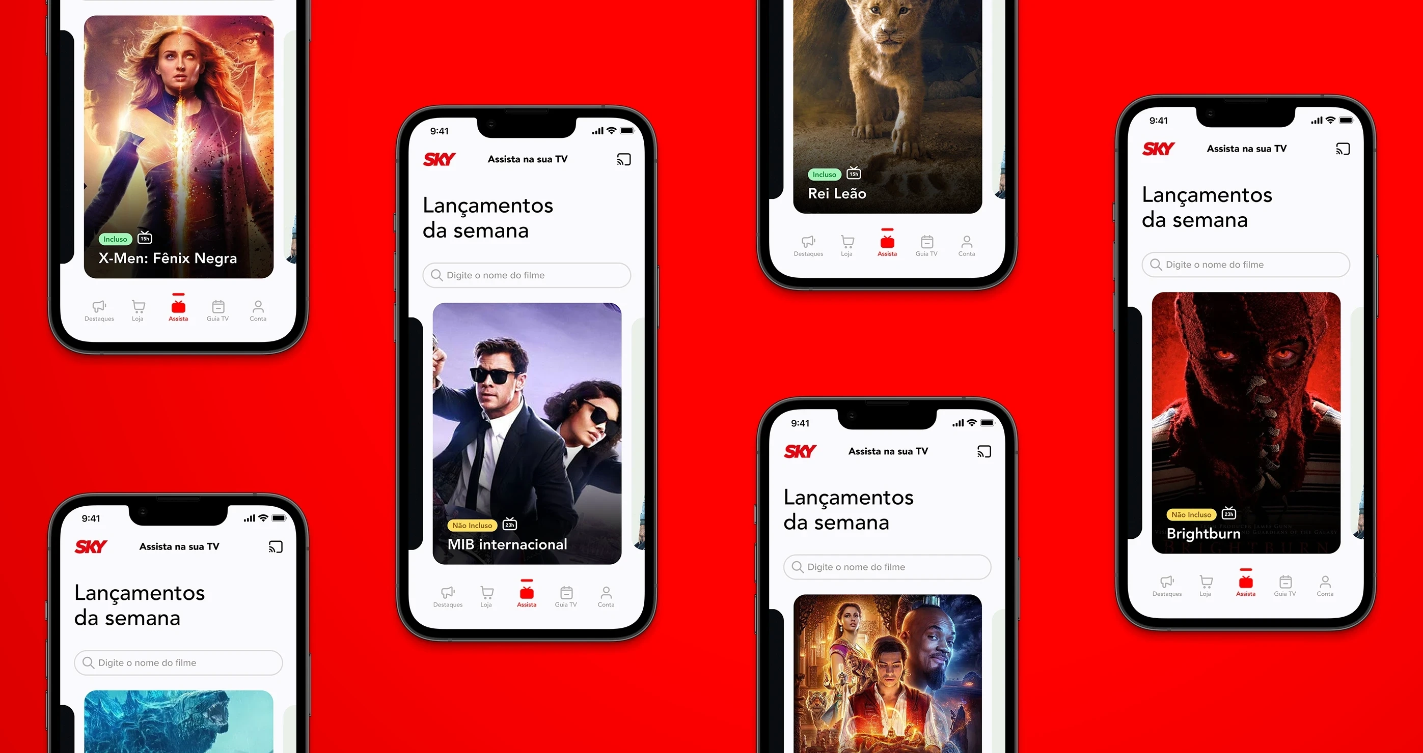
The SKY app underwent a facelift, a modernization process and I was responsible for the TV Guide feature, which serves as a shelf for VOD content that may or may not be included in the customer's plan.
SKY releases an average of seven new movies per week in its programming, transmission is made on specific channels at fixed intervals that are repeated during the week.
The TV Guide in the app needs to present these movies and arouse the user's interest in purchasing them if they are not included in their plan.
The big challenge was to make better use of the available space in a way that the movies become more interesting and also bring more clarity about schedules and whether or not it is included in the client's plan.
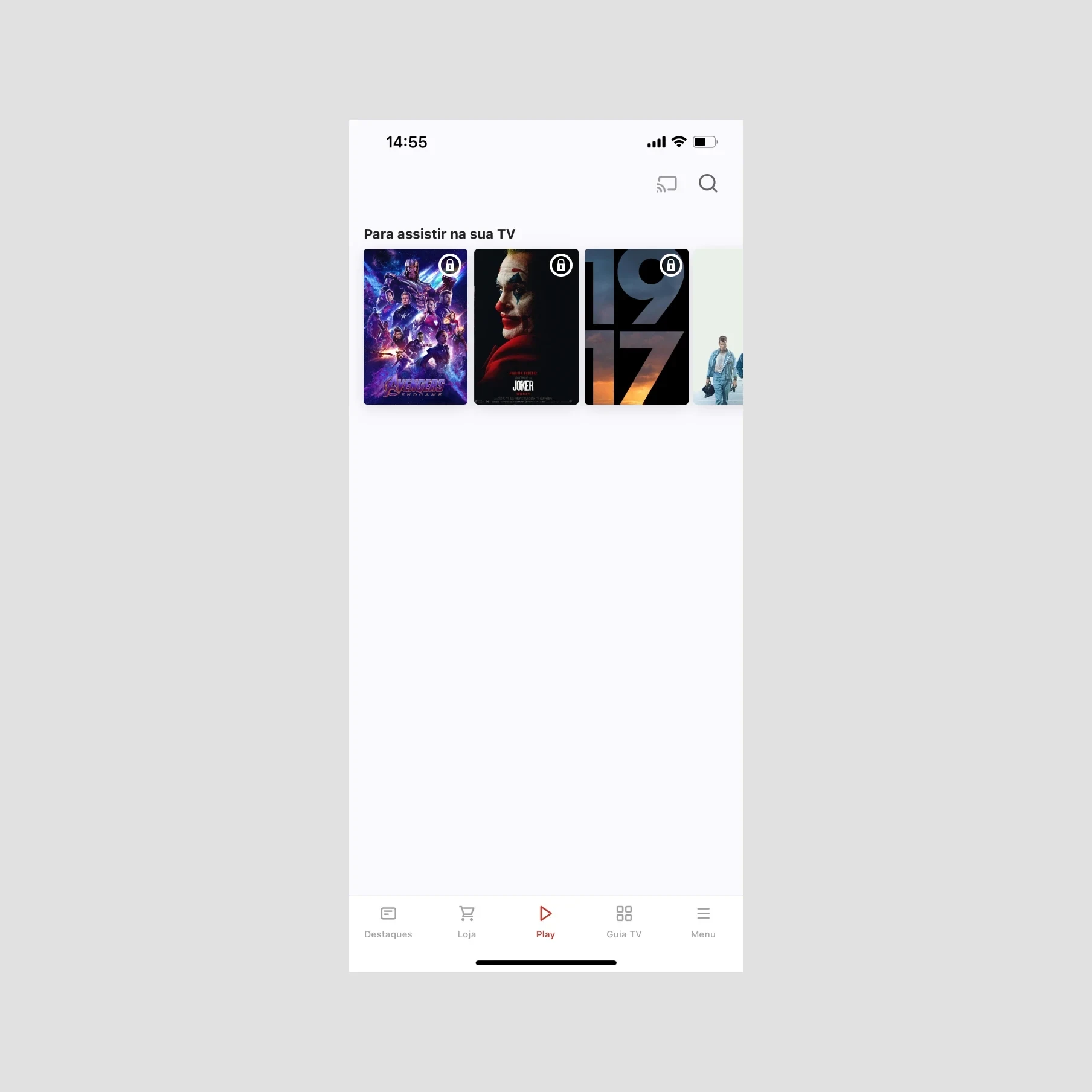
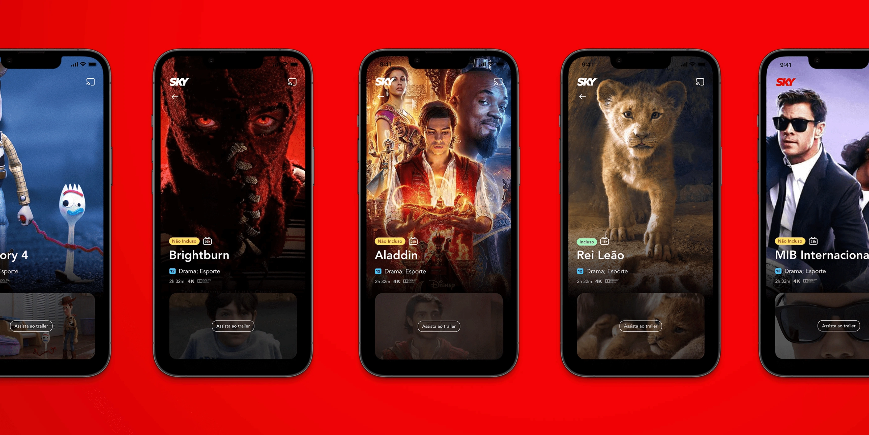
Before: Lots of white space, movies without highlighting, missing information, bureaucracy, and simpleton.
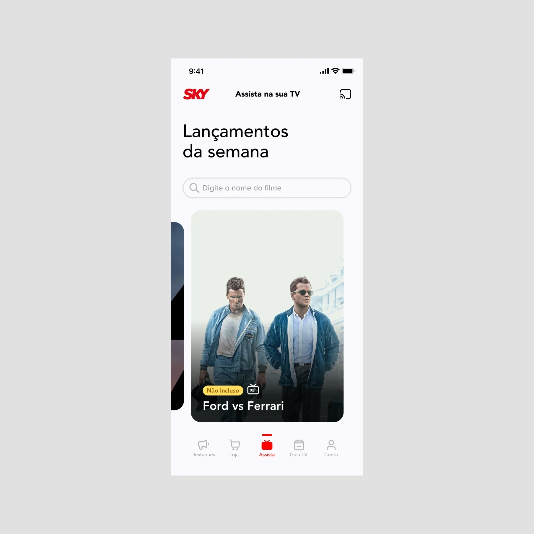
After: Big banners, solid architecture, relevant info, and minimalist.
Results
The redesigned app features a clean, clutter-free interface, making it easier for users to navigate and access essential features.
The improved onboarding process resulted in a 35% increase in new user adoption rates.
The addition of personalization and customization options enhanced user engagement, leading to a 25% increase in user retention rates.
35%
Increased feature access.
5%
More movies selling.
-15%
Reduced dropout during feature access.
Process
Analysis: We analyzed the current interface based on feedback already collected by the support team.
Information Architecture: Based on the research findings, we restructured the app's navigation and content, prioritizing features and information according to user needs.
Wireframing & Prototyping: We built a high-fidelity, interactive prototype to test the design with users.
Usability Testing: We conducted usability tests with a diverse group of users to validate the design and identify areas for improvement. Based on the feedback, we made the necessary adjustments to the design.
Visual Design & Style Guide: We used a style guide developed by the DesignOps team to maintain design consistency.
Conclusion
SKY is a big corp, so each small change had to be validated by several departments, reviewed, and discussed in the group several times but I still believe that I did a good work managing the expectations of all stakeholders involved and delivering something more beautiful and functional, the feedback from the uses side was very important in this process of "selling" the idea of this concept more modern and aesthetic.
Check the whole case
To see all the screens and more detailed info access the project link below.
Password: Phelipe-cases-2023
Like this project
Posted Mar 28, 2024
Product concept and redesign for Sky's programming guide app, an AT&T cable TV subsidiary in Brazil.

