Mobile app marketplace: Personalized Sneaker Marketplace
Life is too short to wear boring sneakers.
Project Brief : Sneakers Sale App

Overview:
I developed a mobile app for my friend, designed specifically for him to showcase and sell his sneakers. The app serves as a personalized platform that highlights his unique collection and facilitates direct sales to interested buyers.
Key Features
Sleek User Interface: A clean and modern design that emphasizes the sneakers and provides an engaging browsing experience.
Featured Listings: Option to highlight select sneakers for better visibility and quicker sales.
Payment Integration: Streamlined payment processing to ensure secure transactions.
Objective:
To create a dedicated platform that allows my friend to effectively market and sell his sneakers, while offering a seamless experience for potential buyers.
Impact:
This app aims to elevate my friend's sneaker-selling process, providing a professional outlet for his collection and enhancing customer engagement.
Wireframing
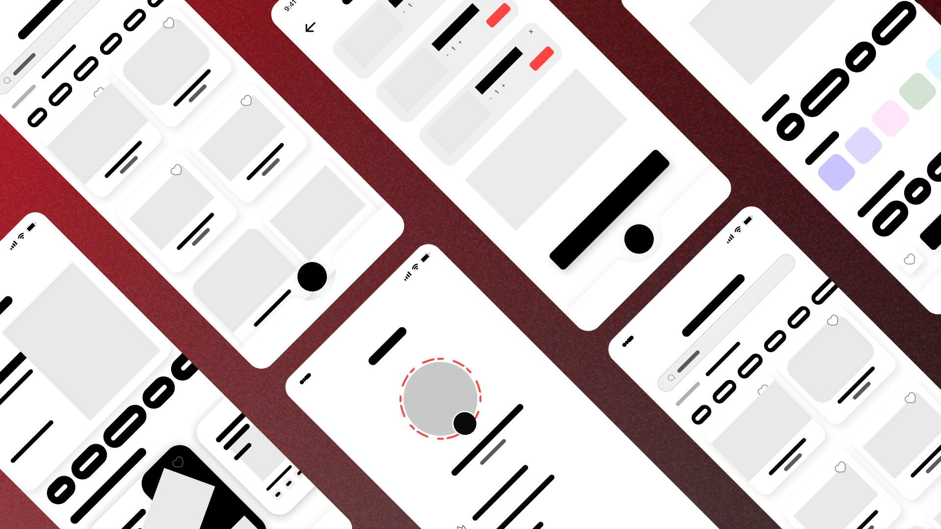
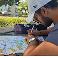
During the design process, I created wireframes to establish the app's layout and user flow. This step was crucial for visualizing the structure of the app before moving on to high-fidelity designs. The wireframes served several key purposes:
Clarification of Ideas: They translated concepts into visual formats, making it easier to communicate design intentions to my friend and gather feedback.
Focus on Functionality: By emphasizing layout and interactions rather than aesthetics, I ensured that the app would prioritize user experience.
User Flow Mapping: The wireframes helped outline the user journey, allowing for an intuitive navigation experience where buyers can easily browse and inquire about sneakers.
Iterative Feedback: The low-fidelity nature of wireframes facilitated discussions about functionality and layout, enabling quick adjustments based on my friend’s preferences.
Screens
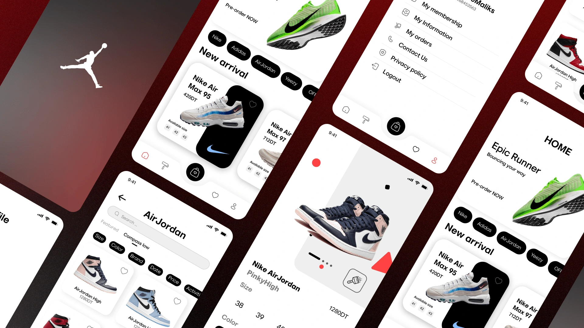
The final user interface (UI) of the sneaker sale app reflects a modern and clean design, tailored specifically to enhance the user experience while showcasing my friend's sneaker collection. Each element was crafted to ensure usability, aesthetics, and a seamless interaction flow.
Design Principles:
Clarity and Simplicity: The UI features a minimalistic design that prioritizes essential elements, making navigation intuitive and user-friendly. This simplicity helps users focus on the sneakers without distraction.
Visual Hierarchy: By utilizing size, color, and spacing effectively.
Consistent Branding: The color palette and typography were chosen to align with my friend's brand identity, creating a cohesive look that resonates with sneaker culture.
The final UI of the sneaker sale app successfully combines aesthetics with functionality, creating an engaging platform for showcasing and selling sneakers. By focusing on user-centered design principles, I aimed to ensure a positive experience for both the seller and potential buyers, ultimately facilitating successful transactions.
Design System
Thank you for scrolling!
Like this project
Posted Oct 11, 2024
Designed a mobile app to showcase and sell sneakers, featuring easy posting, browsing, and customization for an engaging user experience.
