Hype bank home page redesign
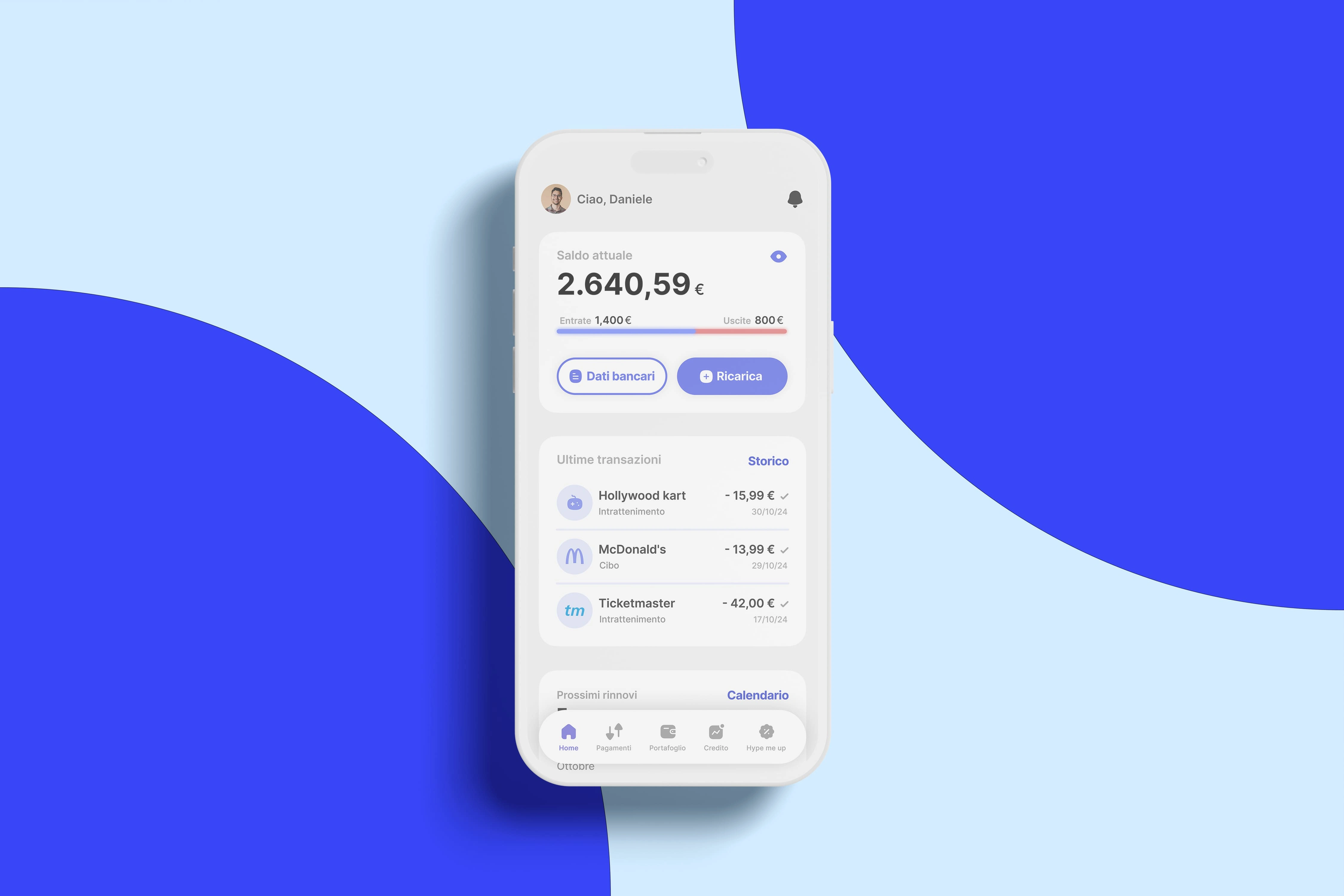
The basis of this redesign is the desire to improve an app that is of daily use by yours truly, despite being a redesign reduced to the main screen, not having data in hand I have tried to reduce to the errors that I consider important the changes and improvements. In the current version of the app, as you will have occasion to see there are several errors and divergences that could greatly affect the user experience, so it was my great pleasure to improve the user experience and the user interface
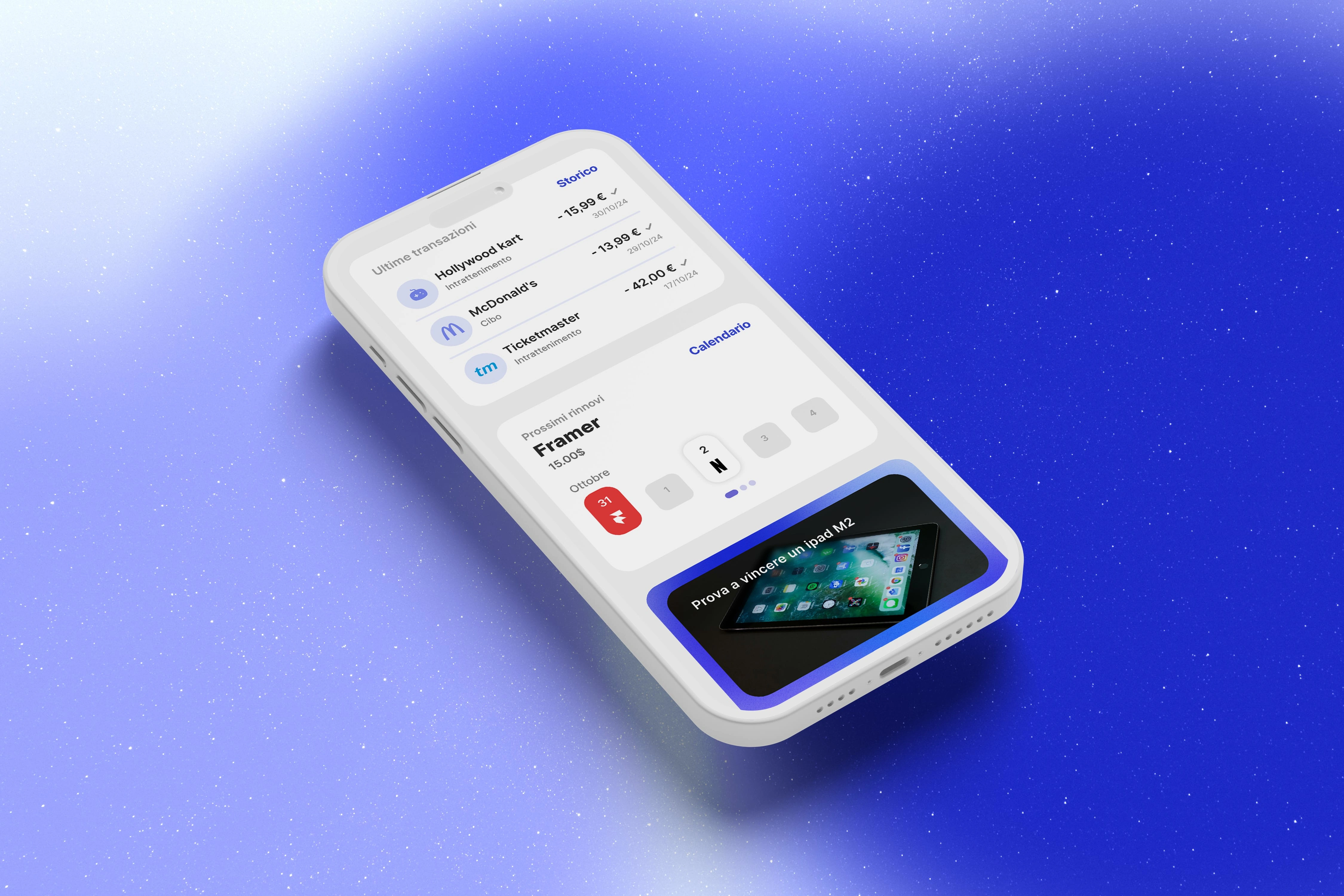
Each of us is now accustomed to an increasingly constant presence of what are the direct subscription possibilities in our bank account, this, for those who own a not inconsiderable amount of subscriptions entails a certain cost. In order to avoid unforeseen contingencies such as an insufficient balance availability for debit or even more importantly, a subscription that one had forgotten to cancel, it was a crucial point of my redesign to create a function that can bring together and solve possible user queries and needs as well as keep the user strongly informed of what is happening or about to happen to his account.
The feature is designed to provide the user with a first set of information with which he can interact in a dynamic and simple way, leaving the possibility to further deepen, if you wish. Despite the limited space, I was able to enter all information about active subscriptions properly and consciously. The card contains: the title of the subscription, the day and month of charge, the cost, a CTA that redirects to a complete calendar and finally a carousel showing which subscriptions will be charged in the next 15 days, Thus offering a clear and complete view.
The carousel is designed to display 5 containers at a time, each representing one day. The appearance of each container varies depending on whether or not there is a subscription renewal for that day. When there are no expected charges, the container will not be clickable and will have a lighter contrast, so that it visually indicates the lack of relevant data for that day. In contrast, containers representing days with expected charges are visually more prominent: they are highlighted by a drop shadow, contain the logo of the company to which the charge will be made and, in case of multiple charges, Also show a notice with the number of charges in addition to the logo.
The user can scroll down the carousel and click on each container that contains a subscription. To make the selected container immediately visible, I chose to mark it in red, thus conveying the idea of an exit of money from the account.
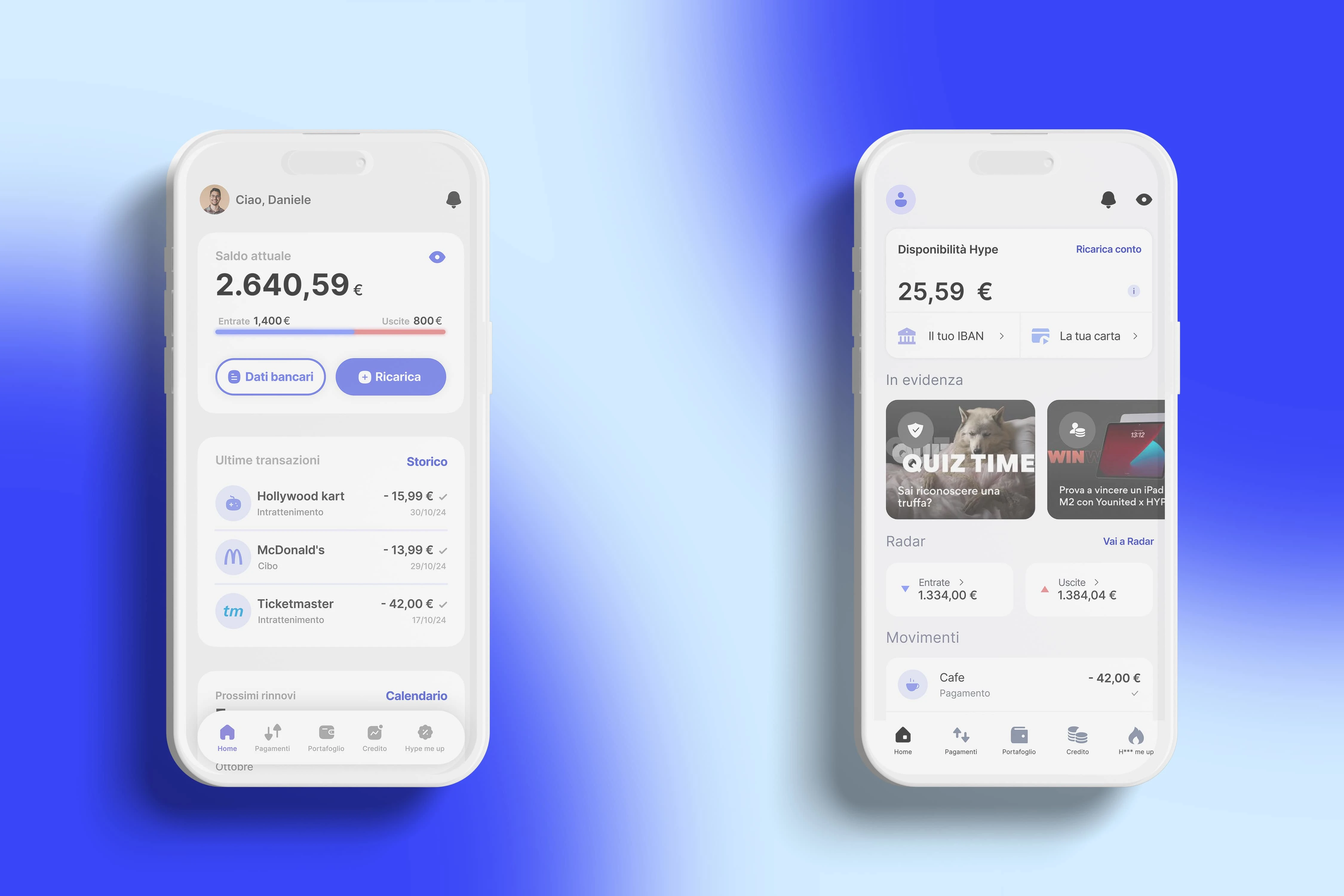
Understanding actions within the interface:
There are errors in the positioning of icons within the interface. For example, the eye icon in the top right, which should obscure the account numbers, due to its current position can lead the user to think that it censors all the numbers on the screen. In reality, it only obscures the balance, income and expenses data, items that are not visually connected or grouped together. My solution aims to improve visibility and optimize space, making the available action clearer: I grouped the "Radar" section within the current balance card and moved the eye icon within the same card, making it clear that only the numbers in that section will be obscured. I also made the "Radar" section more visual, creating a colored bar that represents the ratio between income and expenses in percentage.
Confusion in the entries:
I noticed that users find confusion between the two CTAs present in the previous card: one leads to the IBAN of the account and the other to the card. Since this is a card associated with a bank account, it may not be immediately clear to users where to find specific information, causing a waste of time. Furthermore, it is a missed opportunity in terms of space optimization, which is especially essential on small screens. I therefore combined the items "Your IBAN" and "Your card" into a single button that contains all the banking information, eliminating the need to switch between sections of the app.
Top up account:
By combining the two previous items, a space was freed up that I was able to enhance with a useful action for the user. Analyzing the common use of the card and the preferences of the target, I noticed that many users, given their young age and the associated services for minors, often prefer to manually top up the account rather than directly credit their salary. I therefore inserted a button for top up the account, making it the primary action of the current screen, given its frequent use and importance for the target audience.
UI and design:
I renewed the graphic interface, correcting errors such as inconsistent spacing and improving the entire design system. I optimized the spaces and better organized the sections, currently a bit confusing, correcting errors in the shadows that could lead the user to make the wrong choices. I also updated the icons and lightened the navbar, increasing visual engagement and highlighting the most useful buttons and interaction elements. Finally, I inserted the header inside the cards, positioning the in-depth button next to it for better optimization of the spaces, making the interface more pleasant and intuitive overall.
Like this project
Posted Nov 1, 2024
Through a comprehensive UX/UI audit and redesign, I revamped the homepage of my bank's app to create a more intuitive and visually engaging experience. By analy
Likes
0
Views
2

