Letterboxd Product design
Design errors, Ux design audit
Long-time users in decline: In this project, I delved into UX and UI issues. Then, using a hybrid approach between Data-driven and Genius Design, I analyzed possible solutions to complex challenges, while also trying to close the gap with competitors.
Peak Point: The company is experiencing significant growth due to its strong connection with the public. It is therefore critical to maintain user interest and identify new areas for improvement to attract an even wider audience.
Errors in Ux and Ui There are numerous problems in the user experience and interface, from page structure and the availability of useful buttons, to the desirability of screens and the templates adopted.
Nielsen heuristics
Here’s a summary and translation of the points discussed:
Visibility of system status: There is minimal interaction informing users of available actions. The desktop version lacks a navigation bar, making it hard to understand one's location within the site. The mobile version is an improvement, but the search button distracts from the user’s current position. Additionally, the journal icon misleadingly suggests notifications that don’t exist, and there are inconsistencies in the user interface.
Match between system and the real world: The "Liked?" prompt with a heart icon is not intuitive and can be confusing. Non-intuitive labels like "Journal" are used to track watched films, and there are no clear visual explanations to guide the user.
User control and freedom: There is no option to undo adding a film to the list, nor is there a way to delete a review directly from the film's page.
Consistency and standards: Icons are not appropriate, and there are inconsistencies in size and design. The navigation section is ineffective in engaging users.
Error prevention: There are no error prevention measures, even in registration forms. It’s possible to sign up with random text, showing a lack of validation.
Recognition rather than recall: The app has too many elements that require user memory. Error screens don’t clearly communicate the current state or how to fix issues.
Flexibility and efficiency of use: Adding a film is complicated, especially on the web version. There is no navigation bar, and buttons are placed inconveniently, making the interface inflexible and not customizable.
Aesthetic and minimalist design: The site design appears outdated and unattractive. Pages feel heavy and don’t follow minimalist design principles, with errors in color and space usage.
Help users recognize, diagnose, and recover from errors: Errors are generally communicated and don’t assist users in understanding how to resolve them. There are no error identification systems.
Help and documentation: The structured site training is tedious and lacks visual explanations. There is no official documentation or site map, and adding contact support would be beneficial.
These points highlight significant usability and design issues in the app and site, indicating the need for substantial improvements.
New information architecture
The new information architecture as well as creating a much simpler structure, removing entries and pages that negatively affect the user experience, to add instead, entries, buttons and pages crucial for the usefulness and simplicity of the site.
Competitor & Benchmark
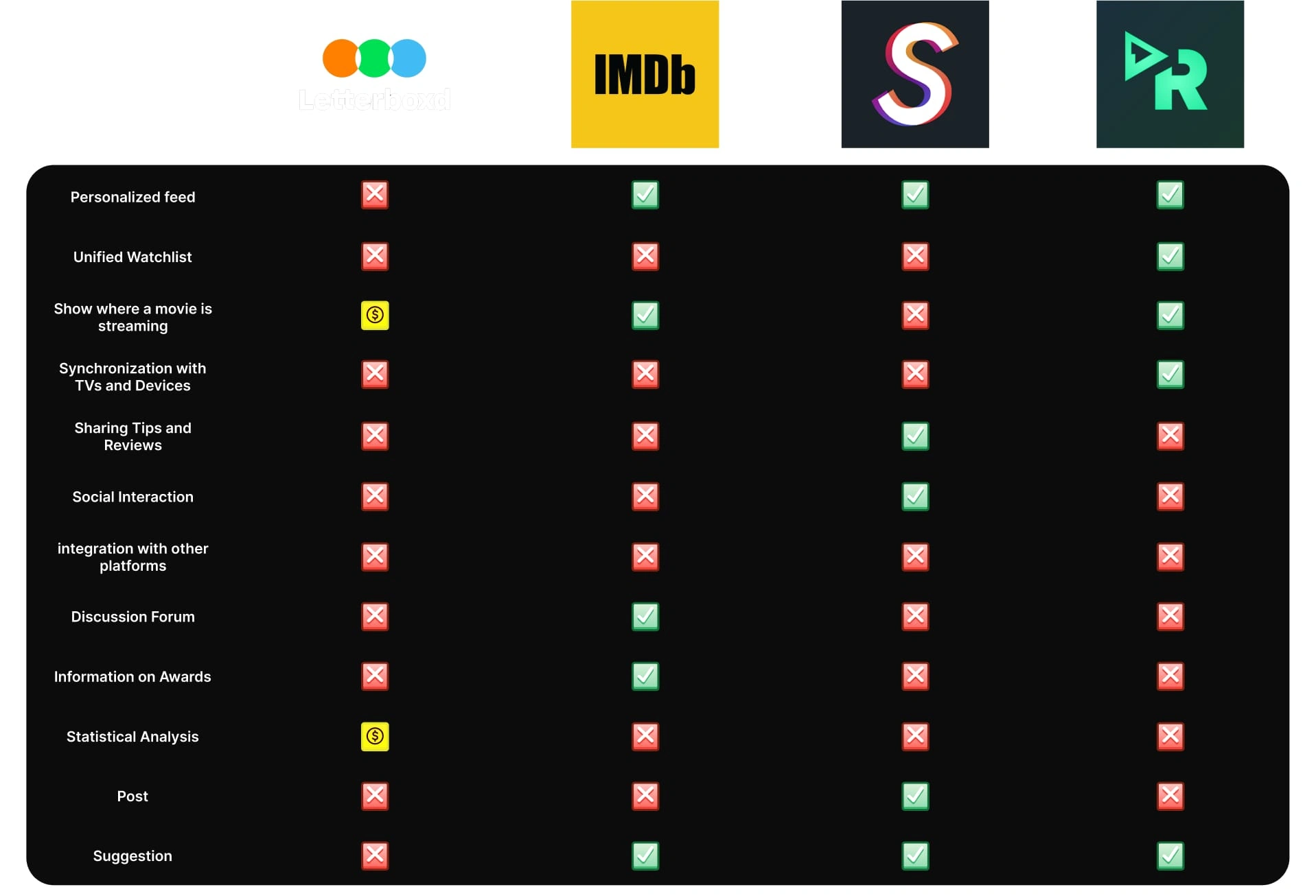
Letterboxd is a film-loving app where users can track the movies they watch, write reviews and share them with a passionate community. This interaction creates a lively discussion space among film lovers.
Moving on to Stamp, we see an Italian platform focused on sharing news and articles. Here, users can discover and discuss journalistic content, creating an active community around topical issues.
On the other hand, we have IMDb, a complete database for movies and TV shows. This app is a critical resource for those looking for detailed information on cast, plots and reviews, and is widely used by professionals and enthusiasts alike.
Finally, Reelgood stands out as a streaming content aggregator. Allows users to find and compare movies and series across platforms, making it easy to find what they want to watch.
In short, while Letterboxd focuses on the social aspect of cinema, Stamp, IMDb and Reelgood offer unique experiences for discovery and interaction with content of various kinds, thus creating a rich variety of options for users.

Survey
After a survey, it emerged that most users would prefer an isolated ecosystem, avoiding links and buttons that link to other platforms. However, social interaction is considered to be essential.
The most popular, but often underrated features include list and like based recommendations. Users complain that the lists are static and little customizable, and want the possibility to upload content and receive news and dedicated feeds on actors and directors who follow.
In addition, film awards are not as relevant to the users. There would be interest in a section dedicated to the posts of acquaintances and not, to encourage new connections, also enabling private messages. Users prefer reviews from others over critics and want a home page that shows their own recent and other people’s reviews, along with recommended content.
Like this project
Posted Nov 1, 2024
In this project I had the opportunity to study and deepen the issues related to UX and UI. Later, through a hybrid approach between Data-driven and Genius Desig
Likes
0
Views
10


