Redefining Volvo for a electric future
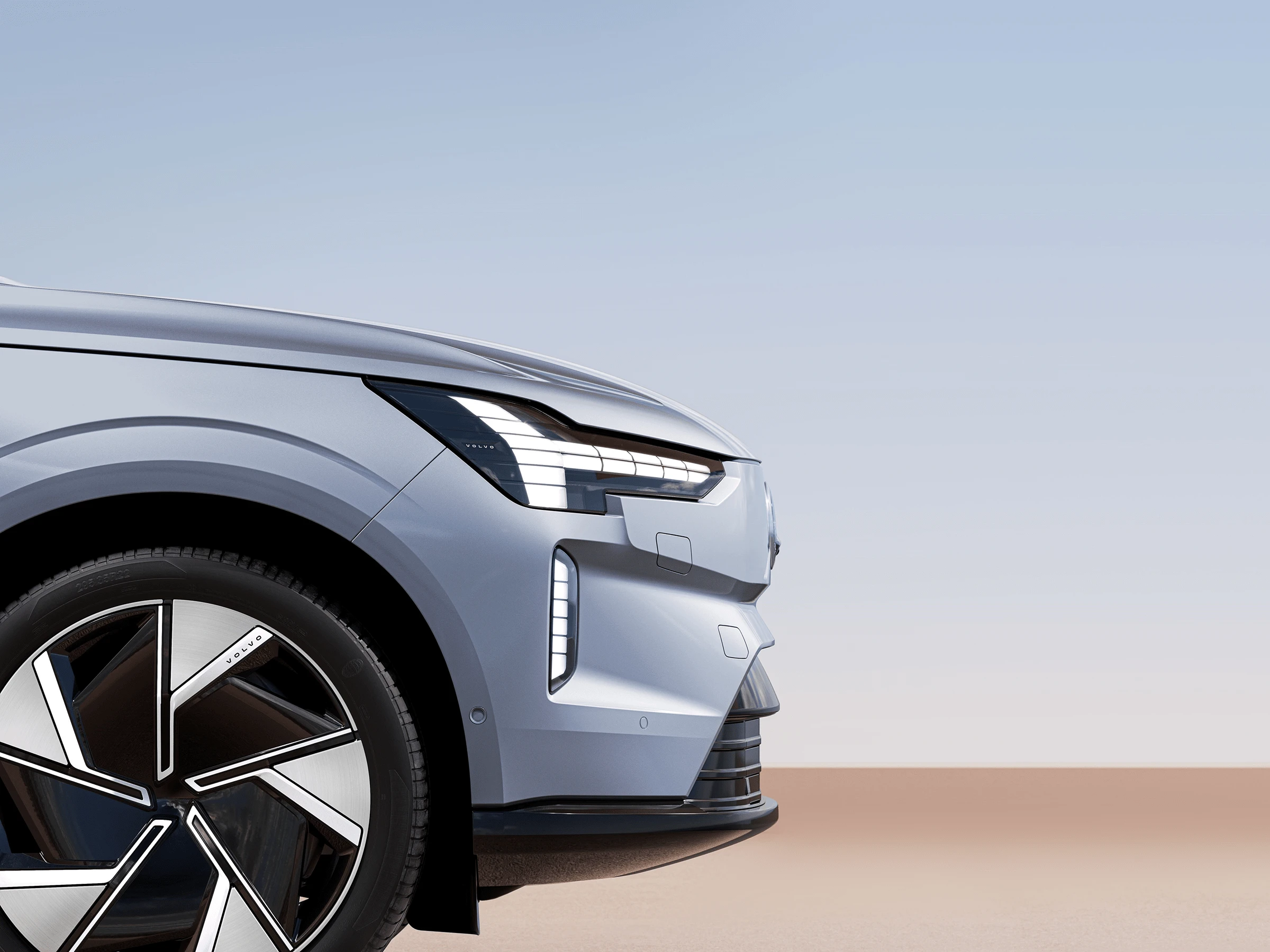
VOLVO is one of the most well-known and respected car brands in the world with sales in about 100 countries. For the launch of its pioneering electric prototype (EM90), I developed a rebrand concept to align it with the new strategy focused on a sustainable and electric automotive model in harmony with the environment.
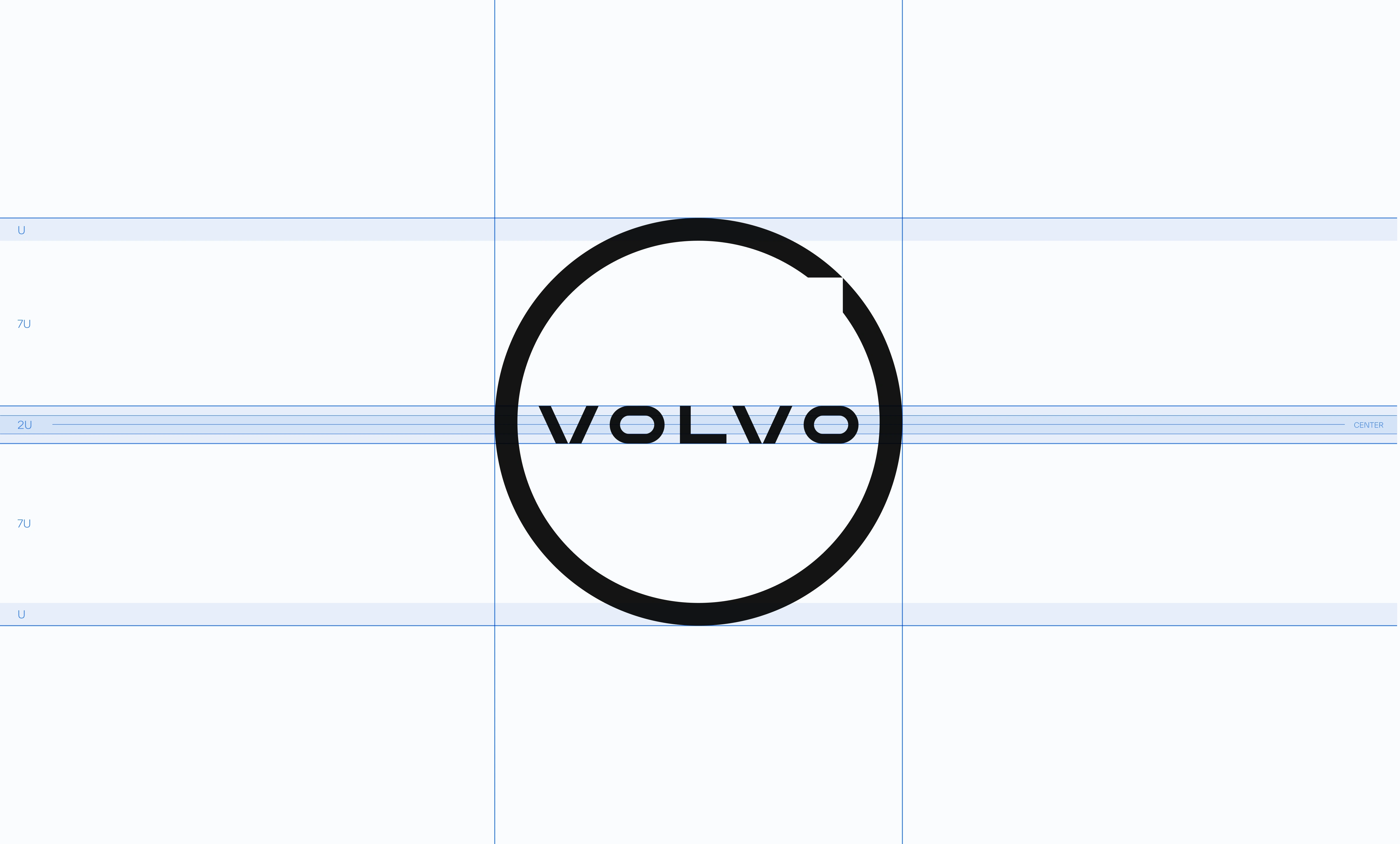
Maximum simplification
For this purpose, the symbol was simplified to the maximum extent possible, representing in it, and at the same time, the traditional and distinctive elements of it — the circle and the arrow — in a more appropriate and modern language, aligned with its new positioning.
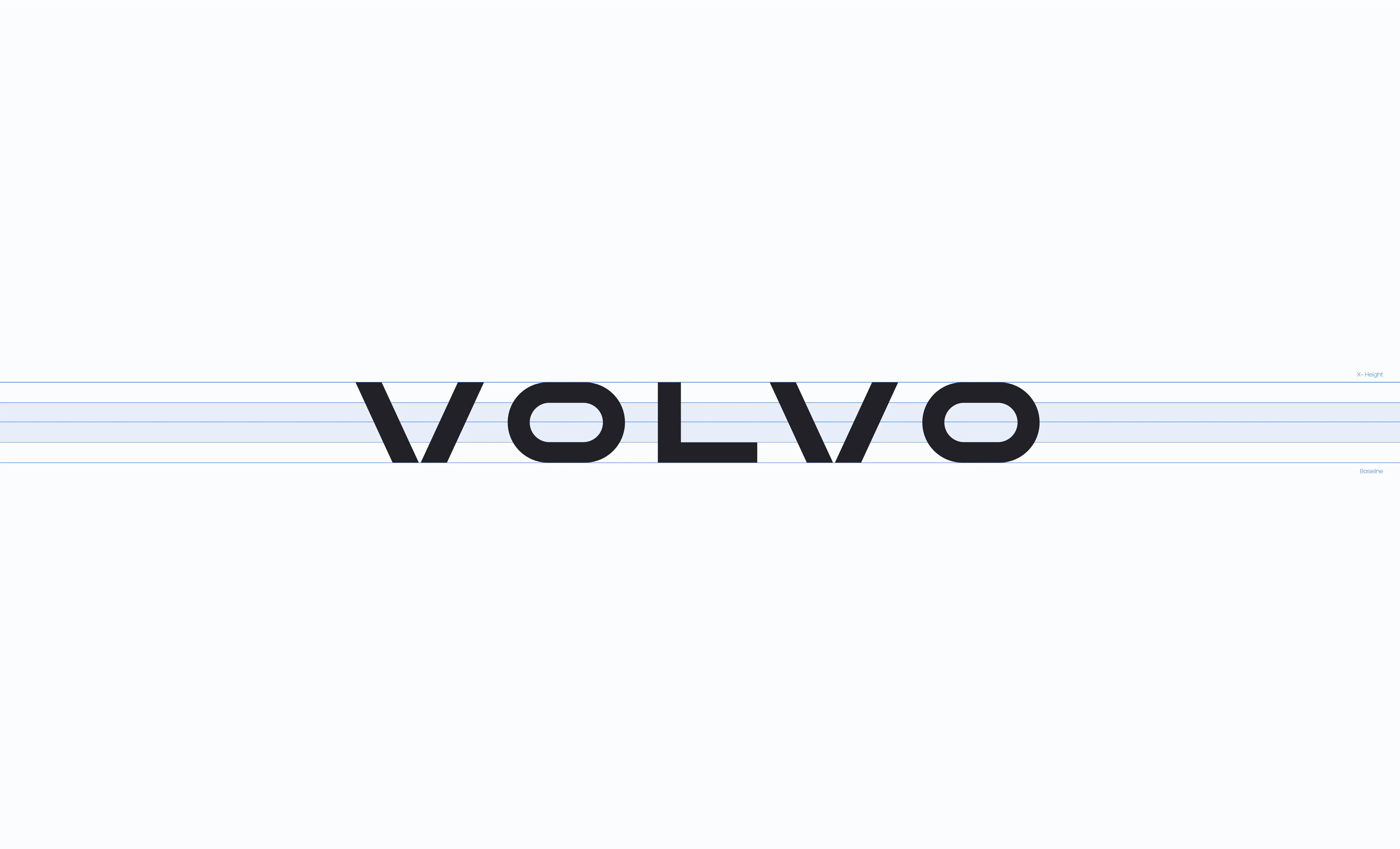
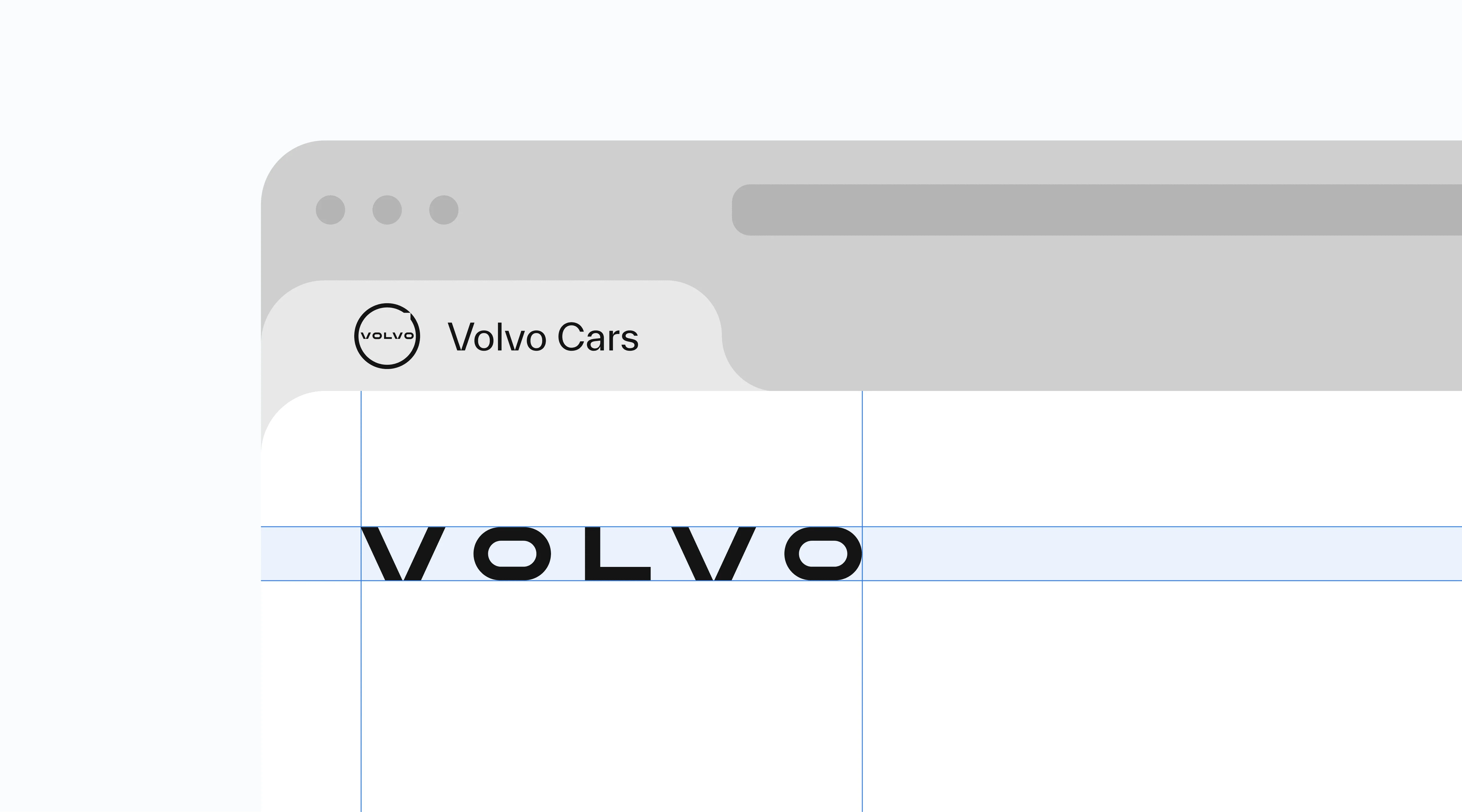
Additionally, I created a custom typeface for the wordmark to preserve and reproduce certain structural elements from the proposed new symbol and its special arrow and morphology.
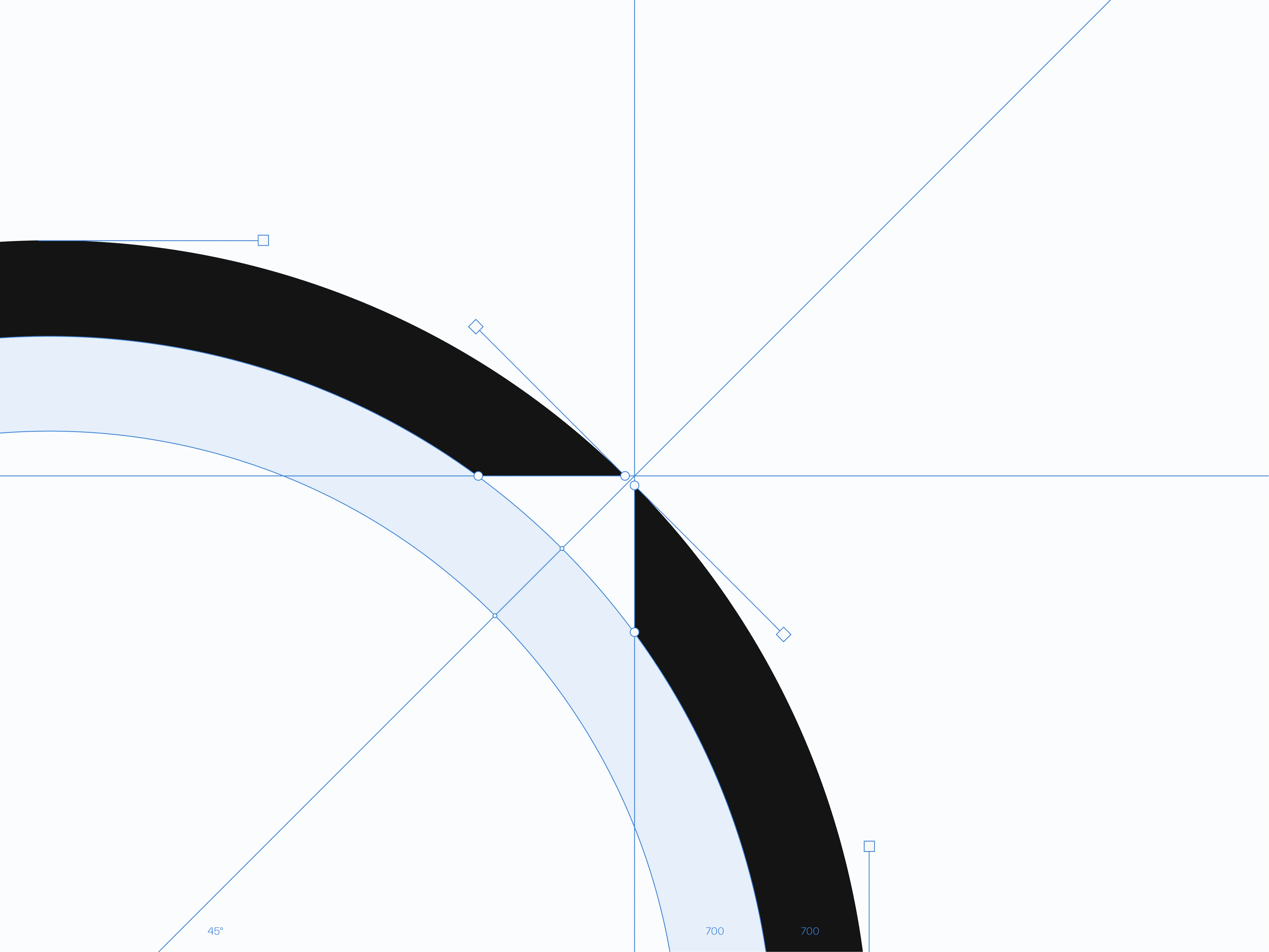
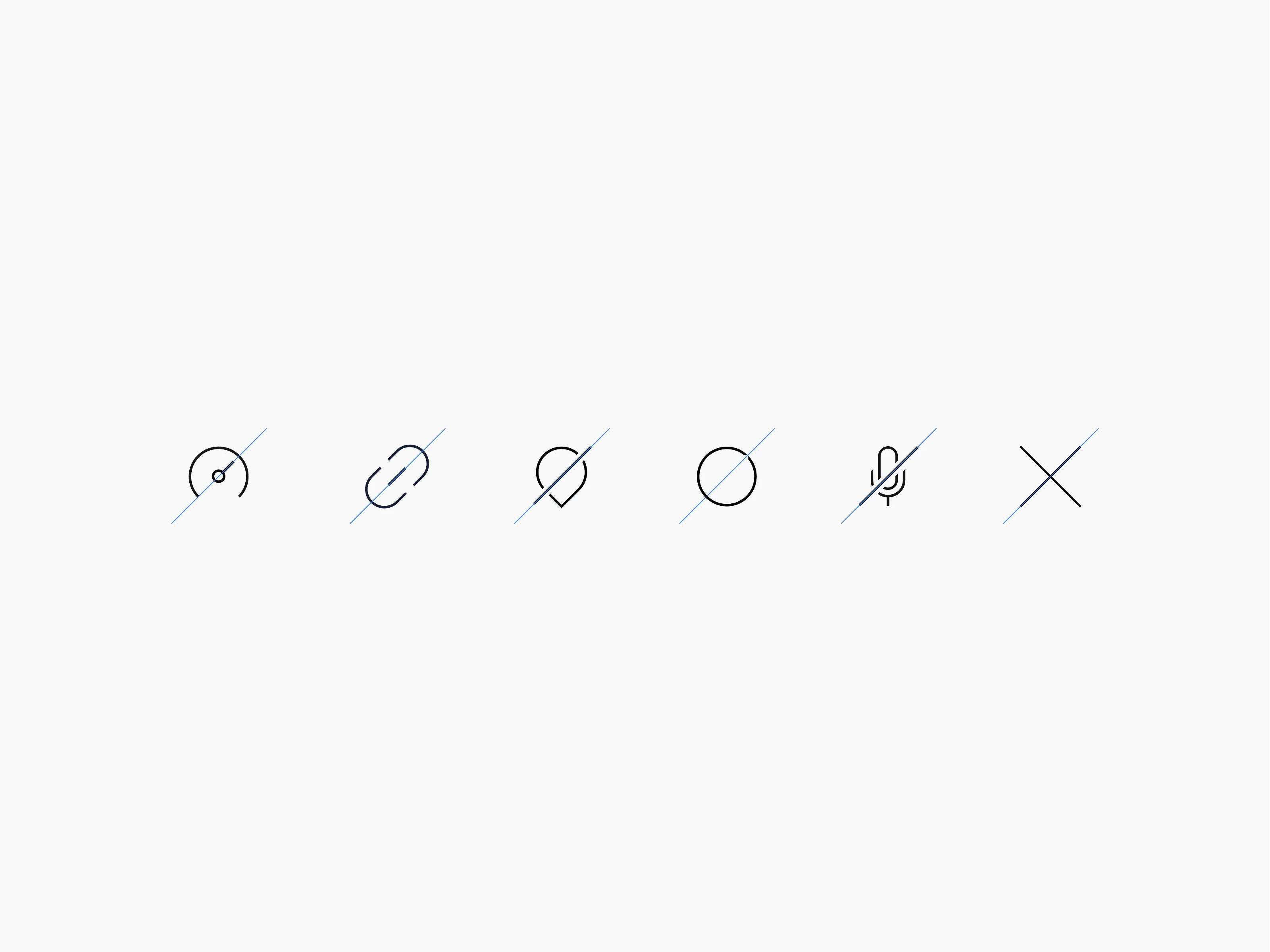
A custom icon set is created based on the new symbol, with diagonal lines representing movement and the future
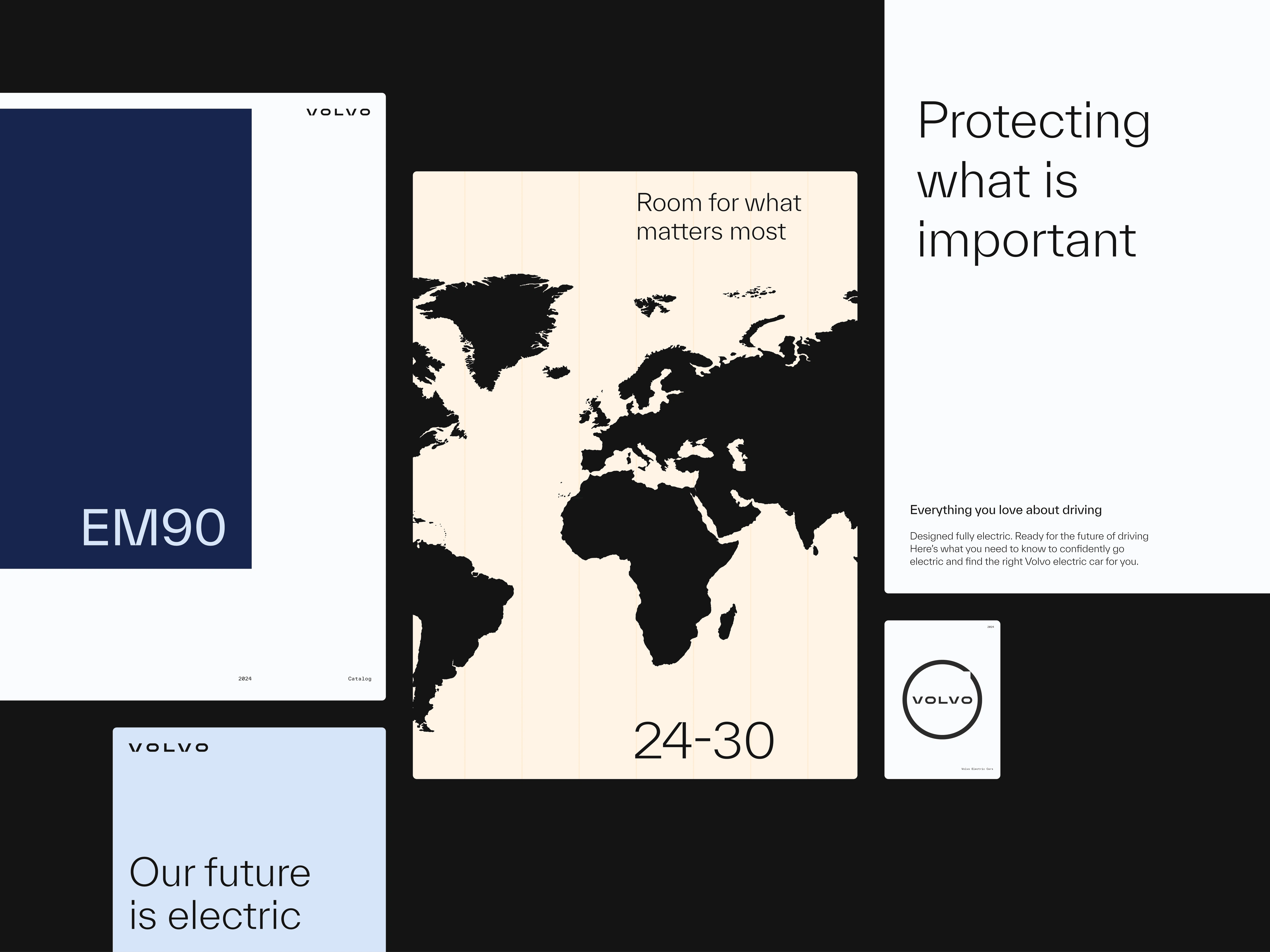
Volvo’s new brand concept for its electric prototypes underscores our commitment to safeguarding what truly matters—our planet. Aligned with a sustainability-focused strategy, we ensure that innovation and environmental responsibility go hand in hand, protecting both our future and the world we live in.


Headquarters
Like this project
Posted Sep 13, 2024
For the launch of its pioneering electric prototypes, Volvo introduces a new brand concept aligned with its sustainability-focused strategy and our planet.
Likes
18
Views
175


