Telediario: Designing a brand for the news of a whole country
Jorge Rico

Telediario is the most important national news program in Spain. Since its beginnings, it has been the informative reference of the public broadcaster RTVE and has aired to the world the most important news of recent history.
To endow the brand with sobriety, reliability, credibility and a modern look has been the starting point for the complete development of this full rebranding of one of the most recognized Spanish-language news programs.
This comprehensive redesign of logo, typographies and general look and feel, the move to a new chromatic palette, and the choice of flat design elements, are the result of the firm intention to modernize the brand and bring it closer to a younger audience in order to turn it into a global icon.
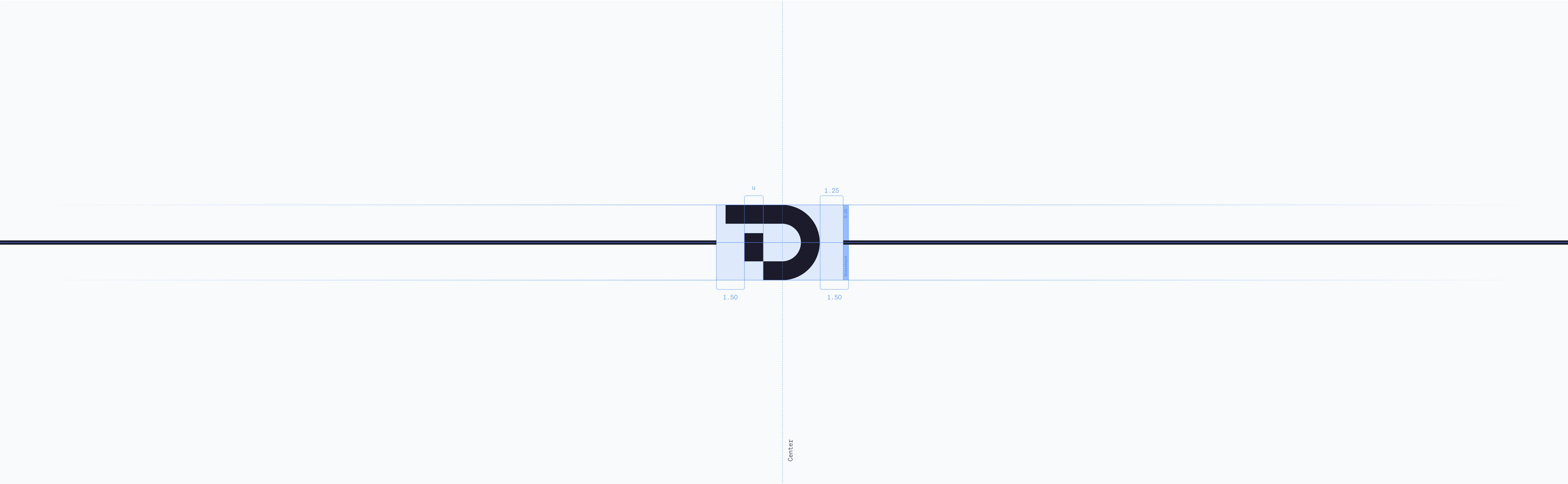
In order for the logo to play a central role in the graphic development of the program, as we will see below, the brand was redesigned and its strategy and narrative were adjusted.
Color
Regarding the chromatic aspect, the decision was taken to move away from the whites and light blues of the previous stage of Telediario, and darken the set to give the space more seriousness.
To the corporate blues of TVE we add black and a dark and dense blue. As accent colors, it was decided that the colors of RTVE and all the brands it encompasses would complete the chromatic palette.
Primary color
Secondary color
Typography
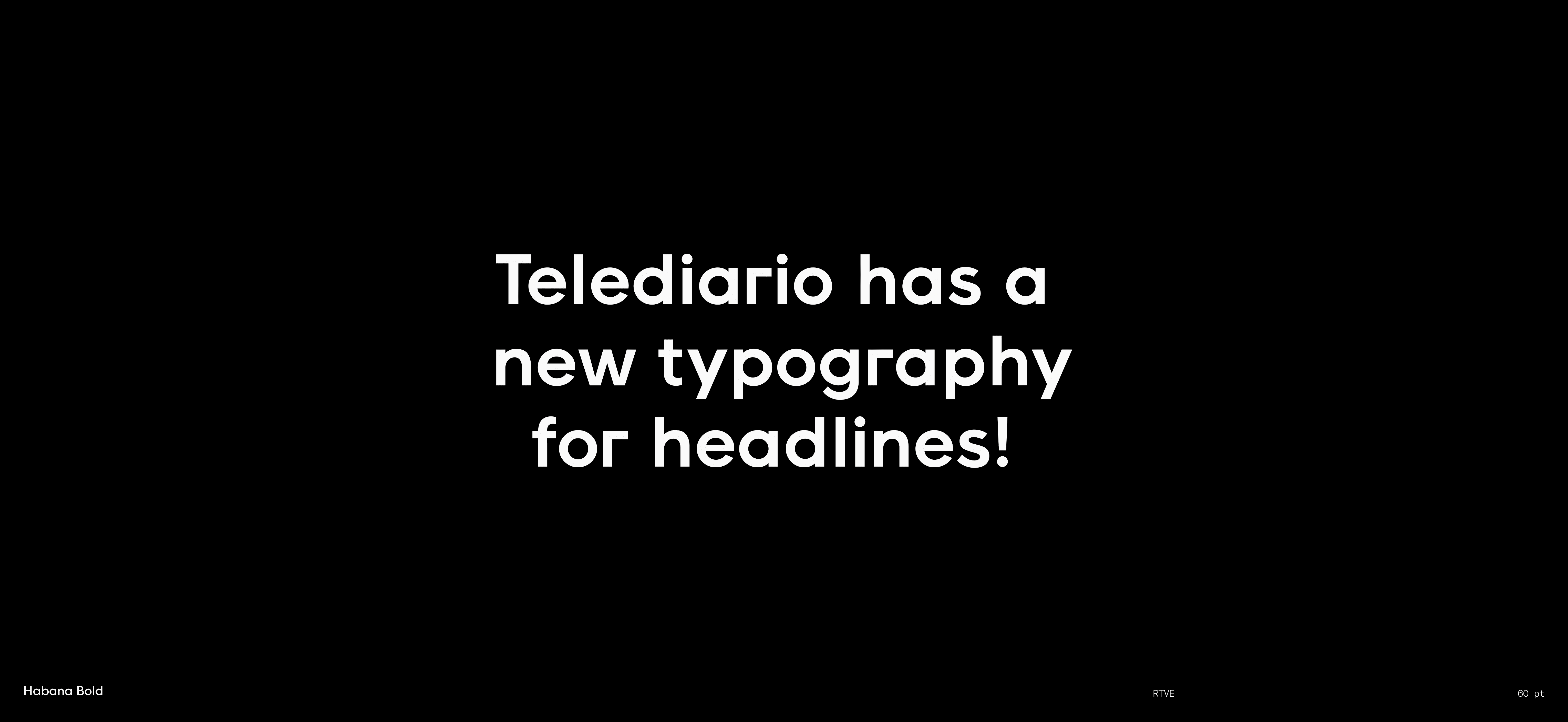
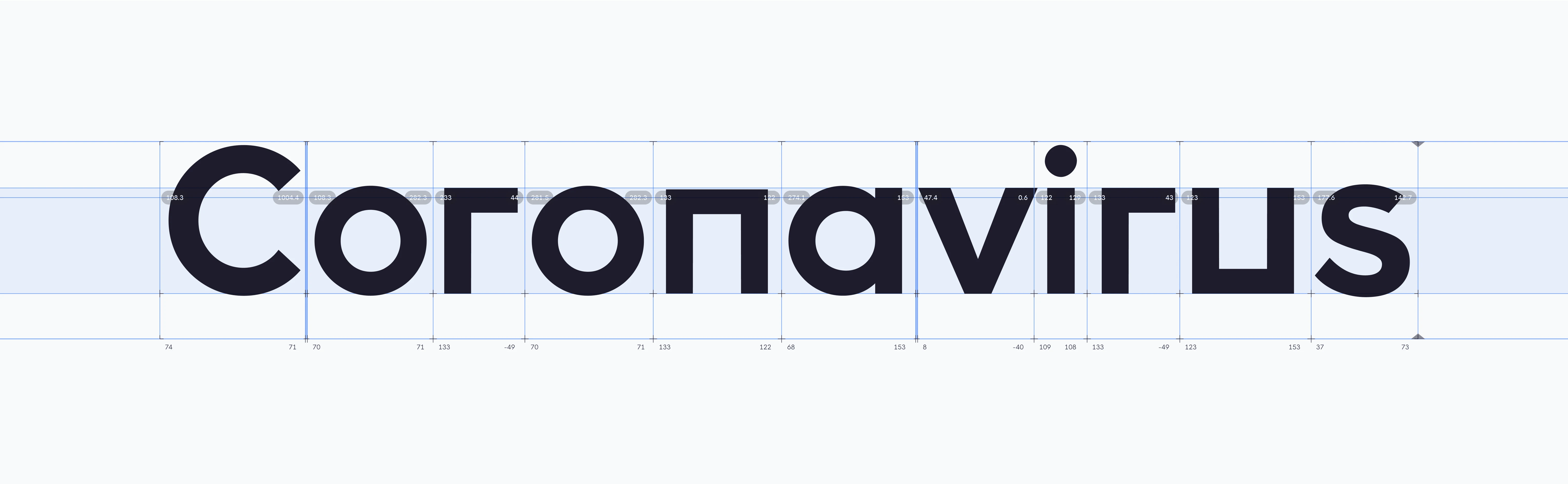
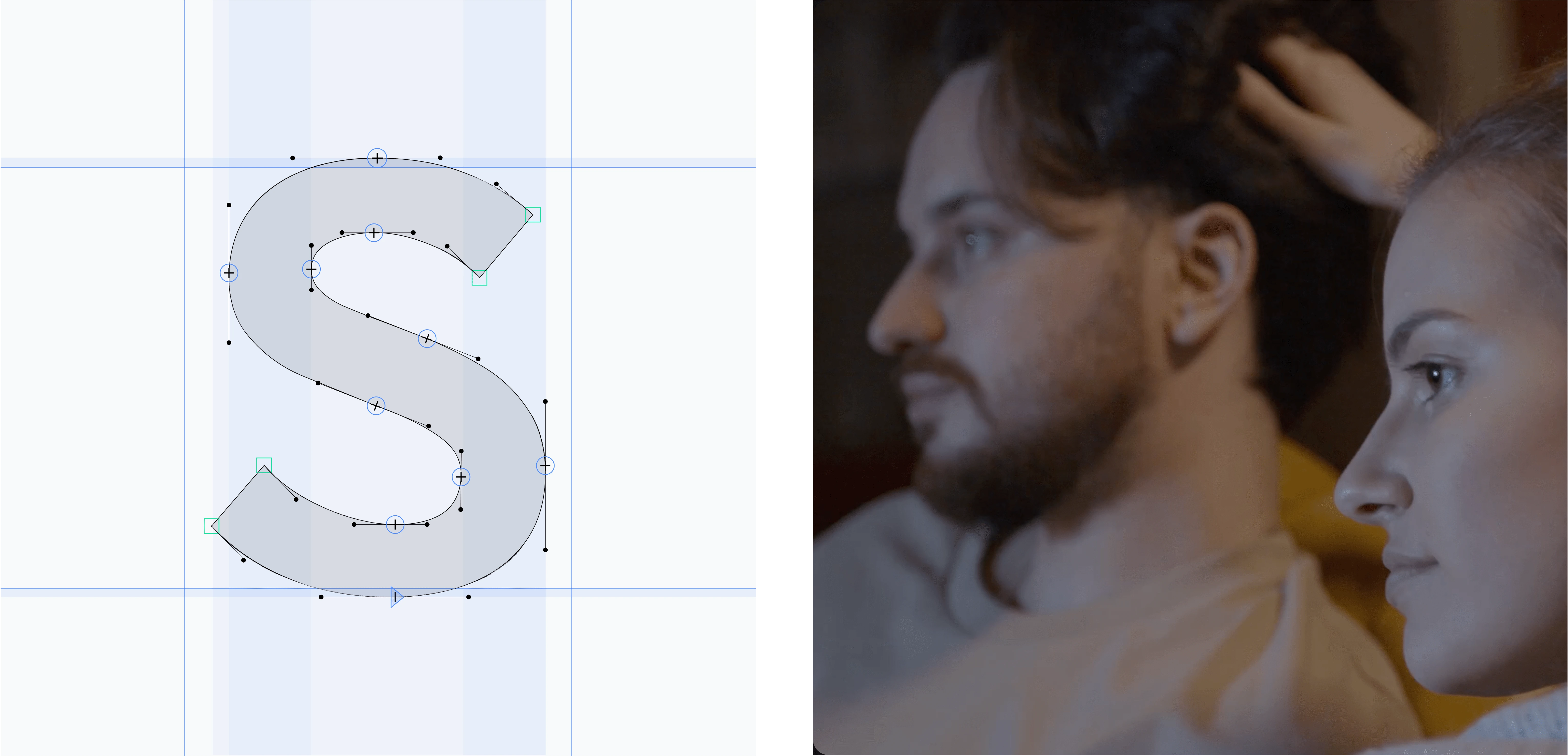
One of the most striking changes in this new stage of the program and its rebrand is the typographic section and the creation of an exclusive typography for the creation of the brand and for on-screen headlines.
To create this typography we extracted some morphological characteristics of the isotype to transfer them to the font developed for it, so that it has a clear continuity in the texts of headlines in headers, badges and screen.
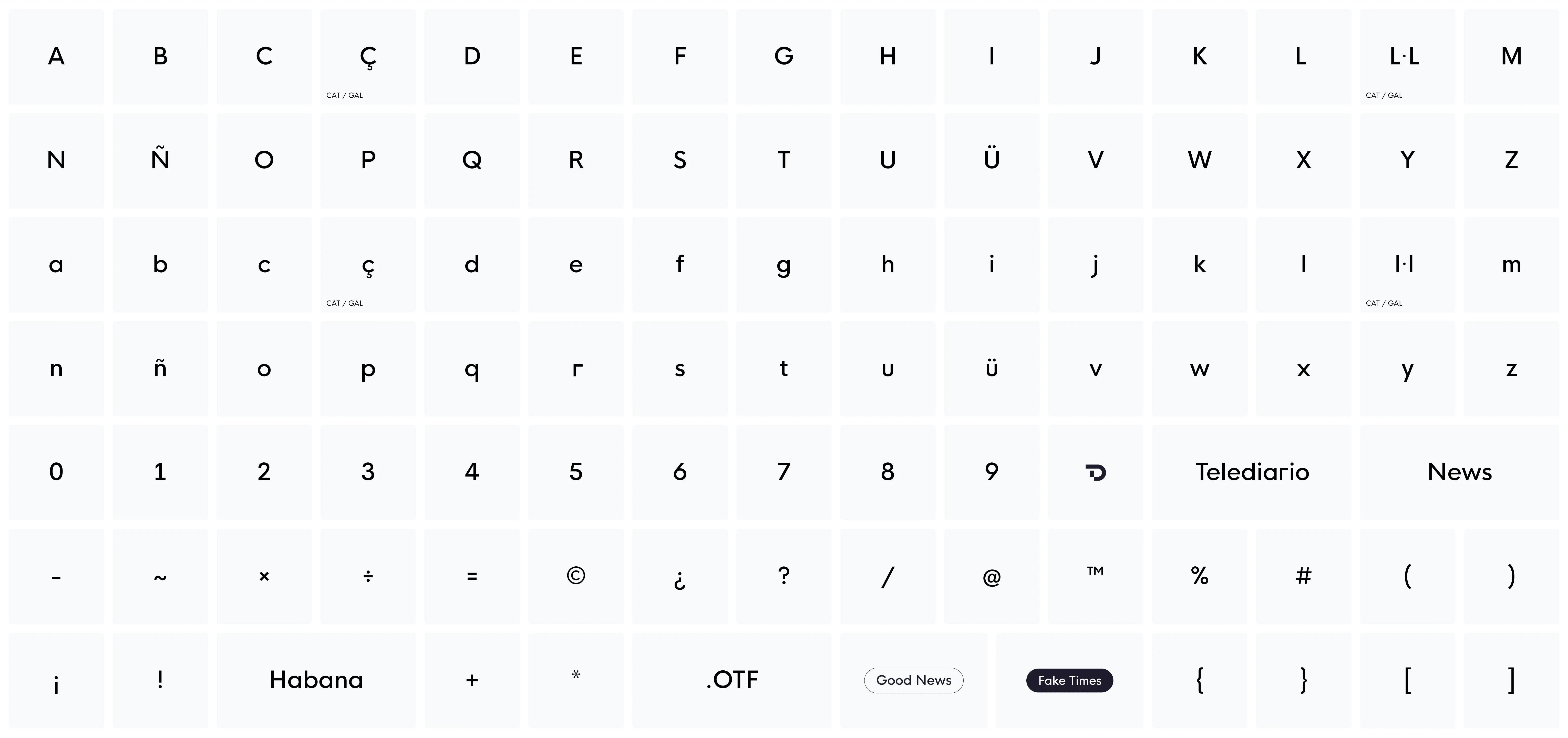
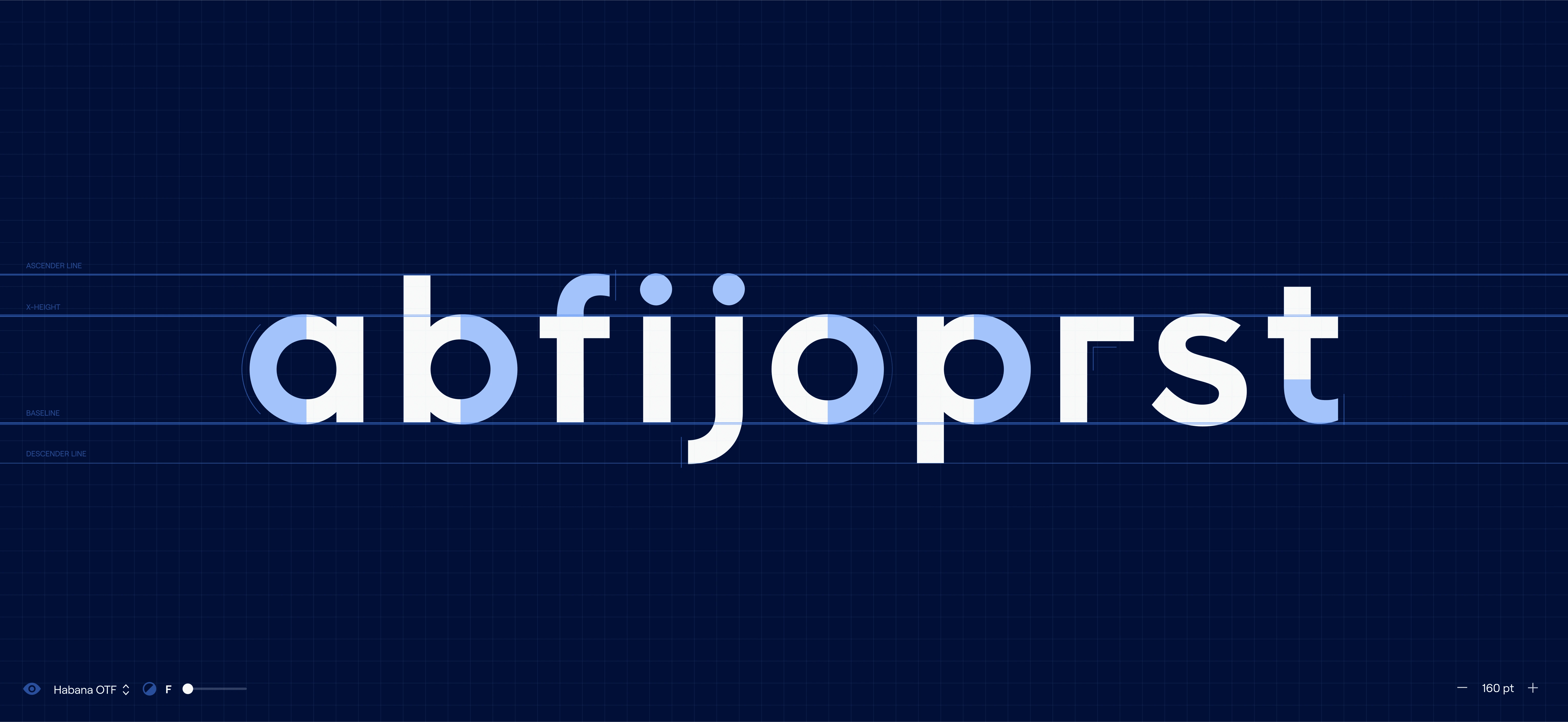
Habana Regular character set
Custom icon set
In order to bring consistency to the whole, the typography is also developed taking as a reference the main typography chosen for program signage.
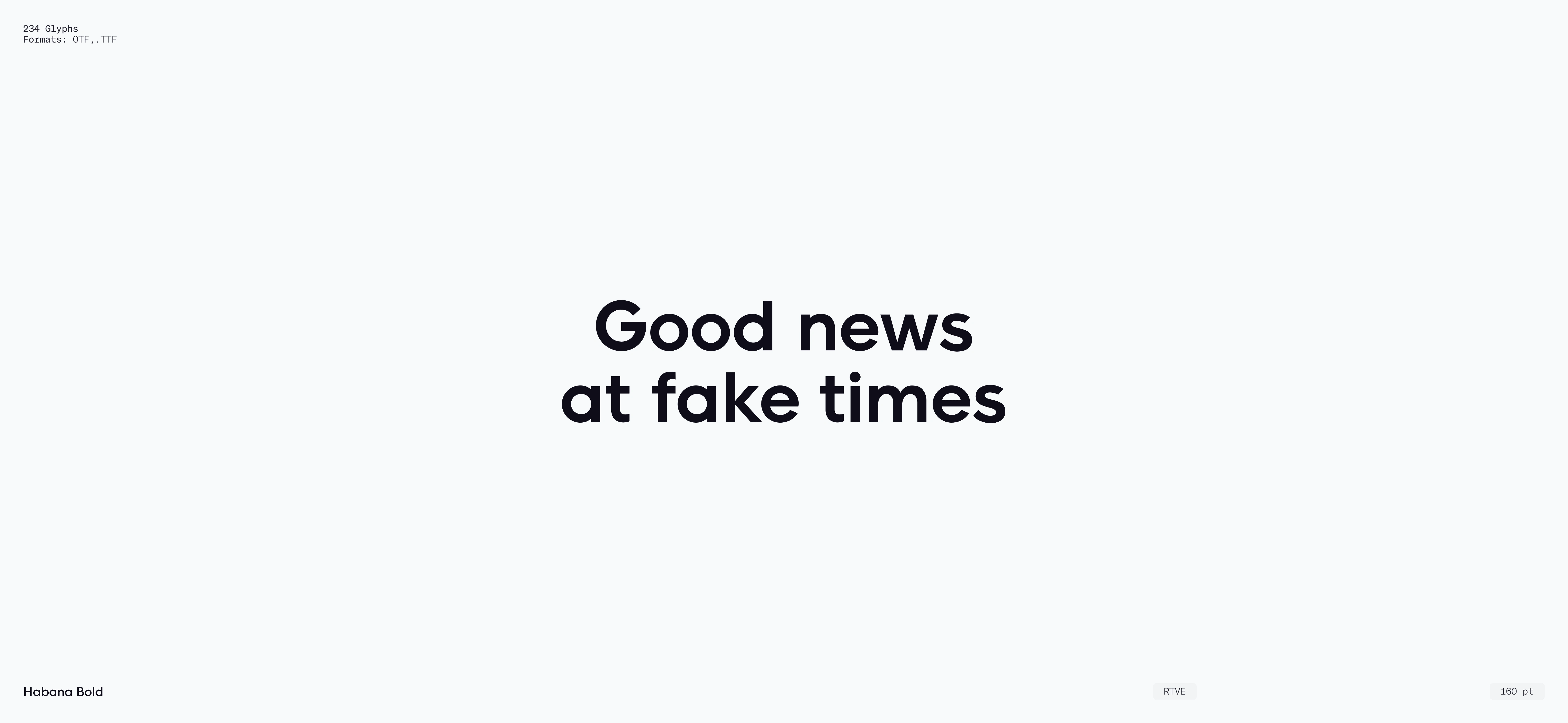
In terms of naming, the typography created is called HABANA, as a tribute to the first TV news studios, located in Paseo de la Habana in Madrid.
ID's
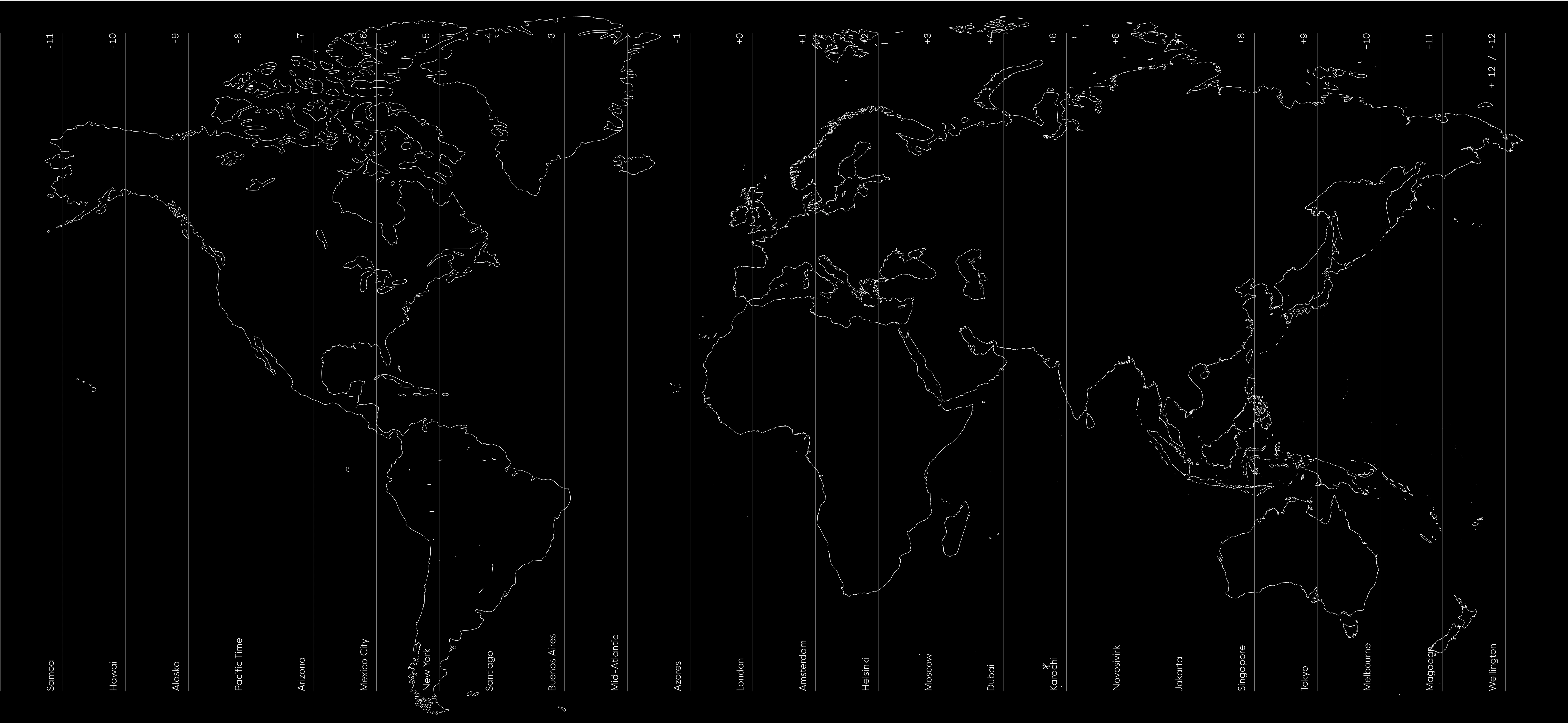
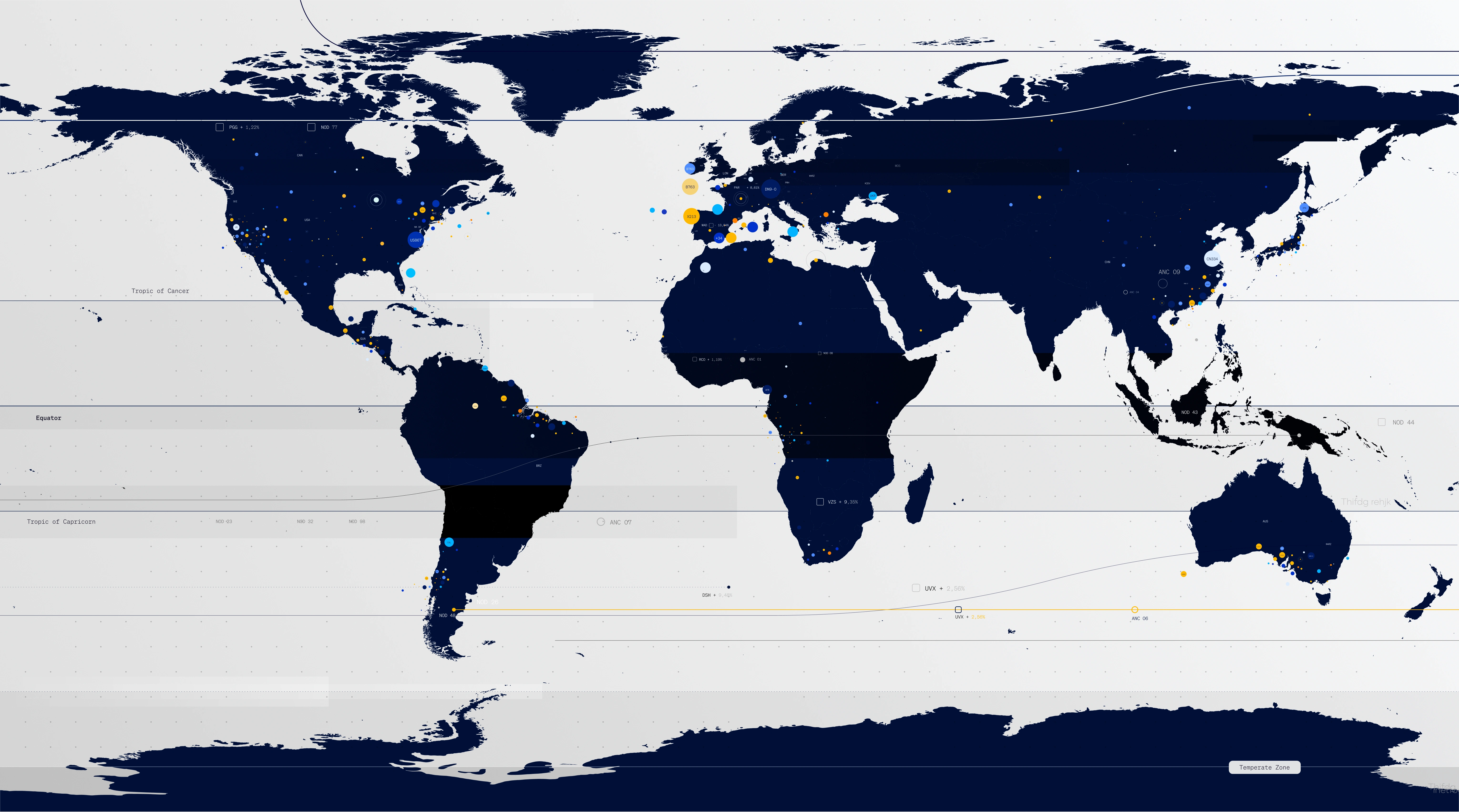
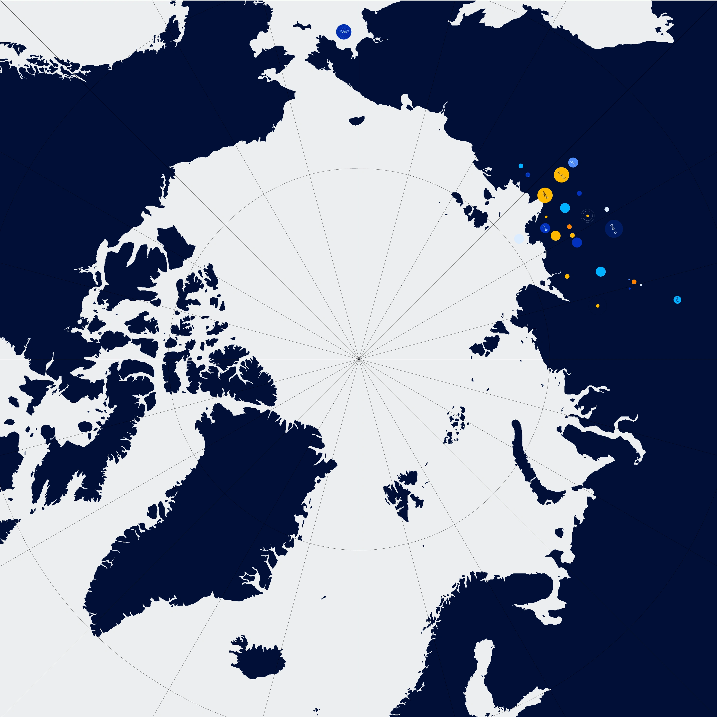
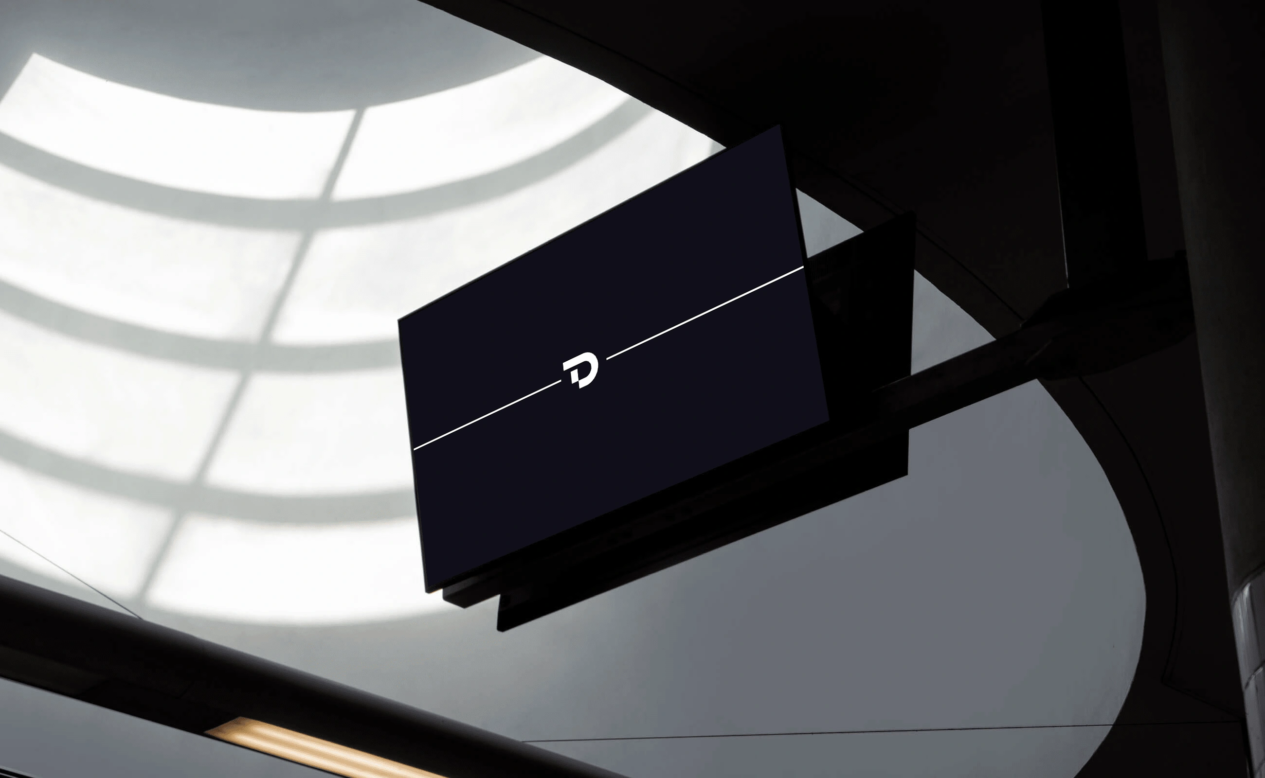
The starting concept on which the new image of the Telediario is structured is the flow of information and data through which the news is possible.
Starting from a map in decomposition, this breaks down into information-carrying lines that take us from one point to another, to finally form the new logo created from data modules.
ID
Navigation line logotype
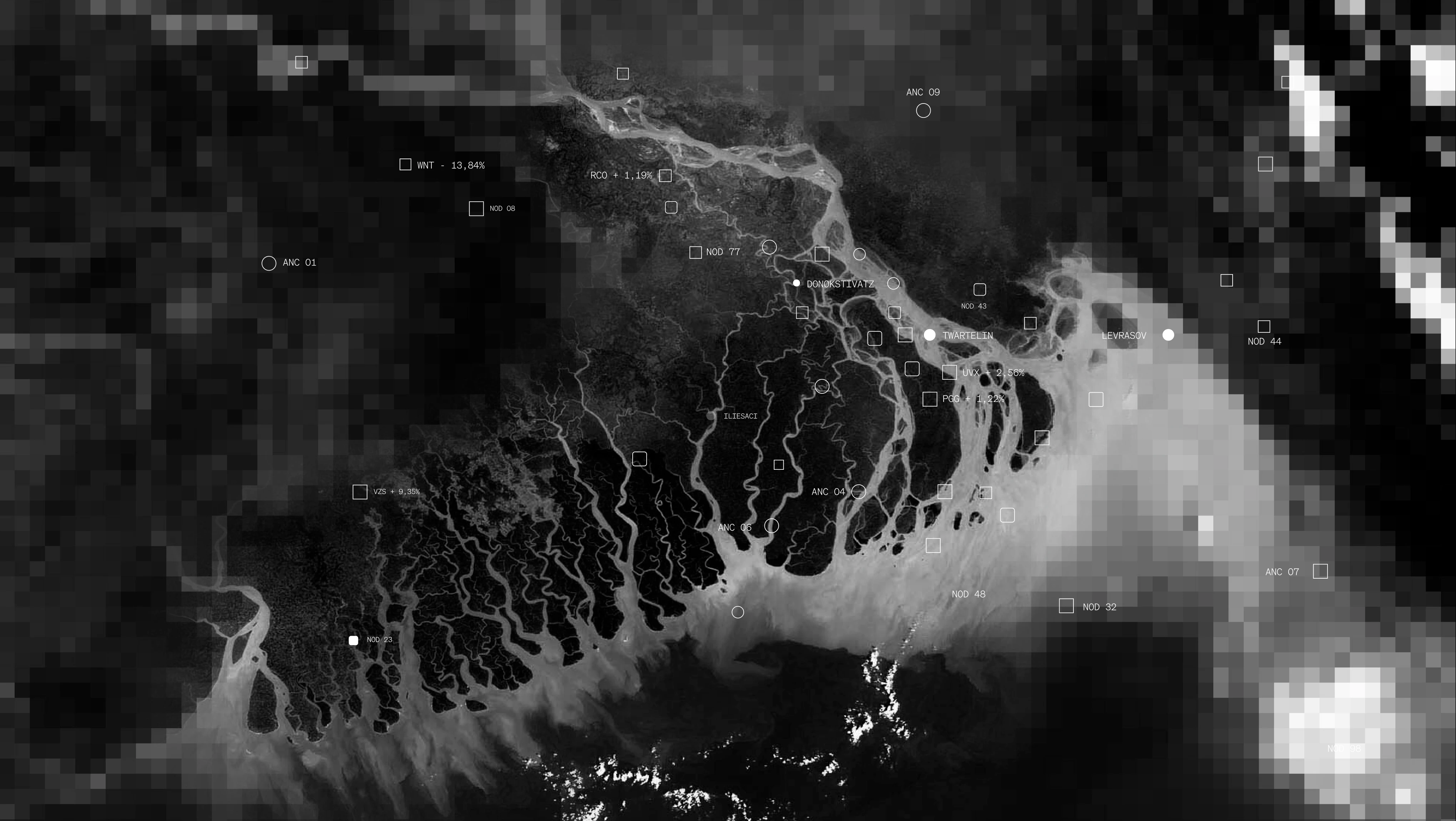
Data
Navigation
In order to reinforce the program’s recognition, facilitate message transmission and collaborate with the dynamics of the news, an iconic element is created: the navigation bar, presented both vertically and horizontally. This bar is the vehicle for the arrangement and appearance of information in a single space or box, varying its size according to the signage needs.
The key innovation is the application of UX/UI to screen navigation, optimizing the communication of information.
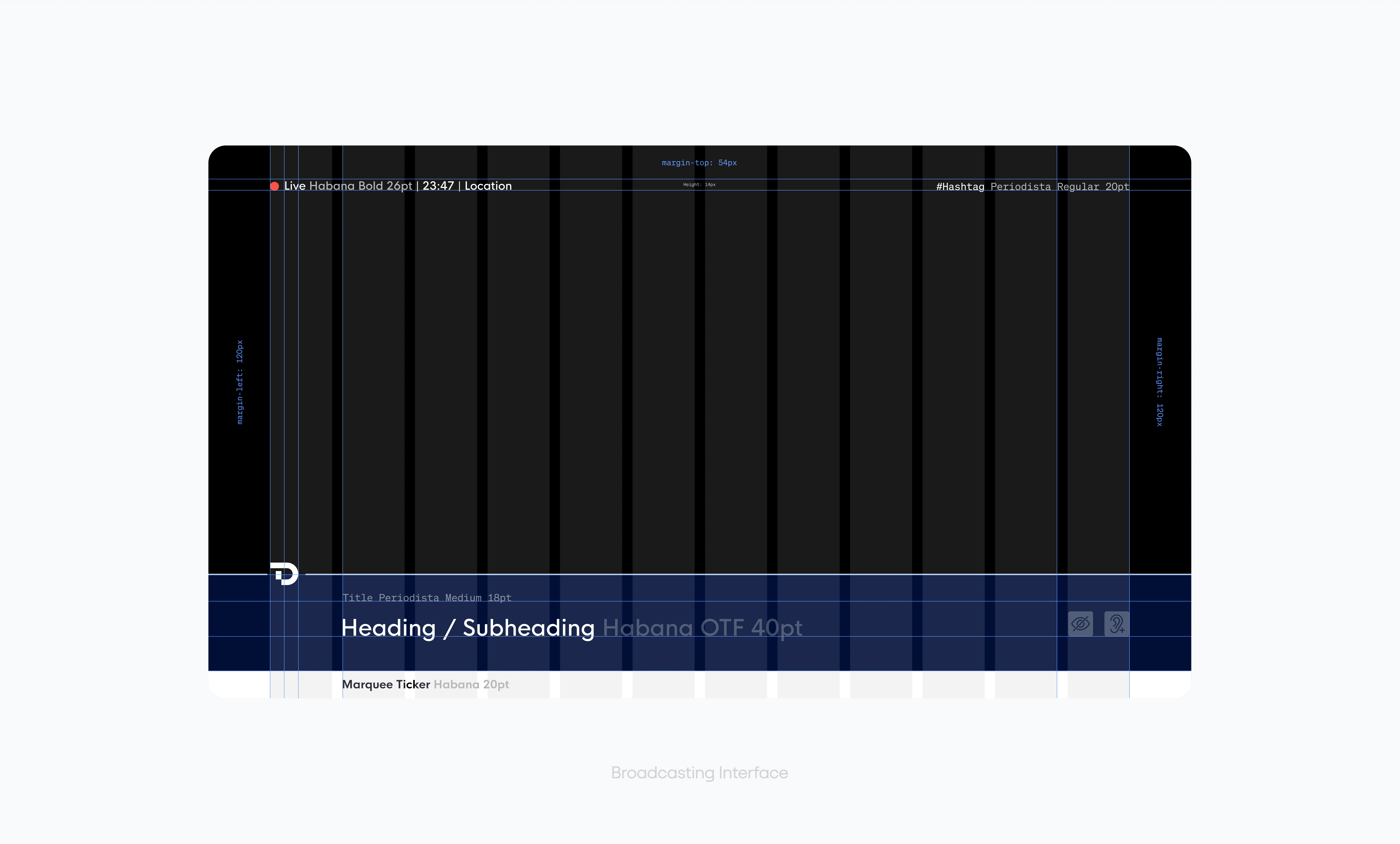
UX applied to broadcasting screens
Infographics
The pieces commonly used for infographic composition have been refreshed, adapting their shapes and colors, and creating animation dynamics that facilitate the understanding of the elements that appear in them during their brief time on screen.
A great collaboration with Visualzink
Like this project
Posted Sep 16, 2024
Full rebranding of RTVE's Telediario, the most important news program in Spain and, without a doubt, one of the most exciting branding projects I have ever work
Likes
1
Views
75