Cozy
Valentin Fernandez
Case Study
Designing a thermostat app. Covering my thinking and visual skills behind an iPhone app that contains some minor flow around a smart thermostat app. Understanding the industry in order to build a product tailored to these specific users.
Research
Goal: Using an app can make things easier but at times comes in as second choice when making changes, I wanted to know why users would prefer using the hardware over the application provided to them with their thermostat.
Is using the mobile app easier? if not, why?
If a user is away from home, what would make things more convenient?
Results
After sending out the survey I was able to find that most people would rather change their thermostat manually as opposed to changing it on their mobile app. This was due to their thermostat app being poorly made. This raised another issue because I had to frame the question on assuming that the app ran smoothly, as it should.
Majority of users said that they like to make changes to the temperature while they were away in order to not waste energy.
Empathizing with the user
After gathered my semi-meaningful data, I gathered the needs of the app
Strong call to actions
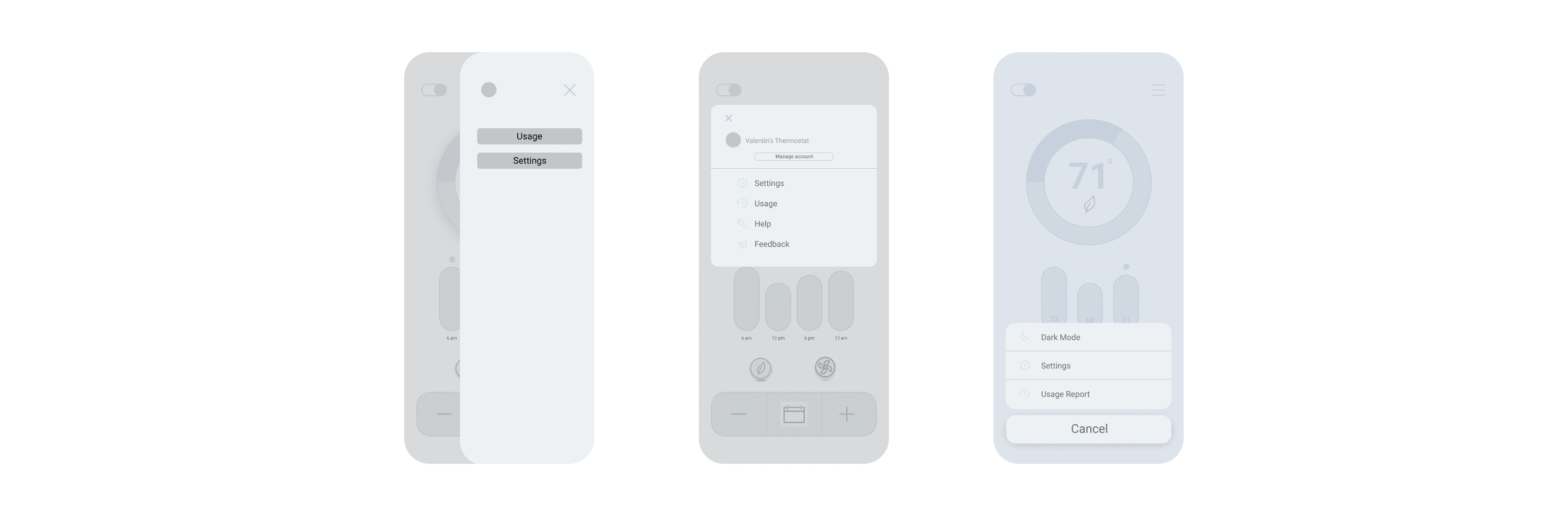
Nav bar with minimal options
Convenience
Quick Navigation
Research
I did some research on competitors and found somethings I wanted to use for my prototype
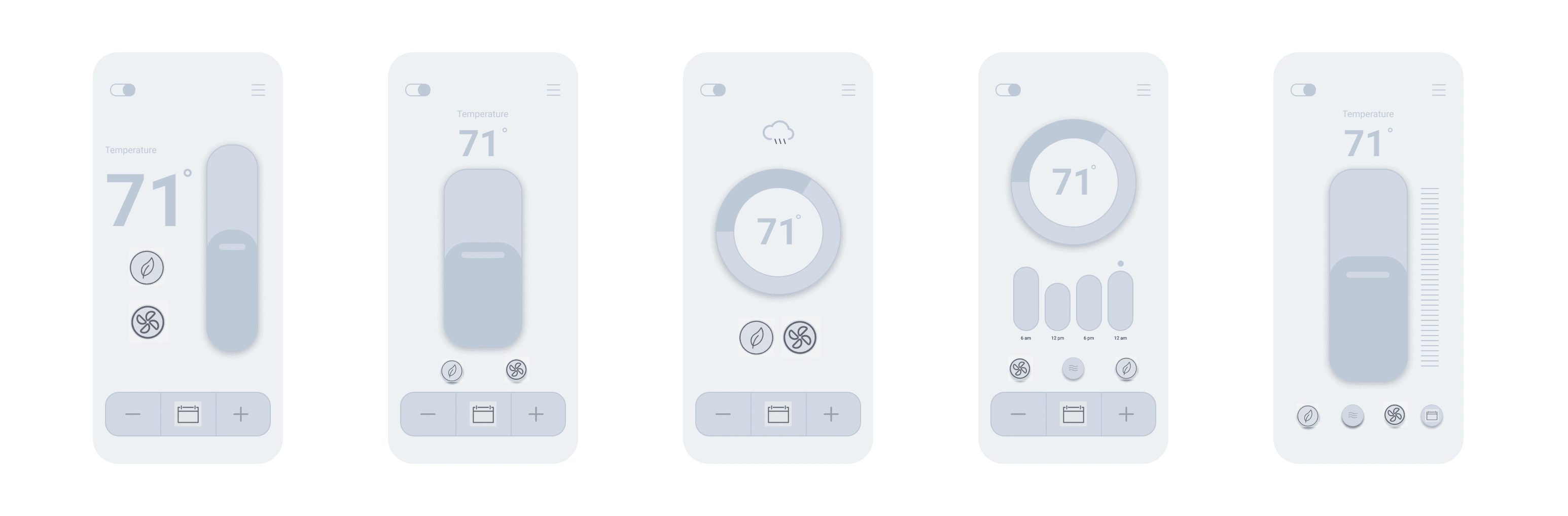
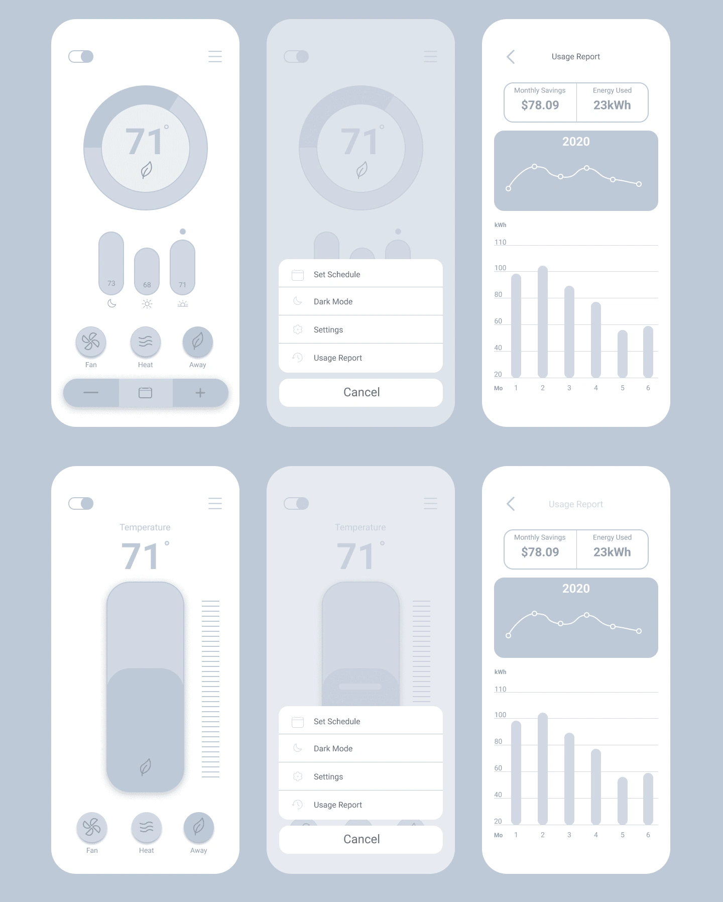
Show current temperature
Small space for goal temperature
Icon for scheduling
Icon for fan speed
Eco-friendly/Away Mode
Prototype/Testing
Roasts, Obstacle, and Discoveries
After molding my wireframes around the survey, I stood in front of an obstacle. I had two different pages that I felt could help engagement/usage on the app. One allowing the user to press the familiar -/+ buttons on the bottom the screen to indicate higher or lower, placing a schedule icon in the middle to smoothly transition to scheduled changes. While also leaving room for a quarterly temperature stamp for each day. The other having options at the bottom but leaving more space for the editing of temperature, laid back design allowing for an ease of use.
I was obviously quite biased which one I wanted to move forward with but did some testing of my own to see if I could reassure my design.
I ended up finding out that platforms like Reddit or Discord aren't very fond of the A/B comparison.
Neither. Go back to Linkedin.
It wasn't all bad though, I was able to get some feedback worth keeping. A real *meaningful* A/B test would look something more like me testing a usable prototype with both pages and comparing them based on usage, clicks, obstacles. However, I didn't have much time to spend on that. I used friends and family and took them through a scenario instead. Although it wasn't the data that I wanted I moved forward with what I had.
Changes
Users had no idea what each of the buttons did. I ended up adding text under the icons to make it clear what action I'm conveying.
I used Icons of each time of the day. Midnight, Noon, and Afternoon to reduce noise.
I made the navbar a bit smaller in order to increase accessibility.
I added what status the temperature is currently on. Heat, Fan, and Away.
My Process
Like this project
Posted May 18, 2022
Thermostat App | Case Study
Likes
0
Views
57