
The Goal
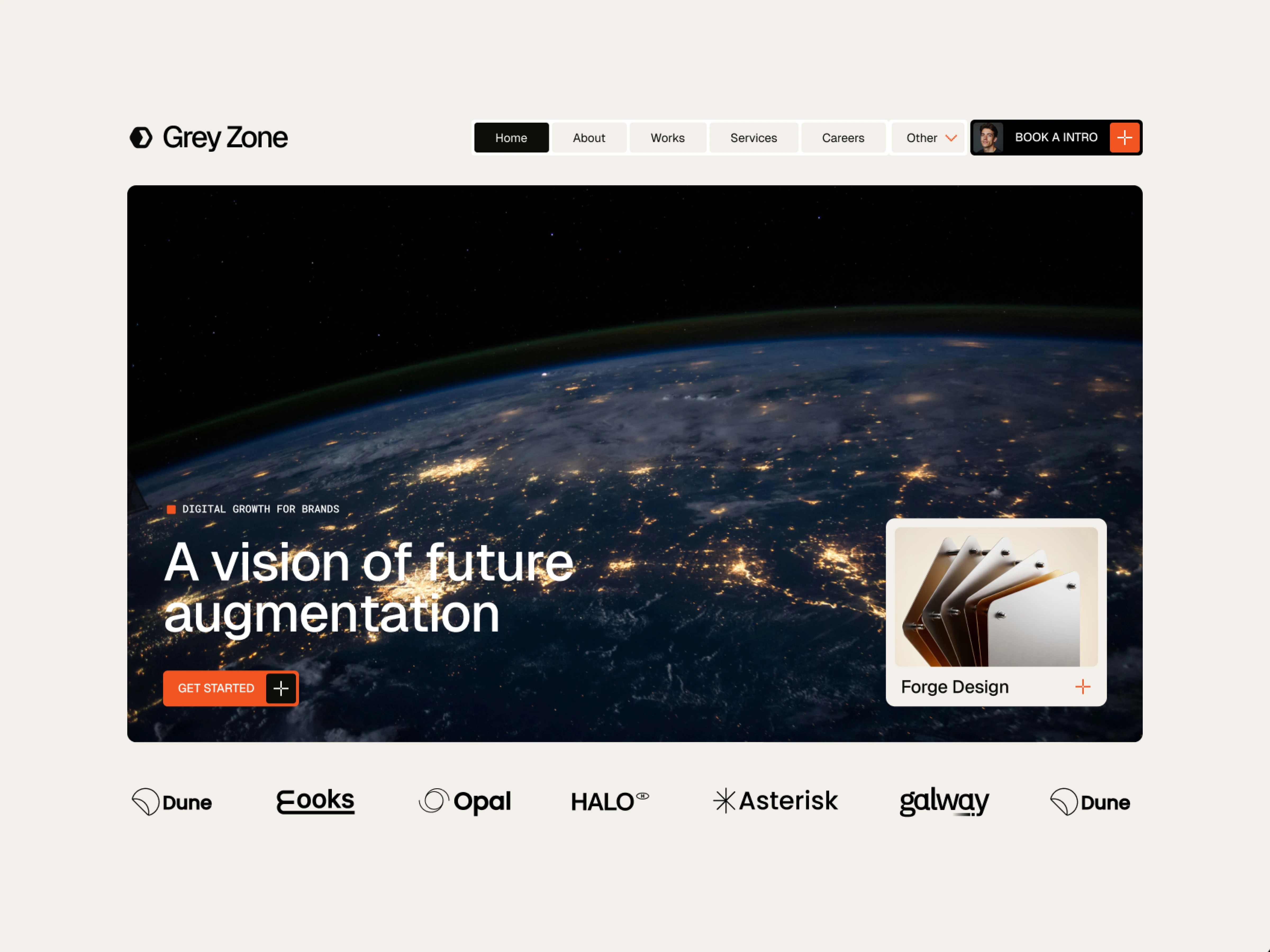
Creative agency websites often blend together with generic templates or overly chaotic layouts that bury the actual work. The goal here was to design a sharp, editorial hero section for Grey Zone that balances bold visual storytelling with clear, high-intent conversion paths.
Design Decisions
High-Contrast Editorial Framing: Set a full-bleed orbital Earth visual inside a rounded container against a warm off-white background—giving the layout breathing room while keeping the focal point crisp and immersive.
Tactile, Modular Navigation: Designed a pill-style top navigation bar with a high-contrast active state and a personalized Book an Intro CTA featuring a founder avatar to make outreach feel direct and human.
Clear Value & Featured Work Preview: Paired a punchy eyebrow tag ("DIGITAL GROWTH FOR BRANDS") and bold white typography ("A vision of future augmentation") with a Get Started CTA on the left, balanced by an interactive Forge Design case study card on the bottom right.
Immediate Social Proof: Anchored the bottom of the fold with a clean monochrome client logo strip (Dune, Eooks, Opal, HALO, Asterisk, galway) to establish credibility before the first scroll.
Deliverables
High-fidelity hero UI design (Figma)
Modular navigation & CTA component system
Responsive layout & visual hierarchy structure
Tools Used: Figma
0 likes · 1 view · Nov 16, 2026
An editorial, conversion-focused hero exploration for a digital growth agency, pairing bold visual storytelling with modular navigation a featured case study.
