
The Goal
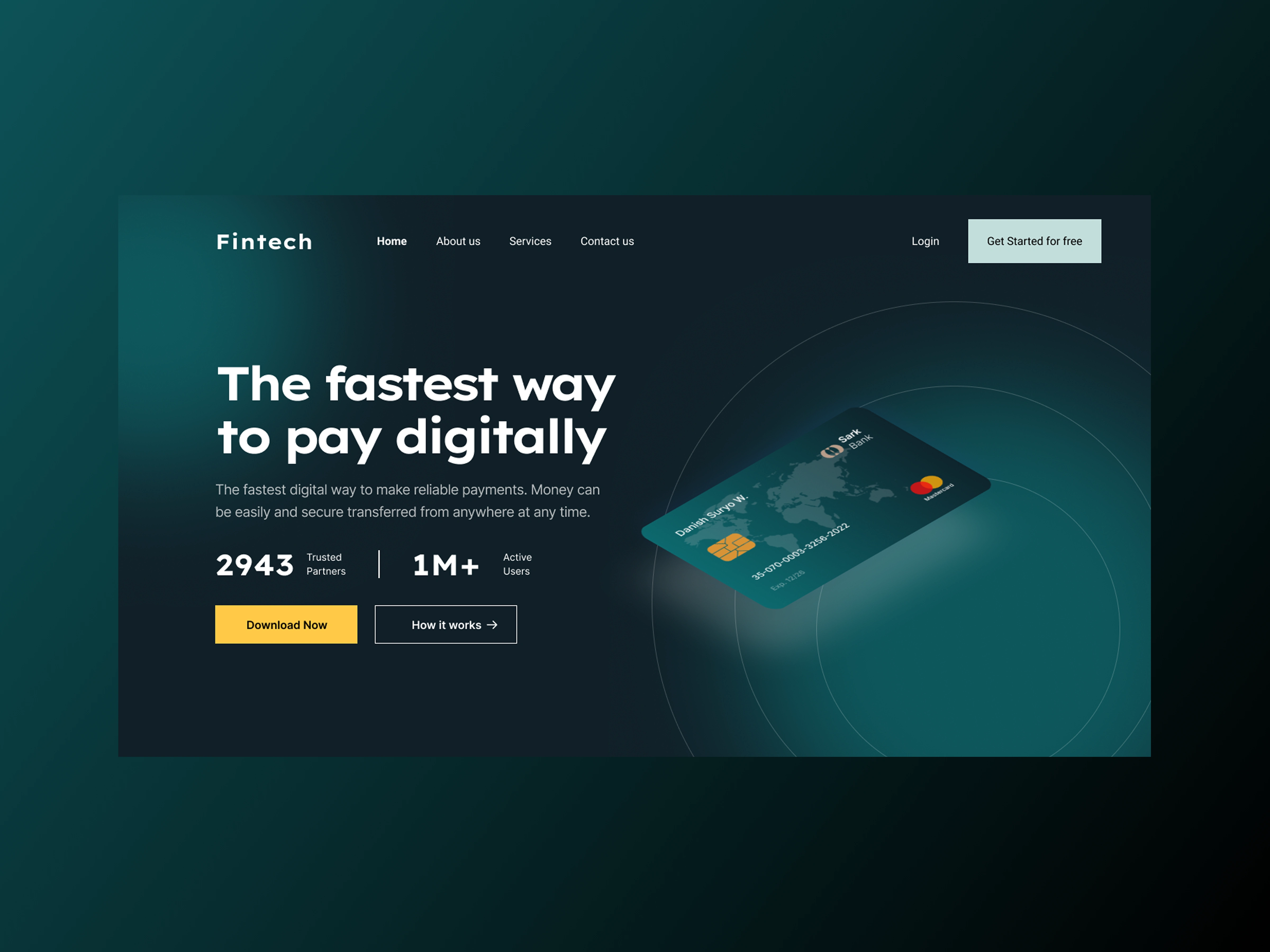
Digital banking tools often feel overly technical, cold, or cluttered with financial jargon. The goal here was to design a high-converting hero section for a modern payment platform that immediately communicates speed, security, and trust, without overwhelming first-time visitors.
Design Decisions
Visual Hierarchy & Contrast: Paired a deep teal-to-charcoal radial gradient with crisp white typography to anchor the core value proposition ("The fastest way to pay digitally") right at eye level.
Trust Signals Above the Fold: Highlighted key traction metrics (2,943 Trusted Partners and 1M+ Active Users) directly beneath the subcopy so visitors get immediate social proof before scrolling.
Clear Action Paths: Used a warm amber-yellow primary CTA (Download Now) to draw the eye to the main conversion goal, balanced by a clean ghost button (How it works) for users who want more context first.
Product-First Visual: Featured a realistic, angled virtual Mastercard on the right side set against subtle orbital rings, giving the layout depth and reinforcing the idea of global, borderless transfers.
Deliverables
High-fidelity hero UI design (Figma)
Custom card asset & visual styling
Responsive layout structure & component system
Tools Used: Figma
0 likes · 0 views · Nov 13, 2026
A conversion-focused hero exploration for a digital banking platform, designed to highlight speed, trust, and clear user actions above the fold.
