
The Goal
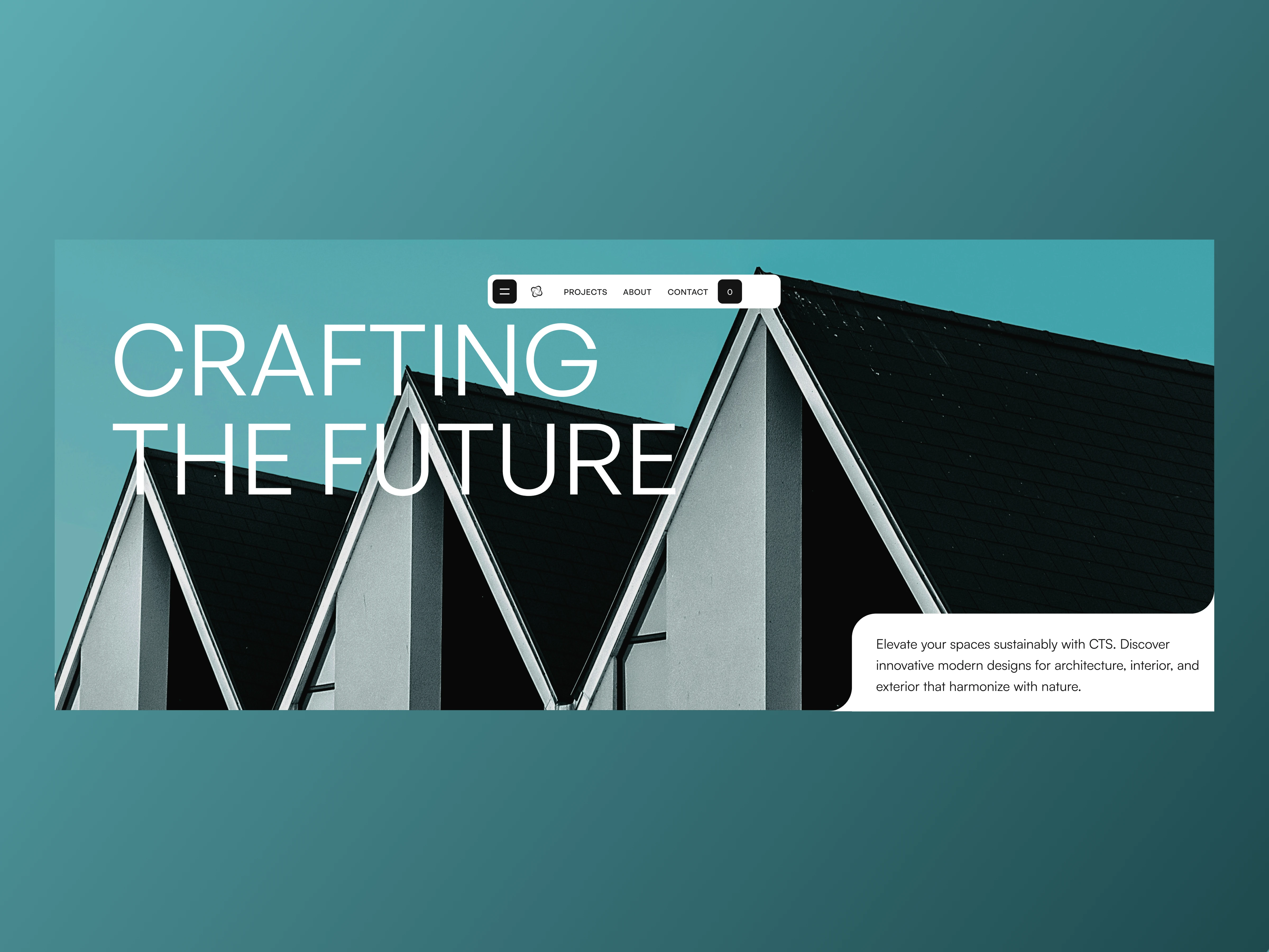
Architecture portfolio websites often fall into two extremes: overly minimal grids that feel sterile, or heavy galleries that hide the studio's core identity. The goal here was to design an editorial, visually striking hero section for CTS that lets architectural geometry lead the composition while keeping navigation and brand positioning effortless.
Design Decisions
Layered Typographic Depth: Set oversized, clean white typography ("CRAFTING THE FUTURE") across the sky and layered the sharp pitched rooflines directly over the lower half of the lettering—creating immediate spatial depth.
Compact Floating Navigation: Centered a crisp white pill navigation bar (Projects, About, Contact) flanked by a menu toggle and search icon so the header stays functional without interrupting the full-bleed sky.
Editorial Inset Copy Card: Tucked the studio's positioning statement ("Elevate your spaces sustainably with CTS...") into a clean white corner card with an inverted rounded cutout at the bottom right, balancing the heavy visual weight on the left.
Harmonized Color Palette: Used the natural cool teal sky and crisp monochrome architecture to establish a calm, sustainable aesthetic without needing extra decorative elements.
Deliverables
High-fidelity hero UI design (Figma)
Layered visual & typography composition
Responsive layout & navigation component system
Tools Used: Figma, Adobe Photoshop.
0 likes · 0 views · Nov 19, 2026
An editorial hero exploration for a sustainable architecture studio, combining layered typography, geometric photography, and a floating pill navigation bar.

