Golden Weekend
Cameron Maher
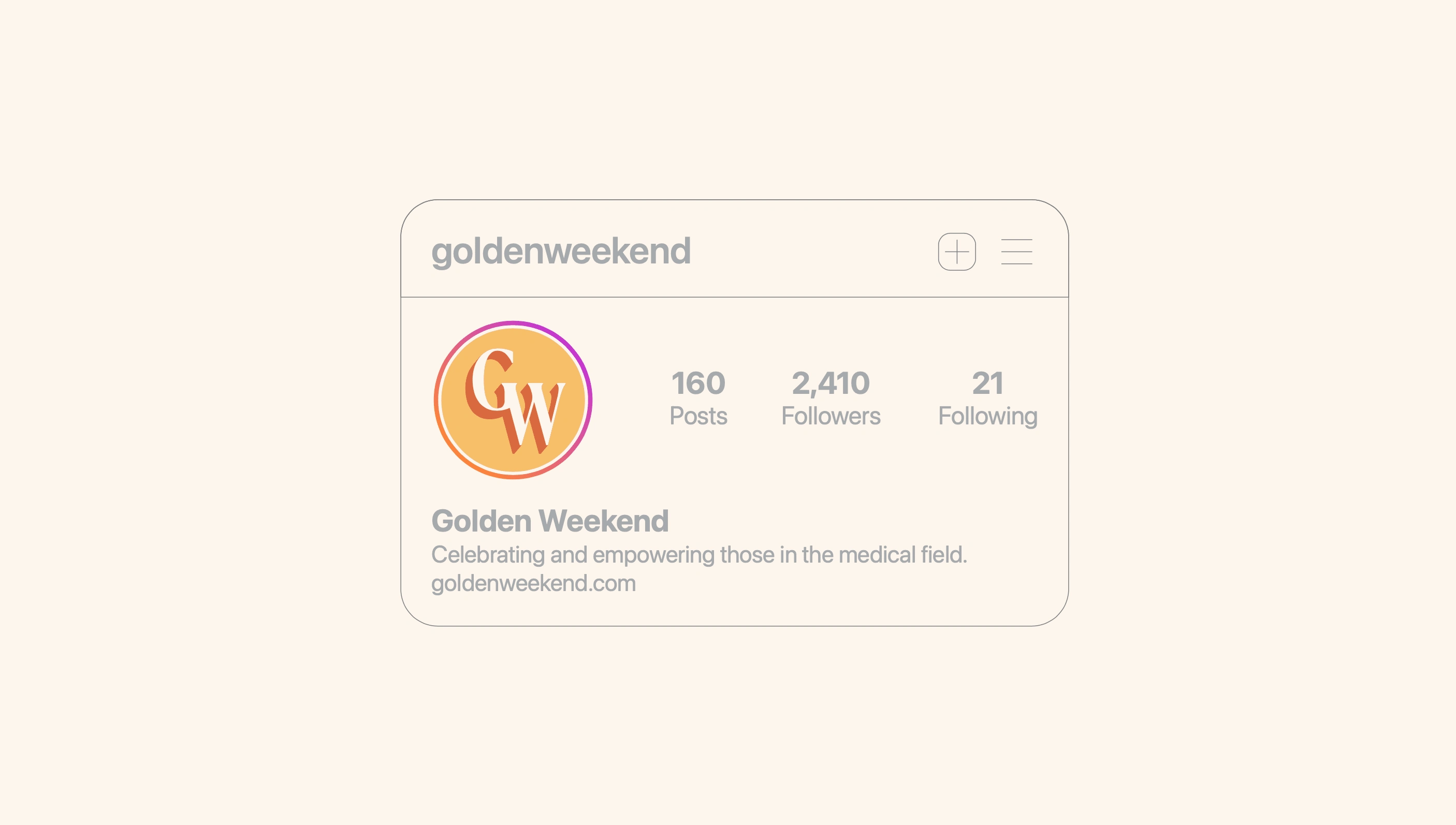
Golden Weekend is a budding community focused on medical residents.
Medical residents are often overlooked and underpowered in the medical field. So, when my client saw a need for a space for people to communicate and feel empowered the idea came into focus to create one himself!
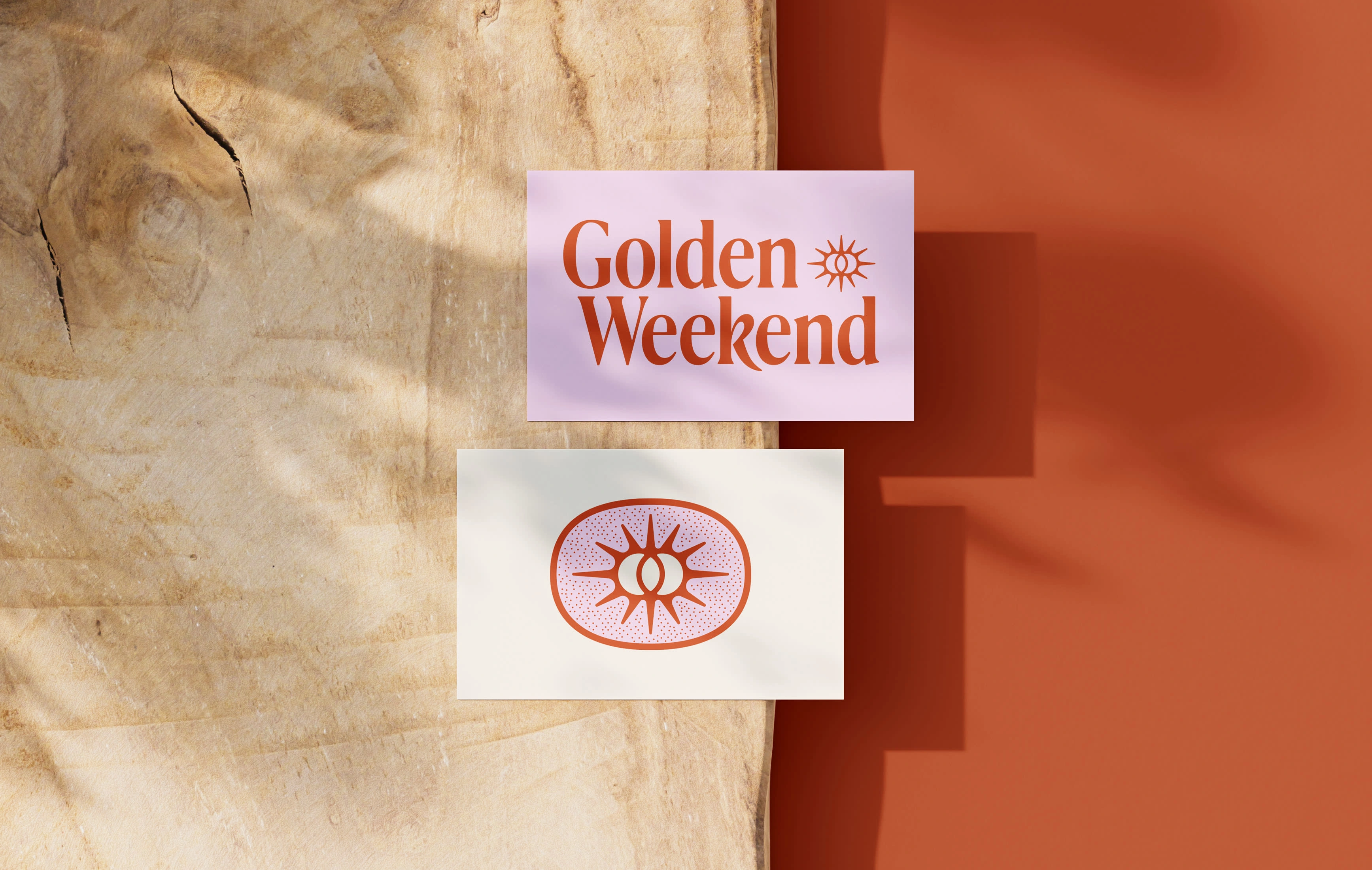
I had the opportunity to work closely with GW's founder to develop the visual identity. The goal was for the visuals to not remind you of something in the medical space at all. The vision for Golden Weekend is to provide an identity outside of the workplace, one of freedom – hence the name, which refers to the "golden" situation when a resident has both Saturday and Sunday off.
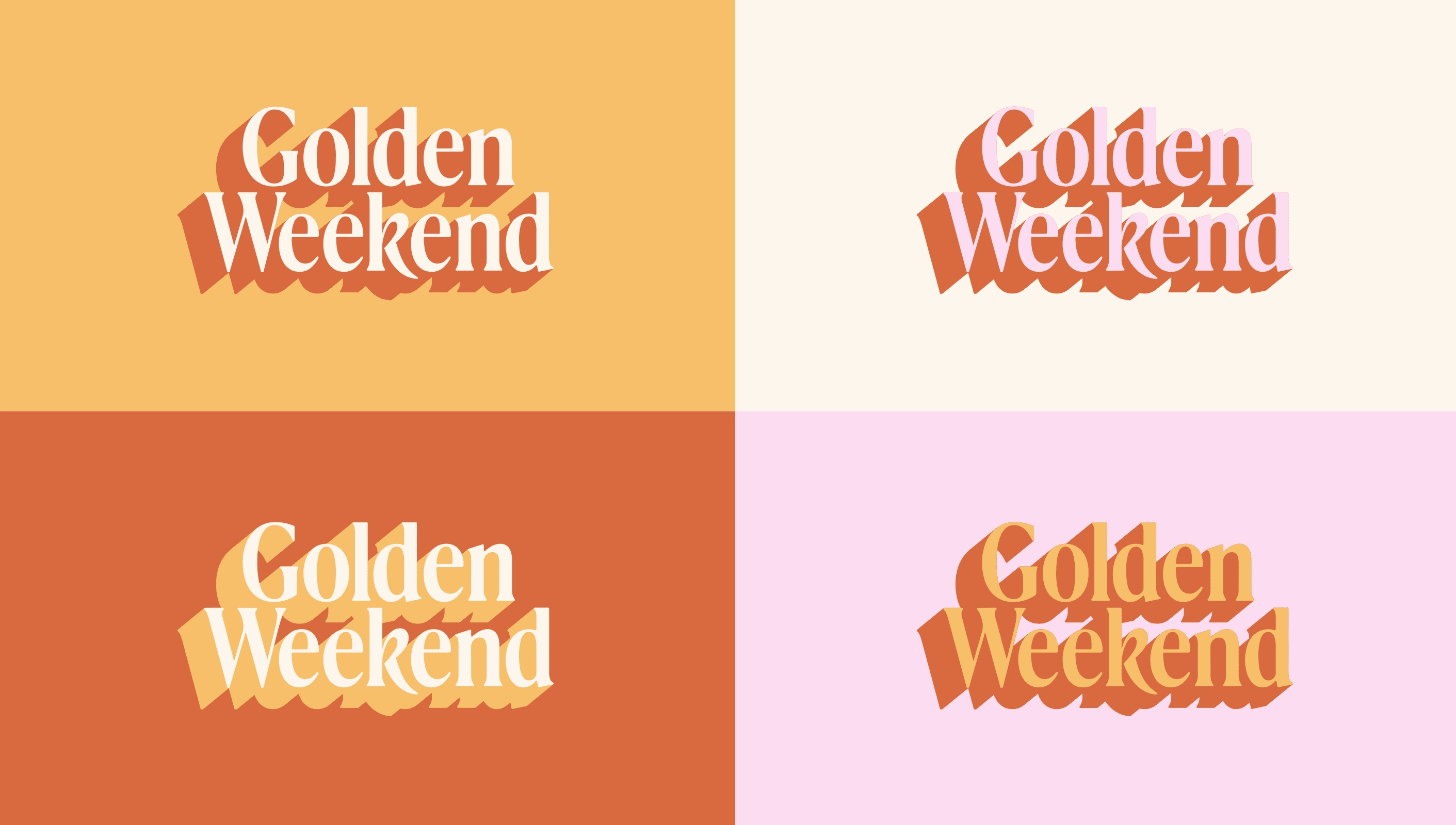
My initial research led me down a path of visual relaxation. Typography that felt like it was taking a big morning stretch. Colors that felt familiar and worn-in. A simple combination of the familiar and the unique.
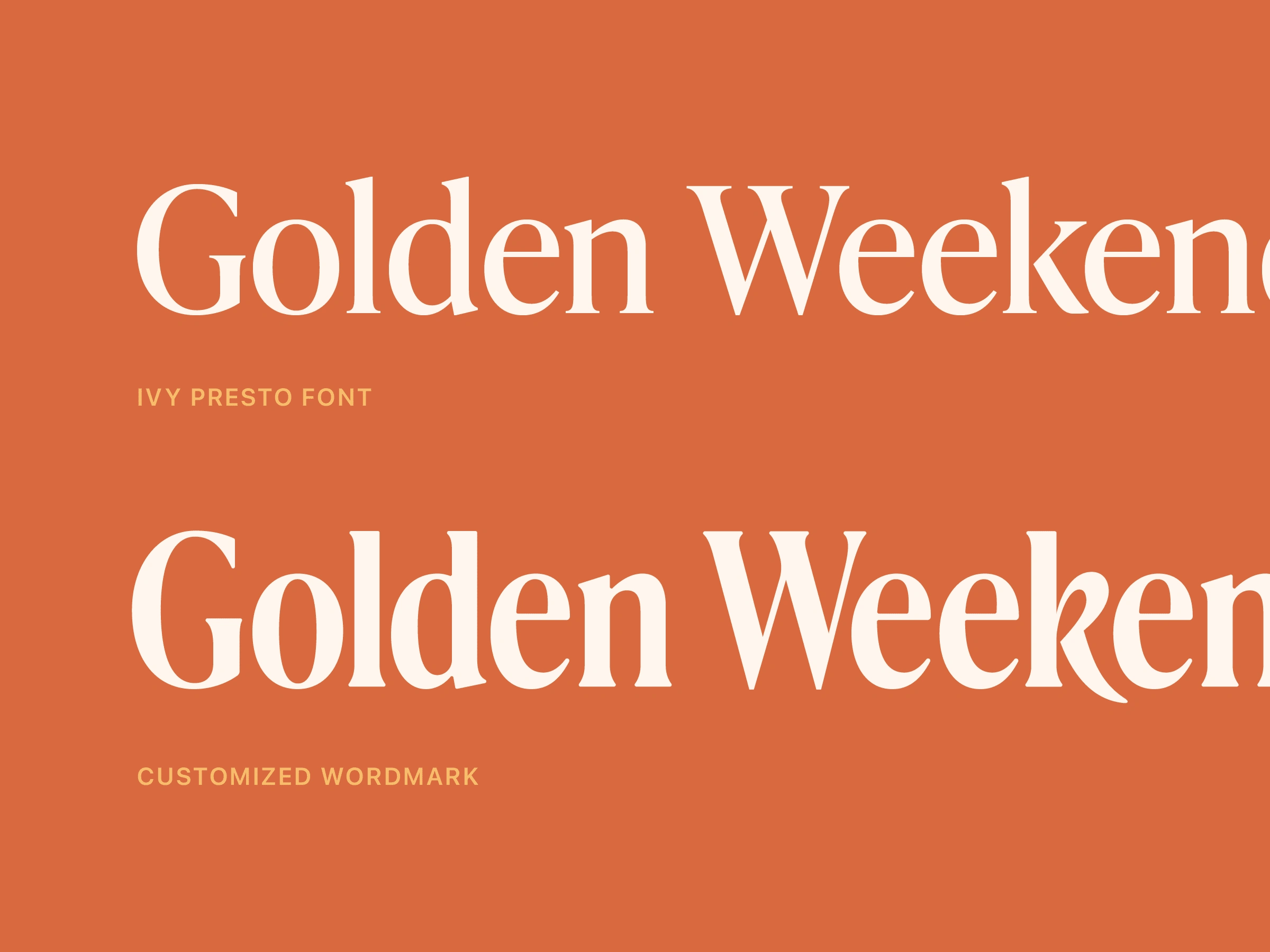
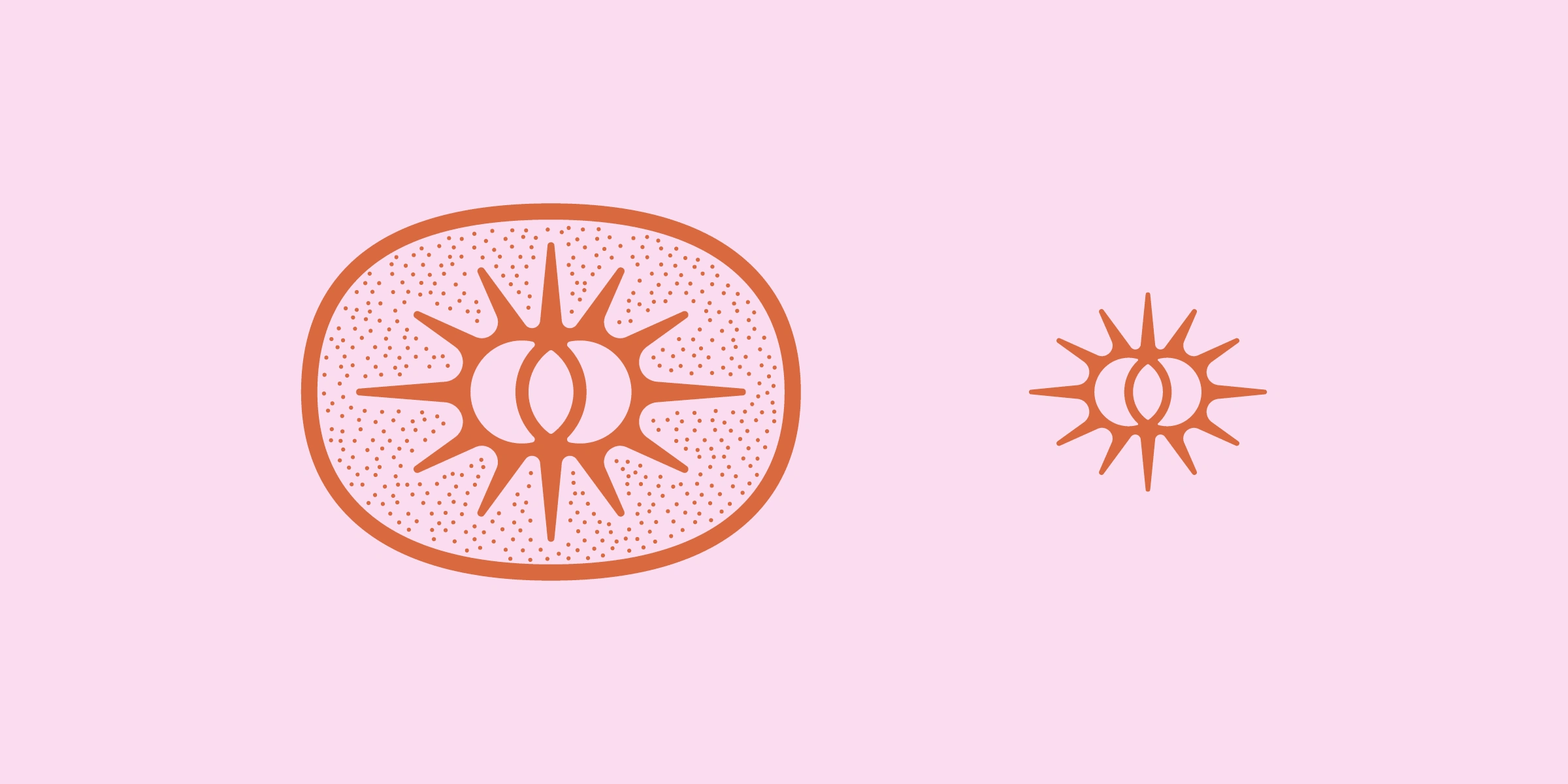
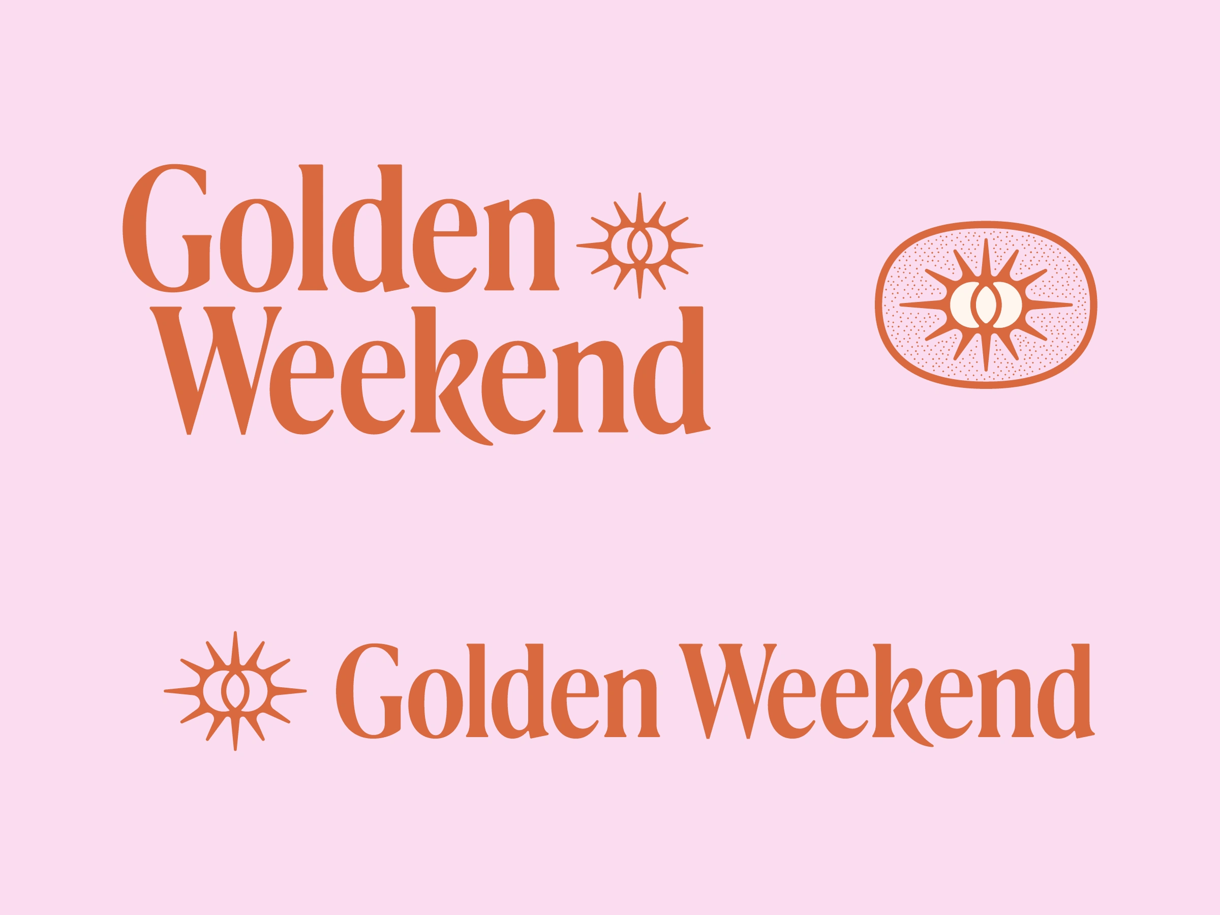
The final wordmark is a customized variation of the lovely Ivy Presto. I broke the one rule that you learn in your early stages of your career - don't stretch your type. In this case, it felt like a good opportunity to break the rules and create something unique. I wanted to evoke this feeling of type from yesteryear. I made some other slight cosmetic tweaks to the serifs and most notably, the 'k' to achieve the relaxed and softer look I was going for.
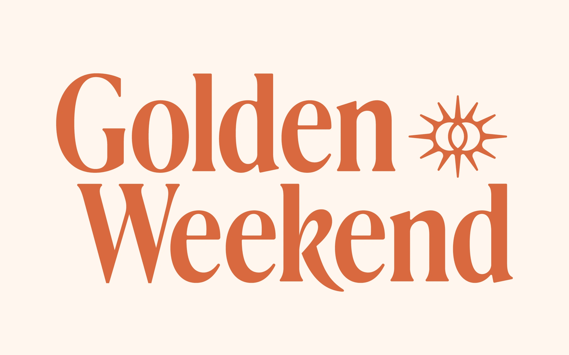
The inspiration for the logo mark was rather on the nose. Capturing the idea of the 'Golden Weekend' into a double sun mark felt like low-hanging fruit, but sometimes what feels right is right! I enjoyed the contrast it had against the elongated letterforms and how it nestled in so nicely into the white space.
I'm really pleased with how this one turned out and am excited to see how they build on this brand into the future as they form this community.
Looking for a creative partner? Let's chat!
Like this project
Posted May 8, 2023
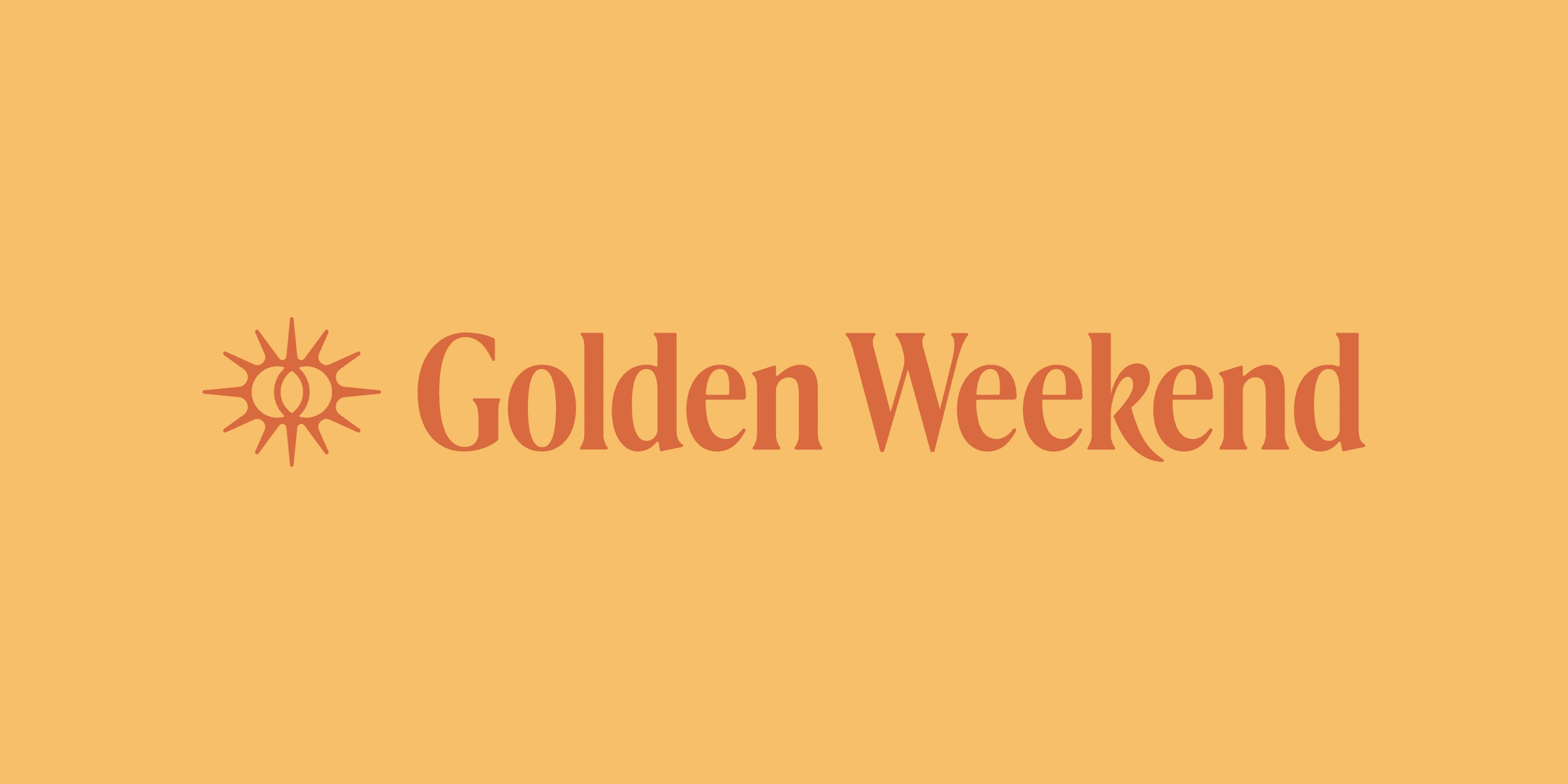
Custom logo and identity for Golden Weekend - an online community for individuals in the medical space.
Likes
1
Views
198