SXSW x Insert Coin Movie
Matthew Morrison
My Hypothesis
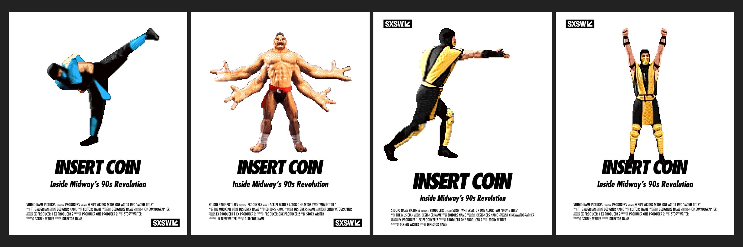
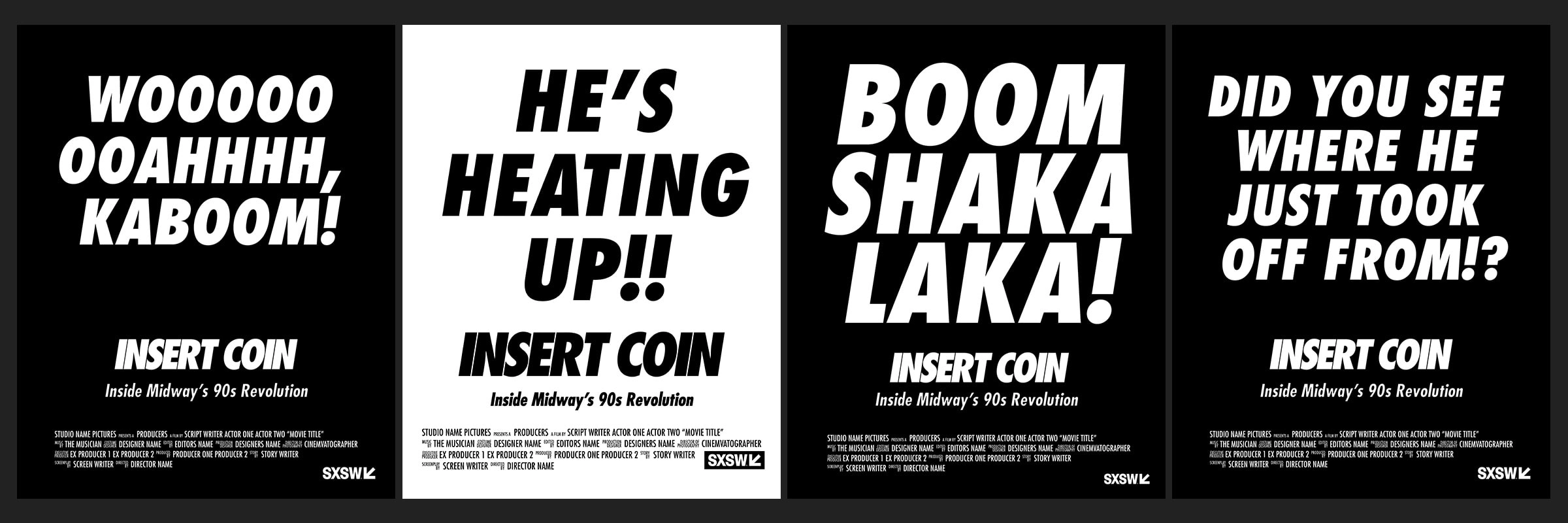
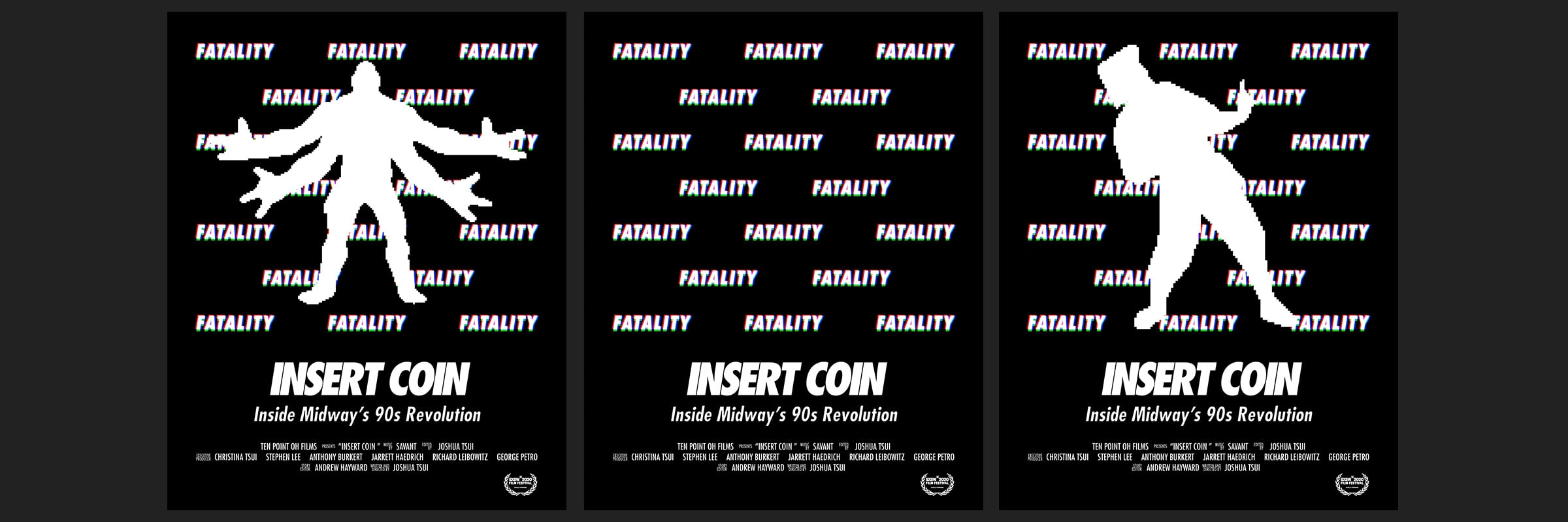
One of the pros of working on such iconic brands and franchises is you can take a minimal approach in your art direction with less risk. I thought a “less is more” approach would work well with easily recognizable elements. Having also played the games myself, I know there are many memorable spoken lines from games such as NBA Jam and Mortal Kombat. There was an opportunity here to go big and bold with typography.
Other distinguishable characteristics of early 90s games were pixel art and the technology that drove those games. Showcasing pixel art, which has grown into its own sub-genre on game marketplaces such as Steam, is a quick and fun way to grab the audience’s attention. Color also plays a huge role because the technology of arcade CRT monitors creates a chromatic aberration visual effect with the graphics.
Putting it into Practice
I started by assessing what assets were available to us that I could experiment with. We were provided with some sprites that were used in the games. I began placing those in rough layouts testing them against my hypothesis of letting the recognizability of the characters speak for itself. While it was a good start. I felt as if things could be pushed further.
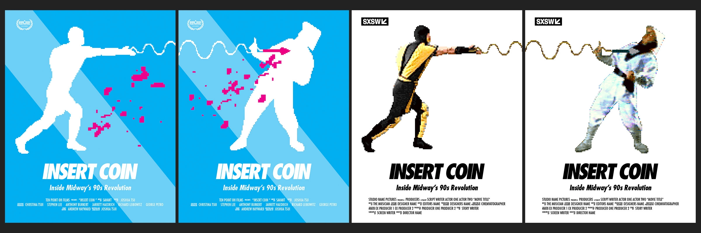
Adding Some Color
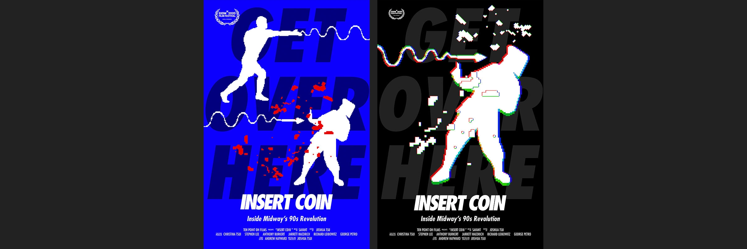
I decided to add in some color and really push recognizability by turning the characters into silhouettes. This also simplified the visual complexity of the poster (again, going for less is more) while adding a pop through the use of color.
A Poster Spread
I was also intrigued by the idea of playing off of Mortal Kombat attacks and the acts of shooting or passing the ball in NBA Jam. I played with the idea of one poster “giving the action” while the other poster in the set was “receiving the action”. I thought this played well the rivalry between Scorpion and Sub-Zero or 2 rivalry teams in NBA Jam. For example, Scorpion throws his attack in one poster while Sub-Zero gets hit in another.
Playing with Type
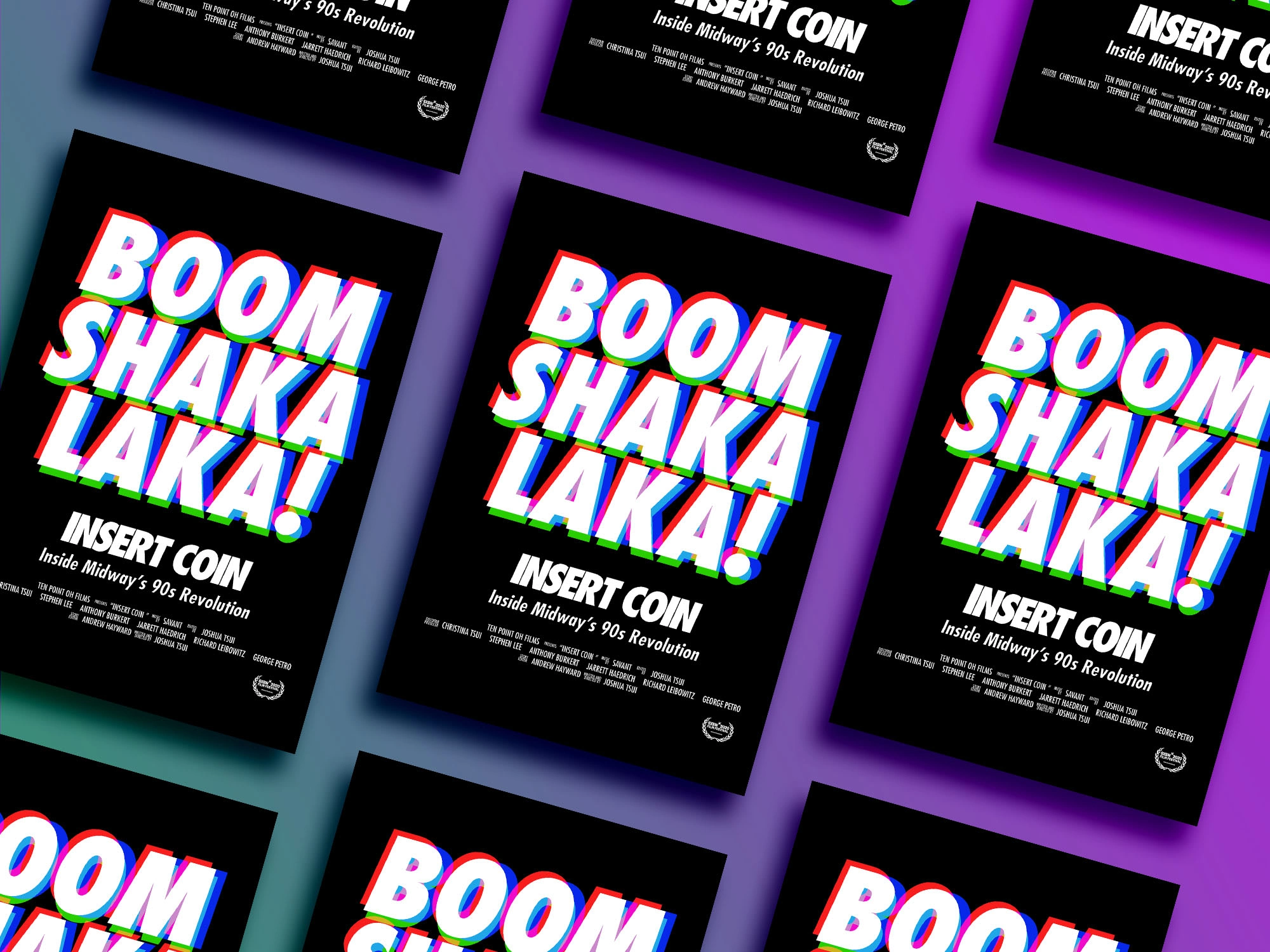
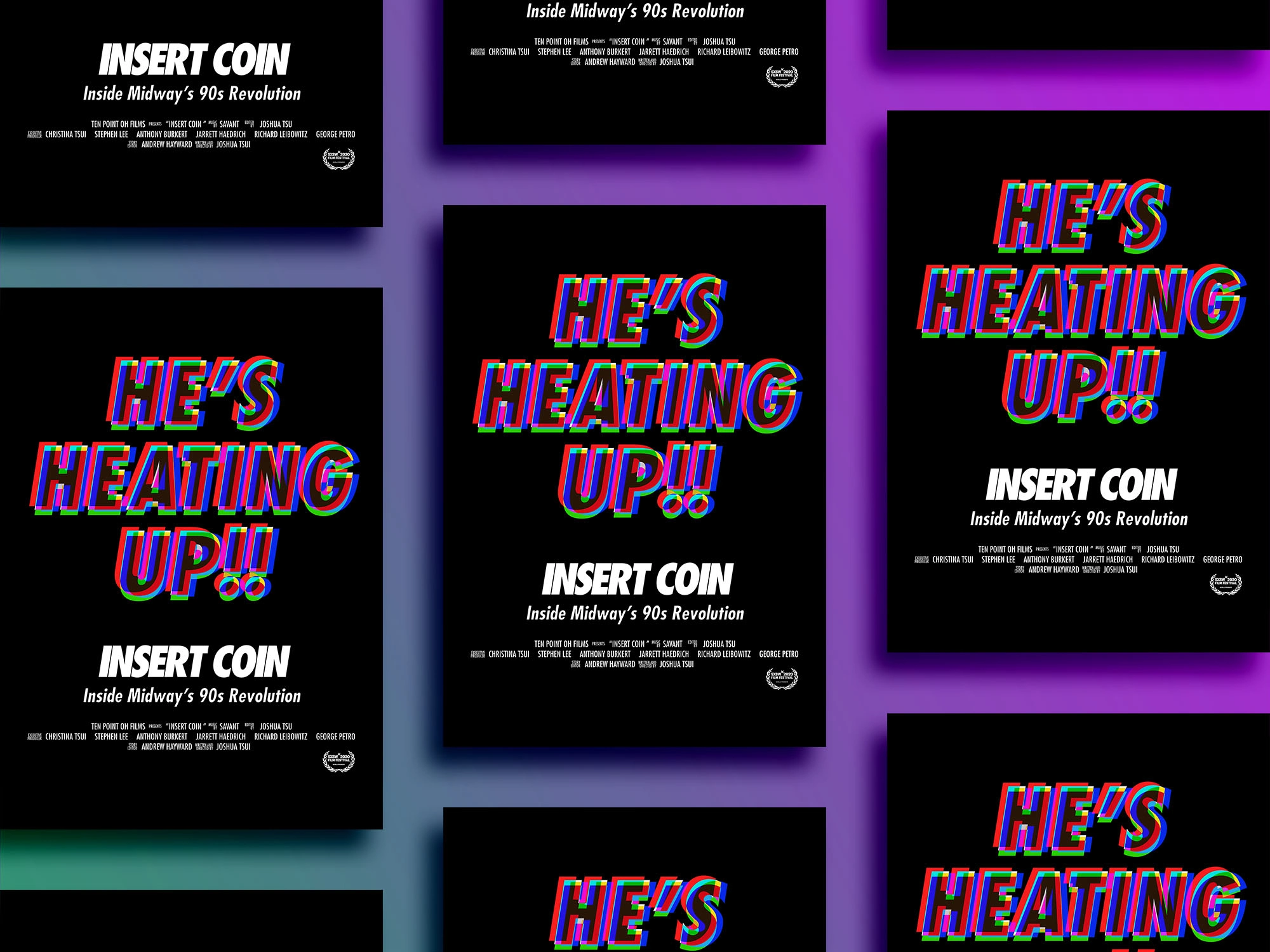
Futura was chosen for the logo. I liked the idea of doubling down and using it for the poster typography as well. Besides the familiarity of the typeface, the characteristics of Futura complemented the project well. The boldness, cleanness, and simplicity of the geometric shapes create continuity between the type and the pixel art. I began experimenting with scale and type style.
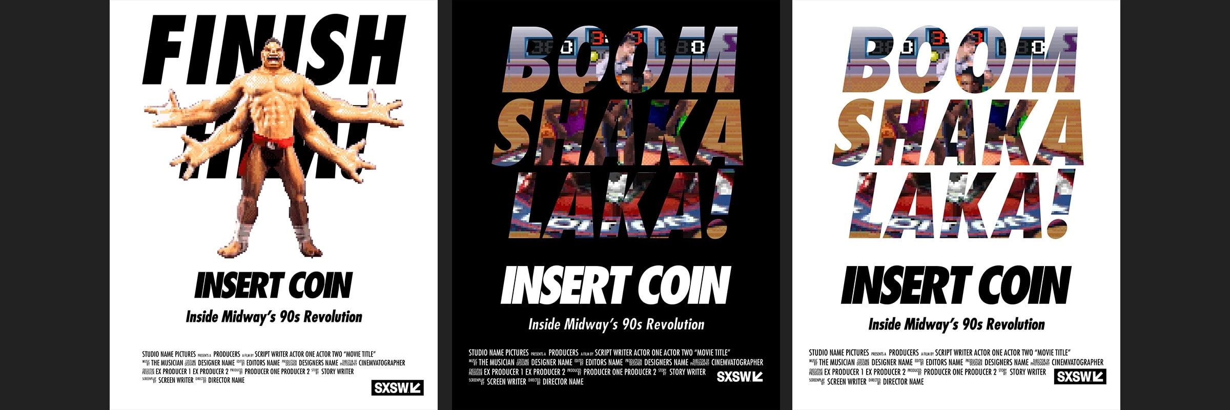
Combining Graphics and Typography
I had two compelling directions. One with the focus more on the pixel art and the other letting the typography take over. Naturally, I wanted to see if both could be combined to create a new direction.
Reaching the Finish Line
After exploring more of the chromatic aberration and the “CRT effect”, I began applying it to the type and graphic to see what interesting combinations I could produce.
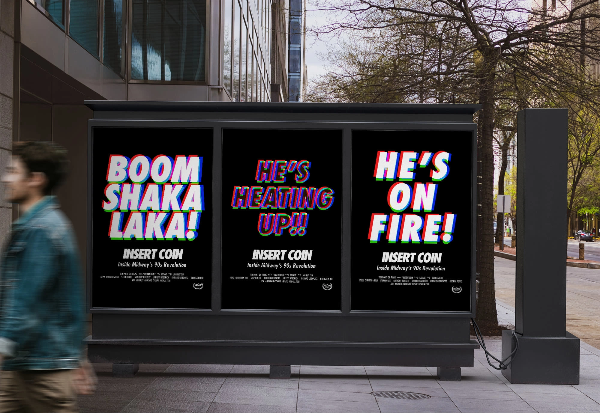
Final Results
The more ideas I executed, the more I returned to the concept of “less is more”. Instead of trying to make both the pixel art and typography work in a single layout, they both felt stronger when allowed to shine by themselves. The client liked the direction of the “CRT effect” on the type so I leaned into bold and big type. I also kept the silhouette of the pixel art to keep that simplicity but increased the scale as much as the layout would allow.
Like this project
Posted Mar 31, 2023
Insert Coin is a documentary that recounts the oral history of the team behind some of the biggest video games (Mortal Kombat, NBA Jam, and others) of all time.
Likes
1
Views
23