Loyola University Chicago
I am a Web Designer with the Marketing and Communications Department of Loyola University Chicago. The Digital Team within that department builds, implements, and measures website strategy, design, and development across all LUC.edu websites. We work across different levels of the university to ensure a consistent and engaging user experience.
My role includes, but is not limited to, designing and coding responsive websites in collaboration with cross-functional and inter-departmental teams, building wireframes, presenting to key stakeholders, contributing to the development of a UI library to standardize site builds across Loyola’s schools, and sharing best practices with departmental site admins.
The Creation of Our Design System
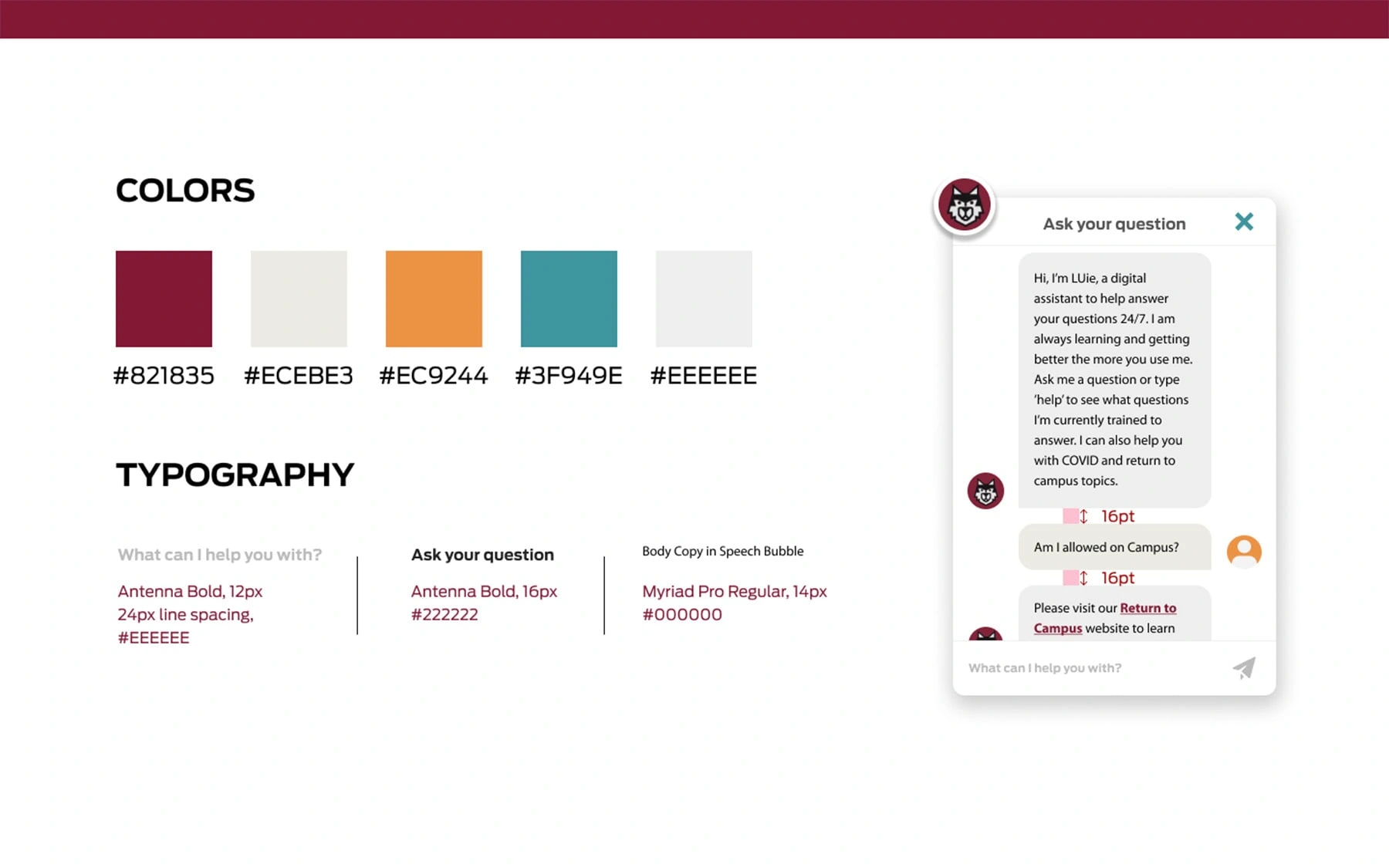
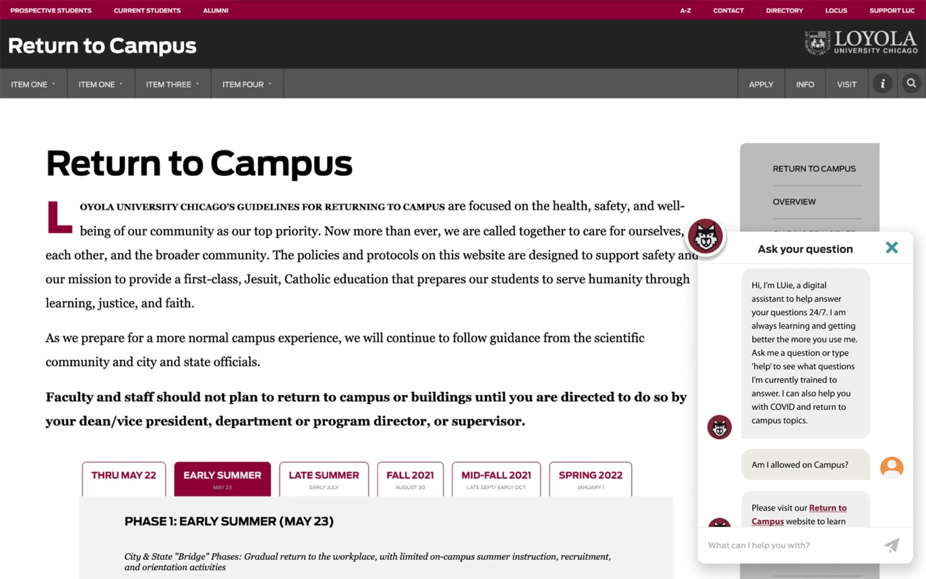
At Loyola, I have contributed to the creation, implementation, build, and perpetuation of our design systems used across all our internal and partner sites and third-party platform integrations. Since its creation and deployment, the University has seen increased traffic across its sites.
The goal was to create a standard scalable system of organized, interconnected, reusable components and patterns optimized for accessibility and responsive presentation.
It is built on the methodology of Atomic Design. Atomic Design, coined by designer, and author, Brad Frost, breaks the UI of a site down into Atoms, Molecules, Organisms, Templates, and Pages. One can create a mental model that helps construct a UI by breaking a page down into these different elements.
System Application and Process

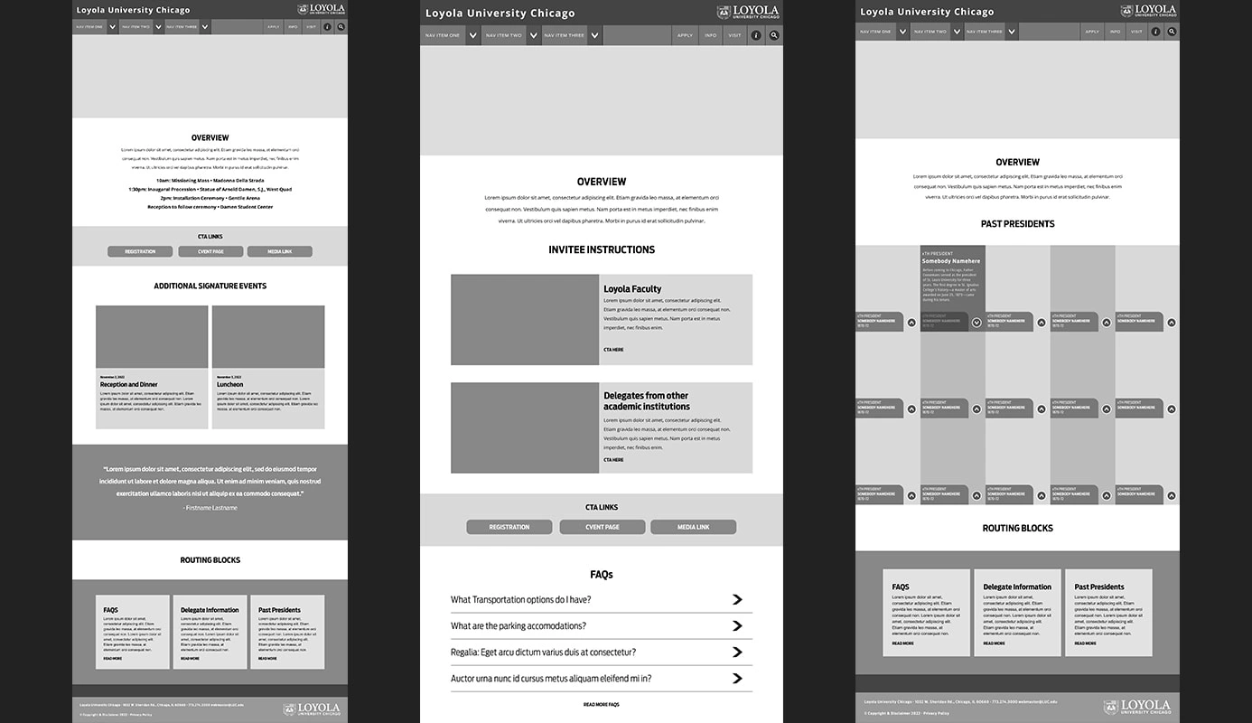
After an audit, strategy session with the client, and copy development, the building blocks of the design system are used to create wireframes to be presented to the client. Because the pieces of the system are responsive, scalable, and reusable components, they can fit into whatever the appropriate page layout is. All Loyola web pages follow a hierarchy to create a multi-tiered elevated page system.

After the wireframes are approved by the client, the site can be built using the approved wireframes as a basis.

Tied together with our content management system, the template remains a comprehensive and flexible tool for our partners and clients as they maintain their newly built sites.
Expanding to Third-party Systems
The UI system code is also easily embeddable and extendable to third-party platforms like exposure.co. This is important as it allows us to extend our visual branding as we reach our audiences on various platforms. We also maintain control over the look, feel, and functionality of our template. Here are some example implementations of the template on Exposure. We’re also continually testing animation with the system while keeping accessibility in mind.


Like this project
Posted Feb 22, 2024
My role includes, but is not limited to, designing and coding responsive websites in collaboration with cross-functional and inter-departmental teams, building
Likes
0
Views
24
Clients
Loyola University Chicago


