Reflex- B2B Webpage
Niche
B2B
Scenario
The scenario was such that, as a newly appointed UI/UX Designer of a digital agency which is in need of a website, create a landing page, service page, and a contact us page using a style guide.
Solution
To tackle this task, I drafted a plan of a sample digital agency that helps clients improve advertising. But to reflect my interest in the utilization of high-tech to solve user or clients' problems, I incorporated three main focus for the agency, SEO Analytics, UI/UX Design, and Virtual Reality, thus creating the brand "Reflex".
The aim of the product:
To redefine the user experience of its clients such that their users have an improved perception about their products and services which in turn leads to improved sales.
To use virtual reality to improve the UX of its clients. An example is the Real Estate VRPO it conducted for a real estate company. The VRPO allowed users simulate structures and buildings they desired on a property before purchase, giving them a futuristic perspective of properties. This would significantly improve how the company's users interact with their products and services.
To use UI/UX Design and SEO Analytics help to identify user experience errors which could be the reason for reduced sales and pursue strategies to improve these errors and enhance clients' UX.
Design
Handsketch
Sketches
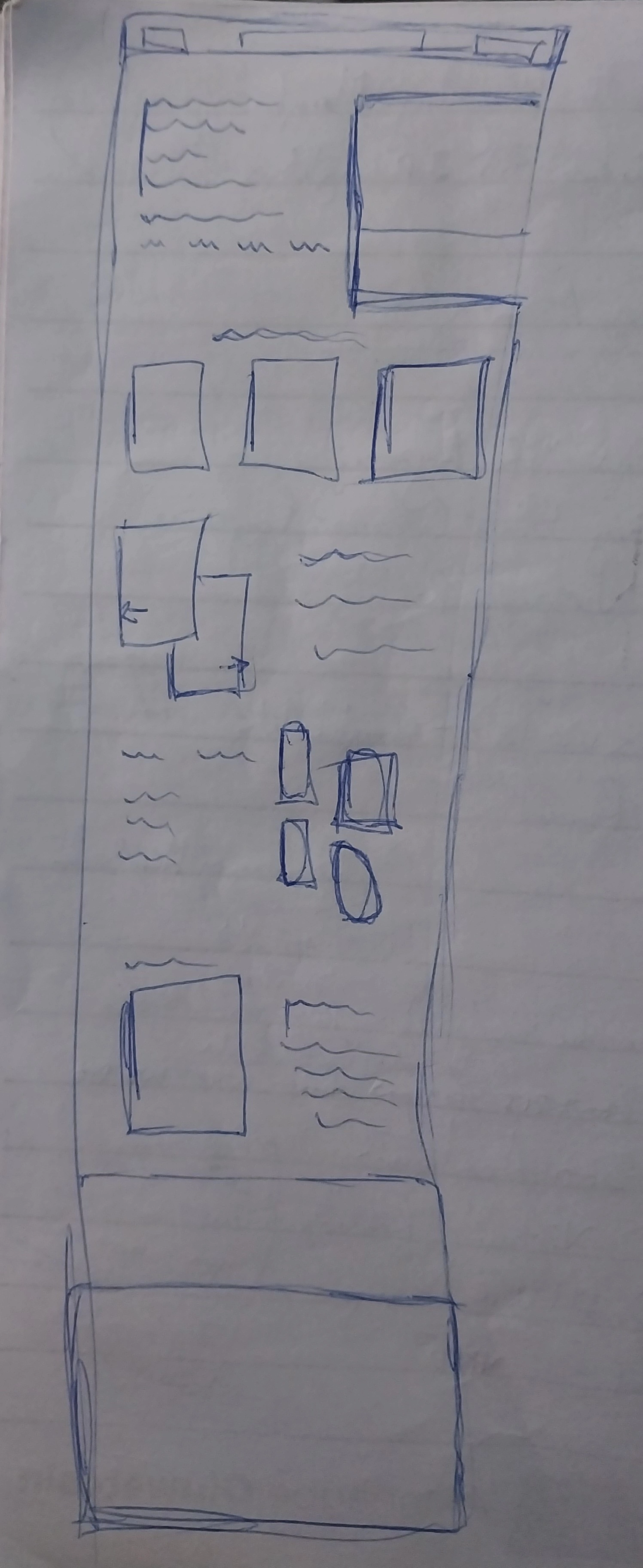
Here is a hand drawn sketch of the landing page. After deciding the scope and direction of the product, the next step was to search for inspiration and sketch out an idea for the landing page.
I sketched only the landing page because based on the layout of the landing page, I could create a layout for the service and contact us pages. Also, this was the initial idea I had for the landing page, but if you check this sketch against the actual UI of the product you would notice that as the design progressed there were certain iterations made to it.
With the help of this sketch, I determined the number of elements that would be on the landing page, the various sections of the landing page, and the copy required for each section.
Decision:
From this sketch of the landing page I decided that it would have seven different sections, which are;
The hero page
Service section
Projects section
Team section
Review section
Contact us section
The Footer
Although the UI for the landing page later changed from what was initially on this sketch, the outlined sections remained the same.

Low Fidelity Designs
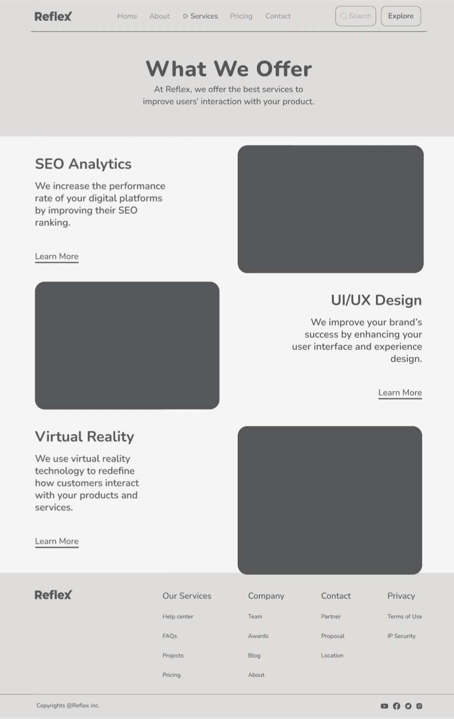
After sketching I went straight to designing the UI, by trying out various layout in my Figma board. I ended up settling for this in form of a low fidelity screen.
Landing Page
For the landing page, the hero section maintains the layout as that in the sketch. Same with the service section, but for the project section, instead of an intersection of two images, I settled for a single large image which depicts the specific project, represented in the lo-fi as s large rectangle. The team section also gets an upgrade from four images to five, represented by the curved rectangle.
Then rather than show the user a single customer review, I didn't to present three customer reviews in the next page which represent each of service offered by Reflex. So, there is our work with Samsung portrays for SEO Analytics service, the Real Estate VRPO with Cushman & Wakefield which represents for VR service, and our project with Airbnb which represent our UI/UX Design service. The use three reviews representative of each service offered was seen as a more effective means of selling Reflex's services to potential clients and visitors of its platform than the use of a single customer review.
Also, the contact us section and footer were filled with the necessary contents and elements.
Service Page
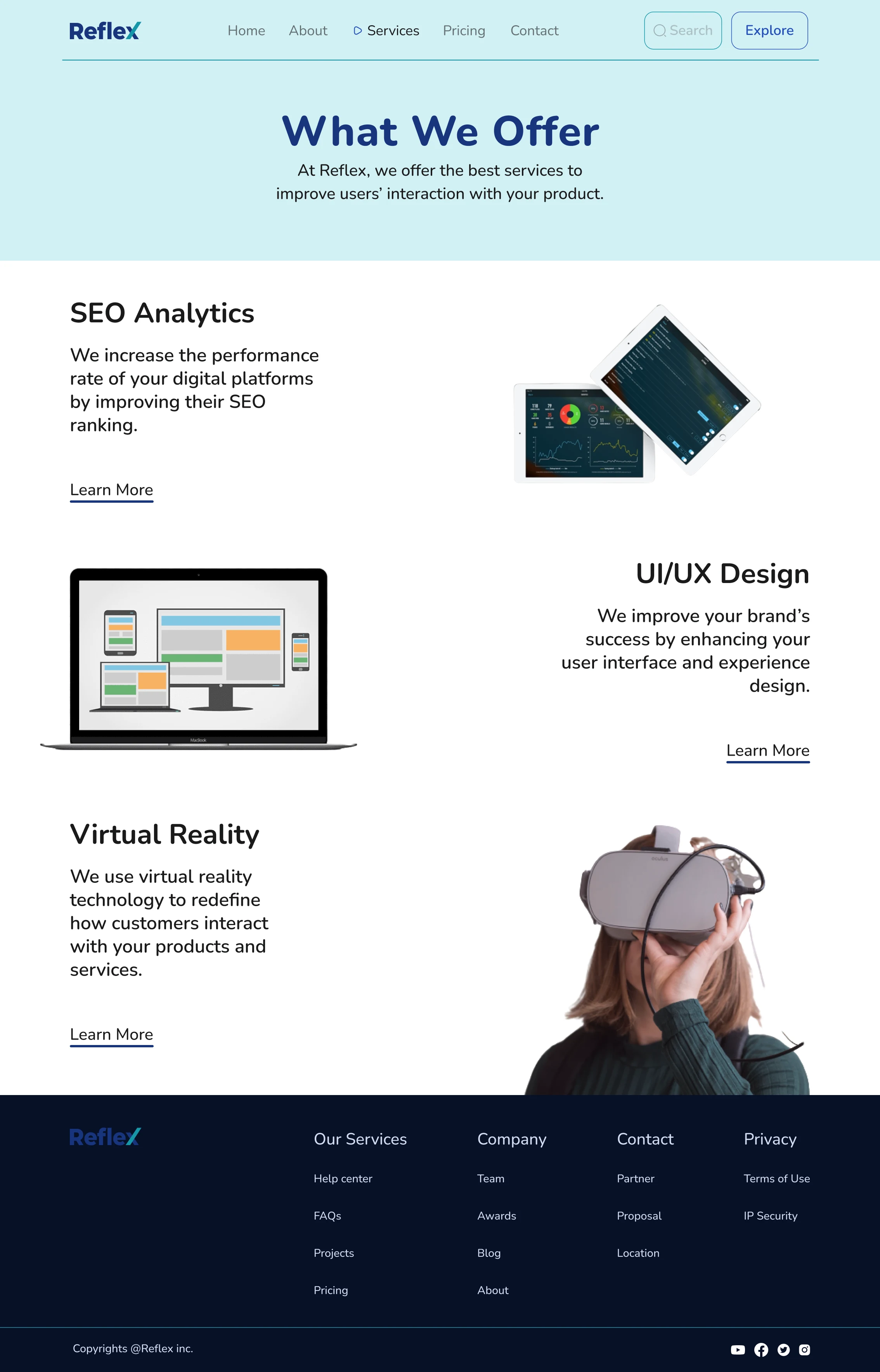
Based on the decided layout of the landing page, I decided to go with this layout for the service page. Maintaining the sequence of elements from the project section and team section of the landing page, the three services were designed in an alternating pattern with an image and a copy from left to right and right to left. To keep the page simple and straight to the point the top copy was centre aligned with no image.
Contact Us Page
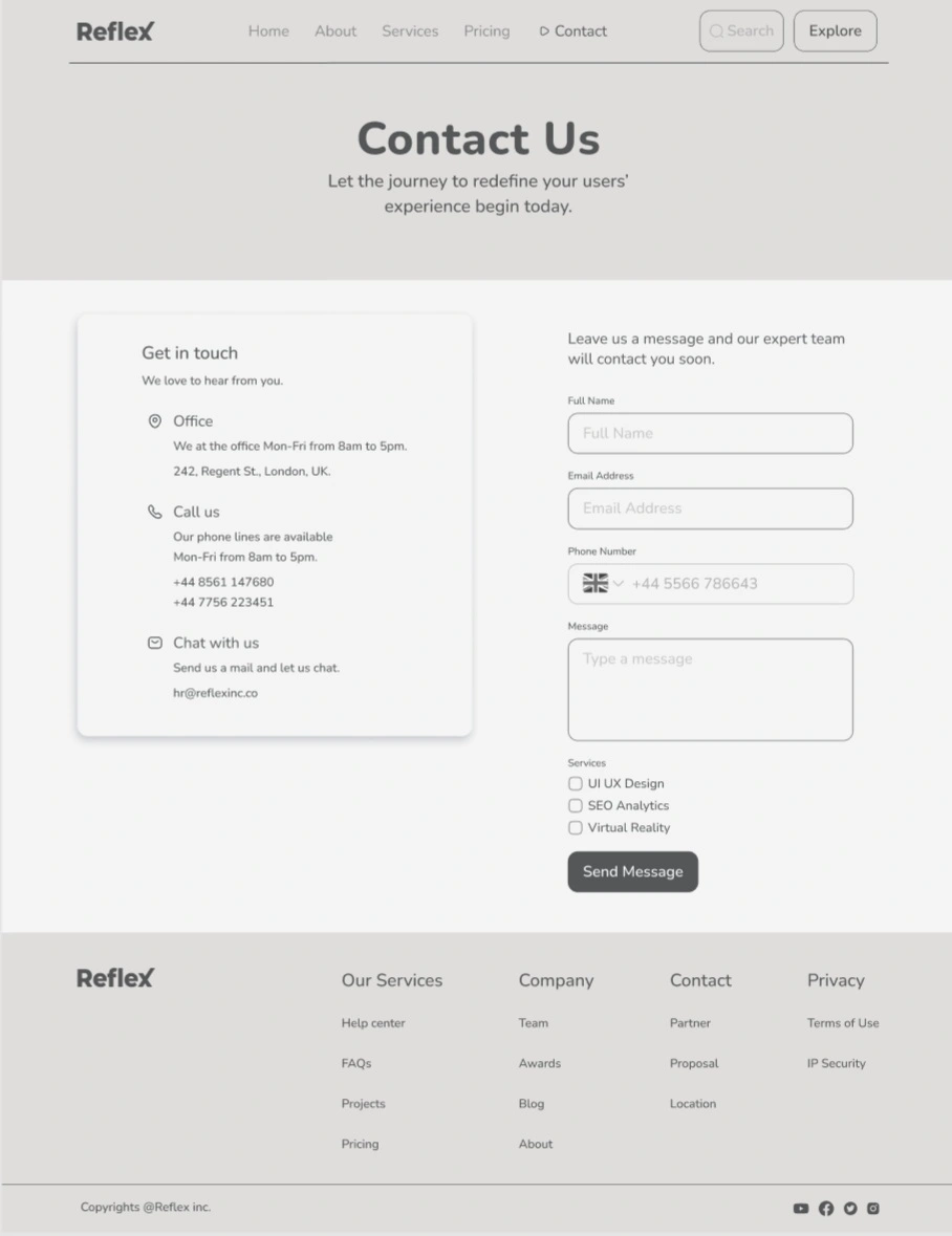
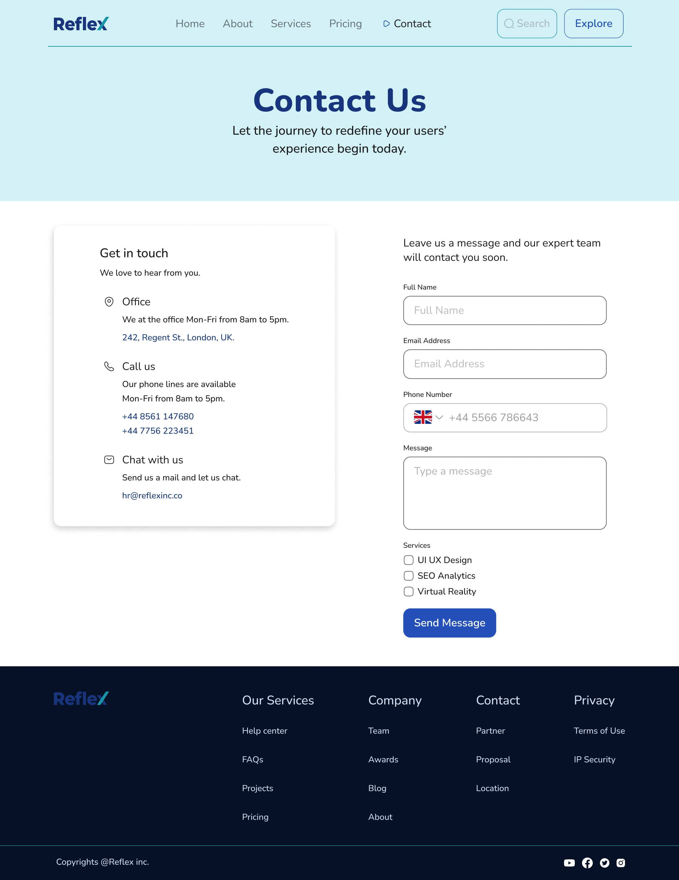
The contact us page follows a similar pattern to the service page. The main text at the top is centre aligned with no image, while a card containing the details of the company is aligned to the left and the necessary information required to send a message to the company is aligned to the right.
To ensure that the users get the appropriate response their require, there is a function to tick which of Reflex's services the message is based on. This helps to filter messages received by the company into categories which would be easier and faster to respond to.

Landing Page
UI Design
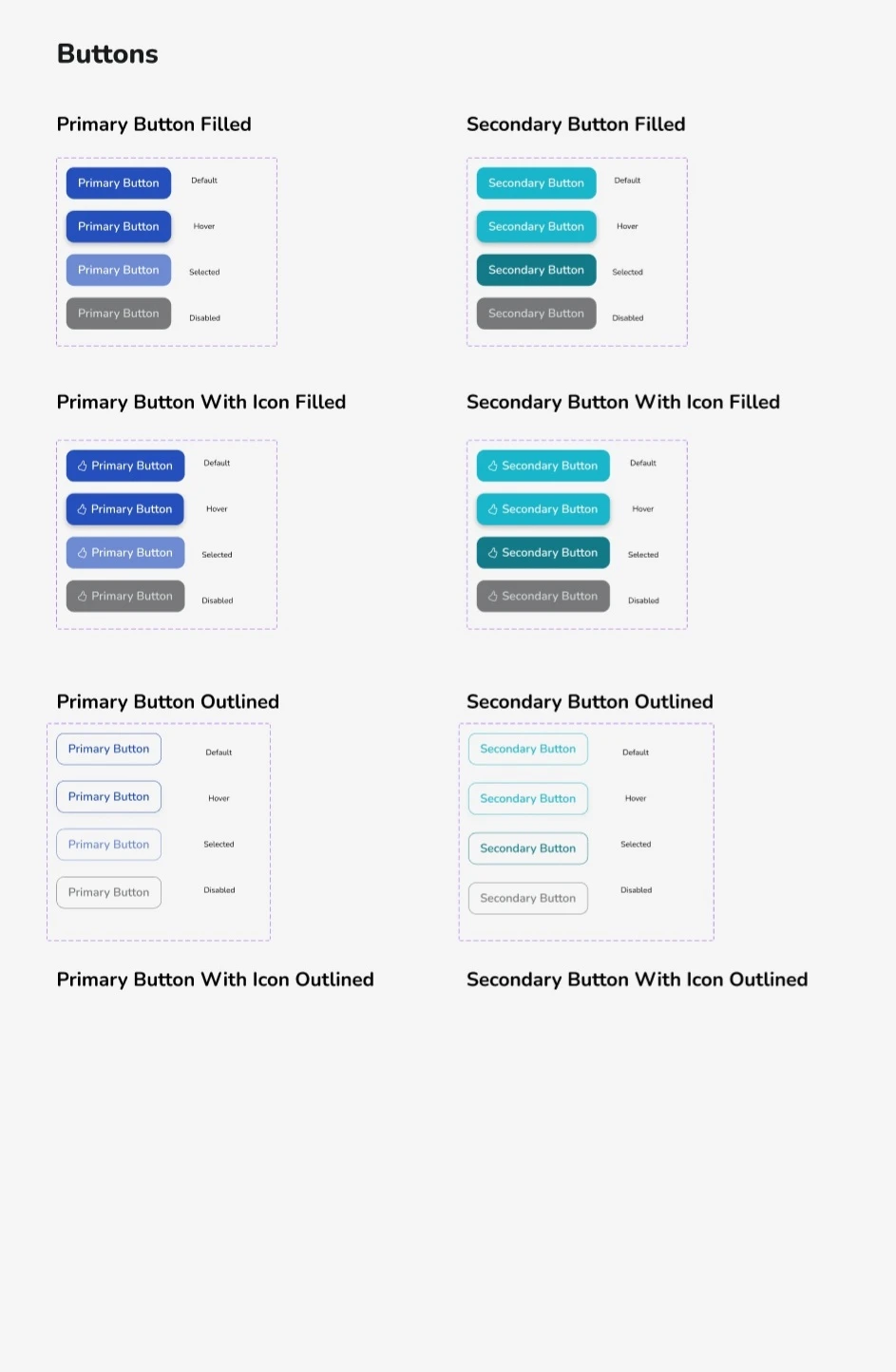
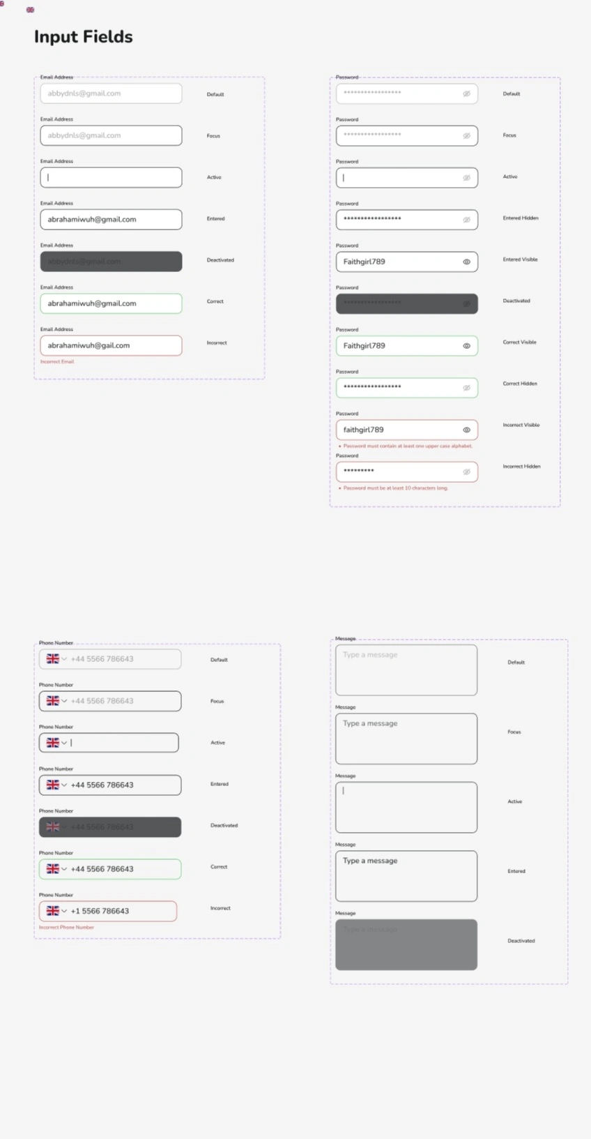
The next step was to design the high fidelity of the website and here I begun with the Hero Section. The UI design makes use of the icons, colour, typography, buttons, and other elements from the style guide shown below.
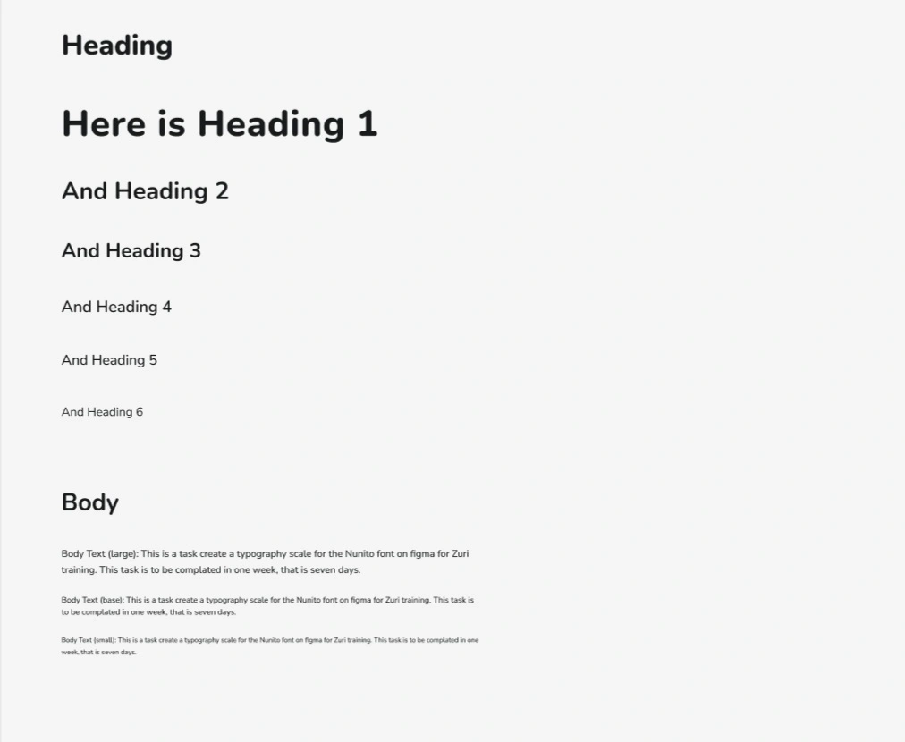
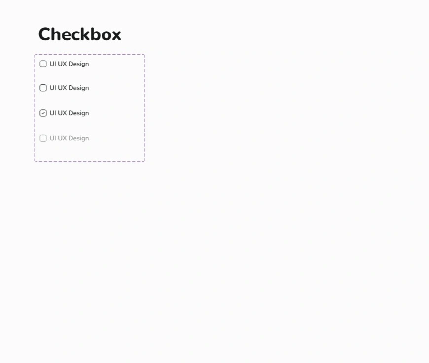
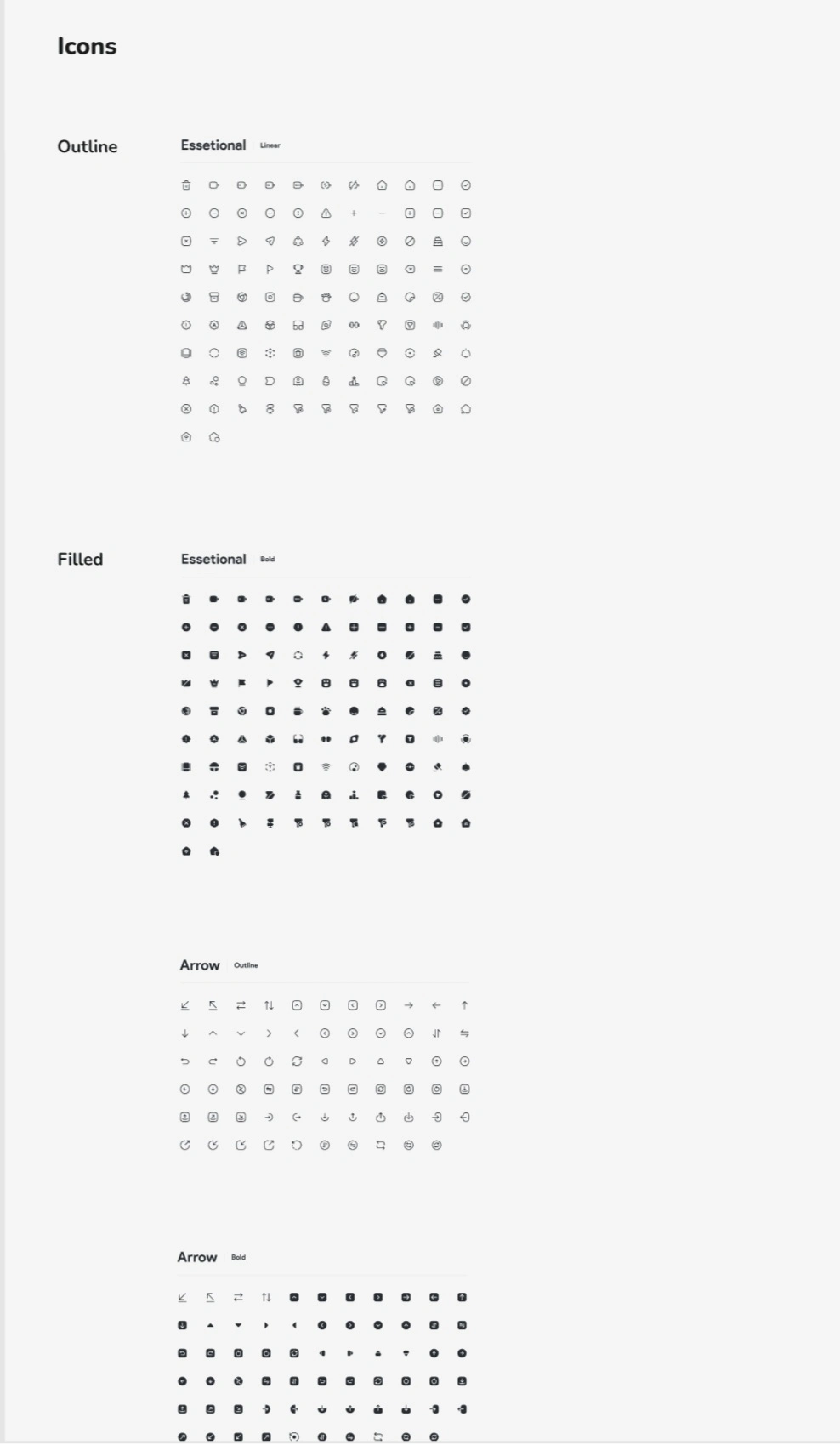
Style Guide
Before designing the high fidelity designs of the website, I created a style guide with colour styles, typography, grids, icons, buttons, text fields, and checkboxes. This made the process of creating the high fidelity screens much easier and improved consistency across the design.
To create the colour and typography styles I used the the 'Tints and Shades' and 'Styler' Figma plugins.
Iteration to Hero Section
Hero Section
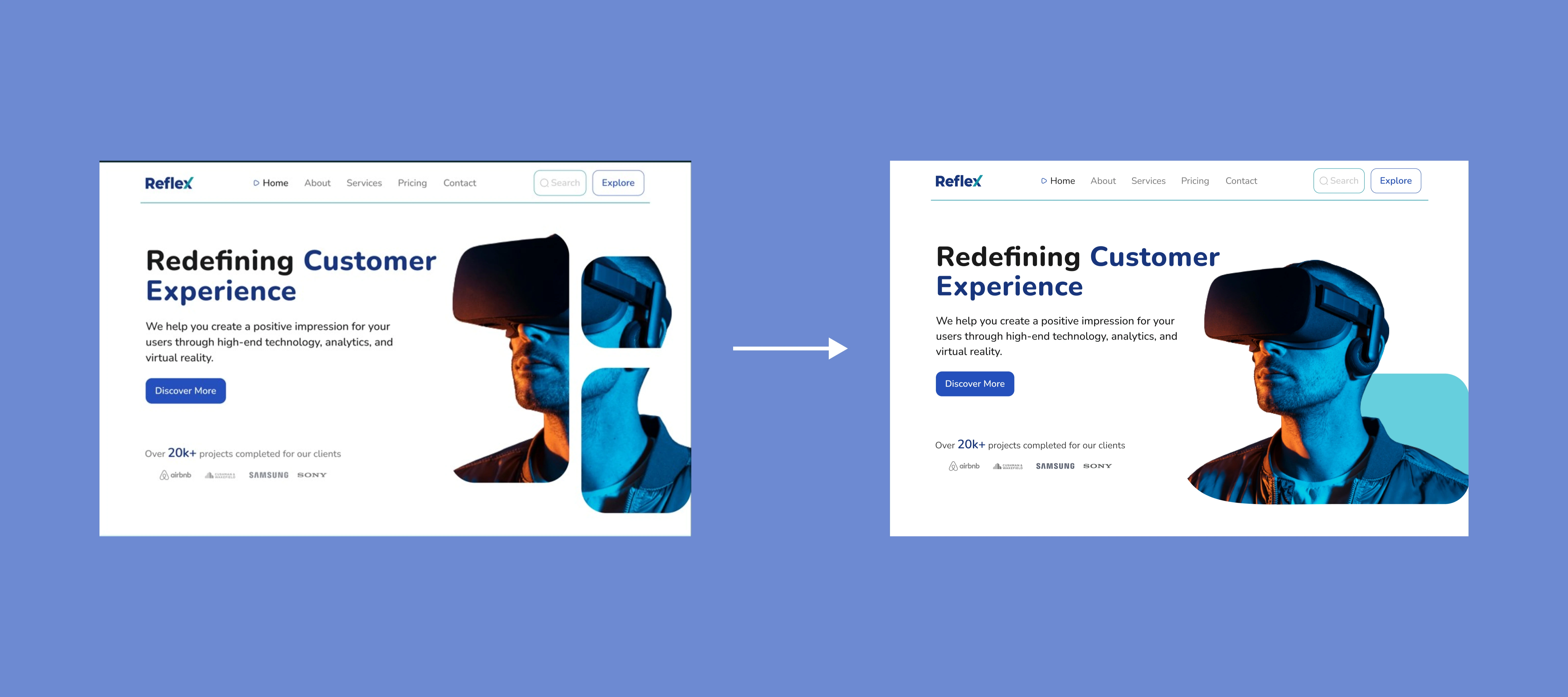
It was important to make the Hero Section appealing, informative, usable, and simple for users to comprehend. Therefore, I spent more time on the hero section to ensure that the elements are easy to digest with a stylish and usable page indicator, and that the Call to Action (CTA) was clear, while the copy reflected the aim of the company. So, I made changes based on feedback.
Iteration to Contact Us Page
Contact Us Section
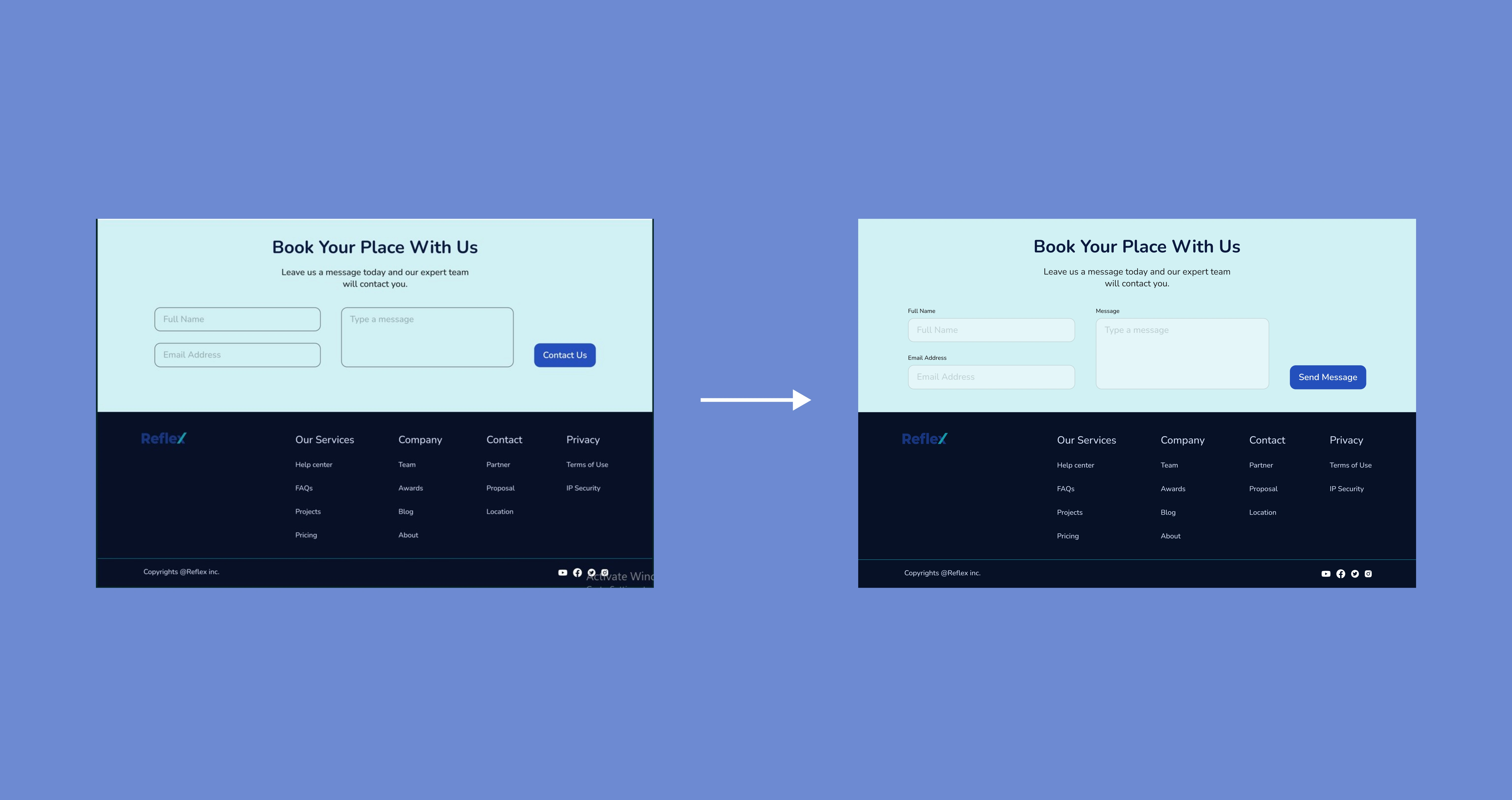
For aesthetics and usability, I changed the fill and stroke of the text fields in the contact us section on the landing page. I also adjusted the spacing and positioning to achieve consistency across the design.
The image on the right, unlike that on the left has a placeholder above the text field to help users identify each text field. It has larger text fields which offers more room for users to type. It has more spacing between each element, and a fill for the text fields to make them easily noticeable to users, thus, encouraging them to contact the brand, which is the CTA of the landing page.

Timeline
6 Days
Insight
Working on this task helped to reemphasize the importance of hero sections in a landing page. I realized how hero sections are critical to the flow of the website and in convincing the user to continue reading through the website. So, I learnt the basics of creating hero sections, ensuring to include clear and bold Call To Action (CTA) Button in order to guide the action of the user as desired.
Also, the sections of a landing page are not merely for aesthetic purposes, their essence goes beyond that. This I realized with the review section of the landing page. I learnt how the use of three customer review card which represent each service offered can better convince a potential client then a single customer review card from a big company. So, I realize how little design elements can shape the perception of the user and significantly impact the business as well.
Like this project
Posted Sep 14, 2023
Redefining customer experience to improve sales.
Likes
0
Views
7

