Mfit

Mfit
Overview
Mfit is a mental health centered fitness mobile application that provides a supporting community for users.
View the prototype here.
User
Working class, aged 20-39 years old.
Problem
The idea begun with the intention to create an integration between a physical gym and its digital product to enable users to exercise from home when they cannot visit the gym and still get quality service. But this changed due to insights derived from subsequent user research.
Below are the initial assumptions of this project
Users want to use their physical gym subscription to access a digital fitness product.
Users are willing to exercise from home.
Unavailability of fitness equipment is a constraint to home workout.
Users would prefer watching a fitness video led by an instructor they are familiar with.
Design Process
I used the Double Diamond Design Model; Discover, Define, Develop, and Deliver.

Discover
Surveys
To ensure that the product was user-centric, my first step was to conduct a user survey using Google forms to identify representative samples.
I created an online survey with screener questions.
The survey had 25 responses from a diverse demography.
From the survey and with the help of the screener questions, I identified five representative samples who were willing to be interviewed.
The screener questions helped me focus on respondents who used the gym and had a gym membership.
Below is a screenshot of the screener survey.
Interviews
I conducted a 20-30 minutes interview with the five individuals who best represented my target audience as determined via the responses to the screener survey above. The aim of the interview was to gain more insight into their fitness journey, pain points and expectations.
Mode of Interview
The interviews were conducted via a hybrid system. While I interviewed four respondents through a mixture of voice WhatsApp calls and phone calls, I also interviewed one user physically. This research methods helped me approach the problem from a user perspective. With the interviews, I observed users emotions, thoughts, gained insight to their background and daily routine.
Number of Interviewees
I interviewed five users.
Interview Questions
What do you rate your fitness level on a scale of 0-10 and how do you maintain such level?
What is your daily routine?
Do you go to the gym with friends or do you meet friends at the gym?
How productive would you say your fitness sessions are?
What would you say influences the productivity of your fitness sessions?
Do you have gym instructors who lead your sessions?
How attached would you say you are to these instructors?
How often do you visit the gym?
Are there days you do not visit the gym and why?
Does your gym have a mobile application?
If yes, do you use it? And if not, why don’t you use it?
What features do you like about the app?
Are there features you would like to see on the app, which it doesn’t have?
What I was eager to know?
I was curious to ascertain if my assumptions were accurate.
Insights
After the first two interviews I realized I needed to listen to the user rather than focus on my assumptions. Therefore, by listening to what the users wanted I gained insight into the constrains of the users' fitness journeys, specifically how their personal and work schedules, including menstrual flow can hinder them from visiting the gym. I learnt that users had gotten bored of the regular nature of fitness applications and wanted an app which offered features which they couldn't get on TikTok or YouTube.
Were my assumptions accurate?
No, most were not. Rather than desire to exercise at home, watch fitness videos by familiar instructors or use one subscription to access both physical gym facilities and an mobile application users were more interested in conquering the various constraints to their fitness journey. Users were tired of the regular fitness applications and wanted something more, beyond regular YouTube or TikTok content. Users wanted to reduce the number of applications on their phones, so they needed an application that combines some functions of other applications. The users wants style, functionality, and a modem design. Therefore, I made some iterations to the initial plan for this product which is explained below.
Iteration from Research
I decided to change the concept of the product from simply offering home workout features for exercising to a product that helps users generate a unique fitness plan which enables them to work, enjoy their personal life, and be fit, all in one. I incorporated more features which act as daily motivation of users to continue their fitness journey because I realized that most users were influenced by their gym buddies. The product would incorporate features that would help limit the number of applications a user needs.
How I chose elements and features to implement these solutions are all explained in the following sections.
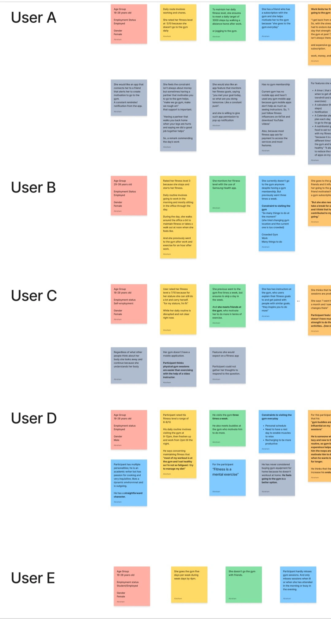
Organized Notes from User Interviews
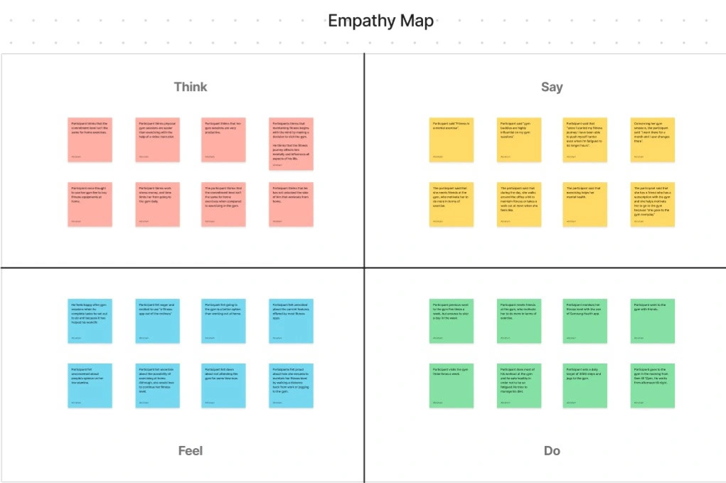
Empathy Map
To analyze the responses of the users, after organizing their responses into notes on Figjam, I created an empathy map. An empathy map is simply an easily understood visual chart which explains everything a UX Designer has learnt about a type of user or group of users. In this case, I created an aggregated empathy map which includes everything I've learnt about all five users.
These insights are arranged into four quadrants; think, say, feel, and do.
Think: this section includes things the users thought about directly or indirectly during the interviews. An example is how one user thought that her work schedule was a major constrain to maintaining her fitness journey.
Say: this section includes things I heard the users say during the interviews. They include direct quotes from users. An example is when a user said " fitness is a mental exercise".
Feel: during the interviews I observed how users felt when expressing themselves, when answering a particular question or when describing a certain experience. Although it wasn't easy as only one interview was conducted in person, I observed other indicators like voice tone, level, and pauses to understand how users felt. One example was when a user was describing how fitness impacts his work. The user felt excited and proud about how he is able to push himself to go further during exercises and how this has helped strengthen his work limits, such that he can work longer hours regardless of stress.
Do: this section describes what users do either as a daily routine or generally as a life style. It includes things users told me that they did and things I observed users do from experiences that they shared with me. An example is that one user ensures to walk a distance home after work to maintain fitness regardless of work stress.
By organizing all users interview notes into an aggregated empathy may I easily identified the pain points of this group of users which improved the efficiency of the next phase. Also, with the information included in the aggregated empathy map I was able to create two user personas, easily identifying the goals and frustrations of the personas from my aggregated empathy map.
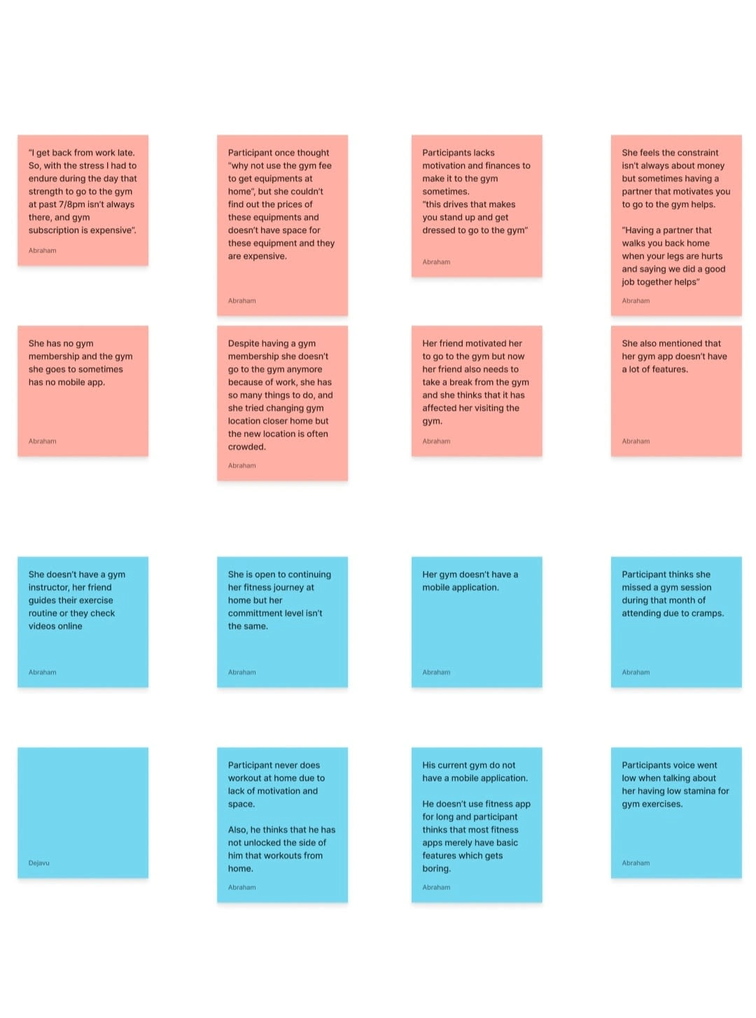
Identified User Pain Points
Pain Points
Identifying user pain points was crucial to my brainstorming exercise in the define phase. Based on the notes from each user interview and the aggregated empathy map I identified 11 pain points of my target users. These pain points as shown in the image above encompass the constrains and frustrations users seek to overcome to achieve their desired goals.
I referred back to these pain points in the define phase.
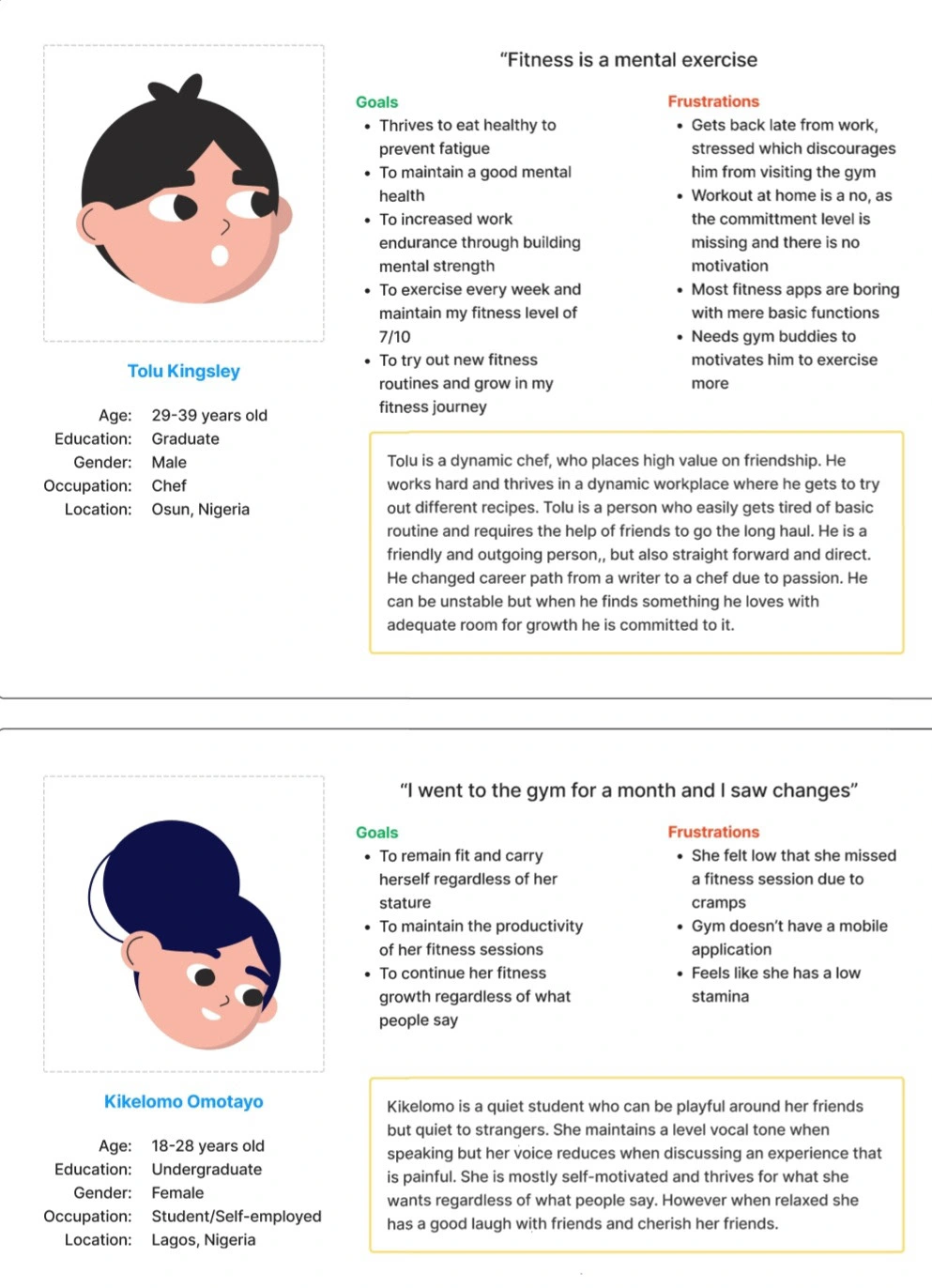
User Personas
Define
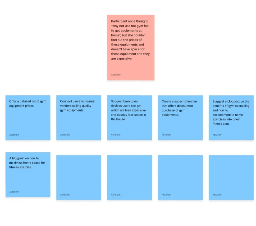
Brainstorming
To begin the define phase, my first step was to identify seven pain points of the users and brainstorm on solutions to this pain points. For the brainstorming stage I emphasized quantity over quality.
The process was simply to take each of the seven pain points one after the other, then think about numerous ways the product could solve this pain point for users. I didn't focus on whether the solution was cost-effective or feasible. This stage was merely about churning out as many solutions to each user pain point as possible which would then be analyzed in the next stage.
The seven pain points were chosen on the basis that they best resonate with the concept of the product and what it aims to offer users, that is providing an encouraging and supporting community for users to achieve their fitness goals.
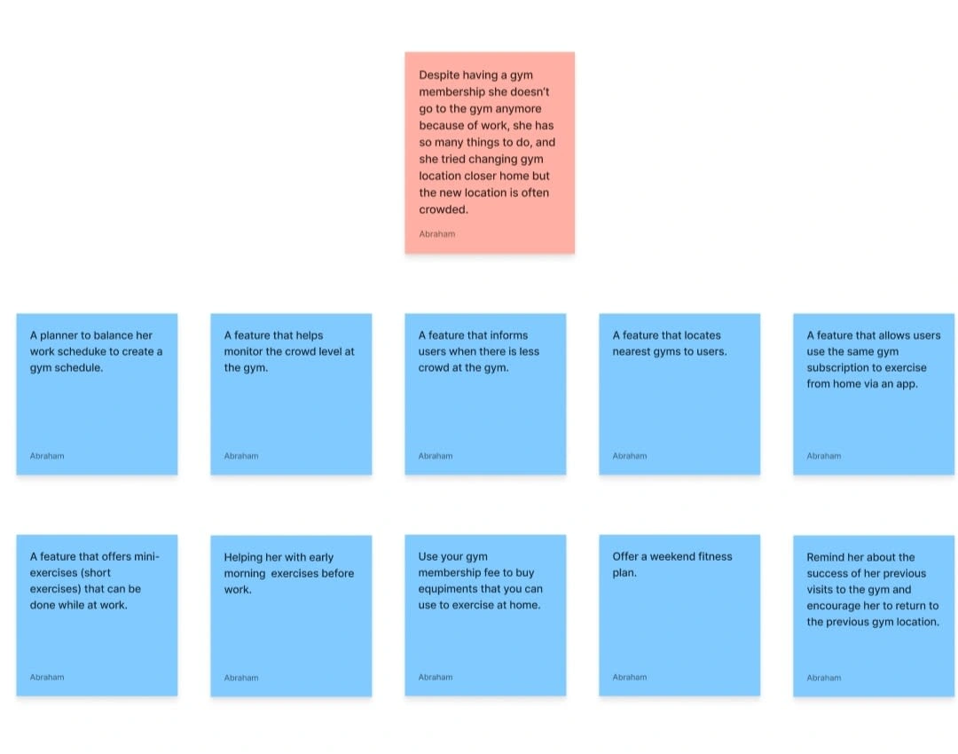
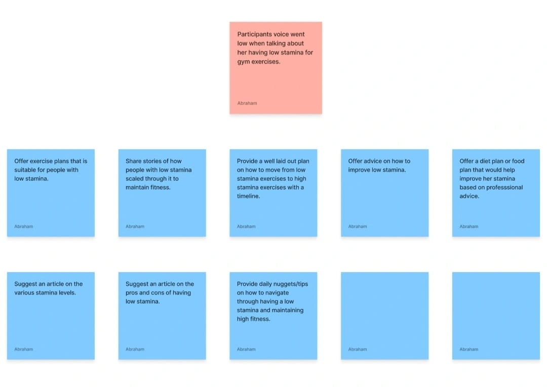
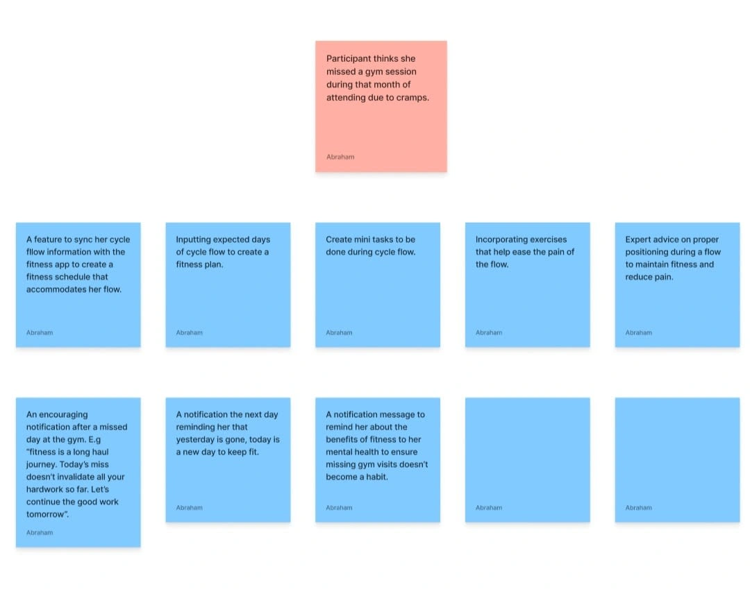
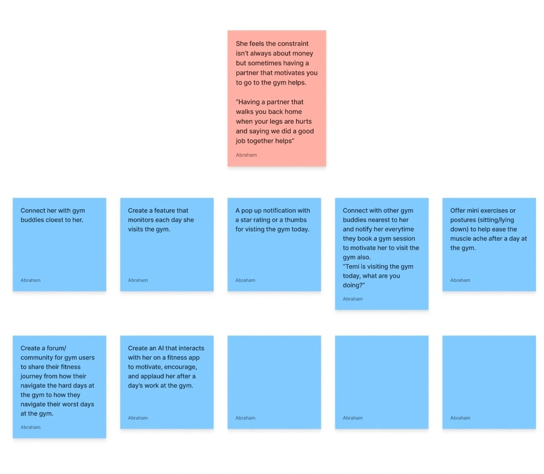
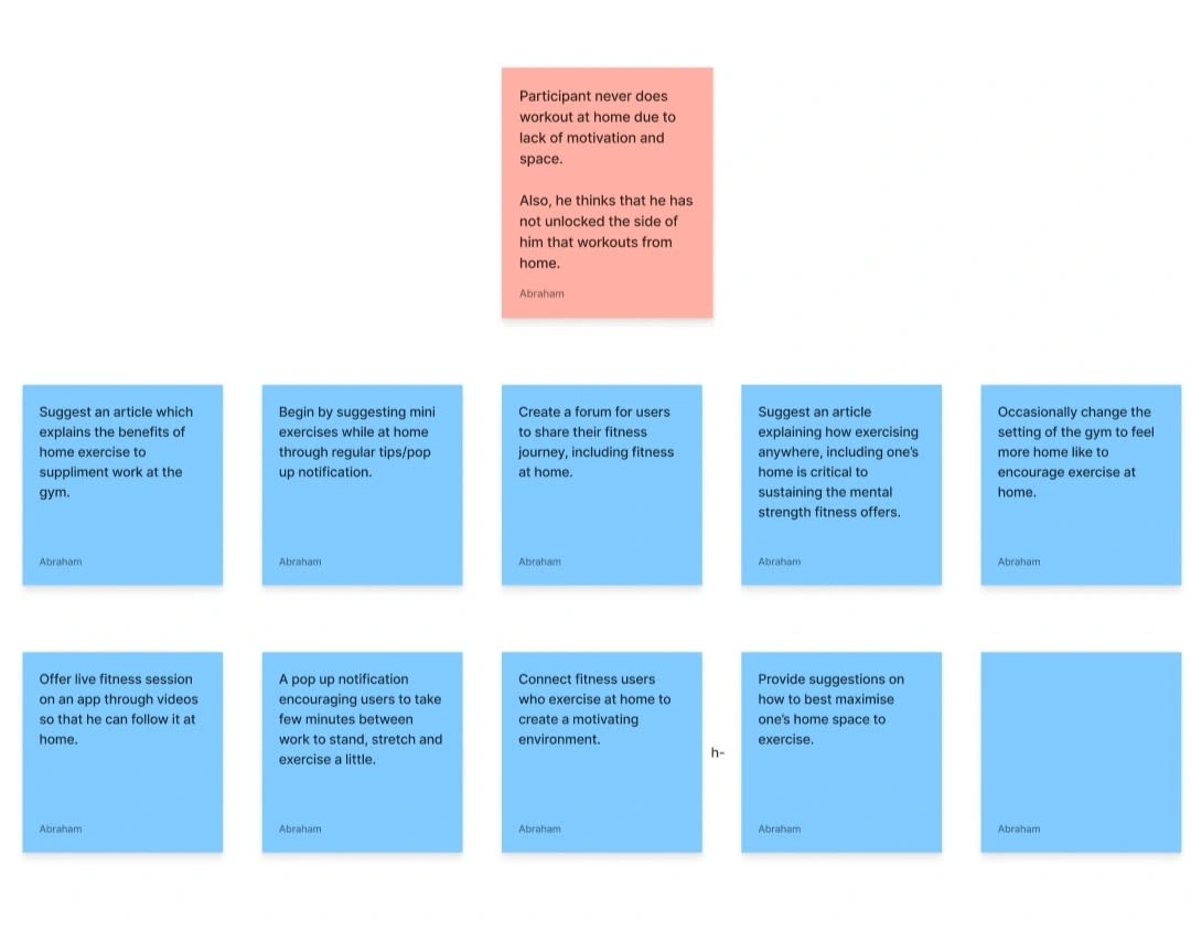
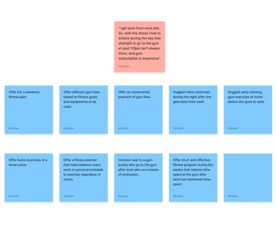
Idea Prioritization Matrix
Idea Prioritization
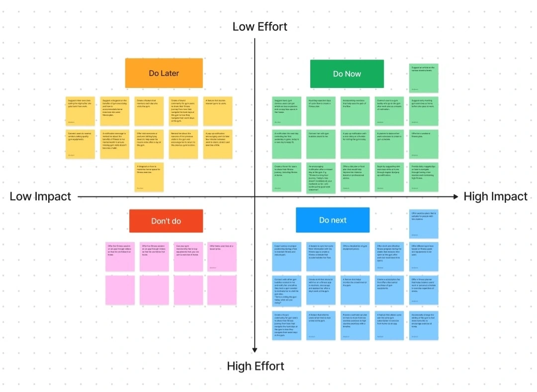
After brainstorming and churning out numerous solutions to each of the selected seven pain points. The next step was to use the idea prioritization matrix to categorize each idea generated into four categories; Do Now, Do Next, Do Later, Don't Do.
Do Now: all ideas under Do Now would offer high value for the user and cost the business low effort to implement. Thus, should be the first solutions implemented in the product.
Do Next: ideas under Do Next offer high impact to users but require high effort from the business to implement. So, these solutions come after the implementation of those under Do Now because they would also be good for the business. They provide ready solutions for future use, improving scalability.
Do Later: all ideas under Do Later offers low impact for users with low effort from the business to implement the solution. Therefore, these solutions should be the third choice for the product after the first two have been implemented.
Don't Do: all ideas under Don't Do would cost the business lot of resources to implement and would provide low value to the users. Therefore, these ideas should not be considered for the product.
Decision
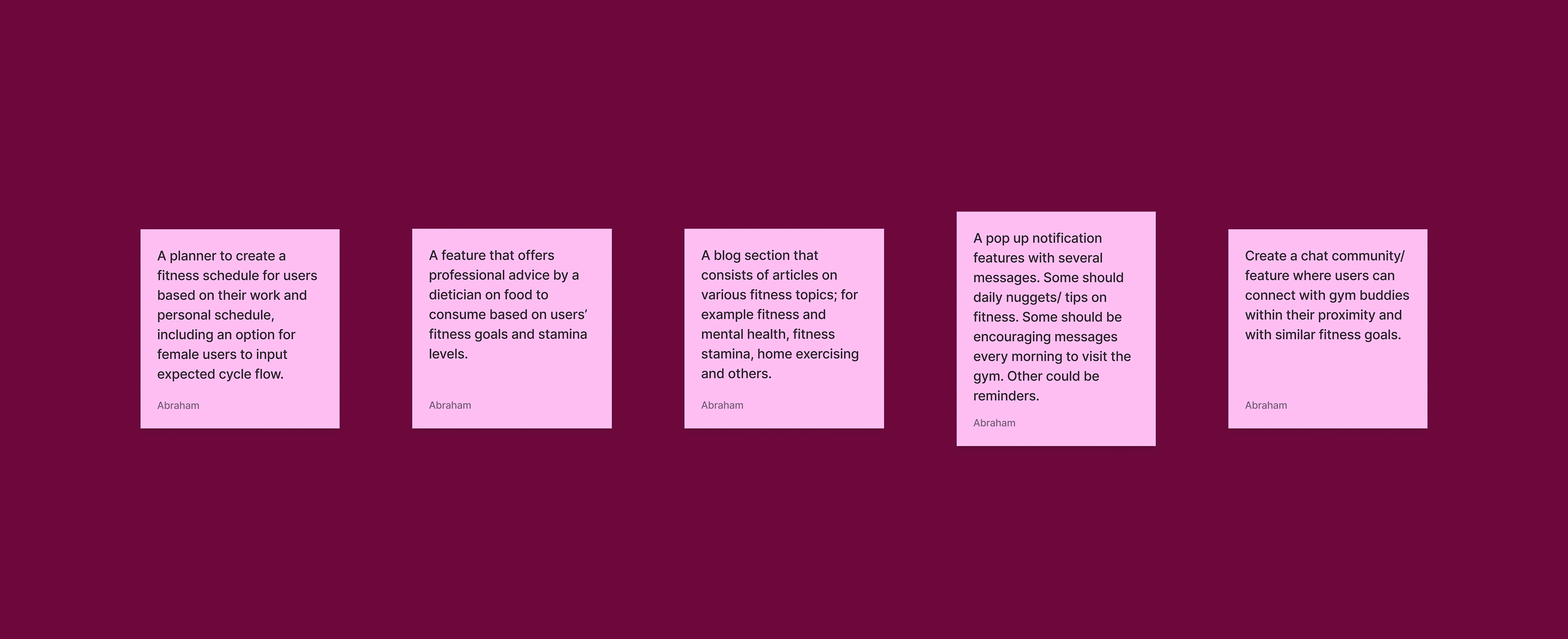
Based on the categories above, I chose five features to be implemented in MFit at its initial launch and because the Do Now category had more than five ideas, all five features came from that category. Although some of these ideas were modified and others merged together into one feature, all came from the same category. For instance, the idea about consideration for cycle flow was not taken as a stand alone idea but incorporated into the fitness planner feature.
Five Main Features
User-Centric and Cost-Effective
Taking initiative from the idea prioritization matrix, I identified five main features for the product which would provide high value to the users by solving their pain points, while being cost-effective for the business by requiring low effort to implement. These features formed the core focus of the design phase and shaped the elements used in the design phase.
Design
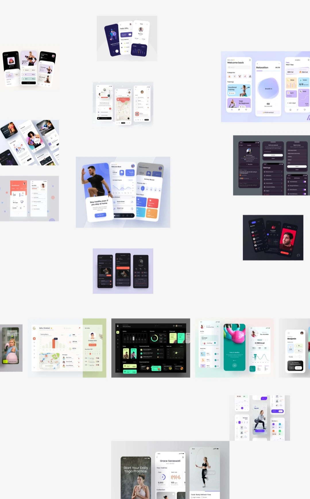
Moodboard
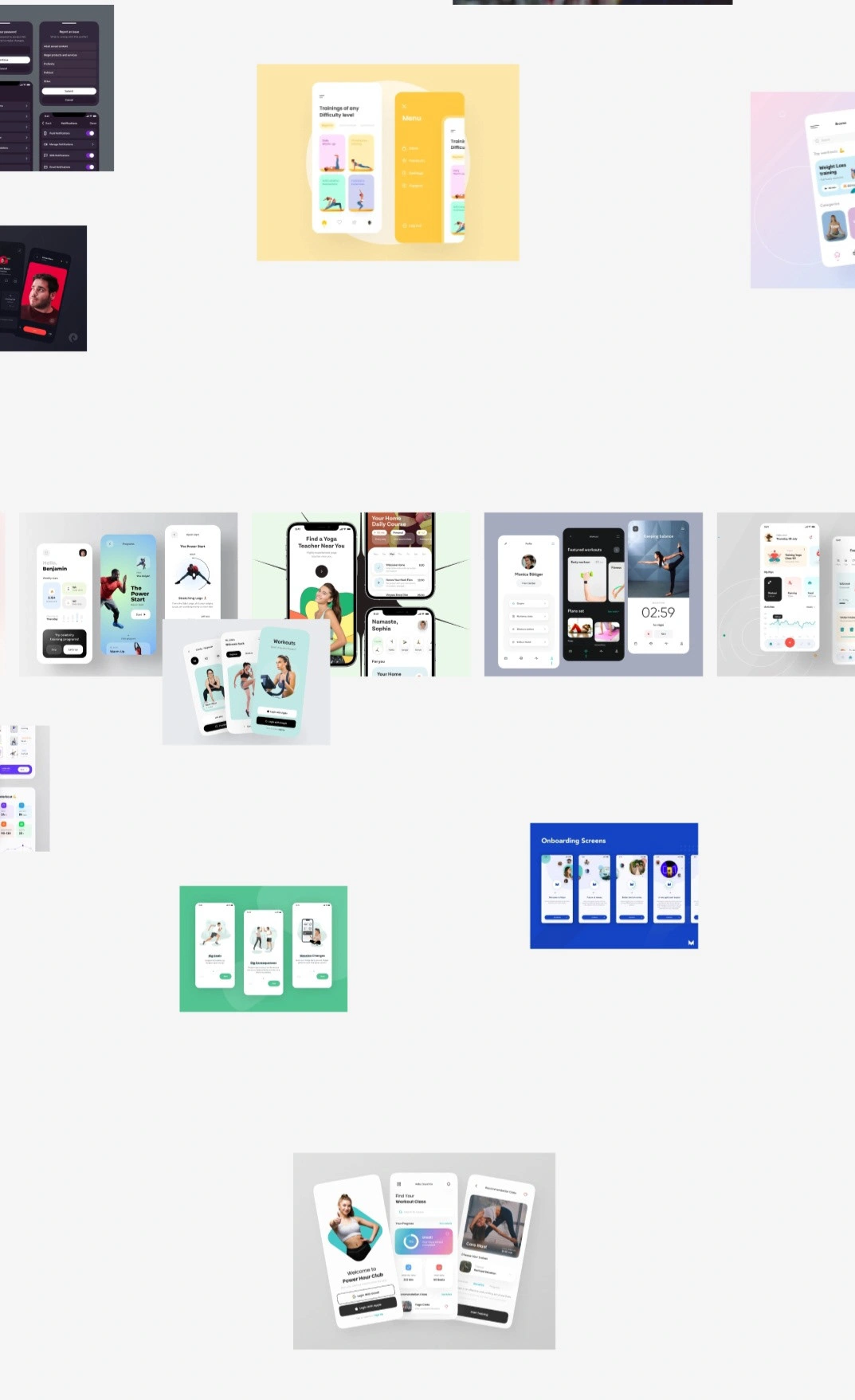
Moodboard
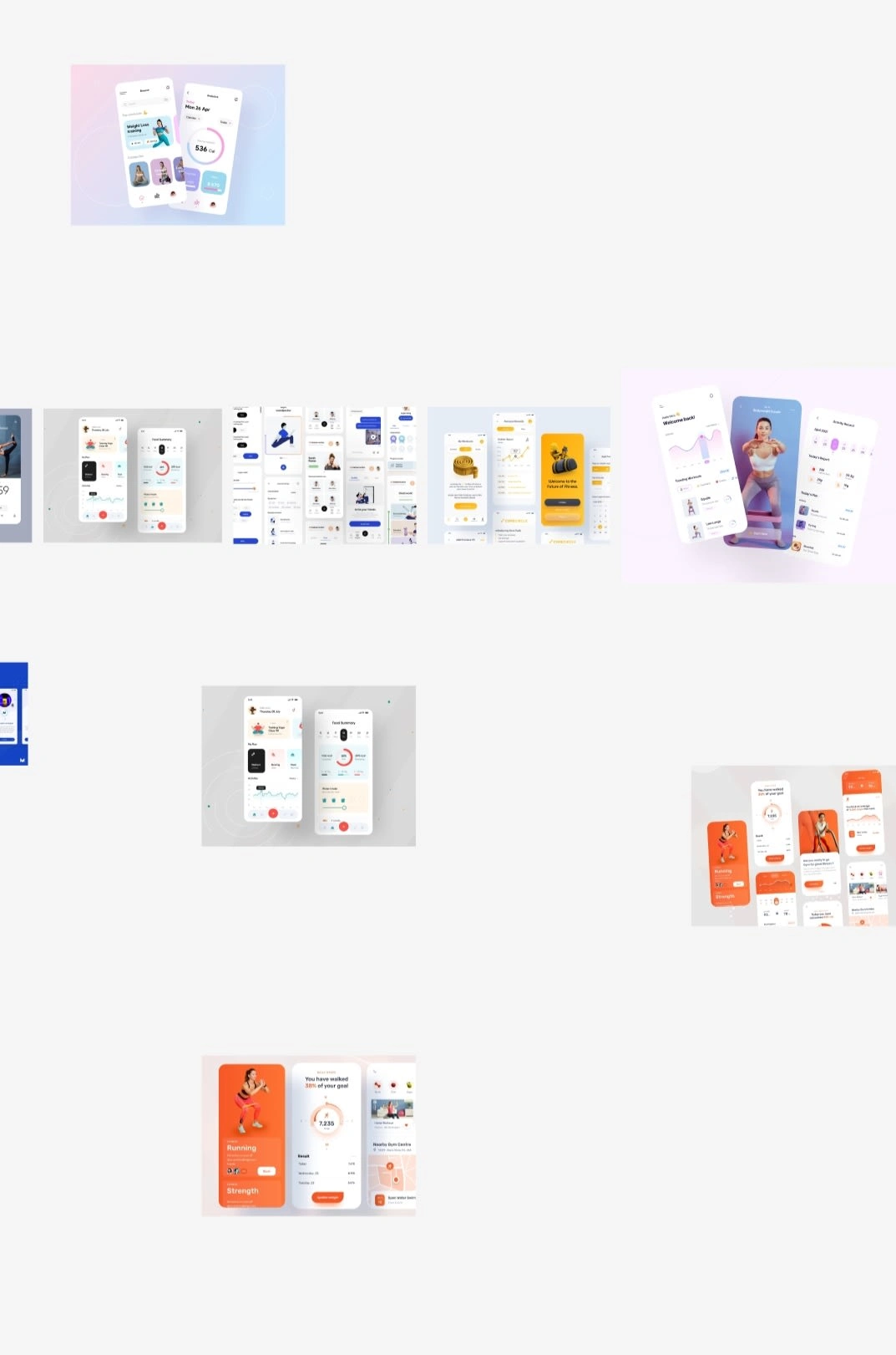
Moodboard
Sketches
After discovering and defining the problem, the next step was to develop the solution through the Design Phase.
I begun with a sketch of ideas for the UI. Some sketches were before I created low fidelity screens and wireframes, while other were during the design of low fidelity when I wanted to change the layout of a screen.
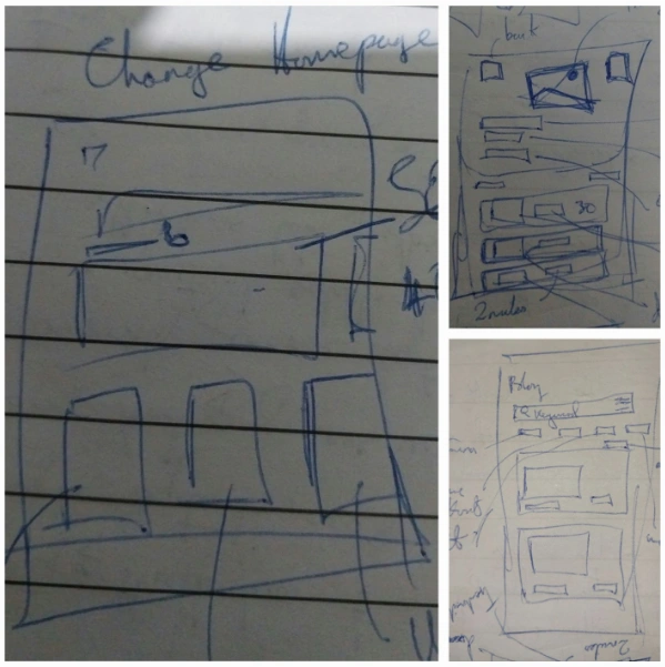
Handsketches
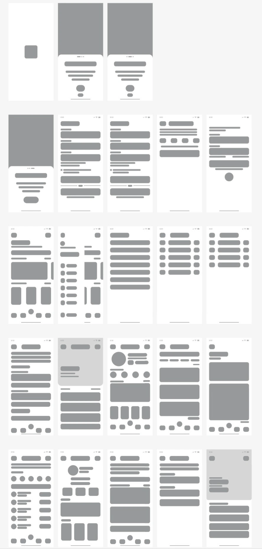
Wireframes
Wireframes
The wireframe provided a general layout for the application and using my moodboard I determined the layout for each page taking into consideration usability, accessibility, and the laws of UX. Often, I had to navigate between wireframe, sketches, and low fidelity. Sometimes, to change the layout of design I would resketch the home page, then adjust the wireframe accordingly. I repeated this process for the home page, generated fitness plan page, and the blog page.
If you're wondering why I had hand sketches and digital wireframes. With the use of digital wireframes I could easily transition into creating lo-fi screens by simply duplicating each frame from the wireframe and editing appropriately. This approach was also used to move from low fidelity to high fidelity.
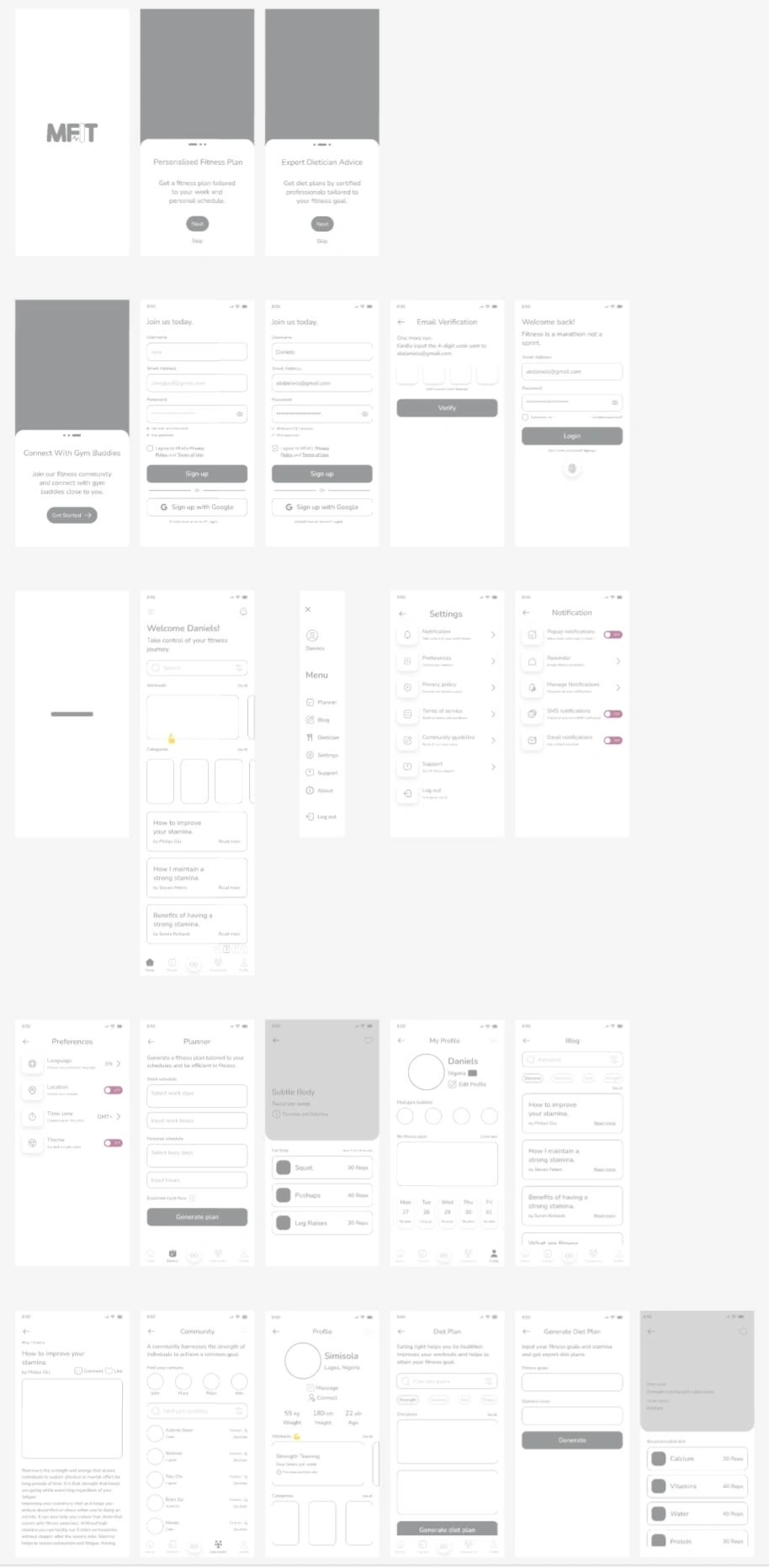
Low Fidelity Screens
Low Fidelity
The next step in my design phase was to create low fidelity screens which displayed everything that would be in the high fidelity screens, but for the non inclusion of colours and images.
Often, I switched between low fidelity and high fidelity. I would make a change on my high fidelity design to improve navigation for users. Then, return to my low fidelity to make adjustments.
The low fidelity allowed me to make necessary adjustments to the copy, and ensured that the size and spacing of the elements were consistent with my grid system and style guide.
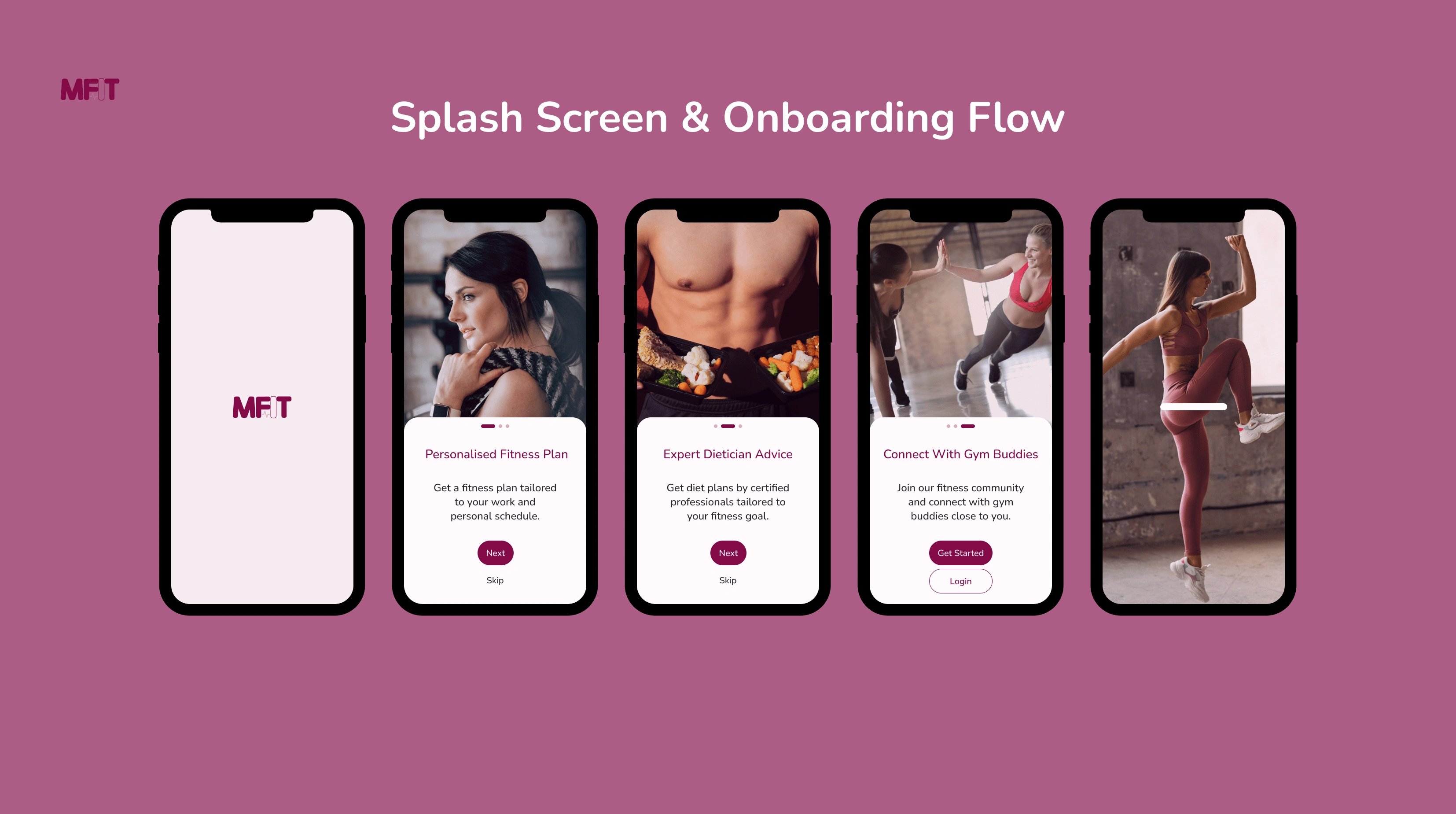
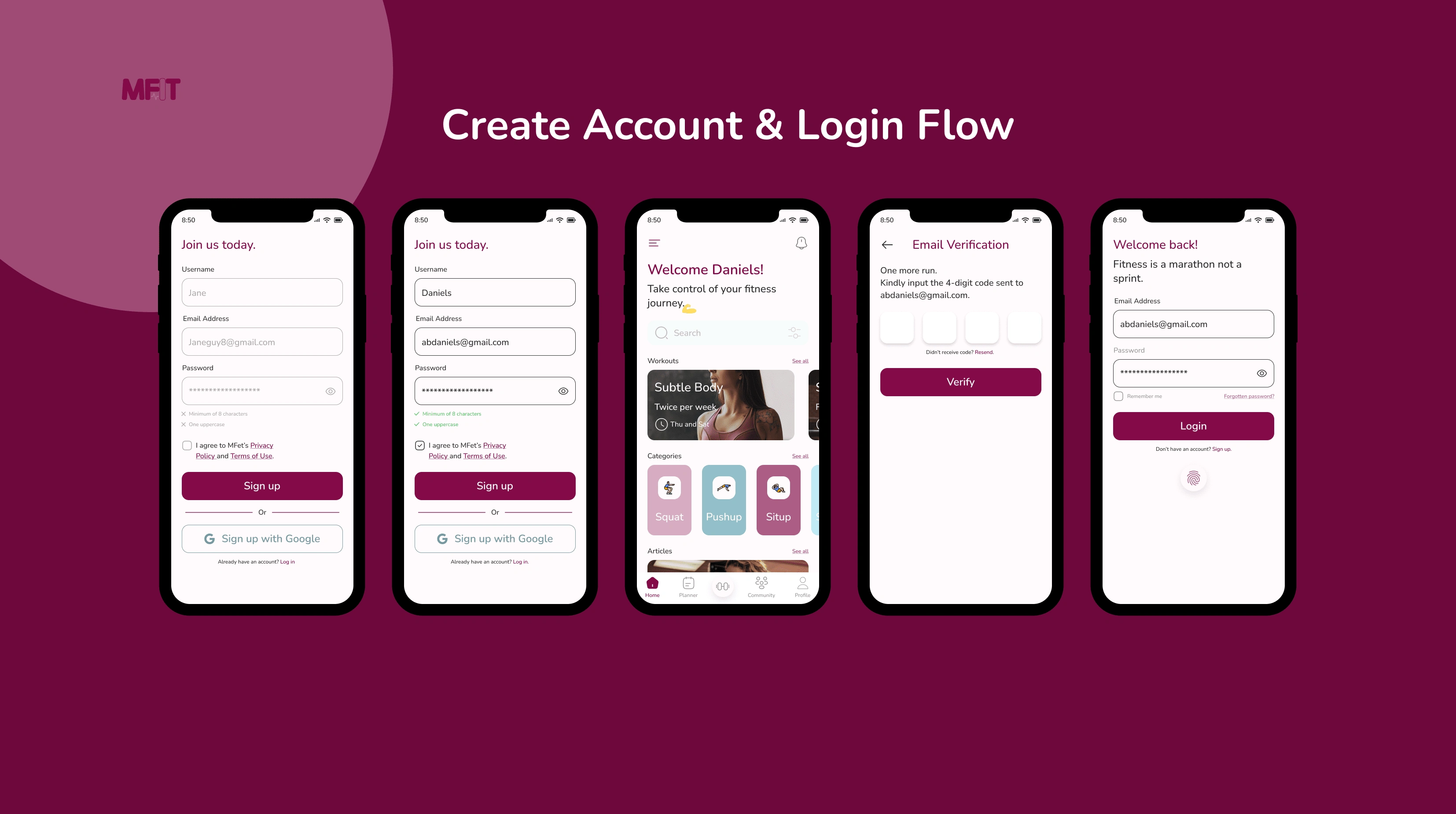
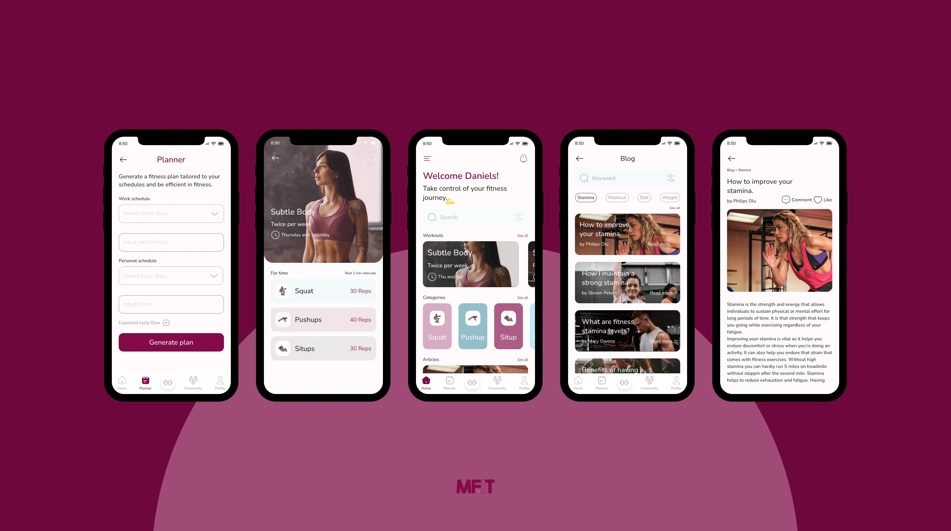
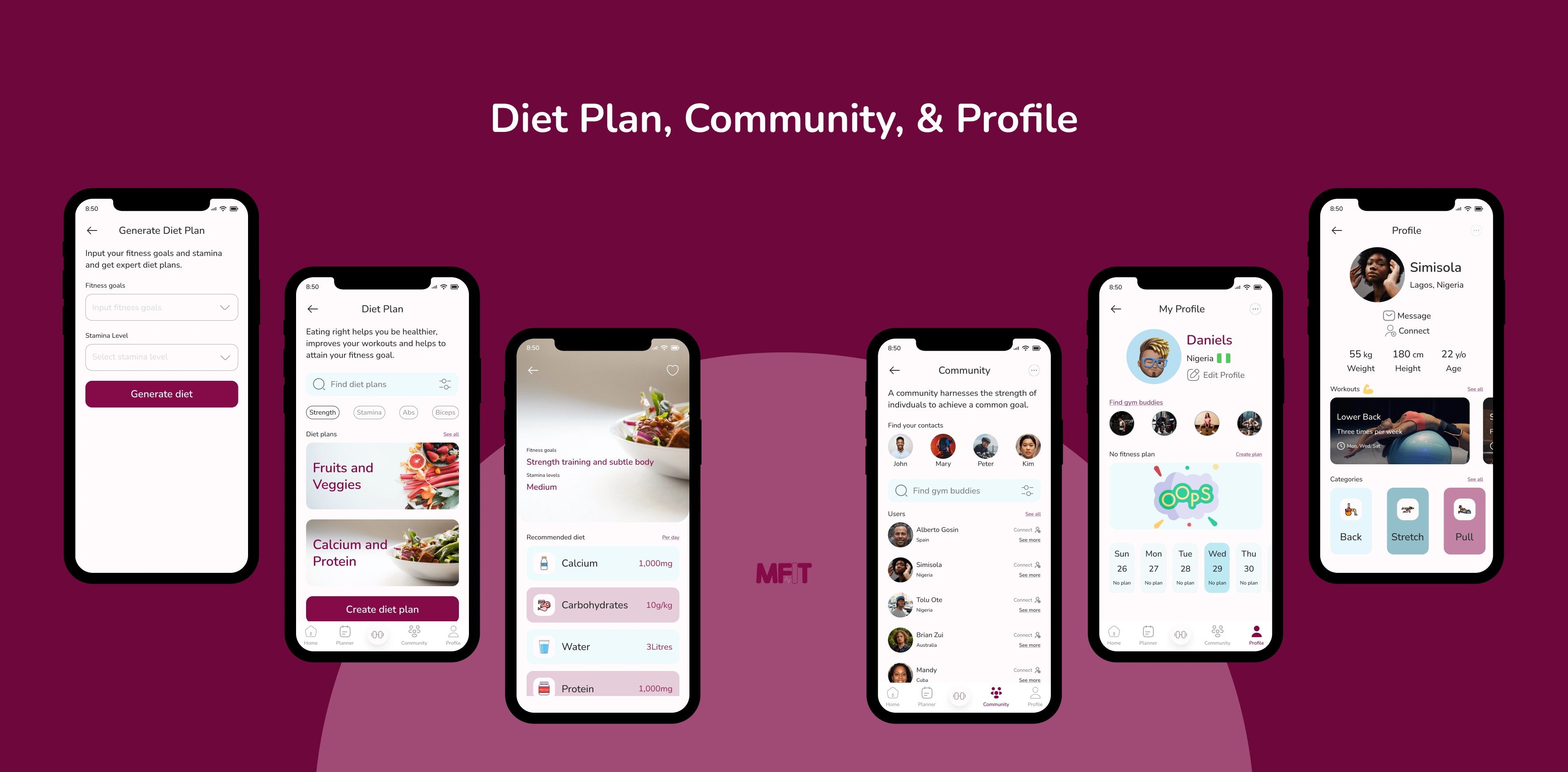
High Fidelity Screens

Style Guide
Deliver
View the prototype here.
Iteration
During prototyping I realized there was no "login" button on the last onboarding screen. This meant that existing users had no way to navigate directly to the login page. Therefore, I returned to my high fidelity and low fidelity screens to add a login button.
Duration
3 Weeks
Number of Screens
23
Prototype
1
Fitness is a mental exercise.
Tolu Kingsley
Like this project
Posted Sep 14, 2023
A fitness mobile application that provides a supporting community for users.
Likes
0
Views
13
Clients
Glaction

