Brand Identity Design for e-Fuegos
Lucia Salcedo
From aesthetic fail to functional fire—how I built a warm, grounded brand for a Córdoba-based e-commerce.
They thought they wanted something ultra-modern and trendy—until we realized the brand needed heart, not hype. After a full reset, I designed a visual identity that reflects what e-Fuegos really is: connection, family, and fire as a way of living.
This brand isn’t about fire alone. It’s about the life that happens around it.
What We Know About Our User
Our users live outside the center of Córdoba, in homes with gardens and long tables ready for asados. They're between 30 and 50, have a mid-to-high income, and take pride in the atmosphere they create at home—both aesthetically and socially.
Men (75% of buyers) value functionality and product durability.
Women, especially in couples, often make the final decision, prioritizing aesthetics because these products live outdoors as part of the home.
On social media, engagement is balanced (50/50) but conversion happens when both function and style are aligned.
They're not just buying grills—they’re curating memories with friends and family.
The Brief
Javier and Regi, owners of a Córdoba-based metal workshop brand (Herrería Los Molles), wanted to launch e-Fuegos, an ecommerce-only brand that centralizes and distributes their entire fire-related product line.
The vision:
A strong online identity.
Brick-and-mortar stores that act as showrooms and customer service hubs.
A brand that feels modern, aesthetic, "canchera", but also human, warm, and familiar.
The First Concept (Spoiler: It flopped 🙃)
I started exploring ultra-modern directions. Inspired by gourmet food, home decor and fashion branding, I built an identity that felt sleek and trendy.
But during the first presentation, I got hit with reality:
It's good...but it doesn't represent us. This is not a brand that screams fire, family or tradition.
They didn’t just want something “nice”—they wanted something meaningful.
The Pivot
After that honest feedback, I went back to research. I revisited what really mattered to them:
A central point (the ecommerce site) that spreads fire everywhere.
A sense of home, gathering and expansion.
Visual harmony that could hold both the ruggedness of fire and the polish of design.
This led to a new north star:
If e-Fuegos were a person, they’d be that friend who knows how to make a perfect steak, cracks a beer for you before you ask, and has a garden everyone wants to hang out in.
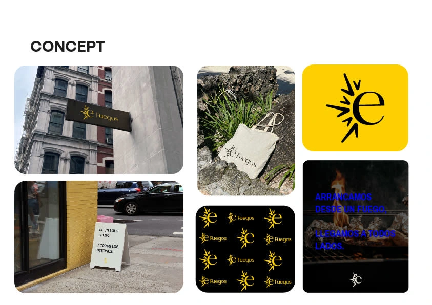
Brand Concept & Visual System
Inspired by fire as both function and feeling, I created a system that balances structure with soul.
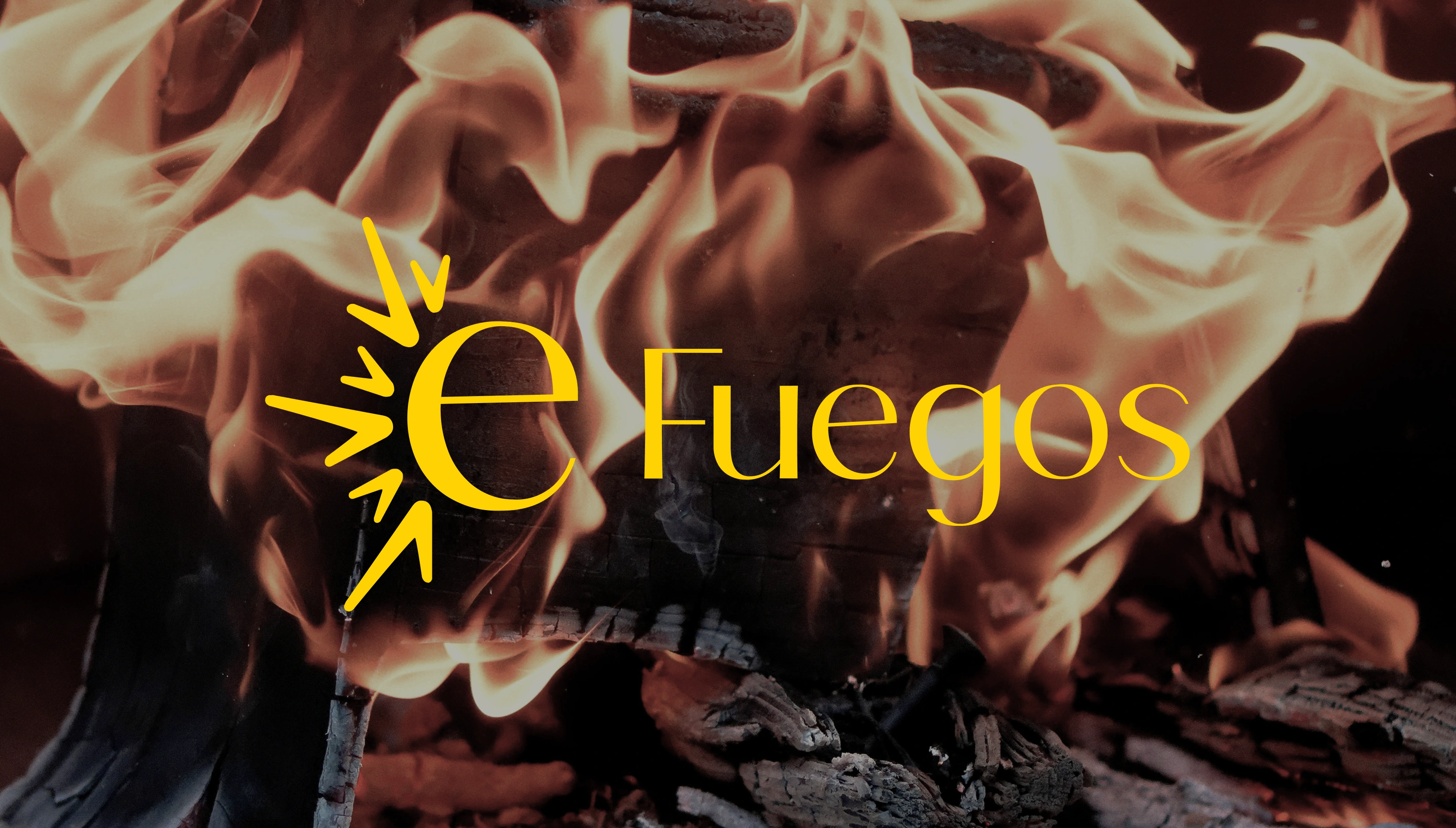
Logo
A bold, minimal “e” surrounded by flames.
Represents the digital center (ecommerce) from which fire spreads.
Symbol of connection, warmth, and growth.

Color palette
Black and charcoal for strength and stability.
Warm beige for calm and balance.
Flame orange and vibrant yellow for energy and warmth.
Accents in blue and purple for modernity and contrast
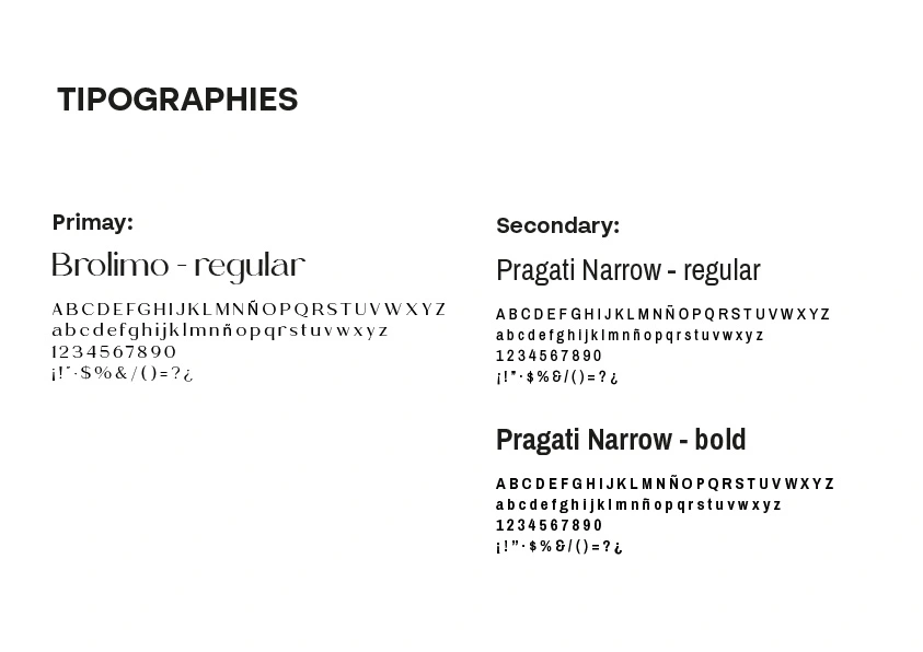
Typography
Brolimo: strong but not rigid
Pragati Narrow: clear and approachable for extended reading
Outcome
The clients were thrilled with how the final identity captured everything they were trying to express: warmth, expansion, and connection.
Even better: the brand system now supports multiple product lines, different audience types, and real-world scalability.
Reflection
Not every first idea will land—and that’s a good thing.
This project reminded me that brands aren’t just visuals. They’re people’s beliefs, goals, frustrations, and values, turned into a living system.
And sometimes the best designs happen right after a total reset.
Like this project
Posted Aug 5, 2025
Designed a warm, grounded brand identity for e-Fuegos, a Córdoba-based e-commerce.
Likes
0
Views
4