Outlook UI Redesign for Enhanced Usability

I redesigned Outlook to reduce inbox anxiety — and made emails actually enjoyable to open.
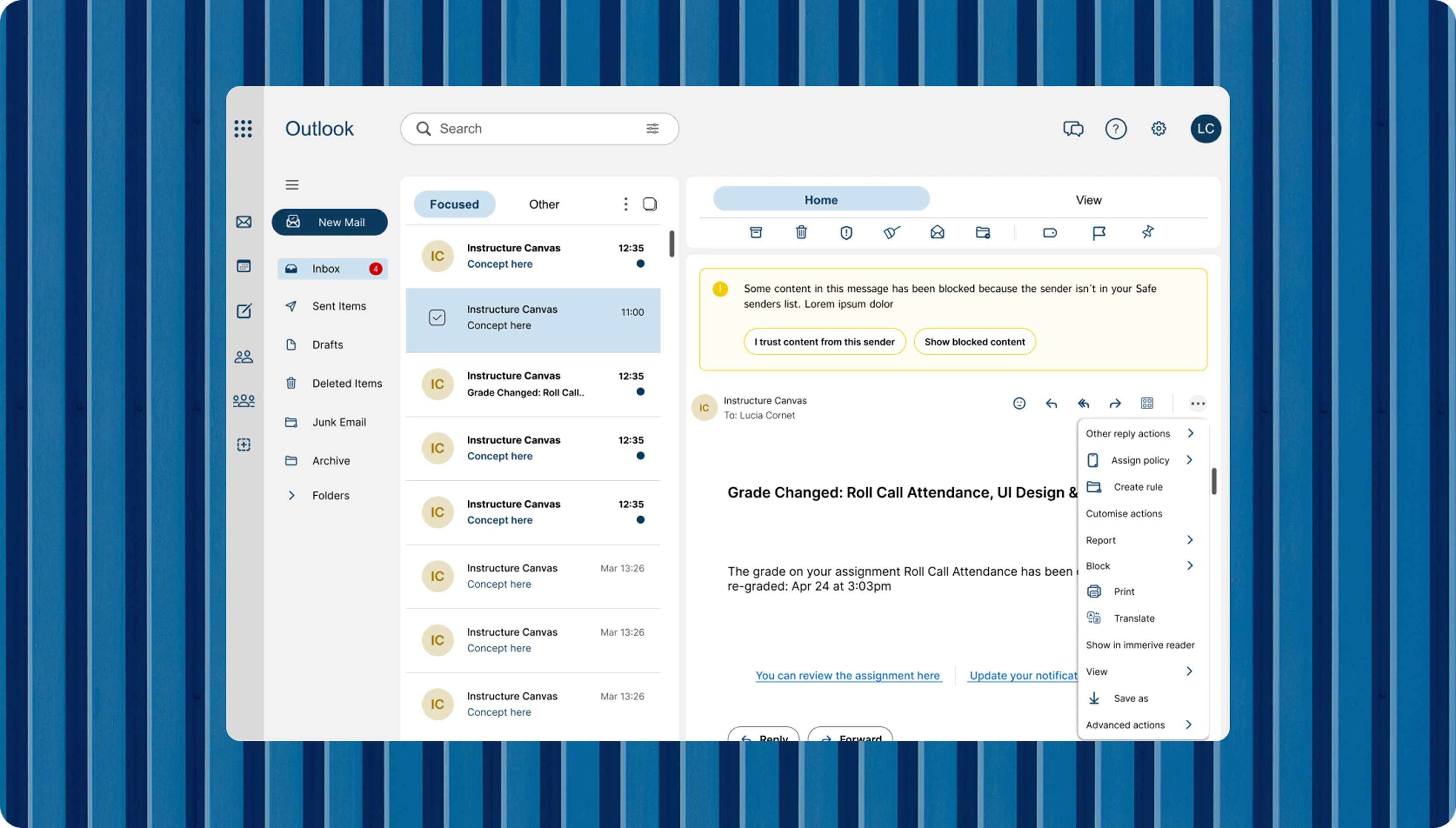
By giving Outlook a modern UI and rethinking its information architecture, I turned a cluttered experience into a calm, functional, and user-friendly space.
Let’s be honest: using the old version of Outlook felt more like surviving than navigating.
The Problem
Here’s what was tripping users up:
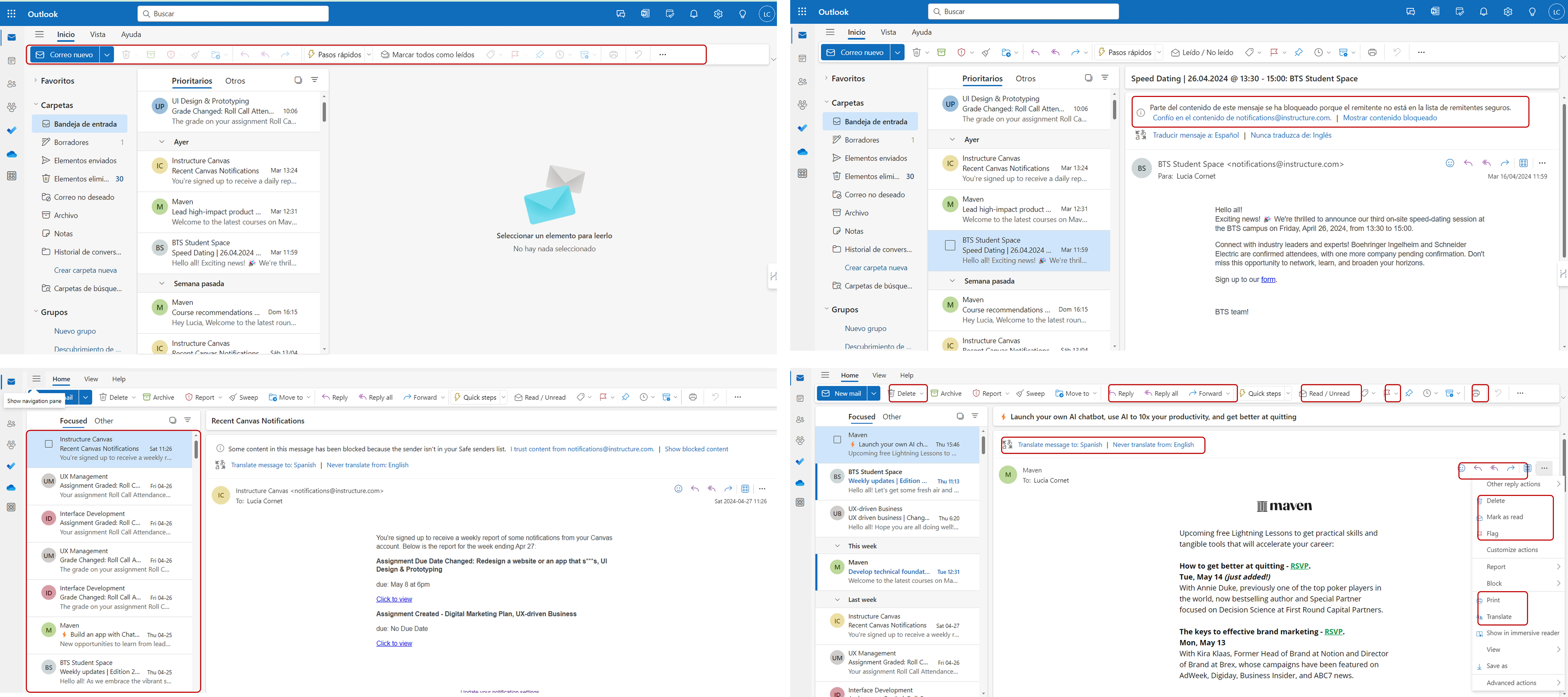
Too much, too soon: Right after login, users were hit with walls of information and tons of disabled buttons. It was hard to know where to start.
Same actions, different places: Repeating the same steps across different parts of the platform wasn’t just annoying—it slowed everything down.
Vague warnings: Important alerts felt like riddles. Instead of helping, they left users guessing.
Cluttered inbox: The email layout was visually overwhelming, making it hard to find anything quickly.

Process
I ran the heuristic analysis, restructured the information architecture, redesigned the UI, and prototyped key flows for validation.
Understanding the user
Although I didn’t run fresh interviews for this redesign, I based my decisions on common usability heuristics and observable pain points within the UI.
The overwhelming clutter and lack of affordances were red flags from the start.
Design Solutions That Made a Difference
Removed Disabled Buttons: If something's not usable, why show it? I removed all disabled buttons from key pages, keeping the interface clean and actionable.
→ This reduced friction and gave users a stronger sense of control.
Streamlined Redundant Actions: Streamlined Redundant Actions.
→ Less clicking around. More getting things done.
Clearer Warnings, Better Feedback: Redesigned alert messages now come with clear language and visible, meaningful call-to-actions.
→ No more guesswork—just straightforward next steps.
Cleaner, Friendlier Email Layout: I redesigned the inbox to highlight what really matters: the sender and subject. Less clutter, more clarity.
→ Now users can scan and find what they need in seconds—not minutes.
Outcome
While this was a conceptual redesign, the goal was to improve overall usability and reduce cognitive load.
If implemented, I’d expect:
A drop in misclicks and user errors due to clearer UI signals.
Faster task completion (especially in email triage).
A more calm and positive user experience when dealing with inboxes.
Reflection
This project reminded me how much design can shape emotion.
Something as small as a button or layout decision can turn a stressful experience into a calm, empowering one.
My biggest takeaway?
It’s not about showing everything—it’s about showing what matters, when it matters.
Like this project
Posted Aug 7, 2025
Redesigned Outlook's UI to reduce inbox anxiety and enhance user experience.


