Boomink — Brand Identity & Packaging Design

Faiz Ansori


Turning printer ink into a recognizable brand
Boomink is a printer-ink brand from Salatiga, Indonesia, positioned around affordable printing. This branding project connects that everyday product category to a distinctive identity through an expressive logo, a print-inspired color palette, clear typography, and coordinated packaging mockups.
The design challenge
The design balances two needs: giving Boomink a recognizable personality and keeping product information easy to identify. Ink is a practical purchase, so the visual system needs to communicate the brand while helping customers distinguish one color variant from another. The resulting presentation brings the identity and packaging together as one consistent system.
Logo and brand expression
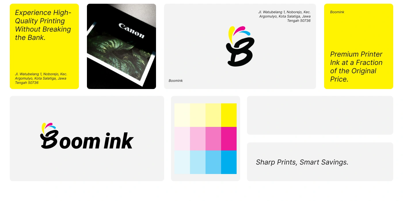
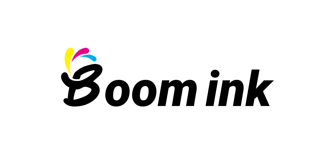
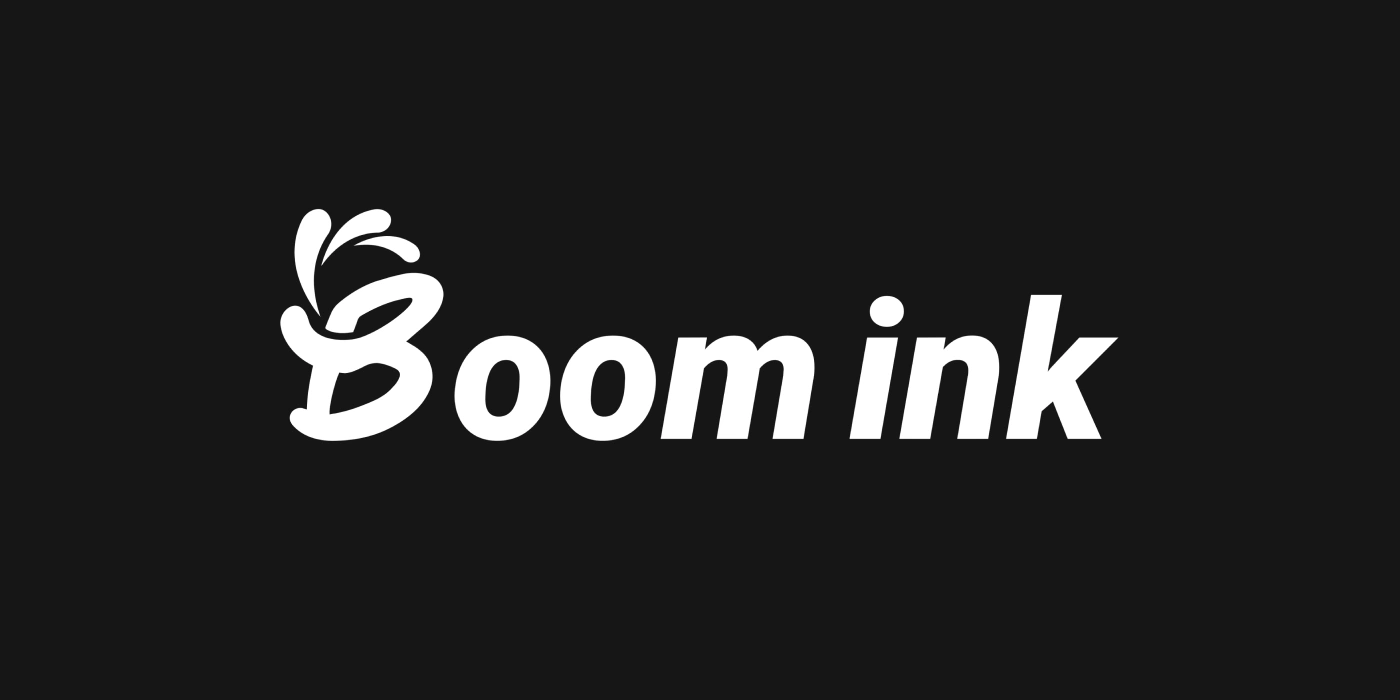
The wordmark pairs a flowing, expressive B with bold, slanted lettering. Cyan, magenta, and yellow splash shapes above the initial connect the mark directly to ink and color printing. The standalone B offers a compact expression of the identity, while the full wordmark gives the brand name greater prominence. A white version on a dark background demonstrates how the same silhouette can remain recognizable without the multicolor accents.
A color system rooted in printing
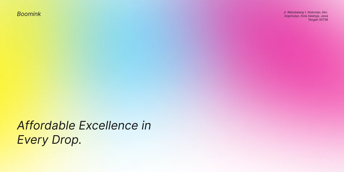
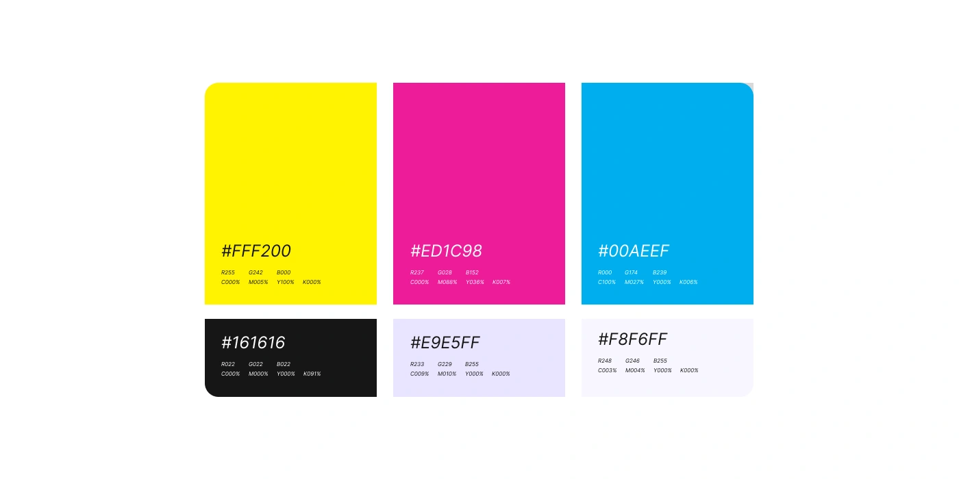
The palette features yellow #FFF200, magenta #ED1C98, and cyan #00AEEF, supported by near-black and pale backgrounds. These colors create a direct link between the visual identity and the product category. Gradients extend the palette into expressive brand layouts, while white space gives the logo and supporting copy room to stand out.
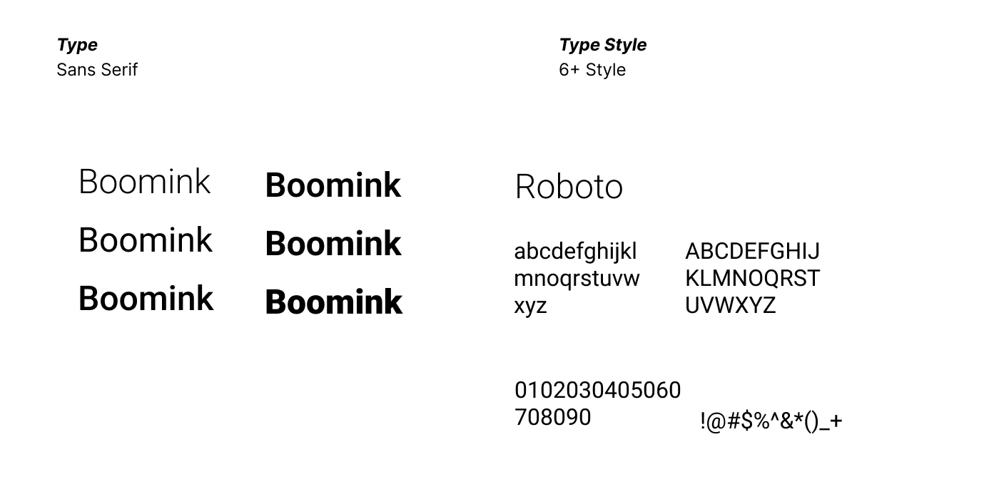
Roboto provides the supporting typography. Its range of weights creates a clear hierarchy for brand statements and product information, complementing the more expressive logo rather than competing with it.
Packaging and product identification
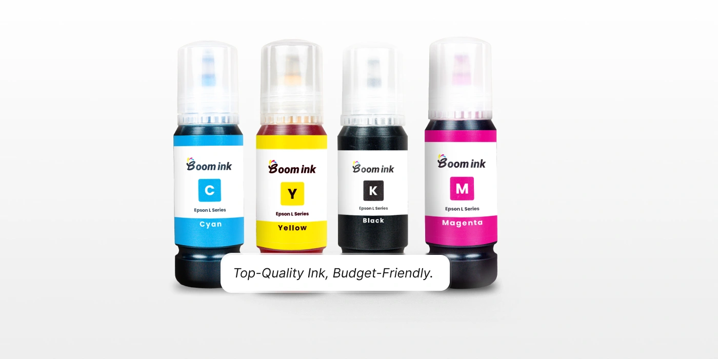
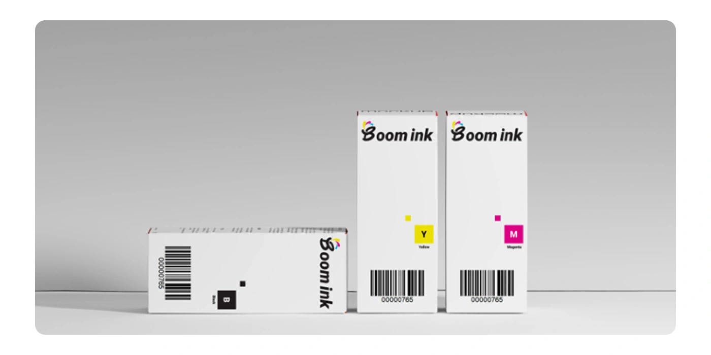
The bottle mockups use a consistent label structure across cyan, yellow, black, and magenta variants. Colored bands, prominent C/Y/K/M letters, and written color names work together to distinguish the products. The box mockups carry the same identity into a restrained white layout, with the wordmark and color markers acting as the main visual anchors.
Design outcome
The final presentation brings together the logo, color specifications, type system, brand-message layouts, bottle labels, and box packaging. It demonstrates how a vivid identity can stay consistent across promotional graphics and practical product surfaces. The mockups show the proposed design in context, giving a clear view of both the brand personality and the packaging hierarchy. Explore the visuals below for the identity details and product applications.
Like this project
Posted Sep 19, 2026
A vibrant printer-ink identity for Boomink, combining a CMYK-inspired logo, Roboto typography, and color-coded bottle labels and box packaging.
Likes
1
Views
11
Timeline
Jan 1, 2024 - Feb 1, 2024