Amazink People Group — Brand Identity Design

Faiz Ansori


Building a people-centered brand identity
Amazink People Group is built around a clear vision: helping people grow in competence and character so they can contribute to others and create a brighter future. This 2024 branding project translates that vision into a recognizable visual identity, bringing together a logo, color palette, typography, and examples of the brand in use.
The design challenge
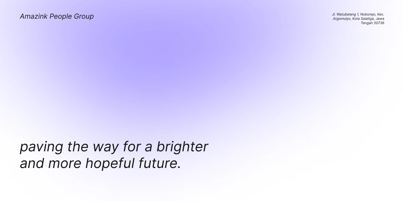
The central design task was to give an abstract idea, personal growth with a positive impact on others a clear visual expression. The identity needed to feel approachable while retaining the structure and clarity of a professional organization. The presentation connects the group’s mission to a consistent set of visual elements.
Logo and visual direction
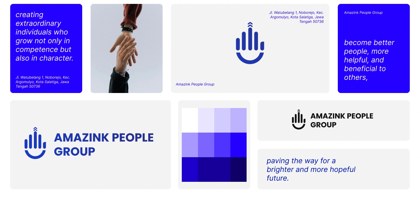
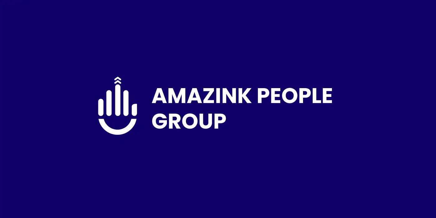
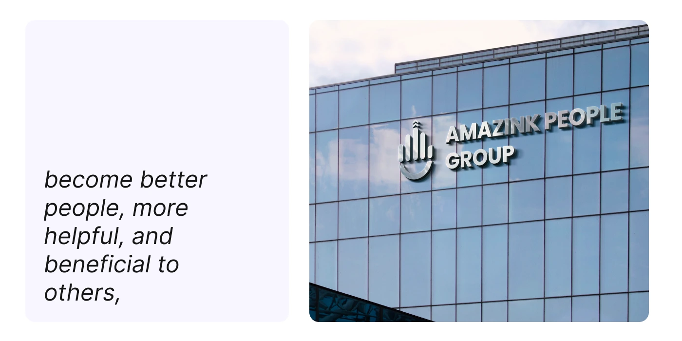
The symbol combines rounded vertical forms, an upward-pointing detail, and a curved base that reads like a smile. Together, these features give the mark a friendly character and a sense of upward movement. A bold, uppercase wordmark balances the softer symbol and makes the organization’s name prominent. The presentation includes the combined logo, the standalone symbol, and light and dark applications.
Color and typography
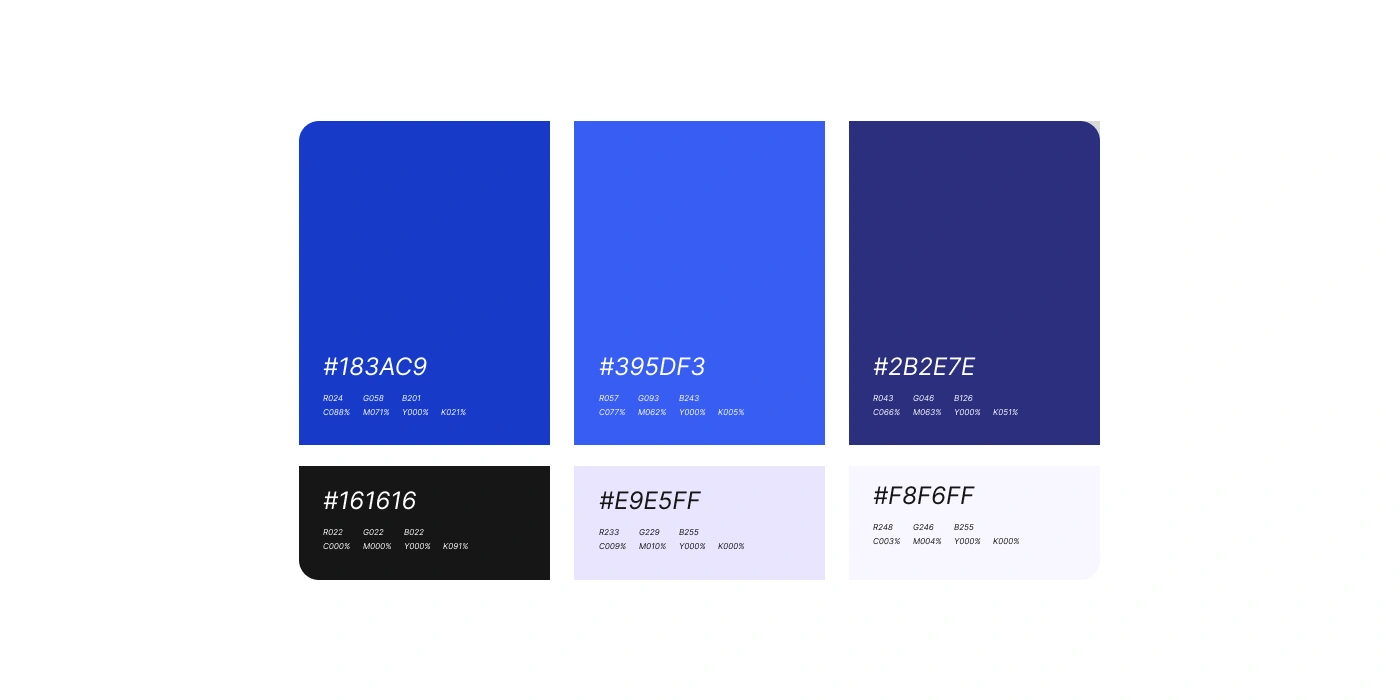
The palette is anchored by blue tones, including #183AC9, #395DF3, and #2B2E7E. Black, pale lavender, and an almost-white background provide supporting options for text and layouts. Poppins supplies a consistent sans-serif type family, with multiple weights for headlines, supporting copy, and brand statements. Bold names and spacious compositions keep the identity clear, while softer backgrounds create a welcoming visual tone.
Brand applications and outcome
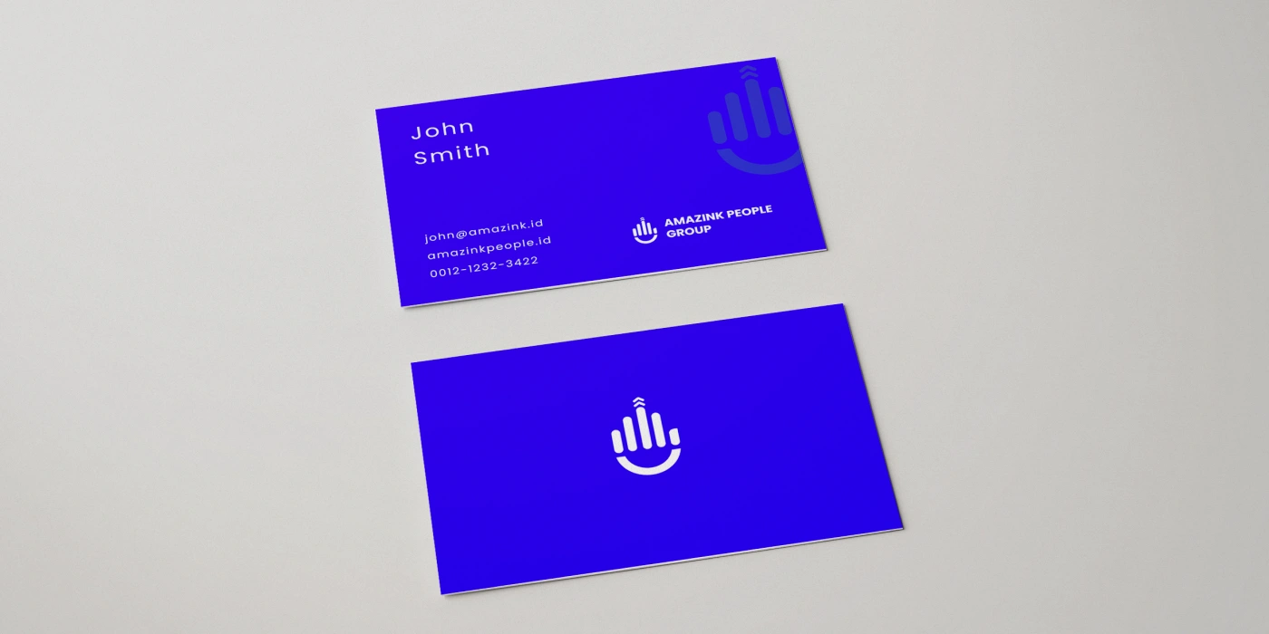
The project presents the identity across business-card and building-signage mockups, alongside logo variations, palette specifications, typography, and mission-led layouts. These applications show how the same visual language can work at different scales from a compact printed card to a large architectural sign.
The result is a coordinated brand presentation with a distinctive symbol and repeatable visual elements. The work shown here focuses on the identity system and its applications; the mockups illustrate the design in context. Explore the visuals below for the logo, color system, typography, and application details.

Like this project
Posted Sep 19, 2026
A people-centered brand identity for Amazink People Group, featuring a distinctive logo, blue color system, Poppins typography, and brand application mockups.
Likes
1
Views
5
Timeline
Feb 2, 2022 - Mar 1, 2022