Email Campaign Design for Functional Drink Brand

Chinwe Owanta-Emenike


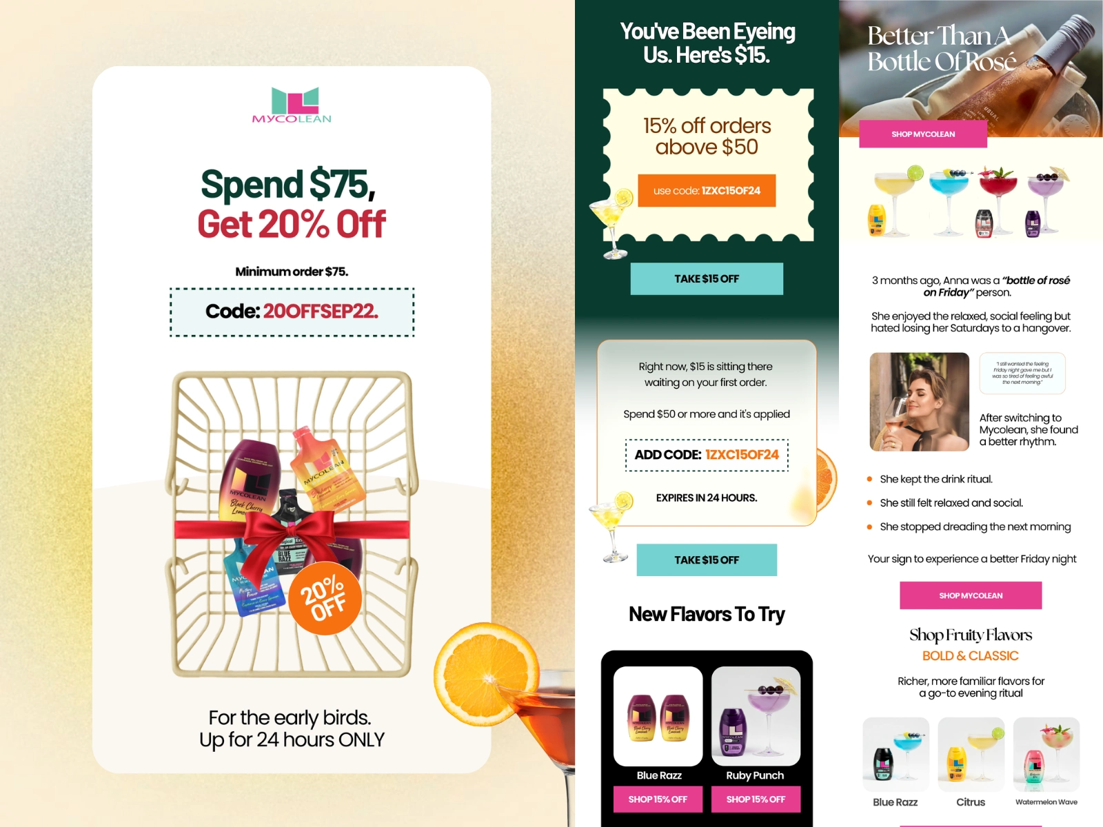
Campaign Email Design for a Functional Drink Brand
Three Promotional Campaigns for a DTC Alcohol-Alternative Brand
Overview
Designed three standalone email campaigns for a functional drink brand positioned as an alternative to the evening drink ritual.
Each campaign had a different commercial job: reframing the product through storytelling, converting first-time buyers with a targeted incentive, and lifting order value through a time-limited offer. Together they show how one brand system can flex across very different campaign goals while still feeling like the same brand.
Context
The brand sells into a moment most people already have: the Friday drink, the glass of wine after work, the social ritual.
The product doesn’t ask people to give that ritual up. It offers a way to keep it without the next-morning cost.
That creates a specific design opportunity in email: show the product as part of the ritual, served, poured, and enjoyed, so subscribers can picture it replacing something they already do.
The Challenge
Promotional emails in the beverage space tend to:
Lead with discounts and nothing else
Show products as bottles on a white background
Treat every campaign the same, regardless of who it’s speaking to
For this brand, each campaign needed to:
Make the product feel like a drink worth reaching for, not a supplement
Present the offer clearly enough to act on in seconds
Use urgency without feeling cheap
Hold a consistent visual identity across very different campaign types
Strategic Approach
Each campaign was built around one job and one audience state:
Story-led campaign
→ Shift perception: why the product belongs in your evening
First-order campaign
→ Convert interest into a first purchase
Flash sale campaign
→ Drive urgency and increase average order value
The product was styled as a served cocktail in every email, so the brand’s core idea, keeping the ritual, was carried visually even when the copy was purely promotional.
Campaign Overview
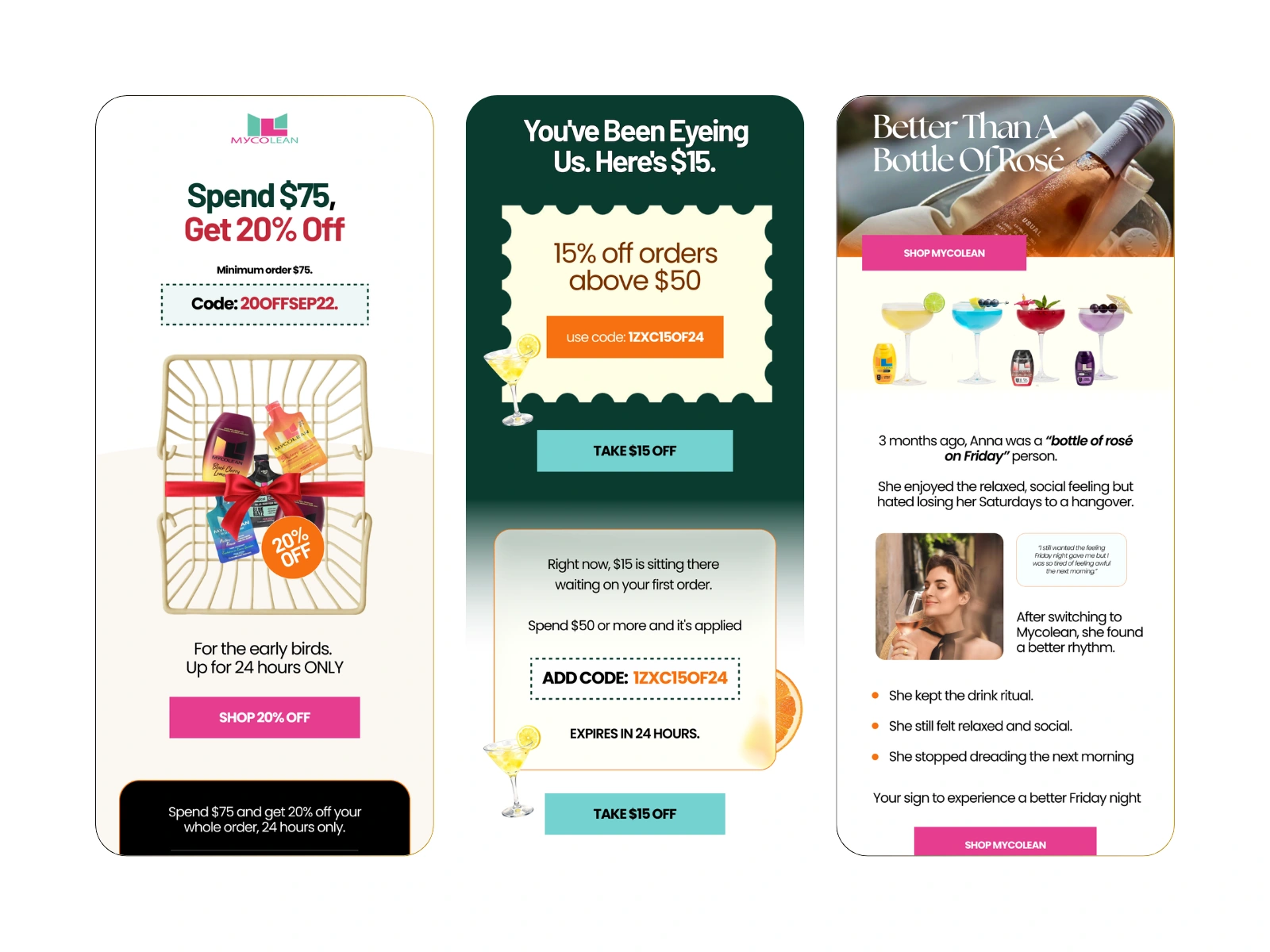
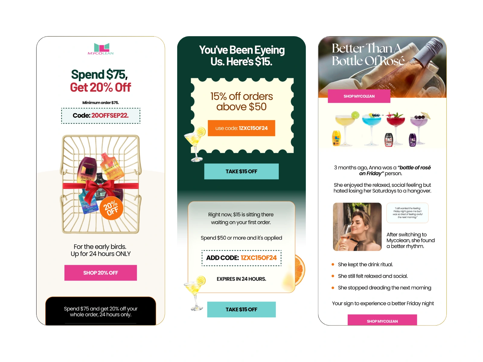
Email 1 — Better Than A Bottle Of Rosé
Purpose: Reframe the product through a relatable story
This email opens with an editorial hero and introduces Anna, a “bottle of rosé on Friday” person who kept the ritual and lost the hangover after switching.
It focuses on:
A short customer narrative supported by a pull quote
Three plain benefit statements tied to her experience
Flavour discovery through the Bold & Classic range
Bundles framed around value, with savings up to 40%
The story does the persuading before any product is sold, so the bundle section lands as a natural next step.

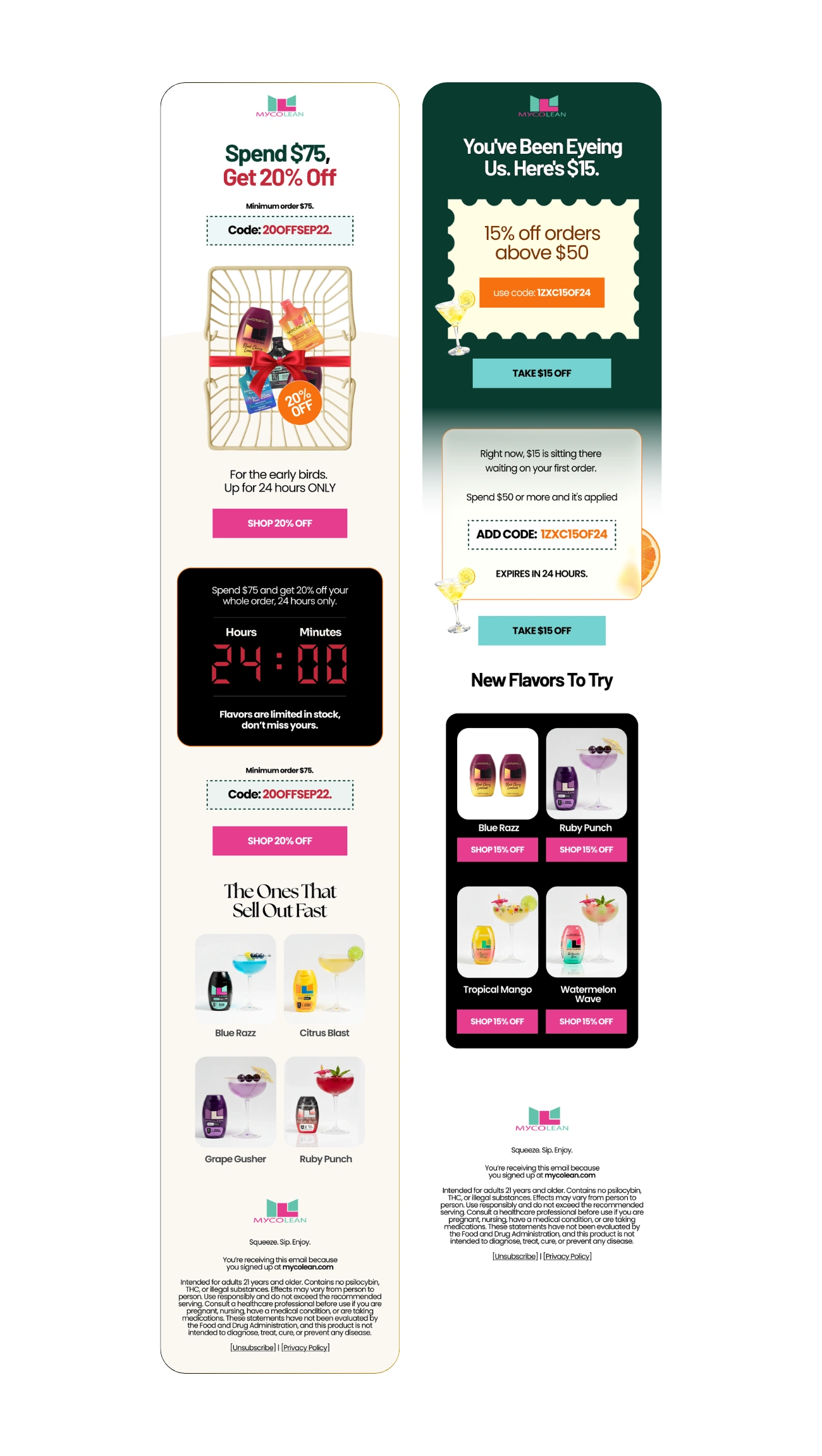
Email 2 — Spend $75, Get 20% Off
Purpose: Increase average order value through a 24-hour threshold offer
The offer is stated in the headline, repeated in a dashed code block, and visualised with a gift-wrapped product basket.
It highlights:
A minimum spend designed to push customers toward multiple flavours
A countdown timer block to make the 24-hour window tangible
The code and CTA repeated after the timer, so readers who scroll never have to scroll back
A “The Ones That Sell Out Fast” grid to add scarcity at the product level
Email 3 — You’ve Been Eyeing Us. Here’s $15.
Purpose: Convert interested subscribers into first-time buyers
The headline speaks directly to a subscriber who has browsed but not bought. The offer sits inside a ticket-style coupon, making the discount feel like something already in hand.
It focuses on:
A coupon visual that turns the code into a tangible object
A reinforcement block restating the offer, threshold, and 24-hour expiry
A new-flavours grid with individual “Shop 15% Off” CTAs, so every product is an entry point to checkout
Design System
The visual system was built from the brand’s identity and adapted per campaign:
Brand palette of deep green, teal, pink, and orange, with deep green used as a full-bleed background to give the first-order email its own presence
Bold sans-serif headlines for offers, paired with a serif display face for editorial and story moments
Product shown as finished cocktails in glassware rather than packaging alone
Citrus and glassware elements breaking the grid edges to add movement and freshness
A recurring dashed code block, so offers are instantly recognisable across campaigns
Consistent pink CTAs, switched to teal where contrast against green required it
Conversion Thinking
Each campaign used a different lever, matched to its goal:
Storytelling to shift perception before introducing price
Threshold offers to raise basket size
Time limits made visual through a countdown, not just stated in copy
Repeated code and CTA placement to remove friction on long mobile scrolls
Product-level CTAs so readers can act from the item that caught their eye
Scarcity framing applied to flavours, not just the discount
The CTA language stays direct and offer-led across all three, moving from a shop-the-brand CTA to “Take $15 Off” to “Shop 20% Off.”
Outcome
The three campaigns show how a single brand system can support story-driven, acquisition, and promotional emails without losing consistency. Each email is built to be understood in seconds on mobile, with the offer, the product, and the next action always visible.
Role & Tools
Role: Email Designer
Tools: Figma
Project Type: Client Work — Email Campaign Design (Brand Anonymised Under NDA)
Before you upload the images, remove or blur the brand name everywhere it appears in the visuals:
the logo at the top and bottom of all three emails
the “Shop Mycolean” buttons in Email 1
the mycolean.com link in the footers
the logo on the bottles and pouches in the hero images and product grids
the logo in the banner image
The bottles are the easiest to miss. If removing the branding cleanly is too much work, cropping the footers off is a reasonable compromise.
Like this project
Posted Oct 14, 2026
Three email campaigns for a DTC functional drink brand: a story-led email, a 24-hour flash sale and a first-order offer, each designed for a different goal.
Likes
0
Views
2
Timeline
Mar 14, 2026 - May 14, 2026
Clients
Potterflow LLC