A Complete Rebranding for Cybersecurity
Padrig Guillard
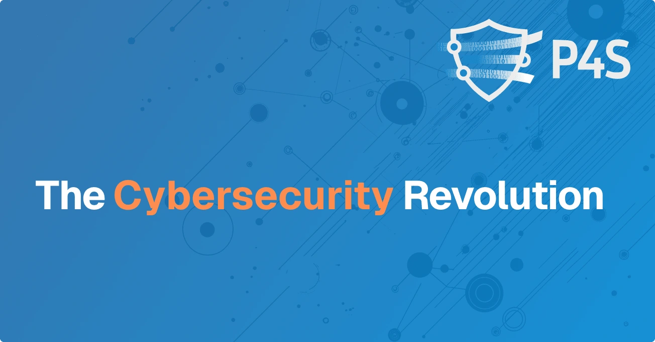
P4S - The Cybersecurity Revolution
Overview
P4S came to Orinn Studio with a challenge: their cybersecurity brand wasn't resonating with the market. Despite their revolutionary approach, embedding cybersecurity directly into hardware for unmatched performance and simplicity, their existing identity was outdated and lacked impact.
In a competitive industry where every detail matters, they needed a fresh, modern brand that aligned with their unique value proposition and spoke directly to their audience.
Branding Phase
Research
Old Website
We’ve started with the discovery session to understand the goals of the website revamp. Having a more professional image for an established company, communicate their core values and expertises to access bigger contracts and also attract talents to grow their team of experts.
There was inconsistency and a lack of a brand identity that was speaking to the management team. The existing website was not representing their ambitions and their image relied too much on stock images and with a classic copywriting.
Brand Strategy
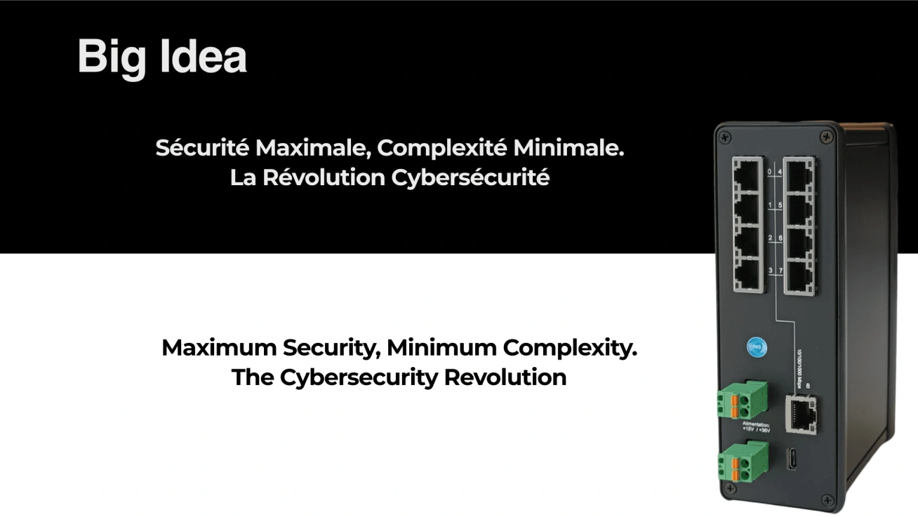
Big Idea
We identified key values: ultra-performance, ease of use, security, and sovereignty. P4S's unique positioning lies in going against the grain—while competitors pile on software layers, P4S achieves better results by optimizing at the hardware level. The message became simple: maximum security with minimum complexity.
Visual Exploration
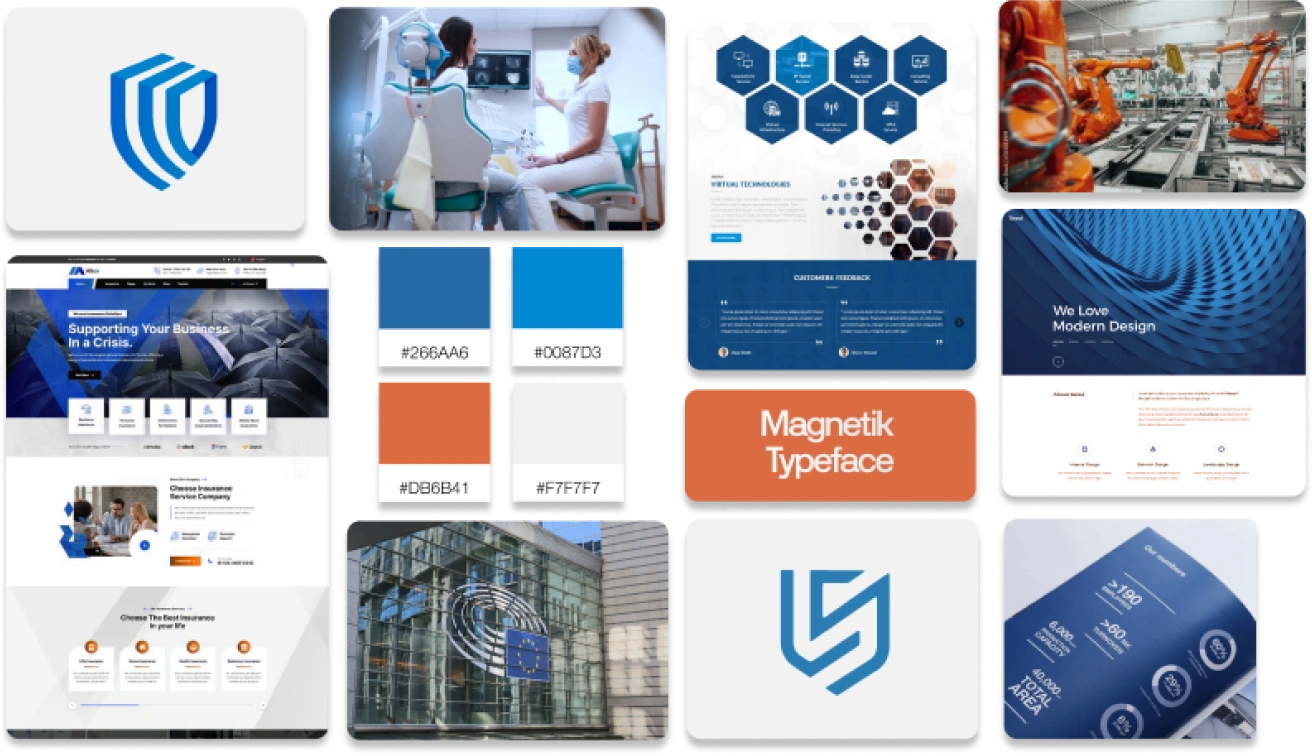
Final Moodboard
The visual identity exploration served as our compass during the brand identity creation process, focusing on a corporate, professional approach for an anti-conformist company. The concept was intended to appeal to B2B customers in industries such as Industrial, Medical, and Administration sectors. The goal was to communicate confidence, cutting-edge expertise, and simplicity.
Design Phase
Color Palette and Typography
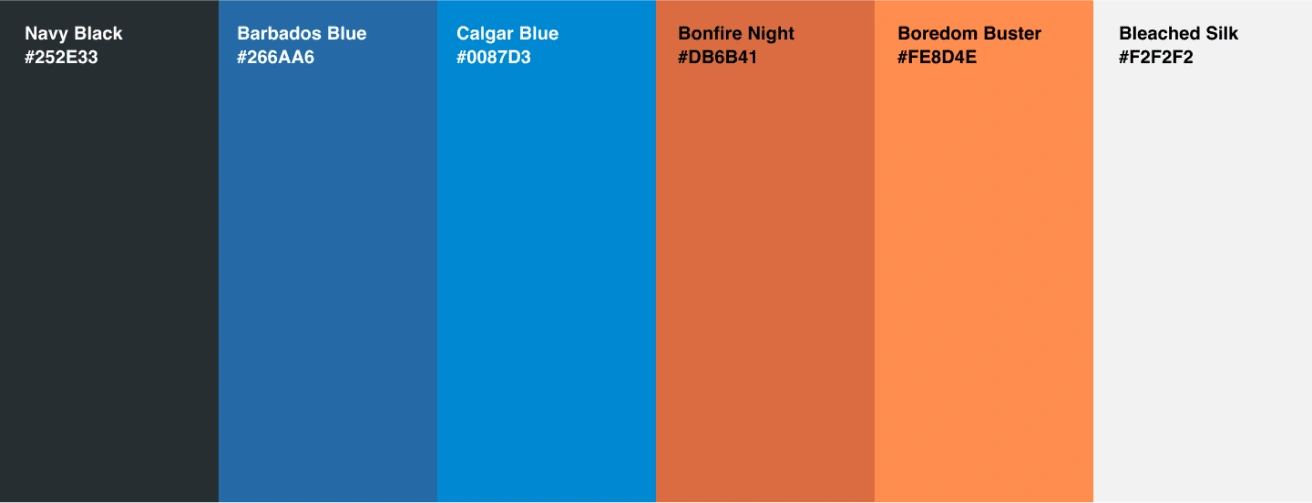
Color Palette
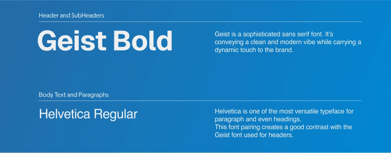
Typography
Drawing inspiration from P4S’s tech-forward approach, we established a color palette that was bold yet sophisticated, echoing the idea of security embedded within technology. The blue represents trust and confidence, speaking directly to B2B clients, while the white conveys a corporate and professional feeling. Orange was used as an accent color to add a dynamic and performance-centric touch. This color palette reflects the core mission of P4S: maximum performance, maximum security, and easy, approachable technology for users. Typography choices reinforced this blend of simplicity and performance—clean lines, clear contrasts, and a touch of modernity.
Logo Construction
The new logo was designed to reflect the core strength of P4S: impenetrable security, yet simple to deploy. It captures both the precision of hardware integration and the straightforward elegance of their cybersecurity solutions.
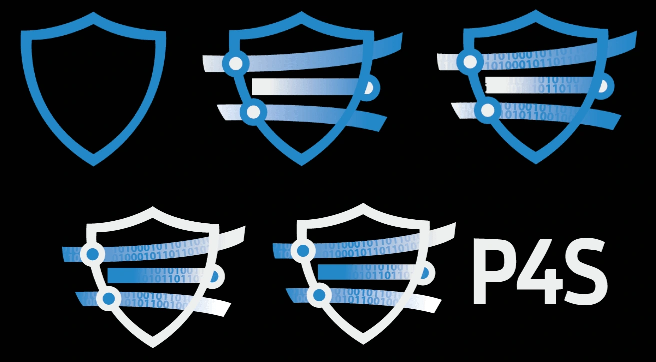
Logo process
The Brand In Action
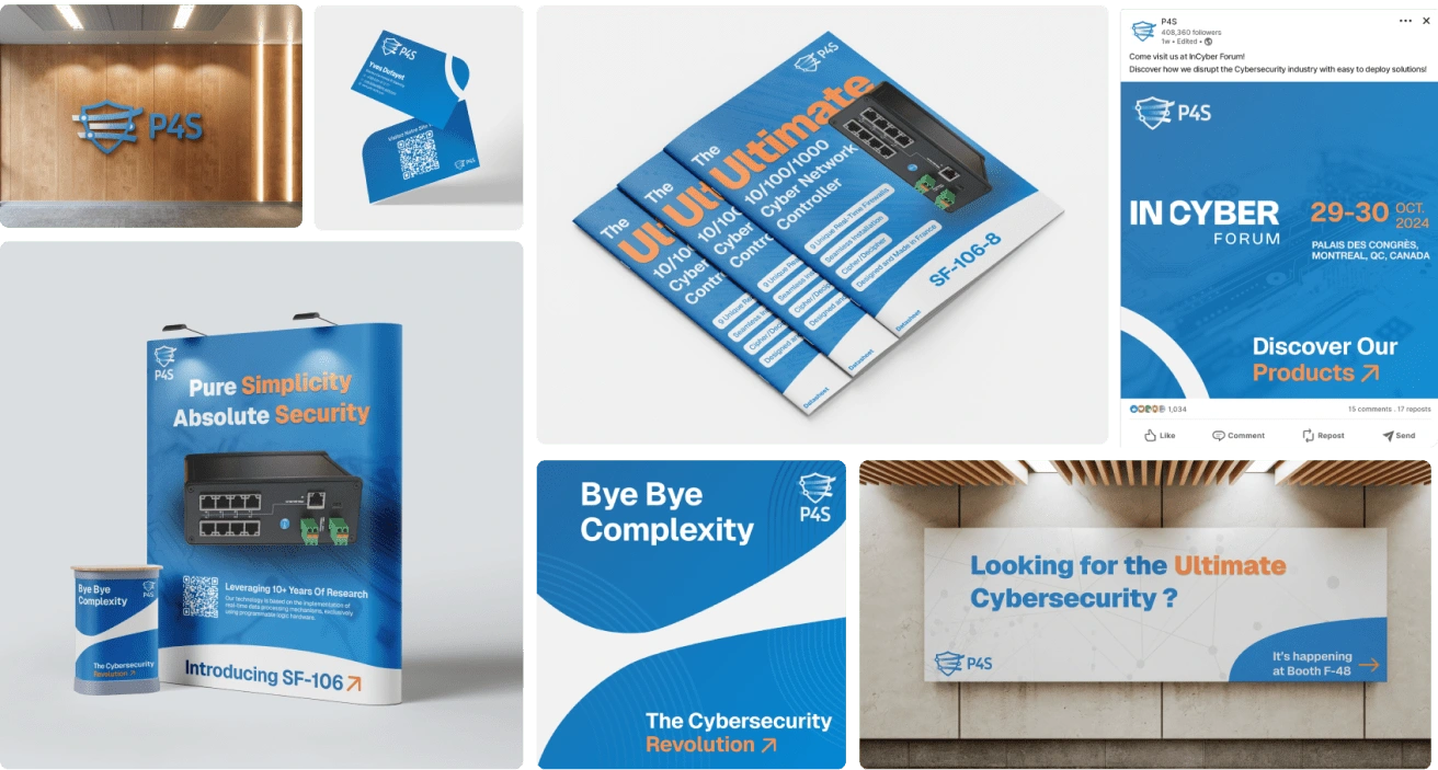
Branding Mockups
The new brand identity came to life across multiple touchpoints—from sleek business cards to product brochures and social media visuals. Each asset carried the same cohesive message: P4S provides an advanced, hardware-embedded security solution that is powerful yet effortless. The branding was further showcased through exhibition materials and digital assets, ensuring consistency wherever P4S made an appearance. The goal was also to communicate a professional, corporate, and modern feeling, moving away from the early startup stage to establish P4S as a significant player in the cybersecurity space.
Website Wireframe
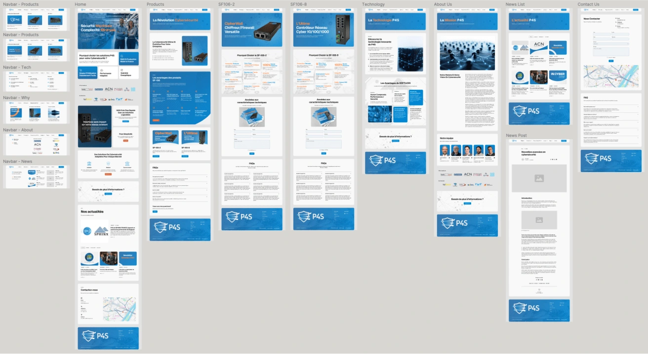
Figma Wireframs
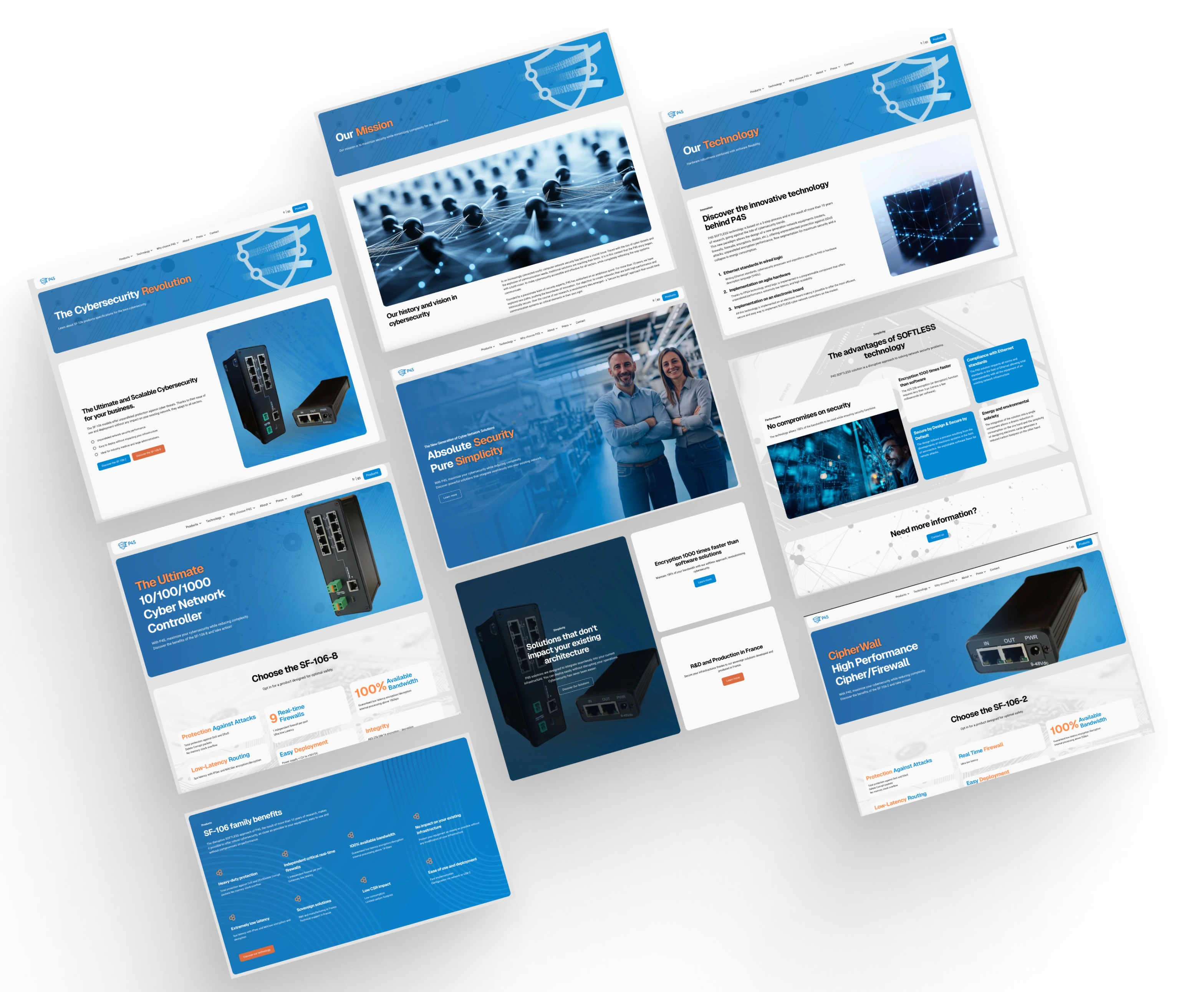
Starting from a user-centric wireframe, we ensured that the new P4S website was intuitive and effective. The layout was designed to guide users effortlessly from understanding P4S's value proposition to taking action—whether that meant contacting sales or exploring their tech. Clear navigation, strategic CTAs, and well-structured content made the user journey seamless. We also created product pages to compellingly explain the product benefits and added a page dedicated to translating complex technology into a digestible and easy-to-understand format, reinforcing P4S's core message of simplicity in using their solution.
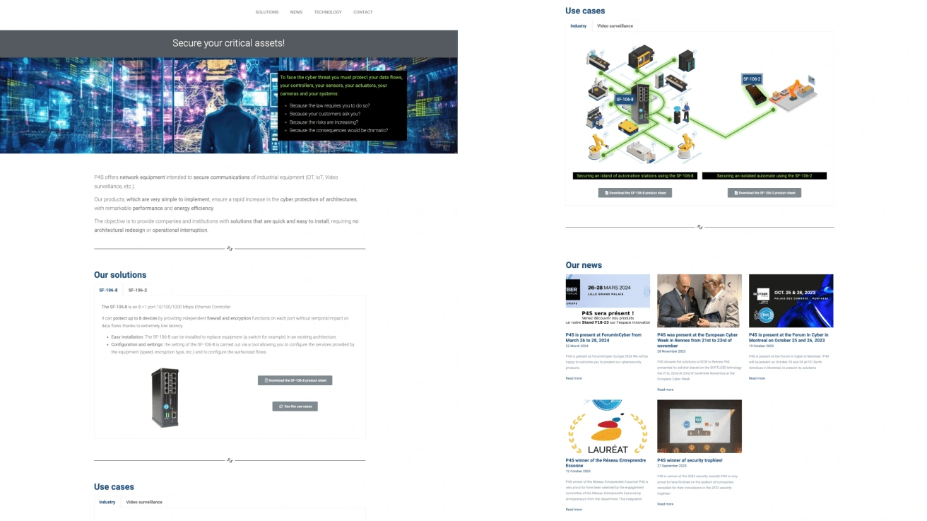
Webflow Development
Webflow Site
Using Webflow, we transformed the design into a fully functional, responsive website. We integrated a CMS for news, articles, and a dynamic FAQ to keep the site fresh and relevant. Every page was crafted to tell the P4S story—from their breakthrough hardware innovations to the straightforward benefits for their clients. We also developed a custom interactive navbar to easily provide key information without requiring users to browse extensively, enhancing user experience and accessibility.
Key Takeaways
One of our key challenges was defining the mission of P4S, merging their focus on maximum hardware performance with a core message emphasizing simplicity and ease of deployment for their clients.
Another challenge involved crafting a visual identity that balanced professionalism and a corporate feel without sacrificing the dynamic, innovative spirit of P4S.
This collaboration transformed P4S's identity from an outdated hardware-focused company to a bold, confident cybersecurity solution provider.
They now stand out in a crowded market, with a brand that speaks directly to their industrial clients while setting the stage to expand into sectors like medical, networking, and administration.
Like this project
Posted Jan 6, 2025
P4S brand was outdated. I crafted a fresh, modern brand and website that aligned with P4S unique value proposition and spoke to their audience.