GreenTech Website From Scratch
Padrig Guillard
Overview
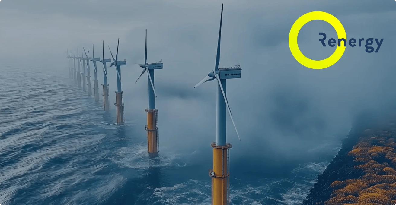
Renergy
Renergy faced a challenge: they were ready to expand but felt held back by their outdated brand image. As a consulting company with expertise in renewable energy, power, naval, and IT/finance industries, they wanted to reach larger clients, secure bigger contracts, and attract top talent. Their existing website, heavy on stock images and lacking a cohesive identity, didn't reflect their ambitions.
At Orinn Studio, we worked with Renergy to revitalize their brand and create a digital presence that captured their expertise and aspirations. Our mission was to reshape how they presented themselves, making sure their brand spoke directly to both prospective clients and talented professionals looking for their next career move.
Discovery Phase
Research
Previous Website
The discovery phase revealed the core needs: establishing a professional, consistent brand image that accurately represented Renergy's market expertise and values. The company wanted to convey their core values and expertise in a more compelling way, as well as list job opportunities on their website to attract talent. Their previous branding struggled to convey their depth of experience and ambitions for growth. Additionally, we conducted a competitive market analysis to understand where their competition stood in terms of brand identity and service offerings. They needed a more sophisticated visual identity that resonated with both corporate clients and potential team members.
Design Direction
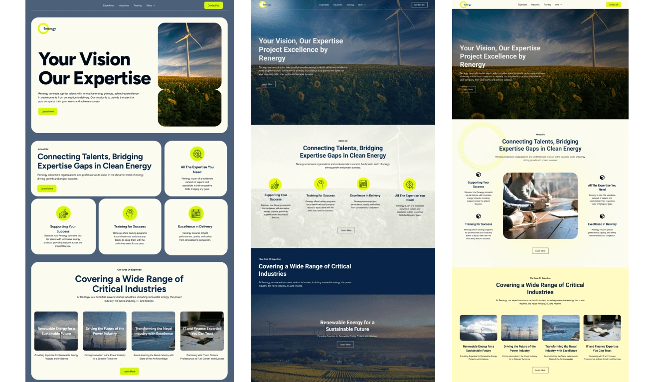
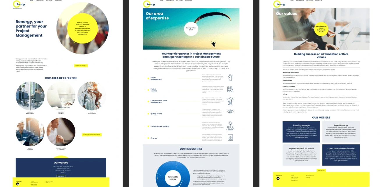
Website Concepts
During the design phase, we explored three distinct design directions:
Bento Box Design Approach: The first concept took inspiration from the Bento Box design philosophy, focusing on clean, modular layouts that were both visually appealing and easy to navigate. This approach allowed for clear segmentation of information, making it straightforward for users to access key details about Renergy's expertise and services. The modern, grid-based structure gave the website a fresh, organized feel, reinforcing the company’s commitment to precision and innovation.
Immersive Full-Width Imagery: The second design direction aimed to immerse visitors in the world of renewable energy by using full-width imagery. This approach utilized large, vibrant photographs that showcased renewable energy projects and natural landscapes, creating an immediate connection to Renergy's industry. The goal was to evoke a sense of scale and impact, drawing users into the narrative of sustainability and positioning Renergy as deeply embedded within the renewable energy ecosystem.
Corporate Neutral with Yellow Accents: The third design direction focused on a more corporate, professional aesthetic, using a neutral color palette with accents of yellow to add warmth and approachability. This concept was tailored to appeal to larger corporate clients, with a balanced, understated design that conveyed reliability and authority. The yellow accents provided a subtle yet effective way to highlight key elements, ensuring that important information stood out without overwhelming the overall clean, corporate look.
Color Palette and Typography
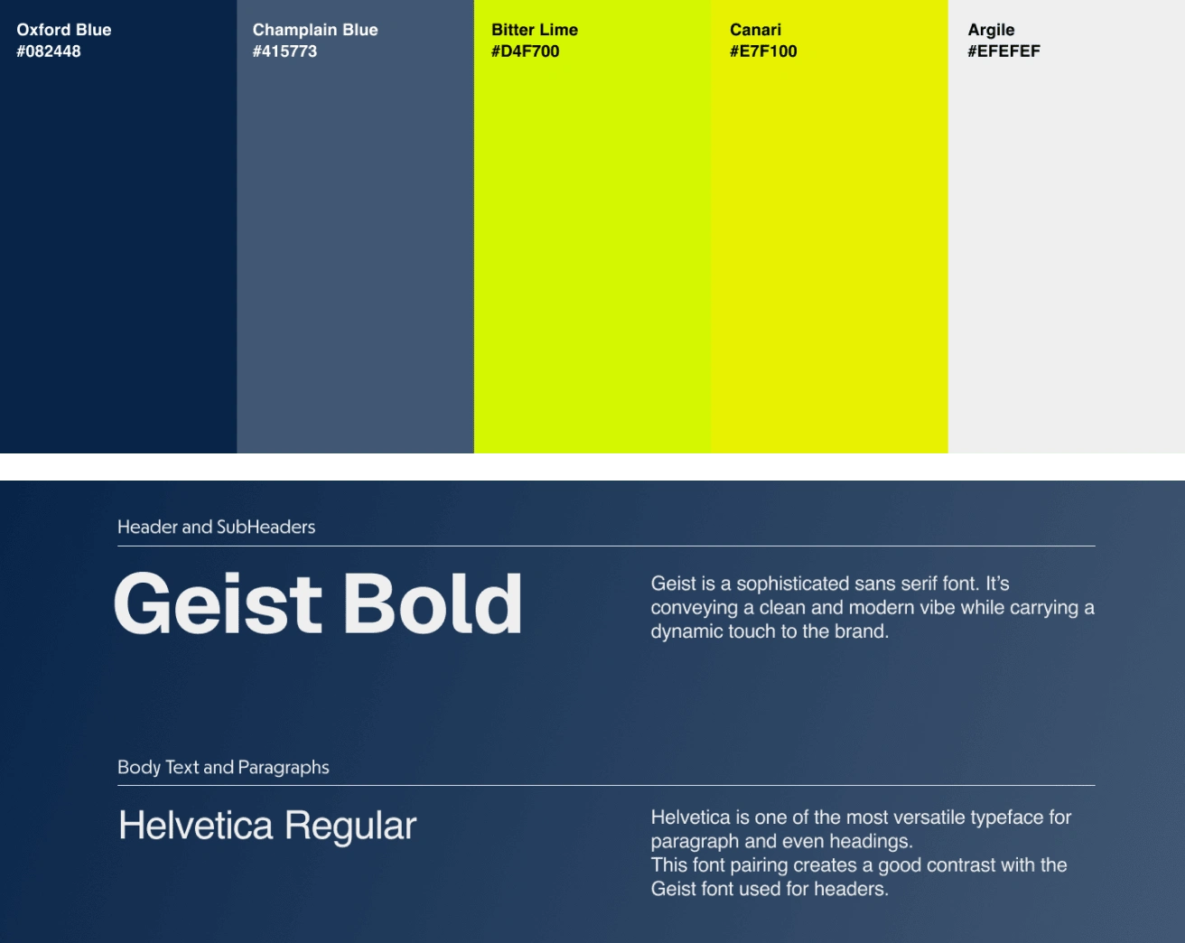
Color Palette & Typography
To establish a distinctive and professional visual identity for Renergy, we carefully refined their color palette and typography. The new color scheme drew inspiration from renewable energy themes, balancing vibrant tones that signify innovation with neutral shades that evoke stability and trust. This cohesive palette created a strong visual connection to their industry while setting them apart. Complementing this, we introduced a modern typeface pairing that combined readability with sophistication, ensuring that their messaging appeared polished and engaging across digital and print media.
Assets Creation
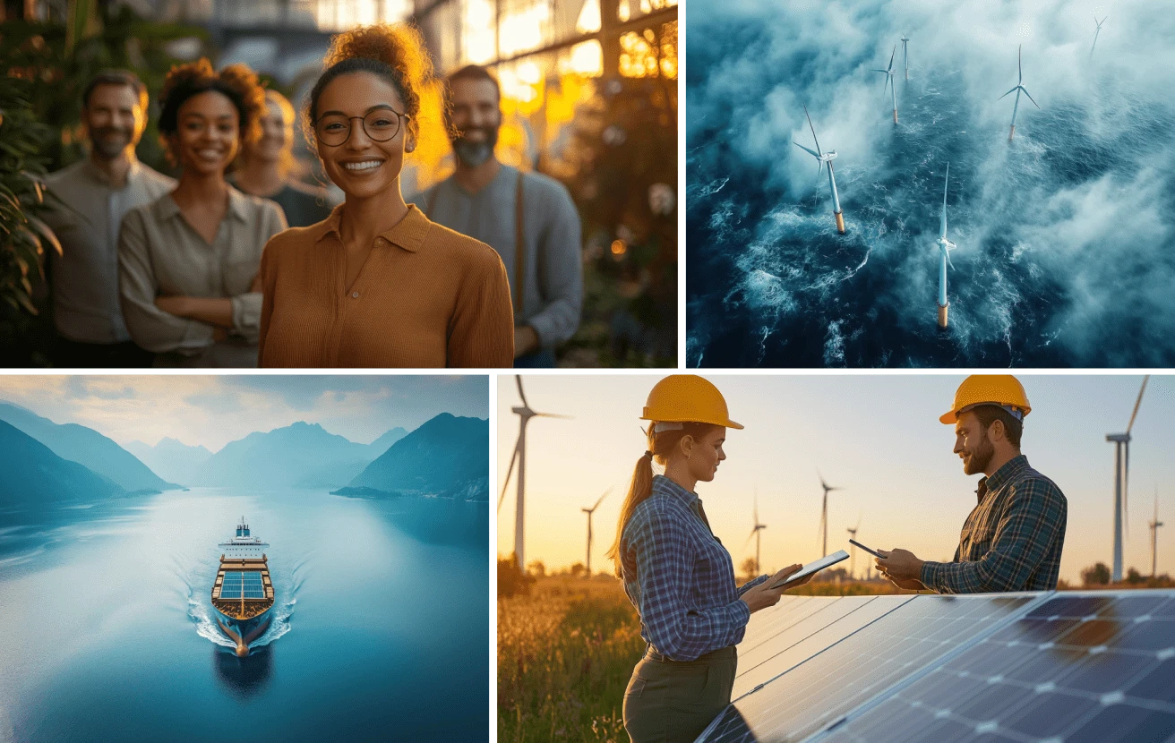
Asset Creation with AI
Renergy’s brand refresh included a strategic approach to visual storytelling. We developed a comprehensive library of custom assets, moving away from generic stock images. This included photographs and graphics that showcased Renergy’s real-world impact across industries, with a focus on human-centric values and dynamic project environments. By featuring professionals in action and industry-specific scenarios, we highlighted their expertise and dedication to their clients' success. These bespoke visuals ensured that Renergy's communication felt authentic and resonated deeply with their audience.
Final Wireframe
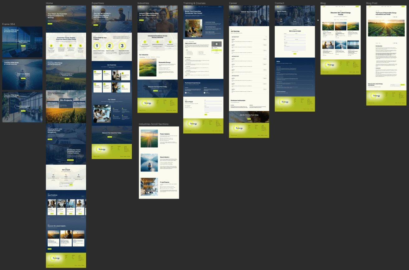
Final Wireframe
After establishing the visual identity, we created the final wireframe in Figma. The goal was to ensure clarity and simplicity, making it straightforward for potential clients and job seekers to understand Renergy's services, values, and unique strengths at a glance. Each section was designed to tell a cohesive story, emphasizing Renergy's expertise and human-centric approach.
Development Phase
Webflow
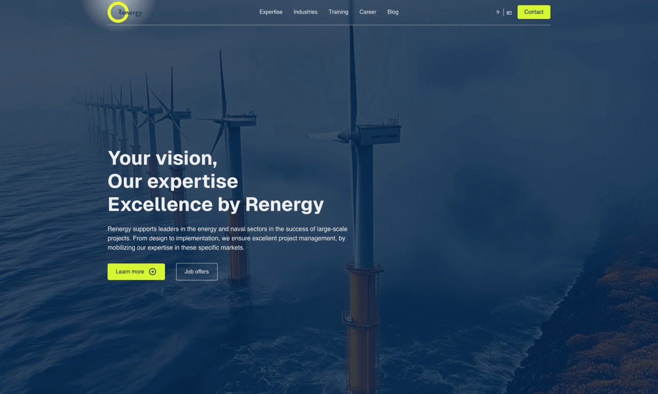
Hero Section
Once the wireframe was finalized, we moved on to development using Webflow. This platform allowed us to craft a visually compelling and responsive user experience that worked seamlessly across all devices. Webflow's flexibility enabled us to integrate subtle animations and interactive elements that enriched the browsing experience while maintaining a professional look. Additionally, we created a generative AI video based on their industry assets, which was added to the hero section background to enhance the professional tone and brand feeling when users landed on their website.
Setting up the CMS and writing the initial content
To make ongoing content management efficient for Renergy, we set up a comprehensive CMS within Webflow. The CMS was configured with two main collections: one for job listings and another for their blog. The job listings setup allowed Renergy to easily create, remove, and update job postings, with the ability to showcase select opportunities directly on the homepage. The blog collection enabled them to publish articles on topics they care about, positioning themselves as thought leaders and authorities within their respective market. By empowering Renergy with the ability to manage their own content, we ensured that their message remained fresh, relevant, and adaptable to future growth.
Social Media & Website Launch
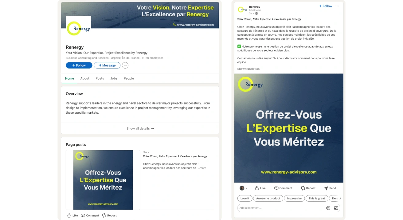
LinkedIn Templates
Beyond the website, we helped Renergy establish a consistent brand presence on LinkedIn. We designed custom templates for their social media posts, ensuring that every update—from industry insights to job postings—was visually aligned with their new brand identity. The goal was not just to launch a new website, but to create a unified brand experience across all touchpoints.
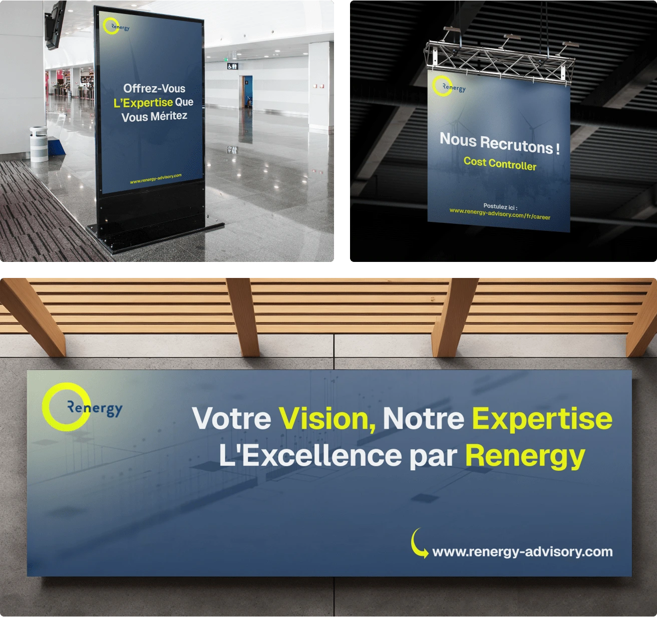
Branding Mockups
Key Takeaways
The result was a complete brand refresh that positioned Renergy as a credible, expert partner ready to tackle large-scale projects. The founders have already received positive feedback from prospects, who have praised the new brand identity and website.
This transformation has empowered Renergy's team to engage in discussions with current and potential clients with greater confidence, highlighting their expertise and aspirations effectively. By creating a cohesive and modern digital presence,
Renergy is now well-equipped to confidently pursue bigger opportunities and strengthen their market position.
Like this project
Posted Jan 6, 2025
Renergy didn't have a website and they needed one to generate more leads and build their brand to access bigger clients.