TeamSync Website Design For Increased Conversions and Clarity

0
Product Designer
Web Designer
Web Developer

Figma

Webflow
Sales Automation
How TeamSync’s Landing Page Redesign Increased Conversions and Simplified the Value Proposition
At A Glance:
Remote SaaS teams waste 20+ hours per week in unnecessary meetings, slowing execution and fragmenting communication. TeamSync eliminates this waste by replacing live meetings with structured, asynchronous collaboration. However, their original landing page failed to clearly communicate its benefits, leading to low conversions, slow adoption, and poor engagement. We redesigned the landing page UI/UX to make the value instantly clear, increase demo requests, and drive conversions—resulting in a 2.8x increase in sign-ups and a 40% lower bounce rate.
The Challenge: A Website That Didn’t Convert
Despite having a strong product, TeamSync’s original landing page wasn’t driving sign-ups or conversions due to three key issues:
Complex Messaging → Visitors didn’t immediately understand how TeamSync replaced meetings or saved time.
Lack of Trust Signals → Without clear case studies or proof, skeptical SaaS teams hesitated to switch.
Weak Call-to-Actions (CTAs) → The page didn’t guide users toward booking demos or trying the product.
These issues slowed growth and prevented TeamSync from capitalizing on its unique positioning in the async collaboration space.
The Approach: A High-Converting, Value-Driven Landing Page
1. Clarity-First Messaging & Positioning
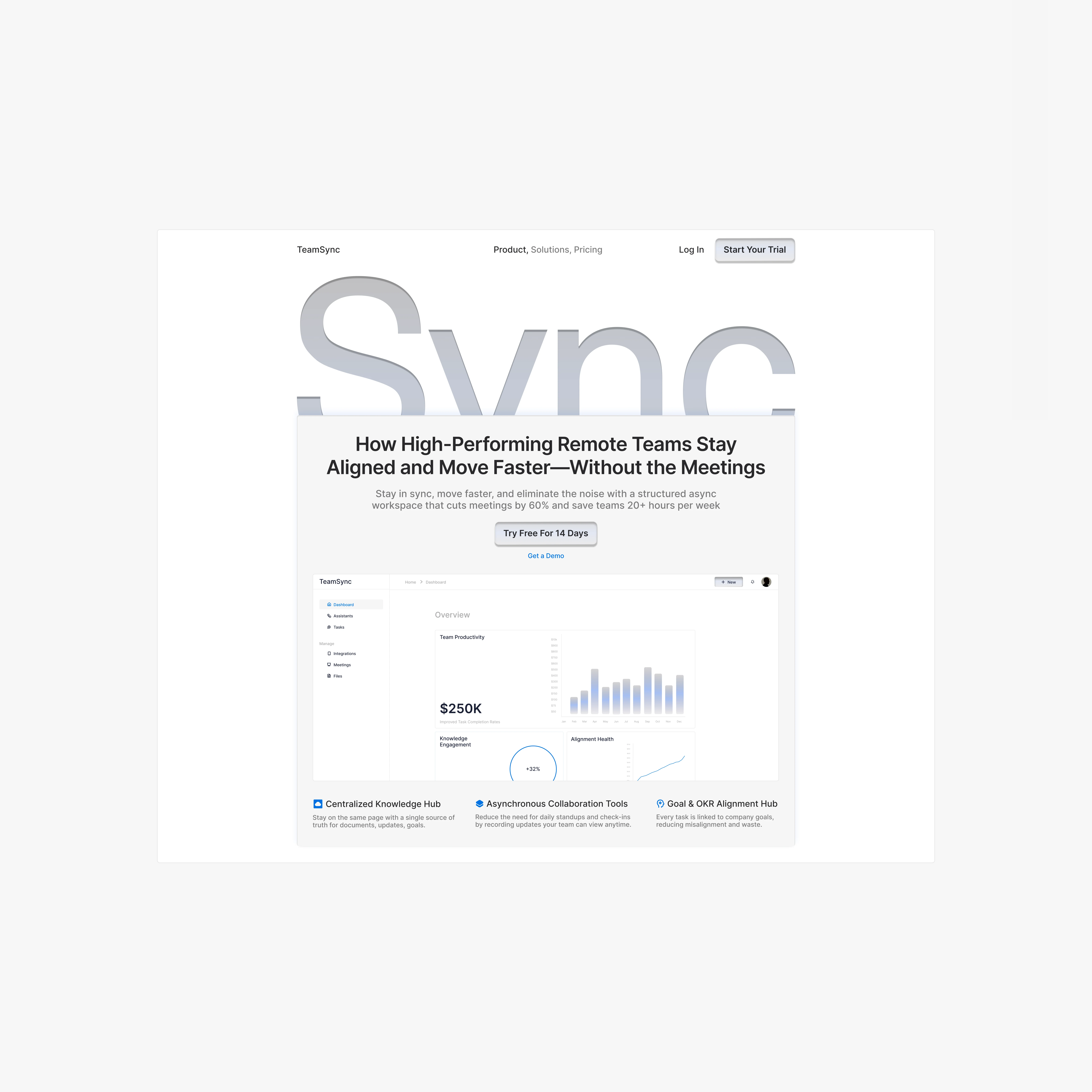
Before: “Async collaboration for modern teams.” (Too vague)
After: “Eliminate 20+ hours of wasted meetings per week. Align faster, execute better, and reclaim deep work.” (Specific & results-driven)
We made the core value proposition unmistakable within the first 5 seconds of landing on the page.
2. Building Trust & Social Proof
Added real-world data: “Our customers cut live meetings by 60% and reduce project delays by 35%.”
Featured testimonials from SaaS teams that validated TeamSync’s impact.
Integrated logos of existing customers and industry leaders to reinforce credibility.
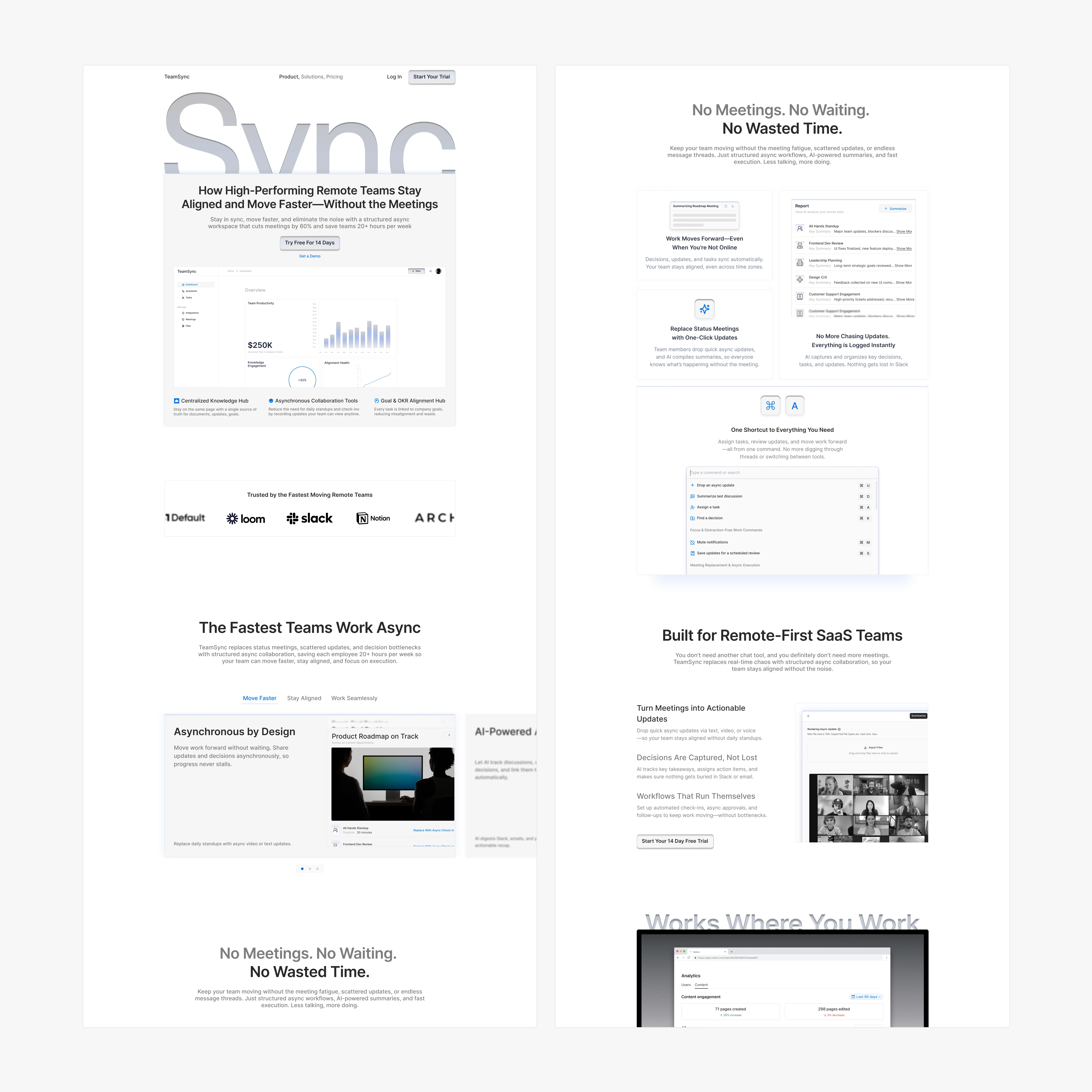
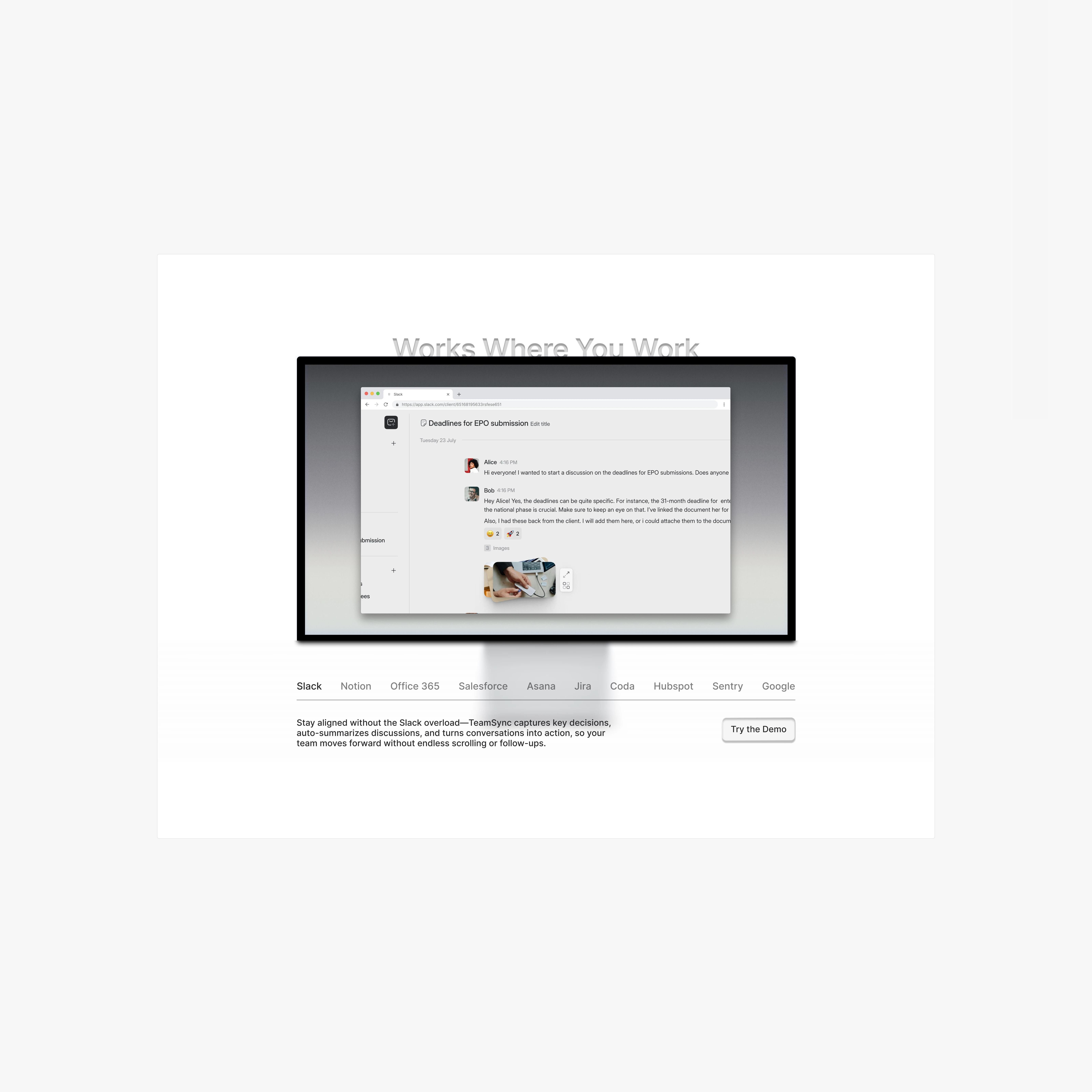
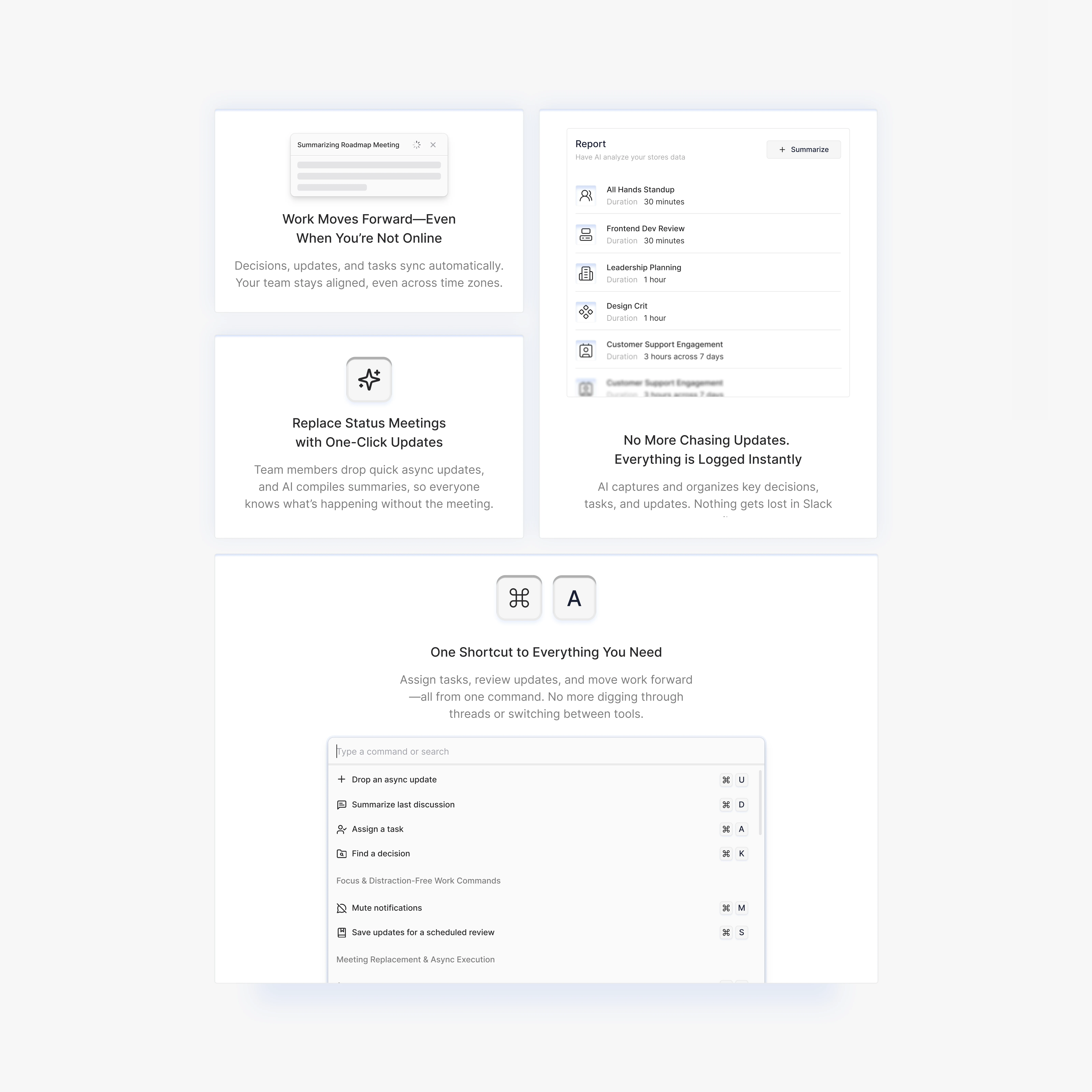
3. Conversion-Optimized UI/UX
• Simplified the layout for faster scanning and clearer hierarchy.
• Redesigned CTAs to be bold, high-contrast, and action-driven:
• “Try TeamSync Free – Stop Wasting Time in Meetings”
• “See How Teams Save 20+ Hours/Week – Book a Demo”
Removed friction in the sign-up process by reducing form fields and eliminating unnecessary steps.
The Results: Higher Conversions, More Trust, Faster Growth
2.8x increase in demo requests within the first 60 days
40% decrease in bounce rate, keeping visitors engaged
Stronger trust signals led to higher engagement from SaaS founders and operations leaders
Clearer messaging reduced confusion, making it easier for decision-makers to commit
TeamSync’s new landing page turned website traffic into real leads, clarified its value, and accelerated adoption among fast-moving SaaS companies.
Why It Worked: Lessons & Takeaways
1. Clarity Converts → Clear, benefits-driven messaging immediately tells visitors why they should care.
2. Trust Drives Action → Adding real-world proof eliminates hesitation and builds credibility.
3. Optimized CTAs Reduce Friction → Simplified sign-up flows and strong call-to-actions increased conversions dramatically.
If your B2B SaaS or workflow automation tool needs a landing page or UX redesign that drives conversions and eliminates friction, let’s talk.
Like this project
0
Posted Mar 10, 2025
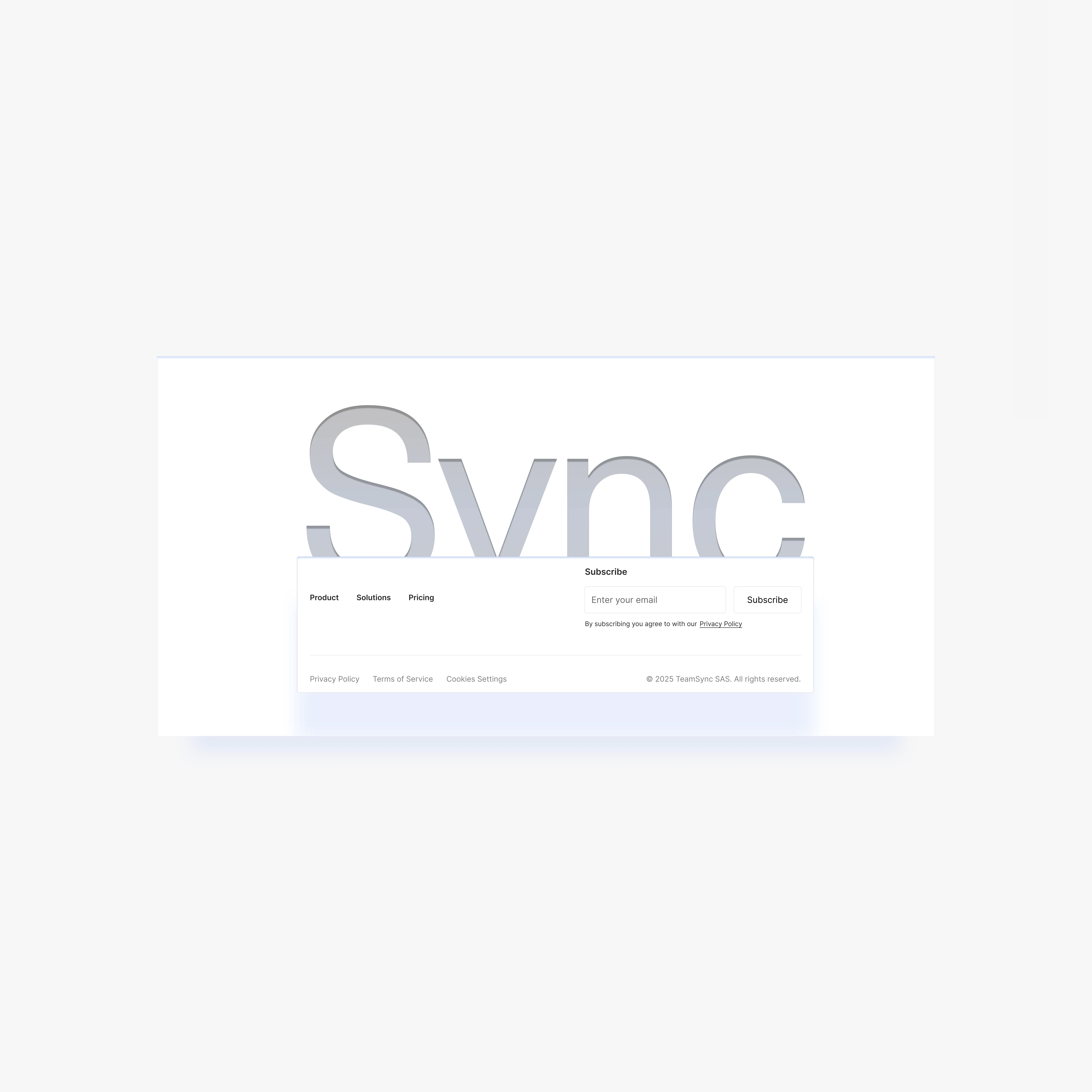
We redesigned TeamSync’s landing page to instantly communicate its value, build trust with remote SaaS teams, and drive higher conversions.
Likes
0
Views
0
Timeline
Feb 16, 2025 - Mar 1, 2025
Clients
TeamSync
Tags
Product Designer
Web Designer
Web Developer
Figma
Webflow
Sales Automation


Landing Page & UI/UX Redesign For Healthcare AI

Reducing Production Costs by 40% with UX Redesign