Classic website design and development / Framer
Greetings 👋
It's Vlad here. Thank you for visiting my profile and for your interest in this portfolio item.
Please, use the table of contents below or browse this page freely. I have prepared visuals, a demo video, and other useful information about this Framer design and development project built from the ground up.
Greetings 👋About this portfolio projectApplying a discovery frameworkWhat is this business?Target audienceWebsite goalsCompetition researchContentFunctional requirementsUI styleKPI and success metricsDesignStyle guideImplementationIllustrationsComponentsBreakpointsCMSWhat I learntWhat will I do better next timeLet's work together
About this portfolio project
Difficulty level: Medium
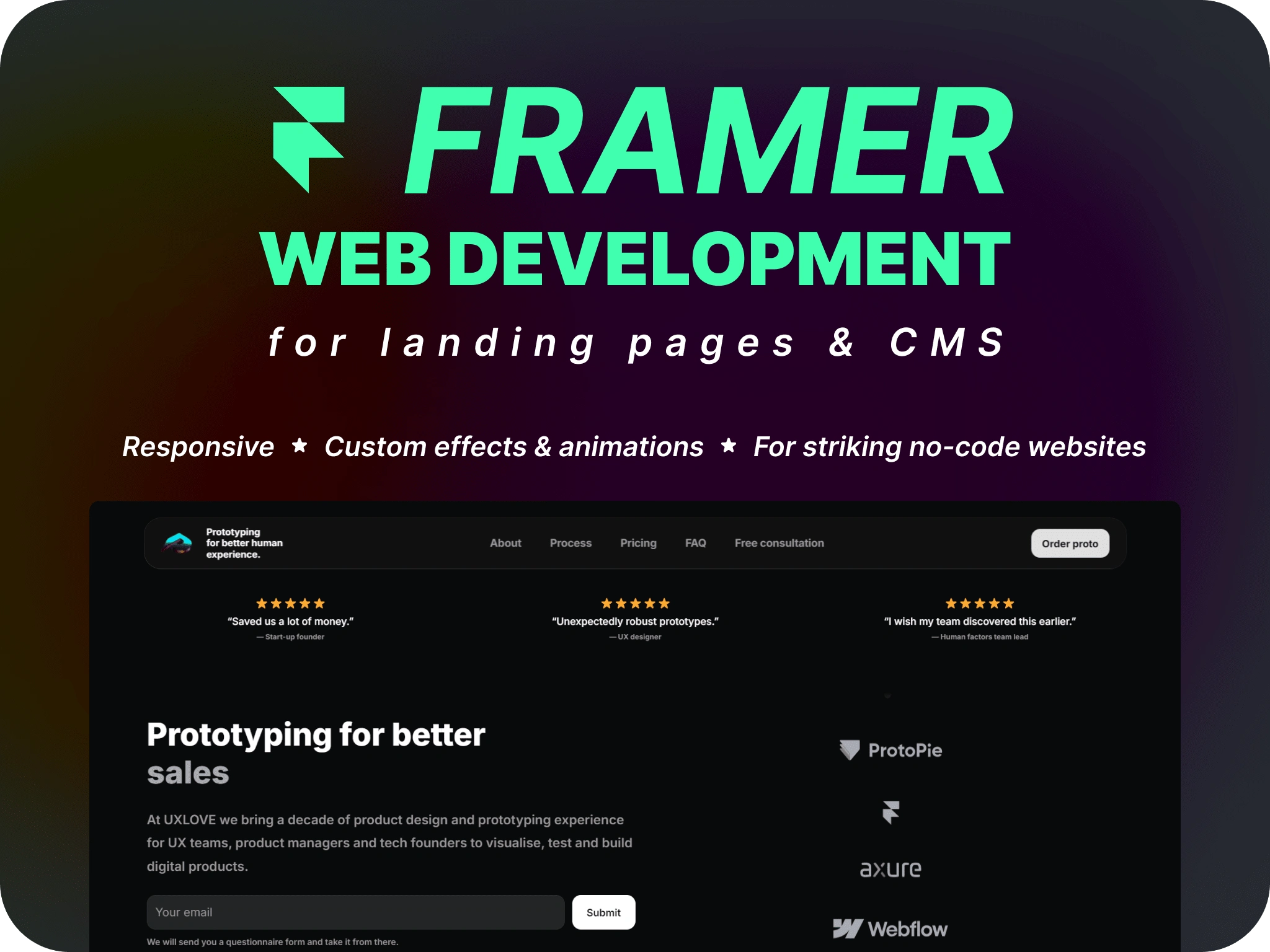
This is one of a few projects I have built on Framer that I wanted to document and share the thought, design and development processes of.
Applying a discovery framework
I never jump straight into design. Actually, if you think of it, it's a bad, bad (and toxic) practice. I start with writing down and describing crucial parts that define invisible and visible parts of a visitor's or user's experience.
In this project, I applied a discovery framework to create sections and uncover the unique selling proposition (USP). I included the following points that allow me to better understand what I will be writing and designing, and for whom. This may not be the most perfect approach, but it is good enough to get started. I am going to explore the following points:
business and its goals,
target audience,
competition,
content,
functional requirements,
UI and visual style,
KPIs and success metrics.
In the end, I created a layout like this, with each card filled with the best knowledge I acquired to further write and design with purpose:
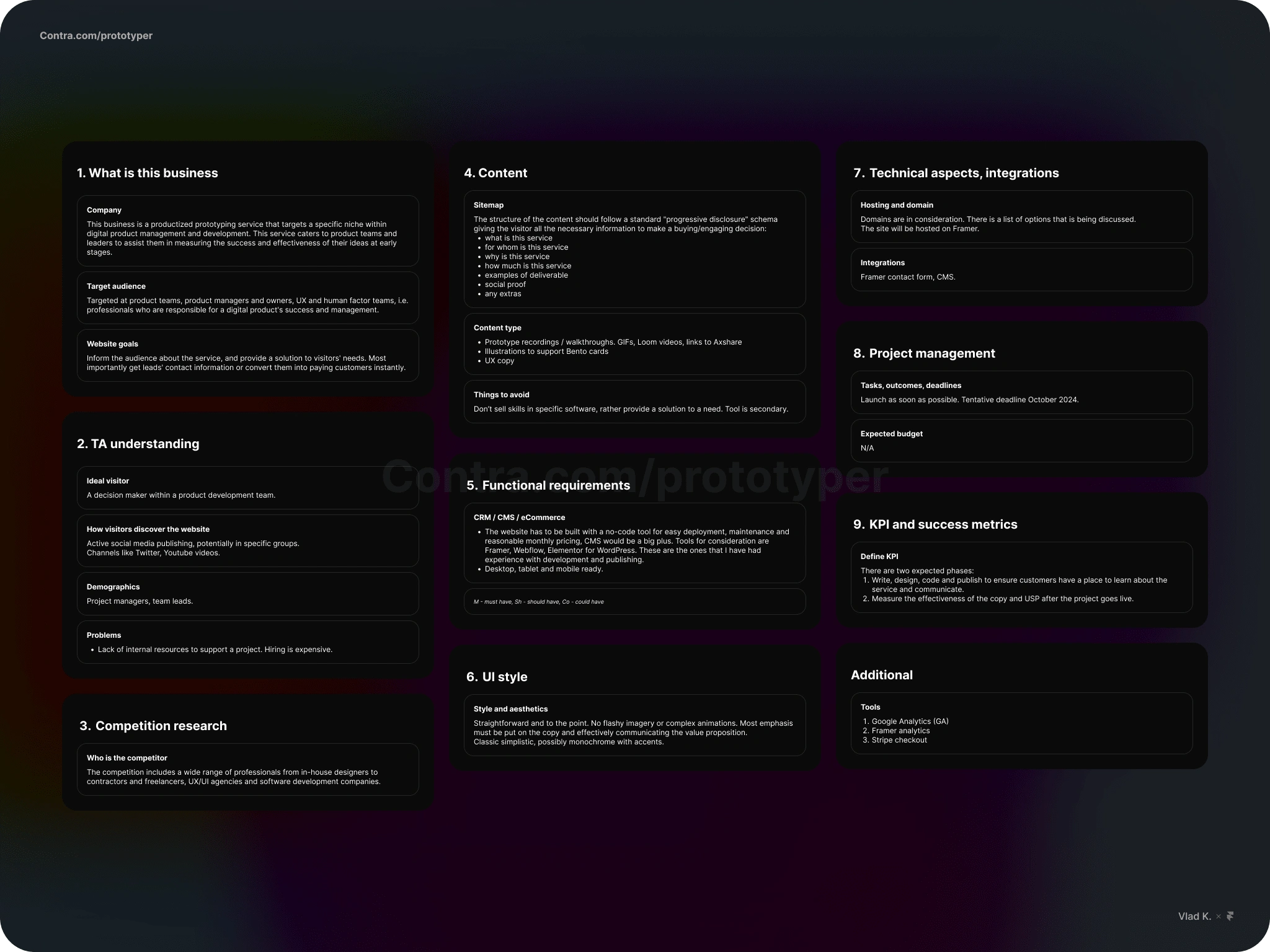
A filled out canvas with all necessary details to get started with writing and design.
Let's look closer at several points of the analysis summary:
What is this business?
This business is a productized prototyping service that targets a specific niche within digital product management and development. This service caters to product teams and leaders to assist them in measuring the success and effectiveness of their ideas at early stages.
Target audience
The service is targeted at product teams, product managers and owners, UX and human factor teams, i.e., professionals who are responsible for a digital product's success and management.
Website goals
Tell the internet about the service and provide a solution to visitors' needs. Most importantly, get leads' contact information or convert them into paying customers instantly through the checkout.
Competition research
The competition includes a wide range of professionals, from in-house designers to contractors and freelancers, UX/UI agencies, and software development companies.
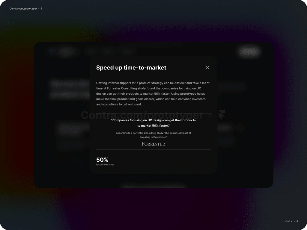
Fixed overlay in action. Contains secondary information about an item.
Content
The content should follow a standard "progressive disclosure" structure, giving the visitor all the necessary information to make a buying/engaging decision as they scroll through the page. I focused on these points:
what is this service,
for whom is this service,
why is this service,
how much is this service,
examples of deliverables,
social proof, if any,
any extras.
Functional requirements
The website has to be built with a no-code tool for easy deployment, maintenance, and reasonable monthly pricing. CMS would be a big plus. Tools for consideration are Framer, Webflow, and Elementor for WordPress. These are the ones that I have experience with in development and publishing.
This must be a responsive website: desktop-, tablet-, and mobile-ready.
UI style
Straightforward and to the point. No flashy imagery or complex animations - I don't want to distract users from their actual intent of visiting this page. Most emphasis must be put on the copy and effectively communicating the value proposition.
Classic simplistic, possibly monochrome with accents.
KPI and success metrics
There are two expected phases:
Write, design, code, and publish to ensure customers have a place to learn about the service and communicate. At this point, the goal is to be concise and formulate value to the best of my ability.
Measure the effectiveness of the copy and USP after the project goes live. Speaking to potential customers later will help them understand how they think and what language they use, which will provide data to improve.
Design
I favour websites and apps (any content in general) that are clear, use language that is easy to understand, visual or audio presentations of which is well-structured and pleasant to consume. As much as I appreciate the great artistic effort of individuals that create colorful complex animations pushing the web beyond, in my informed opinion this distracts more than it converts.
Here are some of the 'wants':
Out of today's web layout trends, I like it when Bento cards are used to highlight selected features. When done thoughtfully they provide a ton of value in just 1 frame.
Elegant uncomplicated illustrations to support narratives.
I want to add 3D objects from Spline into the mix but I am unsure that this is a good style combination.
And of course, bring animated prototypes into the spotlight which is what the site is selling.
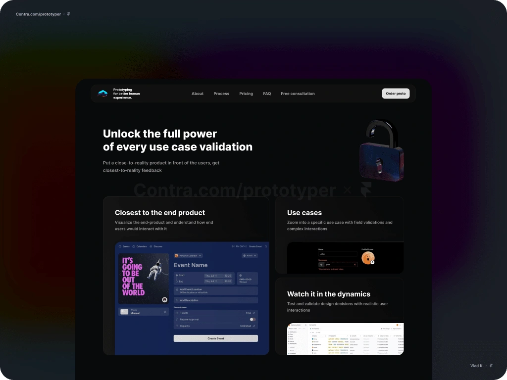
Bento cards are used to highlight selected features.
Style guide
Style guides are a summary of your design work and should be created at the end of the design process. They create design language rules and constraints to support a design.
Here you can see that my minimalistic approach doesn't include 32 shades of grey and 12 font styles which is a maintenance and implementation nightmare.
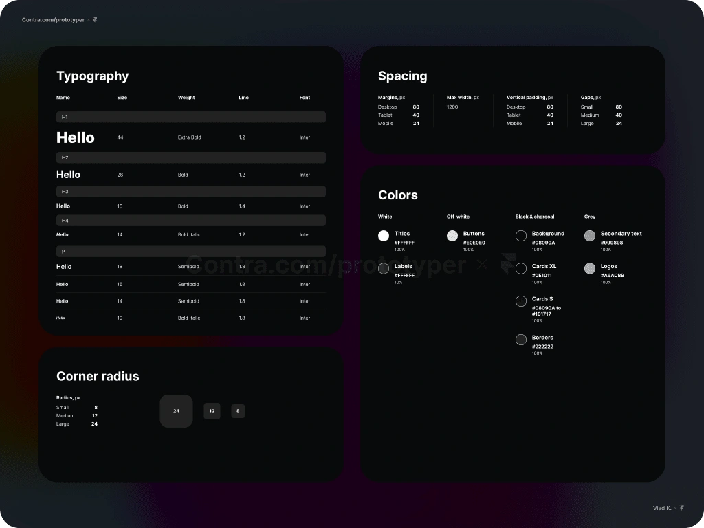
UI styles and rules formatted in a small table.
Implementation
I've been a big fan of CMSs and no-code tools for years. Though web design skills are not the skills I wanted to acquire, however, in my career I have created many websites. I started with Joomla back in 2015, followed by WordPress. No-code builders, like Elementor, allow to create simple websites almost for free. But services like Webflow and later Framer have captivated my attention forever.
Development in Framer is my favourite part as it gives the designer control over things—get things done as they are supposed to be done. Also, all issues and bottlenecks are resolved by yourself. You are making changes and getting them developed or designed instantly correctly and without 3rd party revisions, how great is that?
Framer has a number of cool interactive components like a ticker, carousel and slideshow that allow this smooth content transition right out of the box: we're going to use them. In addition to the accordion that can be used for the FAQ section.
Ticker moving in the opposite directions in action.
Illustrations
I don't like the idea of simply exporting illustrations from Figma and uploading them to Framer as-is. I always want to challenge myself so I tried recreating them using no-code, which allowed me to add subtle touches like hover effects and shooting-star-like animations.
Some illustrations require a mobile variant, which becomes possible with Framer's components that allow you to select a specific variant for each breakpoint.
As a highly detail-oriented person, I'm in love with subtle interactive animations and the idea that a visitor might accidentally discover them and get caught up playing with them (and get distracted). ADHD'ers 👋
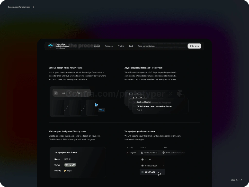
No-code illustrations with interactivity built in Framer.
Components
Like in Figma, components revolutionized no-code website building. Introducing components into the workflow reduces the burden of making updates and changes. It's like a single control center for anything you like: icons, illustrations, menu, frames, etc. Make changes in one place, and update every instance instantly.
Illustrations can be put inside a component. This gives a lot of flexibility in cases when you want to optimize the display of it on a screen of different sizes.
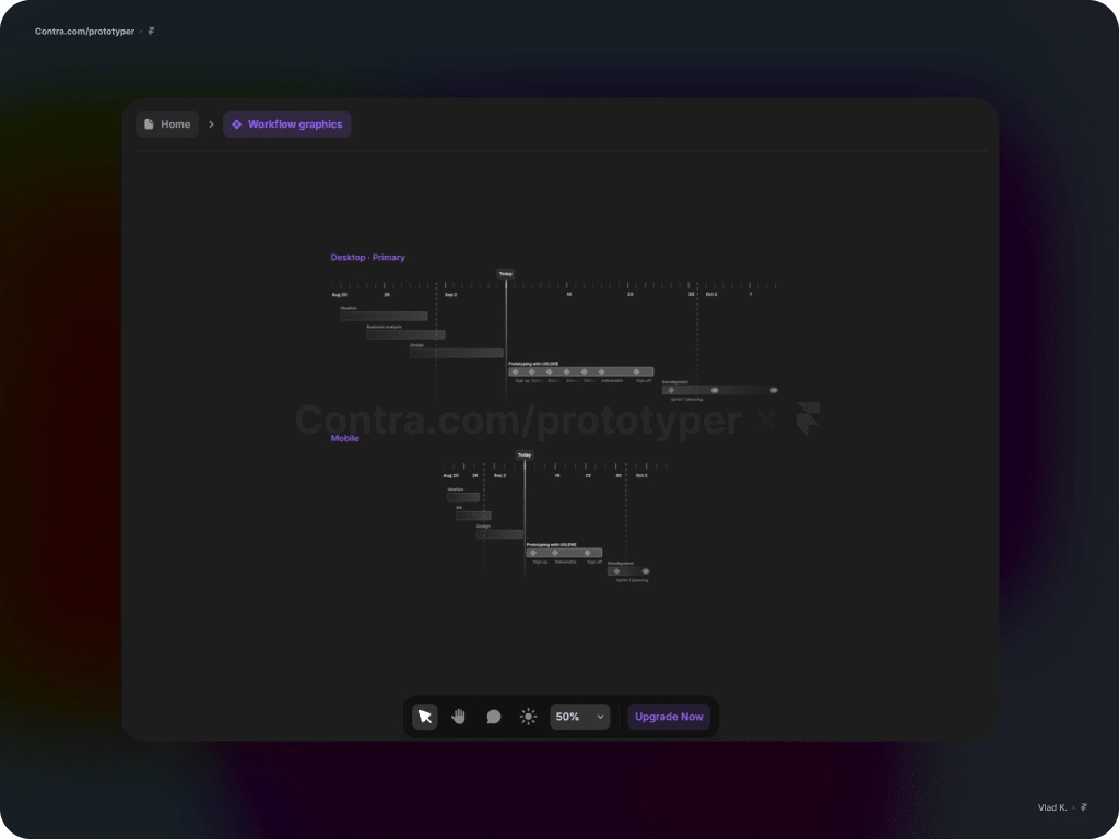
An illustration that has a second variant optimized for smaller screens.
Breakpoints
Framer makes it absolutely easy to set up different views and adjust margins and gaps specifically for the selected view. Oftentimes, we need to adjust the content for better use of real estate on narrow screens, thereby reducing gaps, padding, and margins of pages, frames, and stacks. Also, hiding some content on smartphone views becomes an option. The Visible toggle in the Styles section allows us to do so.
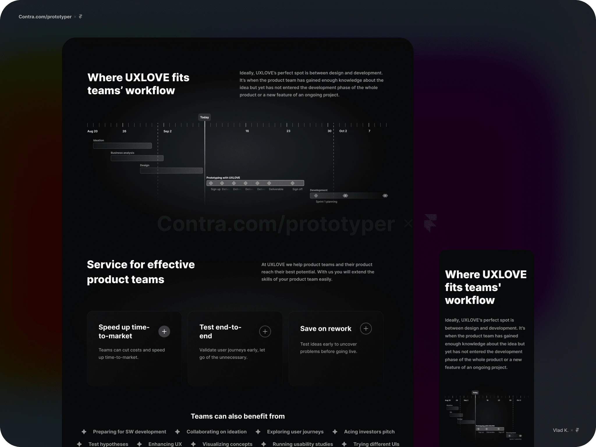
Working with breakpoints: a web page's content and illustrations are optimized for mobile.
CMS
Framer's Collections enable creating objects with multiple attributes which streamlines the way we organize our content. For example, create a collection, name it "Blog", start adding fields to it the way you like to organize the content: add "Date", add single-select, add image.
Plus you can cross-reference collections and enrich every post you create with more attributes (PRO plan). Create people, tags, toggles, etc.
Here we have a simple structure for article consisting of title, category, slug, date, image and content. Now that all the necessary information is in the table we can manipulate and add it the way we like.
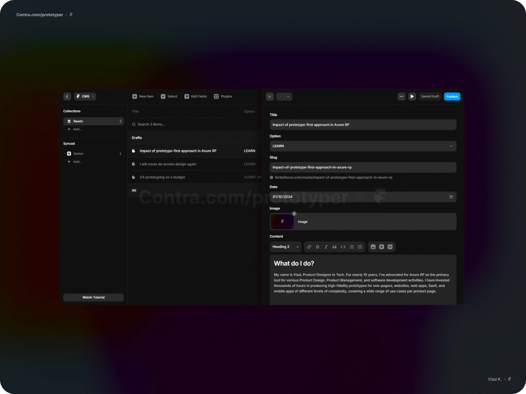
Framer CMS is simple and super flexible.
This flexibility allows us to play with how and where we want to display attributes.
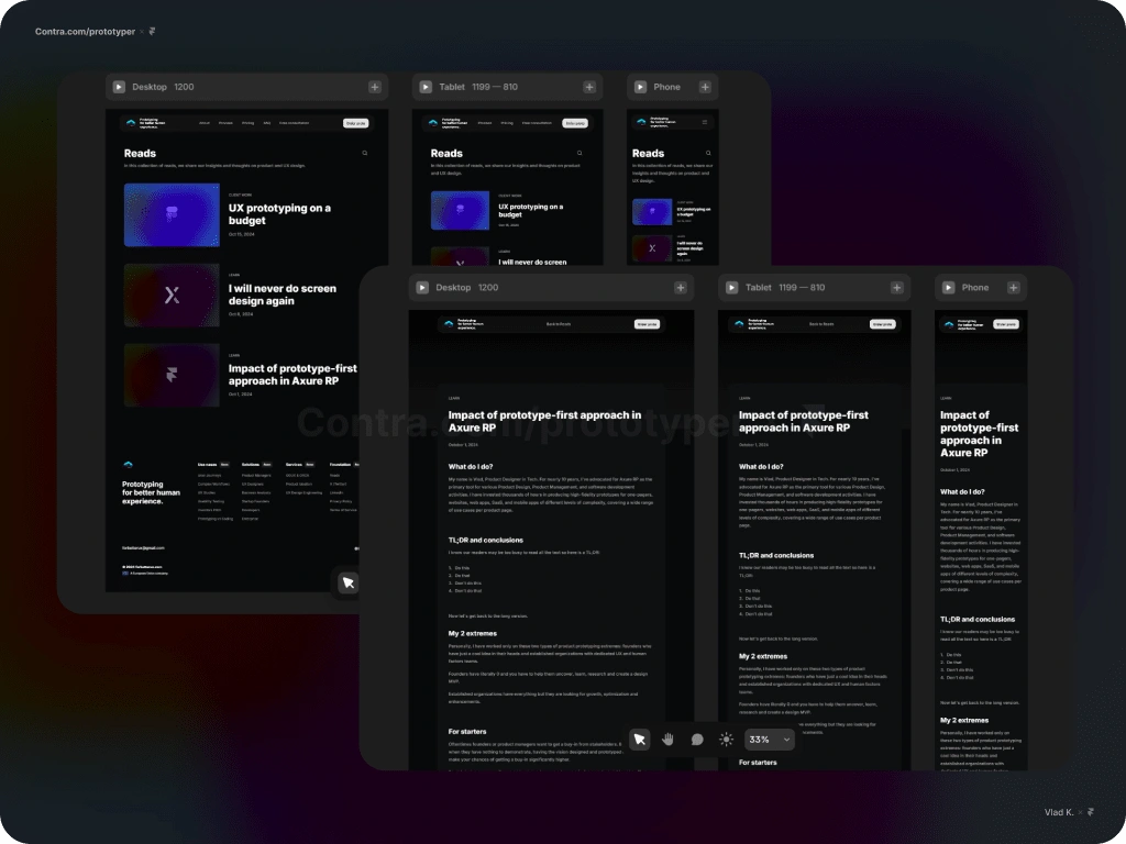
Blog and a single article view optimized for desktop, tablet, and mobile views.
What I learnt
Everything is an assumption until proven otherwise.
Keep it simple, always.
Stick to the framework to create meaningfully.
What will I do better next time
Get on YouTube faster to find solutions and tutorials.
When 80-90% done, publish. Perfect details later.
Let's work together
If you have an ongoing project that can benefit from my design approach or in case you have any questions feel free to reach out. We are going to create something great.
I also prototype software and apps at a very detailed use case level. Check more of my demos on Contra:
Like this project
Posted Sep 23, 2024
A website design and development project in Framer. Fully responsive and optimized. My role: Framer Developer / Website Designer / Content Writer / Web Master.
Likes
1
Views
20

