AI SaaS UX review / Applying UX thinking
Greetings 👋
It's Vlad here. Thank you for visiting my profile and for your interest in this portfolio item.
Please, use the table of contents below or browse this page freely. I have prepared visuals and other useful information about this UX review project.
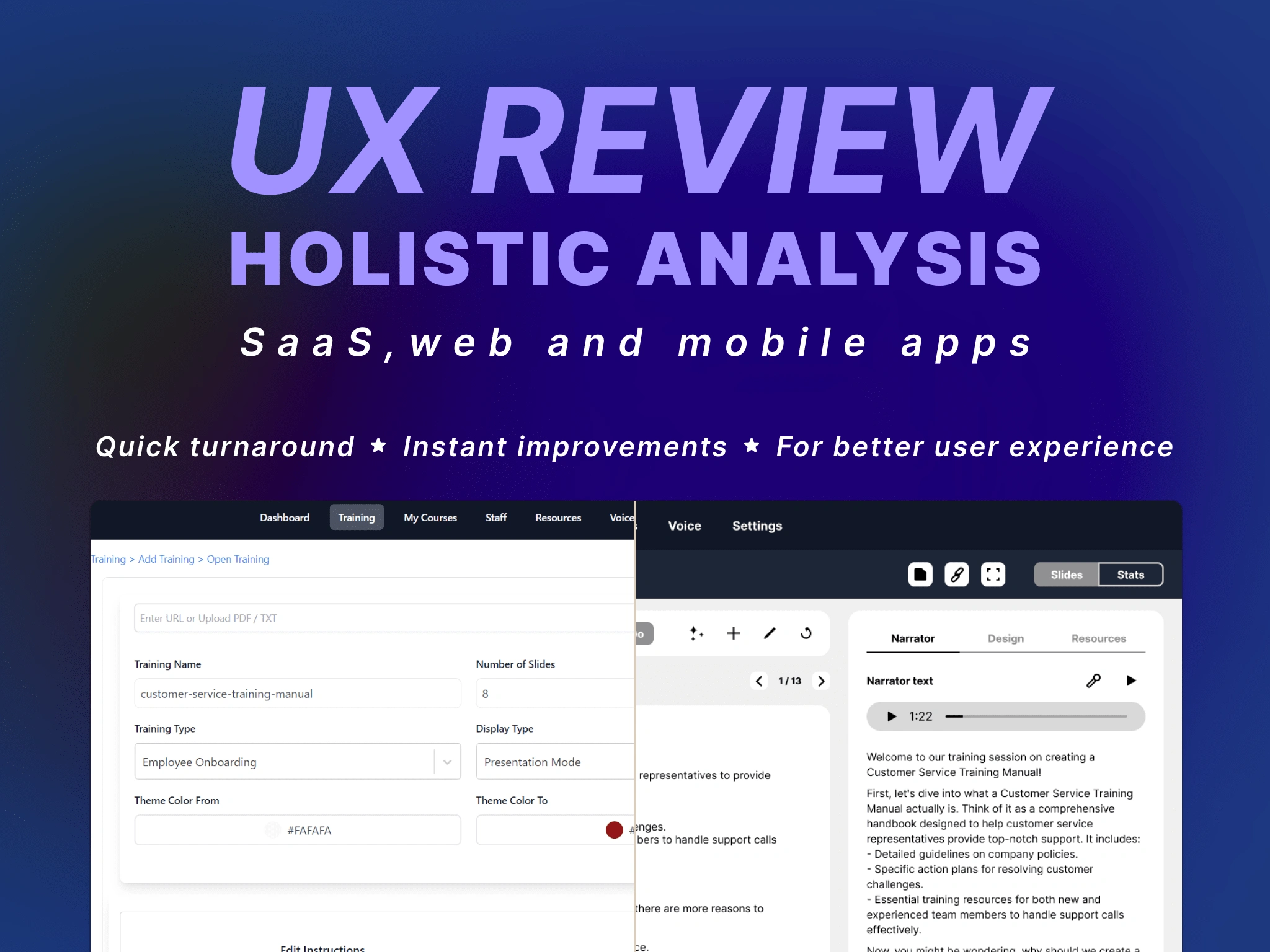
Welcome to one of a series of my UX review projects where critique UX of SaaS using psychological principles.
Introduction
I invite you to explore my thinking in UX through my recent experience with a new SaaS product in the AI space.
Client’s request:
A client, currently raising funds in Silicon Valley, approached me to enhance the visual design of their AI SaaS application.
Client’s perspective on problem:
"Our app doesn't look polished enough. We want to improve its design to align with modern SaaS UI standards."
First experience with app
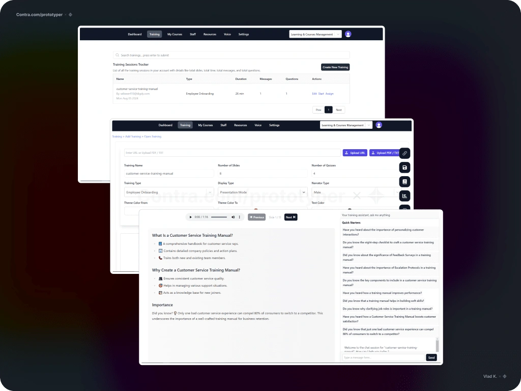
Screenshots of the client's AI SaaS solution.
A quick interview with the client confirmed my assumption that, once again, they believed the visuals were the problem. While the Bootstrap theme was an adequate choice, the real issues were:
UI architecture,
fundamental UX.
Let me explain →
Example of UI architecture issues
Red selection (full stroke)
An area focused on prompt setup—essentially, the core paid feature of the app's module.
Blue selection (dotted stroke)
A combination of formatting and display settings, unrelated to the prompting functionality.
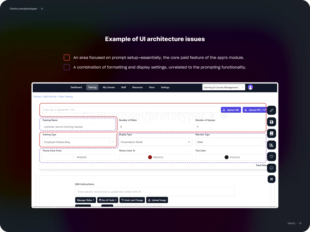
Example of UI architecture issues.
What’s wrong with this experience
User attention is dispersed. Uncertainty about where to start, combined with too many options, leads to fatigue (Hick's Law, Cognitive Load Theory).
Required and optional controls—prompt-related and formatting—are all grouped in one section (Gestalt Principles).
There are no clear required actions or calls to action (CTAs) to initiate AI generation (Fogg Behavior Model, Affordance Theory).
Next steps
Analysis and discovery of user journeys.
Analysis of controls and their associated actions.
Refinement of each step in the user journeys.
Enhancement of the UX for task completion.
Improvement of UI architecture.
User testing.
Analysis & discovery
Break down the UX into smaller components.
Create a map of objects and actions.
Identify user tasks end-to-end:
define happy paths and edge cases,
address any unaccounted scenarios.
As a result, we get a number of structured tables summarizing all findings →
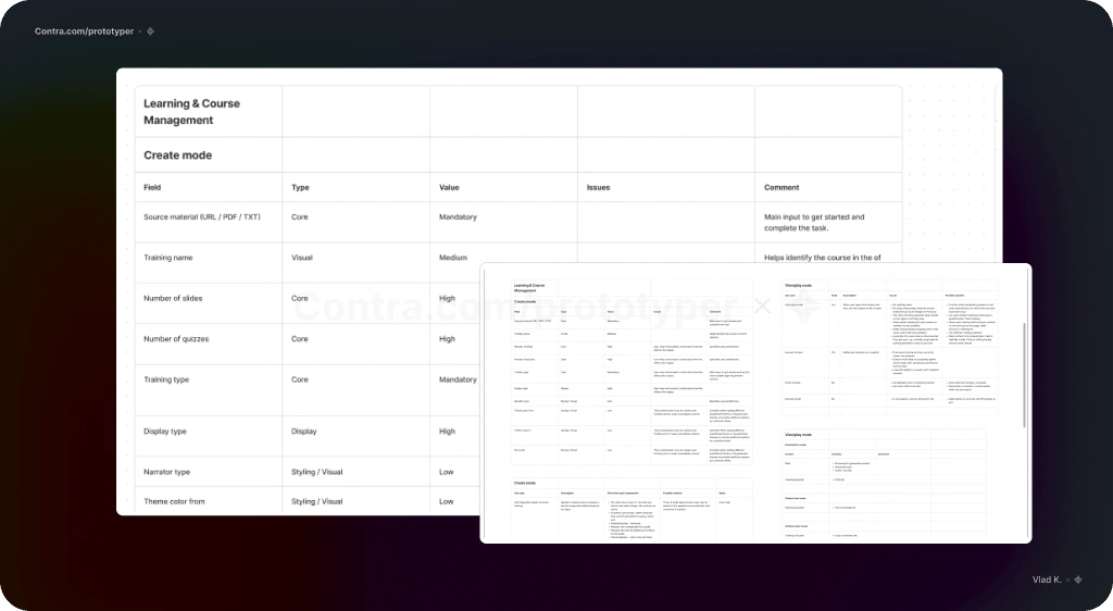
Structured tables summarizing all findings.
Define user journeys
Analyze for gaps in the UX.
Assemble all components into refined user flows.
Incorporate all related and potential user actions.
Use this as a guide for future effortless design.
As a result, we get a list of detailed user journeys and related actions →
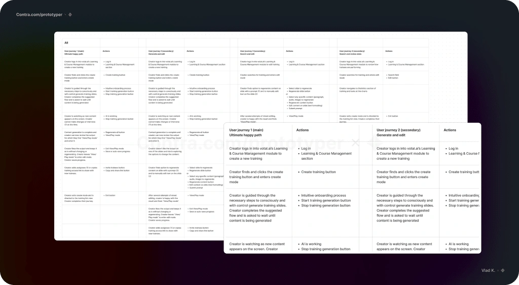
List of detailed user journeys and related actions.
UX analysis report’s to-do list
Define user journeys and use cases to design for.
Redesign the app experience.
Set up UX testing sessions with current users to measure success before and after implementing the suggested changes.
Implications:
Make changes to BE.
Make changes to FE.
UI analysis report’s to-do list
Choose a strategic approach to UI library:
design within Bootstrap’s constraints;
use React or other appealing UI libraries;
create a custom design.
Redefining problem
From:
The problem is that the app’s UI doesn’t meet modern standards and hinders our ability to attract investors and customers.
To:
Users struggle to complete tasks without guidance; therefore, the UX must be self-explanatory. UI should be a cherry on top.
Before
Fields and buttons that are semantically and contextually mismatched.
Inactive buttons and selectors clutter the UI.
Original input (now) and usage statistics (future) blocks are mixed together and appear as an AI output.
Generated slides (AI output) are difficult to find on the long page.
Controls and other UI components are randomly placed.
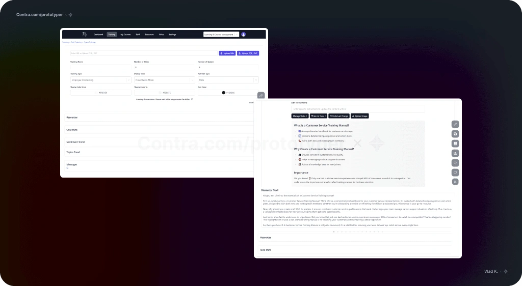
"Before" UX.
After
Reorganized into a simple two-step flow: set up prompts → review and refine output.
Button-decision fatigue is reduced while maintaining all functionality, with the buttons placed in context.
The generated content is brought to the forefront for easier formatting and AI refinement.
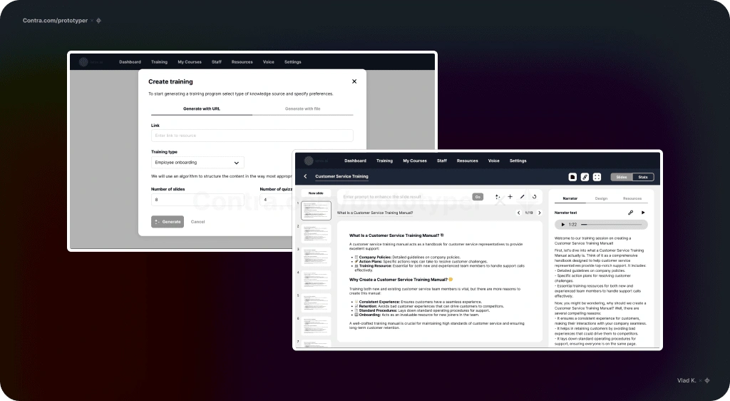
"After" UX.
Suggested next steps
Testing the new UX with customers.
Analyzing feedback and observations for refinement.
Conducting further testing.
Let's work together
If you have an ongoing project that can benefit from my design approach or in case you have any questions feel free to reach out. We are going to create something great.
I also design and develop websites on Framer.com. Check this one out:
Like this project
Posted Sep 27, 2024
Let's take a look at how we can instantly improve a SaaS product's UX using OOUX and psychology. My role: Product Analyst / UX Designer / UI Designer.
Likes
1
Views
22

