EmailGenie: AI-Powered Email Campaign Builder
Oladimeji Abubakar

EmailGenie: AI-Powered Email Campaign Builder
Overview
As a product designer, I crafted EmailGenie, an intuitive AI-driven platform that empowers marketers to create, manage, and track stunning email campaigns in seconds. Drawing from user pain points like time-consuming design and fragmented workflows, EmailGenie streamlines the process with conversational AI assistance, a dark-mode visual editor, and data-rich dashboards. This mini case study highlights the core screens I designed to deliver a seamless, modern experience—balancing creativity with efficiency for non-designers.
Key Screens & Design Highlights
Campaign Dashboard Overview
In designing the dashboard, I aimed to transform raw data into a motivational launchpad, recognizing that marketers often feel overwhelmed by scattered metrics at session start. By clustering key indicators—like campaign counts, contact totals, and open rates—into compact cards with subtle growth indicators, I created a glanceable overview that invites deeper exploration only when needed. The multi-line chart, with its layered filters for sent, opened, and delivered emails, emerged from wireframe tests showing users' need for temporal context without modal overload; this allows seamless toggling to spot trends, like seasonal spikes, fostering a sense of control that propels them toward action rather than analysis paralysis.
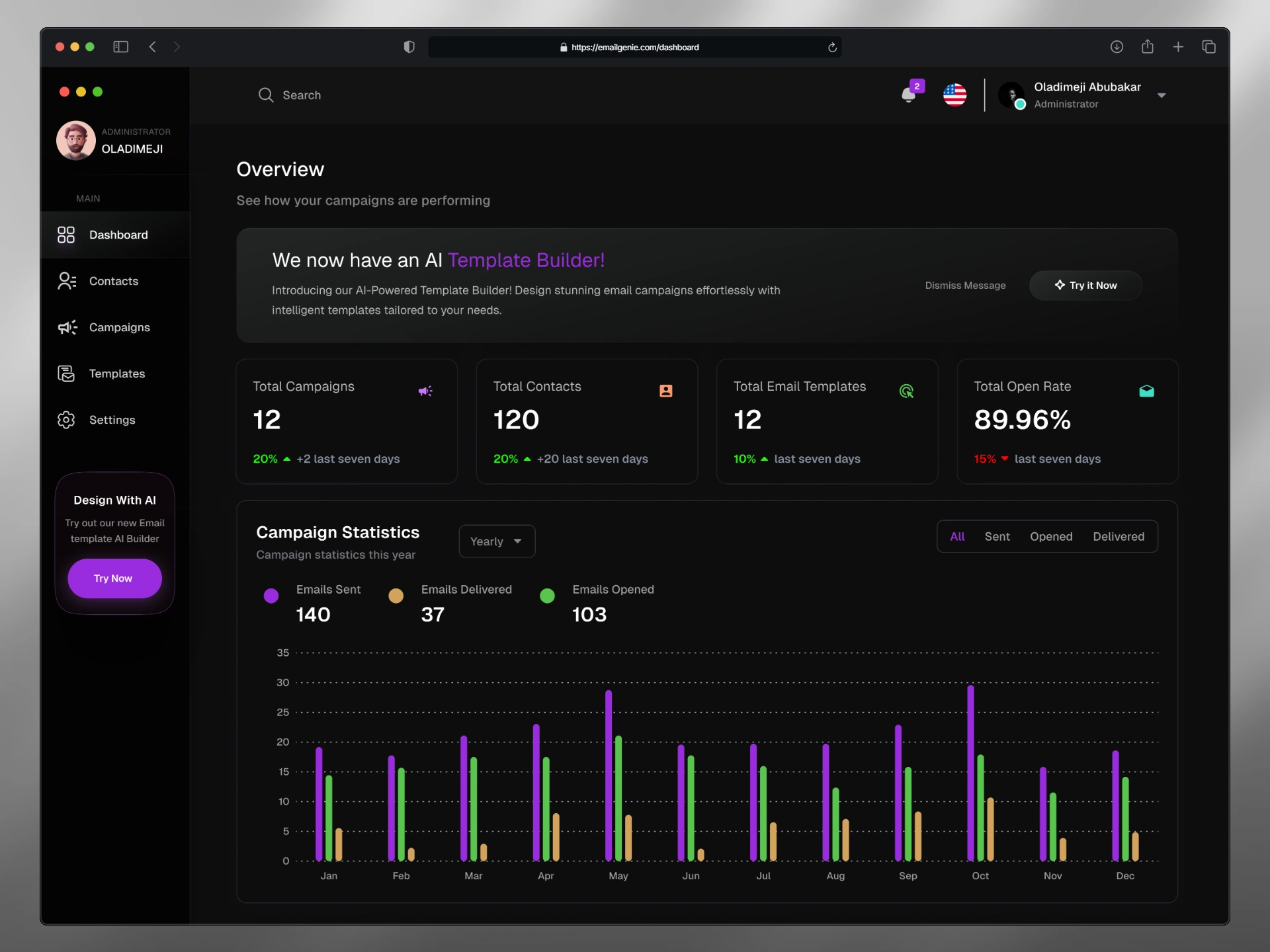
Dashboard
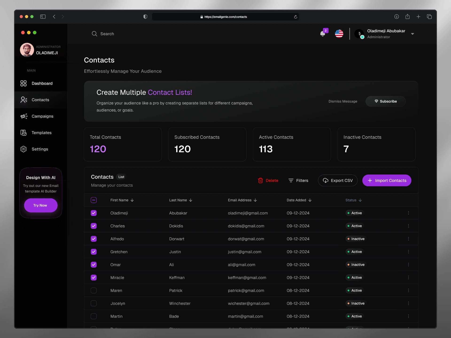
Contacts Management
For the contacts screen, my goal was to alleviate the tedium of audience wrangling by making it a proactive extension of campaign planning, not a separate chore. I opted for a clean, filterable table with inline status badges (green for active, orange for inactive) to enable rapid triage, informed by early sketches that highlighted how color semantics speeds decision-making over plain lists. Bulk actions like imports and list creation prompts sit intuitively at the top, with persistent sidebar navigation to maintain spatial awareness; this design choice stems from user flow mappings that revealed context-switching as a major friction point, turning potential drudgery into an empowering ritual that keeps energy focused on personalization over maintenance.
AI Prompt Screen
The AI prompt screen was conceived as a gentle on-ramp to combat the intimidation of starting from scratch, where vague ideas often stall creativity. I centered a forgiving input field with voice support and predictive suggestion chips—like "welcome new users"—to scaffold intent without dictating paths, a decision rooted in prototyping sessions that showed how subtle priming reduces abandonment. The ambient, glowing AI icon paired with an aspirational tagline against a gradient backdrop builds subtle excitement, drawing from affordance studies to evoke possibility; this setup ensures users transition effortlessly from inspiration to generation, making the first step feel like a spark rather than a hurdle.
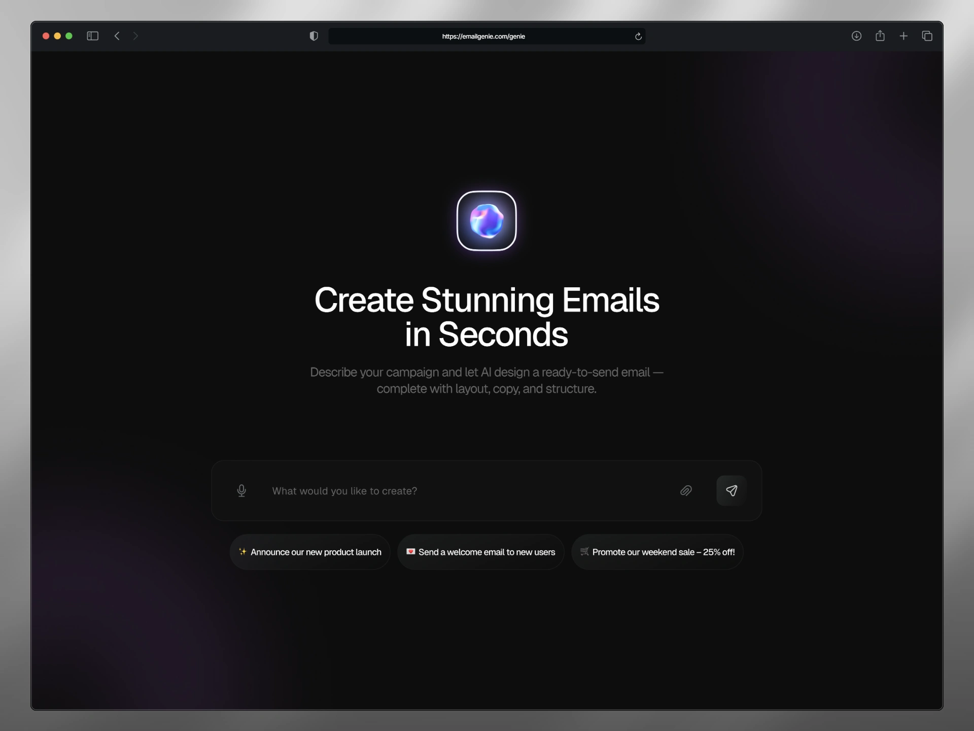
Prompt page
AI Editor
For the AI editor, I envisioned a seamless conversational layer that demystifies refinement by overlaying a persistent chat sidebar directly alongside the evolving template canvas, countering the isolation users feel when toggling between tools mid-iteration. This dual-pane setup—tabbed between AI and visual modes—lets queries like "keep it friendly and modern" or "change this button color to white with blue text" trigger instant previews of rewritten paragraphs, adjusted buttons, and retried drafts, all annotated with editable badges and fallback "Retry" prompts for granular control. Drawing from dialogue flow prototypes that emphasized real-time syncing to preserve context, the purple-threaded bubbles and empathetic responses (e.g., "Certainly! I've rewritten the paragraph—users will feel loved") cultivate a sense of partnership, where AI anticipates needs without overriding intent, enabling fluid tweaks that build trust and accelerate from draft to delight.
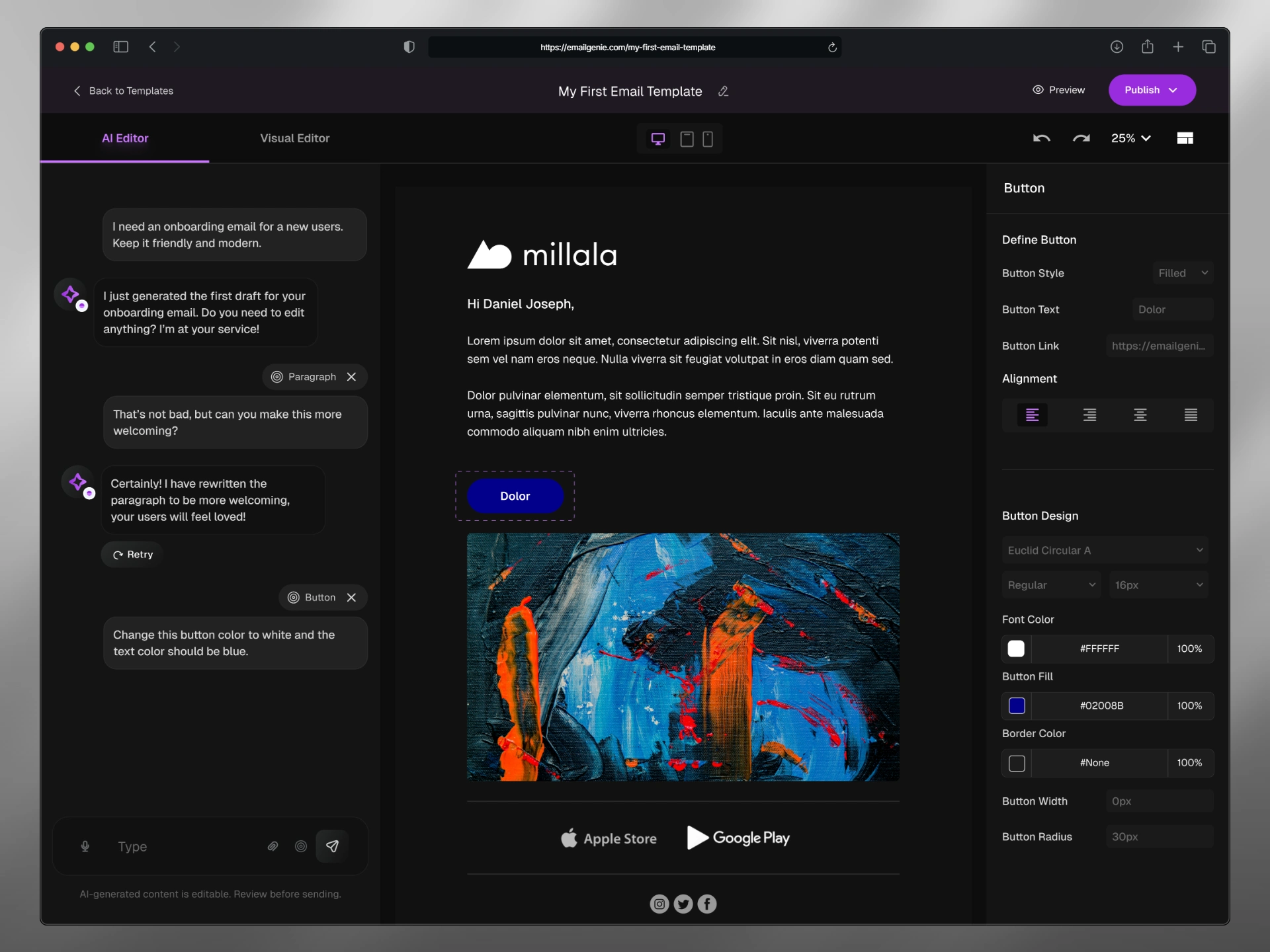
AI editor
Visual Editor
The visual editor embodies the heart of hands-on creation, designed to eliminate the disorientation that plagues fragmented editing tools by anchoring a split-canvas layout that keeps context alive. With draggable widgets on the left syncing instantly to property panels on the right, and a persistent 25% preview thumbnail, I drew from spatial design principles to minimize cognitive jumps—insights from iterative prototypes revealed how live updates cut perceived effort in half. Purple badges flag AI enhancements, like auto-alignment, guiding novices toward polished, responsive outputs; this balance of freedom and subtle nudges ensures the space feels expansive yet supportive, turning abstract ideas into tangible, publish-ready emails with ease.
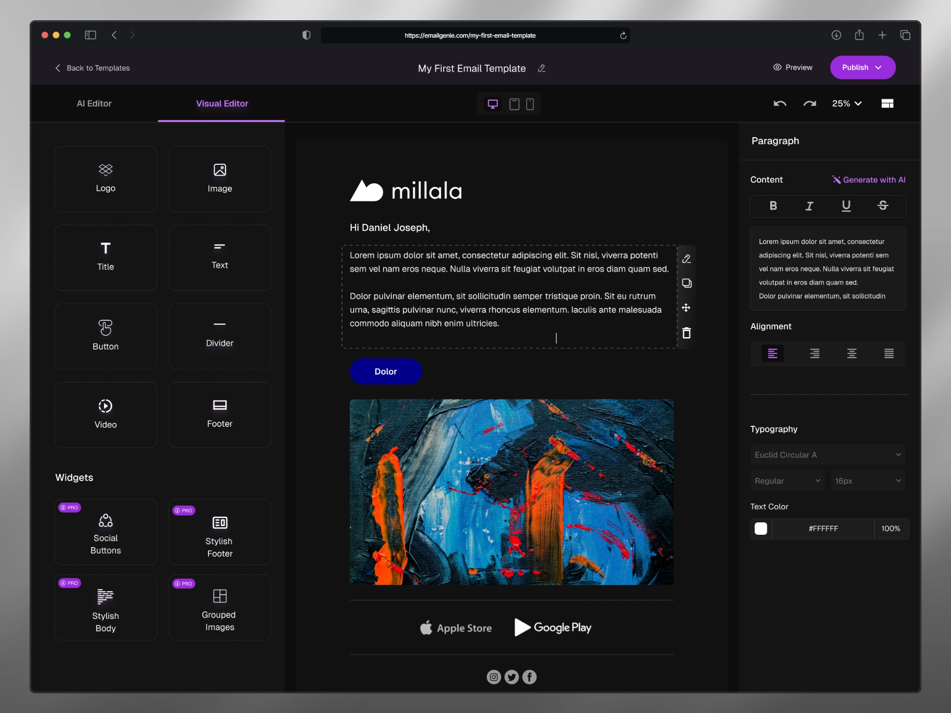
Visual editor
Reflection
This project deepened my appreciation for AI's role in UX as an amplifier of human intent, where thoughtful layering of conversational and visual elements can dissolve barriers to creation. Iterations highlighted the power of restraint in dark-mode palettes for sustained focus, while future explorations might weave in collaborative cursors for team dynamics. Explore the Figma prototype to navigate the flows firsthand.
Like this project
Posted Oct 9, 2025
Designed EmailGenie, an AI-driven platform for email campaign creation.
Likes
1
Views
4