ORSA Brand Identity

Bryan Bernard

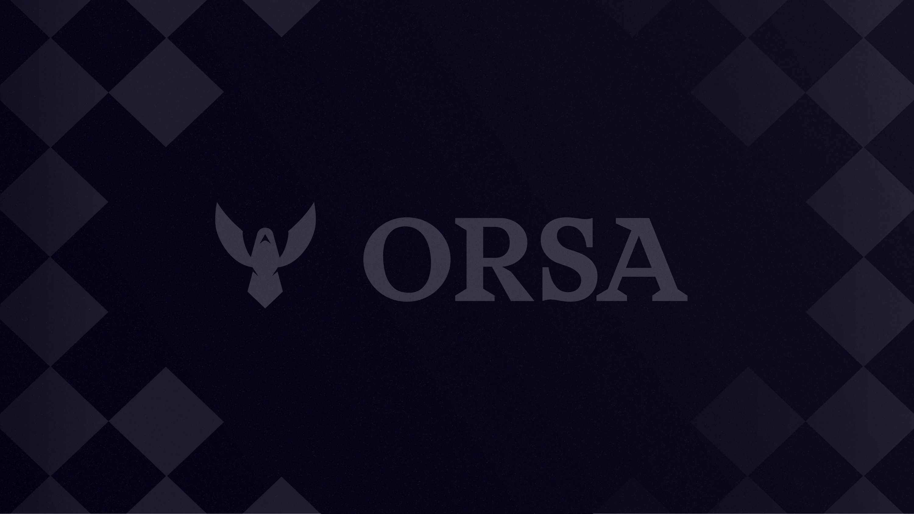
Oser ensemble.
Work in collaboration with Minale Design Strategy
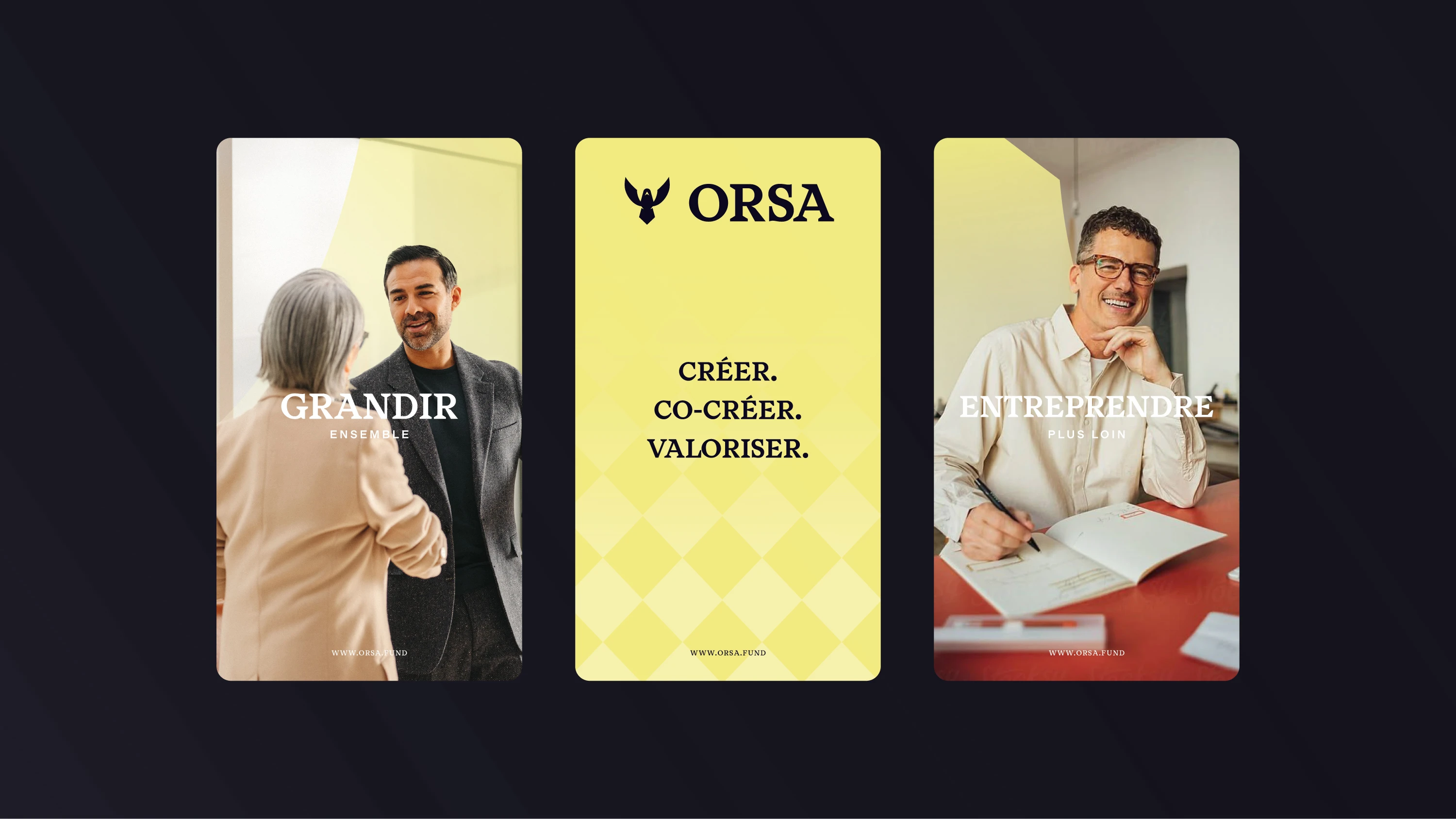
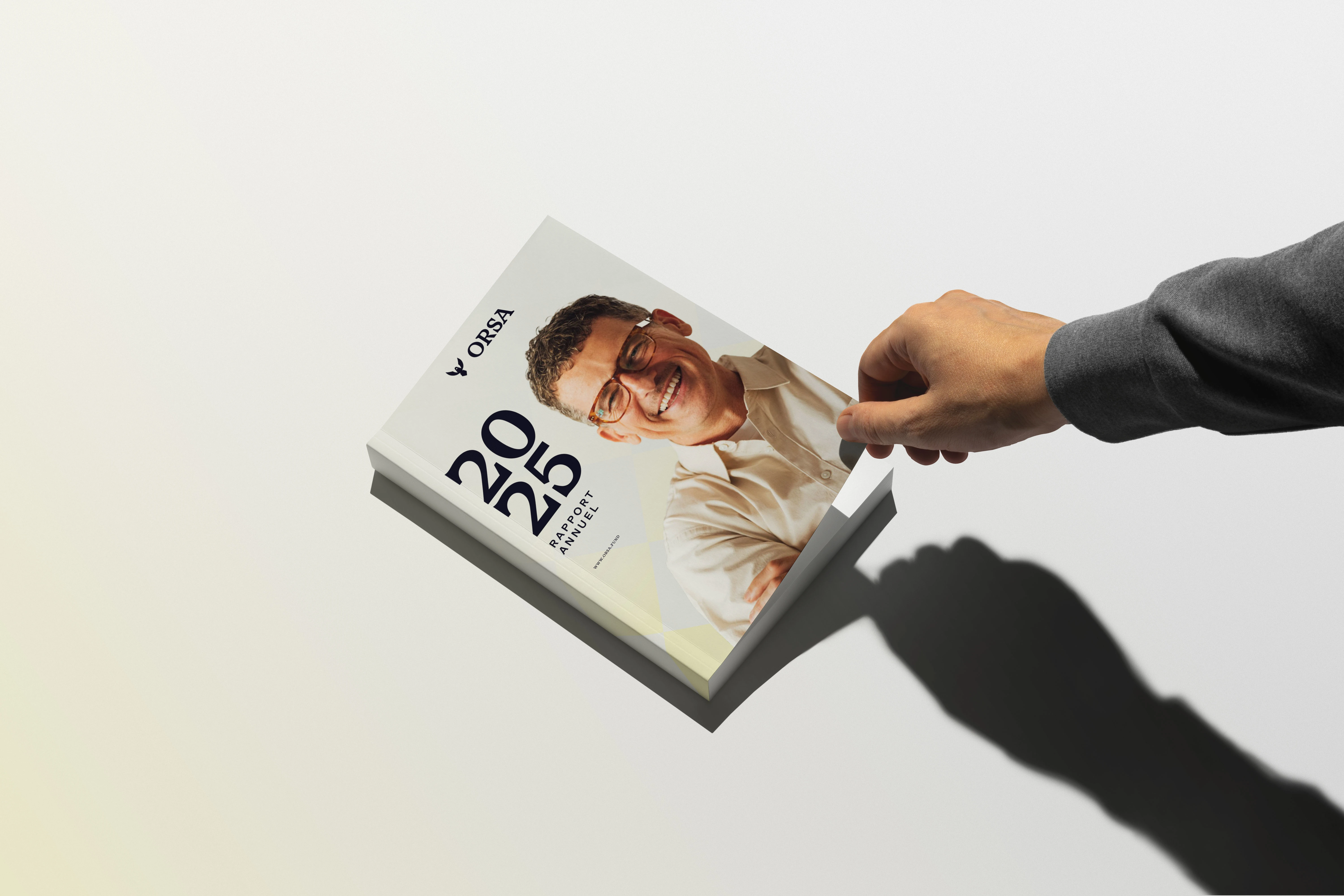
With this new identity, I wanted to give ORSA a more modern, minimalist, and forward-looking image.
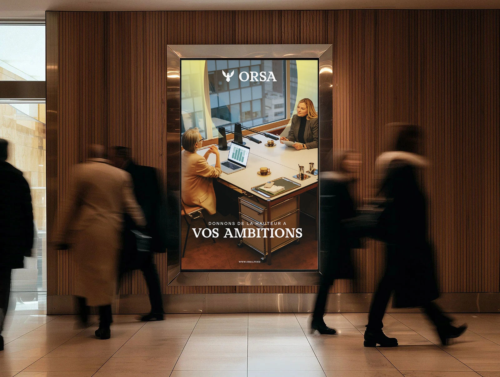
The identity is built around two core ideas: investment and growth. The visual system reflects progress, ambition, and value creation, while maintaining a refined and structured aesthetic that inspires trust.
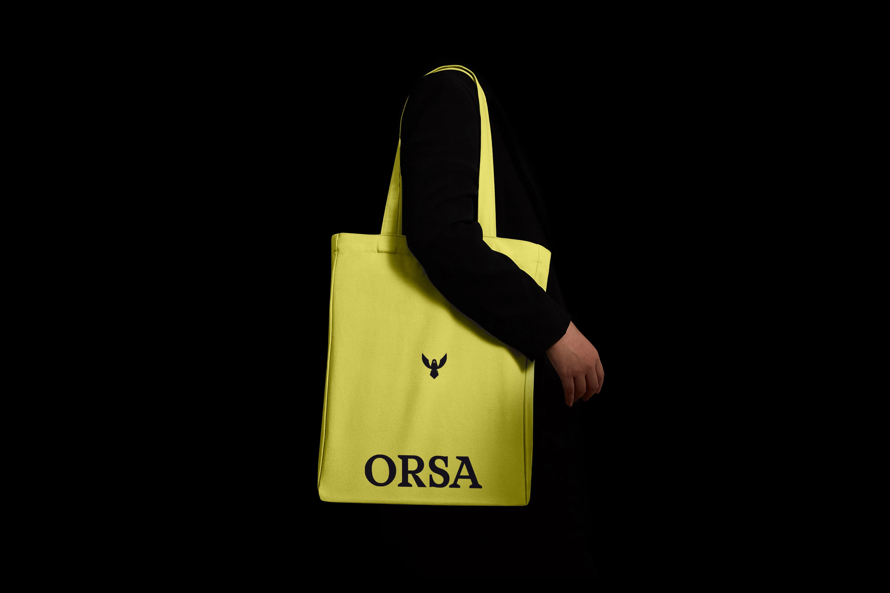
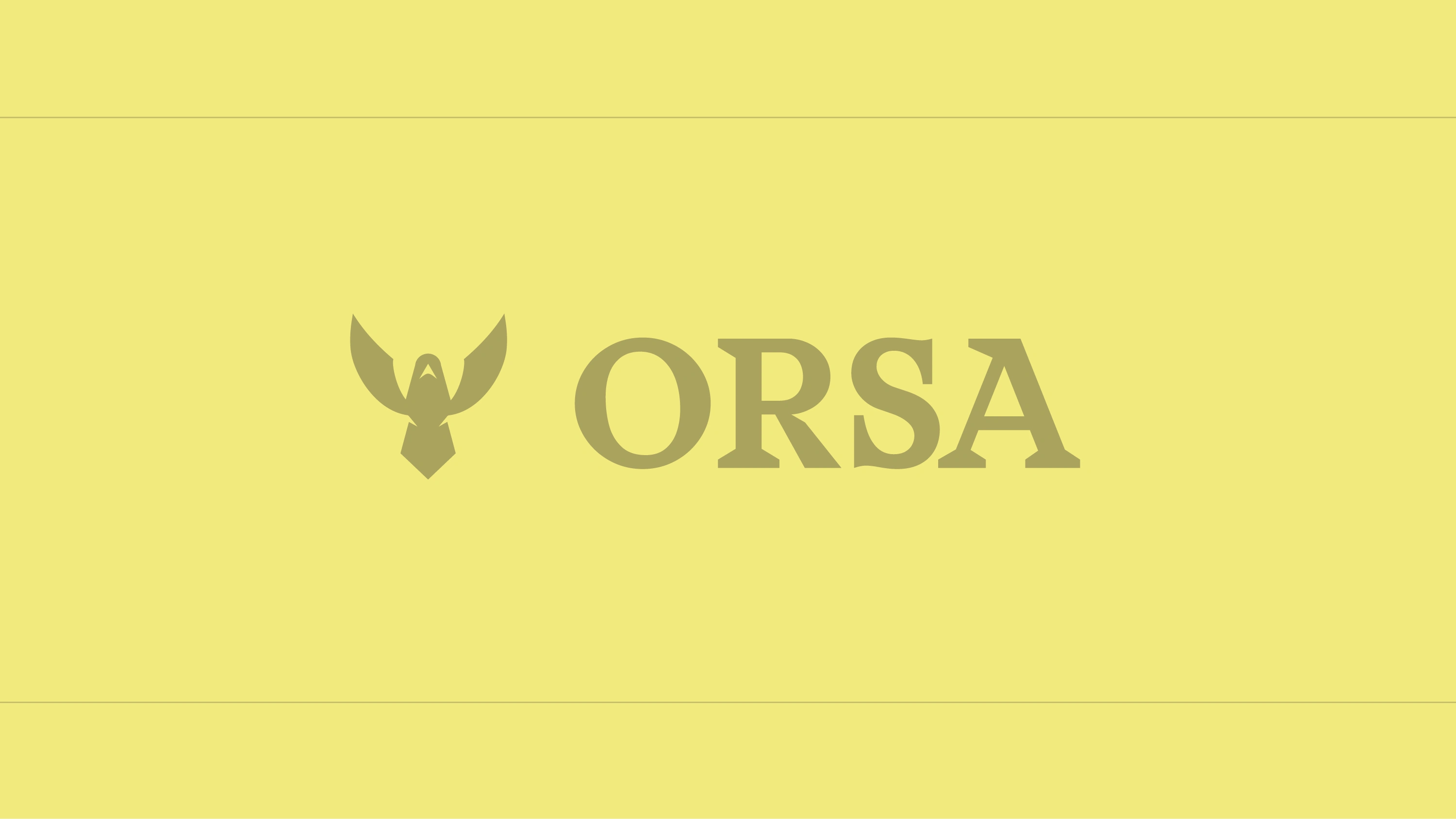
At the heart of the identity, the eagle becomes ORSA emblem. It represents the brand’s vision, strength, and future. Its ability to rise above and see further reflects the fund’s philosophy: identifying today’s opportunities to shape tomorrow’s growth.
The typography reinforces this strong presence with a bold and distinctive character. Its serifs bring a sense of authority and sophistication while creating a recognizable and timeless visual signature.
Together, these elements form a confident, ambitious, and distinctive identity that embodies ORSA Fund’s vision: investing today in what will shape tomorrow.

Like this project
Posted Aug 10, 2026
With Minale Design Strategy. ORSA new identity blends vision, strength and growth, with a bold emblem and distinctive serif typography built for the future.
Likes
0
Views
12
Clients
Minale Design Strategy