ScaleFund Brand Identity

Bryan Bernard



Make your growth inevitable.
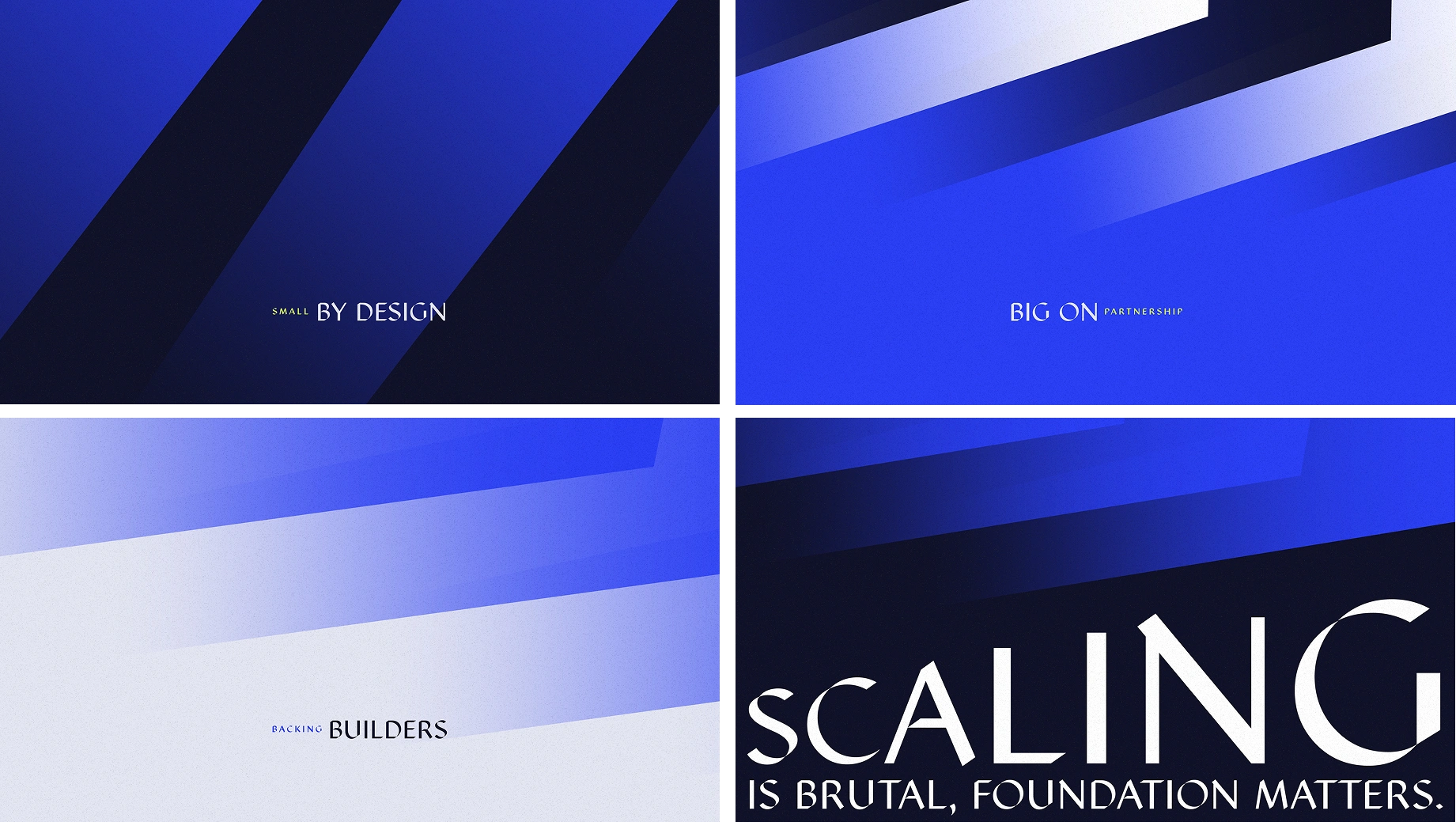
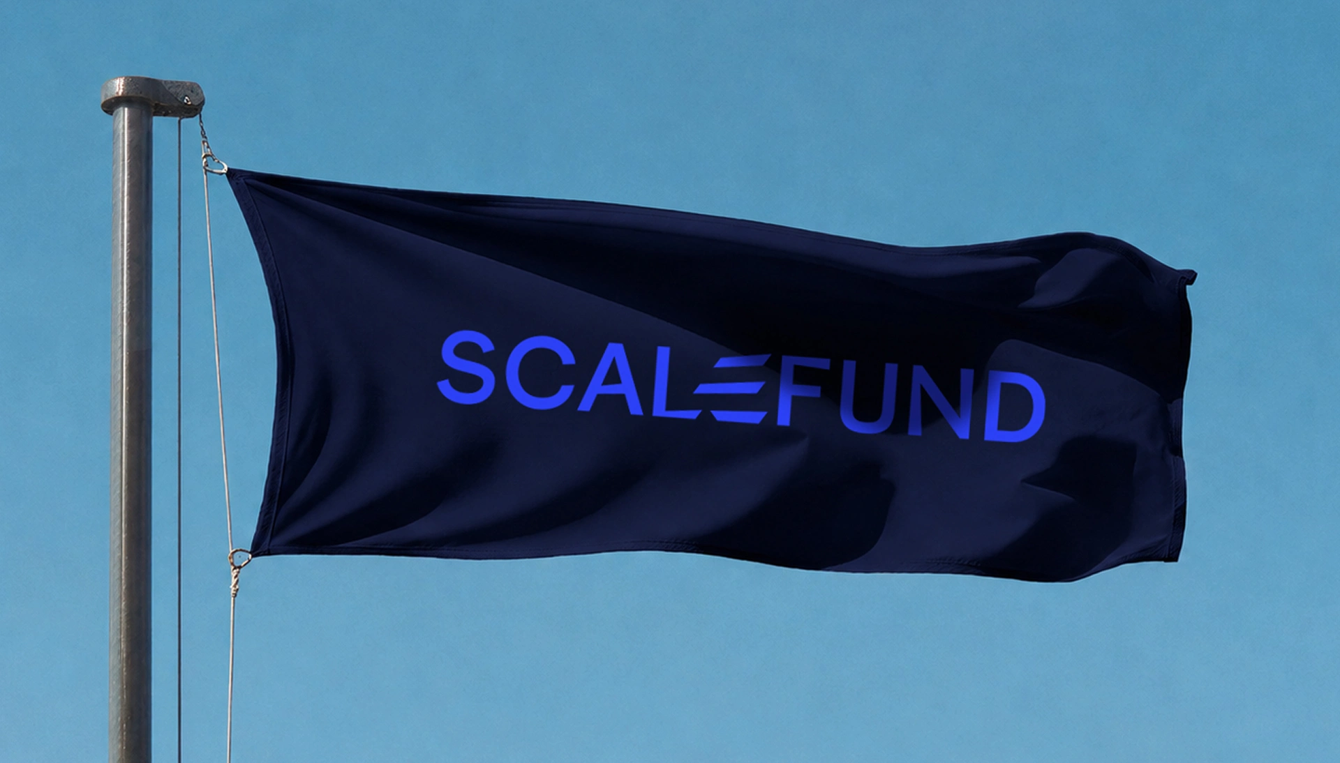
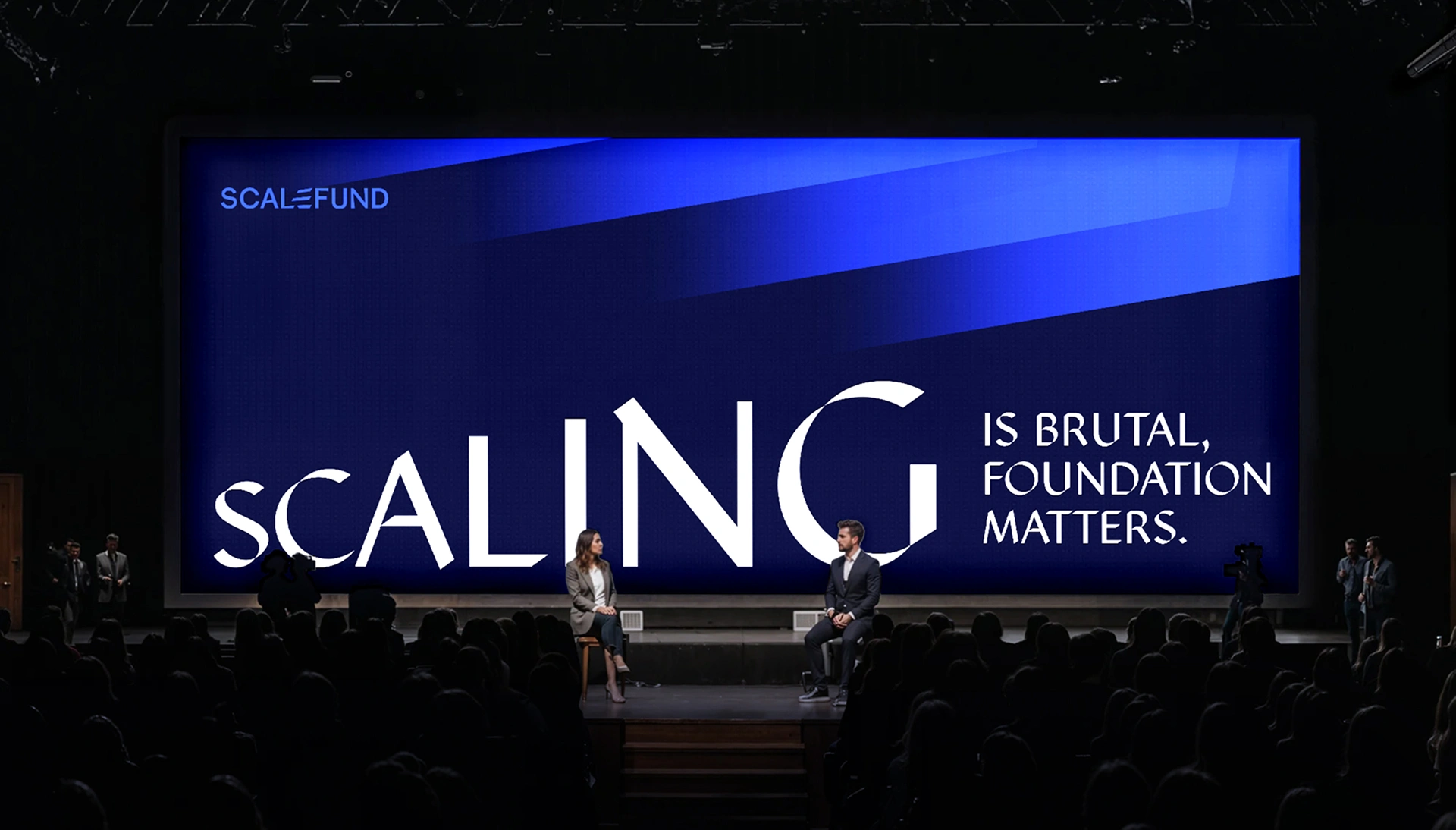
Through ScaleFund, the idea was to visually express elevation and growth. Starting from the existing identity, especially the three bars within
the “e”
I developed a more graphic and distinctive approach, transforming these lines into a symbol of progression and momentum. The goal was
to reinforce the idea of growth while staying true to the brand’s
original DNA.
In collaboration with Reed.




Like this project
Posted Aug 10, 2026
Developed a graphic approach for ScaleFund's visual identity. Strategy by Reed. In collaboration with Reed
Likes
0
Views
11
Clients
Reed