Sales Dashboard - Retail
A Sales Dashboard focused on monitoring goals and results regarding revenue, employee performance and store evolution. Created based on Maven Analytics' DataSet.
Home Page
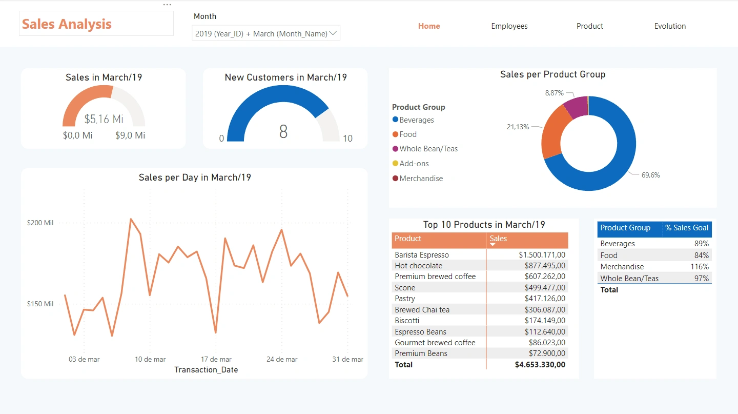
The first page aims to provide quick and useful insights, allowing you to monitor key metrics effectively.
Home Page
The central gauge displays total sales, offering a snapshot of progress toward the monthly goal. You can also track new customer acquisition, ensuring that growth remains on target. Sales are categorized by product group, making it easy to identify which segments are driving revenue and where to focus marketing efforts.
Daily sales trends are clearly outlined, offering insights into peak performance periods and potential areas for improvement. You can quickly identify best-sellers and inventory needs.
Additionally, the performance against sales goals by product group is displayed, ensuring that targets are met across all categories.
Employees Page
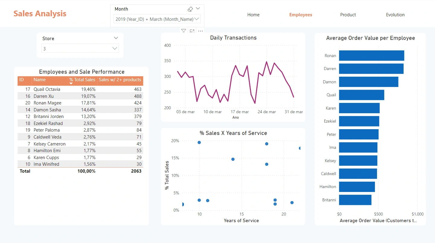
This dashboard page focuses on employee performance and sales efficiency.
Employees Page
The table provides a detailed breakdown of each employee's contribution to total sales, highlighting those who excel in selling multiple products.
Daily transaction trends are displayed, offering insights into customer activity patterns and helping to optimize staffing and resources during peak times. The relationship between sales and years of service is also visualized, enabling managers to assess how experience impacts sales performance.
On the right, the average order value per employee is showcased, ranking employees by their effectiveness in generating higher revenue per transaction. This information is crucial for recognizing outstanding sales tactics and encouraging best practices across the team.
Product Page
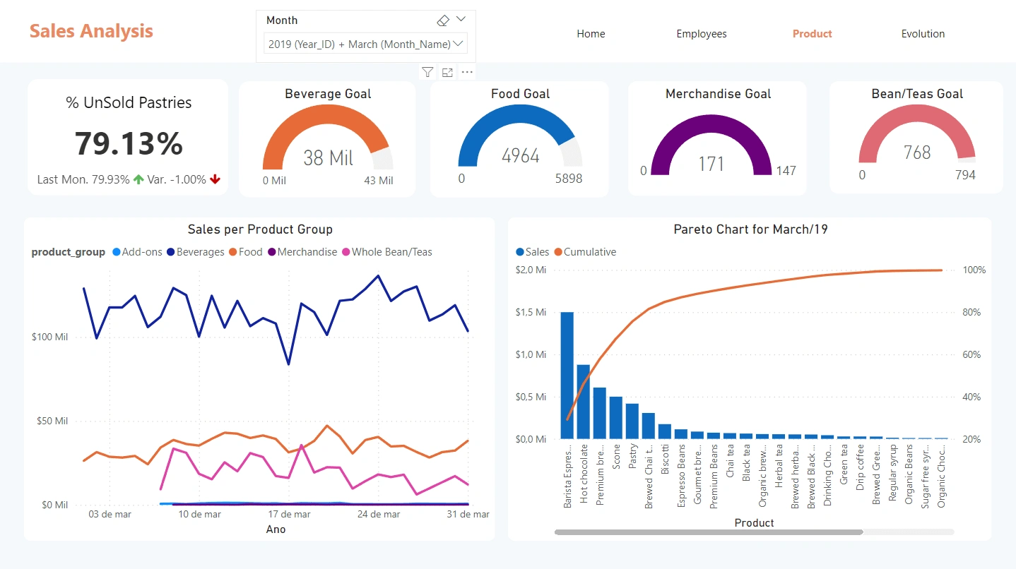
This page helps to monitor product groups goals and key items for the store revenue.
Product Page
Firstly, its possible to quickly visualize progress towards the monthly goal for different categories of products. This enables the manager to focus on specific groups that need more effort in sales.
Additonally, the line graph makes it easy to identify the peaks on revenue in the product groups, where its possible to further investigate low-performance dates.
On the bottom right, the Pareto Chart highlights the top products using the 20/80 rule. Furthermore, the manager can filter data by month, comparing how product sales change in different time periods.
Like this project
Posted Aug 8, 2024
Developed a dynamic sales dashboard with insights on overall performance, employee contributions, product analysis and key metrics for strategic growth.

