Fast Food Mobile App Design
Overview
Like most industries, the fast food industry is currently going through a digital transformation and creating world-class app-driven customer experiences. Now, as a consequent of the digital paradigm shift caused by COVID-19, Chicken Express is adapting with enhanced delivery and take-out options.
The primary goal is to give customers who love to have their meals on the go the best experience by creating a customer-facing food ordering and delivery app.
The key features of the app are a smart food ordering experience and efficient food delivery. To achieve this, we adopted a user interface that promotes healthy meal choices, a customer reward system, an agile geolocation API, an intuitive user interface that makes food ordering easy and convenient for the customers and a simple payment process.
Problem Statement
One of the prevailing problems fast food customers face is getting their orders mishandled and delivered late. Most in-store fast food restaurants in Nigeria still use the old method of handwritten notes in taking orders. Secondly, many people are becoming self conscious of the foods they eat and as a result are increasingly being particular about the nutritional content of their meals. There is also the problem of terrible food delivery experience.
Expanding digital touchpoints and streamlining online strategies are no longer a bonus for restaurants, but a necessity – especially with the major shifts that impact dining experiences amid the urge for social distancing and shelter-in-place practices following the pandemic.
User Research
A qualitative research was carried out on 15 users between the ages of 21 and 50 with the sole purpose of prioritizing the users by putting them front and center. The research helped answer pressing questions such as:
What should the app be built for?
What are the pain points of the users?
How can these problems be solved?
Some of the questions asked were
How often do you order food with food vendors?
How would you rate your meal delivery experience?
What is your take on food hygiene?
What challenges do you face in the ordering process?
How do you make complaints about any dissatisfactions?
If given the power to fix your dissatisfactions what would you do?
Interview Findings
We were able to gather some useful information on the general opinion of customers about their fast food restaurant experience. Through the insights gathered, a holistic view of the problems facing fast food in Nigeria was uncovered. Essentially, there seem to be an absence of a customer-facing experience. Chicken Express seeks to stand out from the crowd thereby, developing a more customer centric experience that truly represents the brand’s offering.Insights from the interview were:
Many people complained about lateness in delivery.
Many people want more information about the nutritional contents of the meals they order.
Many people wish they could express their opinions on their experience to the brand through reviews and ratings.
Iteration
The iteration stage involved the decision of what approach to take in the design process. The team and I looked into several use cases and best practises and a couple of brands were analyzed. Notable among which were Starbucks, McDonald’s and Chick-fil-A. We figured there was no need reinventing the wheel rather we could leverage on the successes of these brands.After series of sprints and meetings, we were able to match up our findings from the user interviews with the analysis made on these successful brands. The areas we zeroed in on are:
ability of users to save their favorite meals to make future ordering faster and simpler.
ability of users to customize their orders just the way they like it.
ability to choose between delivery or pickup.
users get rewards through the express meal reward program.
ability to upload gift cards for safekeep.
Sketches and wireframes
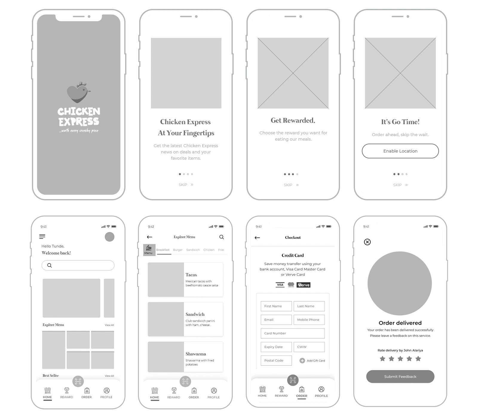
Some low-fidelity screens
High Fidelity
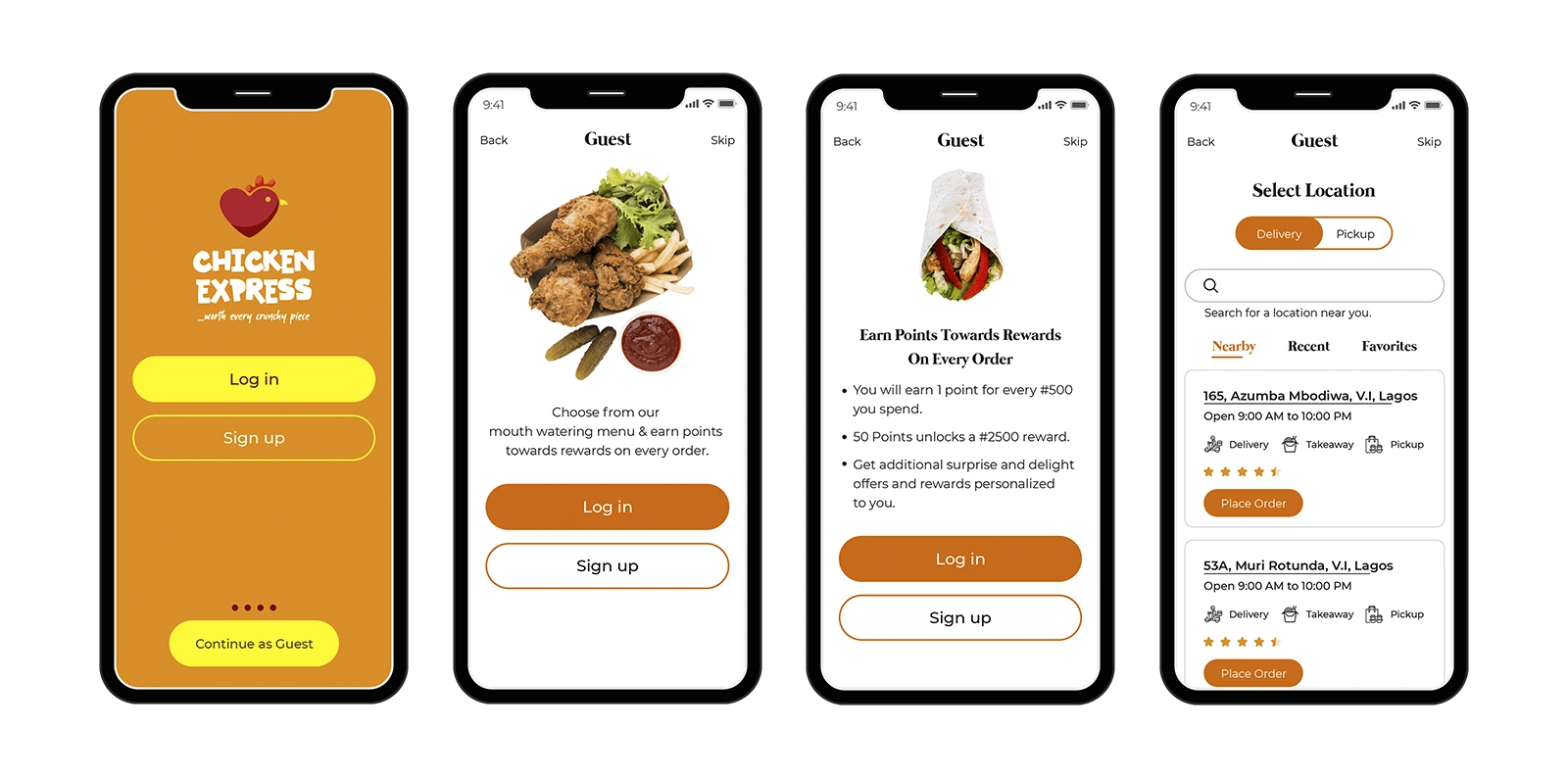
Guided by our research, I was able to derive a structure for the user flow and wireframes. Right off the bat, I thought the onboarding process should give guests a sneak peek of some of the features the app has in store.
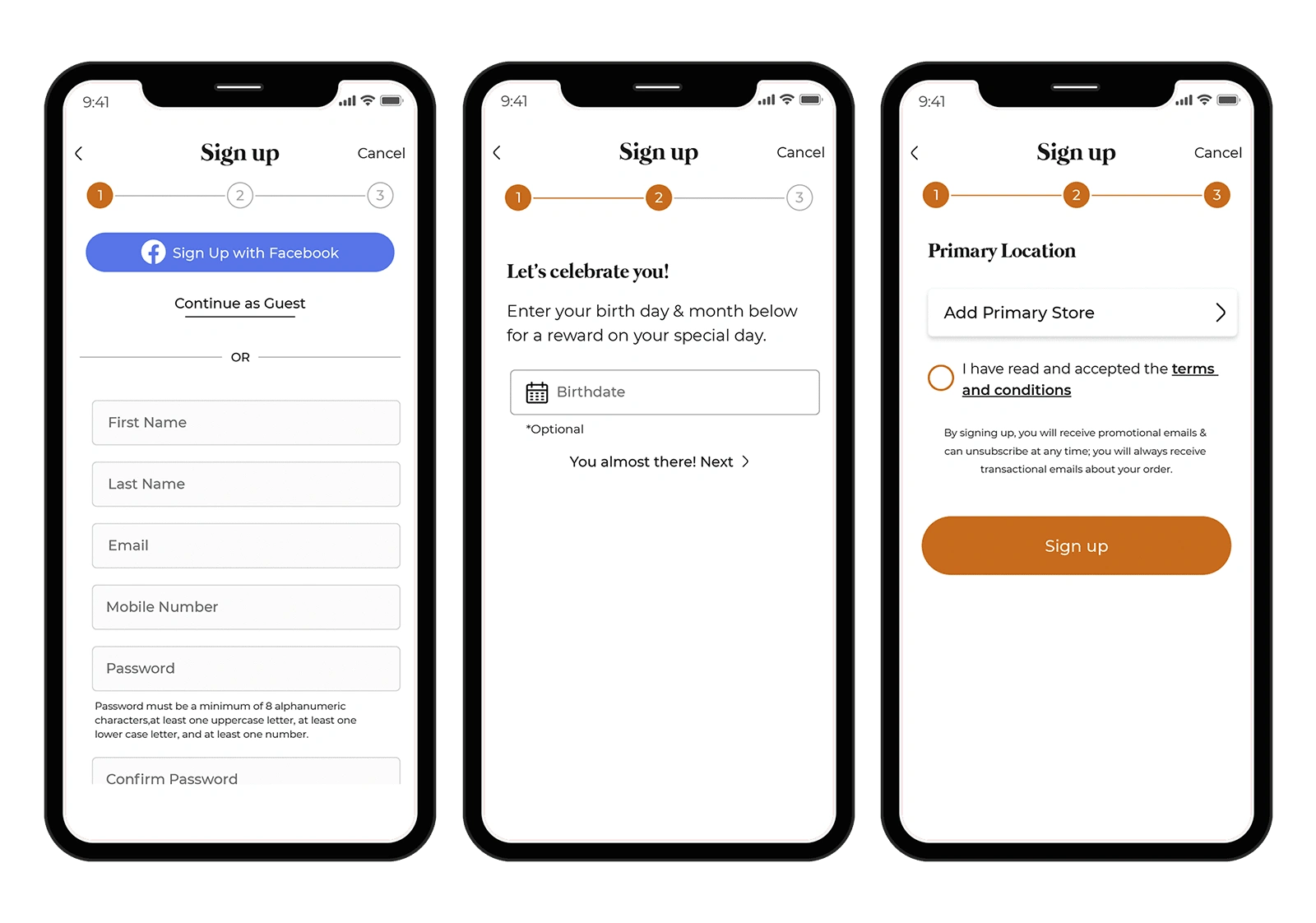
As a way of being more customer-facing, we came up with the idea of gathering some useful customer information that will be used in providing a personalized experience for each customer.
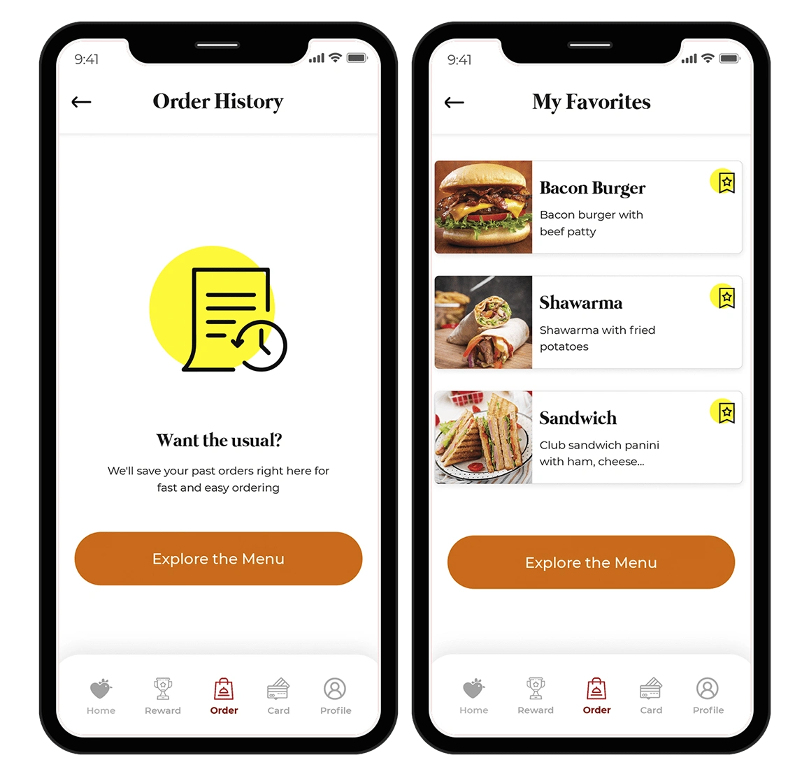
For easy and fast ordering, the app allows users save their favorite meals. The app also remembers what you like and how you like it all saved in the order history.
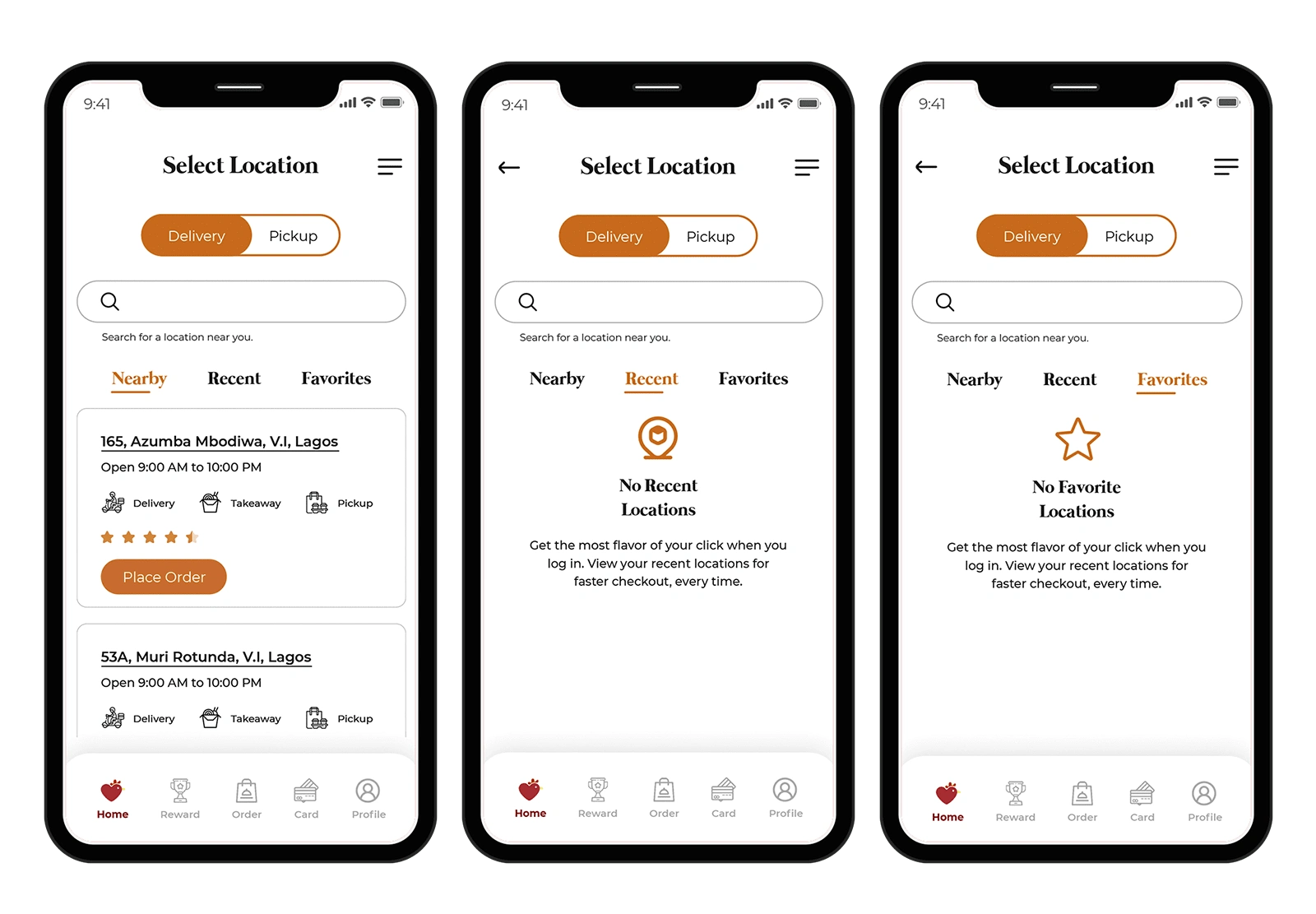
To ensure an agile and intuitive system, users are able to select locations based on their geolocation. Users can also decide to choose a recently visited location or make a particular location(s) their favorite.
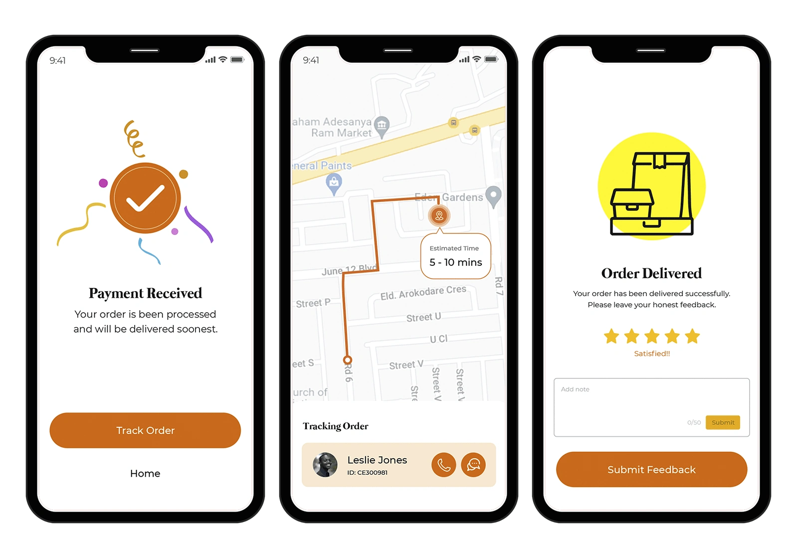
After the whole ordering and delivery process, we want users to be able to rate their experience and give us useful feedbacks that will ensure that we have effectively solved their pain points. This will also serve as a cue to identifying further solutions and how to solve them.
Major Takeaway
Working on this project afforded me a lot of lessons in user testing and how important user-centric designs are in converting customers. The design thinking, implementation, and customer journey gave a more in-depth understanding on how to identify problems, create proper assumptions and get concrete validations for solving those problems.
Like this project
Posted Apr 17, 2023
The idea was to design a fast food mobile app that stands out among it competitors in Nigeria by solving the problem of food ordering and delivery.

