Aura | AI-Powered SaaS Workspace for Focus & Well-Being
Supriya Borgohain
About the project
Aura | AI-Powered SaaS Workspace for Focus & Well-Being
Brand & UI Design by Supriya Borgohain
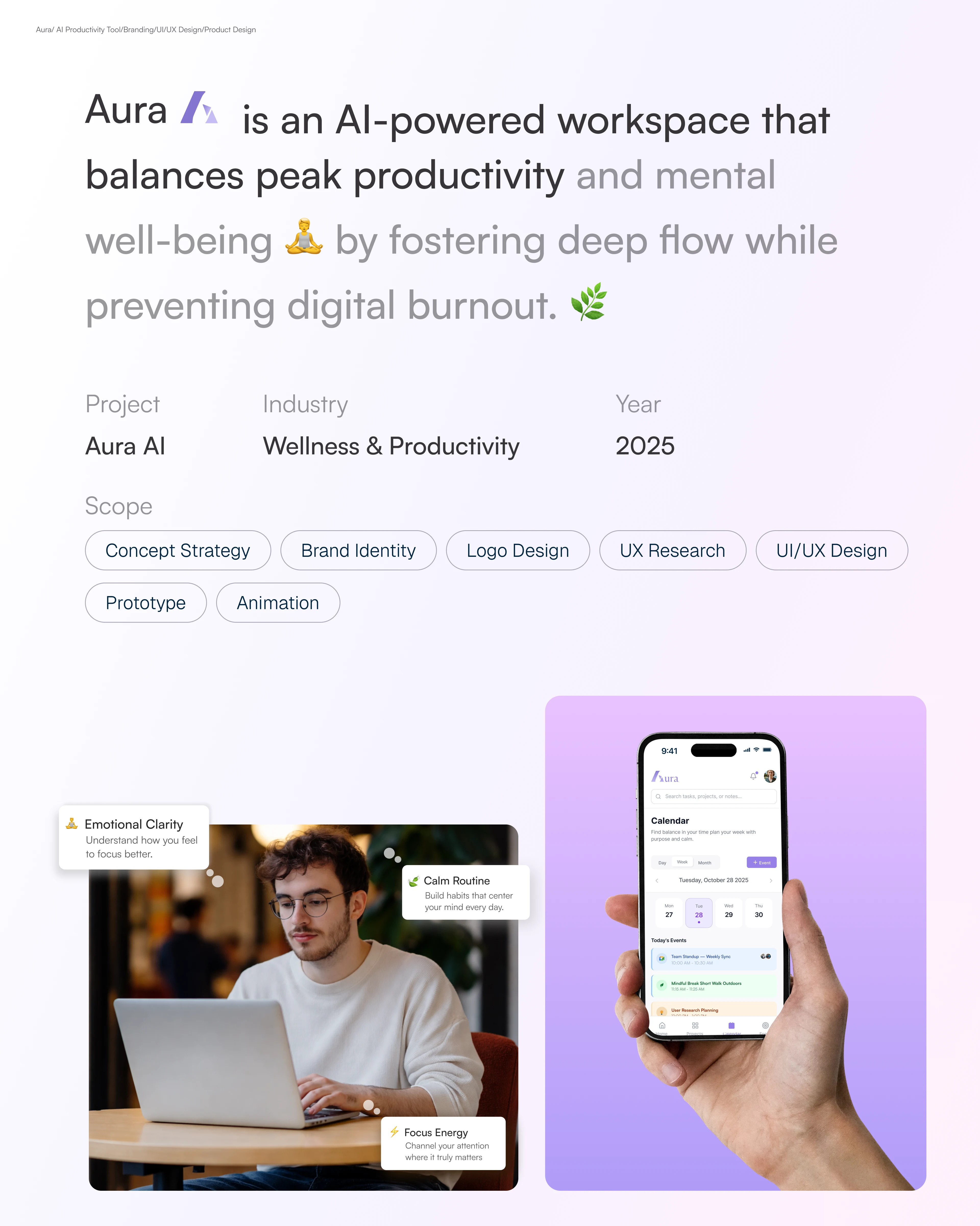
The Productivity Industry Has a Burnout Problem
Productivity tools are supposed to help you focus. Instead, most of them became the distraction. Notification badges, cluttered dashboards, aggressive interfaces demanding your attention the tools meant to help knowledge workers perform were quietly burning them out.
Nobody was building for calm. Everyone was building for more.
Aura started as a question: what would a workspace look like if it was designed around human well-being first, and features second? Not another Notion. Not another task manager. A workspace that felt like it was actually on your side.
The Brief
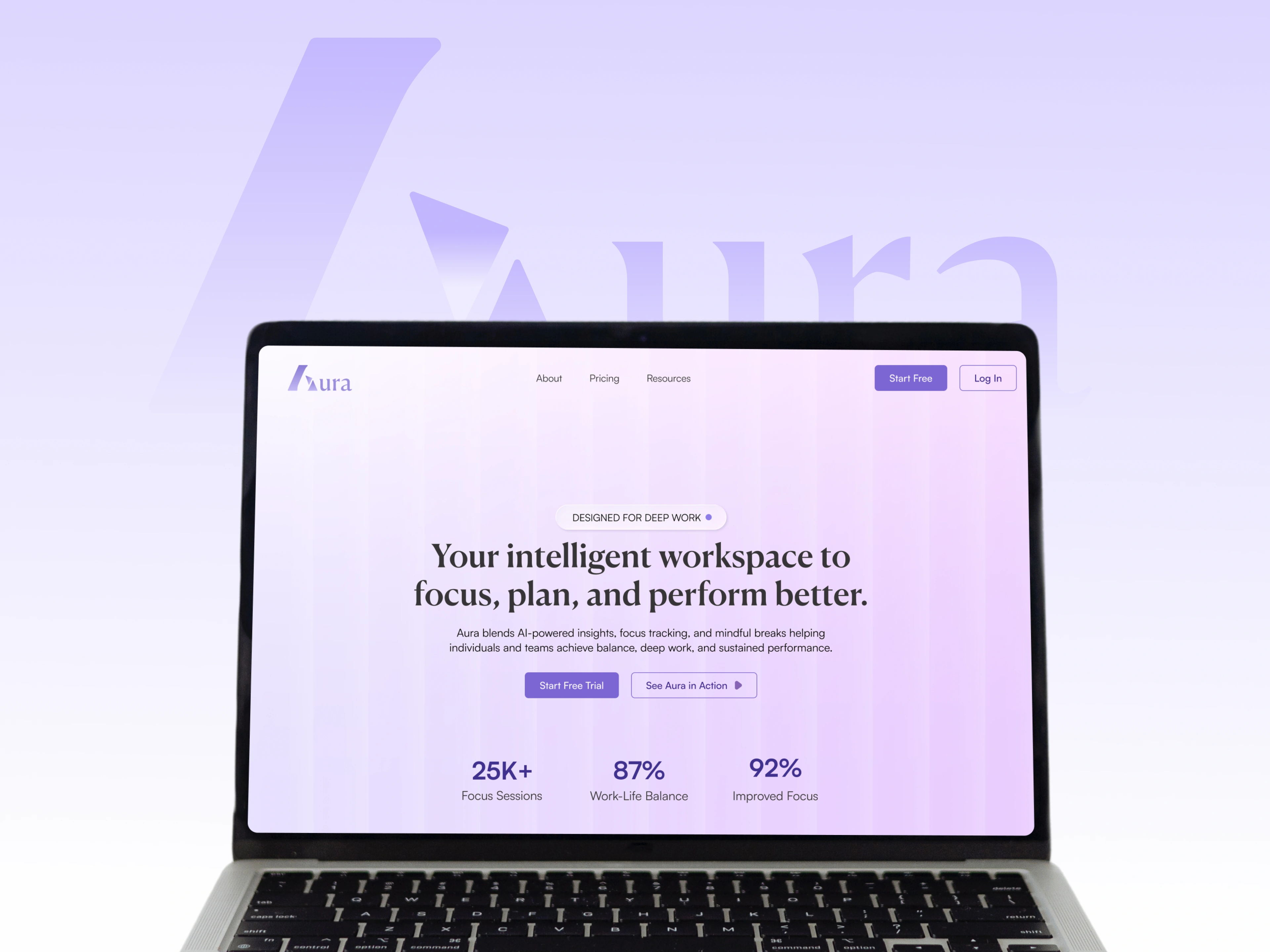
Goal: Design a brand and UI system that makes Aura feel like the only calm corner of the internet.
Scope: Logo, brand identity, color system, typography, user flows, and full web app UI.
Mockup
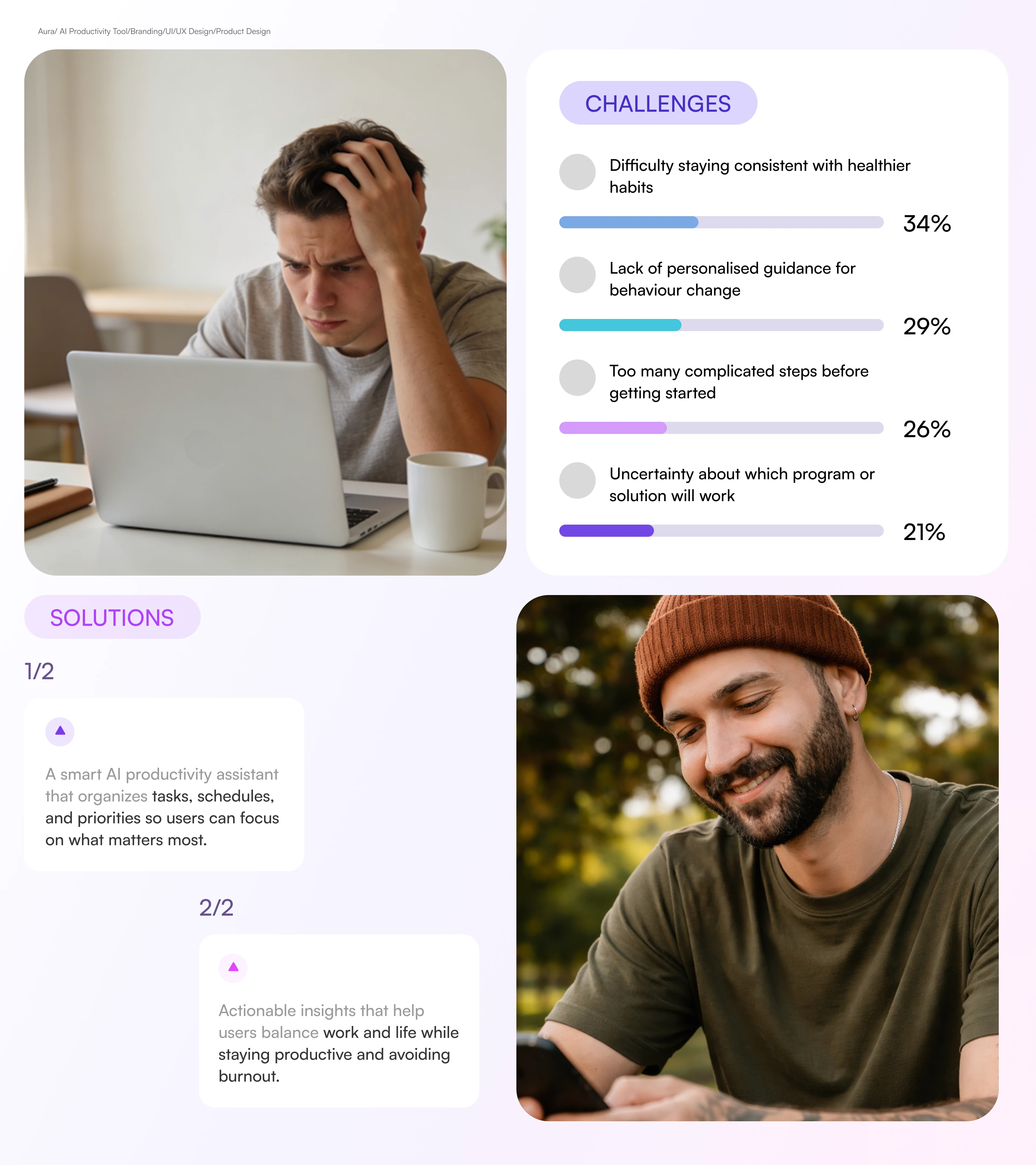
Problem Statement and Solutions
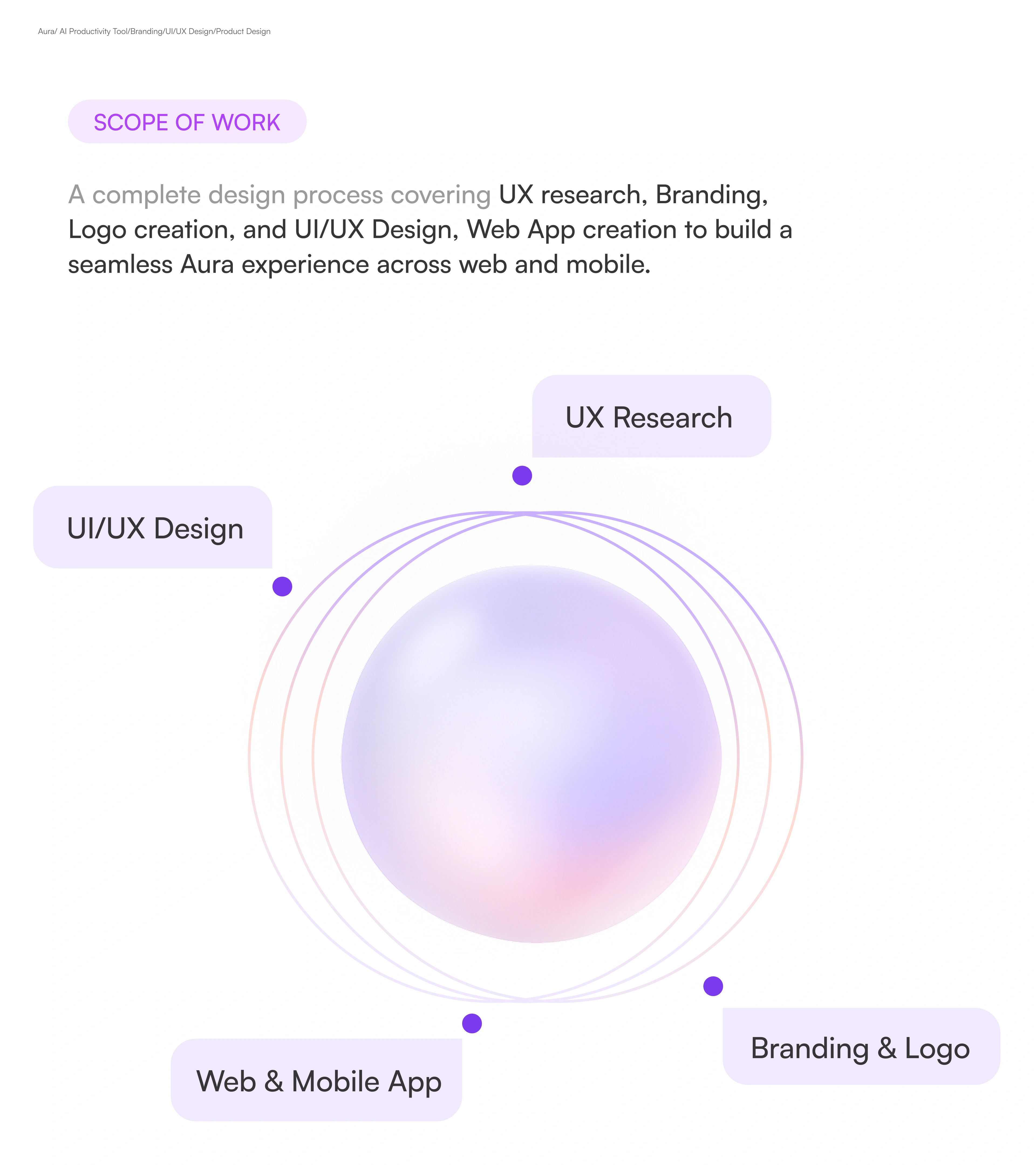
Scope of Work
Brand Identity
Aura isn't a productivity app. It's a recovery tool for overworked minds — one that happens to make you more productive as a side effect.
Logo — The mark was designed to feel like a breath. Soft, circular motion suggesting rhythm and balance, not speed. No sharp edges, no aggressive geometry. It hints at focus as a natural state not something you fight for.
Color — Muted purples and deep neutrals form the base. Cool, desaturated tones reduce visual stress physiologically. Accent colors appear sparingly, only to guide attention where it actually matters. The palette earns every moment of contrast.
Typography — A clean geometric sans for headings: confident but not loud. A humanist face for body copy: warm, readable, easy to settle into. Together they create a voice that feels considered, not clinical.
Design Language — Soft gradients, generous whitespace, rounded components. Every detail was chosen because Aura's users are already staring at harsh interfaces all day. This one needed to feel like relief the moment it loaded.
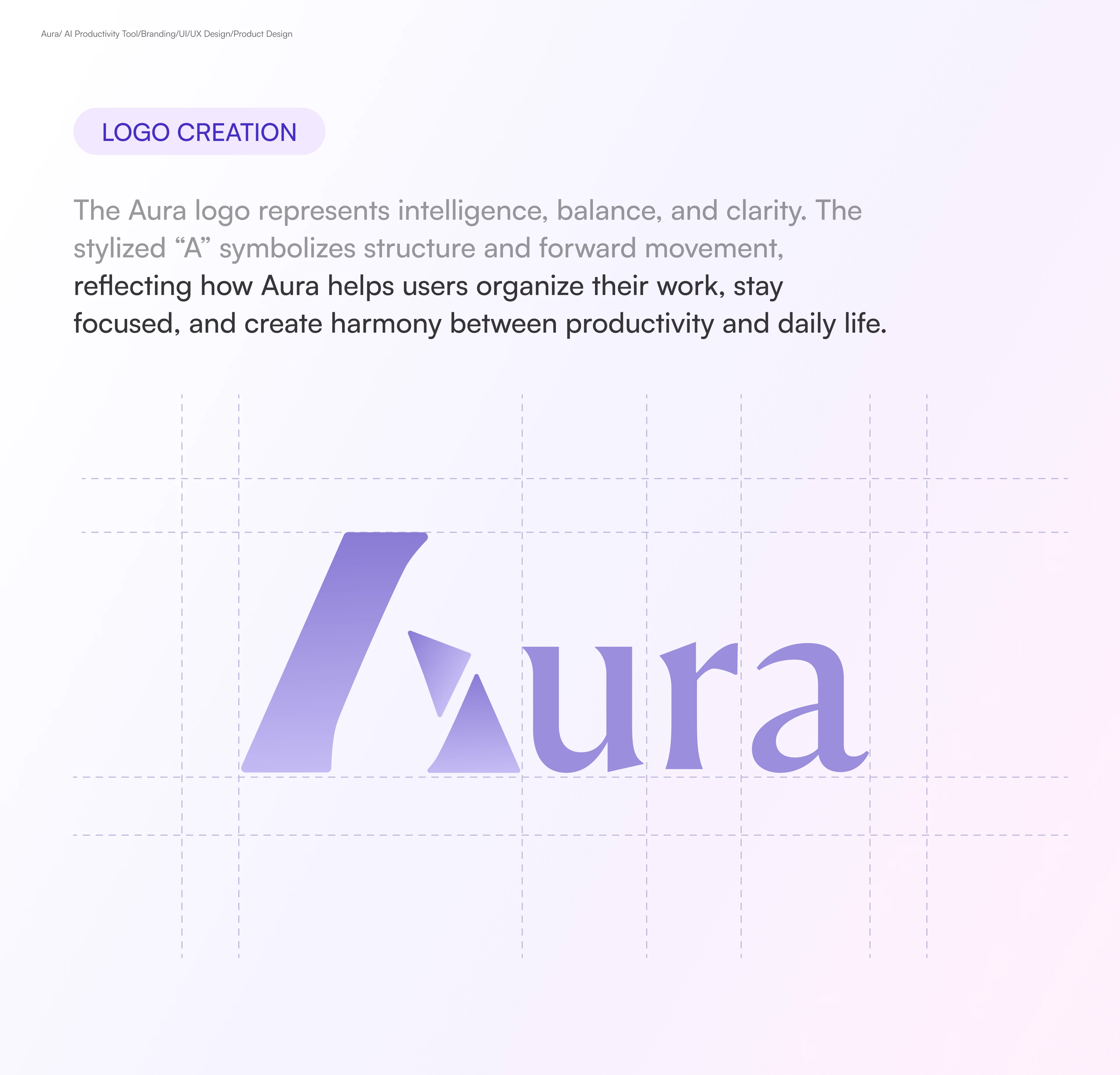
Logo Creation
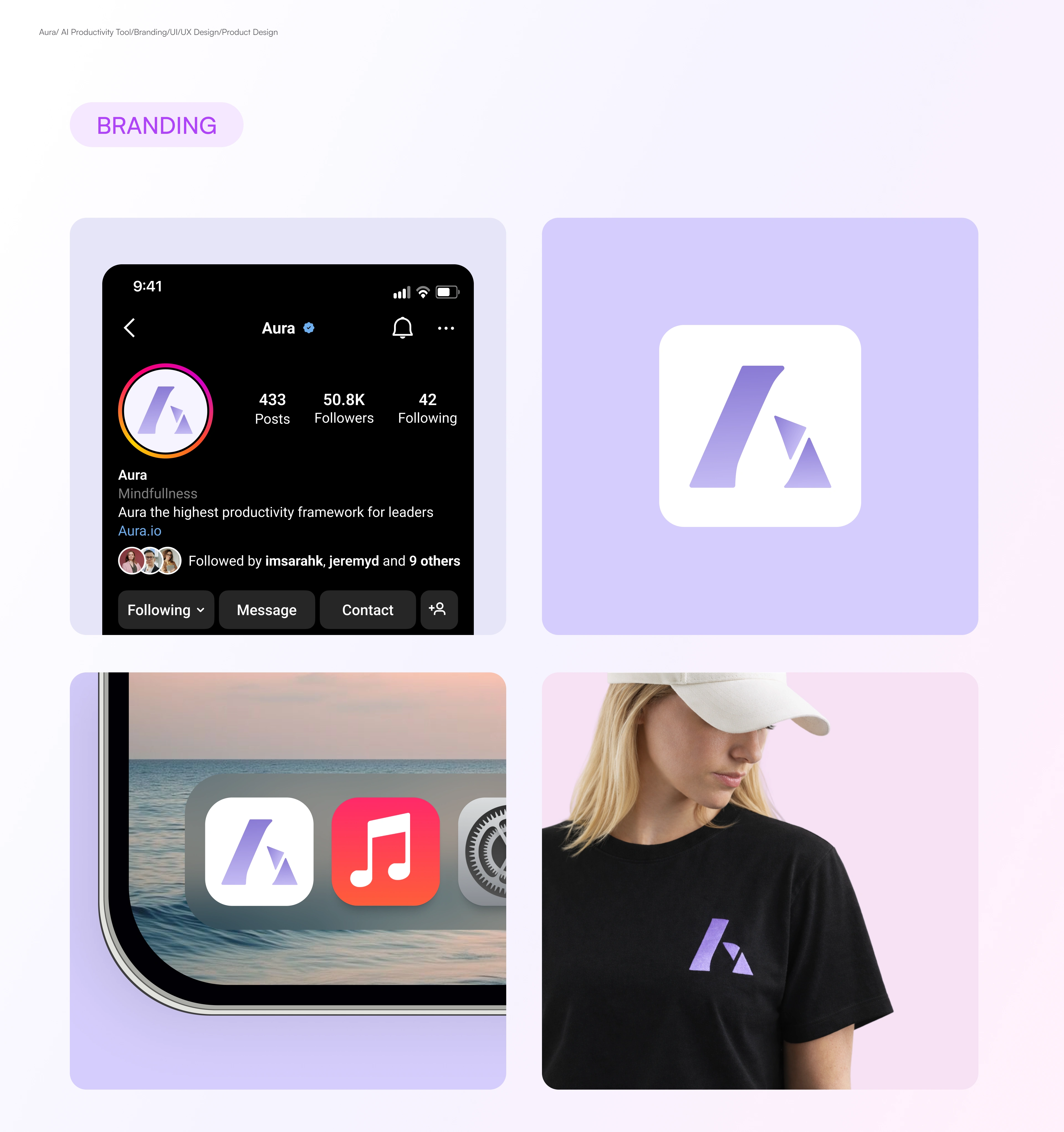
Branding
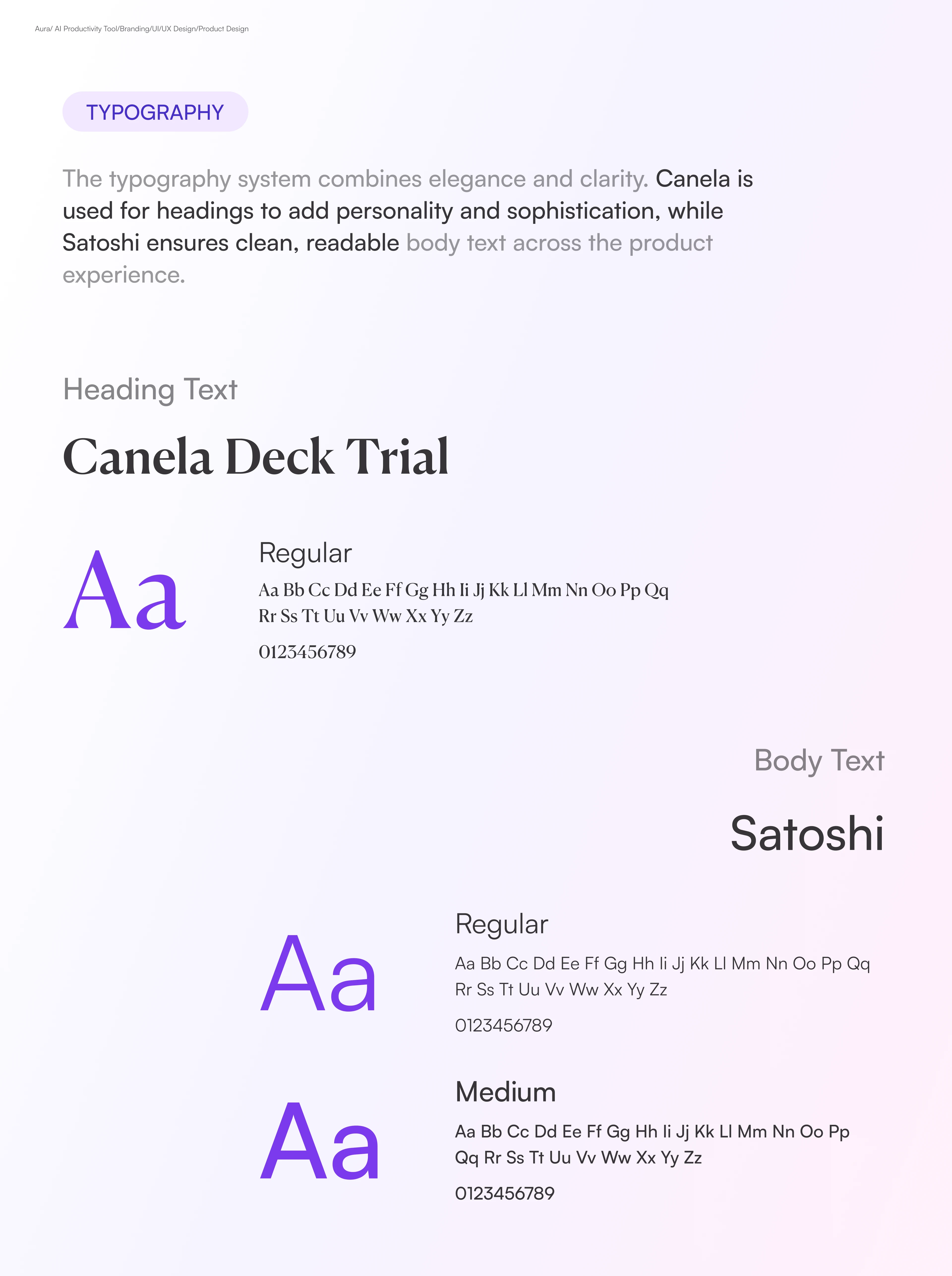
Typography
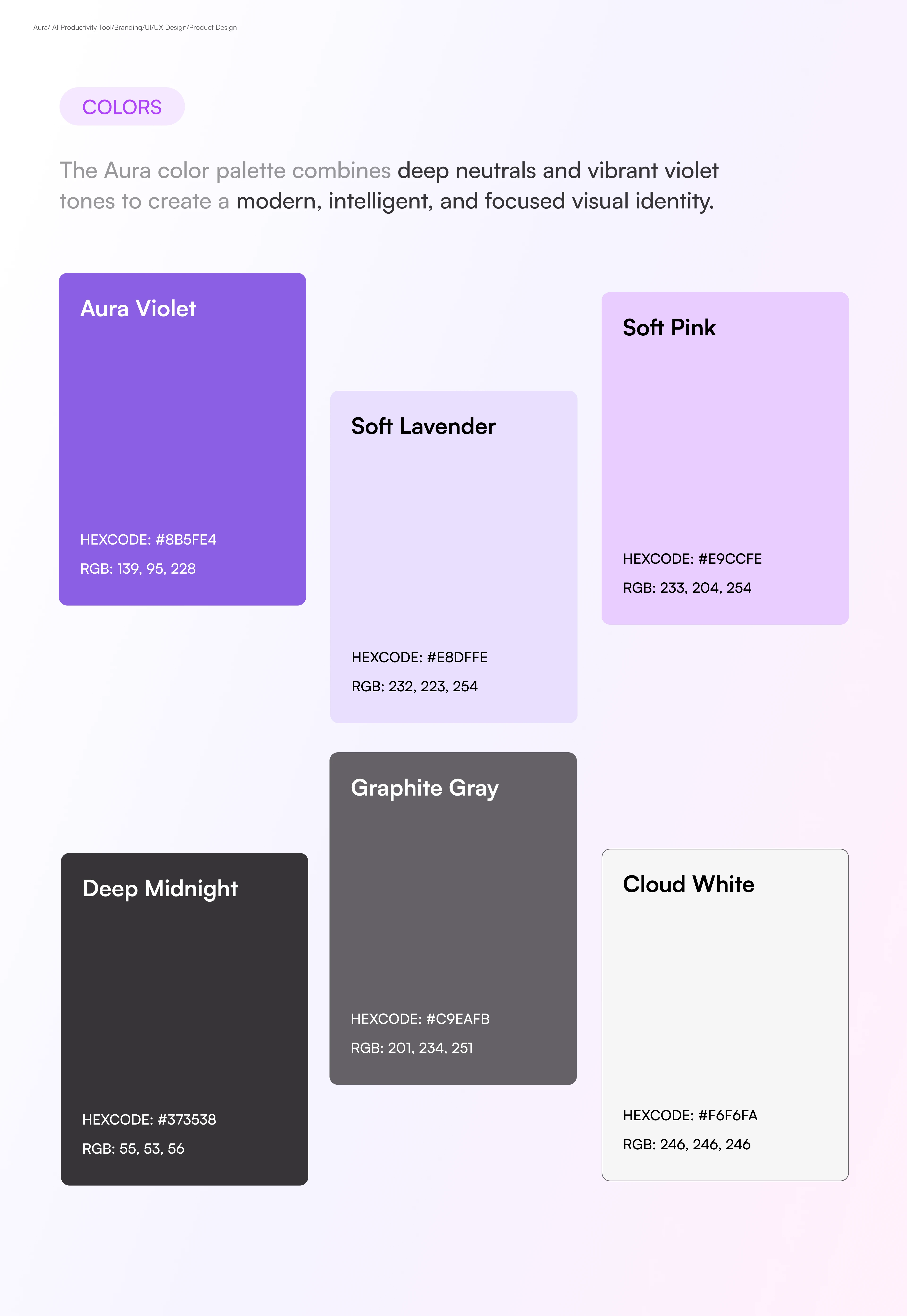
Color Pallette
Project Page Mockup
User Flow
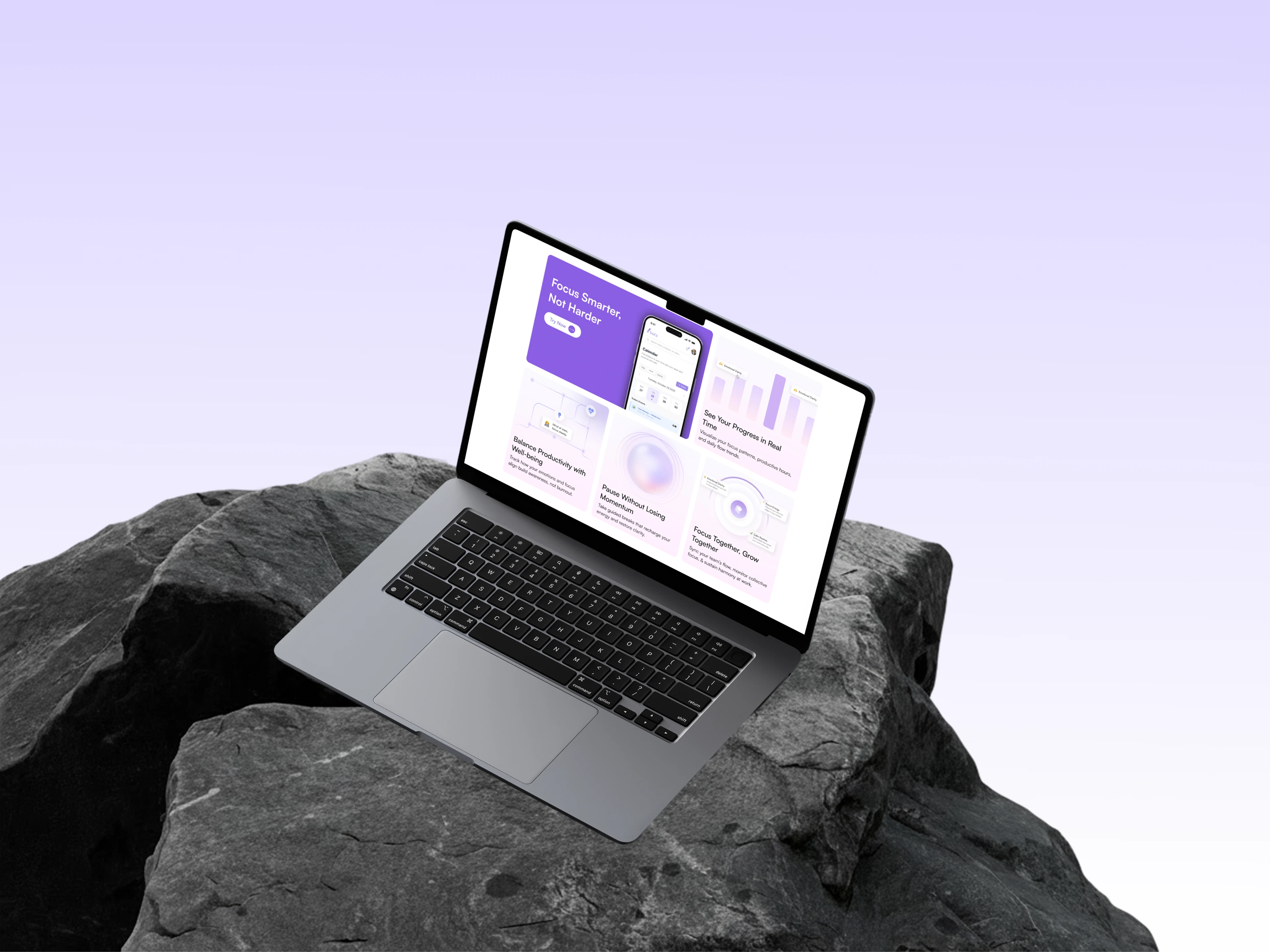
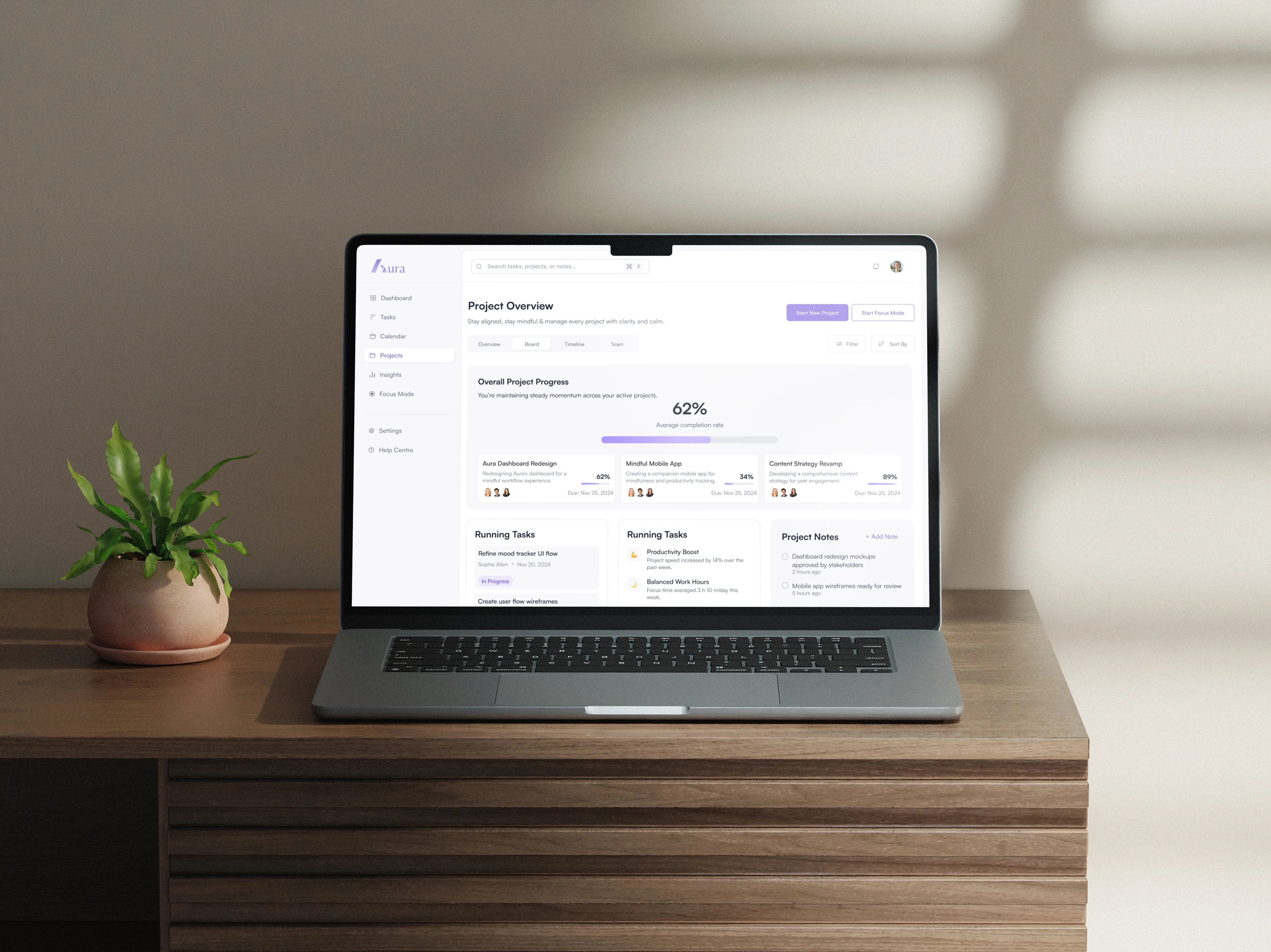
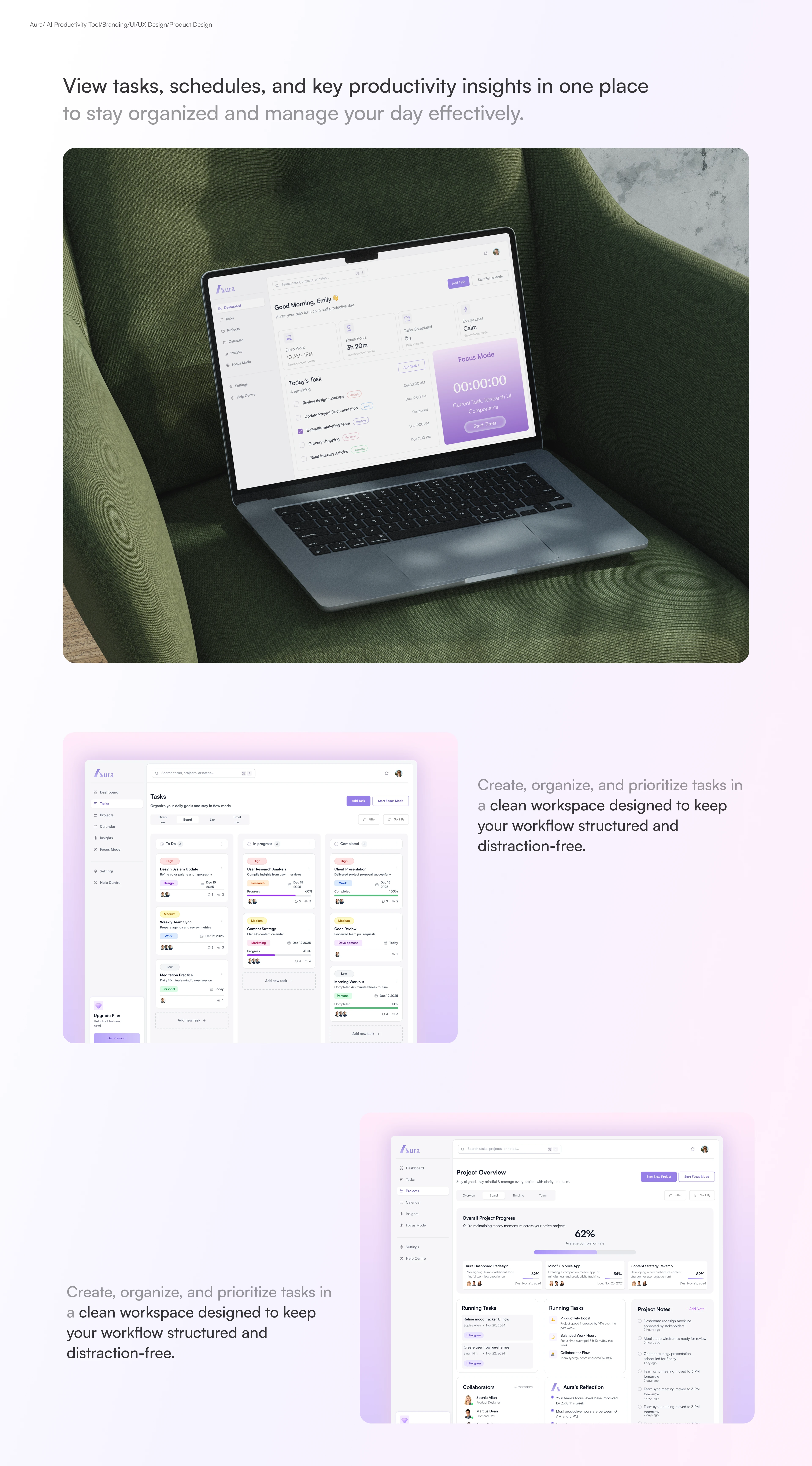
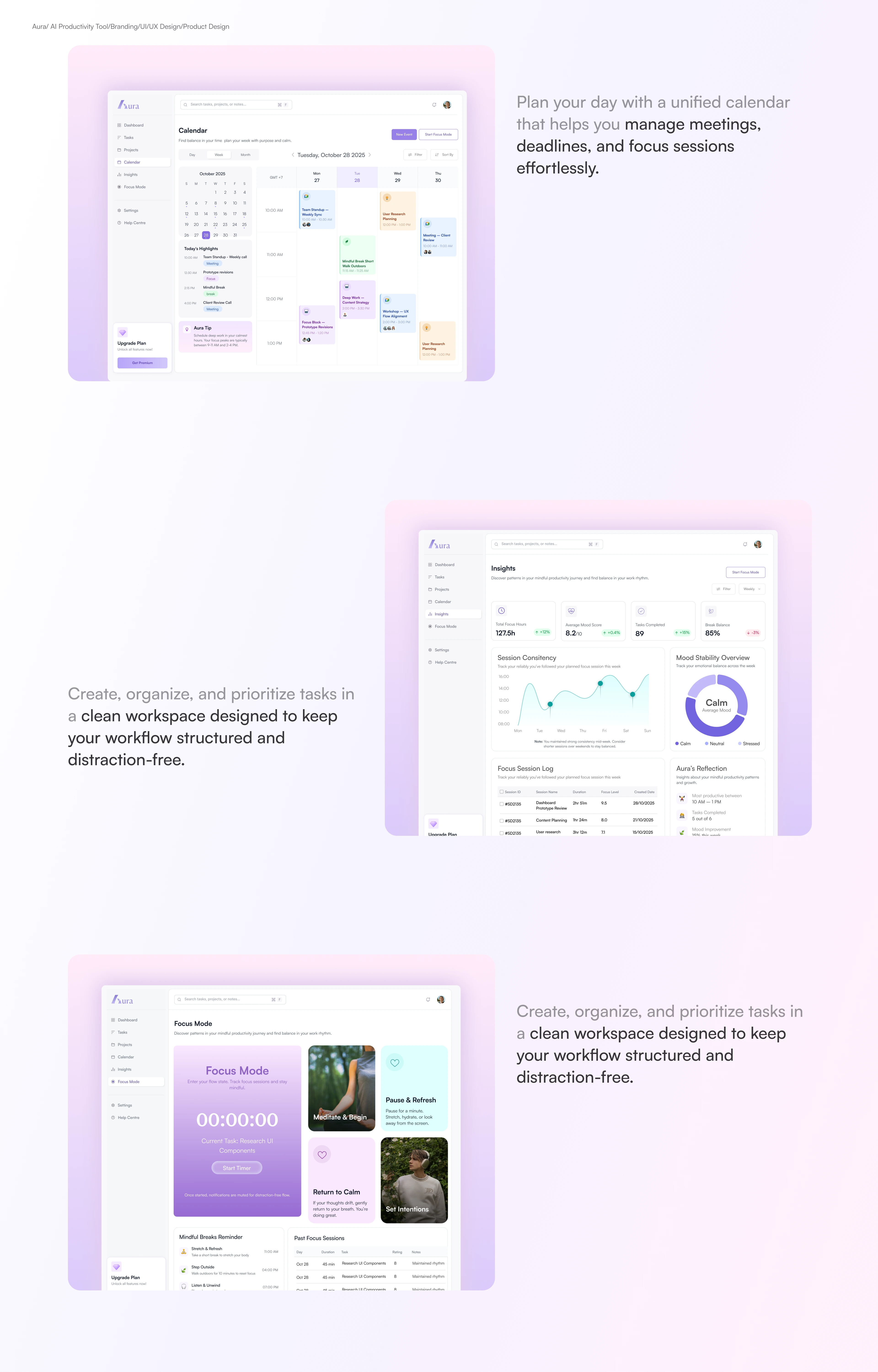
The flow was designed around one principle: never make the user think about the tool. Onboarding gets you to your first focused session in under 60 seconds. The dashboard surfaces only what's relevant right now no sprawling sidebar menus, no decision fatigue on load.
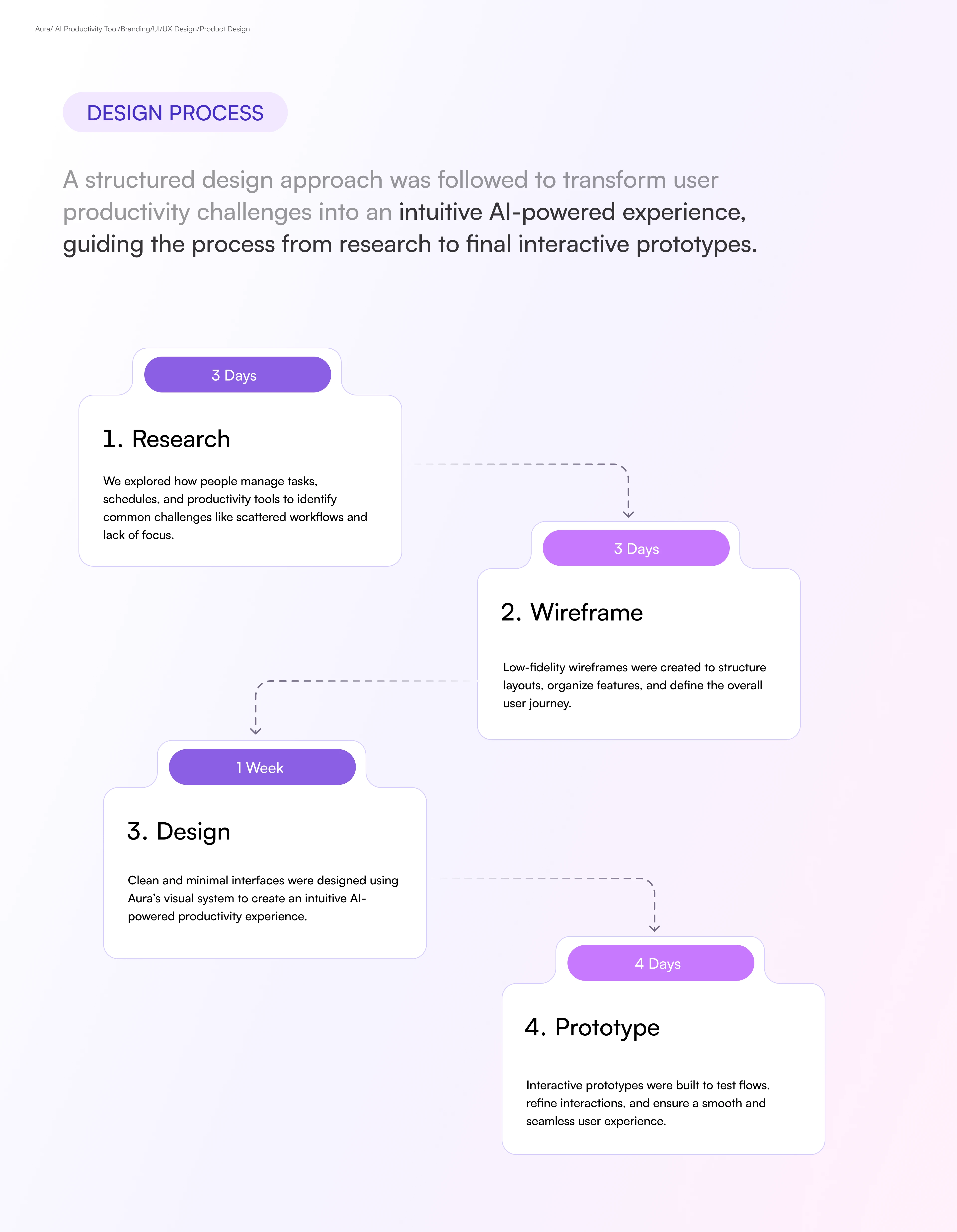
Design Process
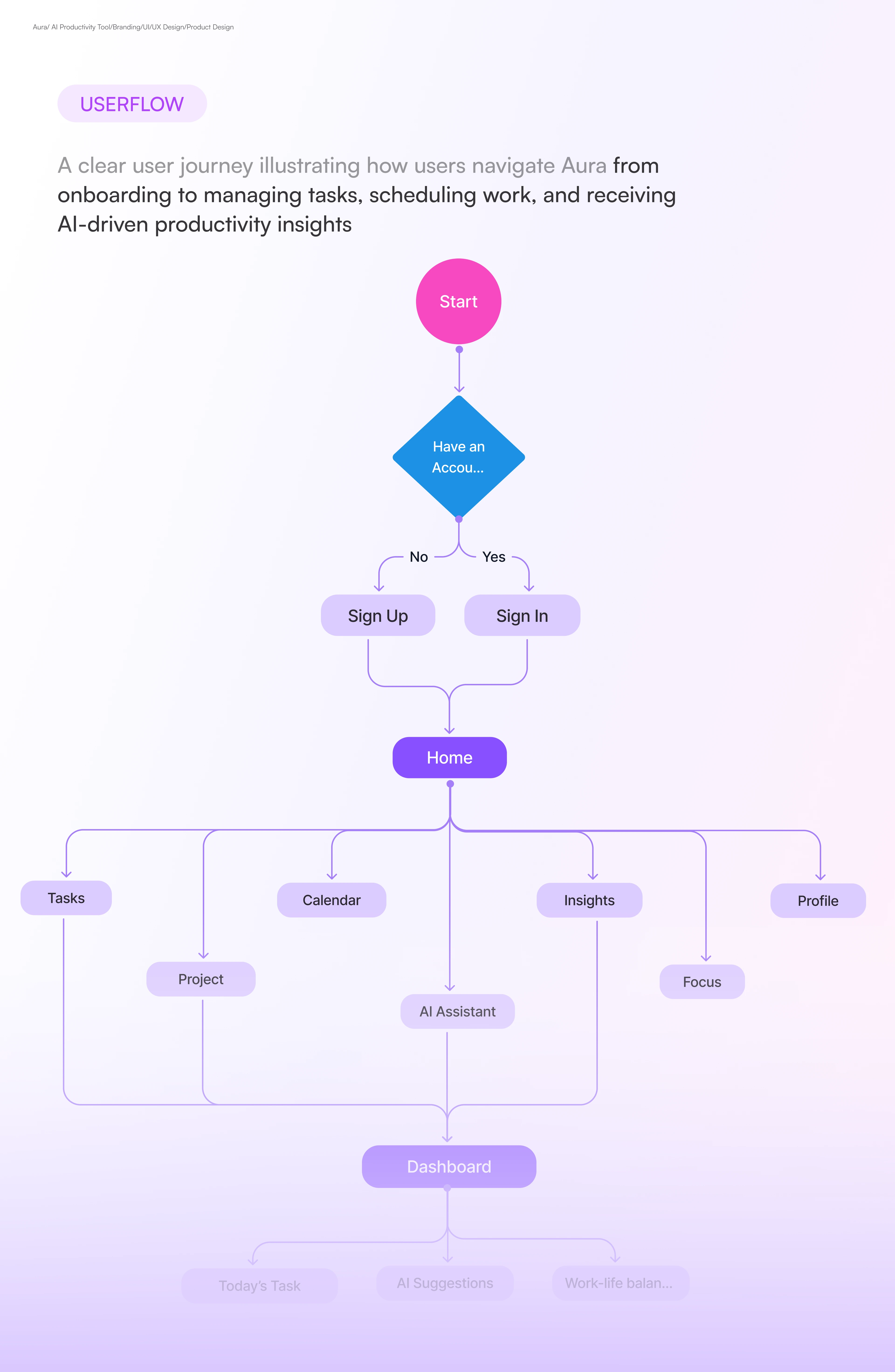
Userflow
Final UI Design
Mockup
Web App Screens
Web App Screens
Homepage
Handoff
Every screen is built with auto-layout, structured components, and a fully documented style guide. Color tokens, type scales, and spacing systems are named and organized ready for any developer to pick up without a single follow-up question.
What This Taught Me
Calm is the hardest thing to design easy to add, nearly impossible to maintain across an entire system. Every element I removed made the design stronger, and the best moments in Aura are the ones where nothing fights for your attention. The biggest lesson: well-being can't be cosmetic. The design only works because it was built around the user's mental state from the very first decision.
Like this project
Posted Mar 22, 2026
Brand and UI design for Aura an AI-powered workspace built on one idea: productivity shouldn't cost you your peace.