Oravia Dental Clinic | Brand Identity & Logo Design
Supriya Borgohain
The Problem with Dental Branding
Most dental clinics look like one of two things: cold and clinical, or aggressively cheerful. Neither builds real trust and trust is the entire product.
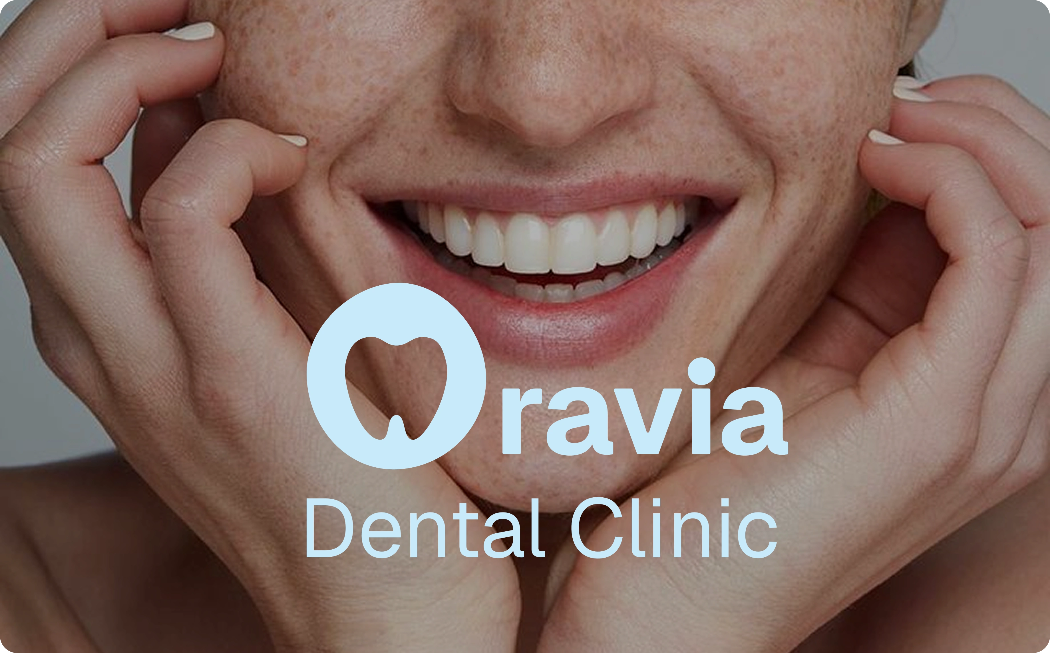
Patients walk into a dental clinic already anxious. The brand's job is to make them feel, in the first three seconds, that this place is different. That was the brief for Oravia.
Logo Mark
The Identity
Oravia needed a brand that felt premium without feeling intimidating. Confident without being cold. The kind of identity that makes a patient think: this clinic takes its work seriously — before they've read a single word of copy.
The Mark
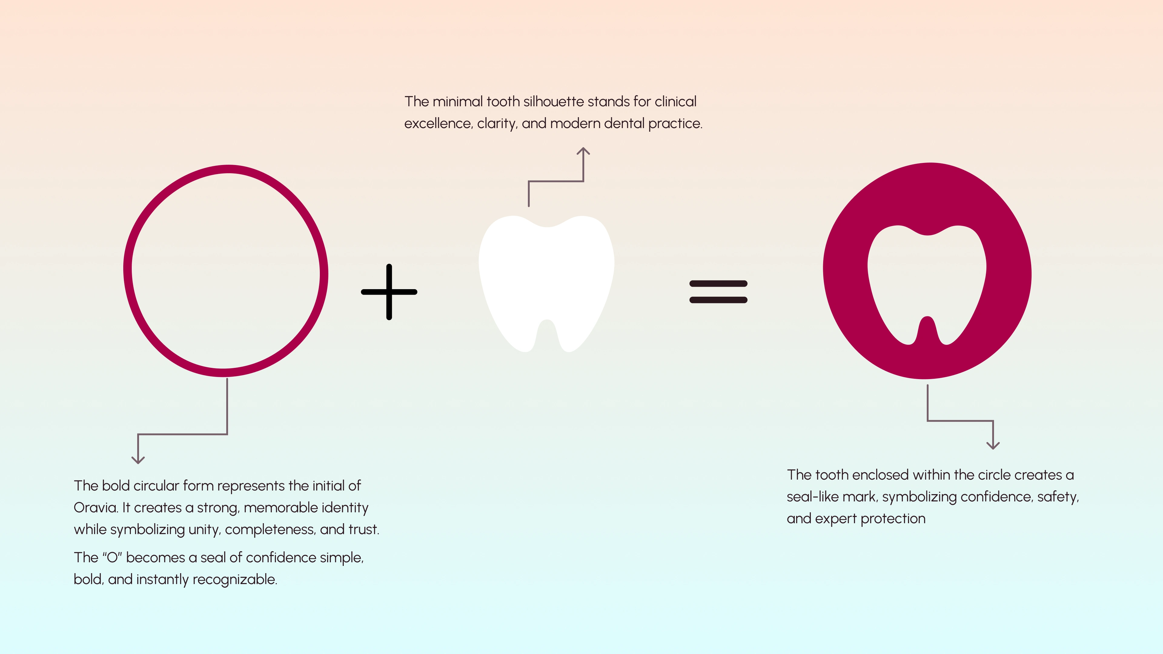
The logomark solves a problem most dental brands get wrong: they try to signal "dentist" before they signal "quality." Tooth icons everywhere, plus signs, generic healthcare geometry.
Oravia's mark works differently. The circular form — drawn from the initial "O" — becomes a seal. The tooth is contained within it, not floating beside it. The result reads as protection, precision, and wholeness rather than just category identification. It's instantly recognizable at any size and carries authority on every surface from a business card to a clinic door.
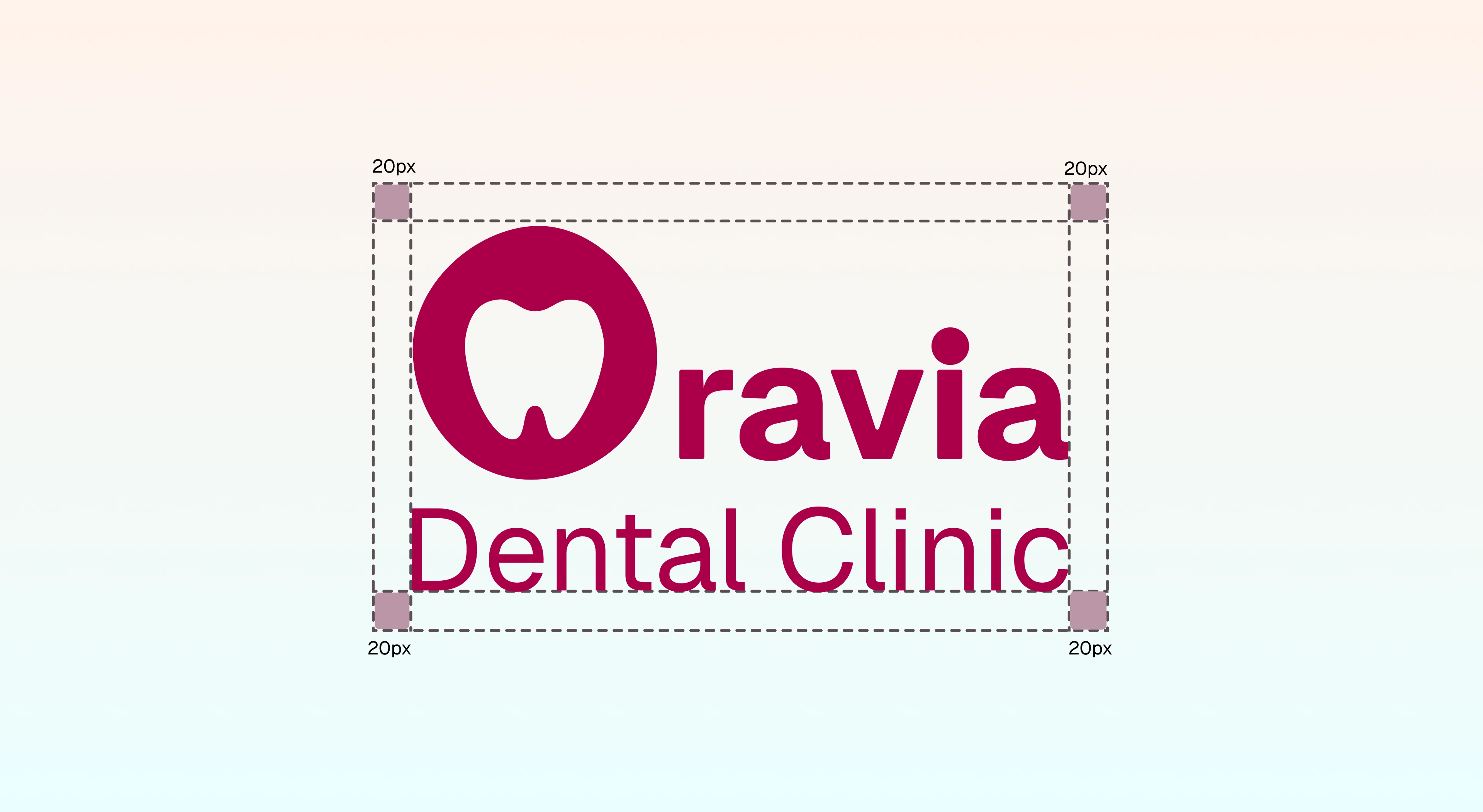
Logo Safezone
Color & Typography
The palette was built around one constraint: nothing that exists in a hospital. Signature Deep Rose (
#AA0049) signals warmth and confidence without clinical association. Soft Sky Blue balances it. Every combination was tested against one question: does this feel like a place people choose to go?Geist was chosen for its geometric clarity without coldness — precise at display sizes, genuinely readable at body sizes. Exactly what patient-facing materials demand.
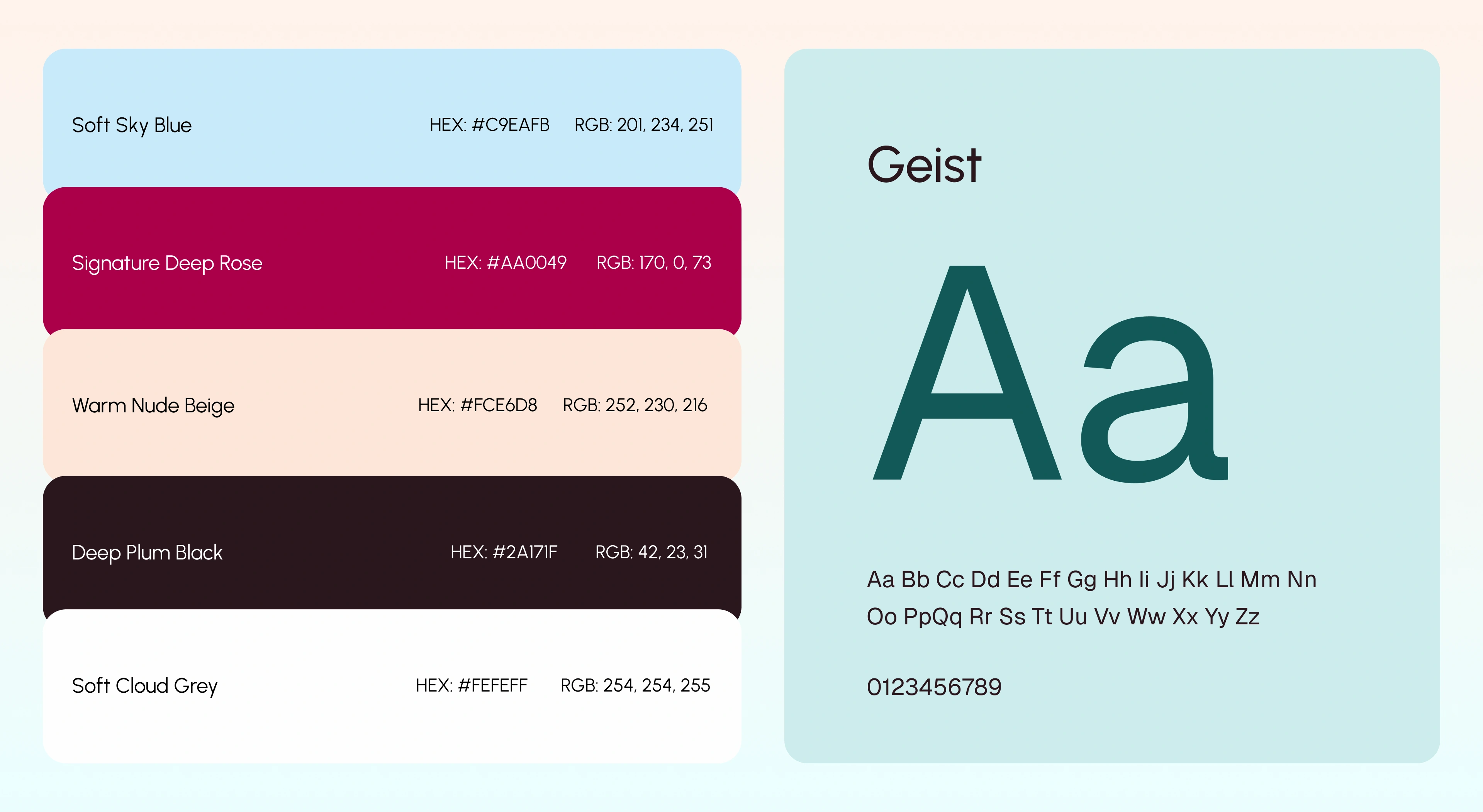
Color Pallete & Typography
Brand in Practice
A brand is only as strong as its weakest application. Every touchpoint — stationery, uniforms, billboard, social media — carries the same quiet confidence.
The identity doesn't live only on paper. It walks into the room, stops the eye on a busy street, and shows up consistently across every platform.
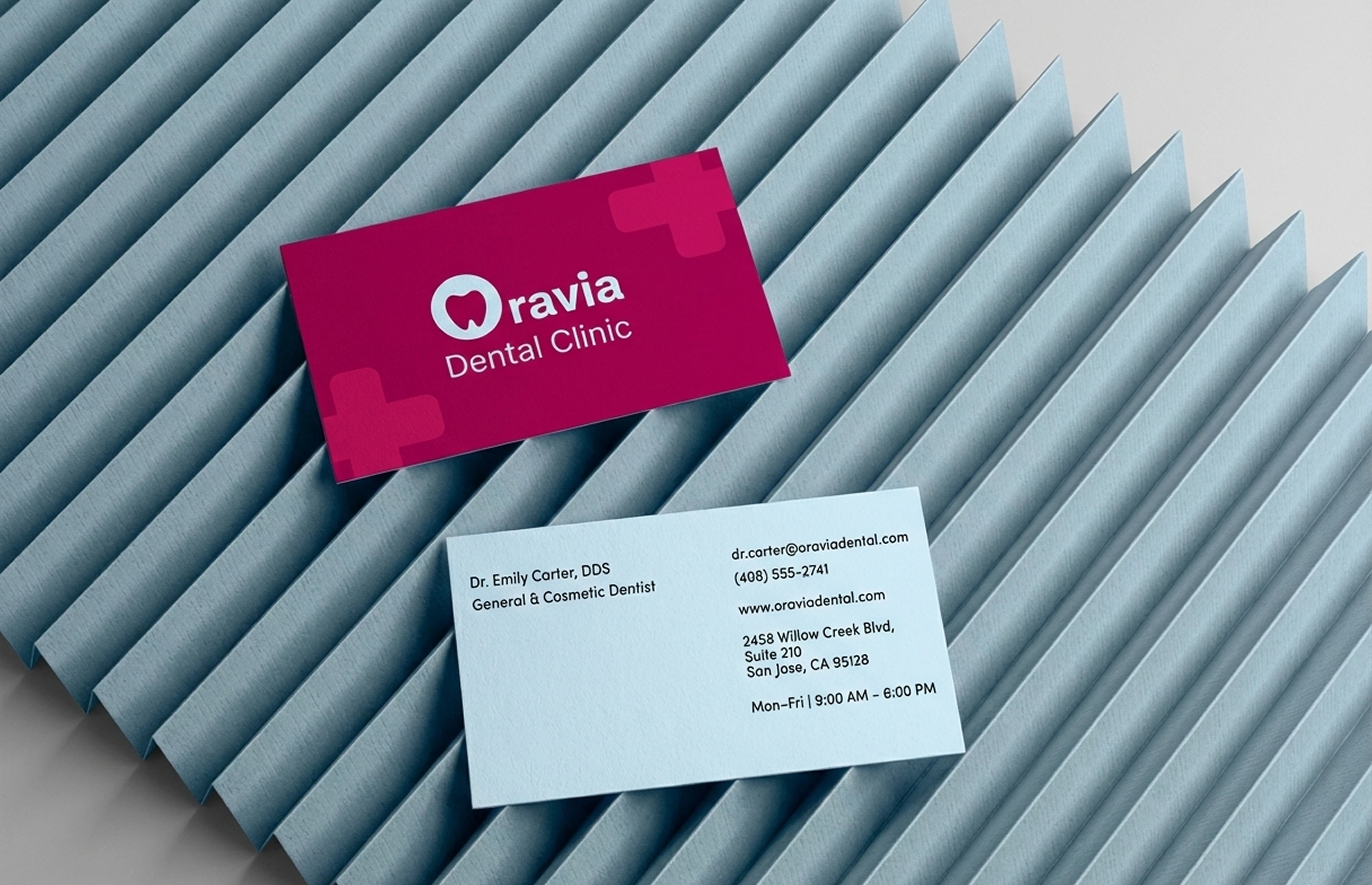
Business Card
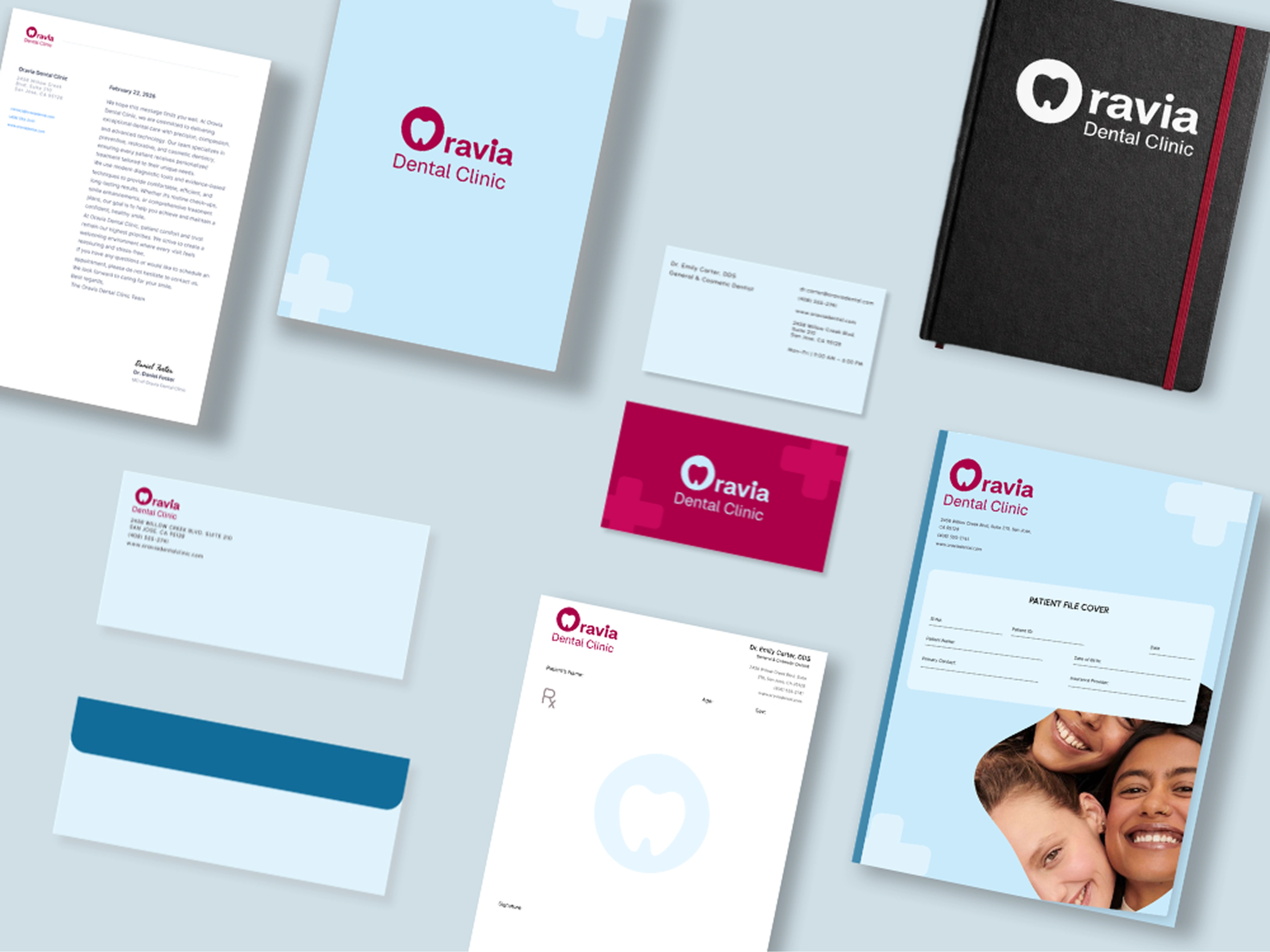
Brand Stationery
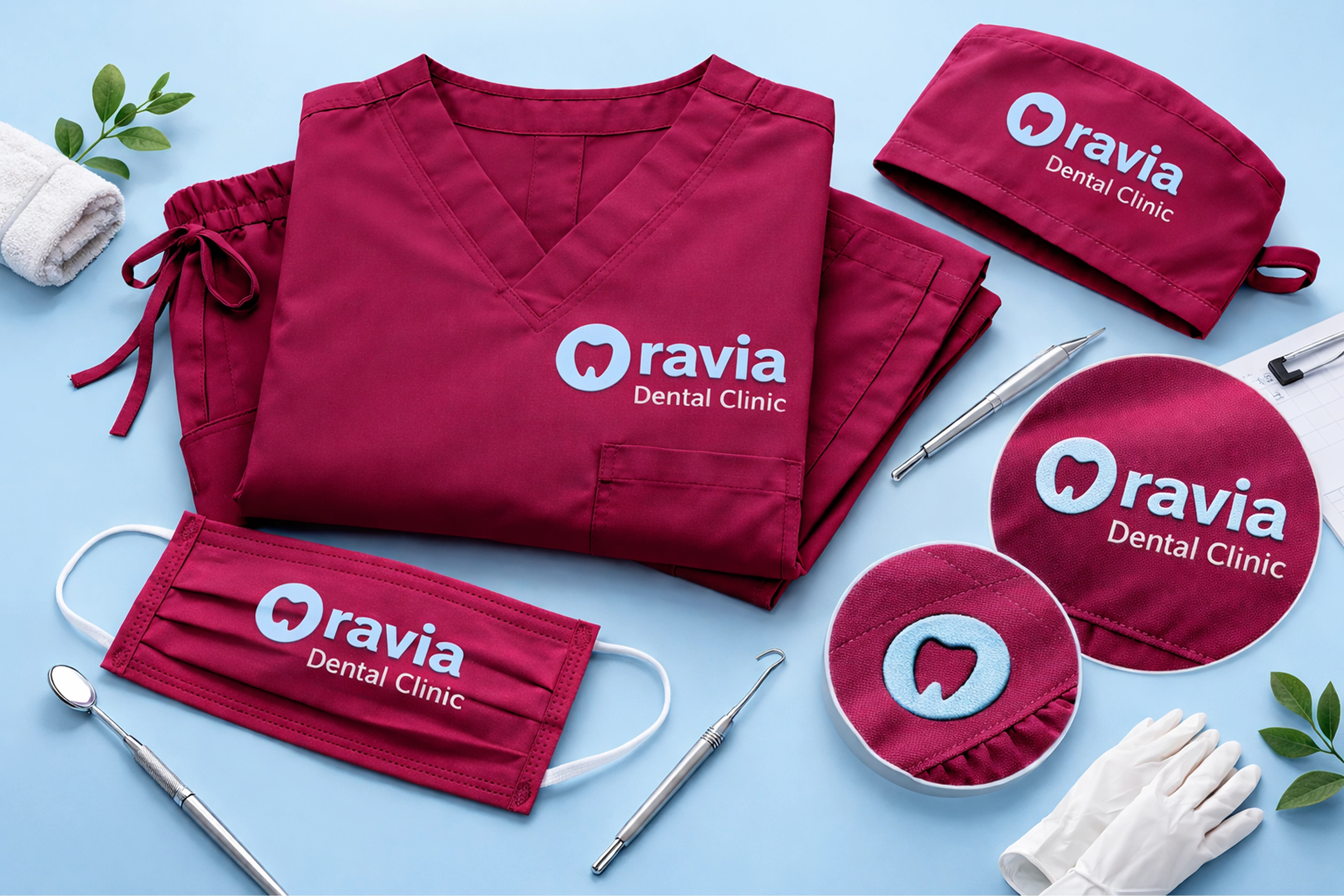
Brand Stationery
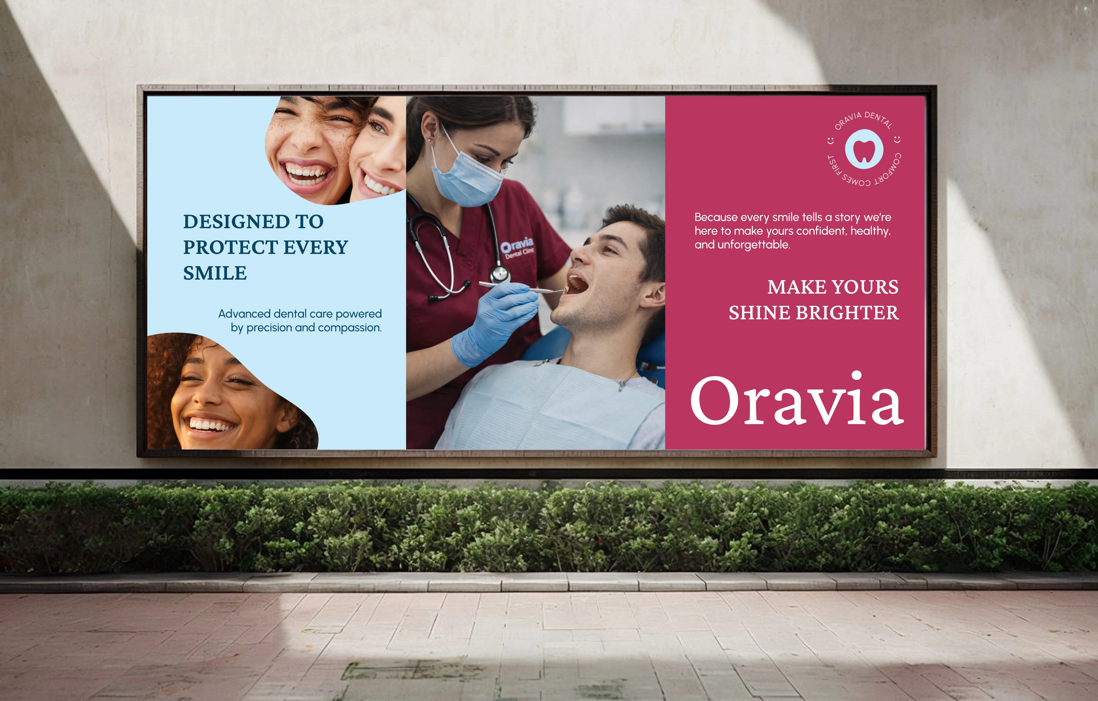
Billboard
Oravia Logo in motion
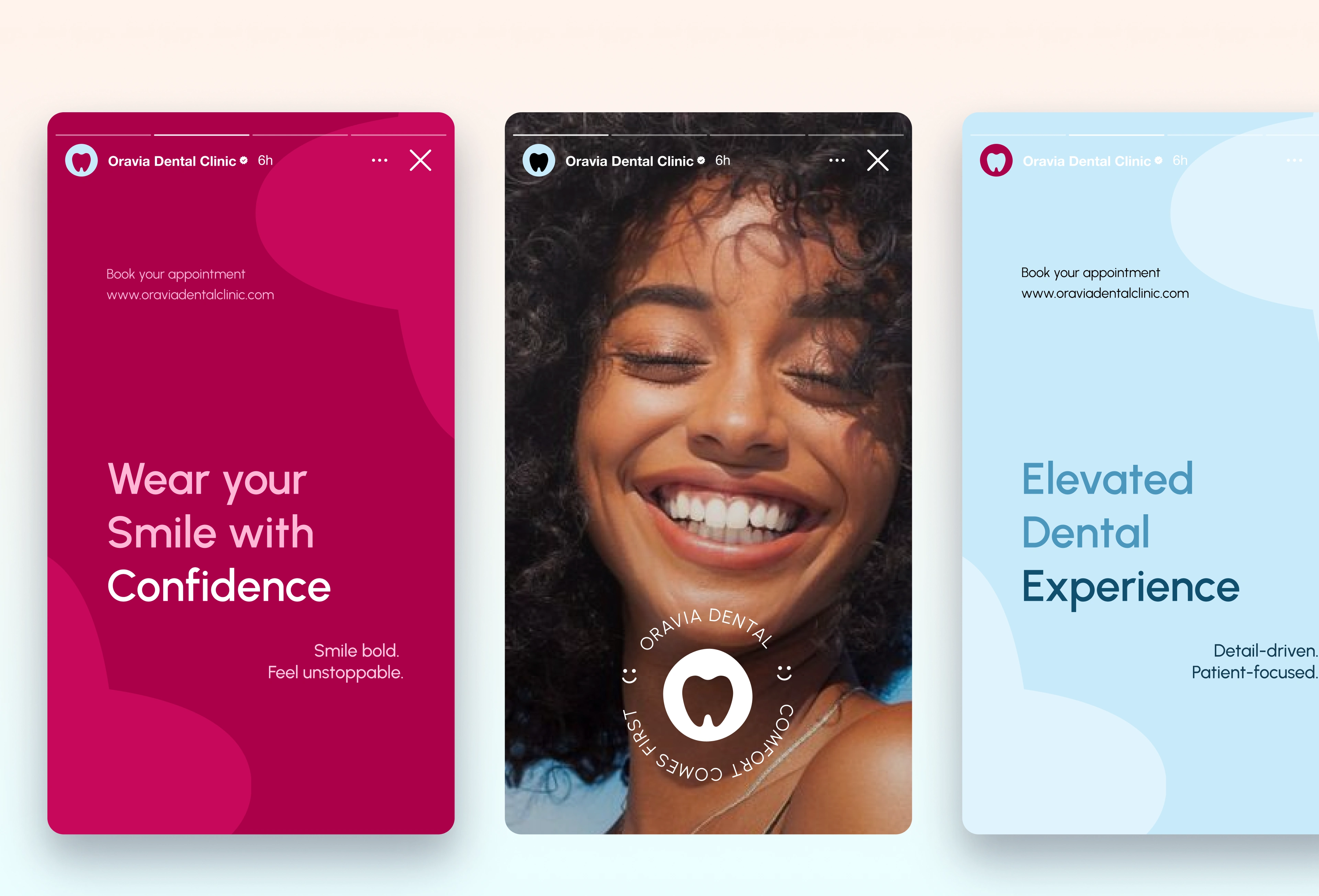
Social Media
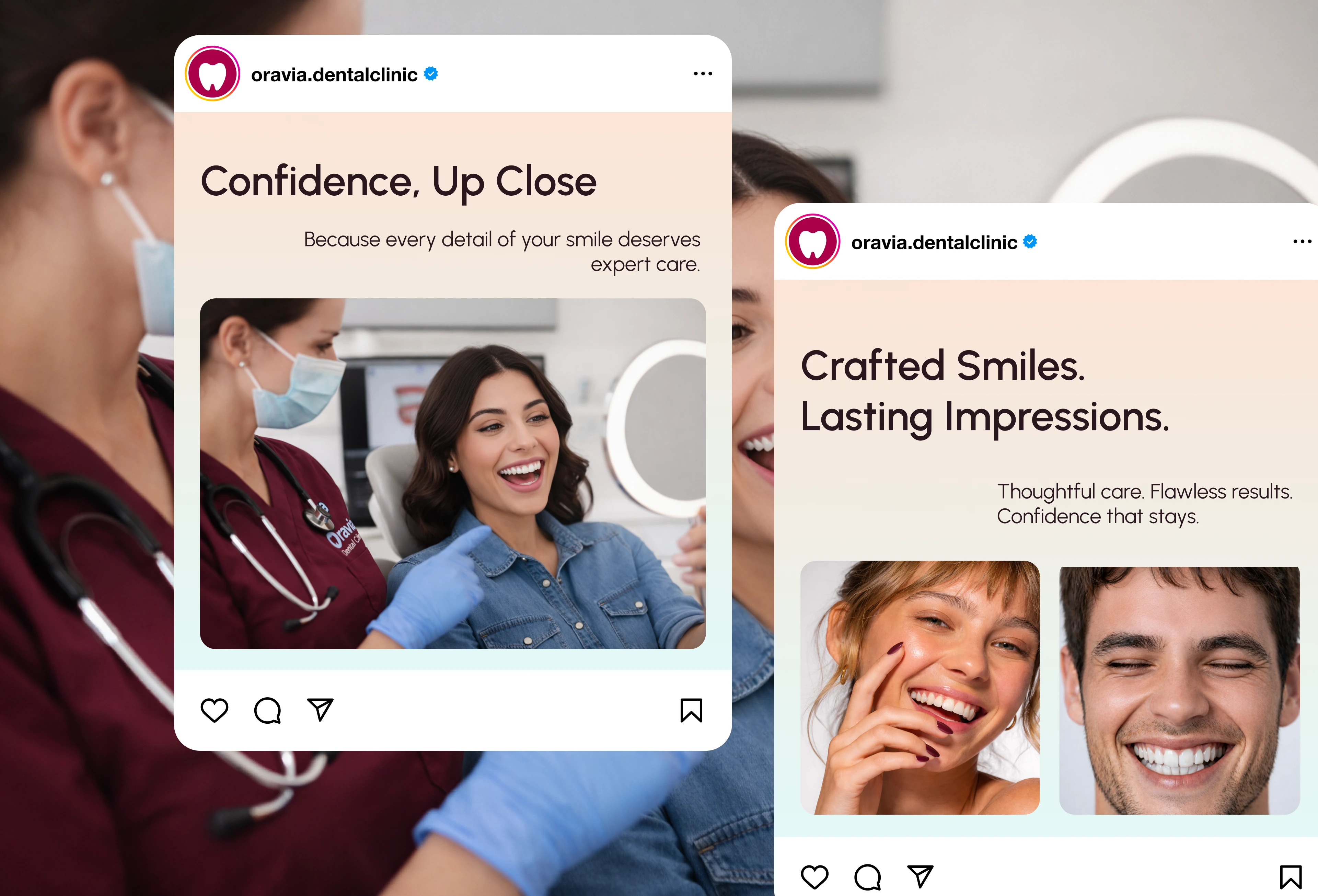
Social Media
What This Taught Me
Safe and trusted are not the same thing. Safe is forgettable. Trusted is earned through confidence in every color choice, every application, every detail.
Category conventions are a brief, not a boundary.
Like this project
Posted Mar 22, 2026
Brand identity for Oravia Dental Clinic logo, color pallete, typography, and full brand applications design.