UX Audit: Blinkist Case Study
Eugene Adavore

So a quick one, a few weeks ago, I went on a journey of designing everyday for a hundred days and during the later part of it, I started auditing the landing pages of some products I find to be very interesting. Well I decided to bring what I learnt to light.
The idea is so I can share what I learnt and the thoughts I had while studying these products and of course should you have something to draw my attention to, I would be more than happy to hear from you. Let’s dive into it shall we.

Unsolicited UX Audit: Blinkist Case Study
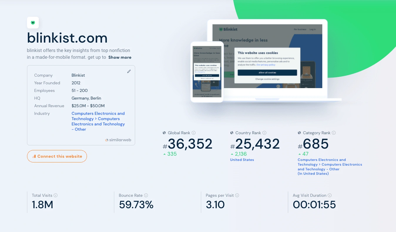
What is Blinkist? It is a well-known digital tool that provides summaries and important ideas from books. It tries to make learning and knowledge acquisition more effective by summarising lengthy texts into briefs known as “Blinks.”
In this audit, I try to understand by delving into the Blinkist landing page to identify areas for improvement and propose strategies to enhance the user experience.
Through research and analysis, I was able to identify concerns regarding bounce rates, average visit duration, ease of use, and scroll fatigue.
Let’s explore some of my findings and recommendations for an optimised Blinkist experience shall we?
Bounce Rates and Visit Duration: During my research of the Blinkist landing page, I found approximately 57% of visitors tend to bounce off upon arrival, with an average visit duration of around 2 minutes. This raises questions about the effectiveness of the current design and prompted me to consider potential interpretations of these metrics.
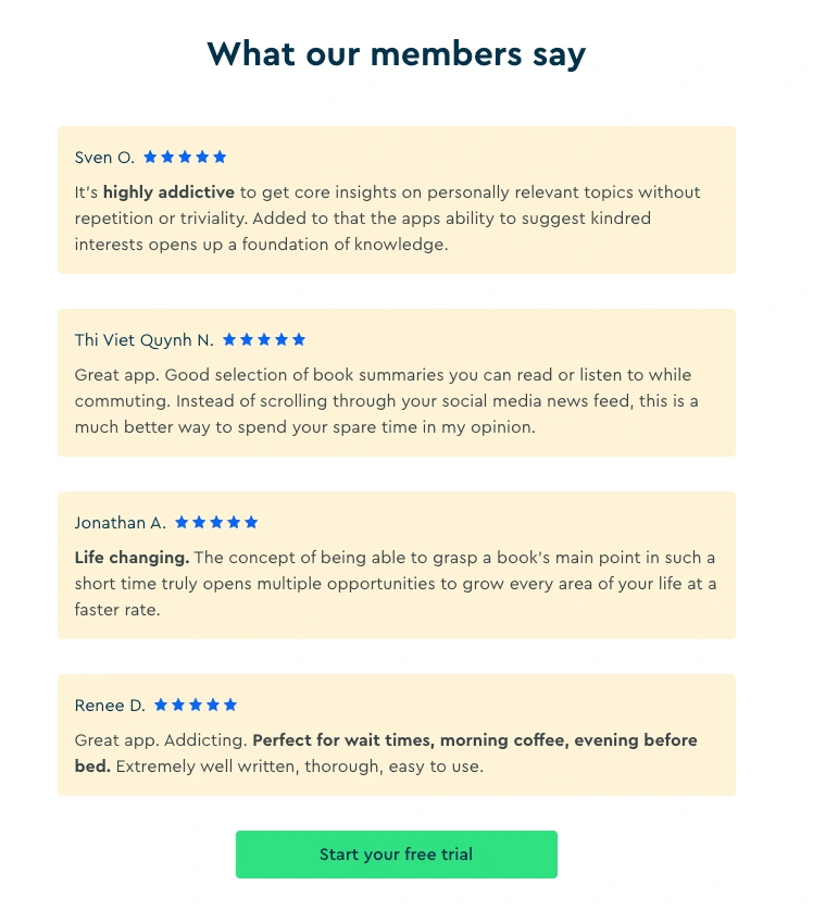
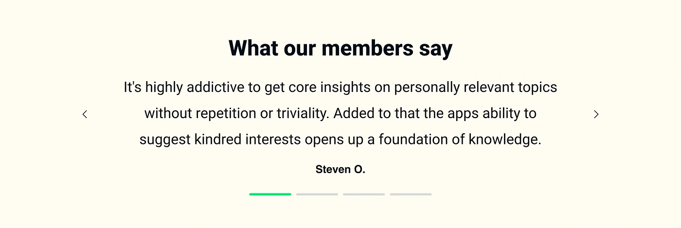
Ease of Use: Upon reviewing the original design, I identified certain information that could be removed as it doesn’t significantly contribute to conveying the main message to users.
In fact, these extraneous elements may distract users while attempting to absorb the essential information. Streamlining the landing page’s content can greatly enhance clarity and focus, allowing users to grasp the core message more efficiently.
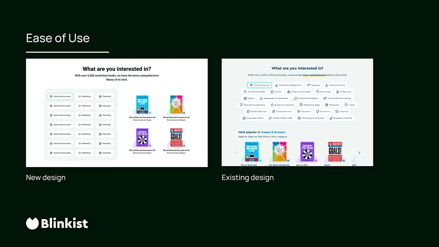
Improving Book Category Selection: An area of concern lies in the process of selecting book categories.
The audit revealed that users experience a cumbersome activity of scrolling up and down repeatedly after selecting a category. This can lead to scroll fatigue and potential user frustration.
To address this issue, I propose laying out the books and indicators side by side, minimising the need for excessive scrolling. This approach simplifies the browsing experience and ensures that users can explore various categories seamlessly.
Mitigating Scroll Fatigue: Scroll fatigue is closely linked to the ease of use and can significantly impact user engagement. The continuous scrolling up and down can exhaust users, diminishing their overall experience. To alleviate this issue, I recommend removing less important information and collapsing certain elements to reduce the amount of scrolling required.
By presenting the information in a concise and condensed format, users can navigate through the content effortlessly and without unnecessary hitches.
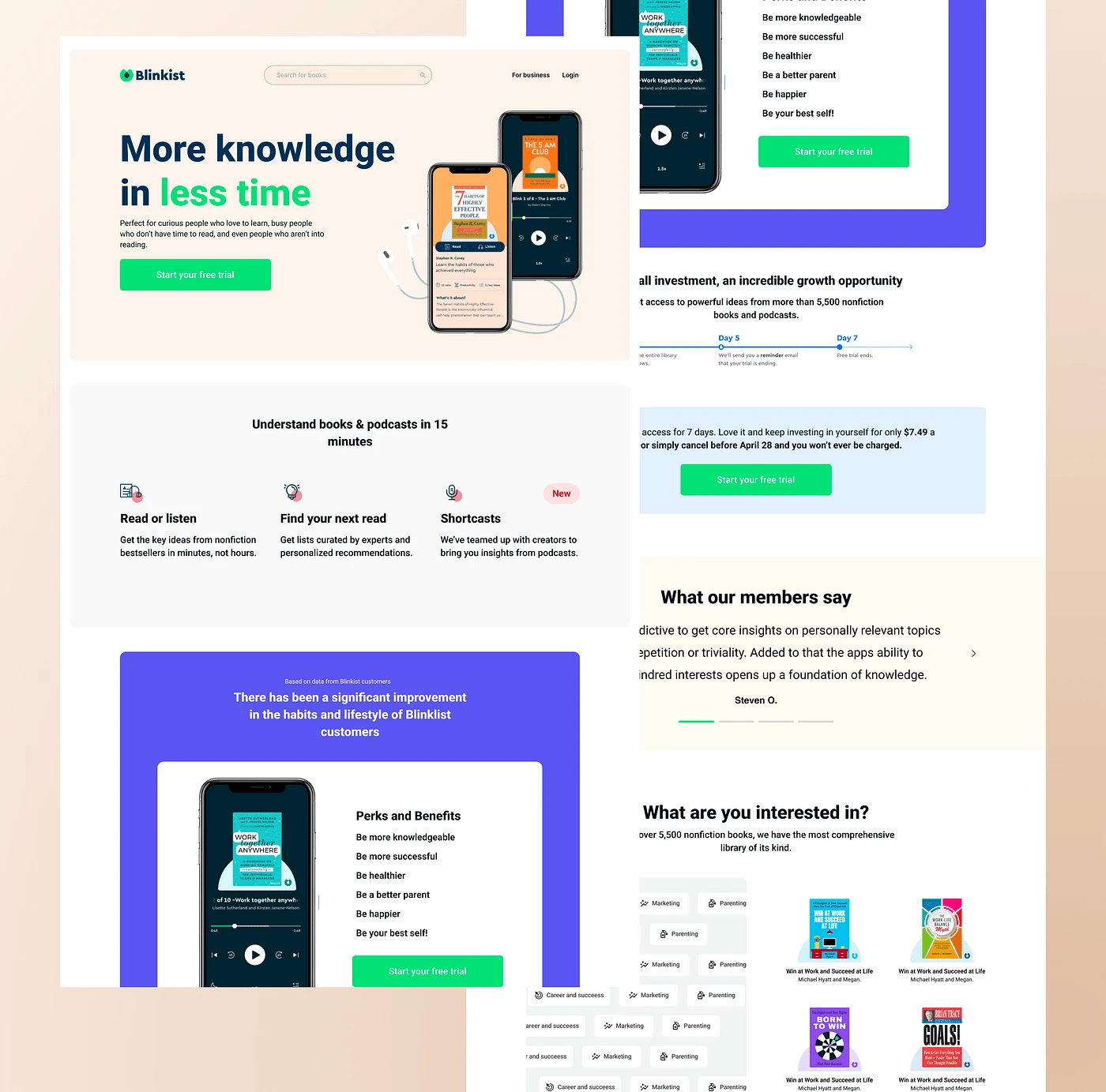
Full view of Landing page and Redesign
Current Design
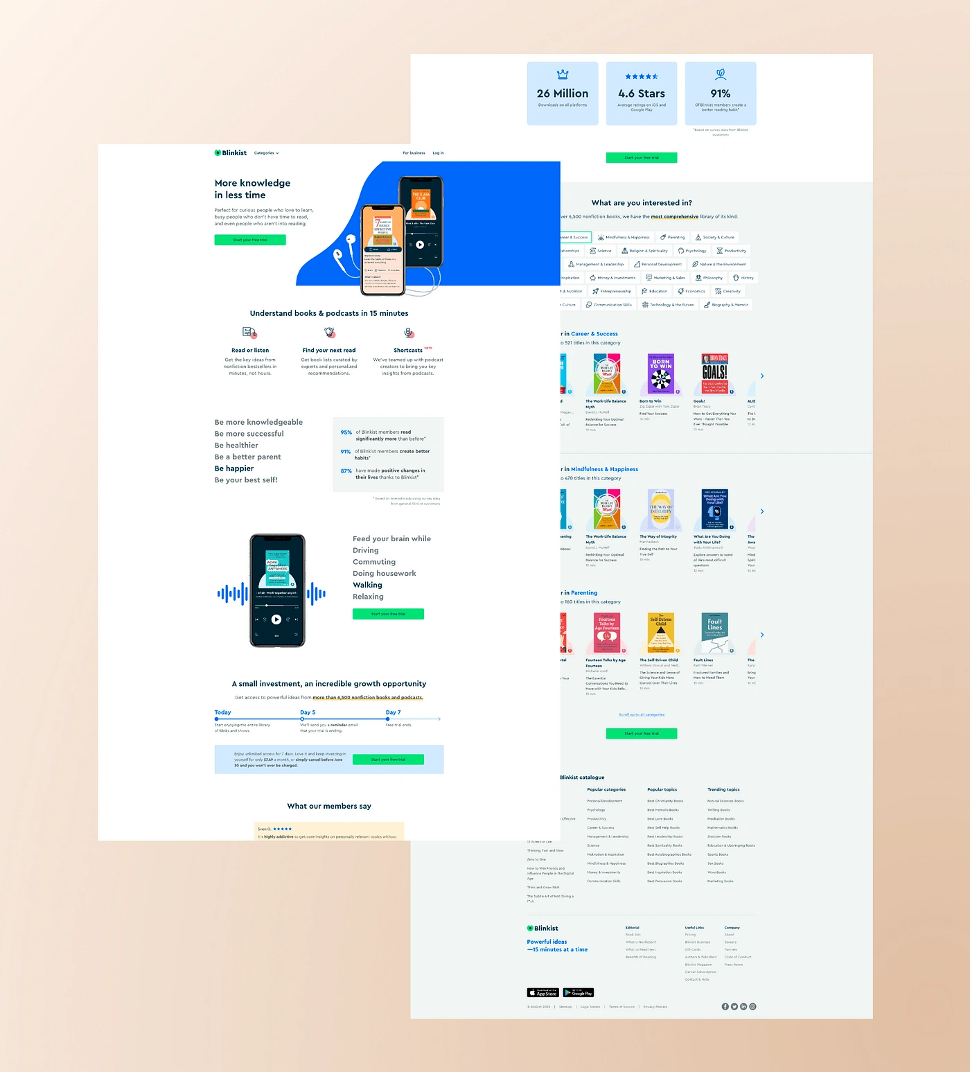
Proposed Redesign
My two cents:
In some of my other articles, I had mentioned that there are varying reasons why users dropoff or not use products as often as expected. Some of the reasons may be founded on the grounds of the interface design, the overall experience or even whether or not the product solves their immediate needs? A need to always ask whether or not this is the product users need and if it is, how best can we meet these needs in as little a time as possible.
With this in mind, brands need to put in mind the need to always pre-audit to know what they are looking for specifically so as not to waste time trying to meet an experience need when the business model is what needs a check.
Conclusion: Based on the unsolicited UX audit of the Blinkist landing page, I have highlighted some areas that warrant attention.
By prioritising ease of use, simplifying book category selection, and addressing scroll fatigue, Blinkist can enhance the user experience and optimise engagement. Incorporating these recommendations will ensure that visitors spend more meaningful time on the landing page and reduce bounce rates. By continually evaluating and refining the user experience, Blinkist can create a platform that truly captivates and resonates with its audience.
Like this project
Posted Jul 20, 2023
The goal of this is to look through the landing page, looking through data to see the drop off rate so as to correct through design.
Likes
1
Views
4