L.I.F.E Website Redesign
Rachana Gone
L.I.F.E Website Redesign
L.I.F.E • UX Designer
Redesigning a nonprofit’s digital presence to build trust, drive donations, and engage the community.
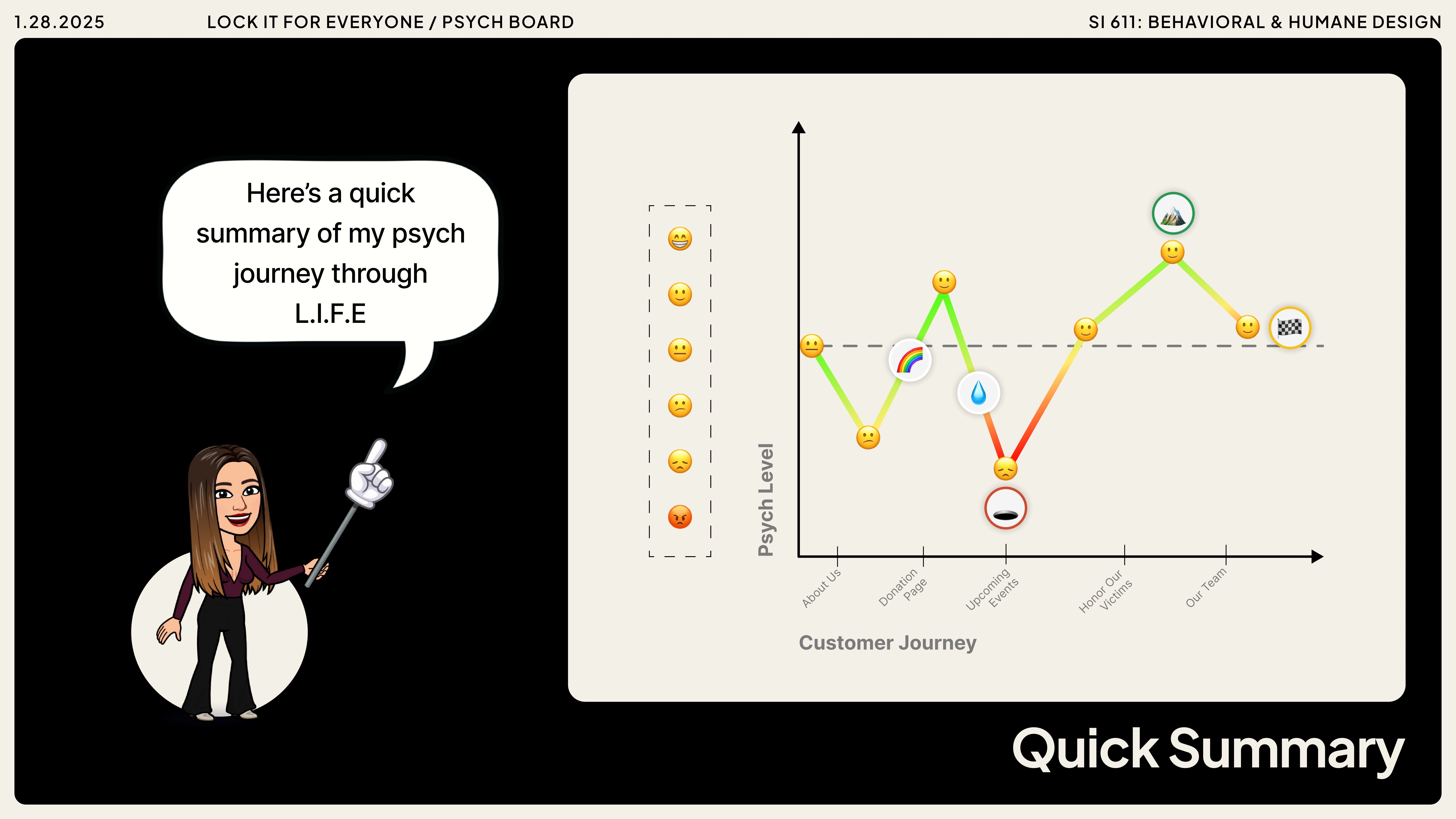
Quick summary
Redesigning a nonprofit’s website to build trust, drive donations, and inspire action.
Gun violence continues to devastate communities, and safe storage education is a critical part of prevention.
L.I.F.E (Lock It For Everyone) is a nonprofit founded after a personal tragedy, working to promote safe gun storage, empower youth, and honor victims of gun violence.
But their existing website was difficult to navigate, lacked credibility, and failed to motivate donations or community involvement.
So we redesigned LIFE’s website.
The new design introduced a transparent donation flow, events calendar, stories & memorial section, and volunteer sign-up form — all supported by a refreshed color palette, clearer navigation, and trust-building visuals.
Impact
2×
easier navigation for users exploring mission, events, and donation pages.
+70%
increase in user-reported trust after clarifying credibility signals.
100%
task completion rate for donations in the redesigned experience.
the problem
So, where did we start?
We began by meeting with the founder of LIFE to understand the organization’s mission, pain points, and vision for the website. From those conversations, we uncovered:
Core mission: Prevent gun violence through safe storage education, youth empowerment, and community engagement.
Primary goals: Increase donations, acknowledge victims, showcase events, and build trust.
Challenges
### **Low engagement** despite outreach (600 ad views → 1 attendee).
Financial constraints ( self-funded).
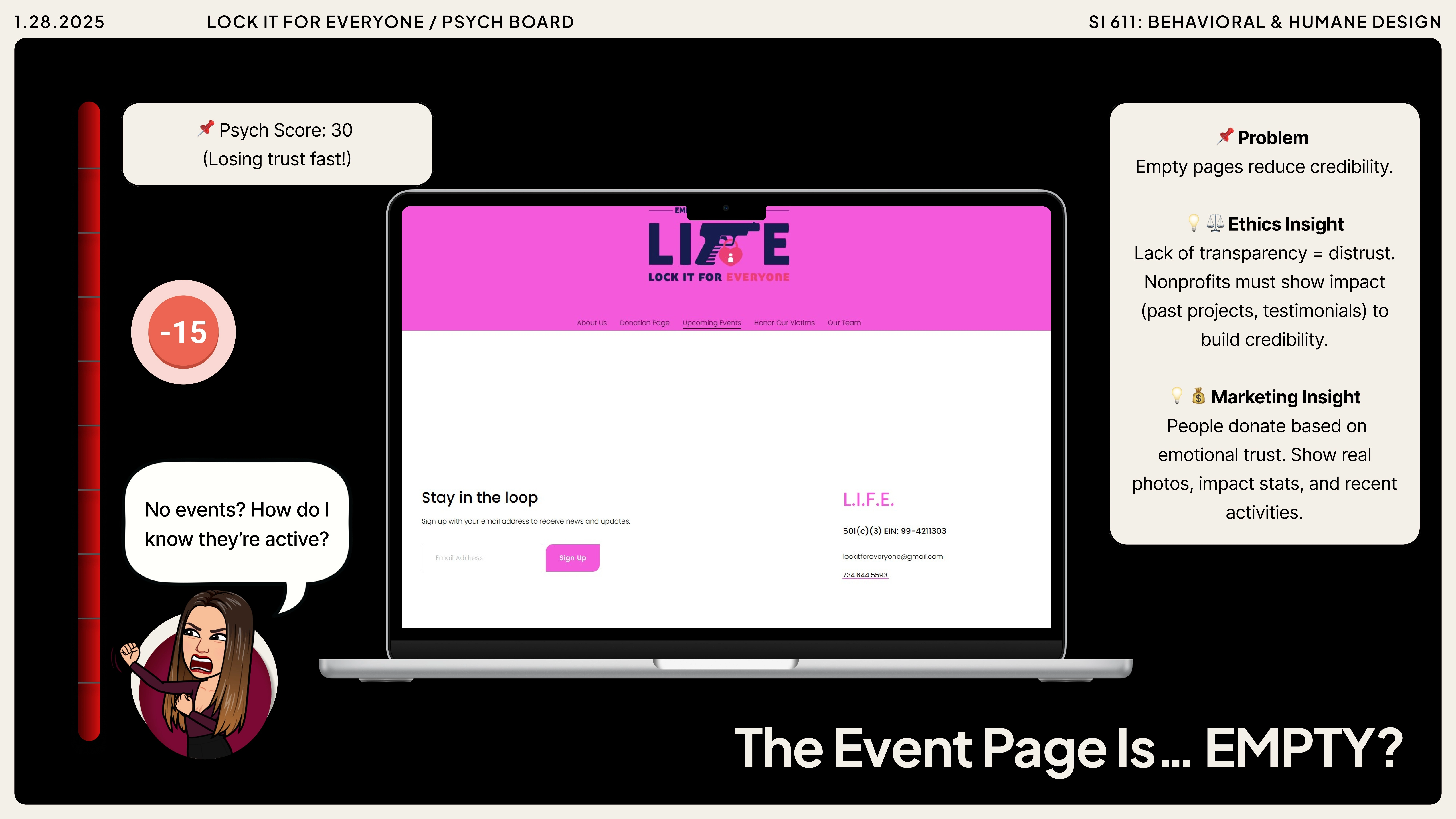
A website that lacked credibility, clear navigation, and donation functionality.
What did we observe?
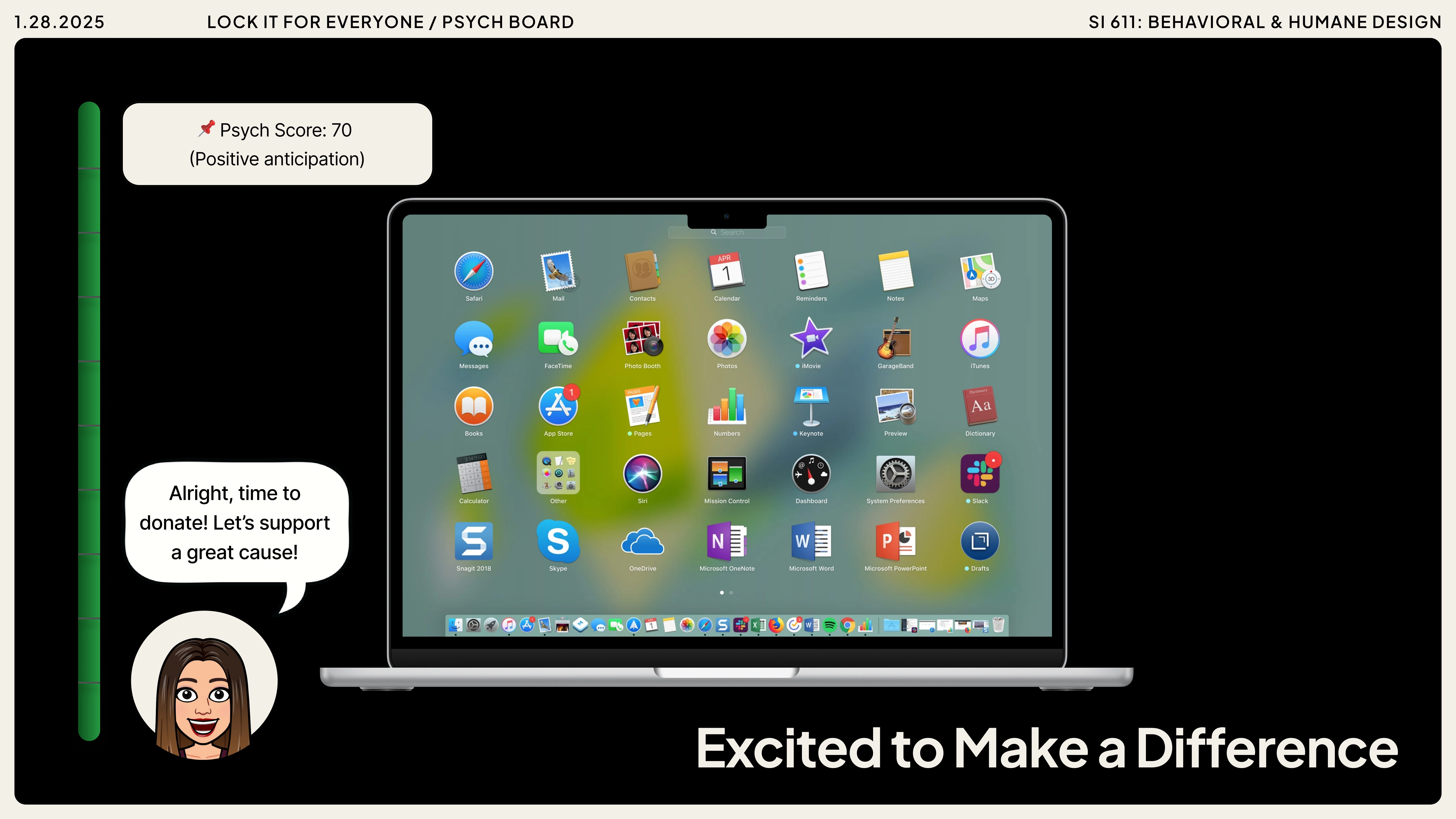
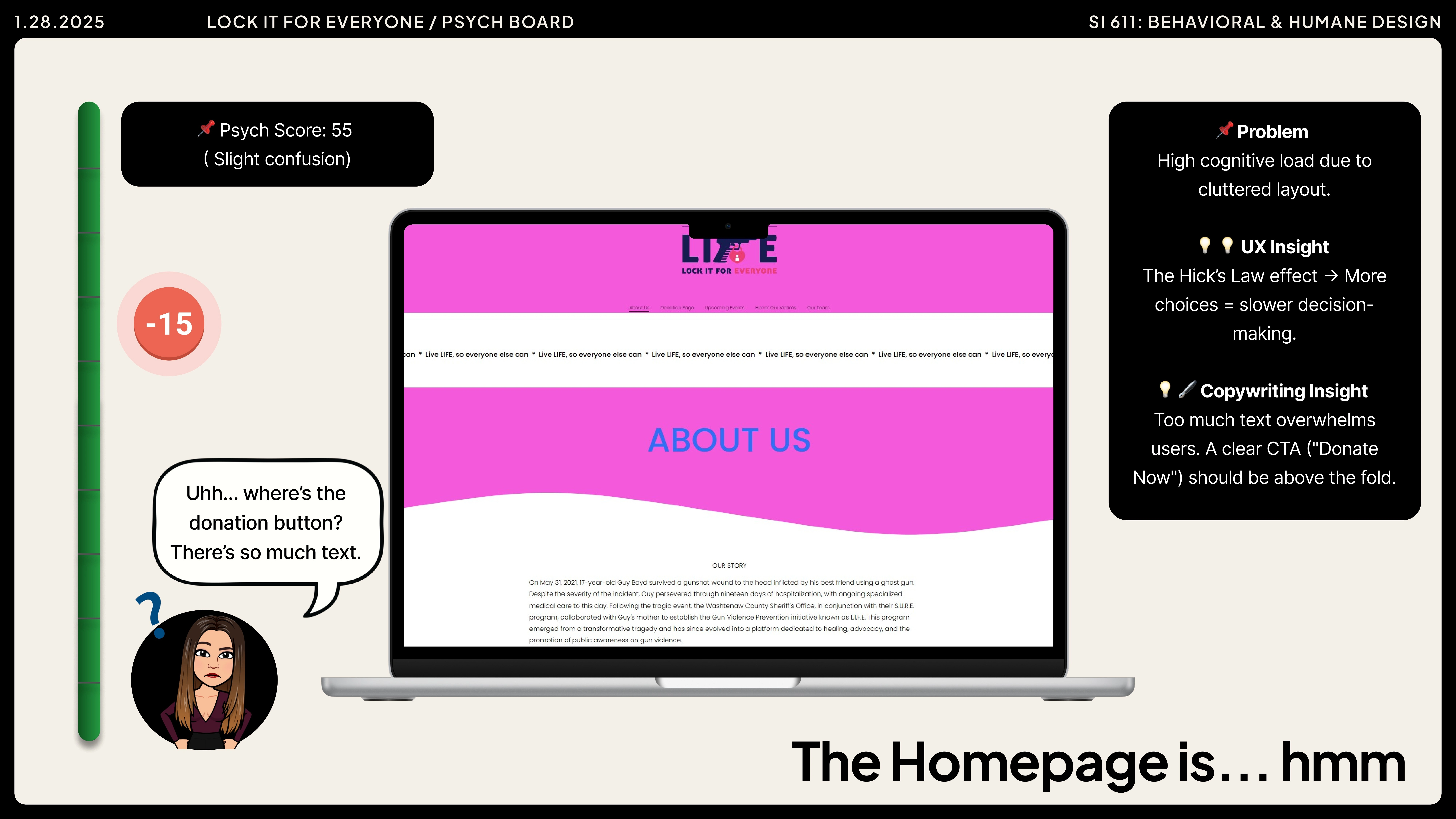
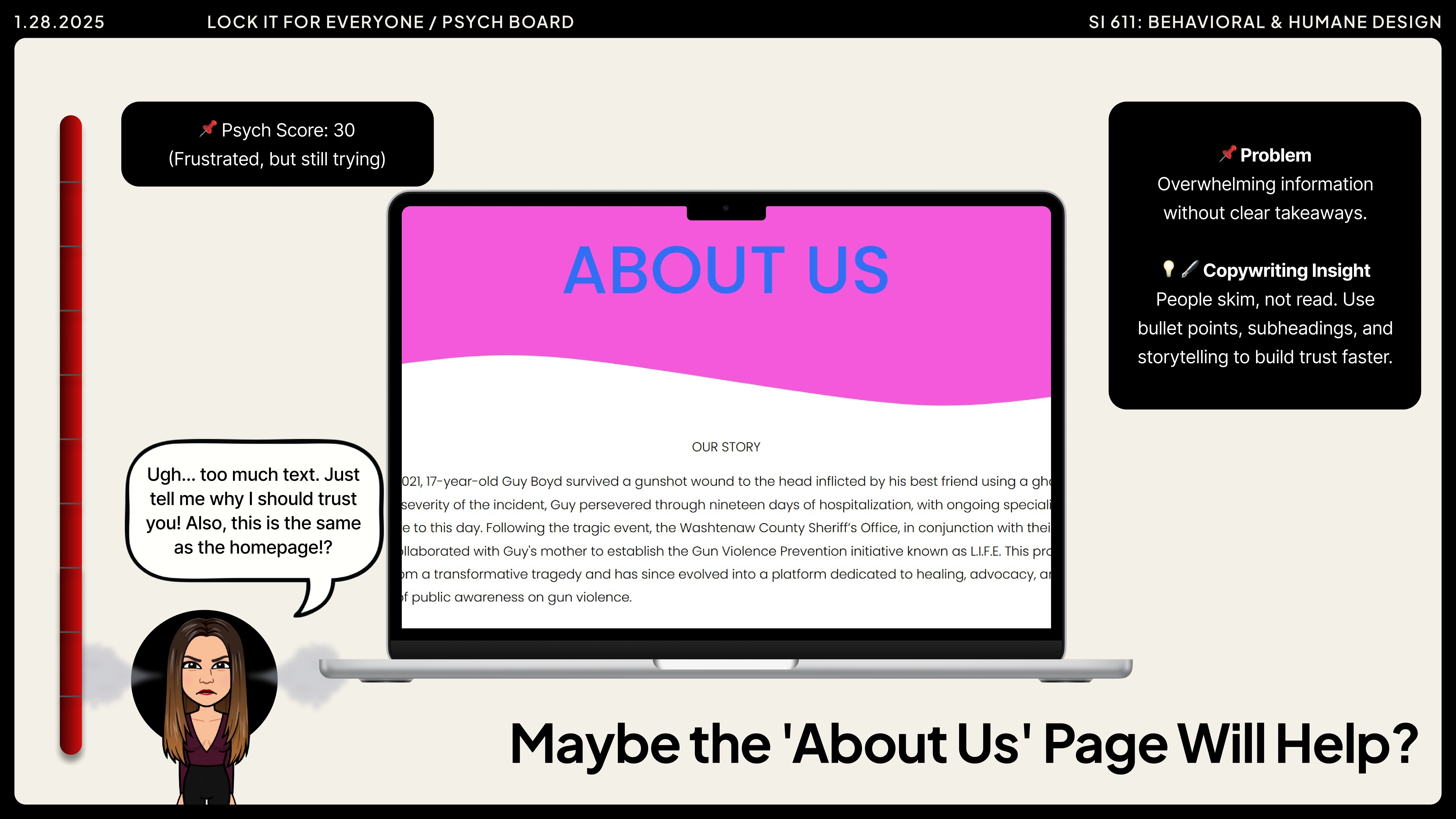
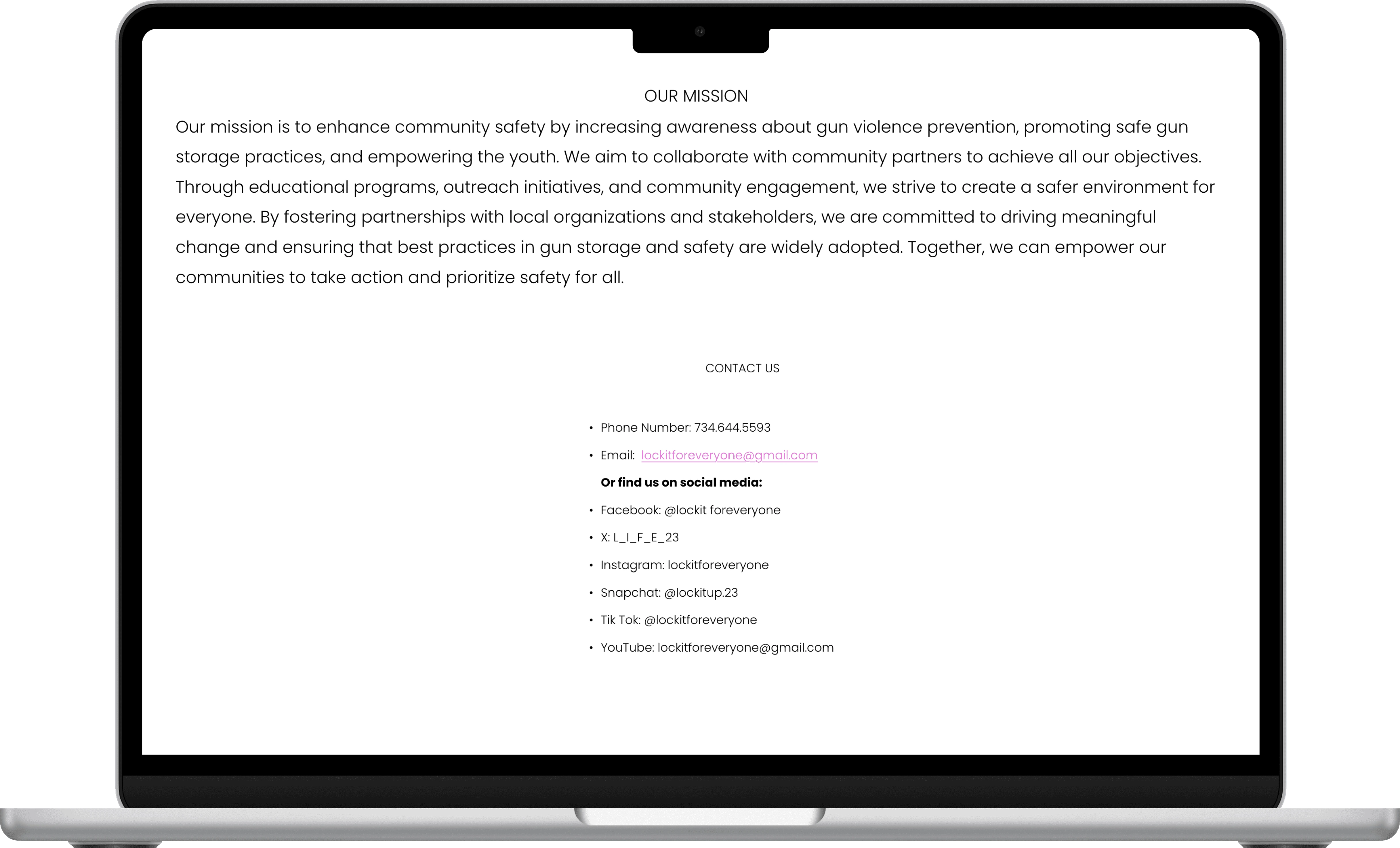
The original website struggled to build trust or guide users toward action.
Navigation was unclear.
Volunteer sign-up lacked a clear flow.
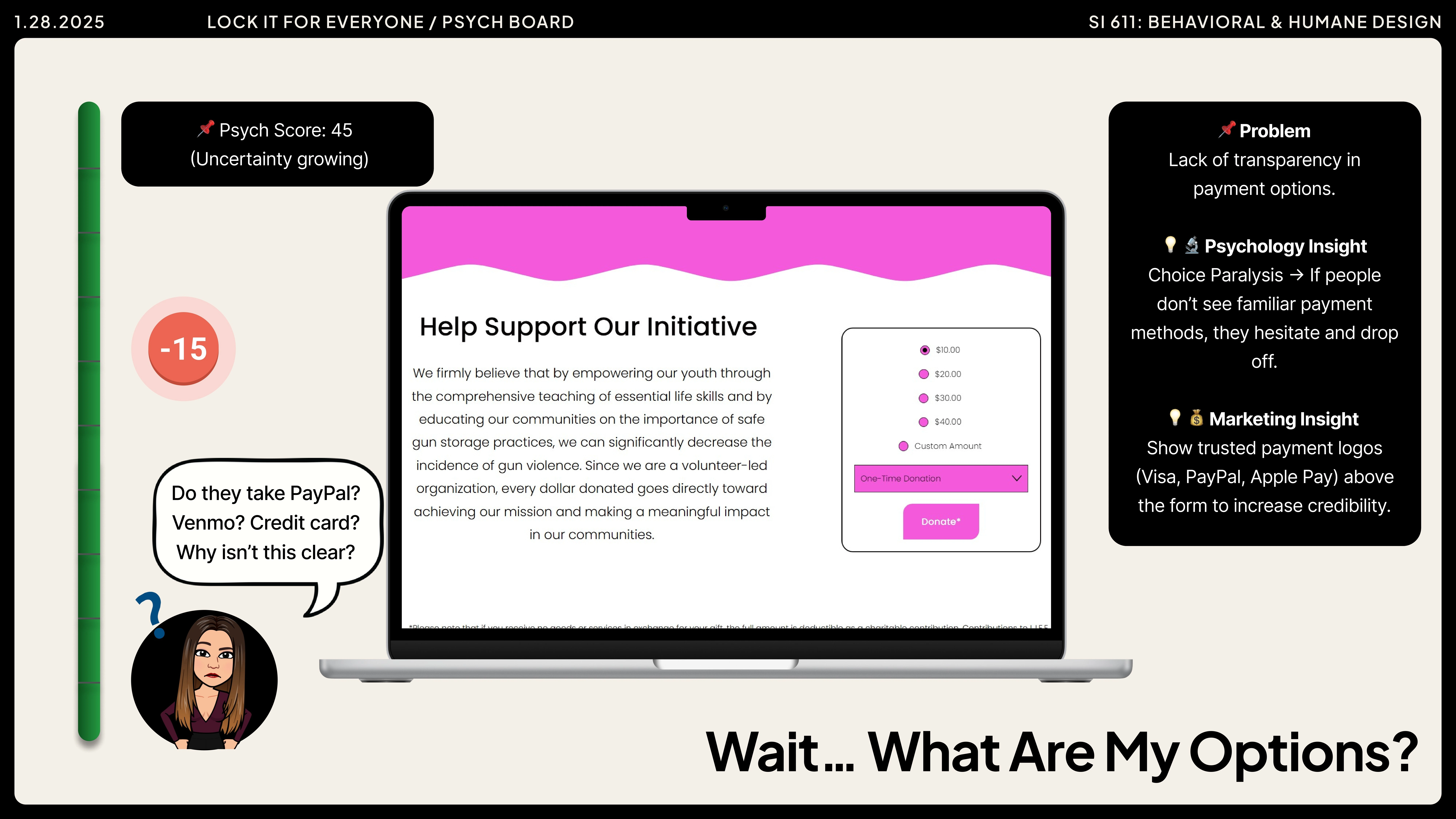
Trust signals like EIN or financial transparency were missing.
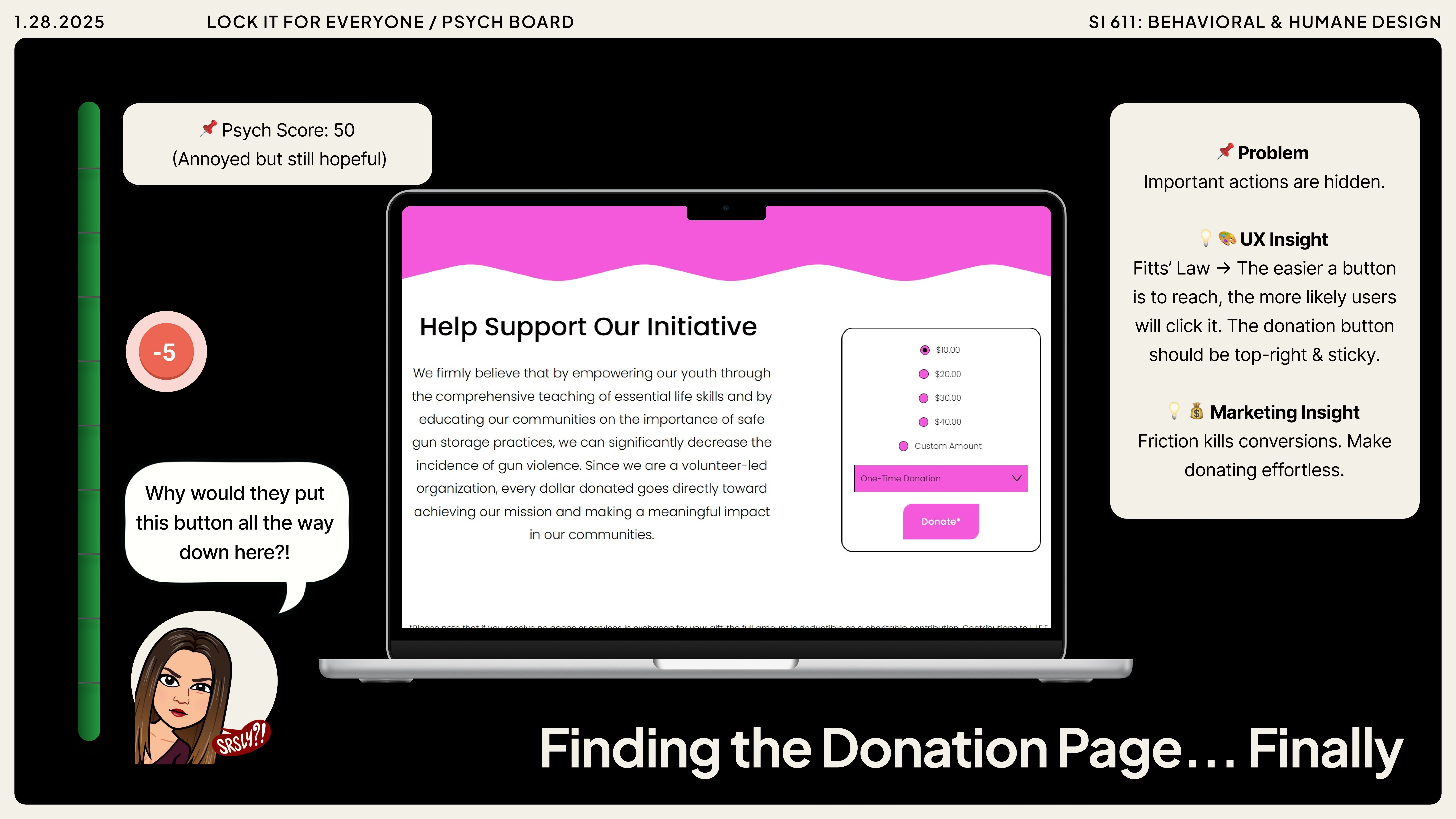
Calls to action were vague, and content like events or impact data was hard to find.
Users felt uncertain about how to engage, donate, or get involved.
Problem Statement
How might we create a digital presence that builds trust and turns awareness into action?
Design process
What did we do?
Week 1–2 → Research & Discovery | Week 3–4 → Wireframes & IA | Week 5–7 → High-Fidelity Design |
|---|---|---|
Client meetings, competitor analysis, and defining core user flows. | Client meetings, competitor analysis, and defining core user flows. | Refined color palette & branding, designed new flows (Volunteer, Memorials, Stories, Contact). |
Week 8–9 → Usability Testing | Week 10–11 → Iteration | Week 12 → Final Design |
Six participants tested the live site versus the prototype on UserTesting.com, identifying gaps in trust, volunteer flow, and event sign-up. | Added EIN & nonprofit details, improved CTAs, redesigned volunteer sign-up, and enhanced event registration. | Delivered polished prototype emphasizing trust, clarity, and engagement. |
The analysis made it clear: without trust signals and clear pathways to act, L.I.F.E’s digital presence could not support its powerful mission.
Design process
What didn't work?
While our redesign improved usability, some design choices still fell short during testing and client feedback:
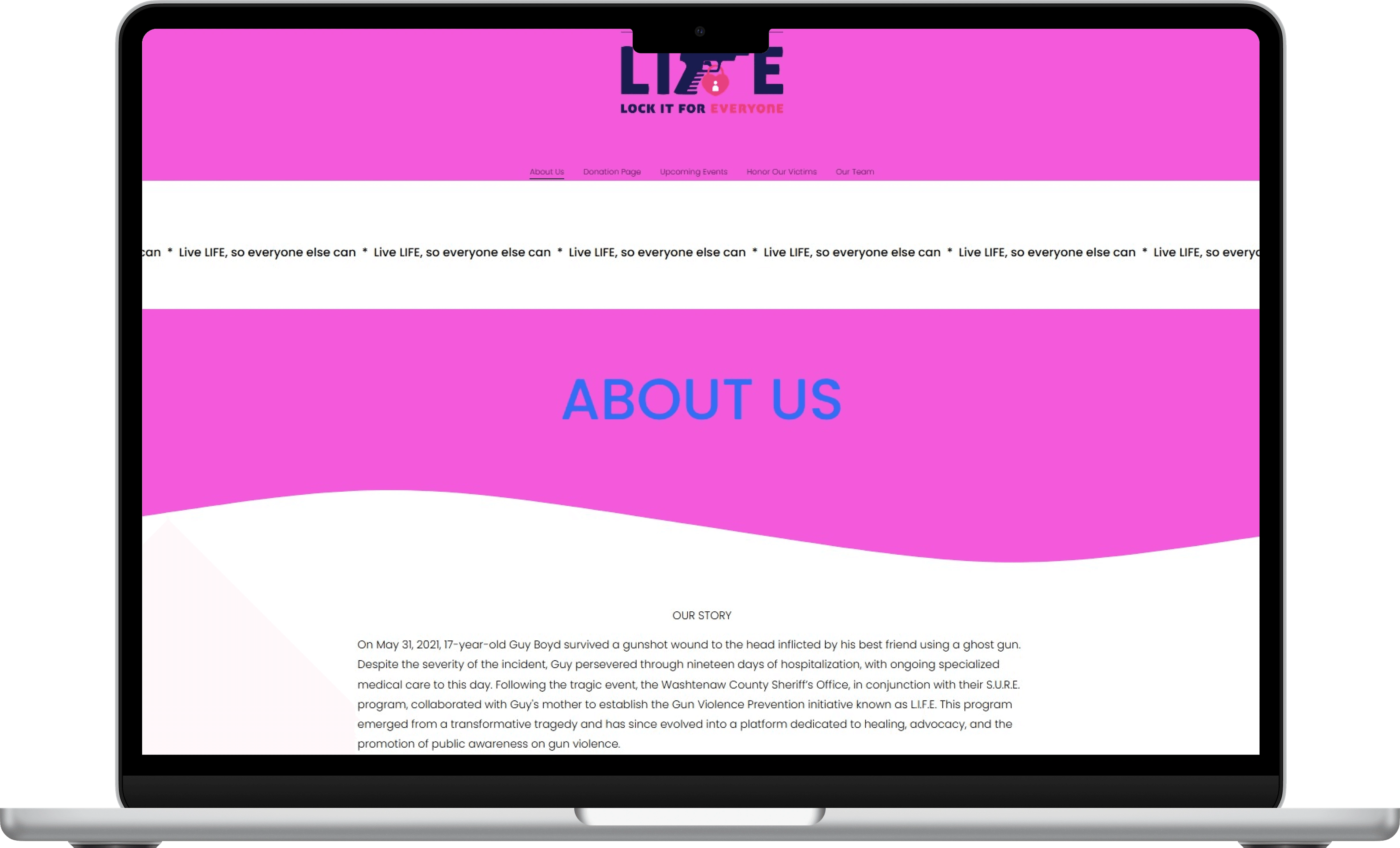
The bright pink branding was eye-catching but reduced credibility.
Volunteer sign-up was hidden under “Get Involved” instead of having a clear, dedicated page.
Calls to action were too vague, leaving users uncertain about their next steps.
Even with a smoother flow, donation still lacked trust signals like EIN, tax status, or secure payment badges.
These gaps highlighted that credibility and clarity matter as much as usability in driving engagement.
final dESIGN
What DID work?
A trusted space for action, not just awareness.
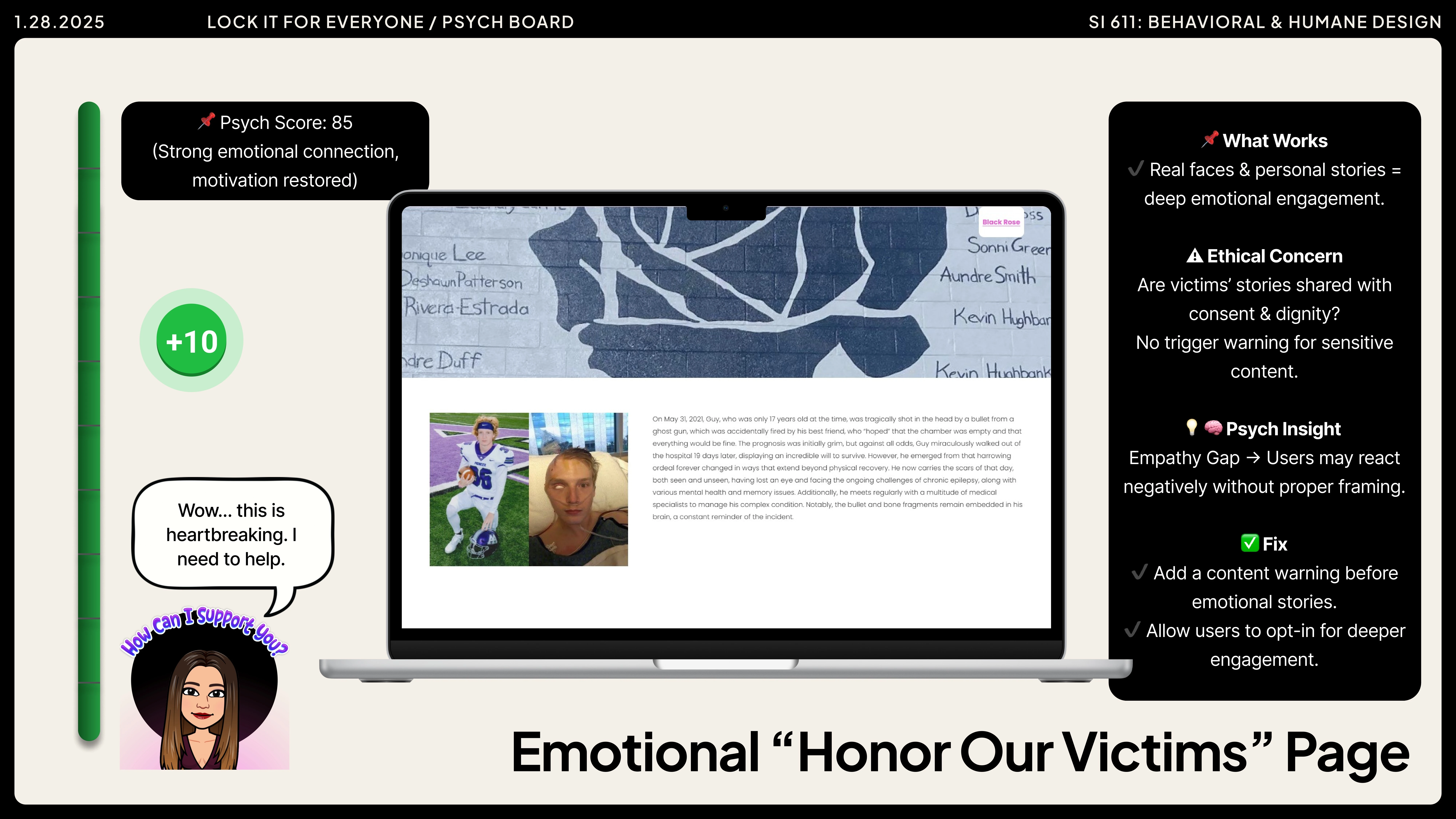
The redesigned LIFE website builds credibility and guides users to take meaningful steps , from donating and volunteering to attending events and sharing stories. With clearer navigation, trust signals, and emotional storytelling, the site turns compassion into action.
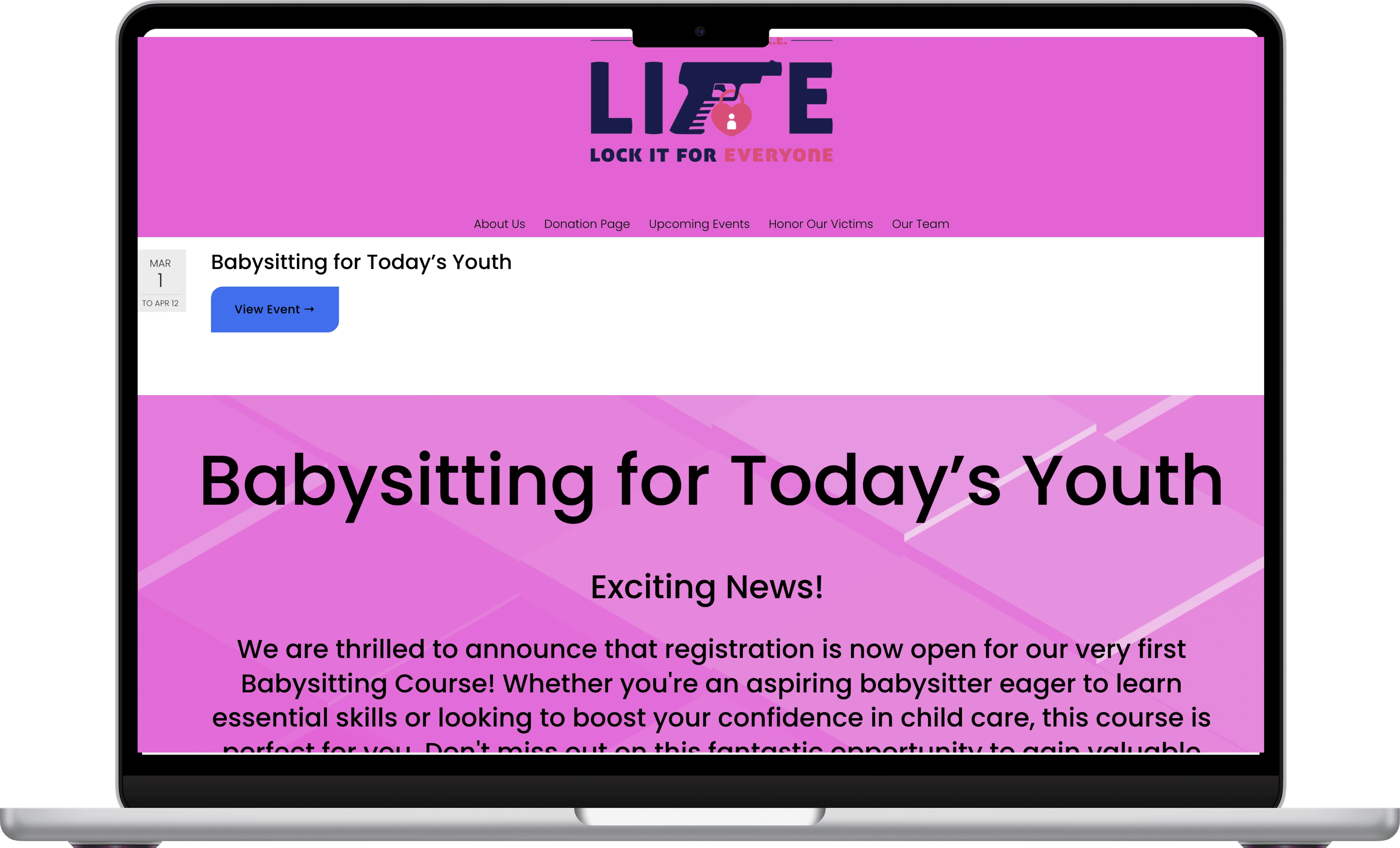
Before
After
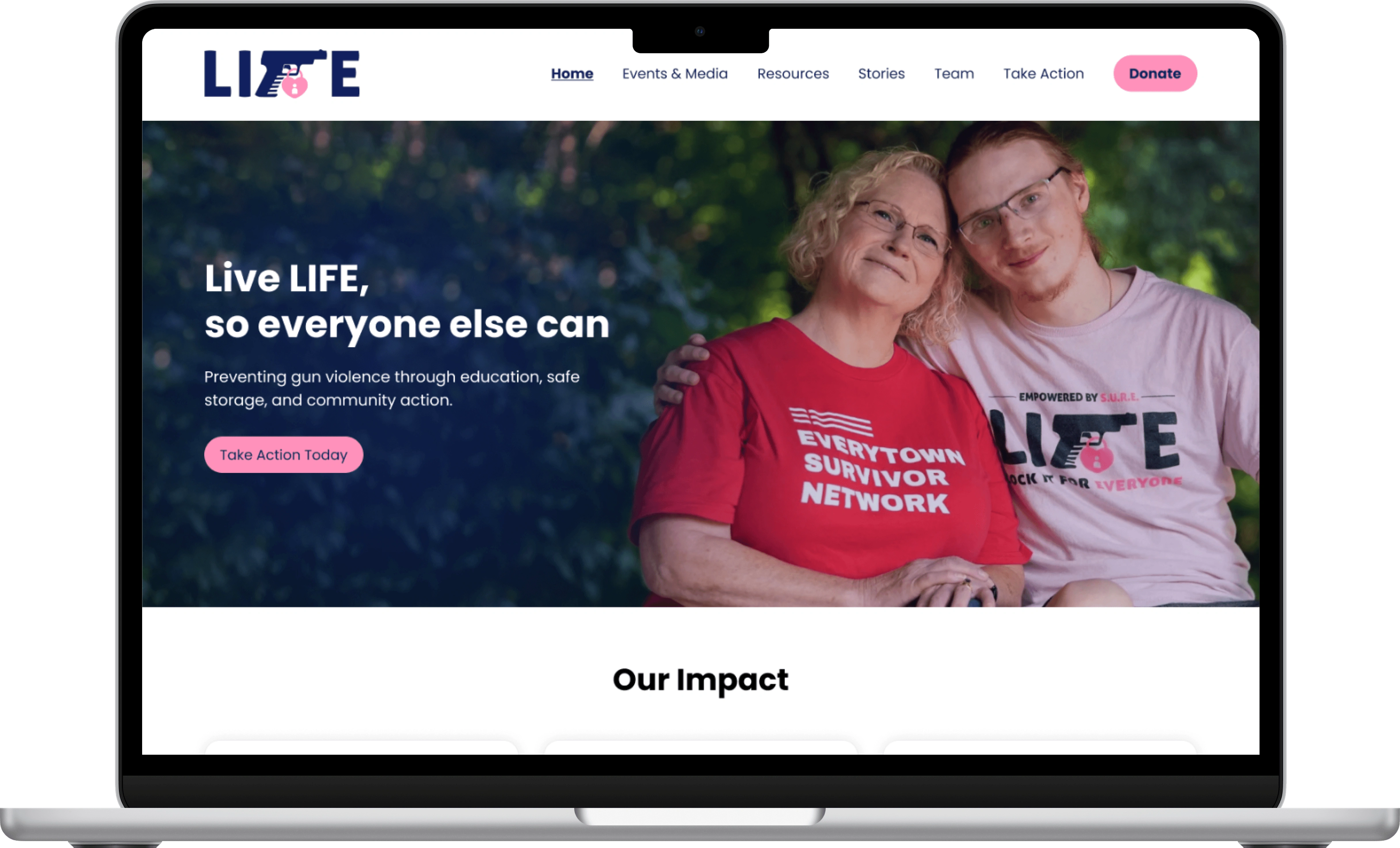
Prominent Donation Accessibility
The Problem
Users had difficulty finding ways to donate quickly and easily.
Our Solution
Added a highly visible and accessible donation button.
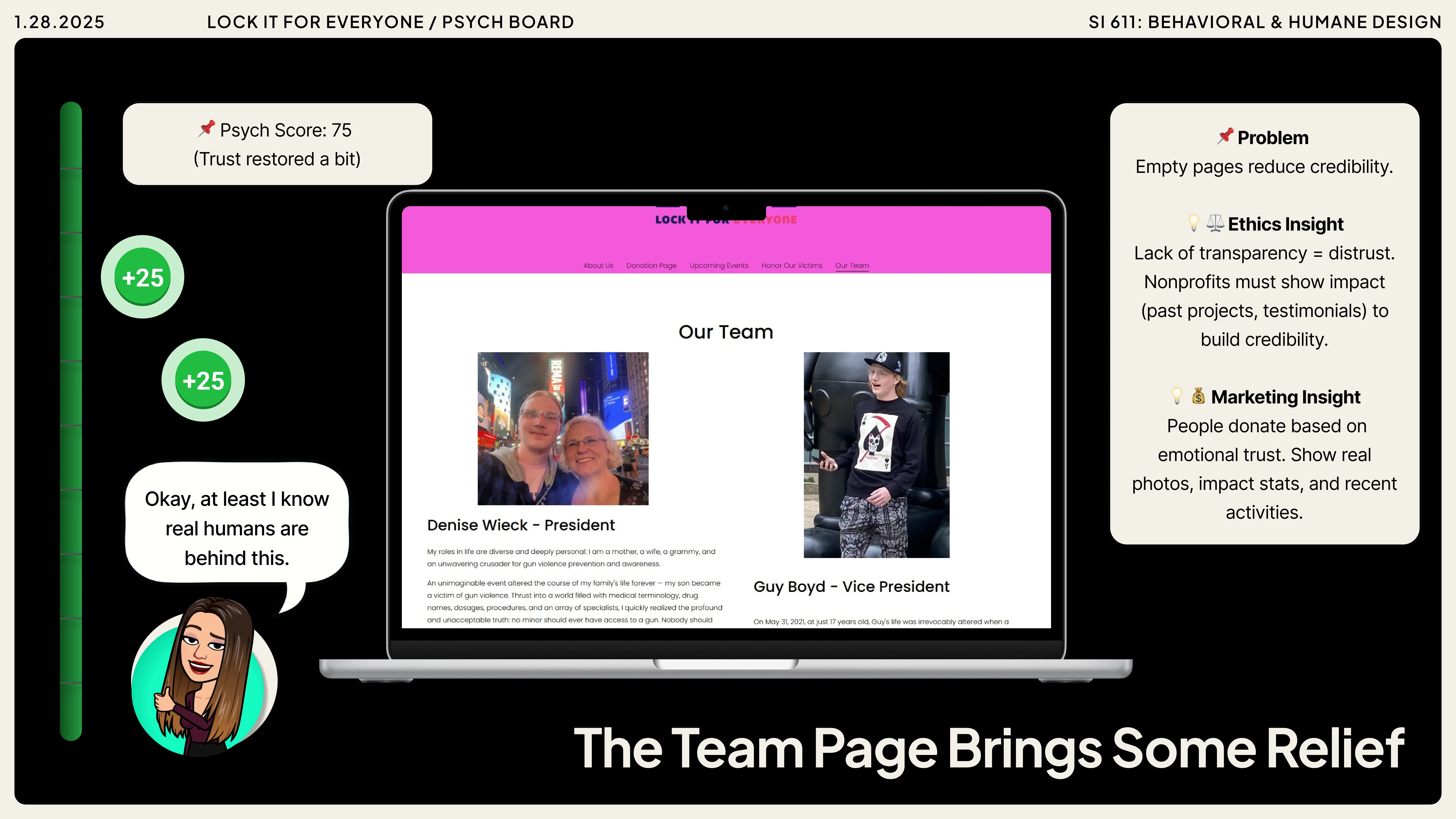
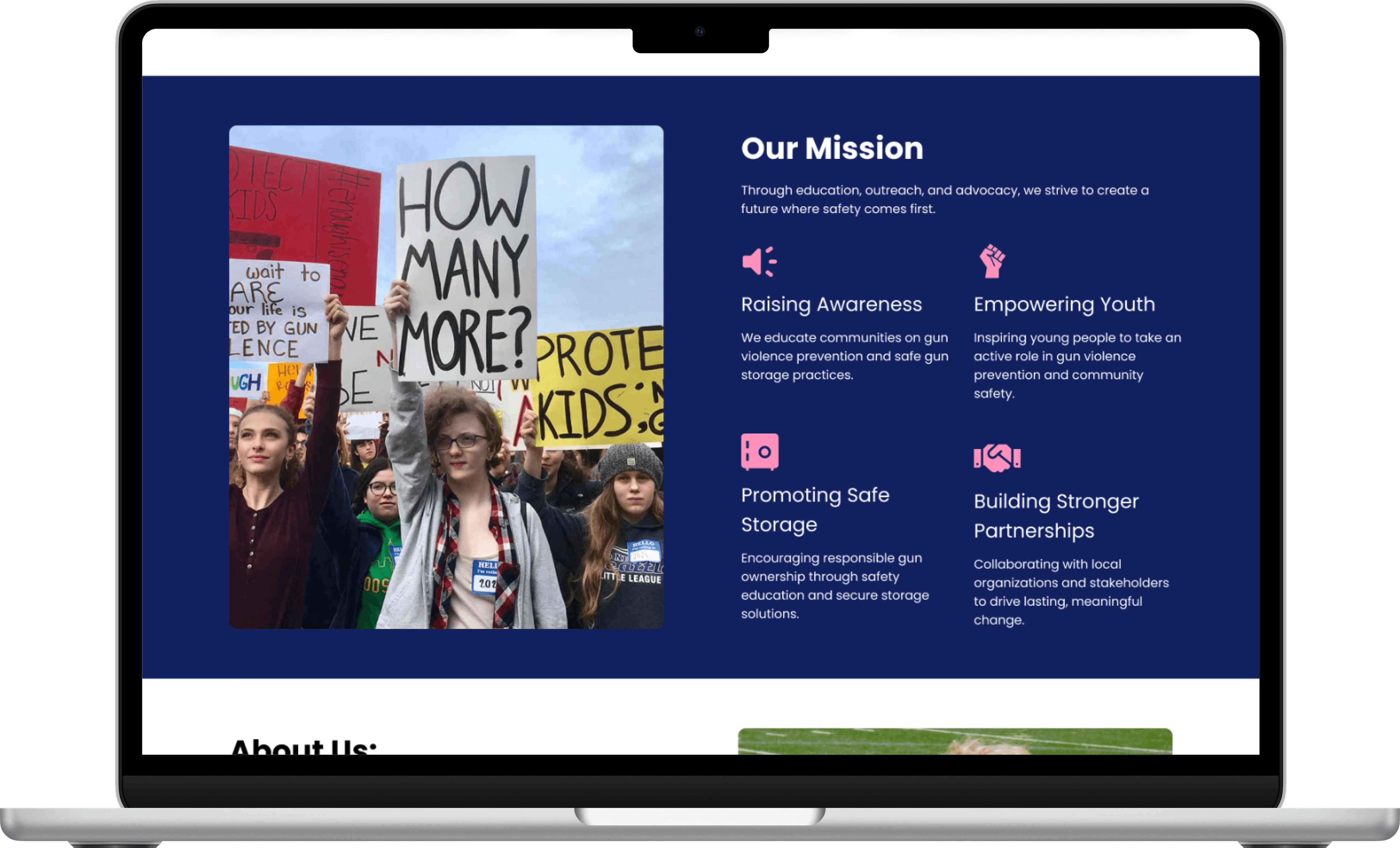
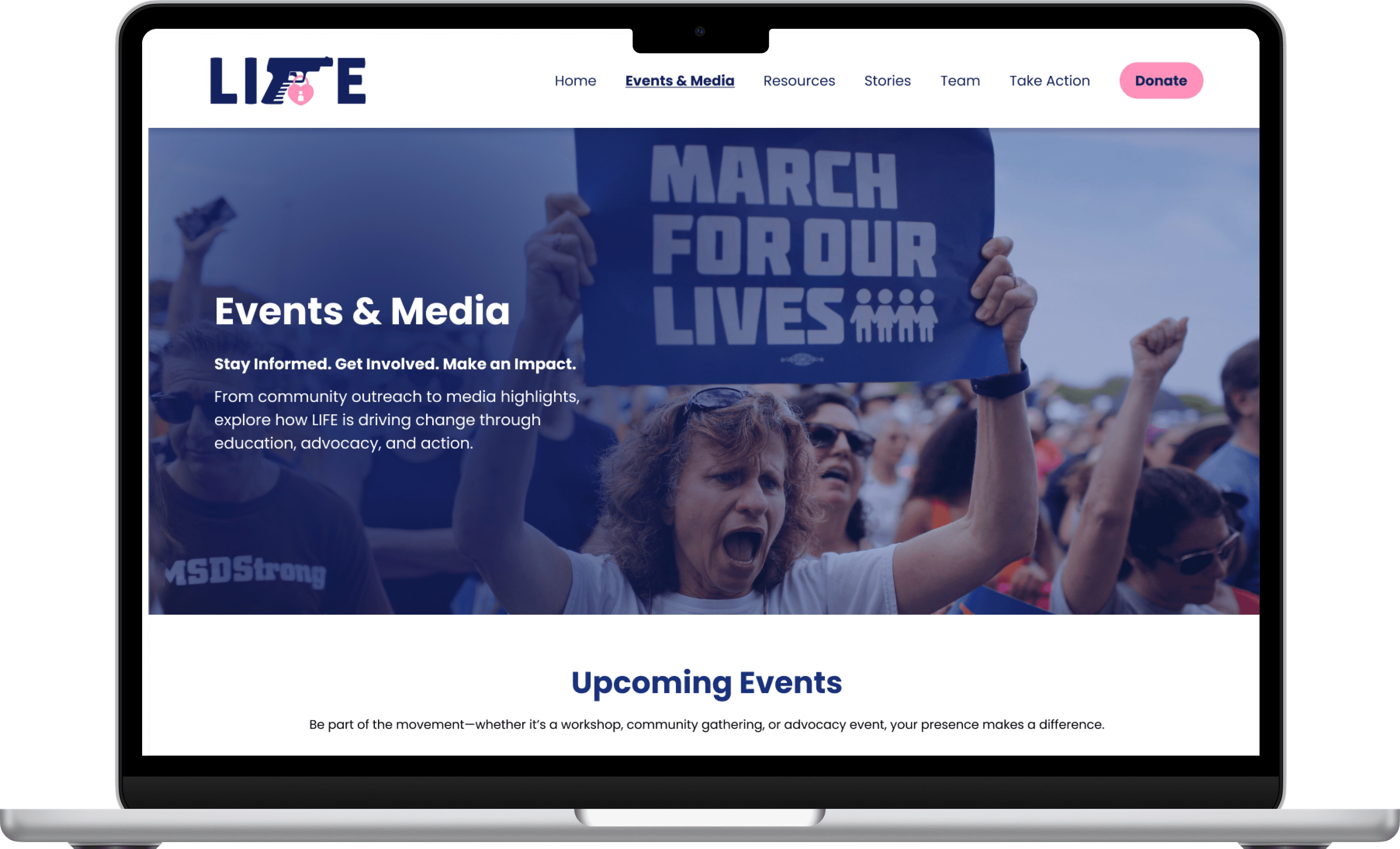
Humanizing the Organization
The Problem
The website lacked personality, making it feel impersonal and disconnected.
Our Solution
Added faces and personal stories to the organization's brand.
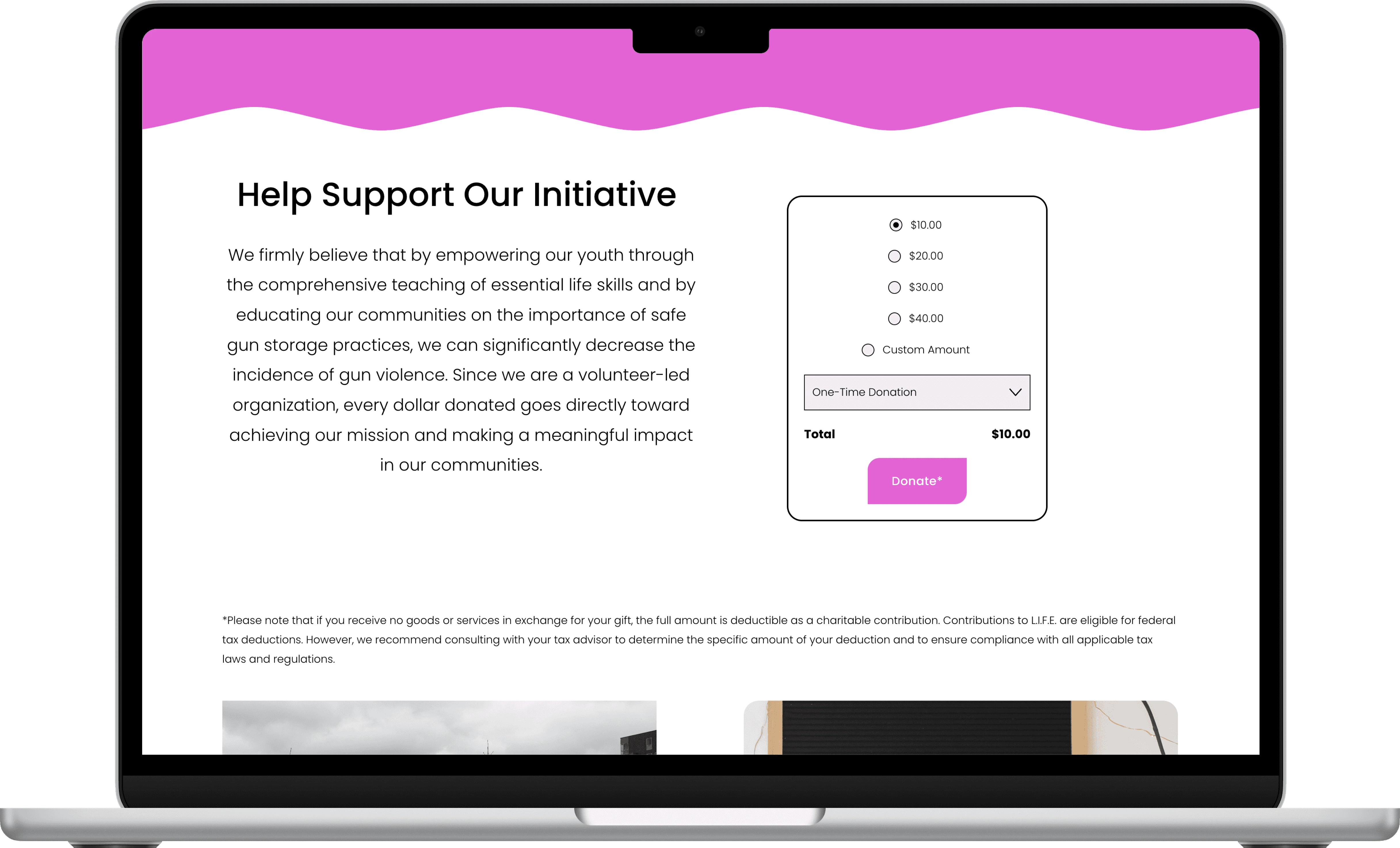
Before
After
Before
After
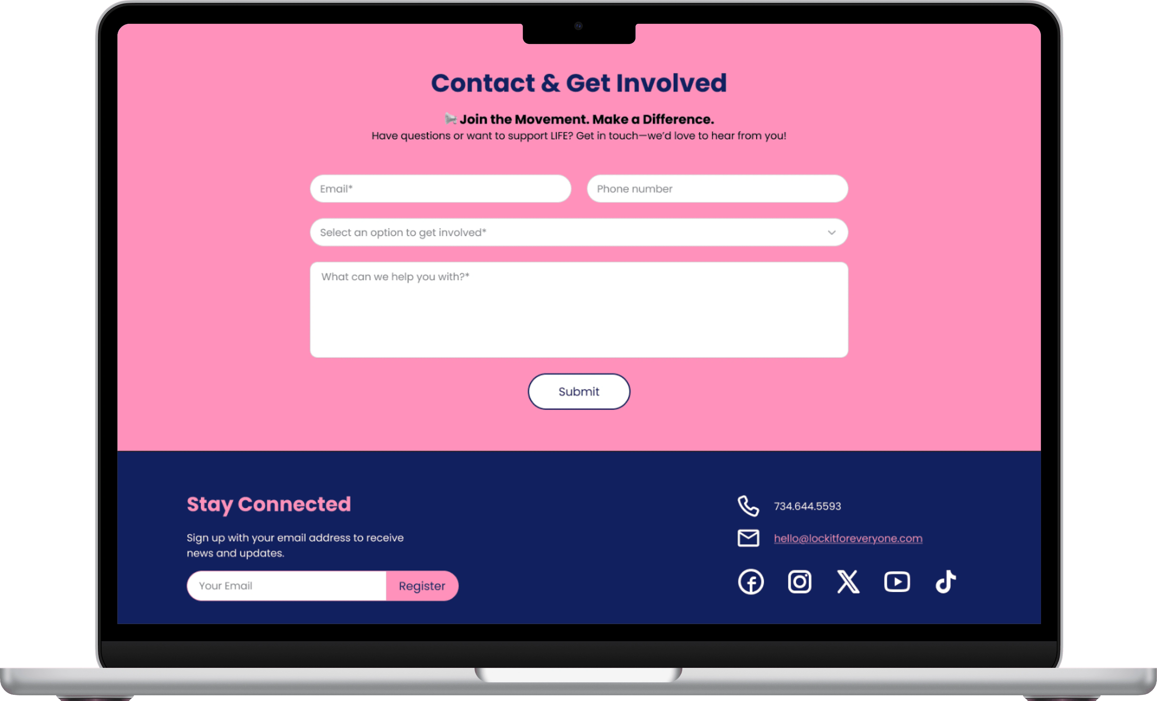
Enhanced User Engagement
The Problem
Users found the sign-up process complicated and off-putting.
Our Solution
Streamlined and simplified sign-up forms for better clarity and interaction.
Revitalized Website Branding
The Problem
Stark brand colors created confusion and a weak impression.
Our Solution
Improved overall visual identity and messaging consistency.
Before
After
Before
After
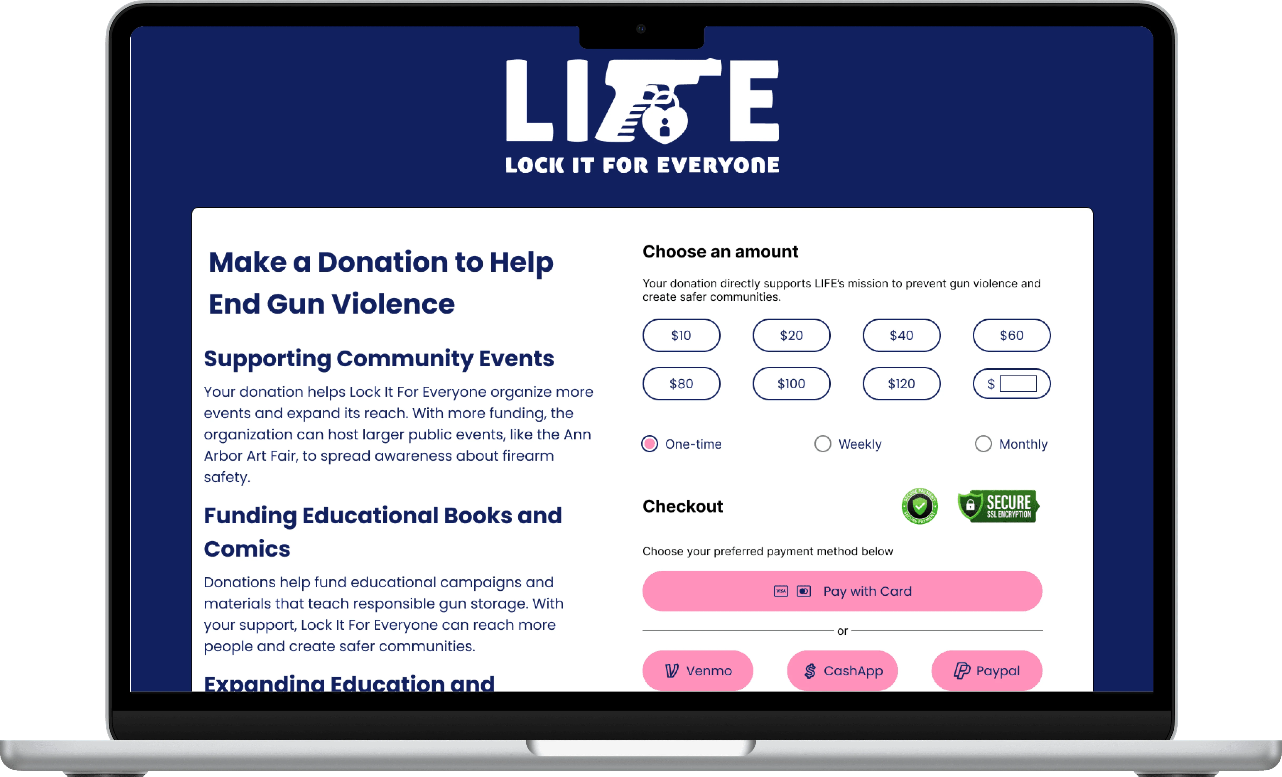
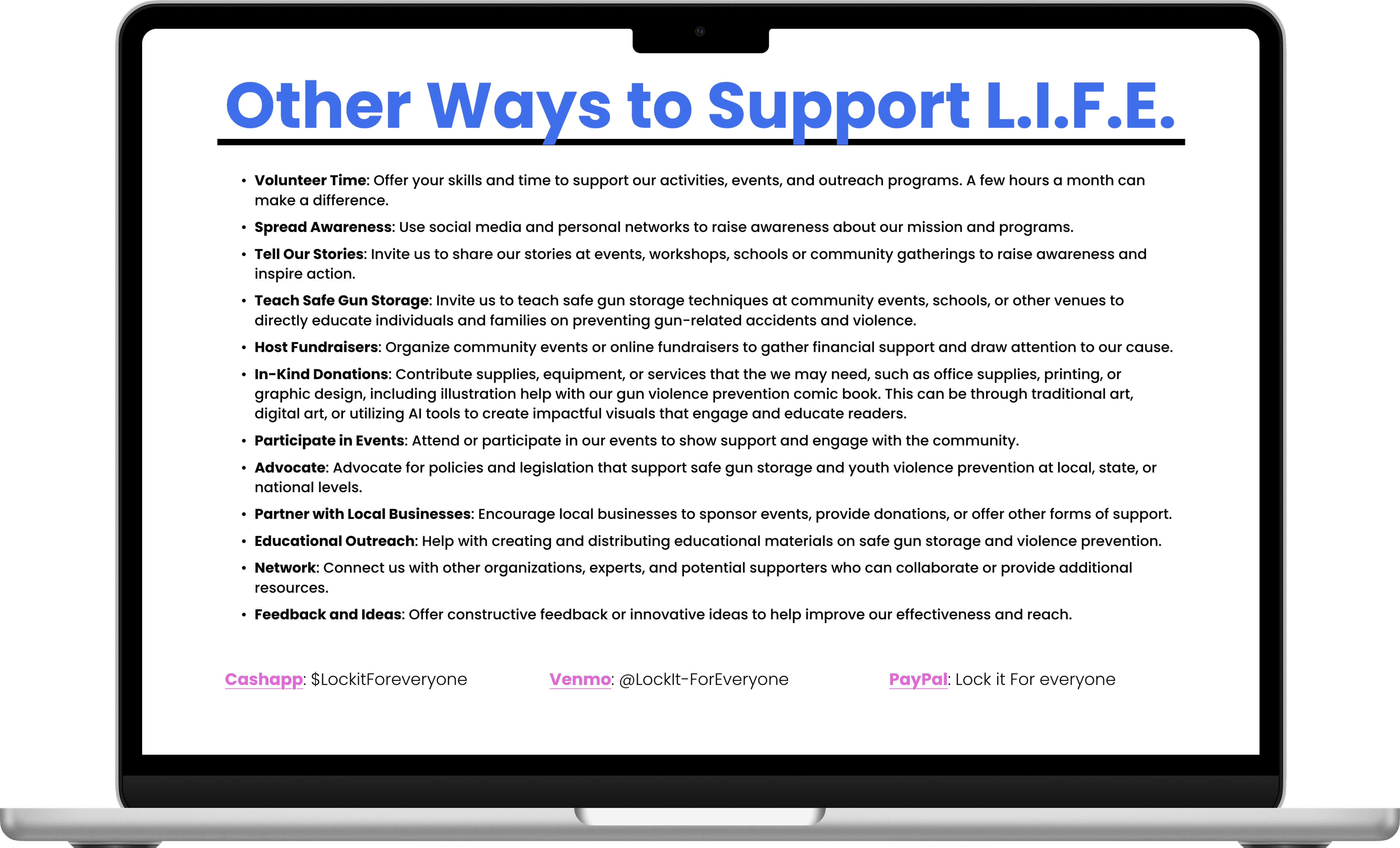
Building Trust & Credibility
The Problem
Users were uncertain about the organization's legitimacy and financial transparency.
Our Solution
Included clear EIN, tax-exempt status, financial transparency details, and secure payment options.
Reflection
What did I learn?
This project taught me that designing for nonprofits requires more than usability; it requires credibility, trust, and empathy. I learned how critical transparency and small details, like clear CTAs or visible EIN info, are in motivating donations and engagement.
I also saw the power of storytelling and emotional design in building connections with users, while balancing client constraints with user needs. Most importantly, I learned how to design not just for functionality, but for impact, creating a digital presence that inspires people to act.
Looking Ahead
Our redesign laid the foundation for a website that is credible, usable, and emotionally engaging.
Moving forward, we aim to:
Align brand and mission by maintaining a cohesive visual identity.
Increase trust and credibility through transparent information and nonprofit verification.
Enhance usability with clear navigation, better readability, and accessible layouts.
Humanize the experience by highlighting personal stories and community voices.
Ensure continuity through clear handover documents for future stakeholders.
Measure impact by tracking WOMI and NPS after launch and comparing against baseline numbers.
Based on our testing results, we expect these improvements to significantly increase website traffic, donor conversions, and community engagement.
Like this project
Posted Apr 7, 2026
Redesigning a nonprofit's website to build trust, drive donations, and inspire community action.
Likes
0
Views
0
Tags