Built with Framer
Colors ― Brand Identity & Framer Website
Karim Dari
COLORS — Show Us Your True Colors
Overview
Brief: When Sarah reached out to me, her vision was clear: she wanted to build a raw, bold, and inclusive brand for her social media management agency. She wanted to break away from the typical corporate agencies that flood the Montreal scene with cold, impersonal branding. Colors had to be the opposite. It had to scream authenticity. It had to welcome imperfections. And most importantly, it had to feel real.
Project Scope: UX/UI, Branding, Figma Website Design, Framer Website Development, Motion Design
Outcome Summary: I crafted a vibrant, personality-packed visual language rooted in authenticity and self-expression, from a dynamic gradient logo system to a playful, social-first website. All of this gave Colors an identity that breaks the mold, connects instantly with its audience, and proudly says: “This is who we are.”
Building a Brand That’s Loud, Proud & Human
The whole foundation of Colors is about helping people show up online as their true selves—flaws, quirks, chaos and all. That energy had to come through in every single element we designed.
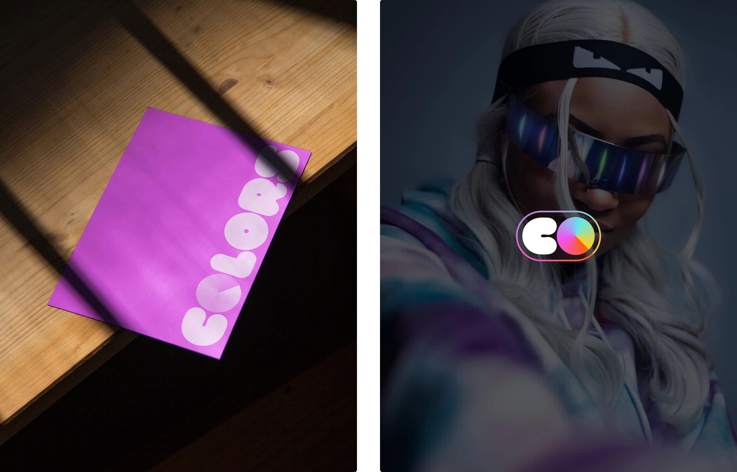
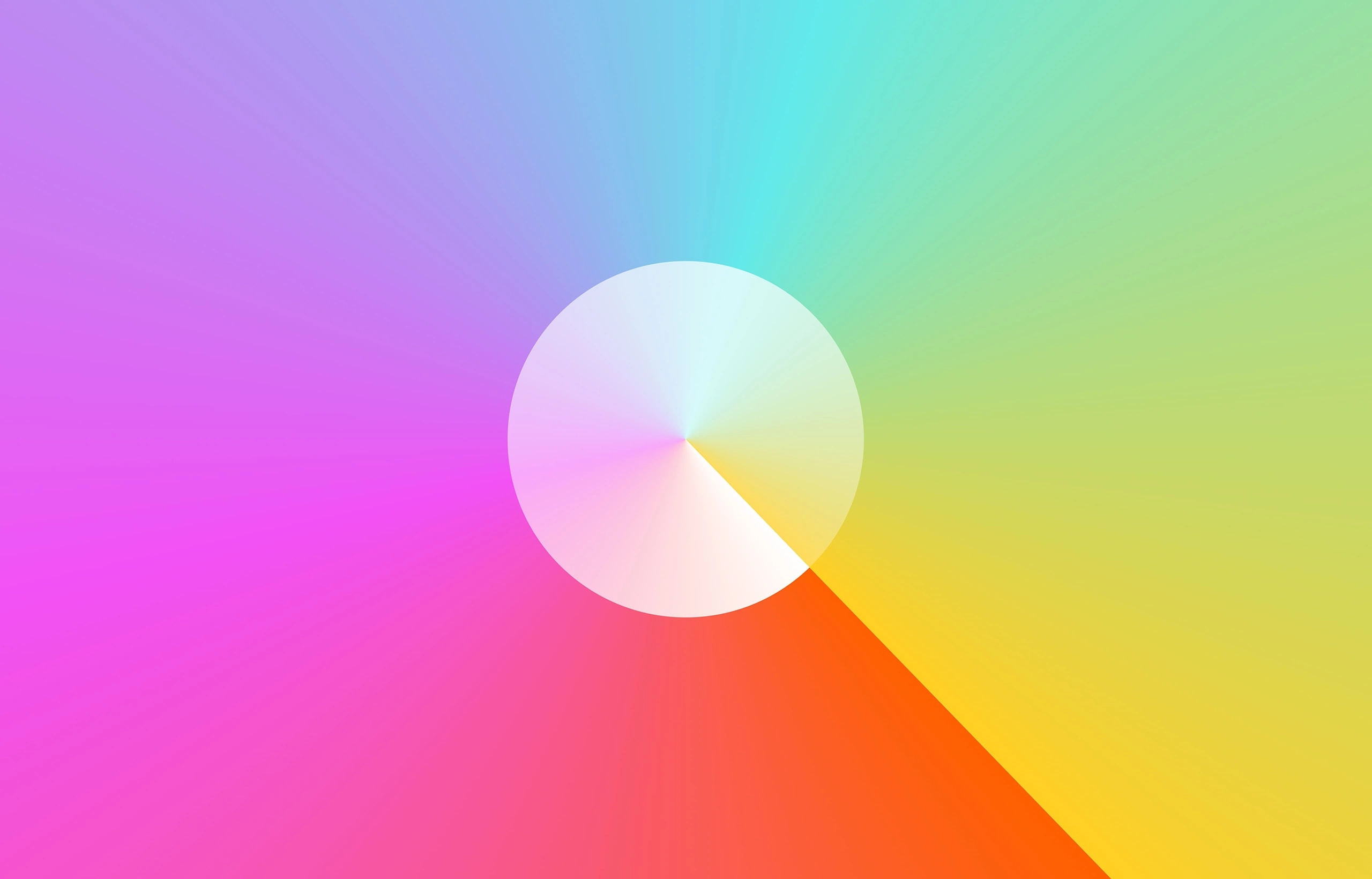
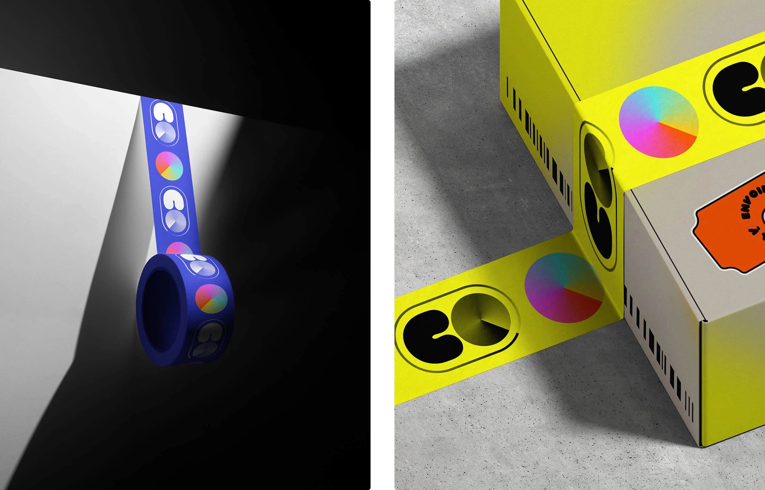
At the heart of Colors, I created a central icon that would be reused across all 3 logo marks. The icon is made of a gradient hue that reminds the audience of the vast spectrum of brand values: diversity, inclusivity, equity & creativity.
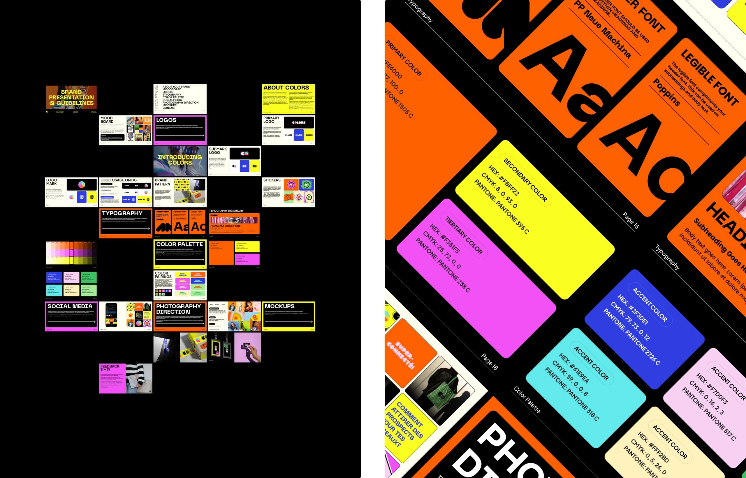
Brand Book: Once the logo was created, I had to go further into the identity, so I got to work on the brand book. This thing had to feel like Colors: bold, human, and unapologetically real. I designed every page to reflect the energy of the brand: big type, a bold color palette, sticker-style elements, and playful copy that reads more like a conversation than a guideline.
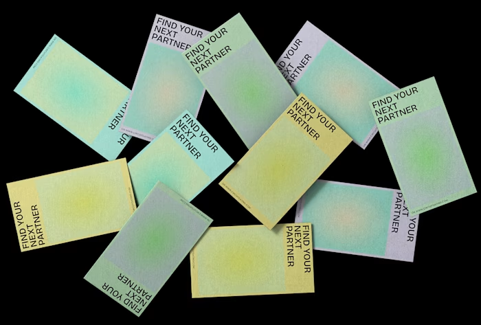
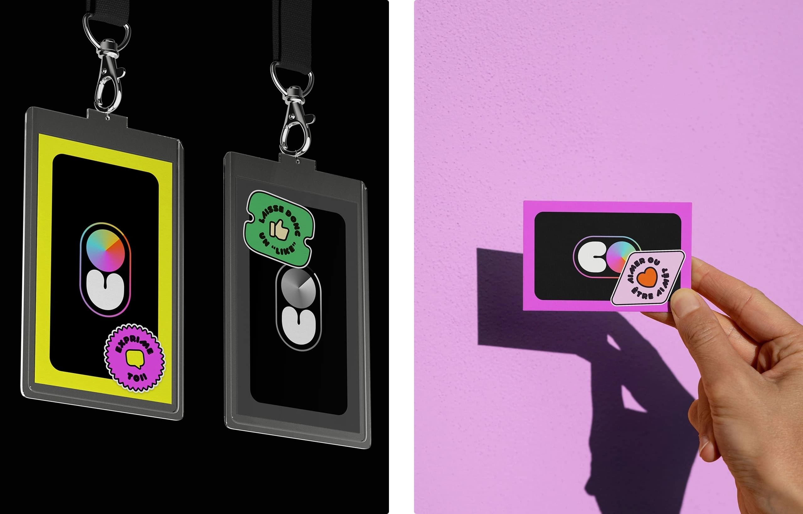
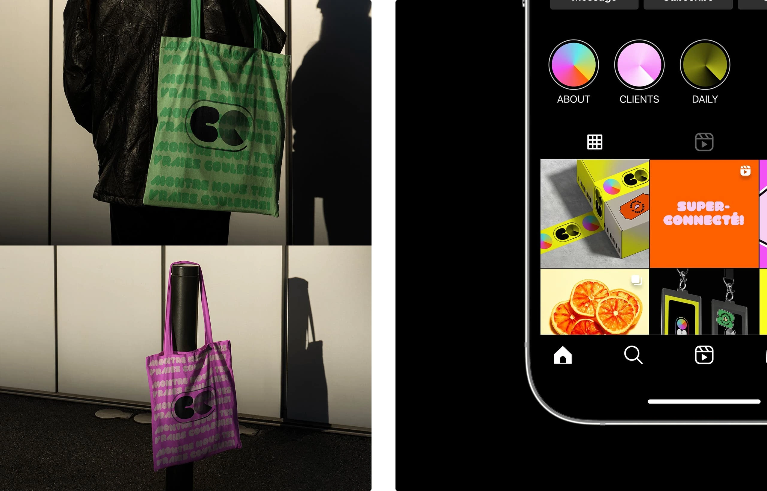
Mockups: Next, I brought the identity to real life. I wanted to show how Colors could flex across different mediums while still feeling cohesive, bold, and instantly recognizable. We mocked up everything from Instagram grids to merch, business cards, and even stickers.
These weren’t just for show either. The goal was to help Sarah see her brand out in the world, and feel proud of how it would represent her agency online and offline.
The Website: Digital Expression
Since Colors lives and breathes on socials, it was critical that the website reflected the brand's personality. Think of it like a digital space for potential customers to feel like they can be themselves online.
I carefully crafted the website from the brand’s assets, typography and color palette.
I kept the structure simple but impactful, designed to move fast, feel fun, and immediately let visitors know what the brand stands for. The messaging is cheeky, bold, and straight to the point. You’ll find hand-drawn lines, a colorful UI, punchy headlines, and just enough motion to keep it playful.
It’s was less “here’s what we do” and more “here’s who we are, take it or leave it.” The whole site is filled with social proof and service info, but nothing feels stiff or overly formal. We wanted to create a space where potential clients would scroll and think: “Okay, this is different. I like it here.”
Conclusion
My biggest challenge was keeping an industry standard look while also breaking the mold and being unique & bold. This was the real tension point in the project, how do I push creative boundaries without sacrificing professionalism?
I knew the brand had to look legit, especially since it’s targeting businesses who are serious about growth on social. But it also couldn’t be boring. That’s where I leaned into contrast. Clean layout meets hand-drawn lines & high-contrast colors. Strategic messaging meets playful language. It’s this constant push and pull that makes the brand feel alive.
Final thoughts: Colors isn’t just a brand, it’s a statement & it sends a strong message: Be yourself! This project reminded me how powerful it is when a brand lets go of trying to be safe for the sake of personality.
What if more brands dared to be real? Wouldn't the internet feel a little more alive?
Thank you for going through this case study!
If you like this project and would like to talk about how i could help you transform your digital presence, book a discovery call with me:
Like this project
Posted Jan 24, 2025
A bold, unfiltered brand identity and website for a social media agency that celebrates authenticity, creativity, and showing up as your true self online.
Likes
22
Views
130
Timeline
Jul 1, 2024 - Sep 1, 2024