Altea Skincare — Brand Identity & Website Design
Karim Dari
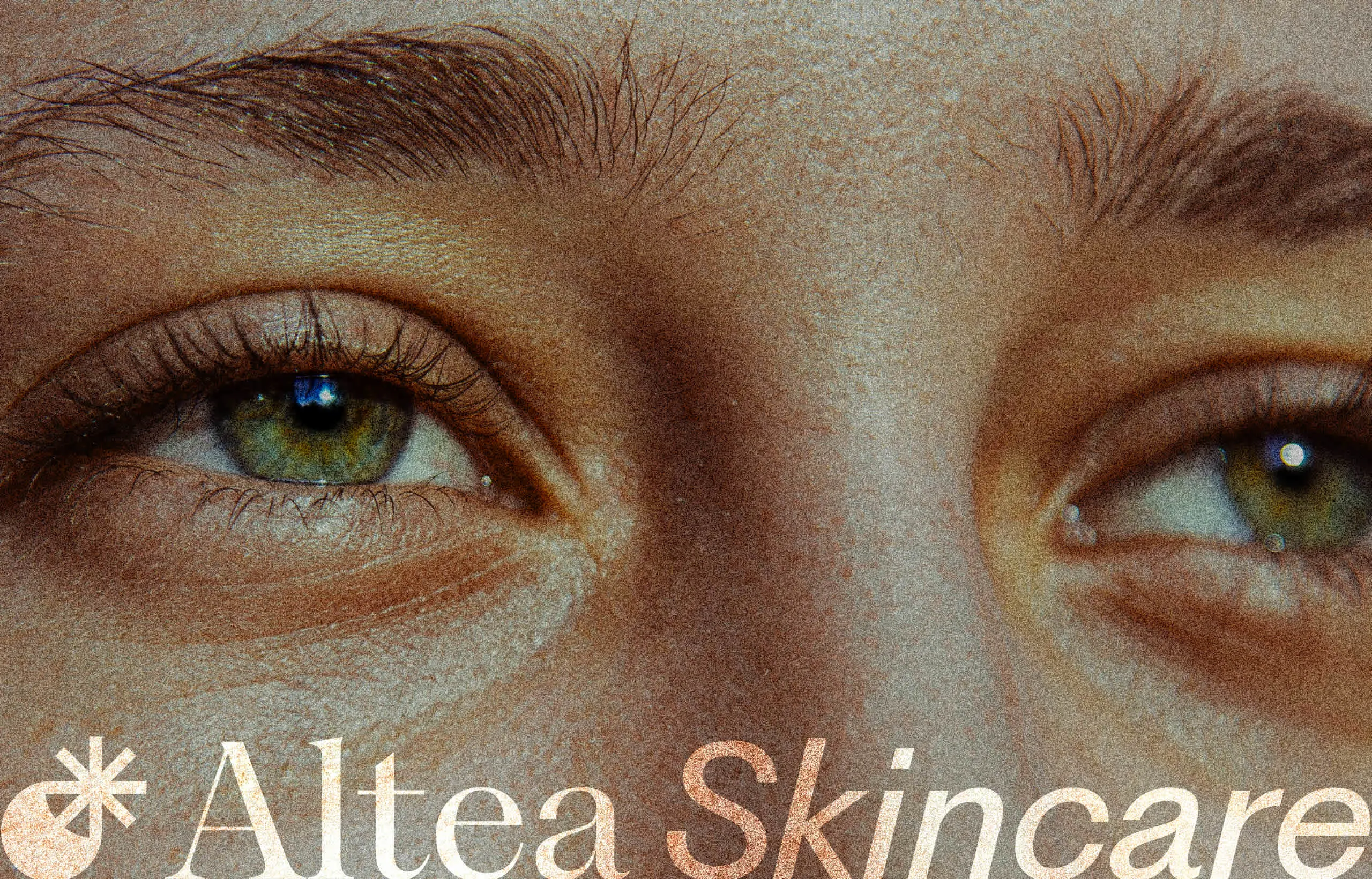
Altea Skincare ― Because Your Skin Deserves To Feel ❤️
Overview
Brief: For Altea, I crafted a full brand identity and product experience around the natural rhythm of the skin: day and night. The concept focused on designing two distinct product lines: one for daytime protection and hydration, the other for nighttime repair and renewal.
I developed a clean, calming visual system that mirrors this duality, pairing soft neutrals with deeper, restorative tones.
Project Scope: Branding, Packaging, Web Design, Motion Design
Outcome Summary: The result was a cohesive, elevated brand that feels both modern and grounded. Altea’s new identity clearly communicates the dual function of its products, making the day-to-night routine feel easy. From packaging to the website, brand cohesiveness was achieved by utilizing the iconography, color palette & typography regularly.
Why Day & Night?
It's very simple. We all use beauty products, at all times of the day. However, most of our routines are built around when we 'think' we should apply certain products.
Altea is trying to revolutionize the routine, reinventing what it means to use different parts of the day for different products. It's basing itself off of science to create two different lines of product, one to start the day revitalized and one to go to bed moisturized & glowing.
A Smooooooooth Brand
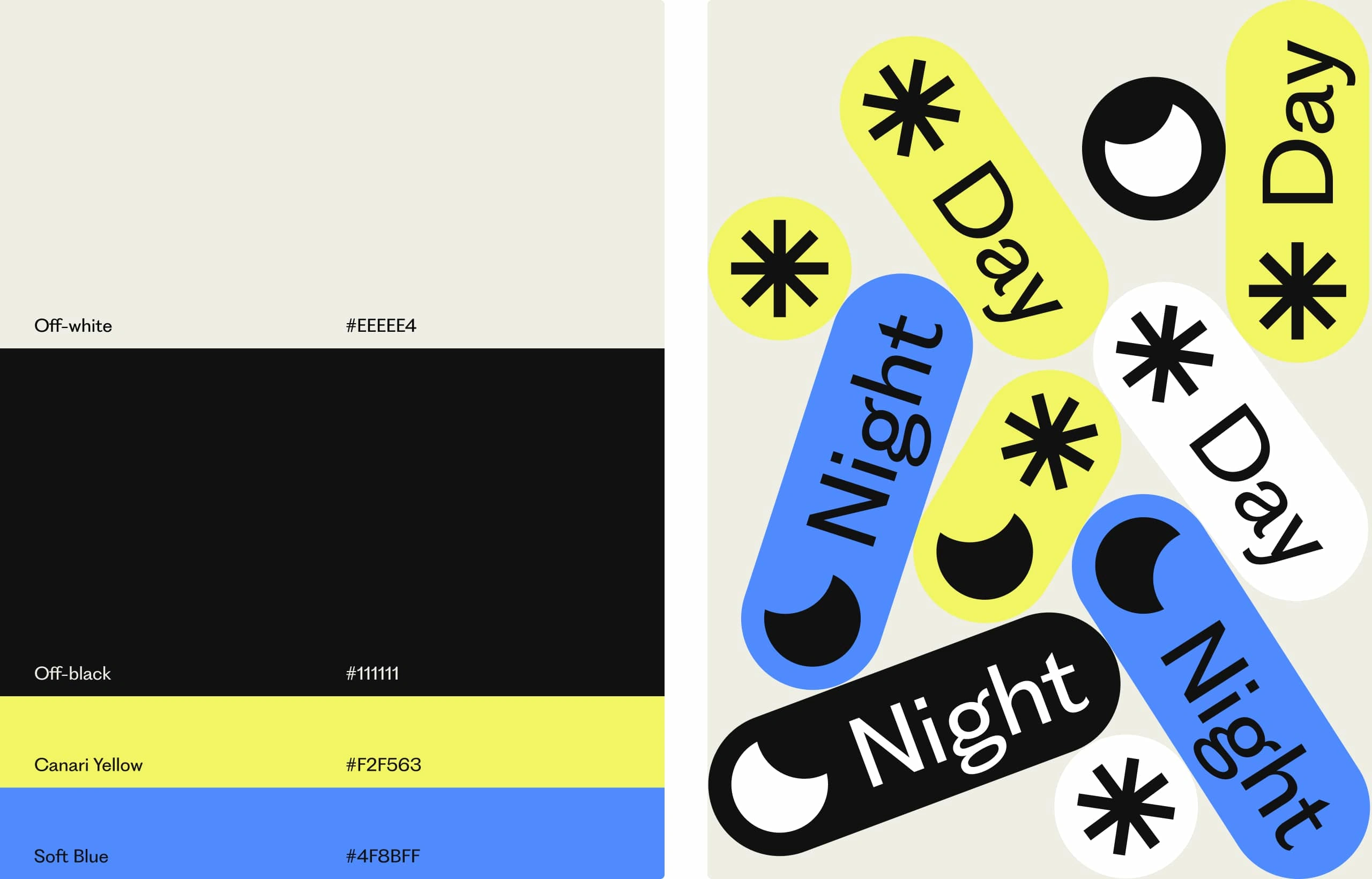
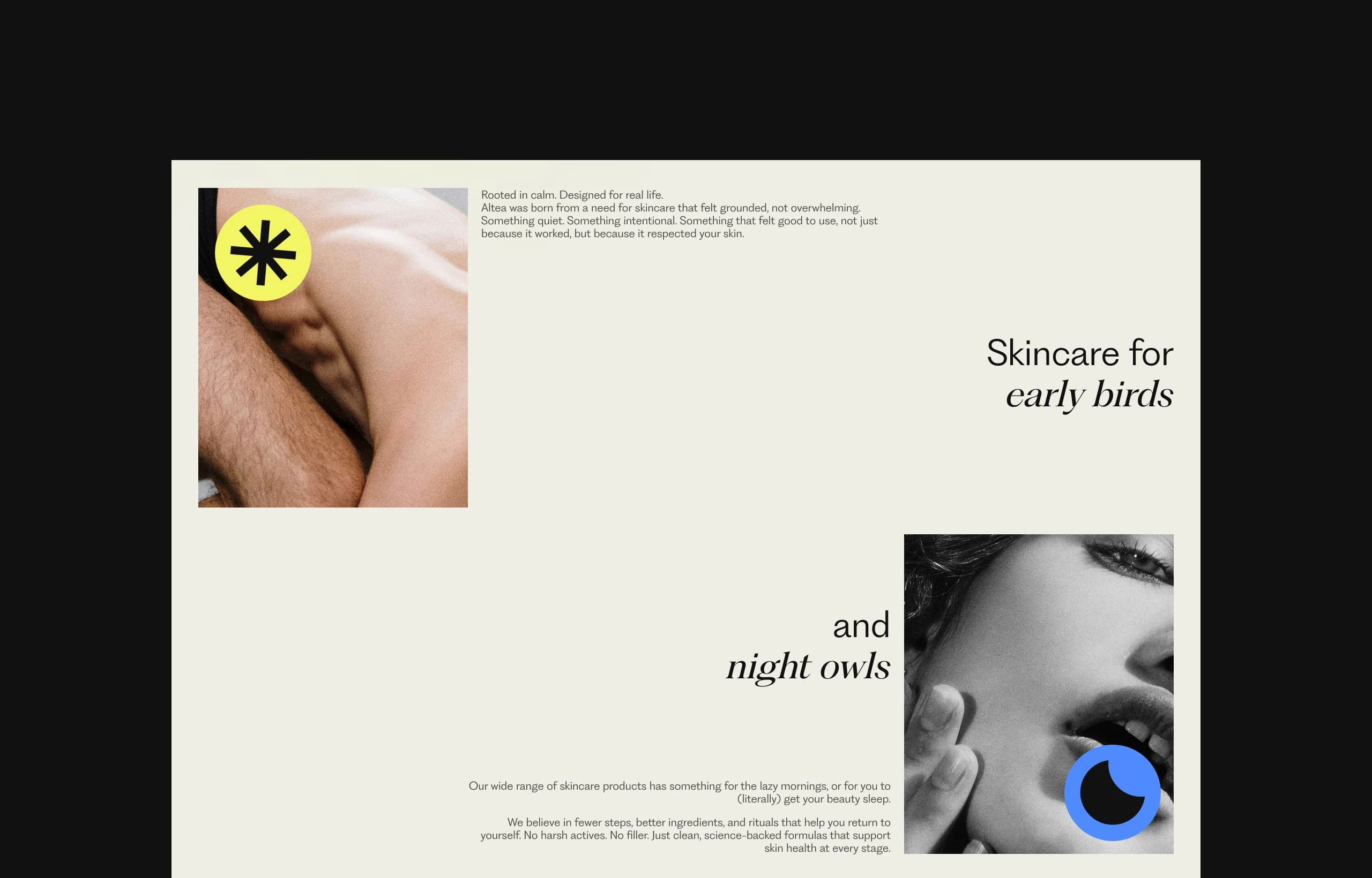
Altea’s visual identity brings the day and night concept to life through soft, contrasting colors that shift between warm daylight tones and calming evening hues.
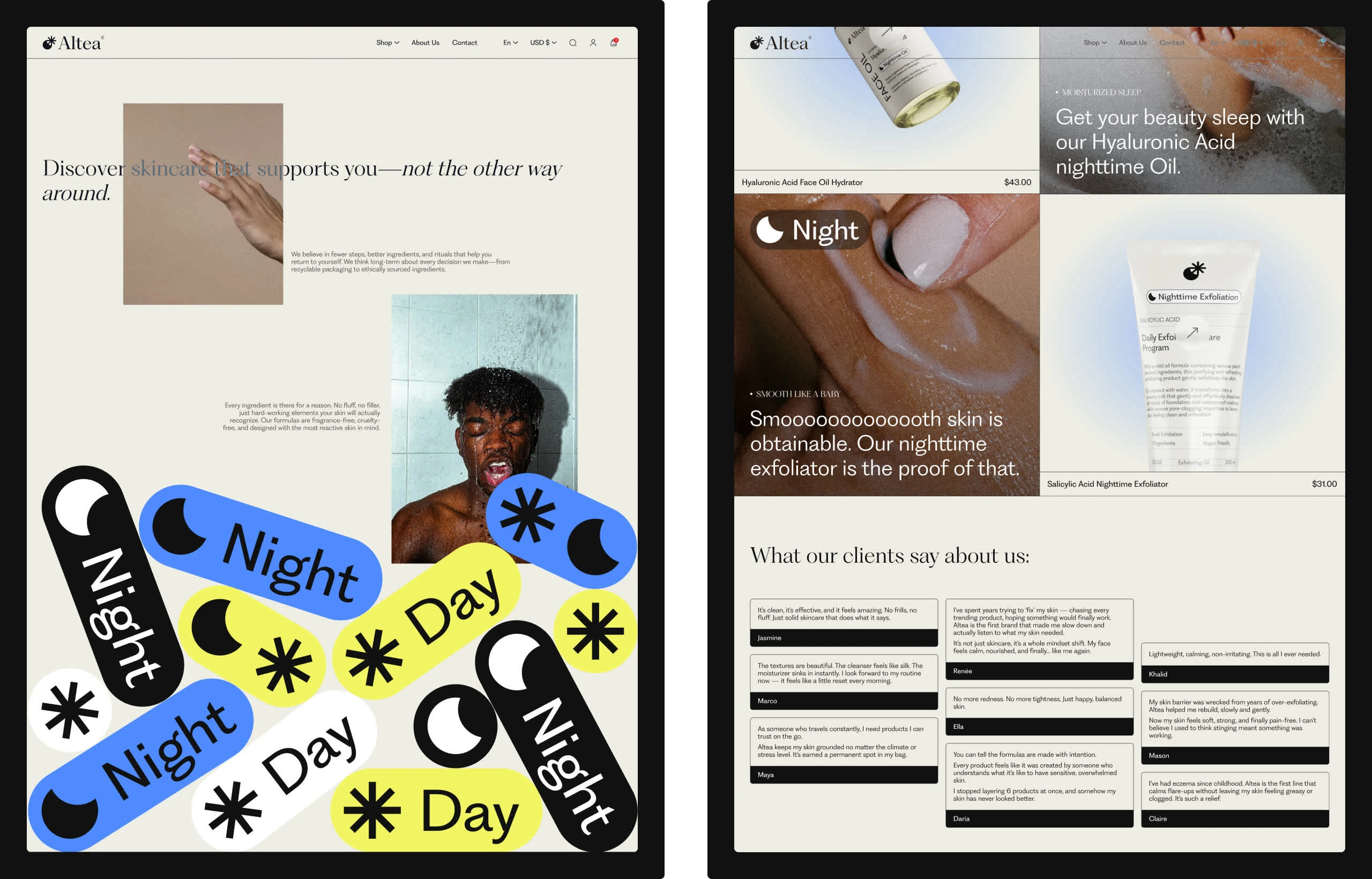
The logo combines sun and moon icons into a single, unified mark, creating a symbol of balance and flow. For typography, we embraced multiple variants from the same family, using the full range to create hierarchy, rhythm, and personality across the entire brand.
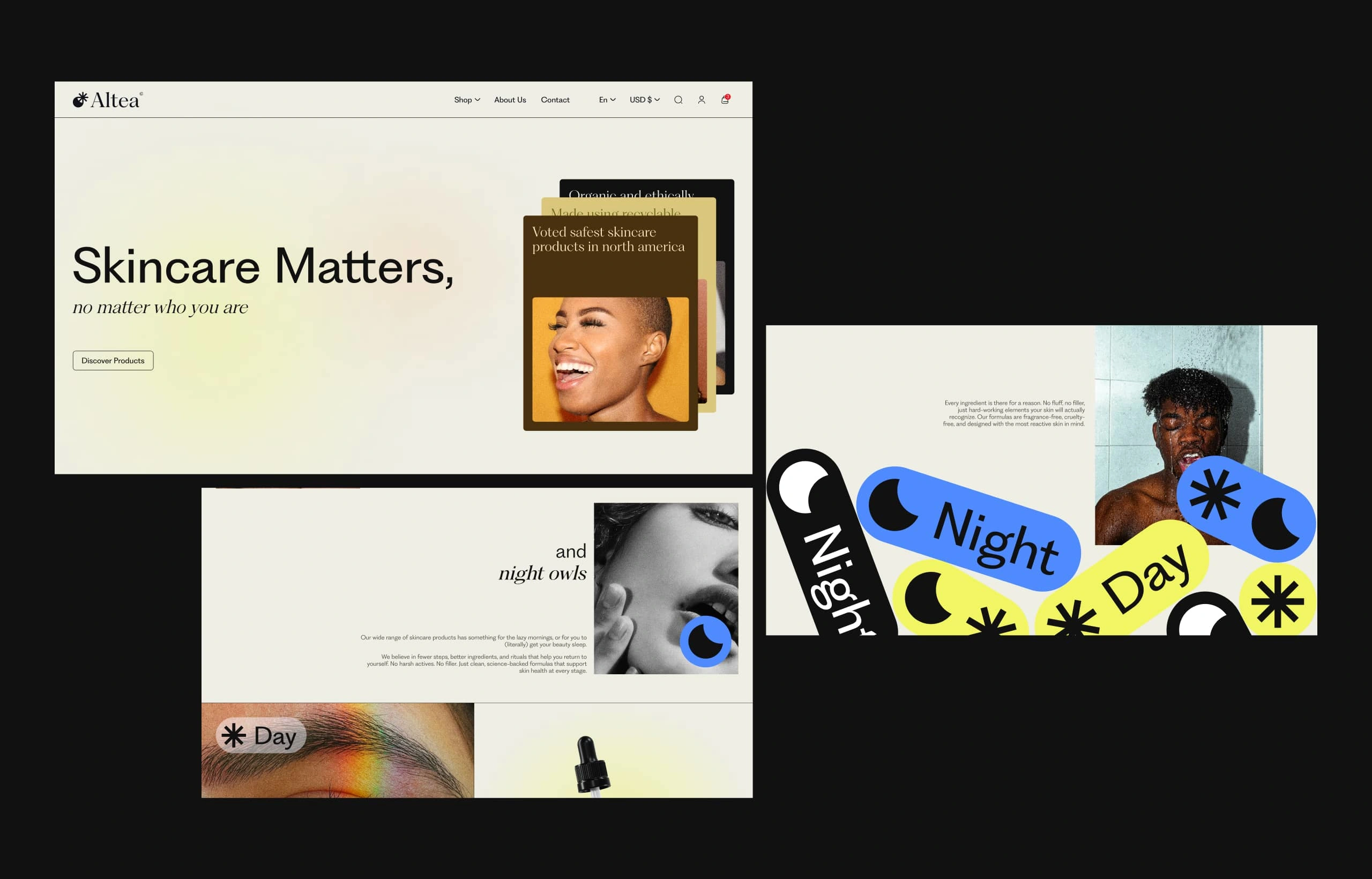
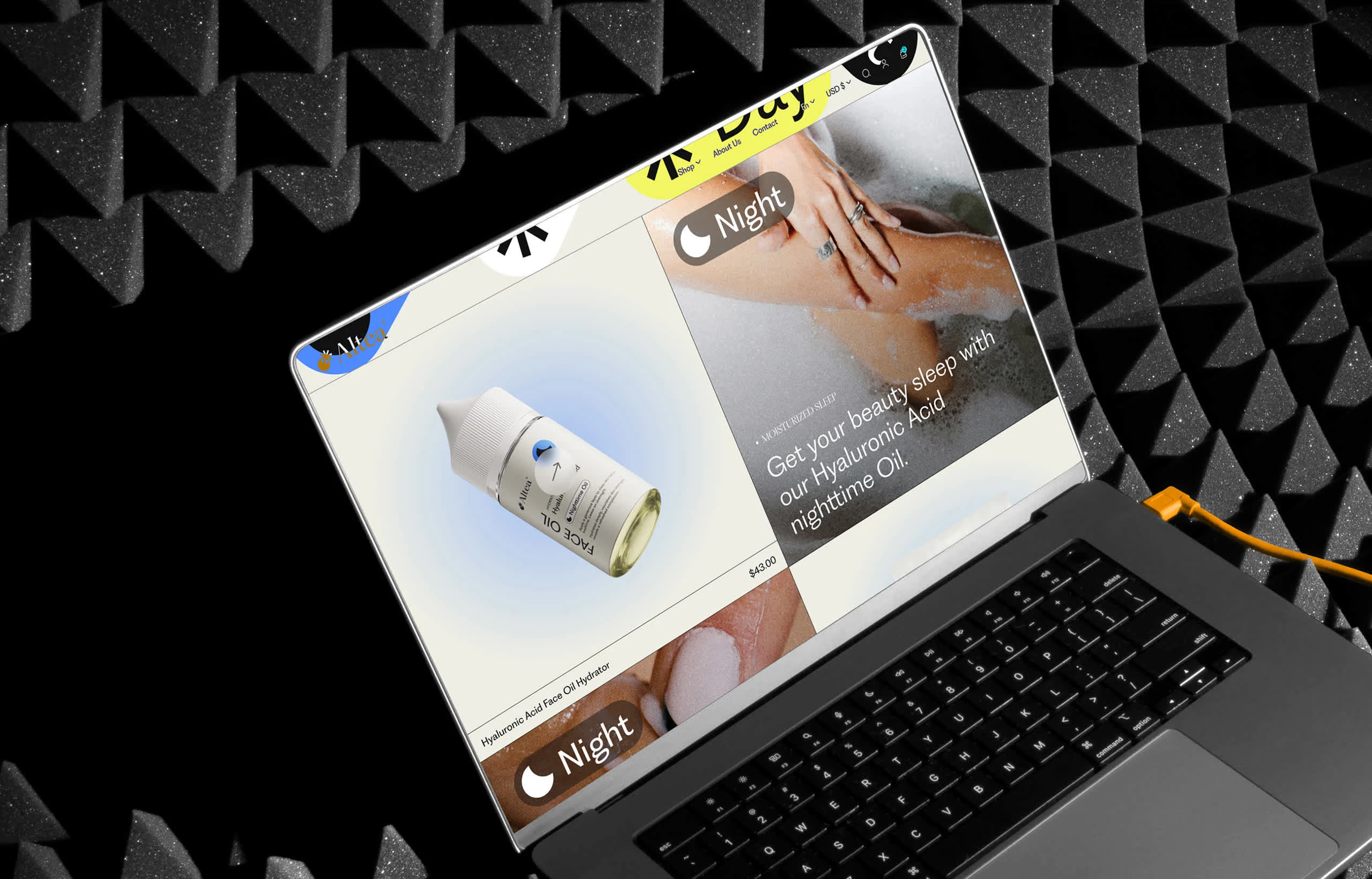
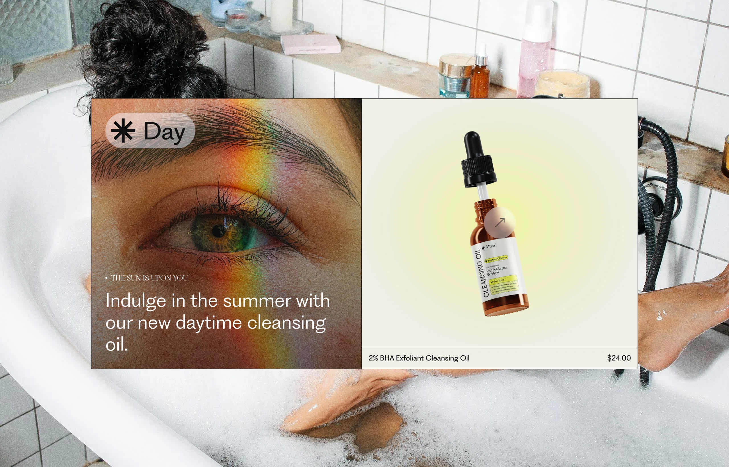
The Digital Part
When you land on Altea’s site, it feels like stepping into a story. First thing you see is the concept behind it all, the balance between day and night, energy and rest. Then you’re pulled into the highlight of a daytime product, with a light & bright vibe.
Slide a little further and the night collection kicks in. Deeper colors, slower energy, products built for slowing down and recharging. Client voices come next with testimonials. And when you’re ready to connect, the Contact Us section feels open & simple. Every section was built with human energy in mind.
Conclusion
Final thoughts: Altea’s brand and website were built to work together like two sides of the same coin. Just like the brand using the iconography of the sun and the moon. Throughout the work, I used this idea of duality in every medium. Every color, every icon, every line of text was built to tell a bigger story about balance & energy. The website isn’t just a store, it’s a space to connect with the heart of the brand.
What if a company gave you a full skincare routine? What if You didn't have to wonder which brand to buy from, when to apply products or how? What if Altea was the solution all your skin-head-aches?
Thank you for going through this case study!
If you like this project and would like to talk about how i could help you and your business transform your digital presence, book a discovery call with me:
Like this project
Posted Apr 26, 2025
A cosmetic brand and website built around the rhythm of day and night, blending human-centric design, storytelling, and youthful energy.