A Modern Web Redesign of the #1 Laundry App

CASE STUDY: Reimagining the ByNext Experience
Project: End-to-End UX/UI Redesign for ByNext Laundry Platform.
1. The Strategy: The "Three-Second Rule"
The core objective was to move ByNext from a service-heavy "directory" feel to a benefit-driven lifestyle solution. The redesign ensures that within three seconds, a user knows exactly what the service is, why it’s credible, and how to start.
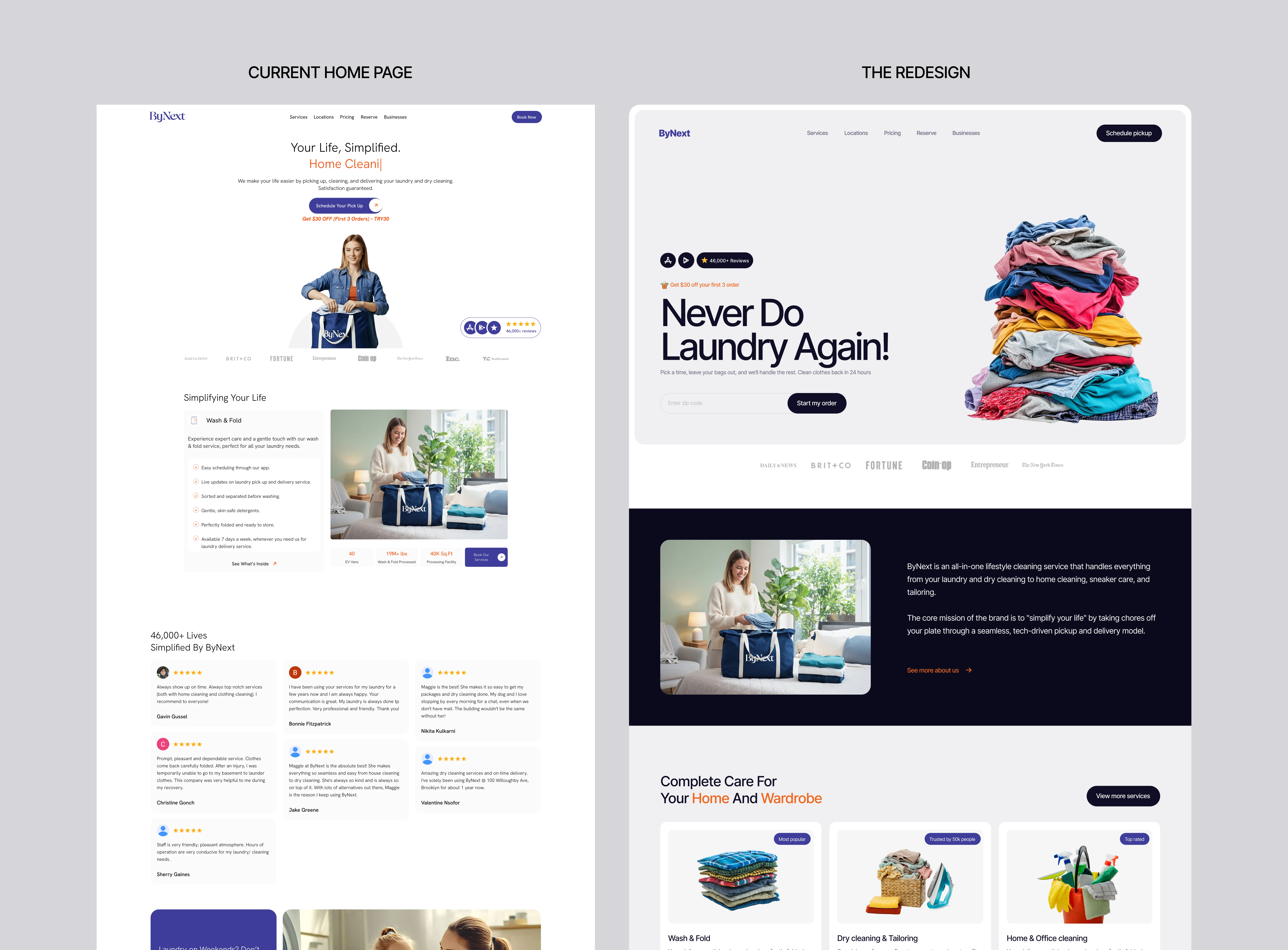
A. The Hero Transformation (Visual Clarity)
The Problem: The previous site lacked a clear focal point and immediate call-to-action.
The Solution: I introduced a high-contrast Hero section featuring the bold hook: "Never Do Laundry Again!"
Friction Killer: Integrated a Zip Code Validator directly into the Hero. This qualifies the user immediately, removing the #1 bounce reason: "Do they even serve my area?"
B. The Three-Card Service Architecture
In the original design, services were buried in text. My redesign uses three visual cards to make the decision process instant and effortless.
The Main View: I designed three clean cards (Wash & Fold, Laundry/Dry Cleaning, and Home Cleaning). Each card has an icon and just a few words of text.
The Goal: Keep the user moving. They can see the service they need in less than a second without being bombarded by paragraphs.
How the "See More" Button Works:
I added a "See More" button to each card. This is the "secret weapon" of the redesign:
Stops Information Overload: It keeps the home screen looking premium and "airy."
On-Demand Details: If a user wants to know exactly how their silk shirt is cleaned or what chemicals are used, they click "See More."
Dedicated Sub-Pages: This button leads to a detailed page that explains every specific part of that service (like tailoring, stain removal, or eco-friendly detergents) without cluttering the main journey.

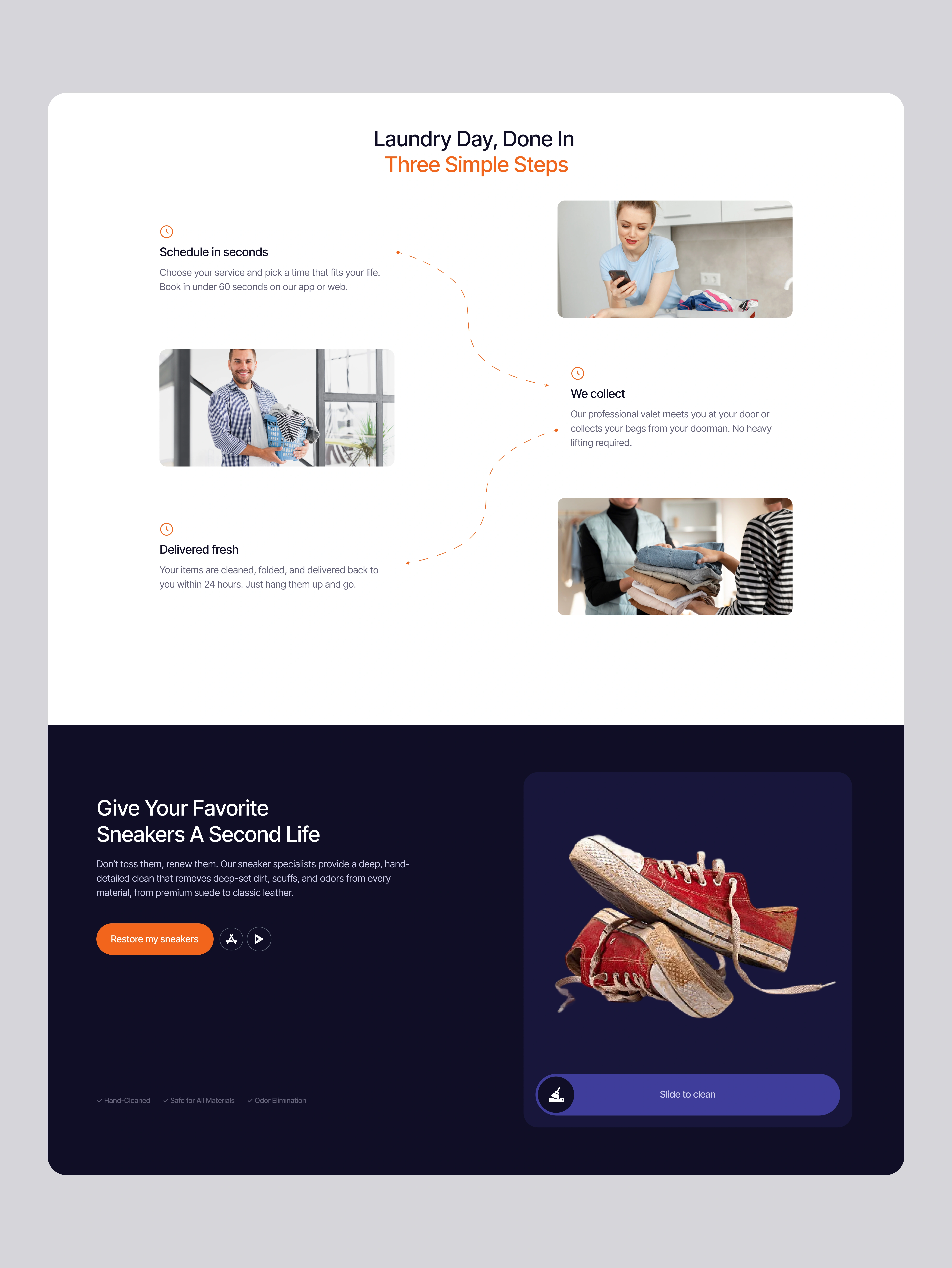
The "Rule of Three" Explainer: I redesigned the "How it Works" section into three digestible steps (Schedule → We Collect → Fresh & Folded), making the complex logistics feel effortless.
The Sneaker Hook: Recognizing sneaker cleaning as a high-interest trend, I created a dedicated "visual hook" section to capture a younger, style-conscious demographic.
C. The Result: A Conversion Engine
By shifting the focus from what ByNext does (laundry) to what the user gets (freedom), the redesign transforms the website into a high-performance sales tool.
Reduced Friction: Minimalist navigation and a "Zip code first" workflow.
Enhanced Trust: Deep integration of social proof and eco-friendly credentials.
Modern Aesthetic: A clean, "Airy" UI that mirrors the feeling of fresh laundry.

The redesign transforms ByNext from a service directory into a conversion-focused lifestyle brand. It isn't just about "doing laundry"; it’s about giving the user their time back through a fast, modern, and frictionless digital experience.
I also went ahead to work on their about us section

Conclusion: Design That Delivers Time
The ByNext redesign is a move from complexity to clarity. By stripping away the "noise" of the original site and replacing it with a conversion-focused hierarchy, the platform now does more than just list services—it solves a problem.
The final result is a digital experience that mirrors the service itself: clean, efficient, and reliable.
### Key Takeaways:
Friction is the Enemy: By integrating the Zip Code check and simplifying the service cards, we removed the mental barriers that stop a user from booking.
Benefits Over Features: The design stops selling "laundry" and starts selling "freedom from chores."
Scalable Trust: Through strategic placement of social proof and a professional B2B section, the site builds the credibility needed to handle everything from a single gym bag to a hotel’s entire linen inventory.
This redesign proves that in a fast-paced market, simplicity and clarity is the ultimate premium.
Like this project
Posted Jan 9, 2026
Laundry is a chore; booking it shouldn't be. I redesigned the ByNext web experience to focus on speed, clarity, and trust.


