Retention Strategy and Experts Portal Design for StupidFish

Lisa Demchenko

Overview
StupidFish is an AI career-discovery app. People take a conversational assessment, get a personal “reveal” of who they are at work, see career paths matched to their strengths, and then pursue one through a step-by-step plan, with a paid membership for unlimited chats, pursuits and tailored resumes.
The launch brought in plenty of new users, but very few stayed past the first week, and many trials were cancelled before the first charge. I was brought in to understand why and to design what came next: a retention strategy for the whole product, an Experts portal on web where users book 1-on-1 sessions with professionals, and a peer Community on mobile. Alongside that I redesigned the web app and the mobile Home, Careers and Profile experiences.
Role: Product Designer & UX Strategist · Scope: strategy, web app, mobile concepts · Platforms: web and iOS · Tools: Figma, FigJam, Claude
01 · Strategy: designing the retention loop
The problem
I ran a UX and growth audit across product analytics, the live app build and every onboarding screen. Acquisition was healthy; the drop happened after the onboarding reveal. The reveal was the strongest moment in the product, but it answered the user’s question and closed the loop. Home showed the same content on every visit, the recurring surfaces (push, the Weekly Catch, fresh matches) weren’t delivering anything new, and Experts, the most action-oriented promise, showed “coming soon”. The trial week was effectively empty.
The approach
I mapped the full journey in FigJam, from onboarding to a finished chapter, and used the Hooked model (trigger, action, variable reward, investment) to decide what each step needed to give people a reason to return. The loop attaches to a feeling users already have: “Am I actually making progress, or just stuck?”
Onboarding moved into the chat, so the setup questions and the assessment feel like one short conversation instead of forms. The reveal now ends with a first move instead of a finish line. Matches explain themselves with pay, demand and “why it fits you”, and when a user rejects a match, the companion reads what kind of miss it was (fit, constraint or context) and asks two or three targeted follow-ups rather than starting over. Pursuing a path starts a plan in chapters: each one saves insights, ends with a seal and unlocks the next, so there is always something waiting tomorrow.
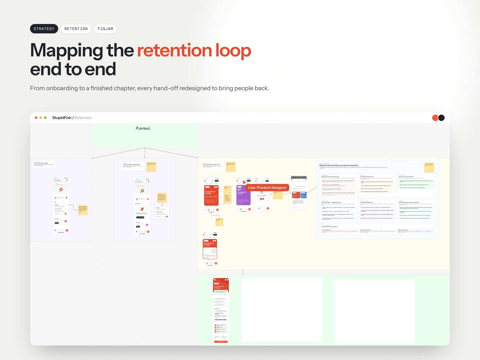
Retention flow, mapped end to end
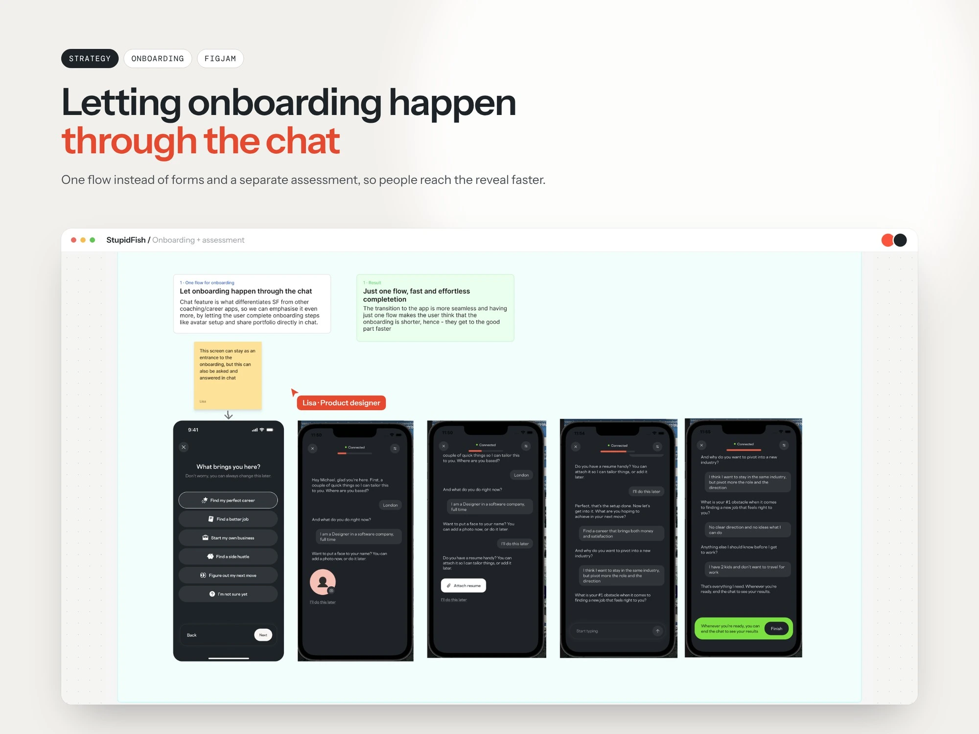
Letting onboarding happen through the chat
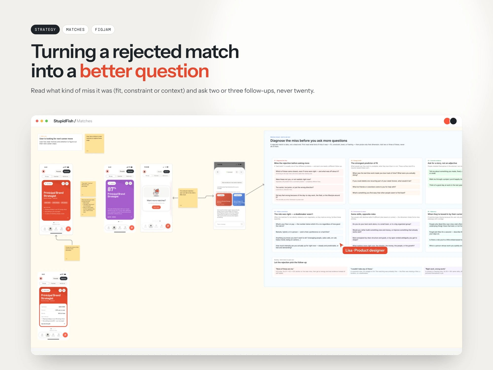
Match recovery: a fit, constraint or context miss
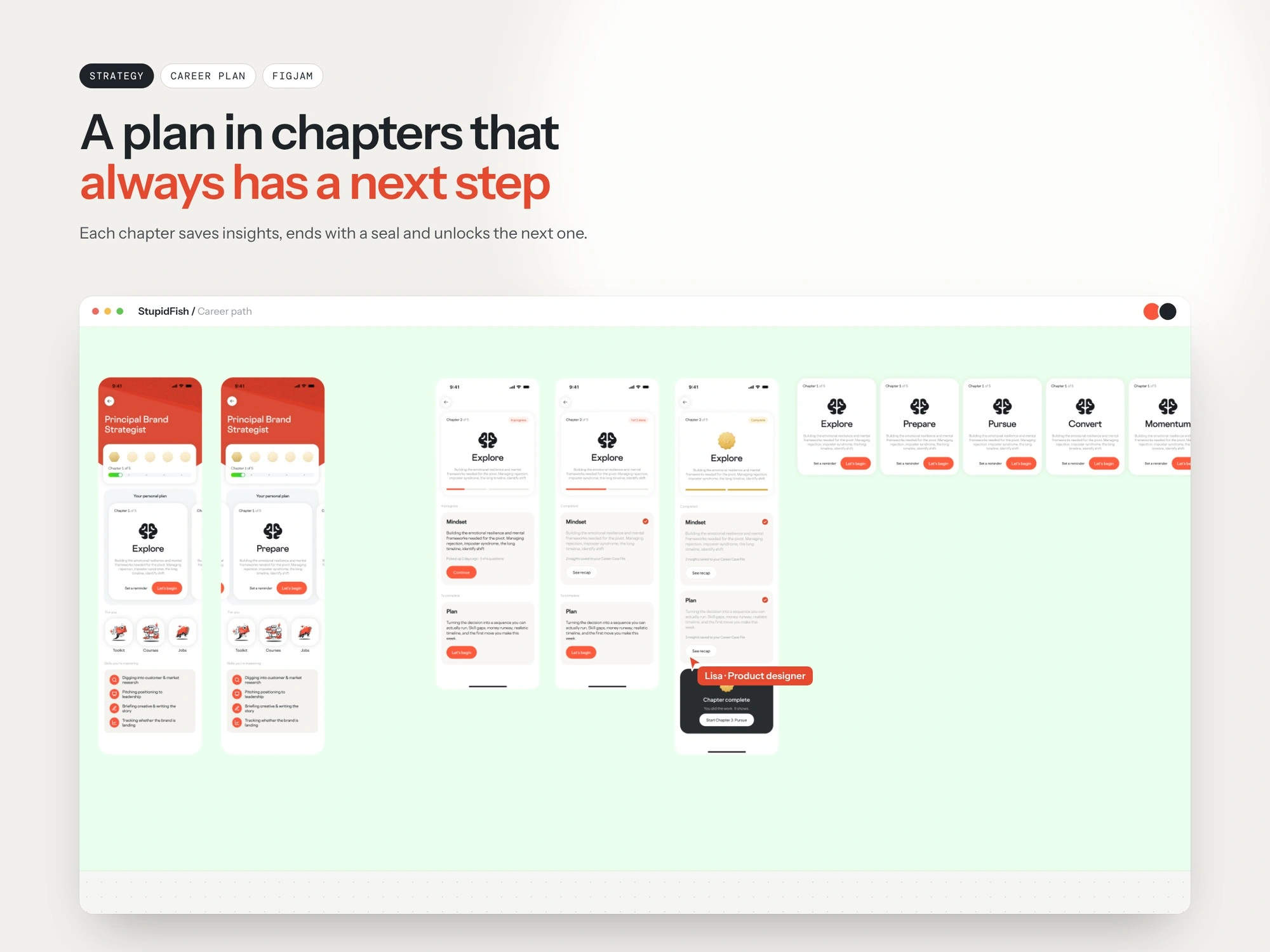
A plan in chapters with a next step
02 · Experts portal (web)
Experts turned the app from “here is your result” into “here is someone who has made this move”. The goal was to make booking a session feel like a natural next step in the plan, not a separate marketplace.
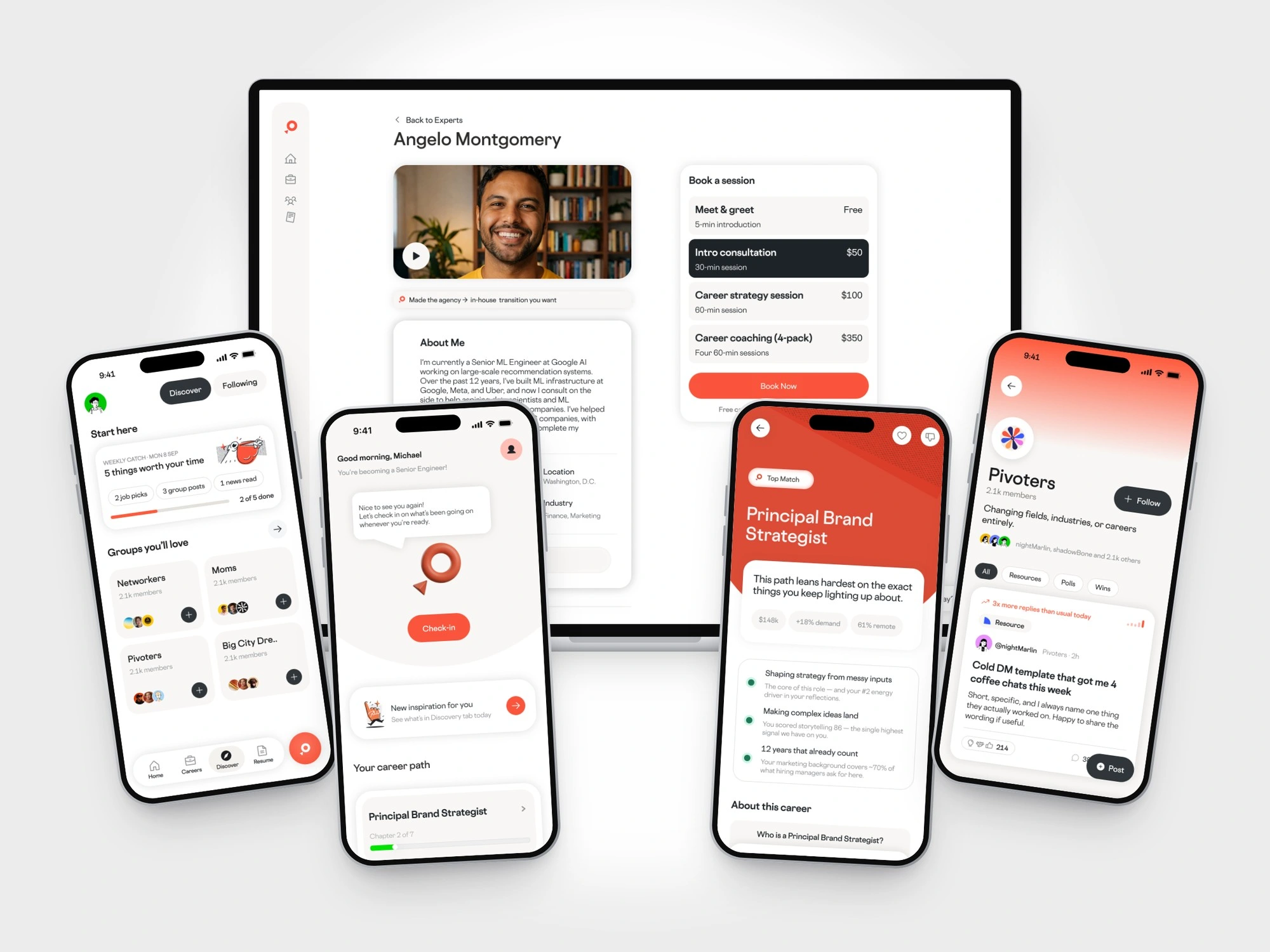
Discovery is matched, not listed. Every expert card carries a personal match reason pulled from the user’s own profile (for example, “Made the agency → in-house transition you want”), alongside rating, price and availability. A video intro and bio sit next to the list, so users can judge the person before the price. A filters drawer covers rating, price per session, availability and experience for people who prefer to browse.
The expert profile is built as a ladder of commitment rather than a single price: a free 5-minute meet-and-greet removes the risk of a first contact, a 30-minute intro consultation is the highlighted default, and longer strategy sessions and a coaching 4-pack are there for people ready to go further. Free cancellation is stated right under the button. Experts also appear where people get stuck: next to career matches (“Need some guidance?”), as upcoming sessions on Home, and as a module inside the career plan.
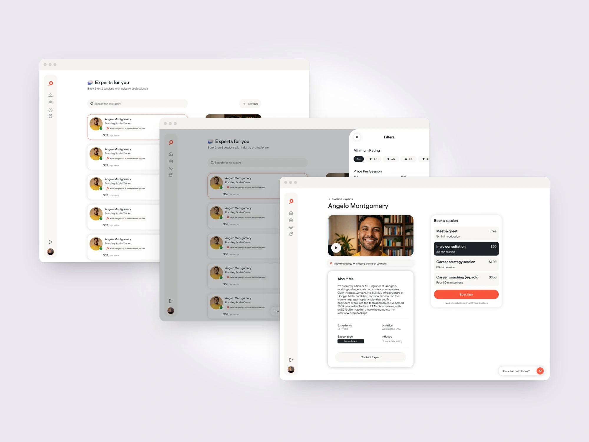
From discovery to booking
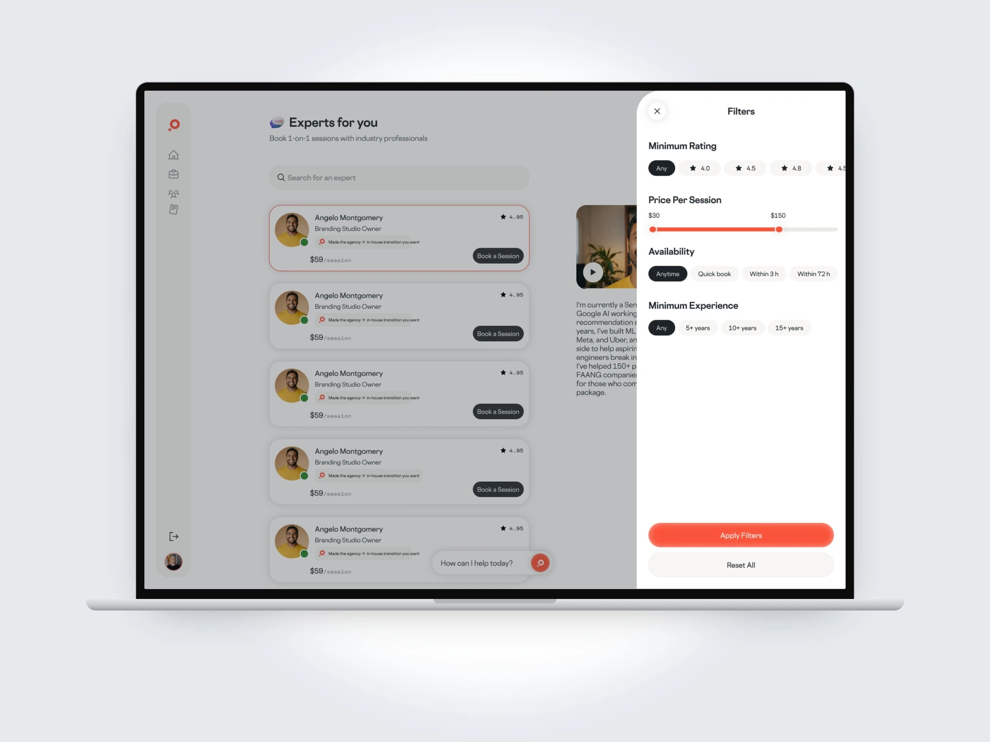
Filters: rating, price, availability, experience
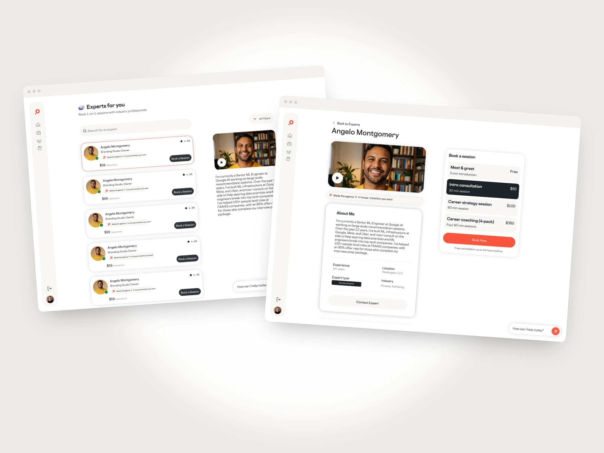
Experts list and profile
03 · Home & Careers (mobile)
Home needed to change every visit. Returning users are greeted by the companion with a check-in, see “new inspiration for you” from Discover, and their career path with the chapter they’re on and the next five-minute step. First-time users get their own state: no goal is required, they can explore first, and a clear prompt points them to review their matches when they’re ready.
Careers turns a match into a decision. Match details lead with why this path fits, written in the user’s own signals (“You scored storytelling 86, the single highest signal we have on you”), followed by pay, demand and remote share, what the job is really about, a typical week, and an honest “you’d love / challenges” trade-off before the “Pursue this path” button. Once pursued, the plan breaks into chapters (Explore, Prepare, Pursue and beyond), each with focused modules like Mindset and Plan and one clear way to start.
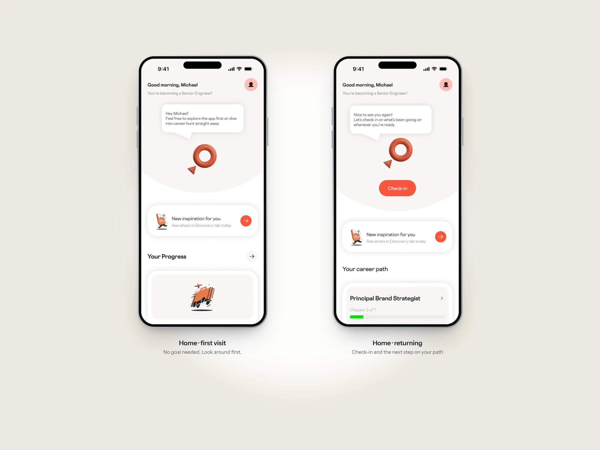
Home: first visit and returning
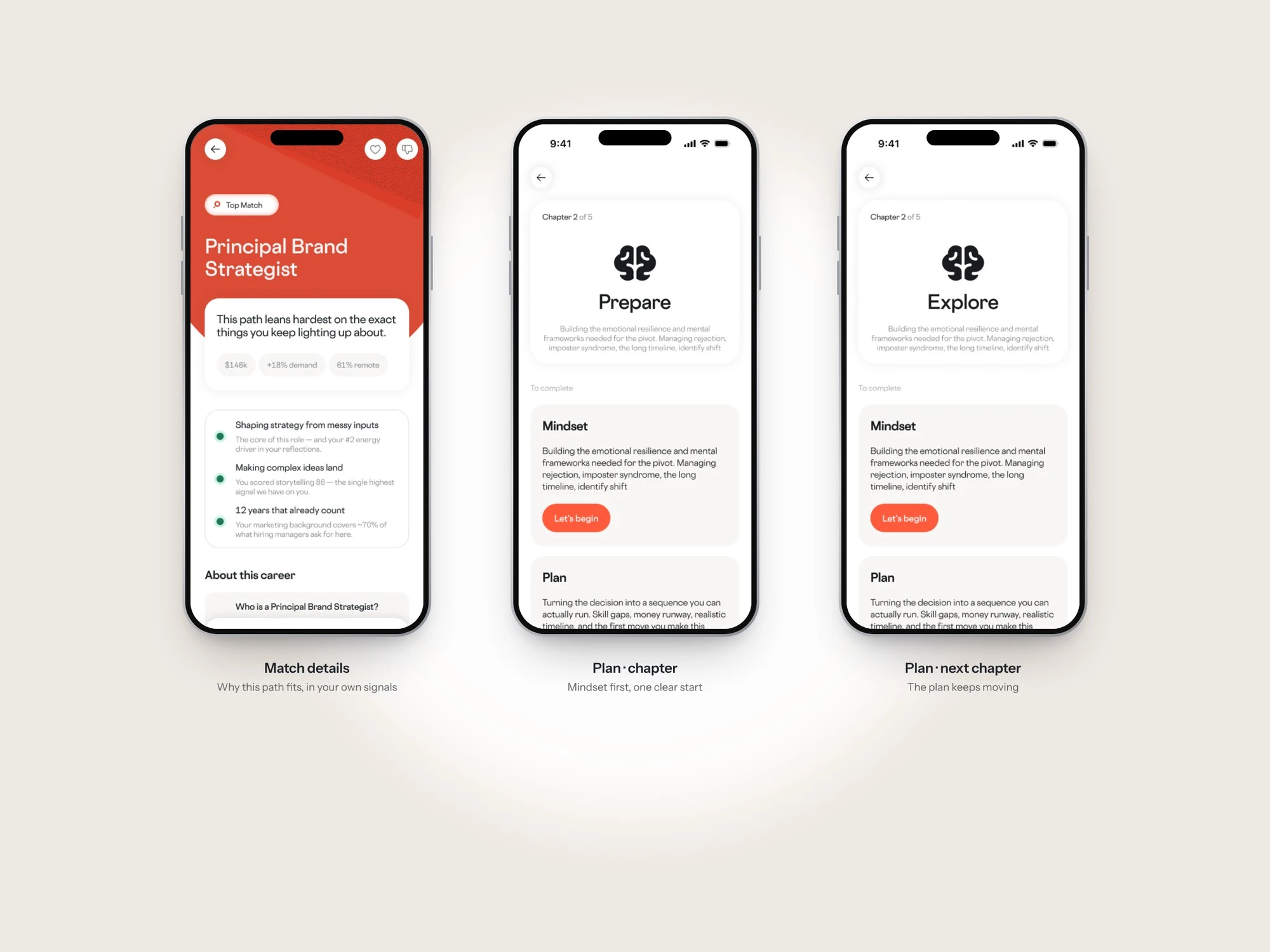
Match details and plan chapters
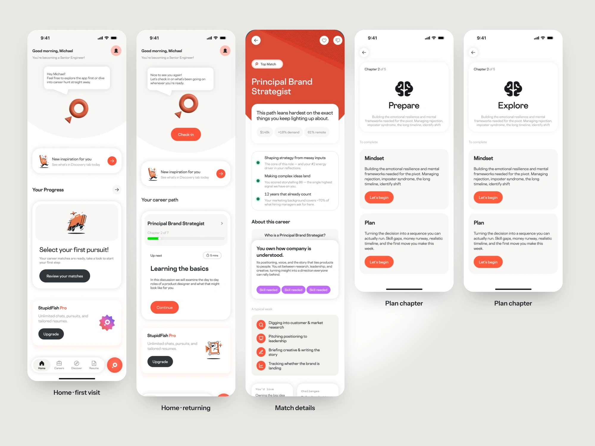
Home and Careers, full screens
04 · User profile
The profile is the investment layer of the loop: the more someone uses the app, the more valuable it becomes. It brings together a career card (who you are, your capabilities and where you thrive), wins logged over time, and the details that power matching (current role, salary, city, career roadblocks and resume), each editable in place. Share, Replay and Edit sit right under the card; Replay re-runs the reveal.
Because career conversations are sensitive, community visibility is fully in the user’s hands. Everyone starts anonymous, posting under a handle with their name, photo and career card hidden. Going public is a single toggle that lists exactly what becomes visible, followed by a confirmation sheet that spells it out and reassures that the resume, saved jobs and assessment always stay private. The public profile shows the career card, groups, and options to message or follow.
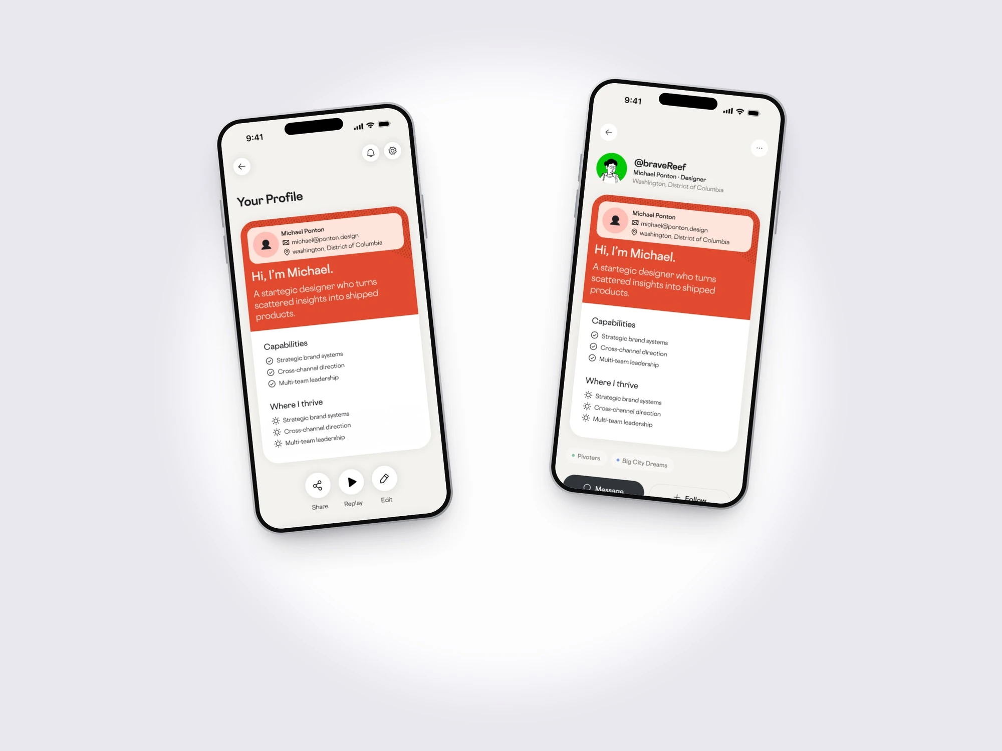
Your profile and the public view
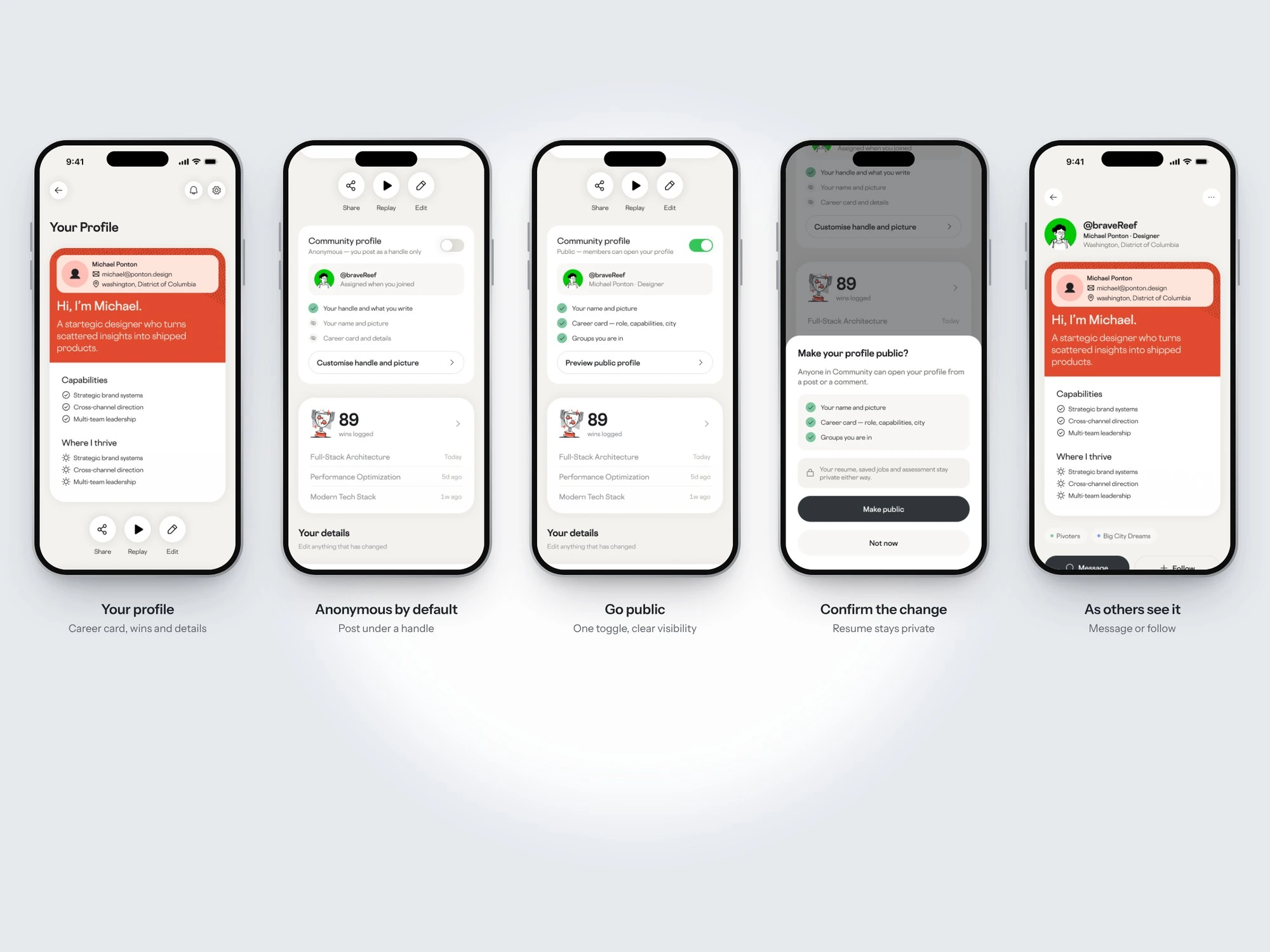
Anonymous by default → go public → confirm → as others see it
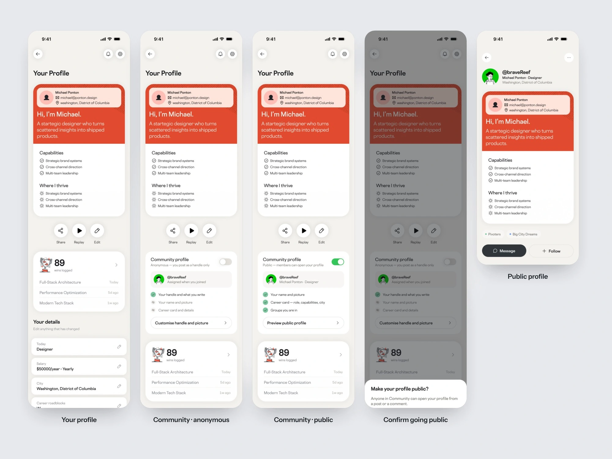
Profile, full screens
05 · Community (mobile concept)
The Community gives people a reason to come back that doesn’t depend on new content from the team: other people on the same path. Groups are organised around the move people are making (Pivoters, Returners, Networkers, Big City Dreamers), not around job titles.
Discover opens with the Weekly Catch (five things worth your time, with progress) and groups you’ll love, joinable in one tap. The Following feed filters by group and keeps a “share a win, question or resource” prompt at the top. Group pages lead with who’s in it and a prompt to ask something, with filters for resources, polls and wins. Posts share one card anatomy with a type tag, career-specific reactions (insightful, helpful) and a “Join 34 people discussing” footer that turns readers into participants.
Creating a post starts by choosing what you’re sharing: support, feedback, advice, a win, a resource or a poll. The type shapes the form, so every post lands in the feed as a clear, typed card. I explored a guided form, a minimal editor and a version with attachments to find the lightest way to post.
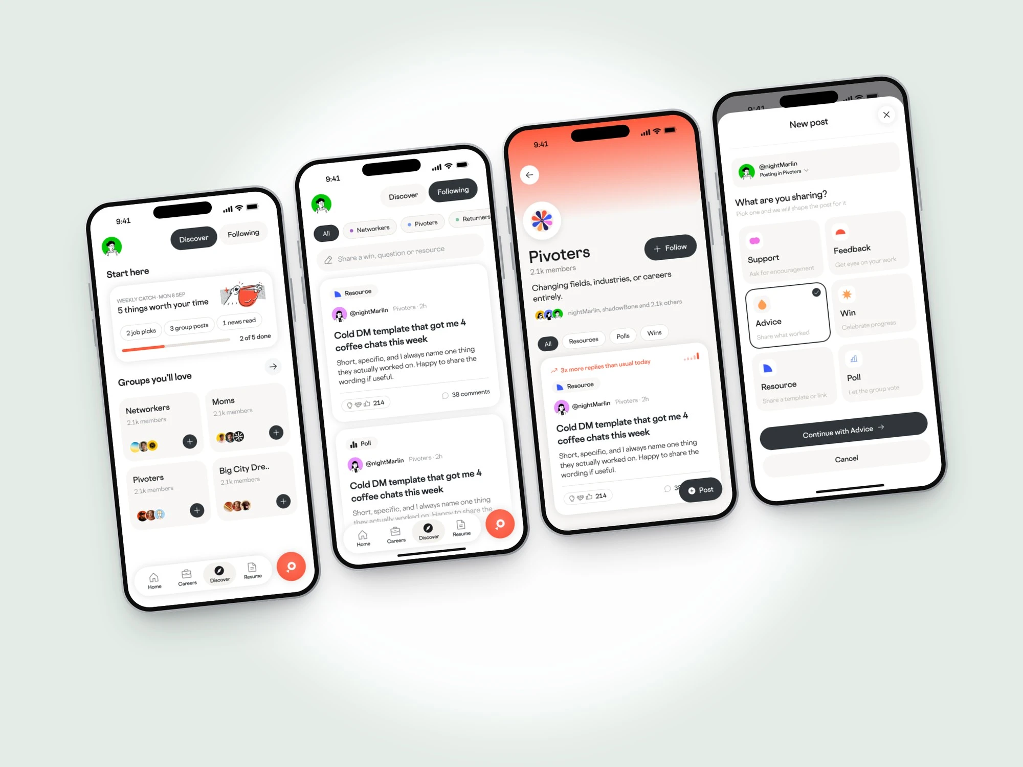
Discover, feed, group page and posting
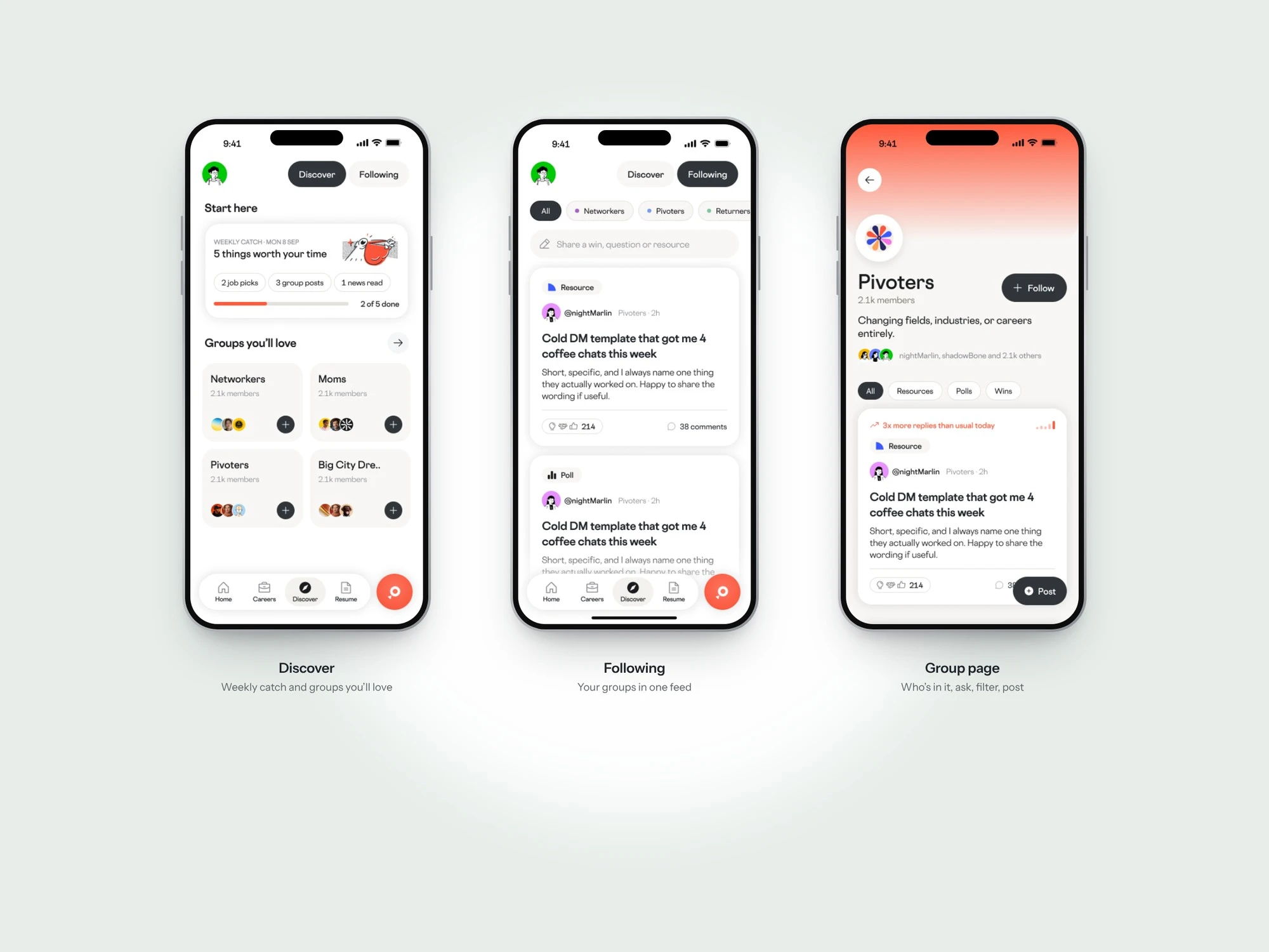
Discover, Following and a group page
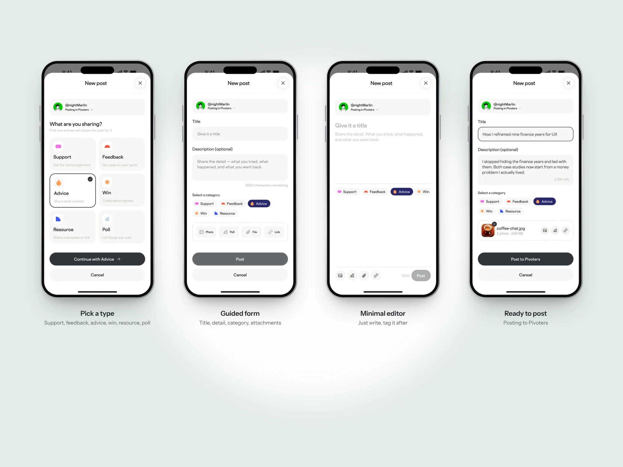
Creating a post: pick a type, write, post
Outcome
The value no longer ends at the reveal. The strategy gave the team a shared model for retention and a concrete first-week journey, the Experts portal turned a “coming soon” dead end into a bookable next step, and the Community concept added a reason to return that grows with every member.
Delivered: UX and growth audit, retention strategy and journey maps, plan framework, Experts portal (discovery, filters, profile and booking), web app redesign, mobile Home, Careers and Profile, and the Community concept (Discover, feed, groups, posting and identity).
Like this project
Posted Oct 9, 2026
UX strategy and product design for an AI career app: retention loop, Experts portal on web, community concept, and Home, Careers and Profile on mobile.
Likes
0
Views
0