Documenting Addepar's Design System
Background
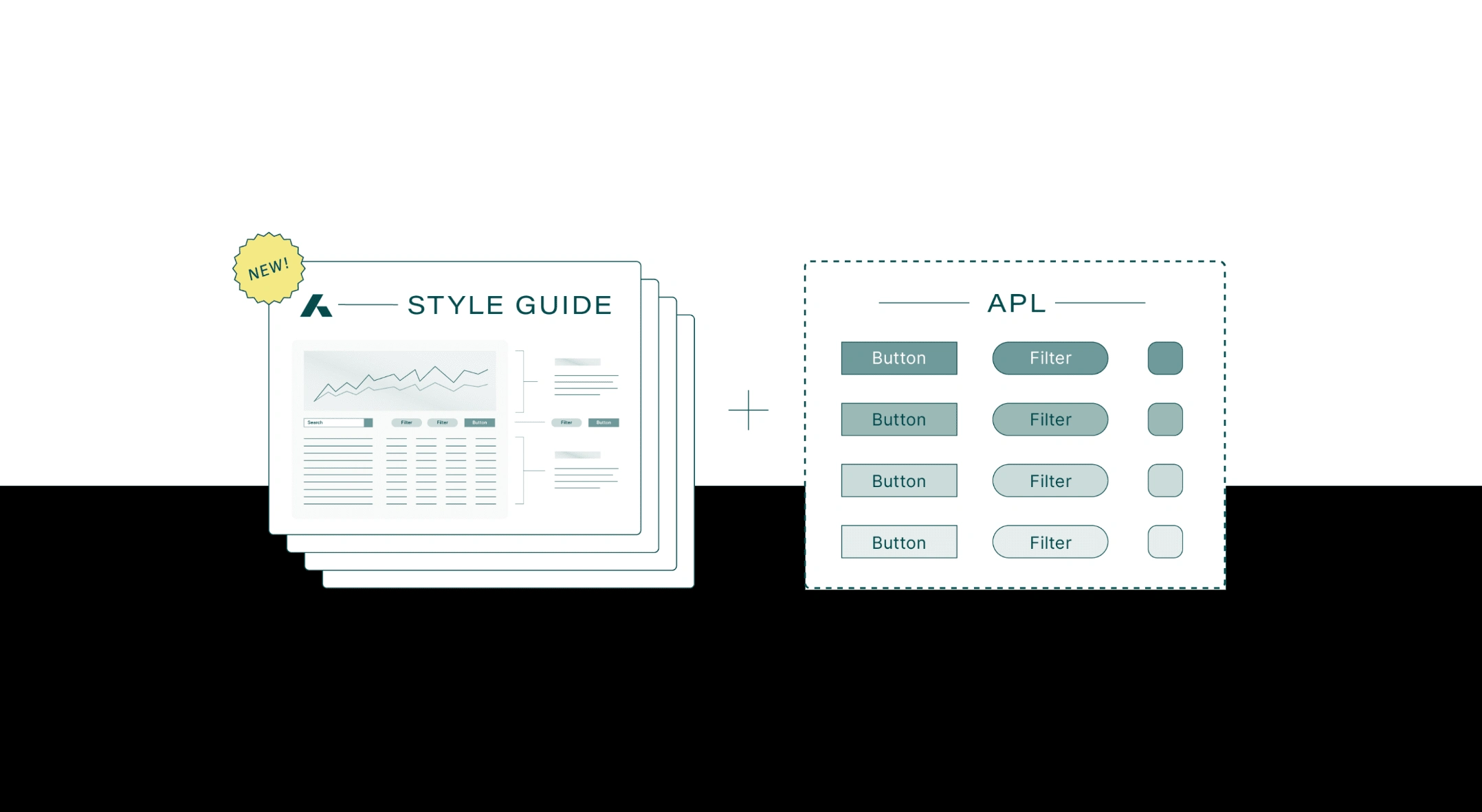
In Spring 2024, the Addepar design system team had reached a new milestone –– they were wrapping up a new component library that would be used to redesign the entire platform.
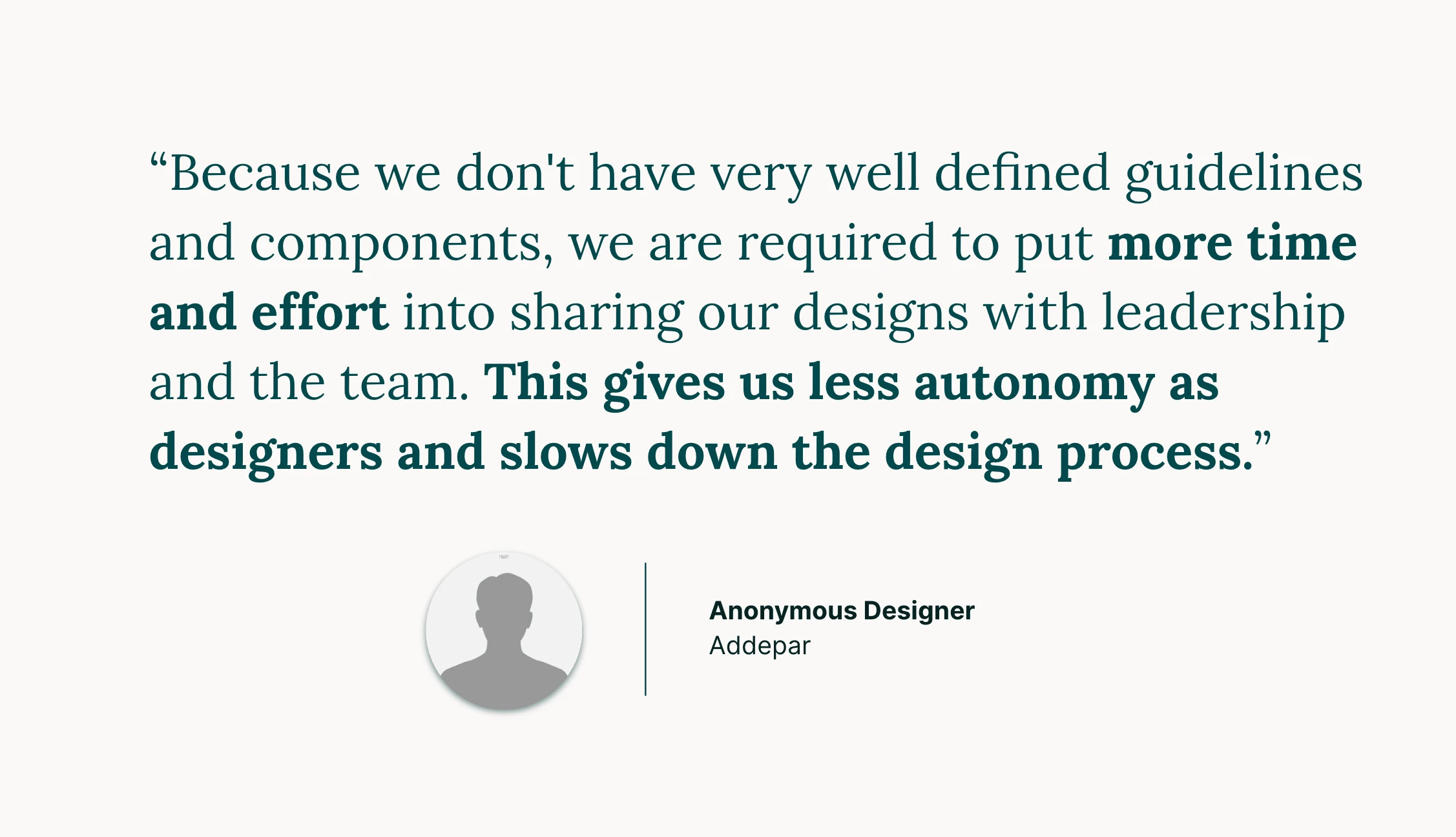
However, the lack of documentation on how, where, and when to use these components was preventing them from an official launch.
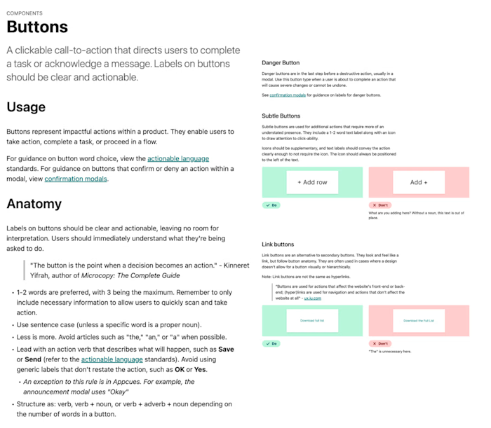
I was brought in to document 32 components, primarily from scratch, as well as design the image examples to publish to the Docs site by the summer.
The goal was mighty but simple: enable Addepar designers to work more efficiently and consistently through detailed documentation.

Process
Planning
I began by planning out the project:
Created a support plan, outlining the proposed tasks, deliverables, and timeline.
Created a draft template
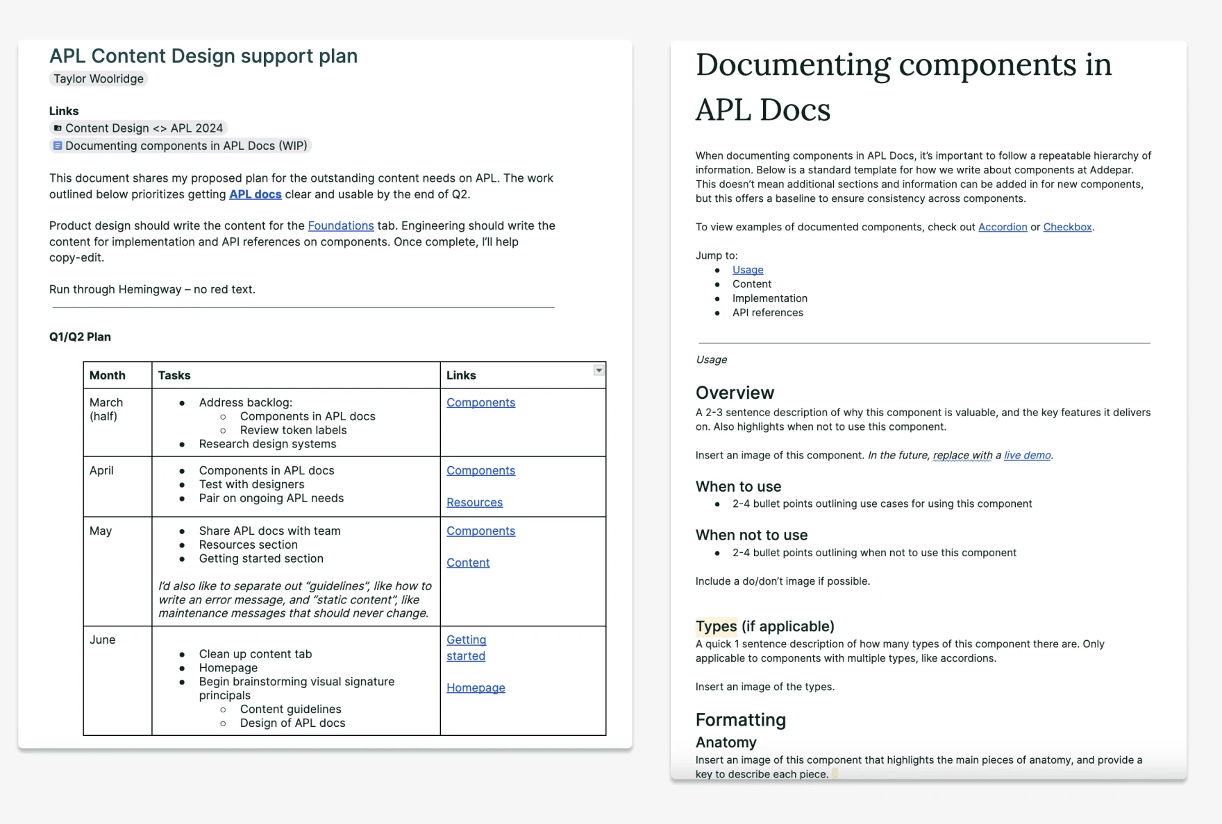
Support plan and draft template
Writing and editing
From there, I audited and organized tasks that needed to be completed:
Made a list of all components that needed documentation, with any relevant resources.
Set a goal to complete ~4/week, working within google docs to allow for easy collaboration with my product design partner.
Documented progress by sharing the status of each component.
Moved all completed docs to a Google folder.
Went back to edit and align all anatomy content for consistency
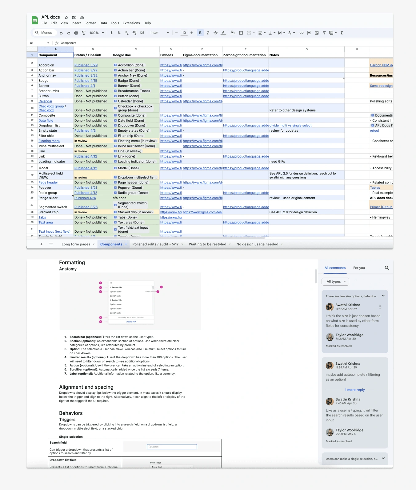
Progress tracking and live collaboration
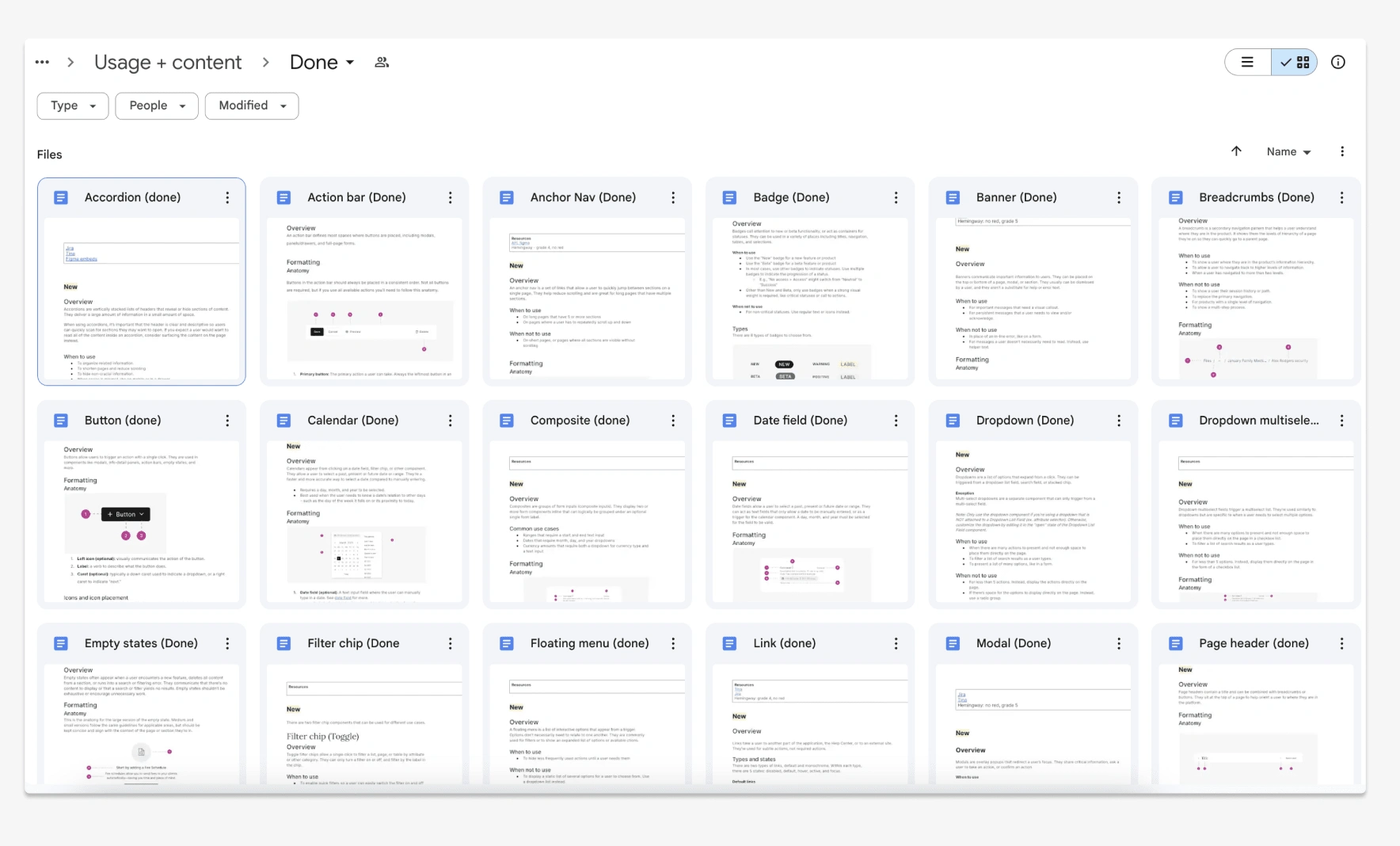
Completed documentation
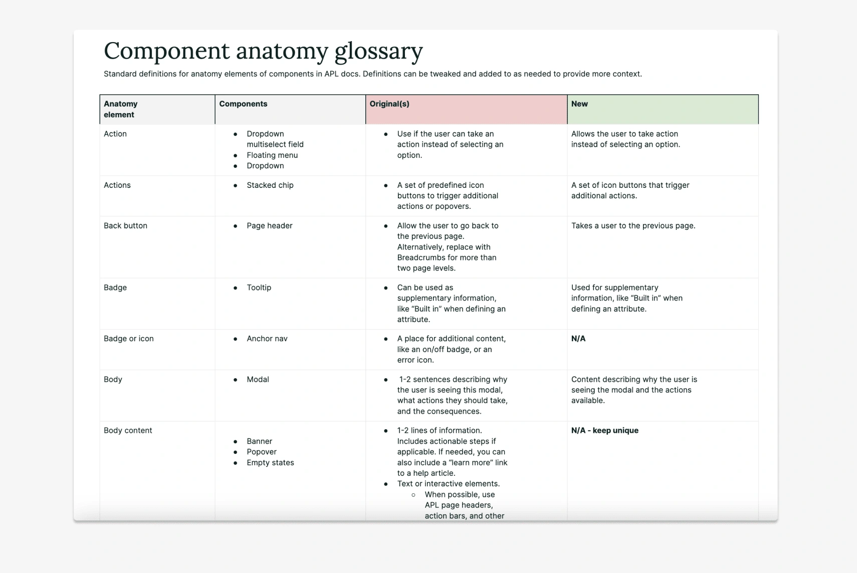
Align copy for consistency
Examples
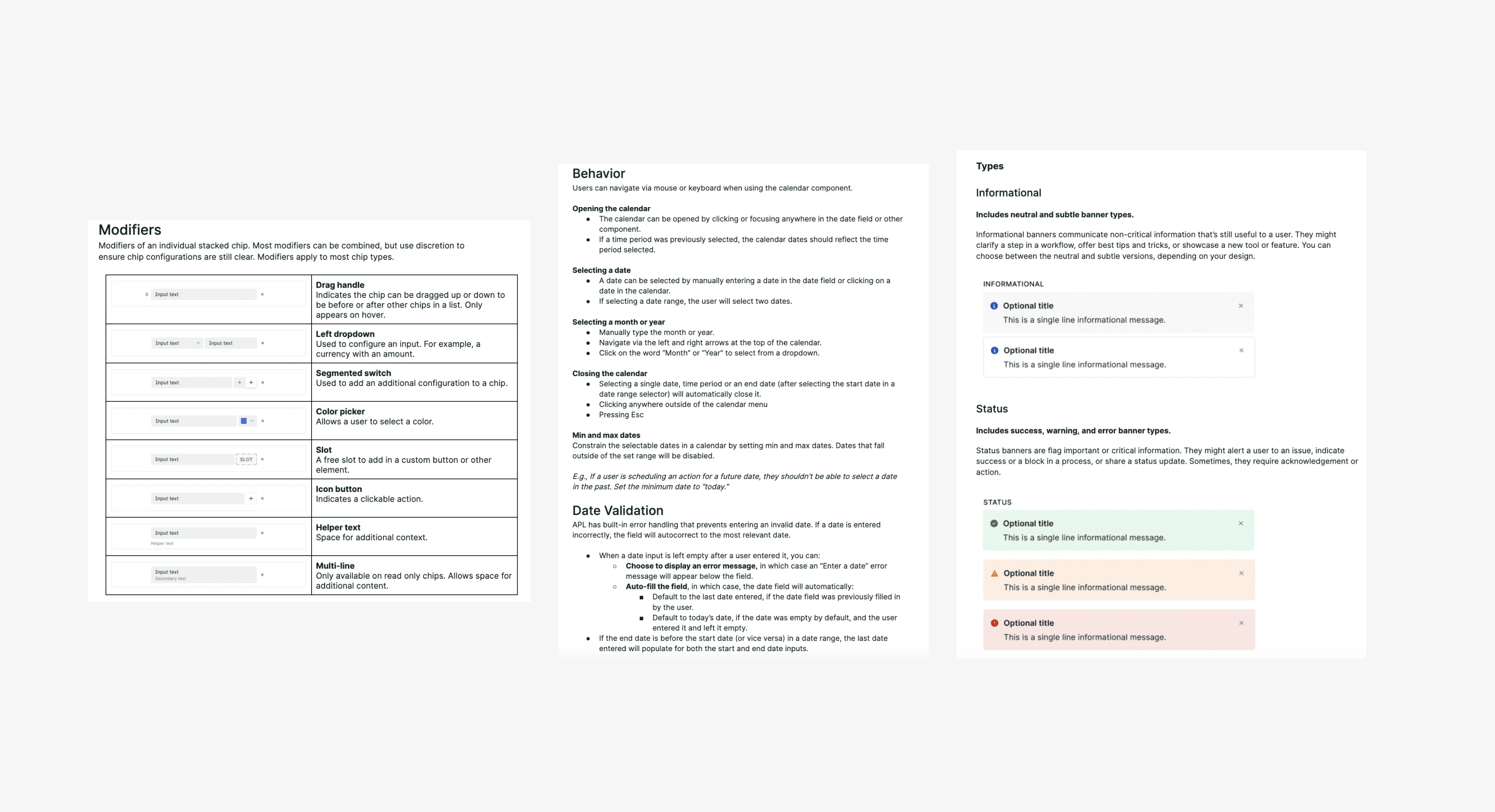
Content examples
Designing images
All components have images to show things like anatomy, types, and placement. I wanted to again ensure consistency across components, so I began working on additional resources in Figma:
Image standards
An APL Docs example
An image template
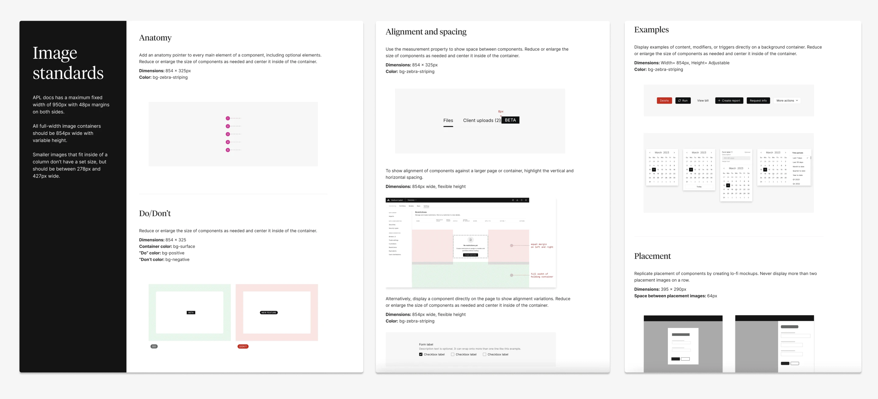
Image standards
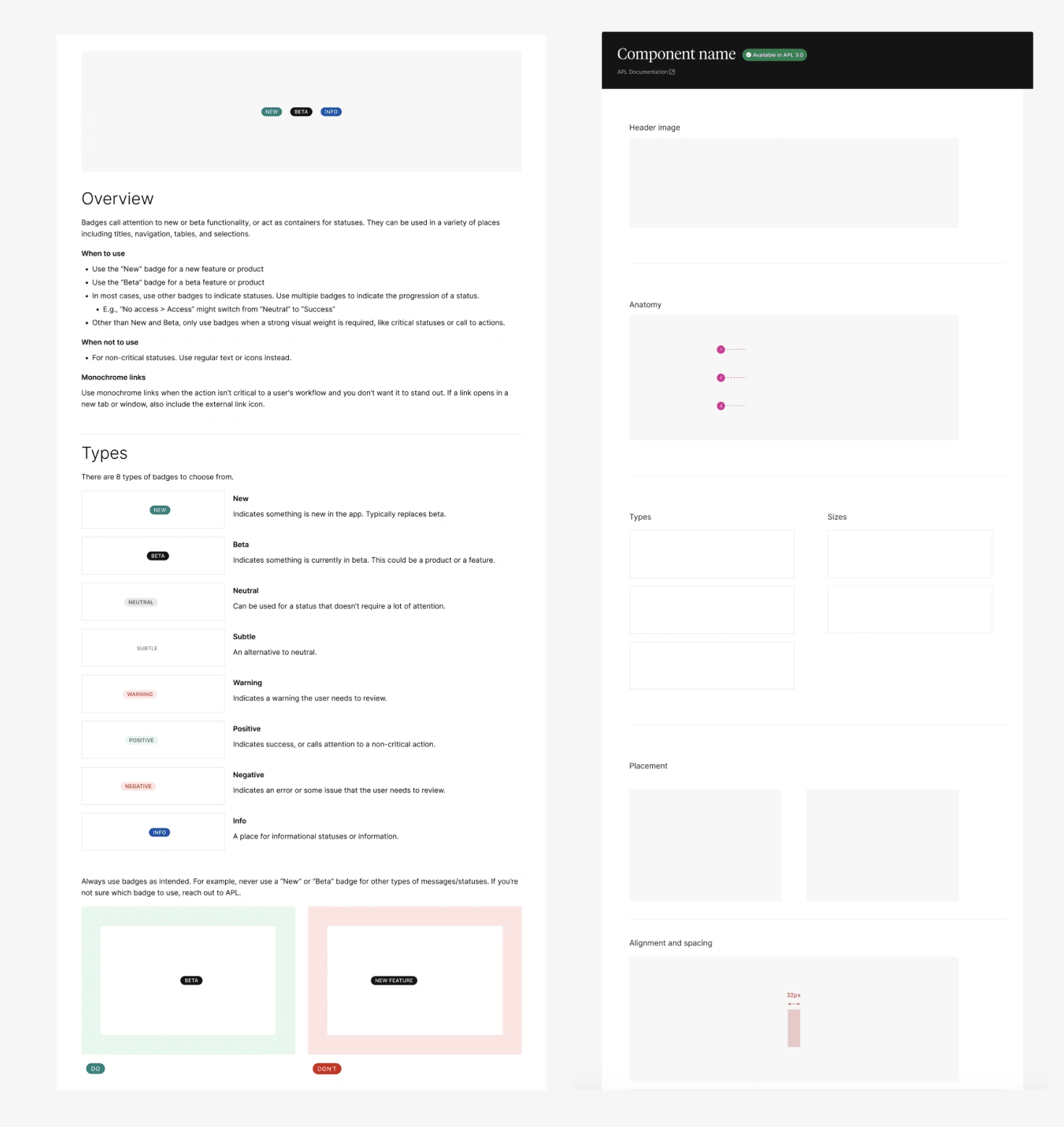
Example and template
Some of these standards were created as I went and found additional needs, and some were created at the start.
From there, I created a page for every component and styled the images needed based on the documentation. For example, some components have multiple types, others don't.
I sorted components by A-Z to make it as easy as possible to find the component you're looking for.
Every individual image is a frame in Figma, making it seamless to copy an embed link to publish directly on our docs site.
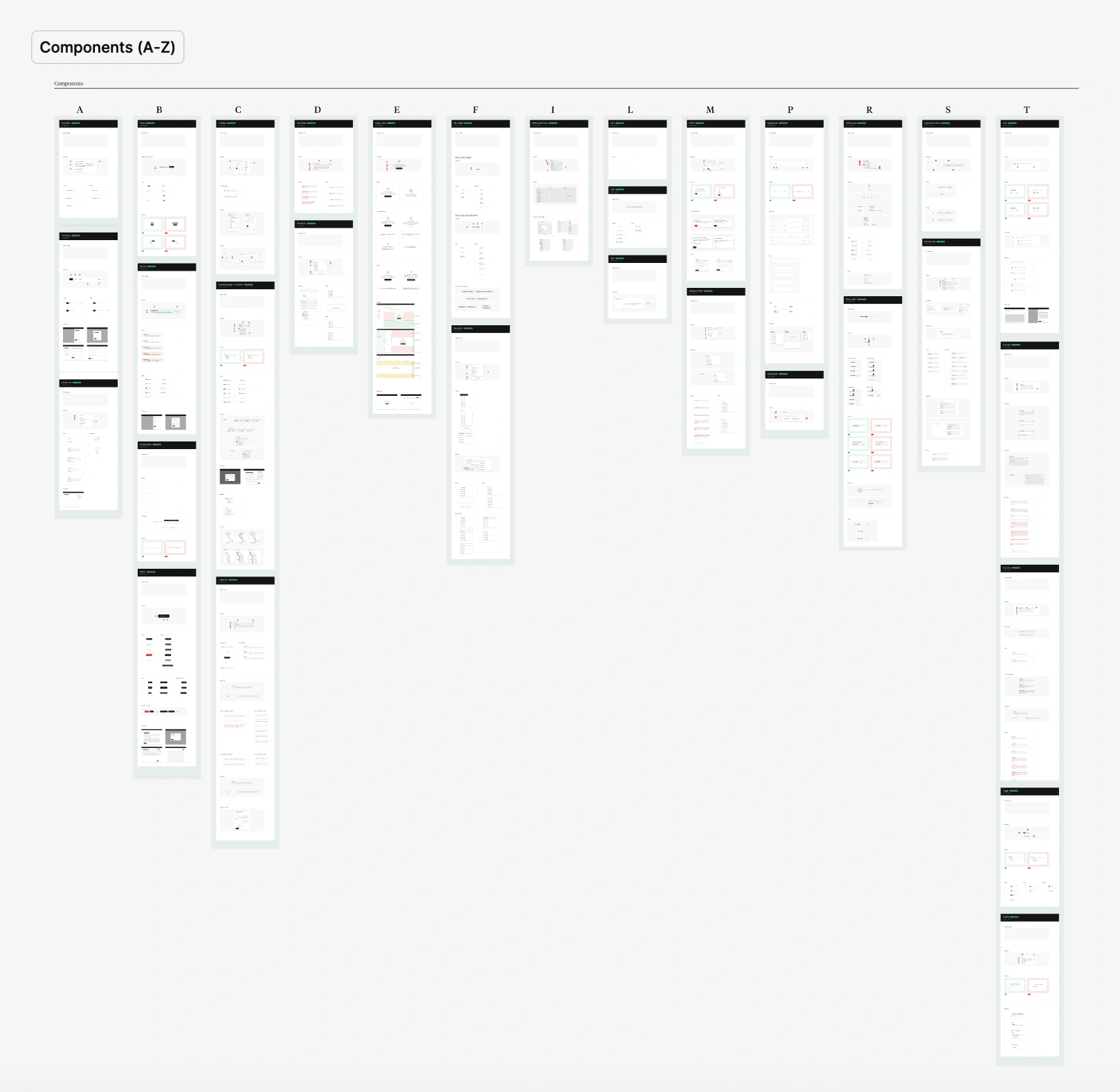
All components
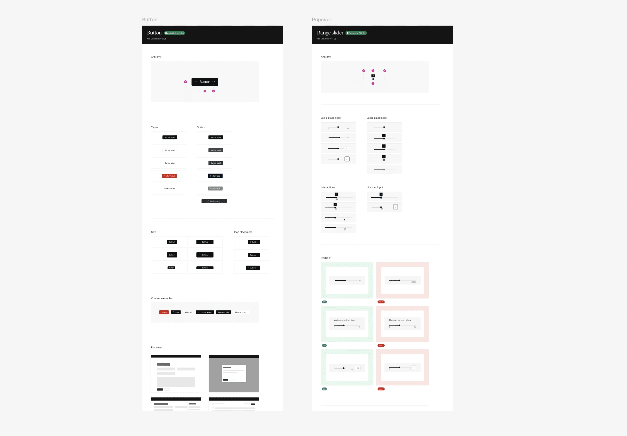
Examples of component images
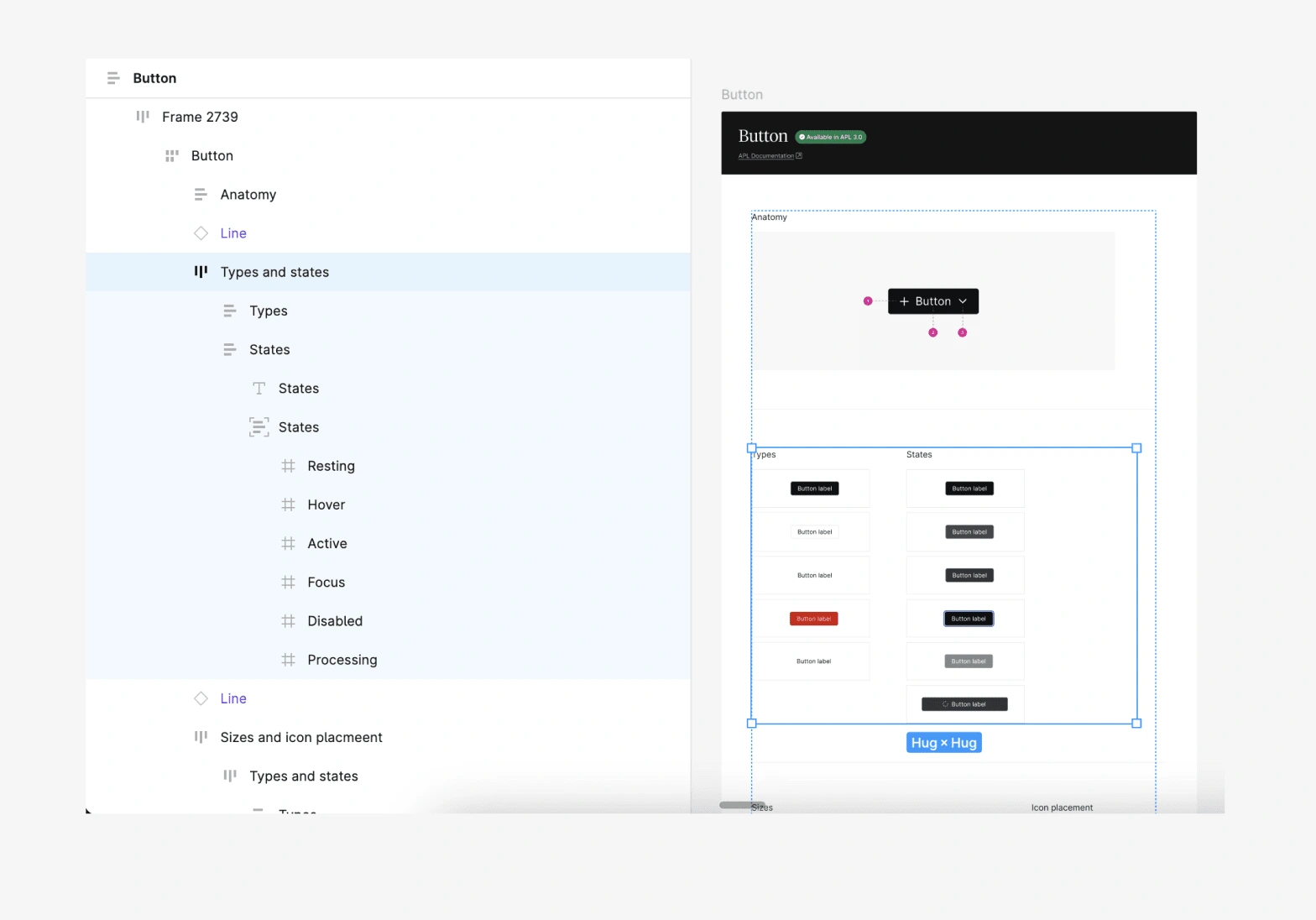
Figma frame naming
Restructuring the Docs site IA
When I began to plan out the longer form content for APL, I came to the conclusion that the current structure of the Docs site was unintuitive. Pages were buried in tabs, making it difficult to navigate.
I looked at best-in-class design systems, like Carbon and Primer, to see how other systems are structured. They often followed a single left menu pattern with sections by function.
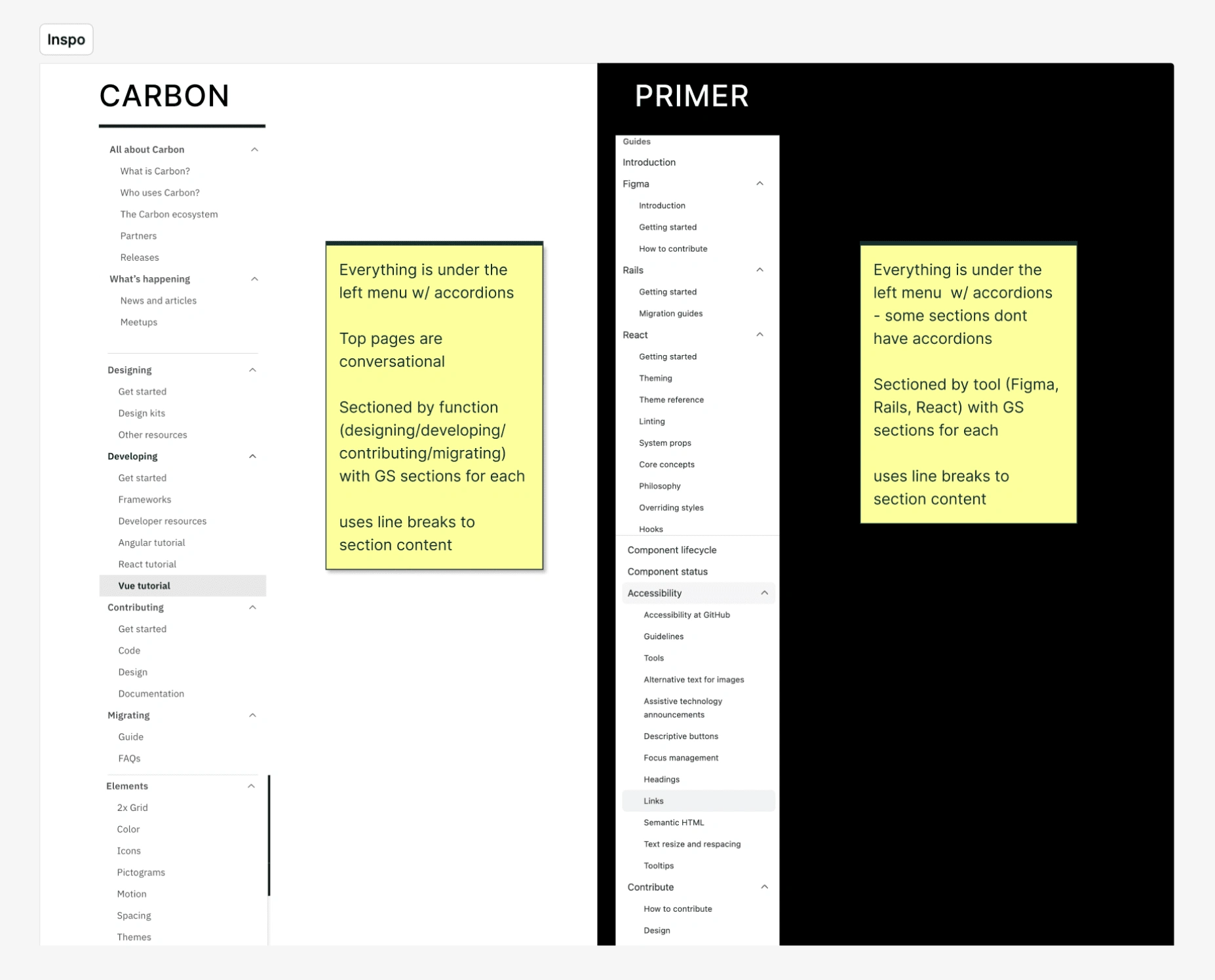
Design system inspo
From there, I outlined the current APL docs IA and proposed a couple of alternative options. I shared those concepts with the broader team and we landed on a new IA.
There would be very little lift from design, we'd just need to polish the UI to give our dev team a final mock. Engineering however would need to go in and restructure how they had originally built the Docs site.
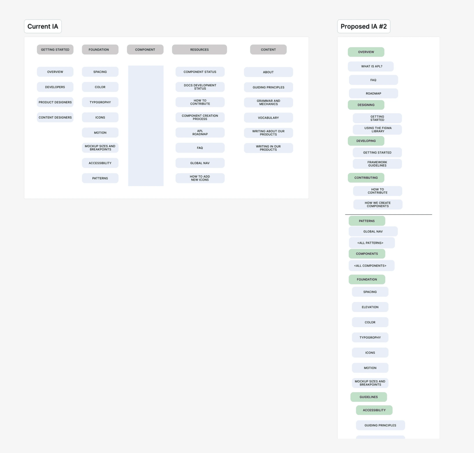
The before and after:
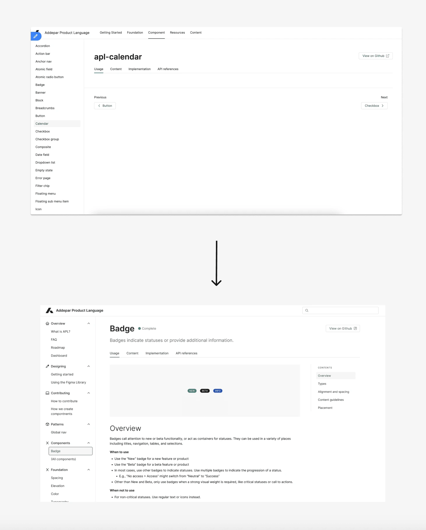
New IA design
Like this project
Posted Jun 21, 2024
Outlining the what, when and where of using the 32 Addepar Design System components. Plus restructuring the site IA and designing 100+ consistent images.
Likes
0
Views
7
Clients
Addepar

