Branding for Sustainable Manufacturing with aktor-e
Markus Zeljak
Branding a Venture That Makes Sustainable Manufacturing Simple
aktor-e aims to help factories use less energy by making old machines digital, and smarter with software.
Industry: Software Development / Smart Factory
Year: 2025
Duration: 2 months
Teammate: Rex Hermansson
Opportunity: Excited about old machinery? Weirdly, yes
I’ll be honest, after two years of repetitive industry work, I didn’t expect to get so excited about this project. But when we learned how they can use software to extend the life of aging machines across entire factory floors – I was thrilled.
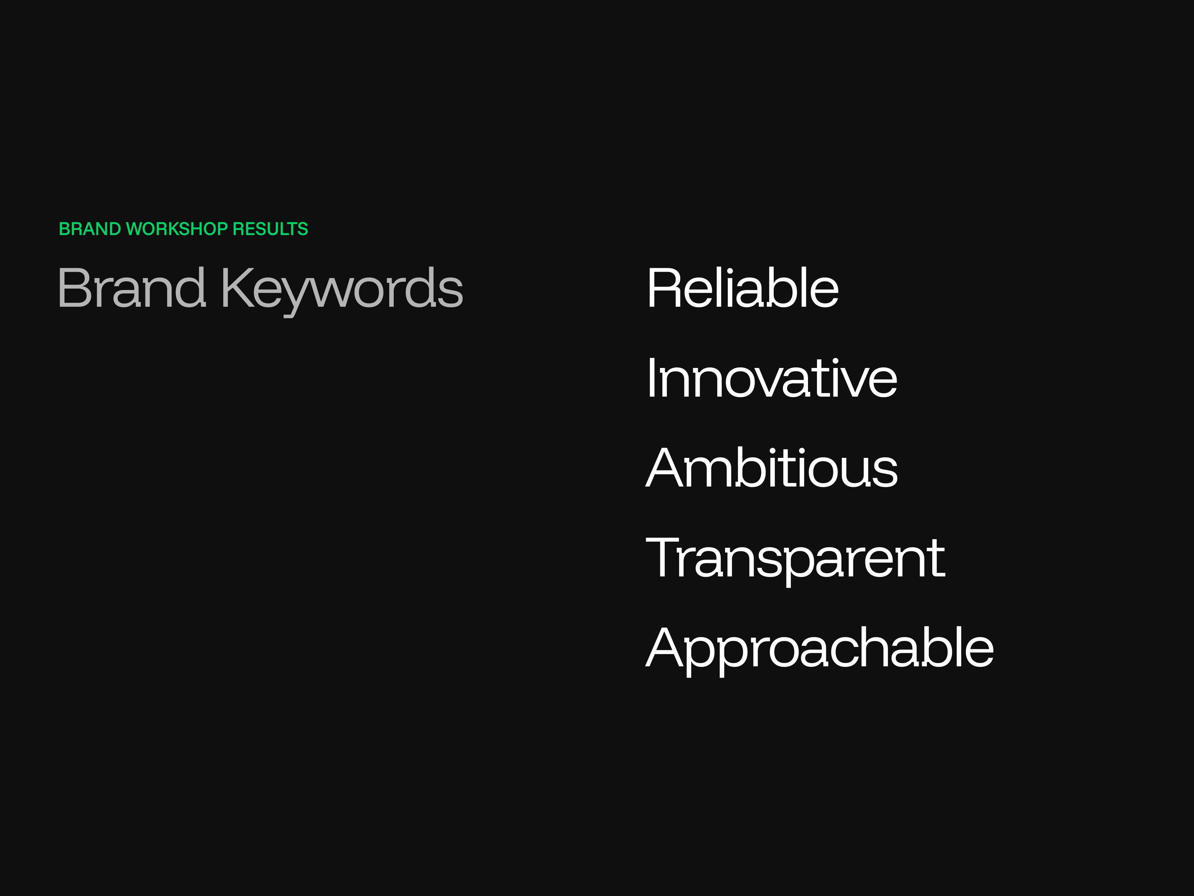
Discovery: Understanding what makes them, them
After running a brand workshop – with my nervous-charged excitement guiding us through each exercise in FigJam – it became clear that how they came across didn’t reflect them.
Strategy: What led to my nerdy excitement
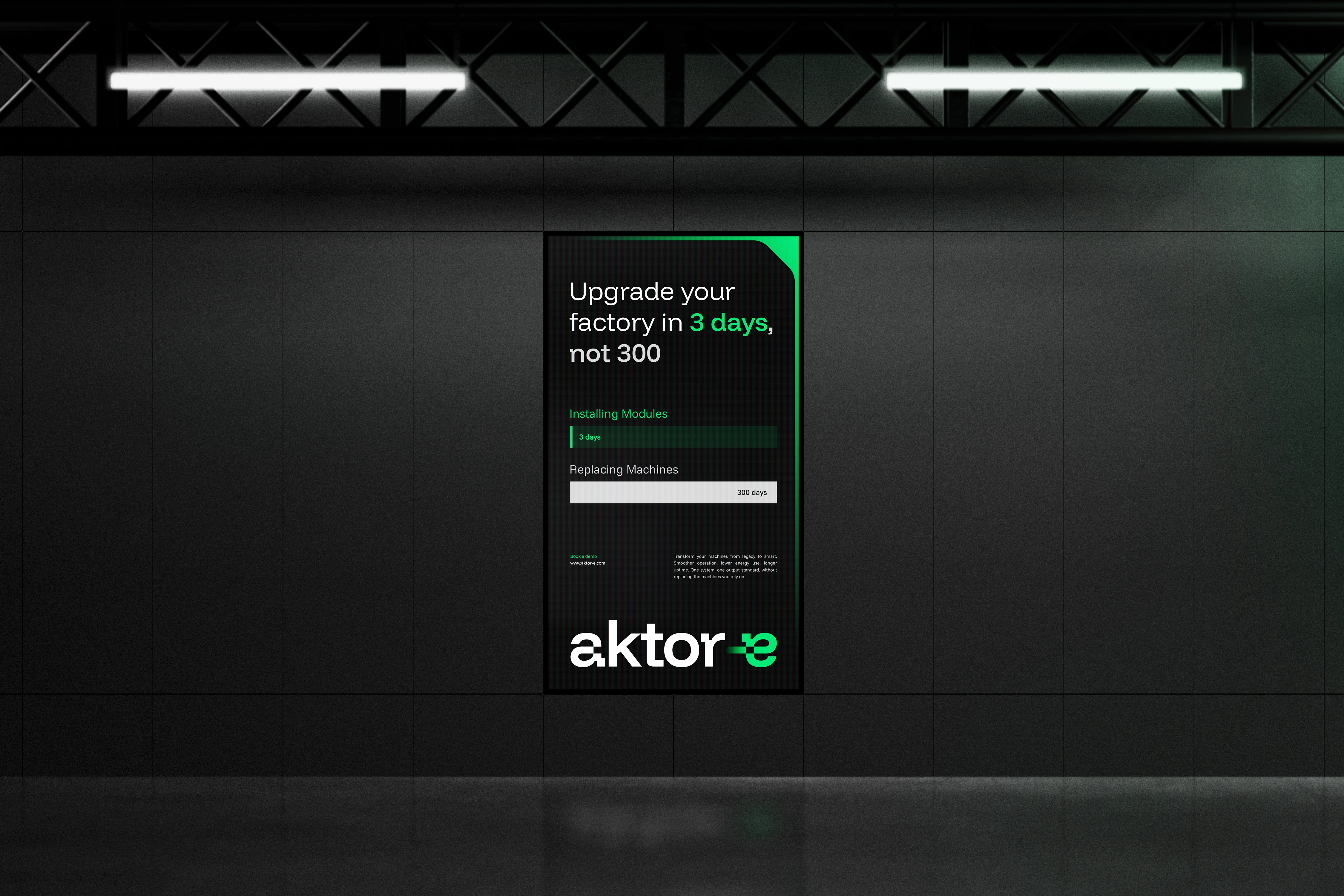
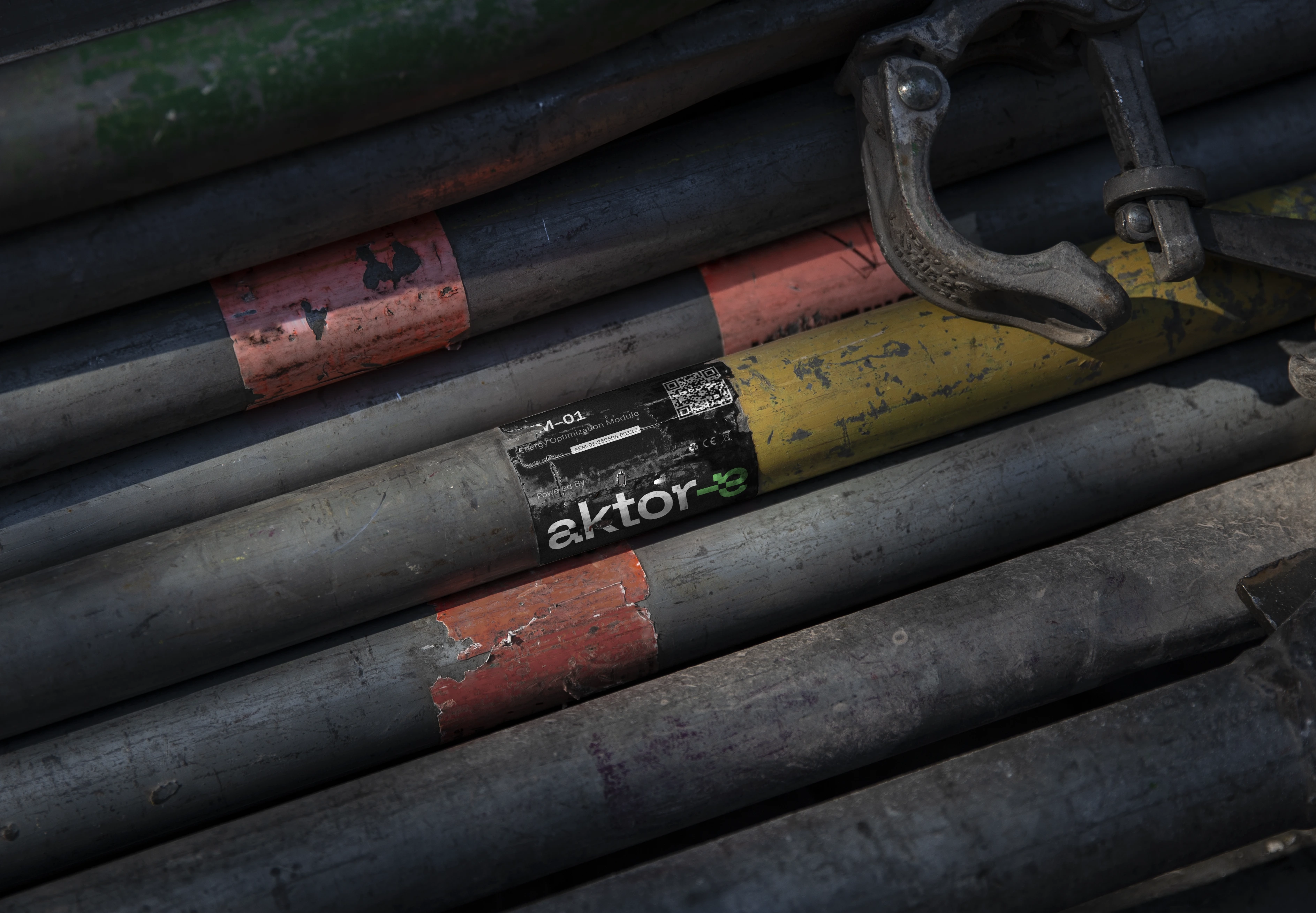
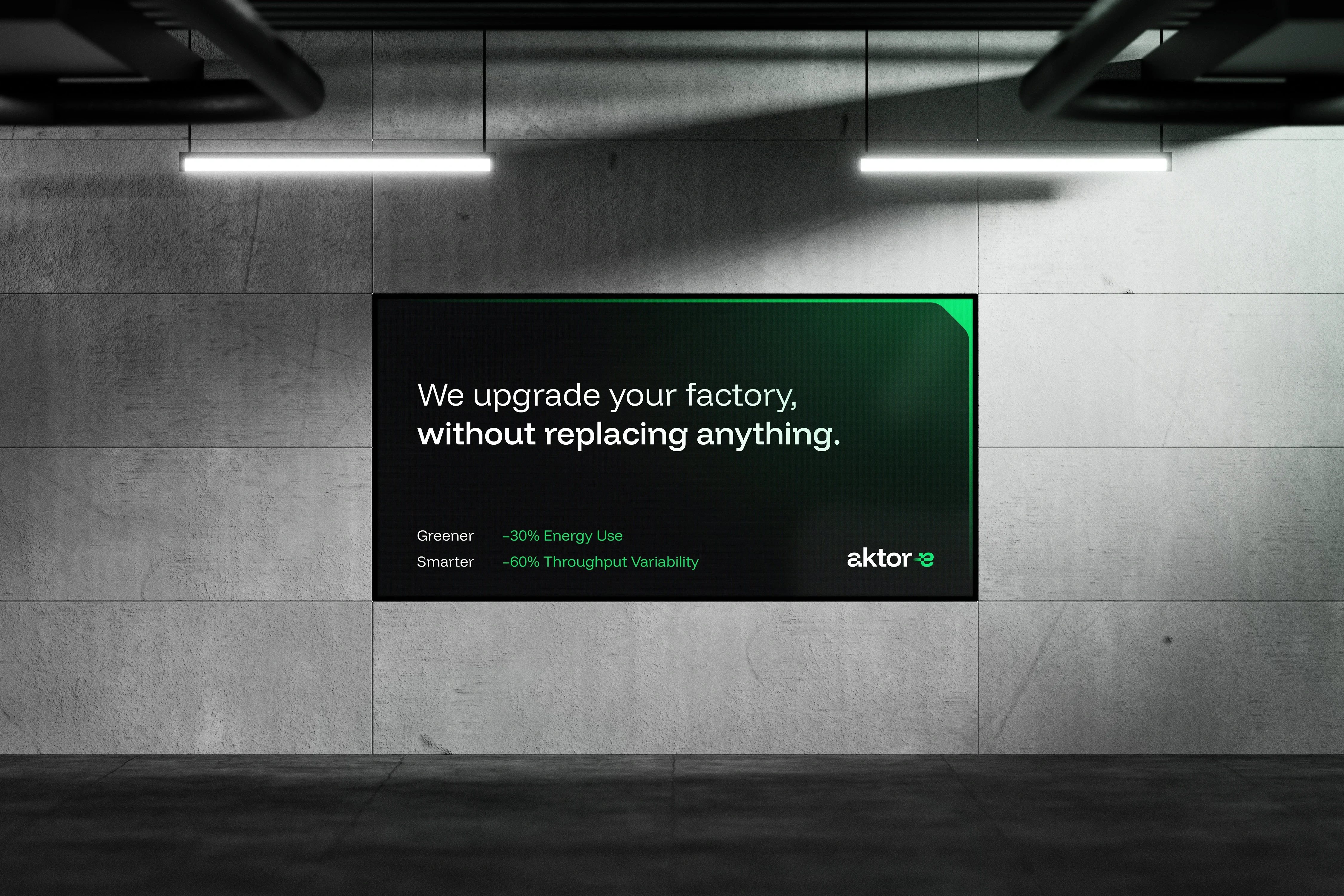
So after they digitize moving machines like robot arms, they run smoother, use less energy and last longer. Great. But their software also connects machines together into one system, allowing entire production lines to ease off when they can, making machines last even longer.
Now imagine that across Europe. Factories connected to each other, adjusting to entire power grids.
Turns out, we are heading there. But aktor-e doesn’t want to replace machines, they upgrade them.
Using only a circuit board and some code. No waste.
They weren’t just “energy optimizers.”
They transform entire freaking factories.
I was thrilled.
Once I’d calmed down, we asked:
How do we design a brand that matches their ambition, but without making them seem like disruptors looking to flip everything upside down? They kind of are, but gently, quietly, validating their impact without shouting it.
Constraints: Setting the logo up for success
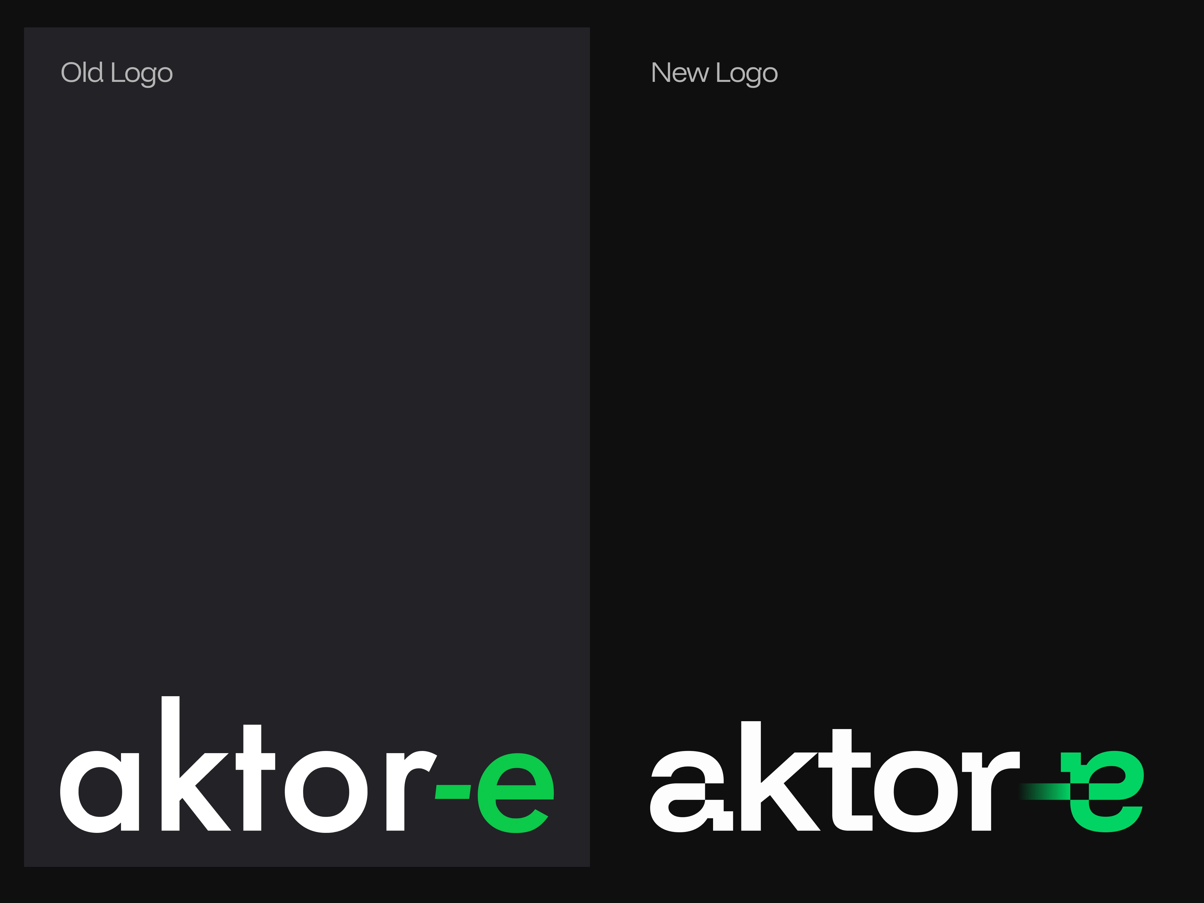
The name was clever but a bit awkward – all lowercase, a tall k, and a hyphen. But the name was set, and honestly, the play on “factor-y” did suit them. So we leaned into it and found a typeface with a tall x-height. It felt grounded and competent, with just enough techy quirk thanks to its offset squares.
Exploration: Early s-y-m-b-o-l ideas
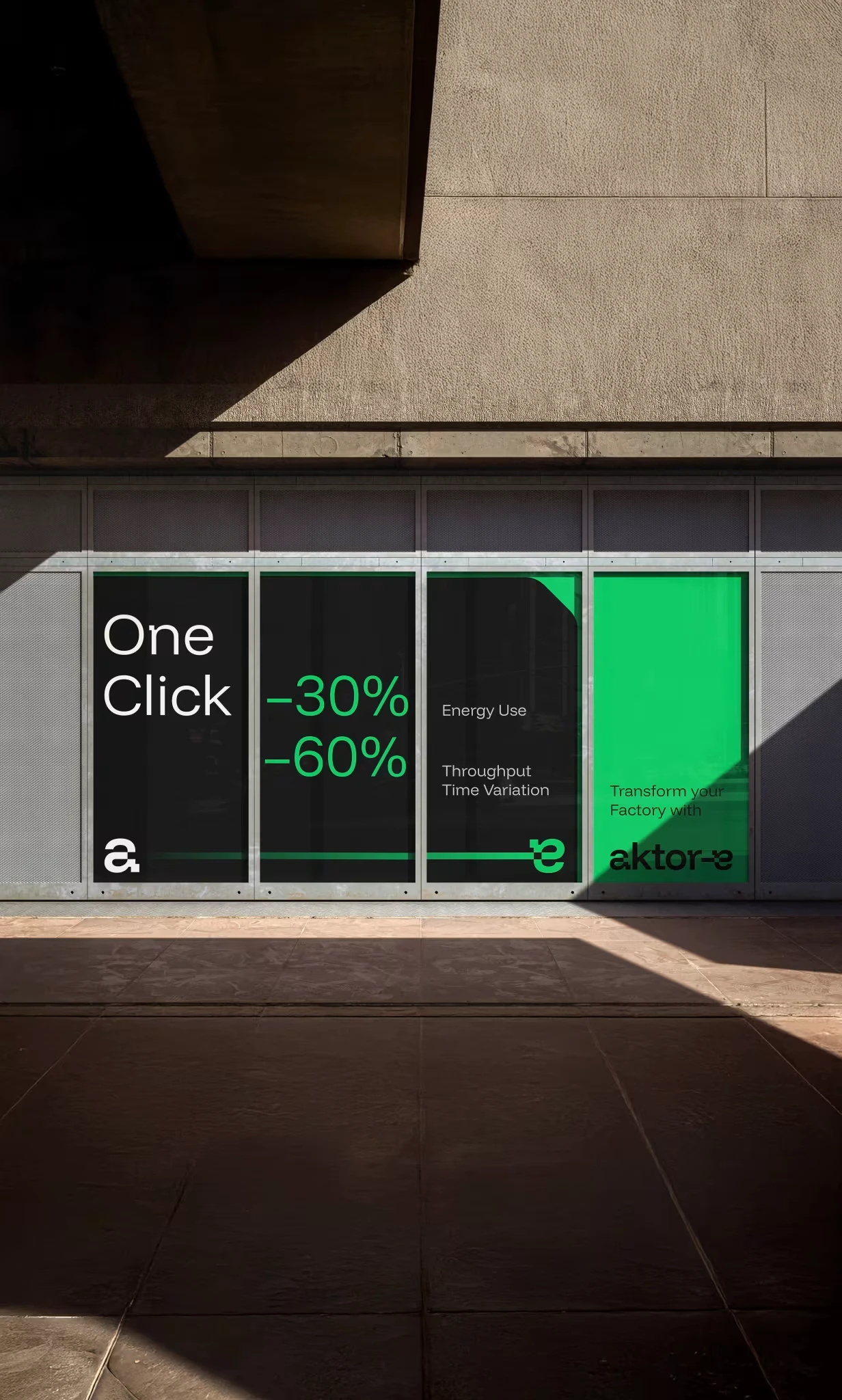
After showing them the first stylescapes, they asked what we were still doing in school – not bad. After a revision, we landed on one with high contrast, a vibrant green, and a digital experience that mirrors their “1-click solution.” This was also when the idea of using the hyphen as a symbol started to float around.
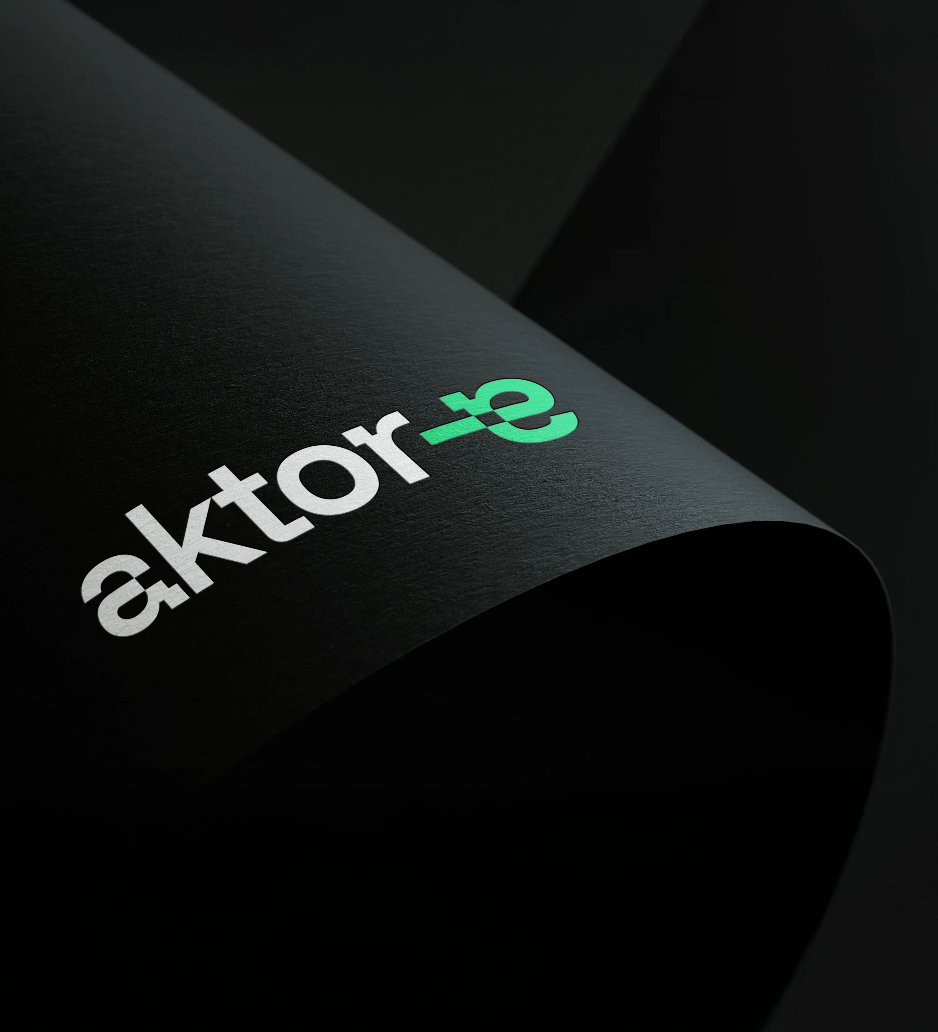
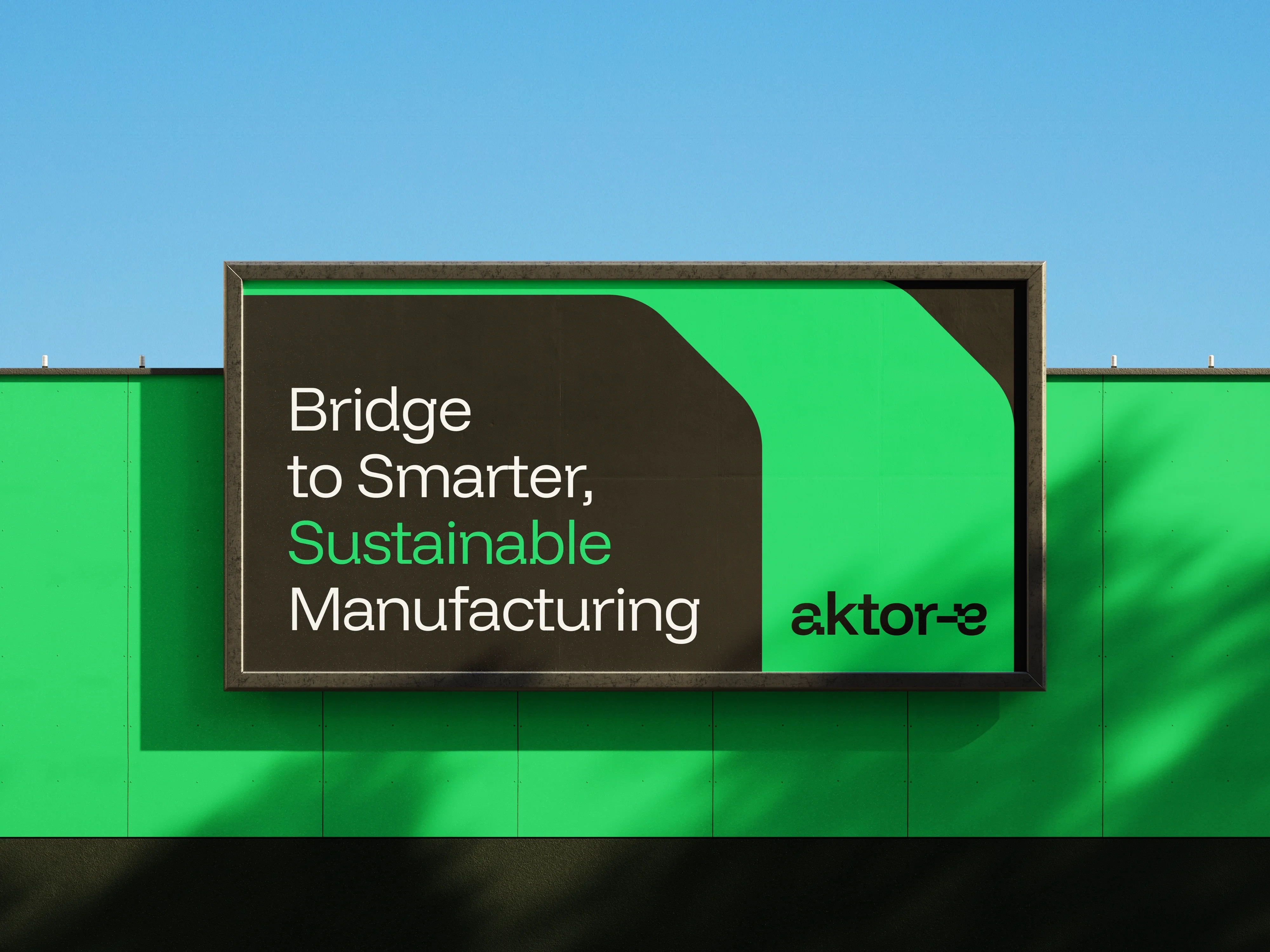
Logo Design: The “Exactly” moment
One night it hit me: the hyphen. Simple, unique, and perfect to symbolize the smoother journey their solution offers. From old to new, A to B … a–e. My teammate Rex turned my sketch into one where the a was flipped in place of the e. I said it’s not readable. He said, “Exactly.” We tested it, and I was happily very wrong. The logo makes you stop for a second, makes you feel something – and it sticks with you.
It felt a bit static though, so we slapped on a gradient. This was just enough to push the feeling of moving toward something greener and smarter. And of course, now we couldn’t stop seeing how it might move, like the hyphen wanted to flex and extend on its own. So we animated it.
And that was it, a simple and flexible logo behaving like their solution: ready to fit into any factory, without friction.
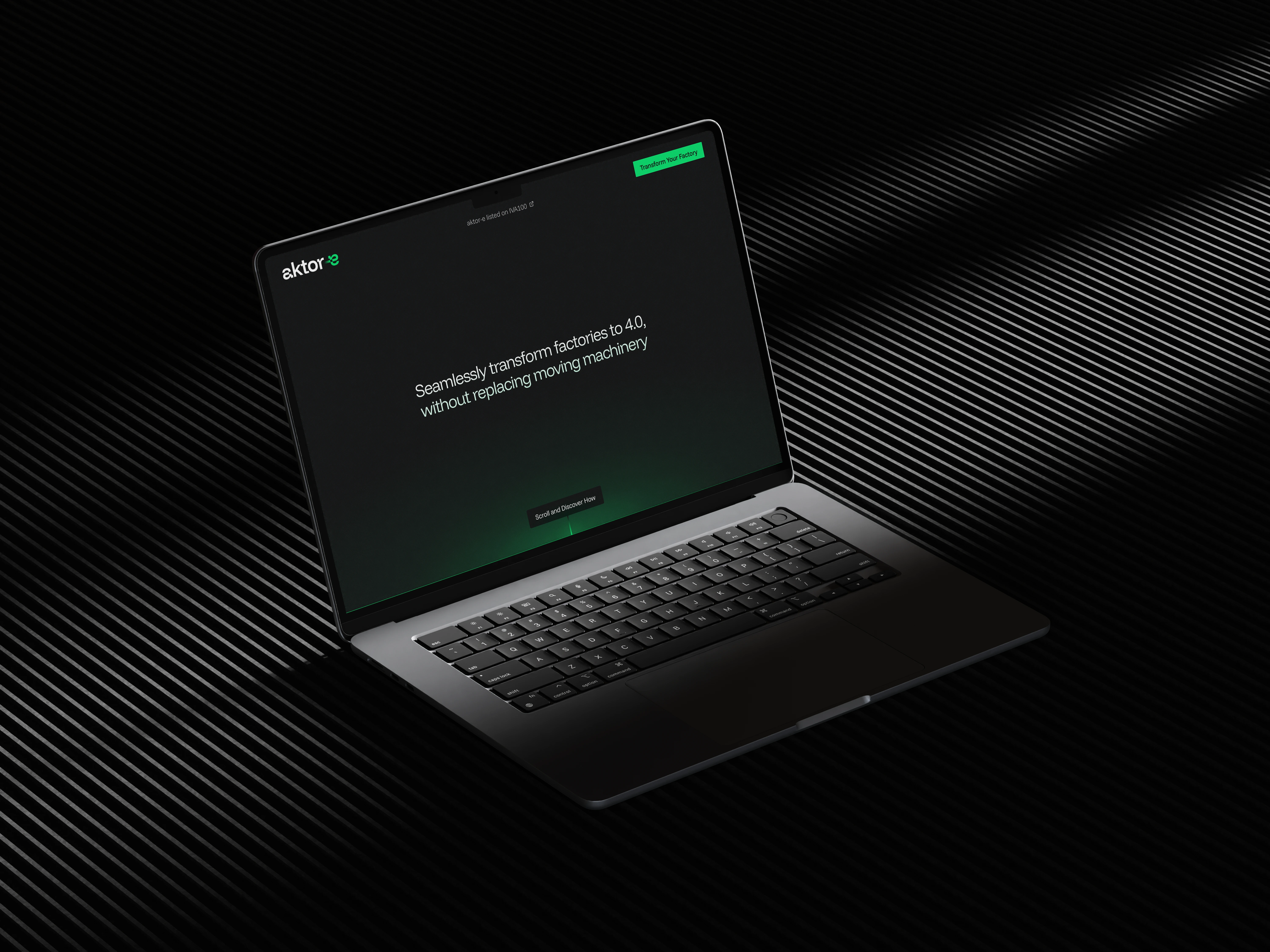
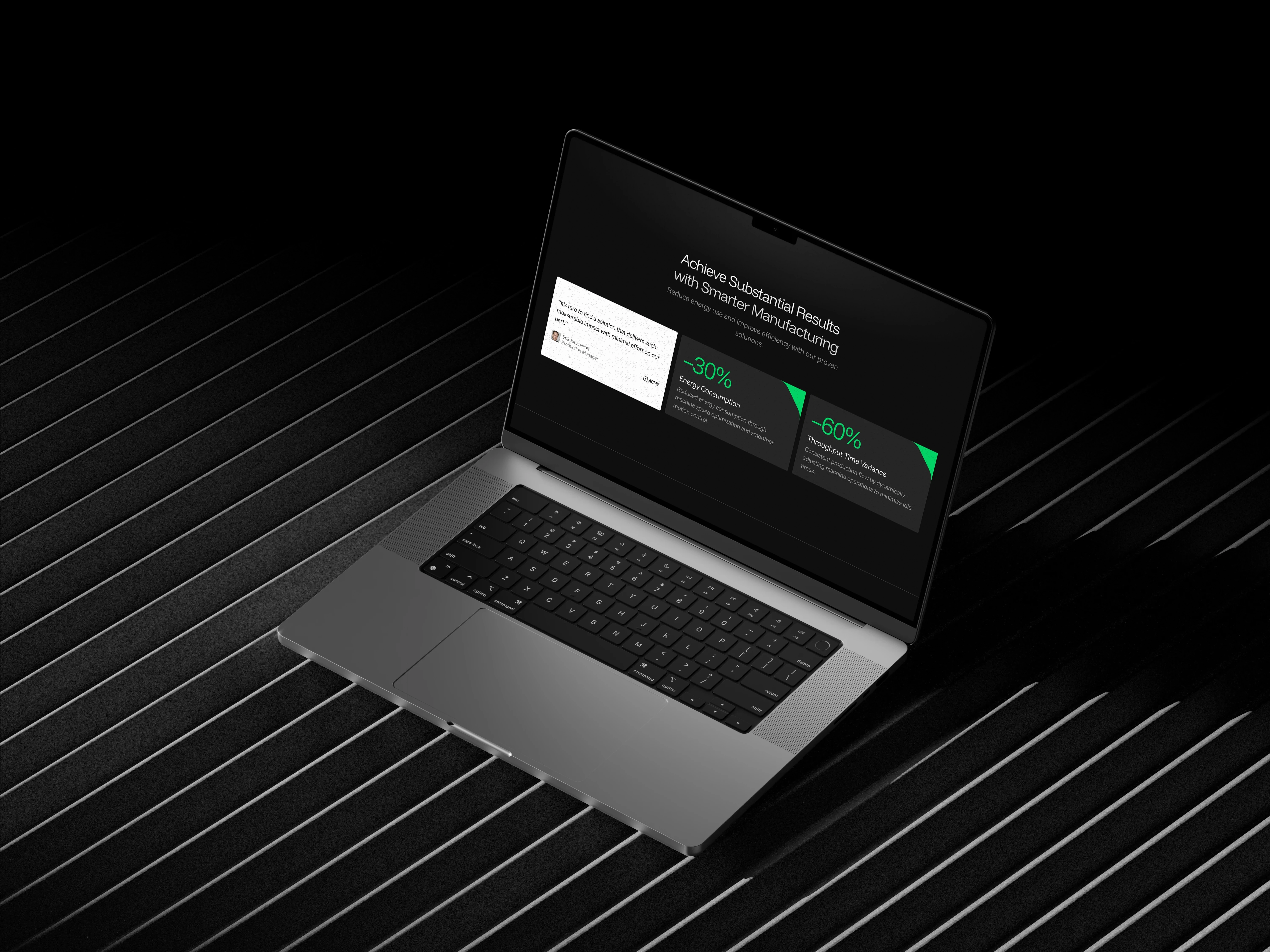
Landing Page: Understanding B2B web needs
While the logo spoke “no friction,” the web design process was anything but. Frankly, we had no idea what a B2B website needed. After some research and a SWOT analysis later, I mapped the site content into a clear information architecture.
One thing stood out: social proof matters. And since they had strong metrics, I added a testimonial right next to them, giving their impact something to stand on. I also designed the hero and solution section, and the last part was where things got extra bumpy.
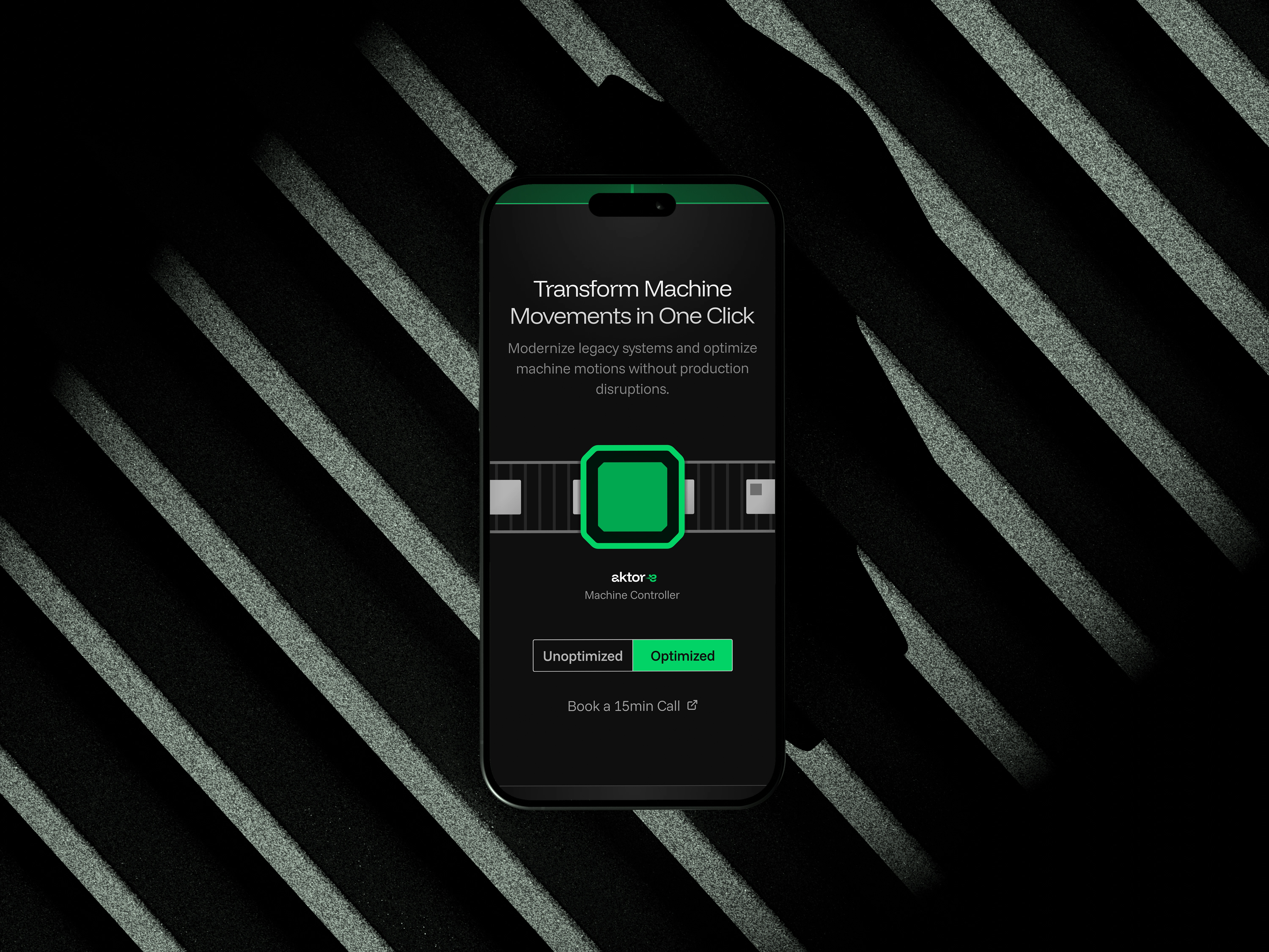
Interactive Rive Animation
Want to experience the animation for yourself? Click the link below!
Reflection: Found my niche
What got me going was really understanding who they are, and helping them show up that way. I learned new tools and pushed through discomfort. I took the lead and became confident in English client comms and presentations. I also cleared my hunch: I don’t care just about the visuals, I care about the meaning. That’s the space I want to keep working in.
Like this project
Posted May 18, 2025
Developed brand strategy and identity for aktor-e, focusing on sustainable manufacturing.
Likes
15
Views
48
Timeline
Dec 5, 2024 - Jan 30, 2025