Branding Everwell: Stress Management App
Markus Zeljak
Branding an App That Helps People Manage Work Stress
Everwell combines your mood, schedule, and wearable data to learn when you get stressed at work, and figure out what actually helps.
Year: 2024
Duration: 2 weeks
Context: Phone buzzing, you... cuzzing?
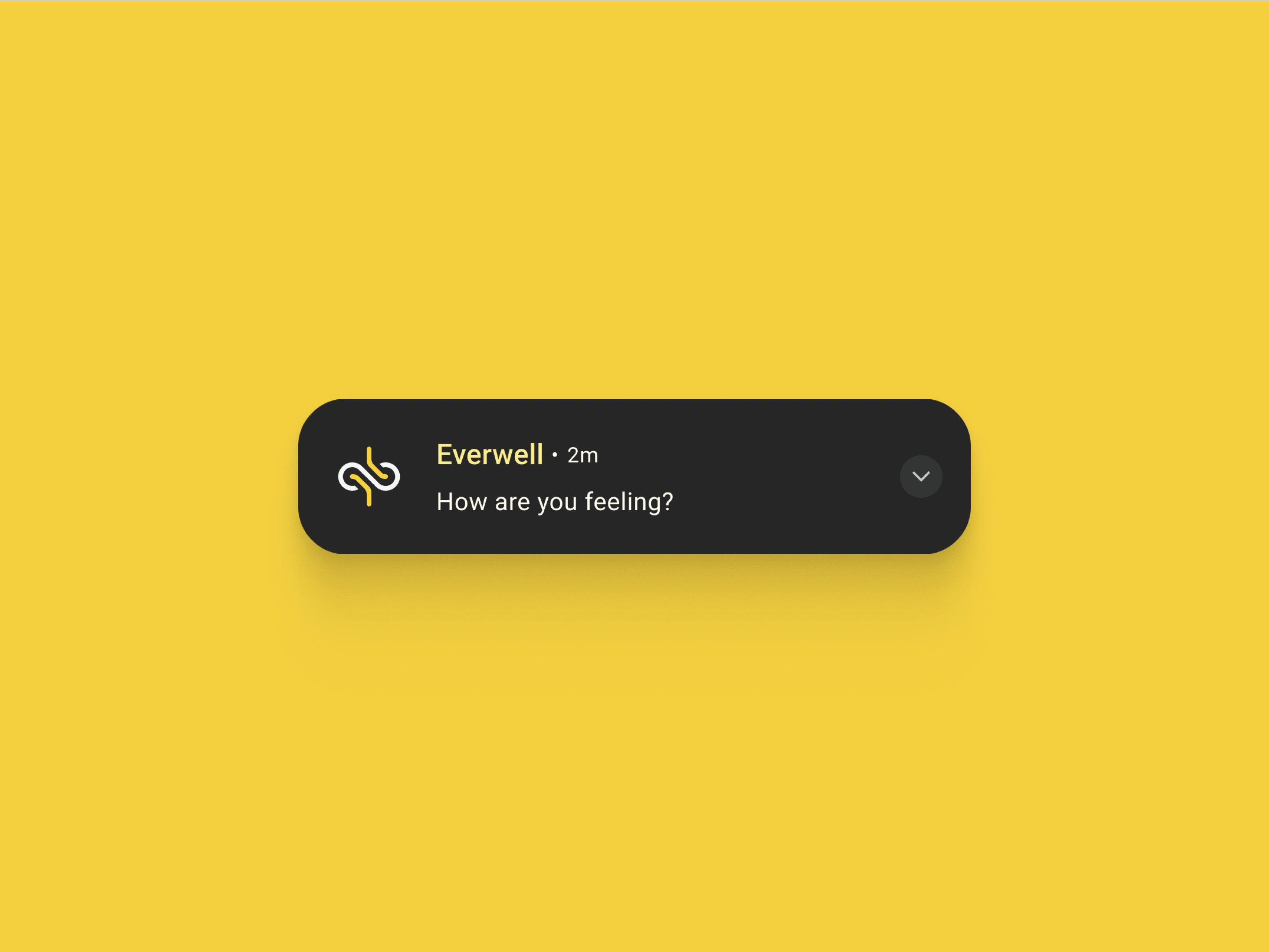
You know that feeling after a long meeting – tired, tense, and just needing a break. Then your phone goes “bzz bzz.” Another thing? Now? Really? But what if your phone gave you relief? If you knew it was just a good friend checking in? That’s the goal of Everwell.

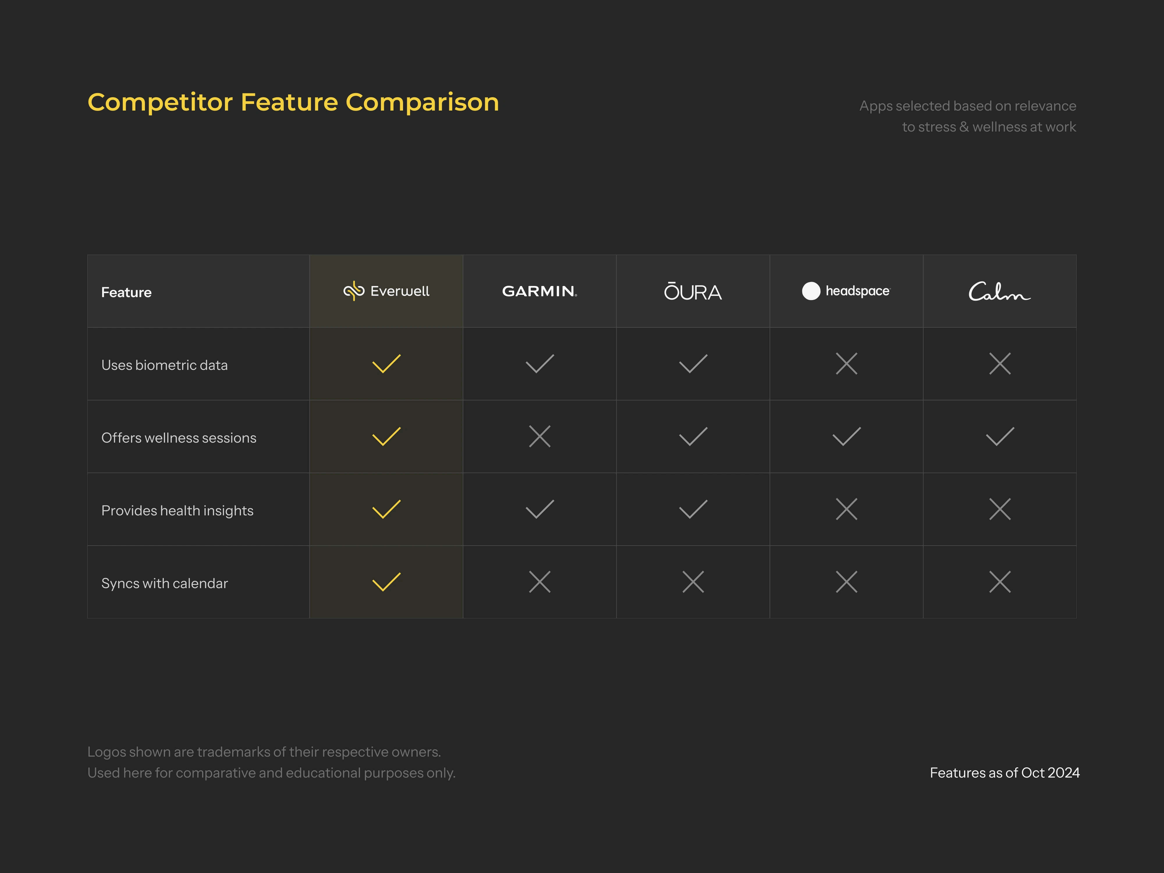
Research: A gap in a saturated market
Turns out there’s this stress epidemic in Europe, and over half are often stressed at work. Good thing though: most want to learn how to deal with it. I looked at existing apps and saw a gap. There was no solution that helped people figure out what actually calms them down while fitting into their work schedule.
Strategy: Less “Top 10 ways to…” and more you
Think of a mood tracker, meditation app, and calendar app – all glued together with AI to actually make it about you. Breathing exercises not your thing? How about a short walk before the next meeting? If it helps – great! Let’s do it again next week. If not, let’s try something else. Over time, you and Everwell learn what works and when – and what’s off the table.
Direction: Ooooh, wisdom concentrate
The brand needed to feel like that good friend who knows when and how to calm you down at work. But I had to also balance it with the techy feel of AI and smartwatches. In my mind I had this neutral and grounded feel, with a warm human touch wrapped around a kind of concentrated form of wisdom.
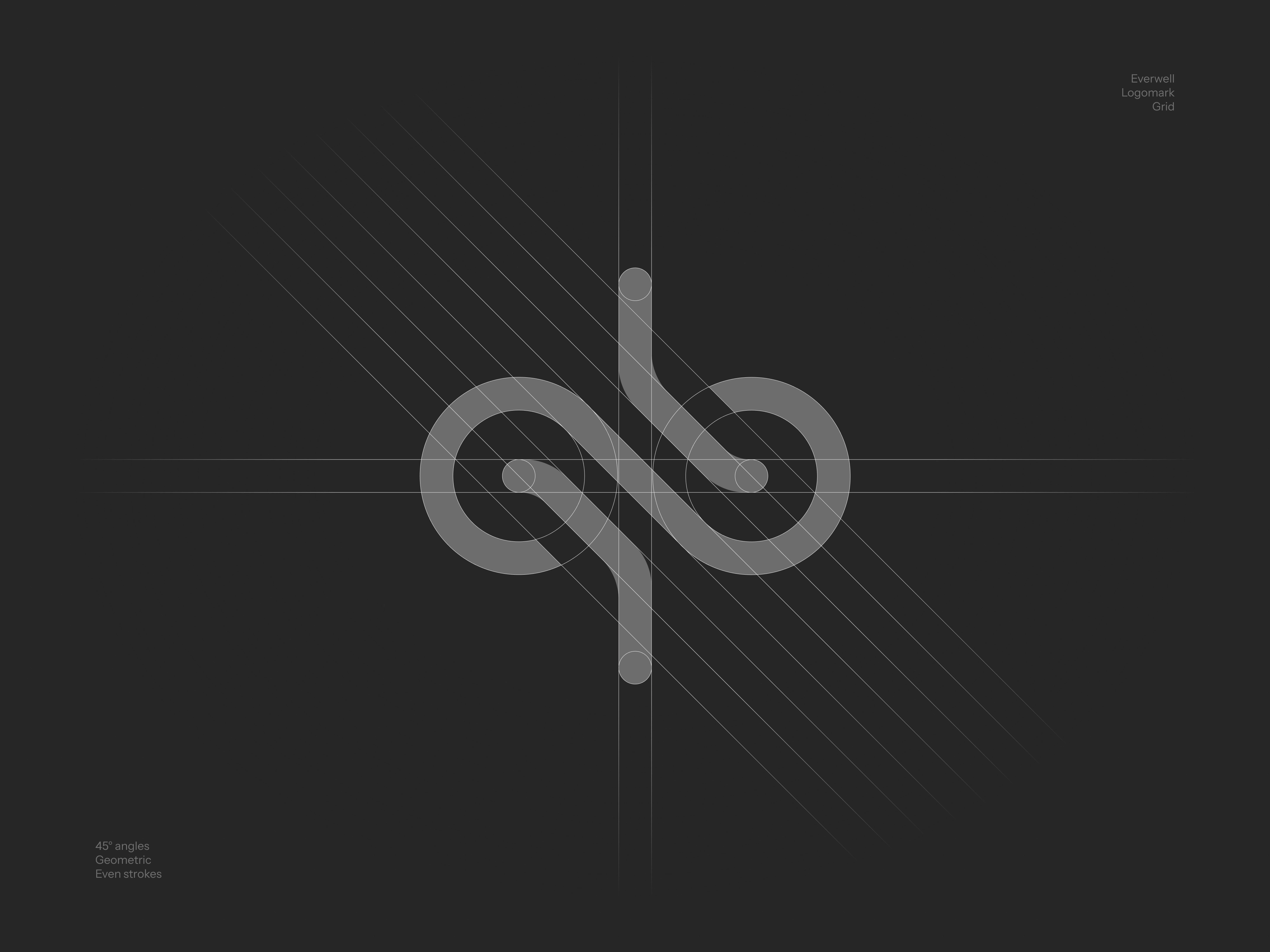
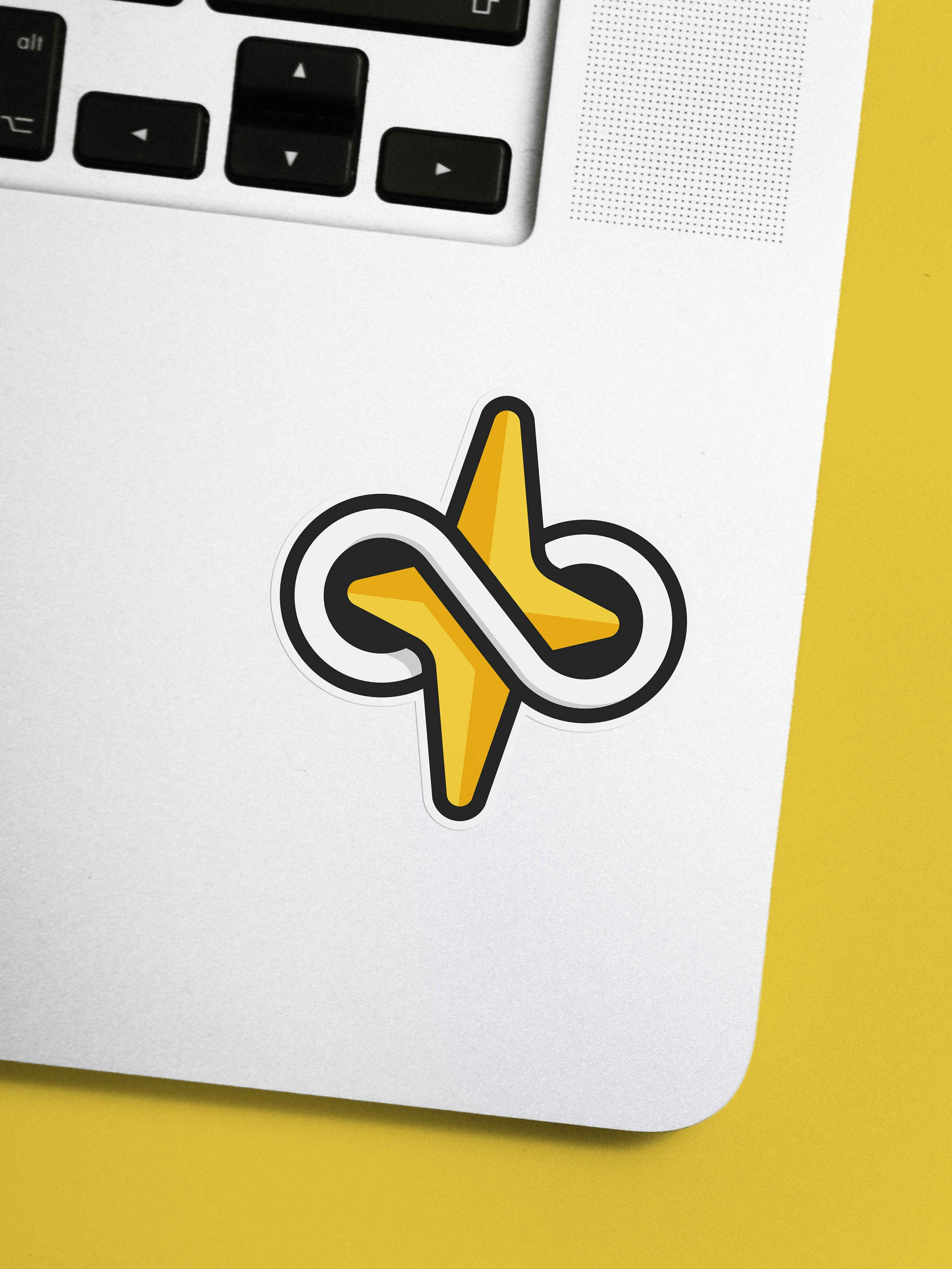
Identity: Infinite insights for ever wellness
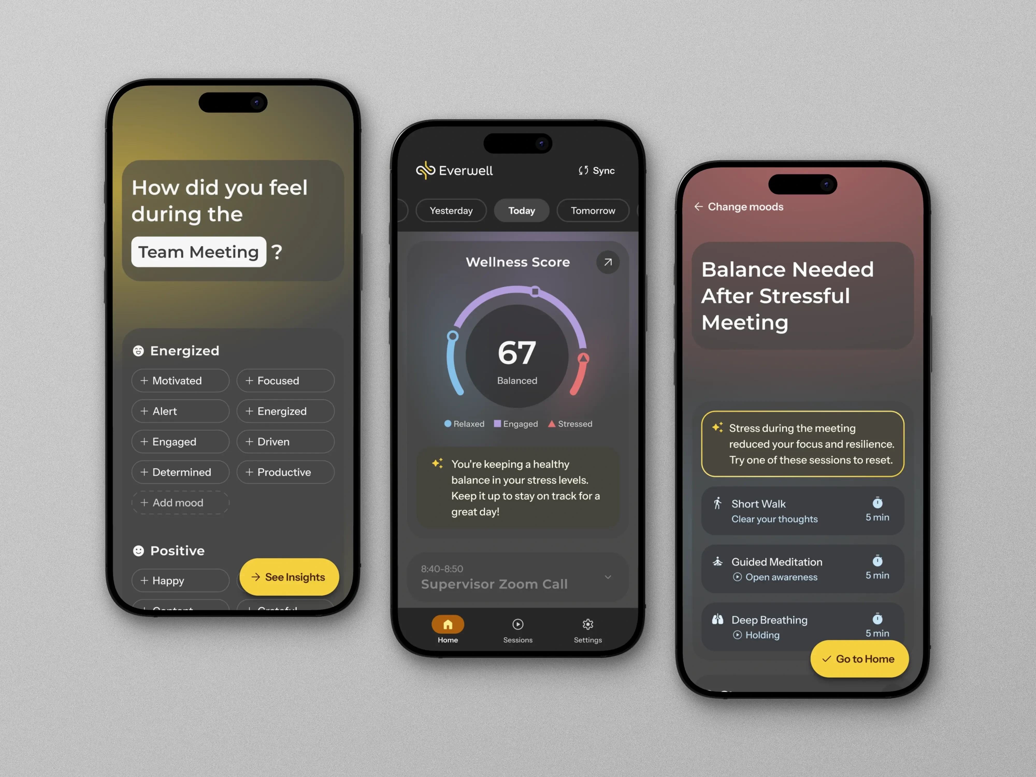
I landed on a grey backdrop to set the calm tone, while letting the infinity-woven star symbolize the wise and warm insights that lead to an ever wellness. This lets the brand build trust on a neutral slate, and not force the idea of saving all your stress – it’s a personal process after all.
Expression: Perfect balance
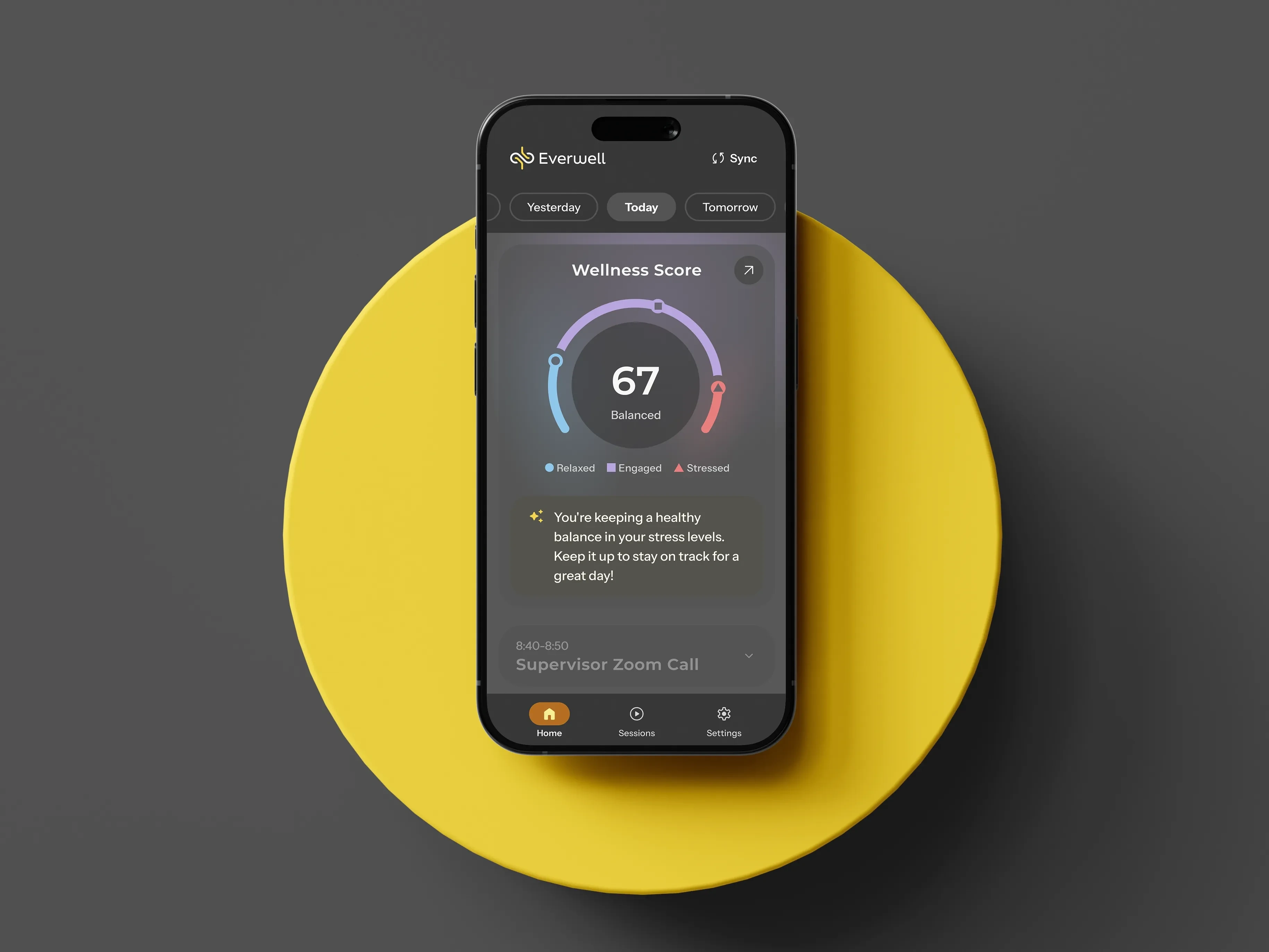
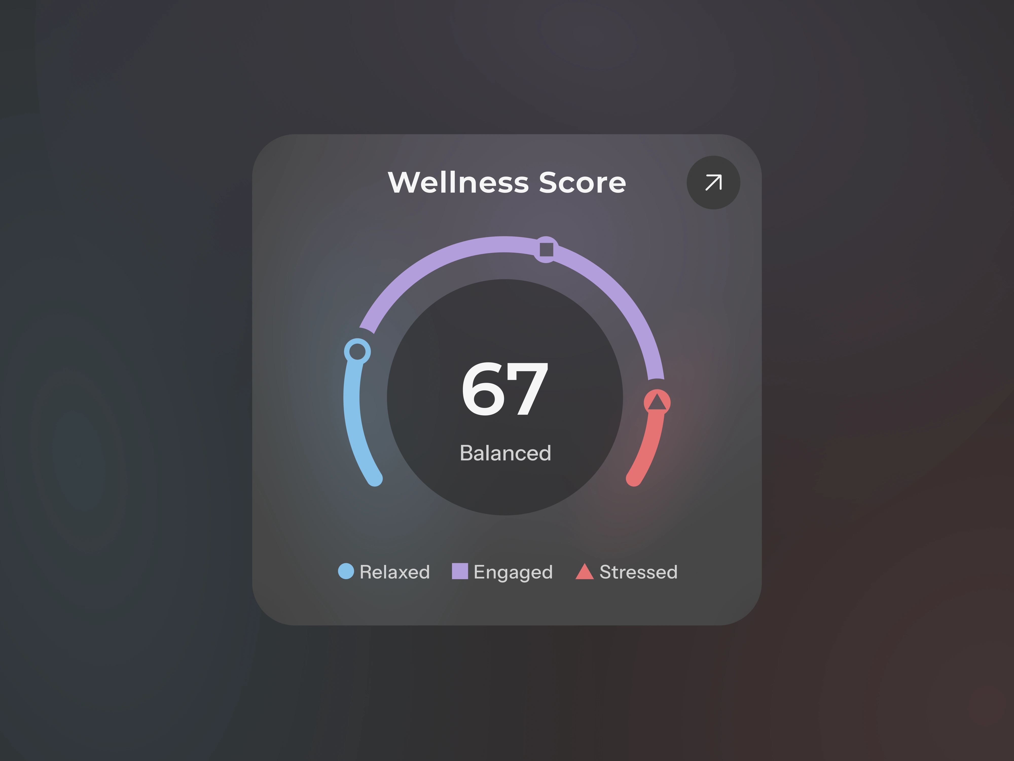
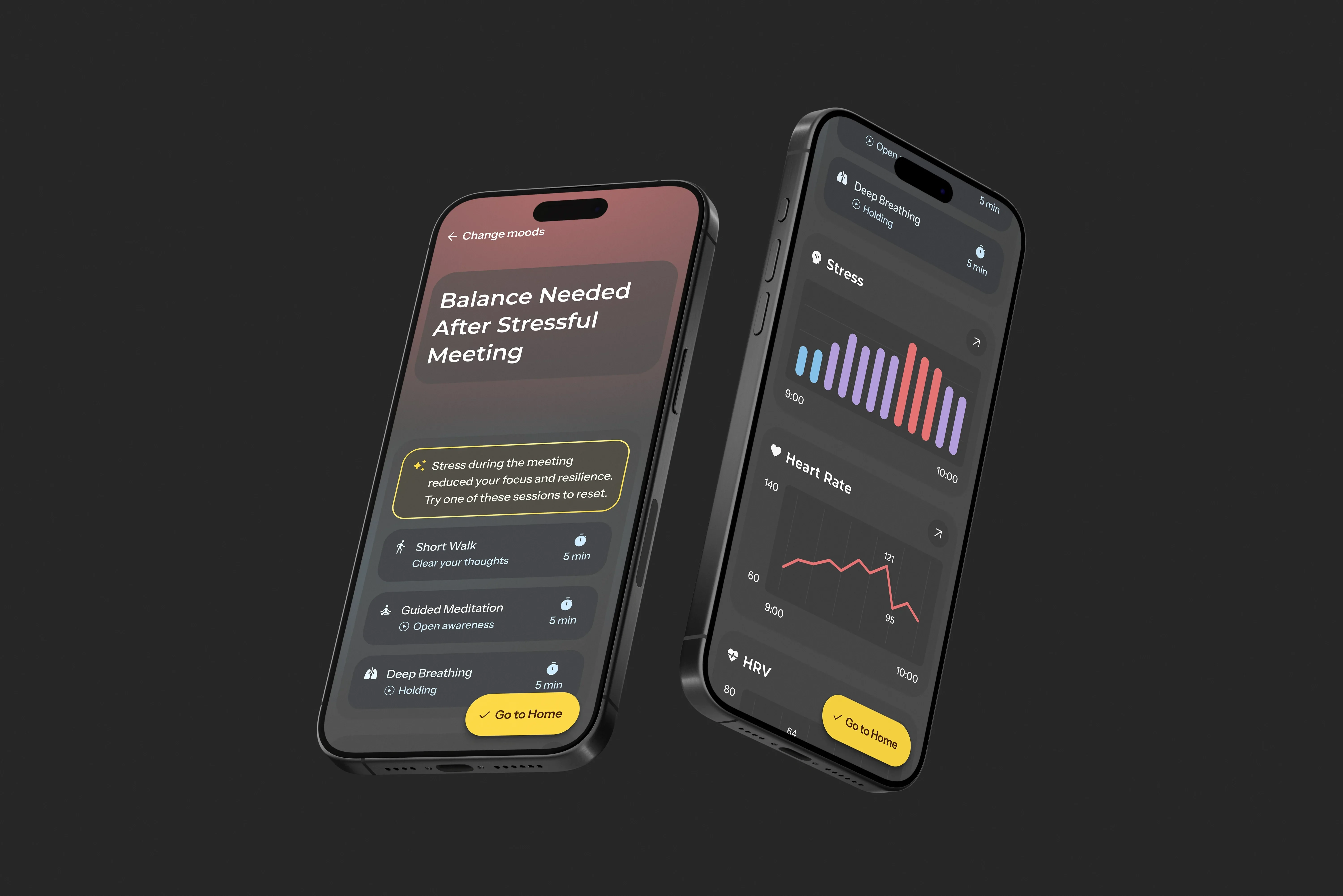
Apparently, not all stress is bad and it’s more of a balance scale. I picked accent colors to reflect each stress level, and toned them down to fit with the grounded feel – so they don’t scream “YOU’RE STRESSED.”
Flows: Making sure the app is for the people
During the brand process, I also mapped the app using personas, flows, and screen/interaction lists. The rest of the process kinda naturally fell in place thanks to clearly defining the brand first.
Accessibility: A friend for everyone
This app could benefit anyone with a job, which of course is a lot of people. So I made sure to check contrast throughout and thought of color blindness and low vision from the start. I also gave the hero piece (the wellness score) extra care.
Tests: "I waved at you!" the friend said
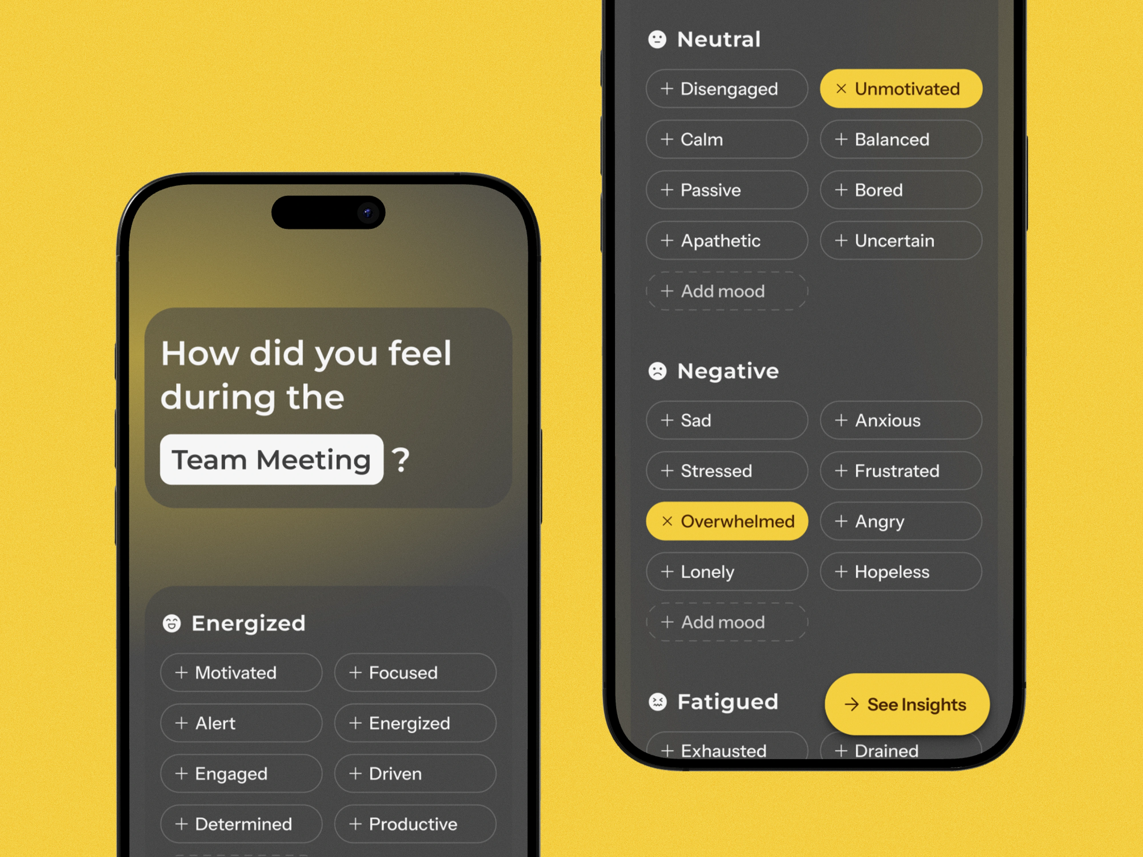
After sifting through paper sketches and moving Rectangle 52 one last time, I turned the mashup of grey boxes into a cleaner prototype. I then tested it on 5 users and realized: there was too much text, it was unclear what you could tap, and graphs were stealing attention from the app's main USP: the insights.
Iteration & Hi-Fi: The friend waves and hollers now
I answered the usability issues with simplified screens, dropdowns, and more digestible texts. I also added a headline and a stress-level accent color to give a quick summary of events. I gave it the final treatment with brand colors and tuned the tone of the insights.
Reflection: Brand first, no doubt
This project taught me a lot, and I learned how important it is to understand what you are designing for, and why. I also realized that I lean a bit too much on my gut feeling, and since this project, I have lowered the bar for the first tests. I also became confident in Figma, especially in using variables and building a design system. I learned that AI-driven products need great thought so it isn’t misused. And finally, if there’s a single key takeaway from this project, it is the impact of starting with the brand, because when that is clear, everything else falls in place.
Like this project
Posted May 18, 2025
Branded Everwell app that manages work stress with AI and wearable data.
Likes
1
Views
3
Timeline
Oct 10, 2024 - Oct 29, 2024