Redesign That Boosted Users Engagement
Rishi Shah
Project Overview
SharpDuel is a marketplace that connects sports bettors with betting experts who offer insights, strategies, and tips. The platform allows experts to create their own storefronts, package their services, and sell them directly to bettors. Bettors, in turn, can browse and subscribe to experts based on their preferred sports, bet types, and betting strategies.
The Problem
Right now, the product experience doesn’t live up to what SharpDuel wants the brand to be. The interface is dated, the user flow feels flat and repetitive, and it lacks the energy and clarity expected from a platform built around competitive sports and high-stakes decisions. Users - both bettors and experts don’t have an engaging or intuitive way to navigate the app, find the right matches, or present their value.
Created before starting the design process. It outlines the experience we're planning to build and is meant to align the team and stakeholders on goals, features, and priorities.
Establish a Clear Visual Identity
The app had zero design infrastructure when I joined—no style guide, no reusable components, no brand voice. Sharpduel is a sports betting app, but nothing about the existing UI made that clear. My first priority was to establish a visual presence that felt aligned with the product’s purpose: high-stakes, competitive, and trust-driven.
So I built a complete design system from scratch. This included a typography scale that felt bold and competitive, a color palette that mixed intensity with trust (e.g. deep blues and reds), iconography with a sports edge, and UI components that could scale. I also documented interaction patterns, spacing rules, states, and accessibility behavior, so any future designer or developer could build with consistency.
Admin portal
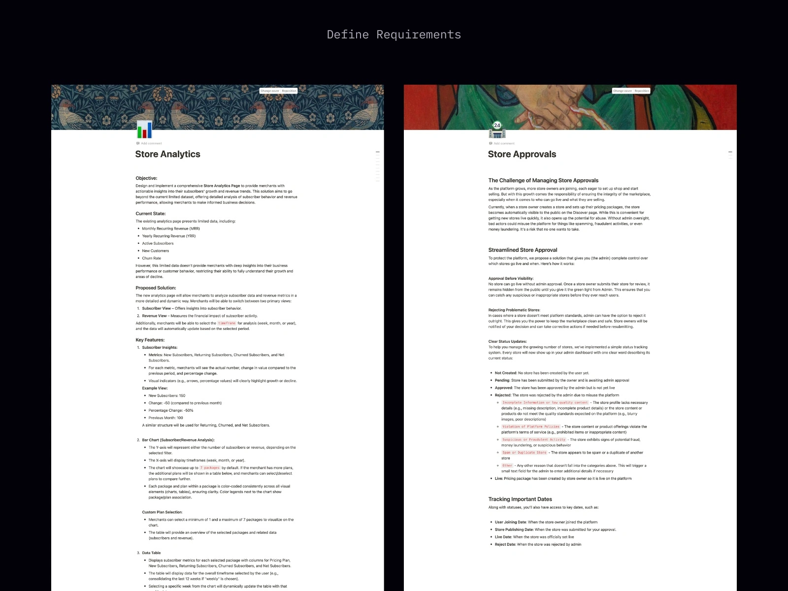
Improved Store Ranking Logic
Not all stores should be treated equally, especially in a market where reputation matters. So I worked on a store ranking system that allows admins to highlight credible, high-quality merchants.
This wasn’t just about fairness it was about shaping the culture of the platform. The updated system allows admins to manually promote trustworthy experts, which helps newer users trust what they see on the Discover page. Over time, this system will also encourage store owners to maintain quality, since visibility is tied to credibility.
Store analytics
Making the Data Make Sense
The existing analytics were too shallow just high-level numbers like MRR, churn, and new customers. What merchants really needed was context: what’s driving those numbers, and how should they respond? So, I redesigned the Store Analytics page to give them a real pulse on their business. Here's what I delivered:
Split views for clarity - Separated analytics into Subscriber View and Revenue View so merchants can focus on either user behavior or financial performance.
Flexible timeframes - Let merchants switch between weekly, monthly, or yearly views to spot both short-term trends and long-term growth.
Detailed subscriber metrics: Added breakdowns for New, Returning, Churned, and Net Subscribers each with actual numbers, period-over-period changes, and visual indicators.
Interactive bar charts - Merchants can compare up to 7 pricing plans visually; excess plans show in a table. Charts and tables are color-coded for clarity.
Plan sorting & color tagging - Pricing plans are consistently color-coded and sortable by name, price, or order of creation.
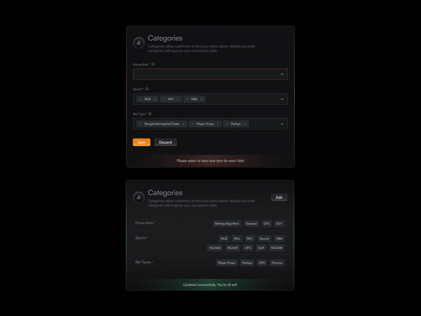
Store setup form
Redesigned the Store Setup Experience
The store creation flow was messy. Fields were dumped in a long, generic form. There was no logic in how things were grouped, no guidance for what each field meant, and no visibility into what came next.
I broke down the setup flow into digestible, logical sections. Grouped related fields together store details, Discord integration, pricing and added inline tooltips to explain each field in plain language. I introduced visual status indicators so merchants always know what stage they’re at and what’s left to complete.
The goal here wasn’t just better UX. It was about creating confidence. Merchants now feel guided, not lost. And the system gently nudges them to finish everything needed to go live, including package and pricing setup
Like this project
Posted Jul 22, 2025
SharpDuel redesigned to improve consistency and usability, reducing user drop-off. Result: 30% faster store creation and a 50% increase in service purchases.